


In Goethe’s color theory, he asserted that colors hold the power to shape our perception and emotional responses to life. Taking it a step further, one could argue that our emotions and moods influence the colors we choose to envelop ourselves in.
My connection with colors has always been profound, but there’s an intriguing journey that brought me to my current fascination with red. For as long as I can recall, I had a disinterest in pink. It was a color I avoided in my clothing and surroundings, even in my childhood toys. However, a peculiar thing began happening in my paintings. Magenta started to emerge as a hidden dominant color. It became the versatile choice for me, seamlessly blending with other tones and enhancing the palette. Then, a change happened—I found myself strangely drawn to pink while out shopping. I allowed myself to lean into this feeling, and slowly, more and more accessories in this color appeared around me. Remarkably, this personal change in my life ignited a transformation in my painting. The presence of pink paved the way for something new, and that something was red. Red took over my canvas, infusing my art with spice, intensity and heat. It’s astonishing how a seemingly minor change, like purchasing a pink T-shirt, can have such a potent impact on one’s creative expression.
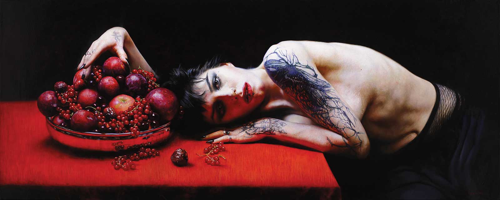
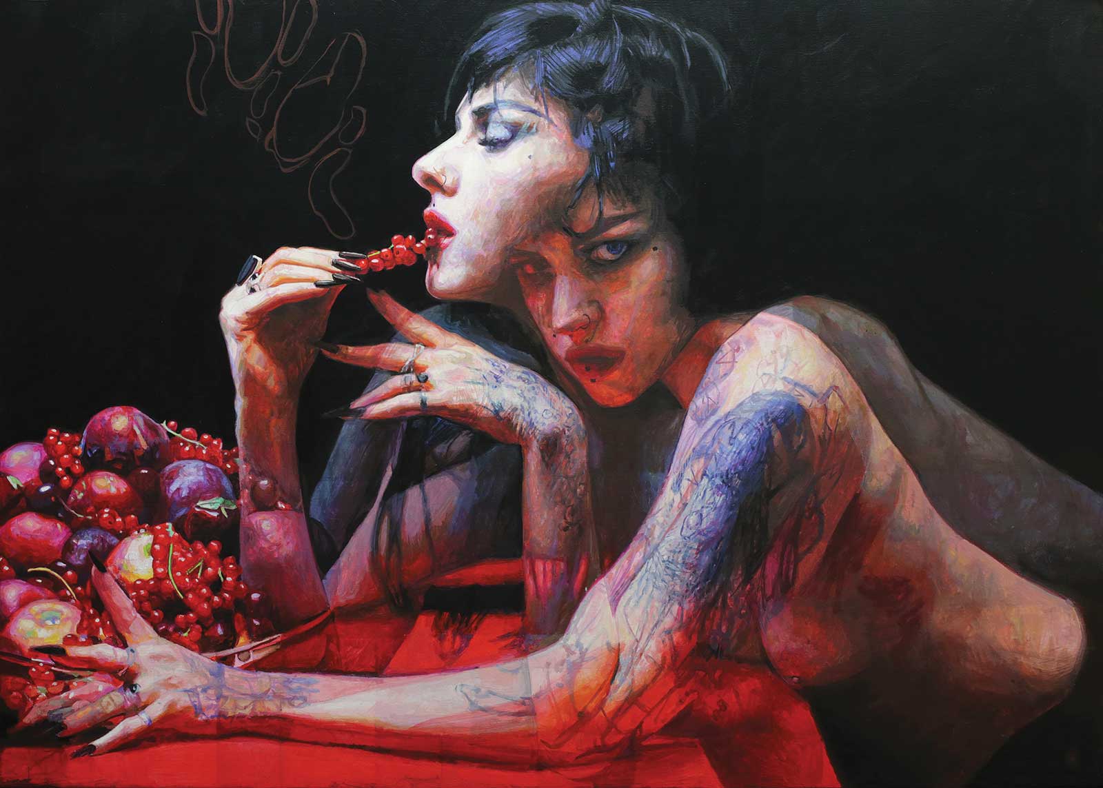
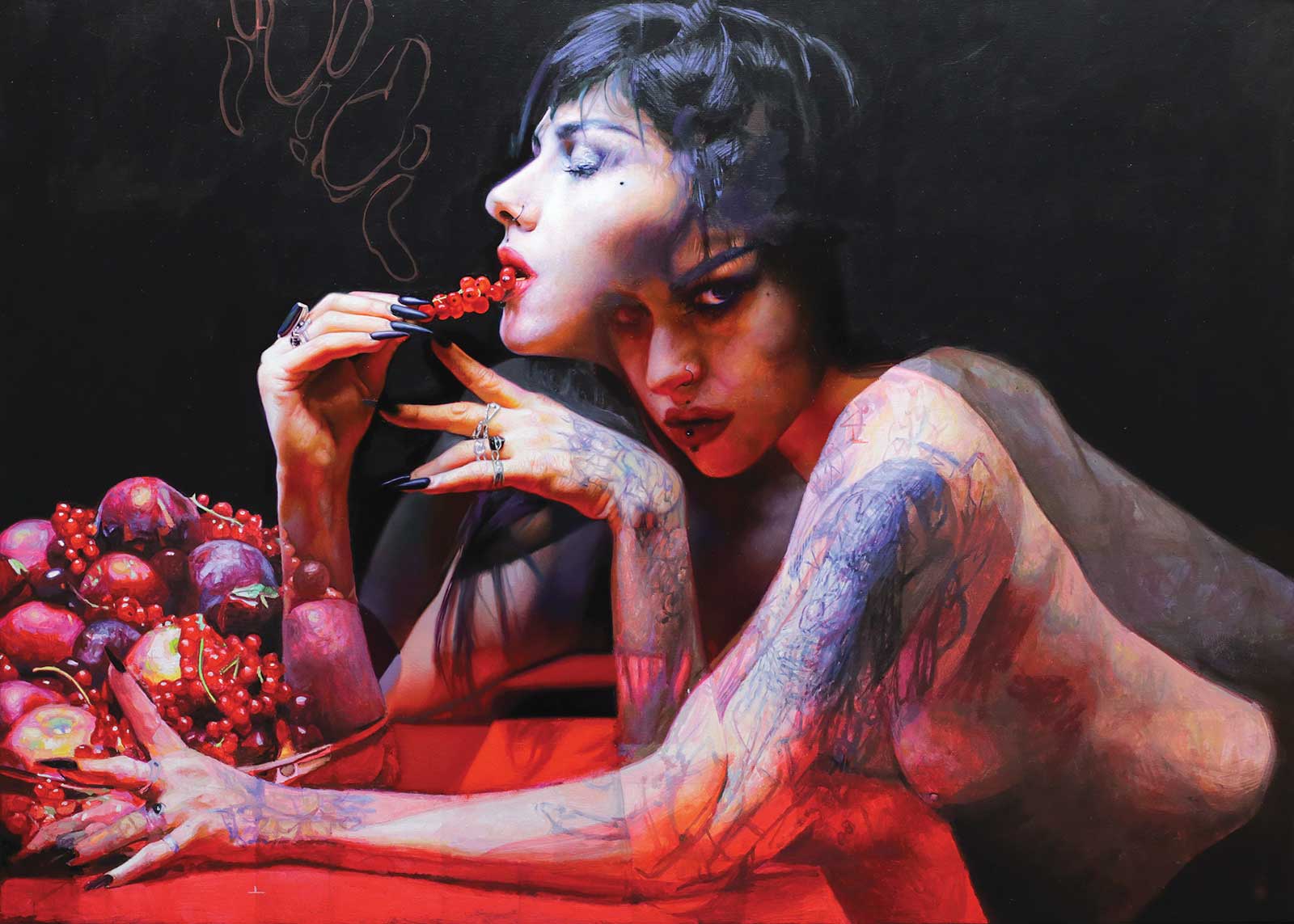
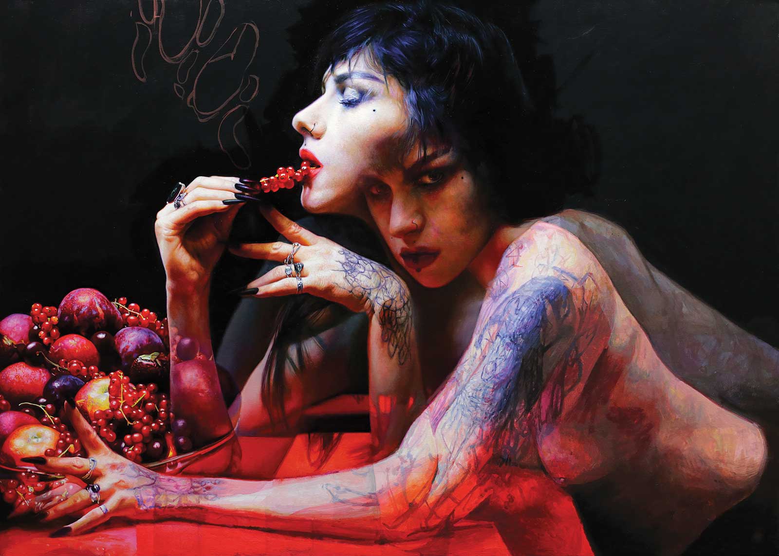
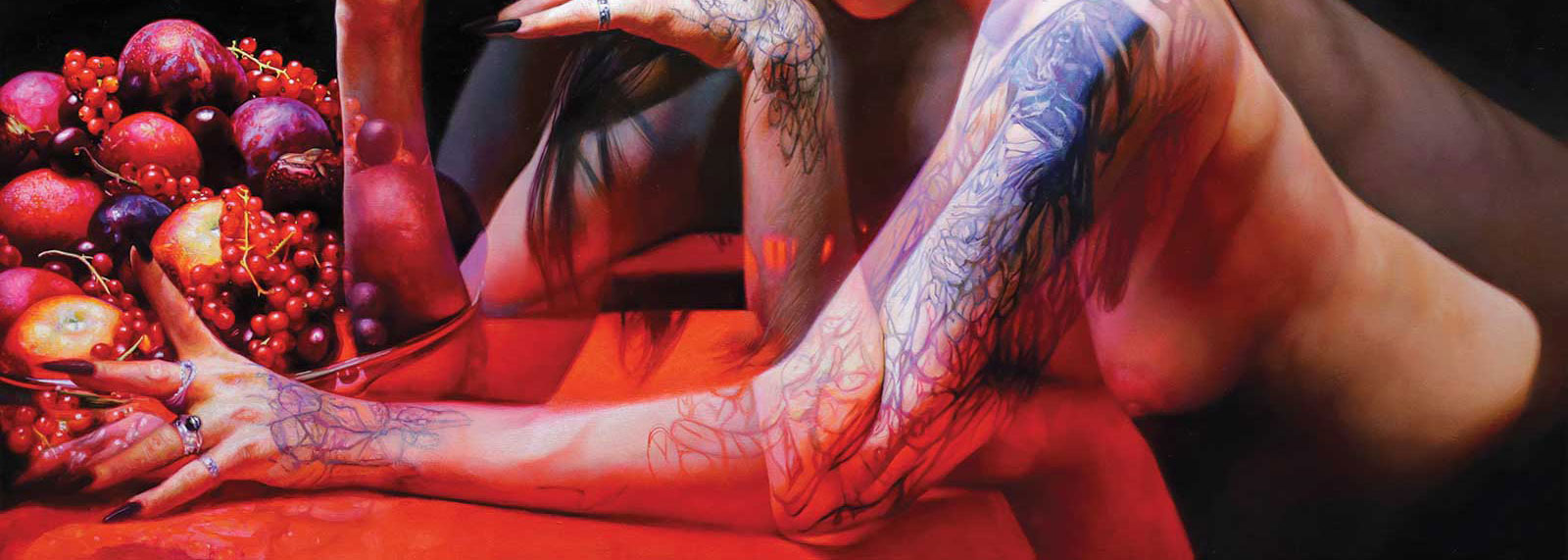
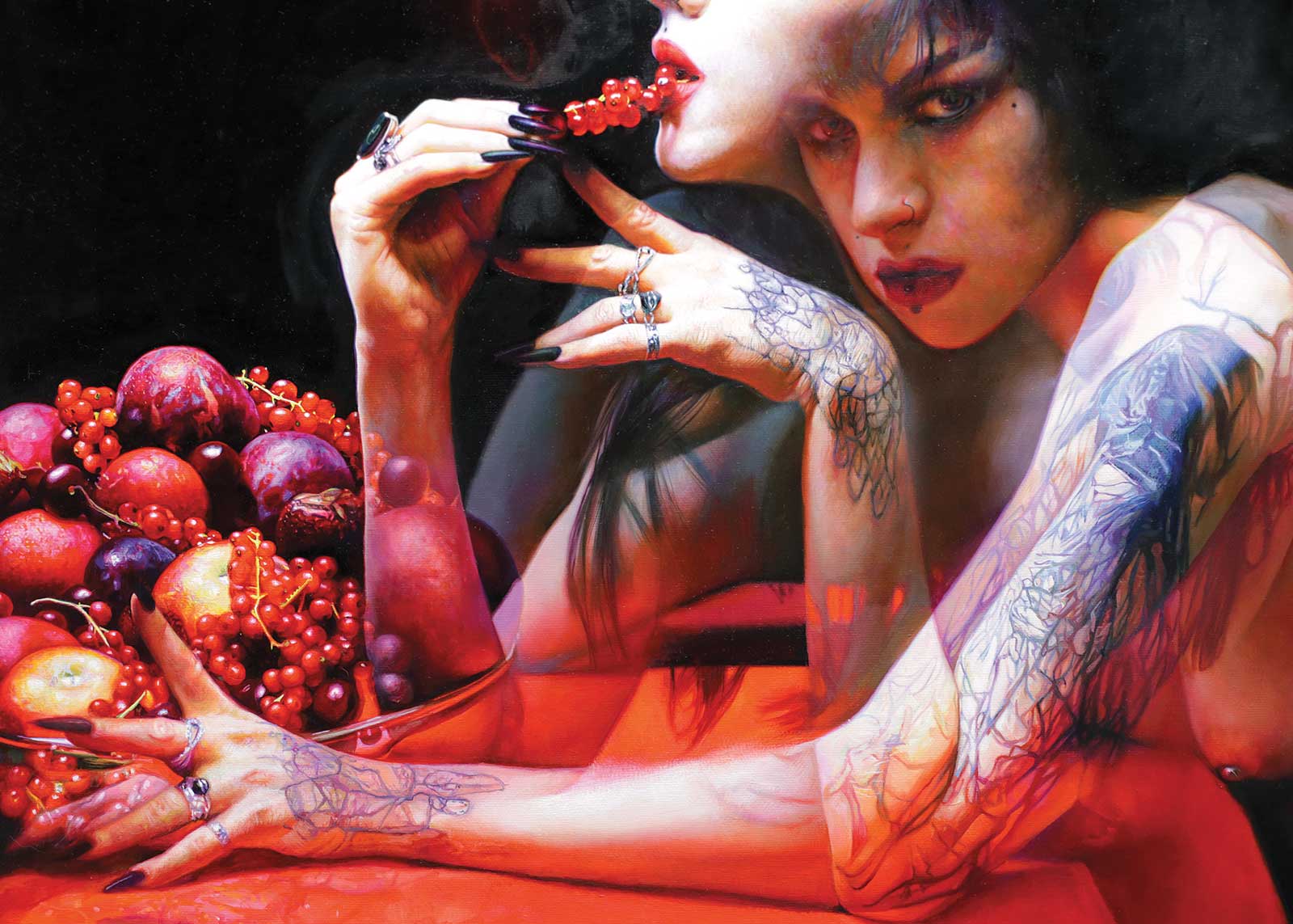
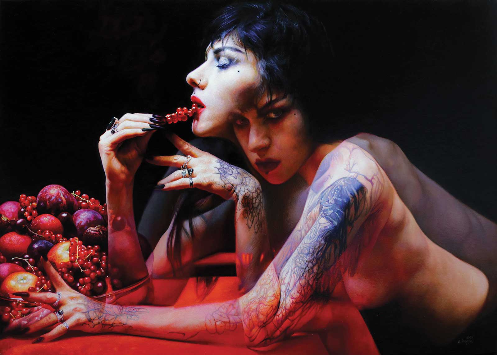
Playing with food - Feast 2, oil on canvas, 16 x 39" (40 x 99 cm) This painting evokes a compelling story, but I won’t reveal it. I created it while immersed in the audiobooks of my favorite Polish fantasy author, Aneta Jadowska. The character depicted doesn’t directly relate to her plots but could inhabit her fantastical worlds, like the Triple Alliance city or Torn. Jadowska’s novels feature witches, vampires and werewolves, and what I appreciate most is the agency of the women in her stories.
Emotions play a significant role in our choice of colors in life, and this principle extends to the selection of shades when painting. However, the challenge lies in making these chosen colors pure and vibrant without making them appear flat or overly artificial, like they’ve been applied straight from the tube. How can we achieve that delicate balance?
Primarily, quality is paramount. To attain vibrant colors, it’s essential to use paints with a rich concentration of high-quality pigments. This aspect is particularly critical when working with vivid and intense colors, such as the red I’ve embraced. Even if a color appears fully opaque, applying multiple layers can enhance its vibrancy. Additionally, ensure that your brush remains impeccably clean, free from any unwanted color residues.
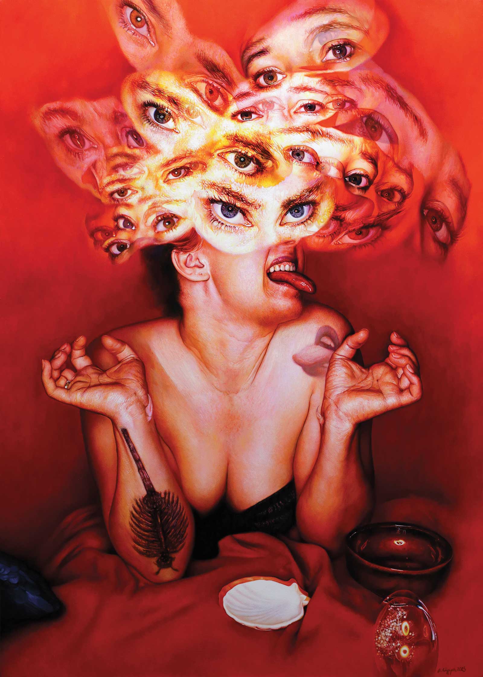
Zwierzok/Creature, oil on canvas, 28 x 20" (71 x 50 cm) We often view wild animals as evil, driven by primal instincts, lacking empathy and depth. But humanity involves embracing our inner animal, understanding its simplicity and building a “civilized” self upon that foundation. It’s not about letting the animal take over but acknowledging it rides with us. True civilization requires a connection with our inner animal; without it, humanism and humanity are mere performances. Remember, we are still part of the animal world, and embracing that makes our humanity more complete. This painting was shown at Zacheta (the biggest public national gallery) in Warsaw, Poland.
The color intensity depends on the surroundings, nearby colors may extinguish or enhance. The same red will look pale in the company of hazy purples and energetic next to intense green. Interestingly, contrast is also important. So it matters whether the green is deep and dark or light and intensely warm.
Working with intense colors requires finesse. When we aim to gently adjust them without compromising their vibrancy, it’s advisable not to introduce too many other colors. Instead, consider adding a touch of white, yellow, or a hint of light pink to subtly brighten the hue. Avoid adding all these options at once. To darken the red and achieve the desired effect, incorporate brown, green, black or dark blue, depending on your artistic intent. Alternatively, you can introduce purple or cool magenta, but it’s crucial not to combine all these options simultaneously. If your goal is to make the red exceptionally radiant, complement it with a neighboring element in a very dark and cool shade.
The sharpness of a color edge is equally significant. A blurred edge can dilute its impact, whereas a crisp, sharp edge enhances it. To give the color an extra boost—making it seem to leap off the canvas—consider adding a fine, nearly imperceptible line of intense green along the red edge of the shape.
By applying the guidance mentioned above, we can make informed choices about which color or shade will take the center role in our painting, allowing us to wield greater control over the visual impact and emotional resonance of our paintings.
My Art in the Making Slow
 Stage 1
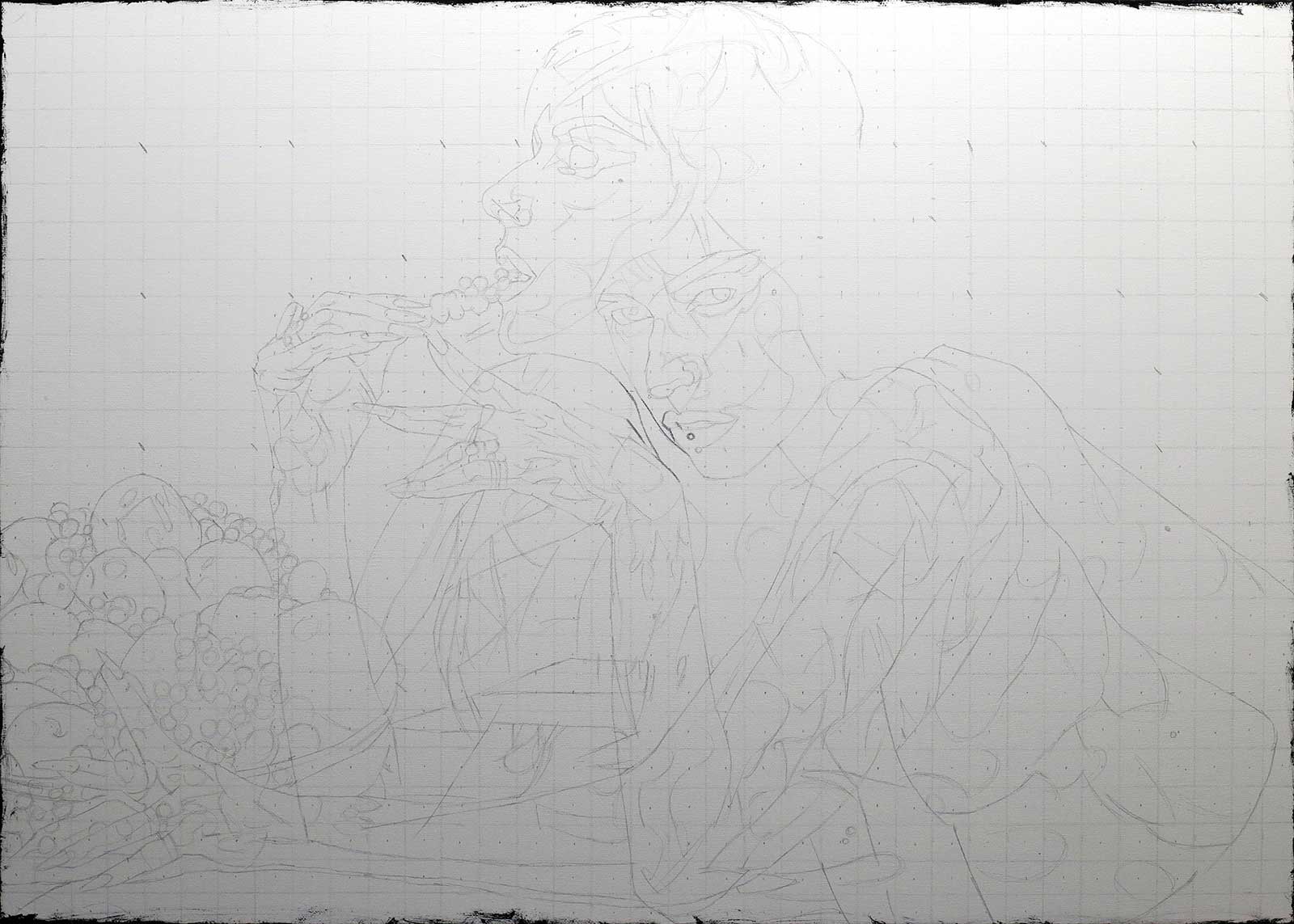
Stage 1 Drawing with Watercolor Crayon
This first stage is about drawing the composition and proportions correctly. Once I put acrylic paint on it, the drawing completely disappears and dissolves. Thanks to this, nothing will be visible later.
 Stage 2
Stage 2 First Acrylic Layer
At this stage, it is about the first color sketch but also about setting the value situation—what contrast and where. Before moving to the next layer, I cover the whole painting with paint.
 Stag3
Stag3Stage 3 Second Acrylic Layer
The second acrylic layer is for positioning and arranging the elements in space, so that something doesn’t jump forward that shouldn’t. It also adds details.
 Stage 4
Stage 4 The Eyes
I always start by painting the eyes, then the whole face. Only then am I able to move on to something else.
 Stage 5
Stage 5 Softening with Oils
I cover the next fragments with oils, making it soft and beautiful. The important thing is that I often return to already painted elements and add details. I like to wait until the previous layer is completely dry. I don’t put one layer on everything—some elements have more, some have fewer.
 Stage 6
Stage 6 Background
Here I worked on the central red zone, which is also the background.
 Stage 7
Stage 7 Foreground
Next, I worked on the foreground of the most intense reds.
 Stage 8
Stage 8 Enhancing Vibrancy
In this close-up you can see how I play with shades and color combinations so that they vibrate and emphasize each other.
 Stage 9
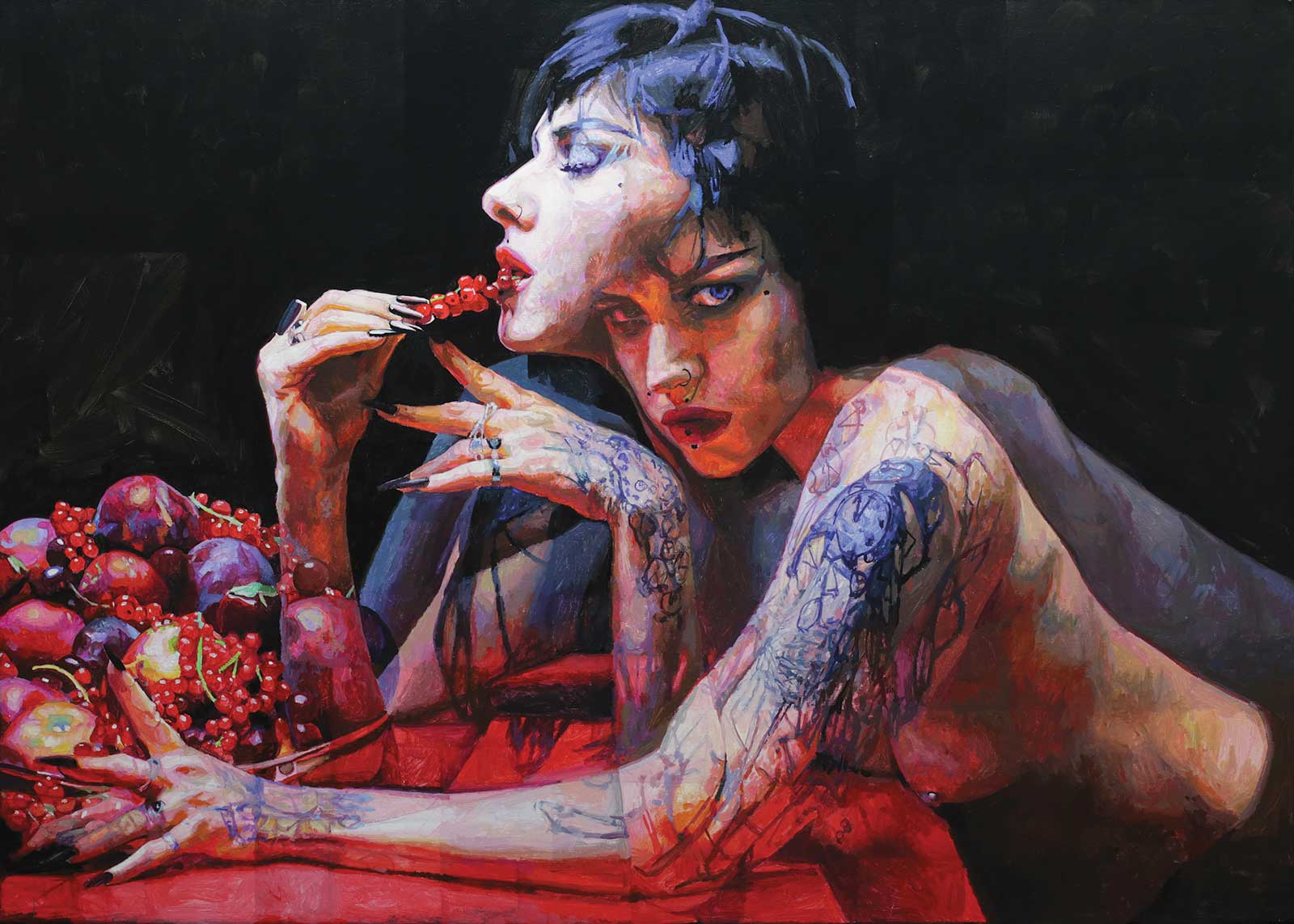
Stage 9 Finished Artwork
Slow, oil on canvas, 20 x 28" (50 x 71 cm) This painting is about hard work and the ability to slow down in order to feel more happy in life.
About the artist
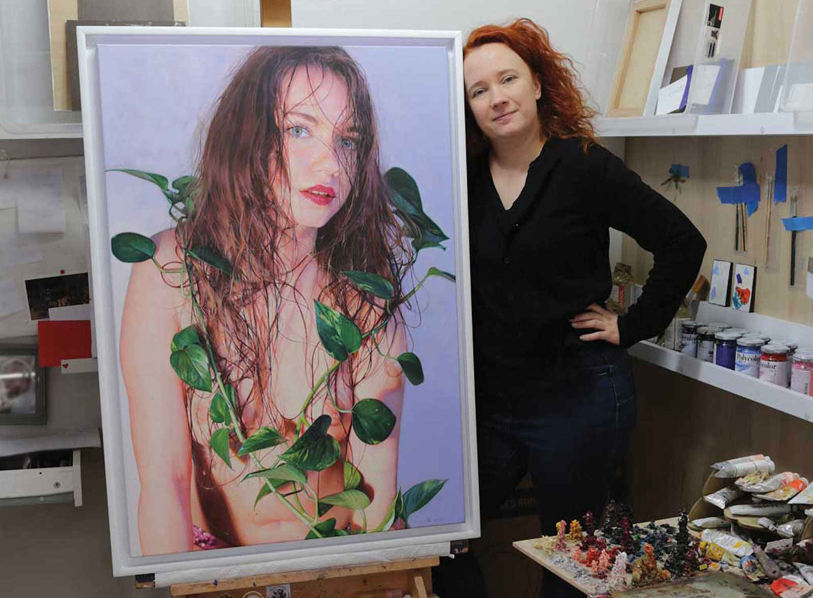 Anna Wypych
Anna Wypych is one of those artists whose paintings become more interesting the more you know about her. She was the winner of Best of Show and Pioneer in Realism awards at the 2020 International Guild of Realism Annual Juried Exhibition, as well as a recipient of the Purchase Award at the 14th International ARC Salon hosted by the Art Renewal Center in 2019. Her paintings are in permanent collections of the European Museum of Modern Art in Barcelona, Spain; as well as the National Museum in Gdansk, the Museum of City Gdansk and the Museum of City Gdynia, all located in Poland. Her works have been shown at many juried exhibitions including the ARC Salons, Figurativas, Modportrait and the Beautiful Bizarre Art Prize. Wypych has also been published many times in magazines such as American Art Collector, Beautiful Bizarre and the December/January 2021 issue of International Artist, where her work was featured on the cover. Wypych’s paintings are also included in prestigious collections like The Bennett Collection. She lives and works in Gdynia, Poland.
Represented by
Principle Gallery, Virginia and South Carolina, USA, principlegallery.com
Abend Gallery, Colorado, USA, abendgallery.com
Gallery 1261, Colorado, USA, gallery1261.com
AnArte Gallery, Texas, USA, anartegallery09.com
Contact at
annawypych.com