


Investigating the impact and mechanics of composition has been a major focus of my recent work. In this article, I aim to share insights and tools that might prove beneficial in the practice of any new, or even experienced, painter interested in improving their composition design. Let us start with a suggested definition: a composition is an arrangement of marks (shapes, colors, edges, textures, etc.) on a surface that achieves a harmonious balance of individual elements within a cohesive whole and evokes a desired emotional or aesthetic response. This definition applies to both figurative and abstract painting. It also applies to music if you switch out “marks” and “surface” for “notes” and “sequence.” Thus, the conclusions drawn from this article can serve you in creating and analyzing any style of art that appeals to you.
Ken Goshen, Self Portrait as a Landscape in Golden Brown, oil on paper, 8 x 13¾" (20 x 34 cm)
In my experience, I have found that the heart of a successful composition is in the reconciliation of oppositional pictorial qualities. These qualities represent “two sides of the same coin,” oppositional in essence, and aesthetically complementary. A painting should attract viewers from a distance, yet also engage them up close, offering both instant visual appeal and depth for prolonged contemplation. It must bring together intellectual and emotional engagement, blending conceptual depth with sensory richness. This concept of oppositional relationships extends to every mark in the composition, whether small or large, light or dark, chromatic or gray. The key to reconciling these contrasting qualities is to think of them as competing elements that can, and should, be put in balance. Like spices in a soup, ratios must be balanced such that each contributes to the overall cohesive flavor without allowing one to overpower the other. The balancing of oppositional elements creates what I call “dynamic harmony”—akin to the active equilibrium of balancing a broomstick on one’s palm—a static state charged with underlying movement. Such acts of balance are the key to designing compositions that both draw viewers in and keep them transfixed.
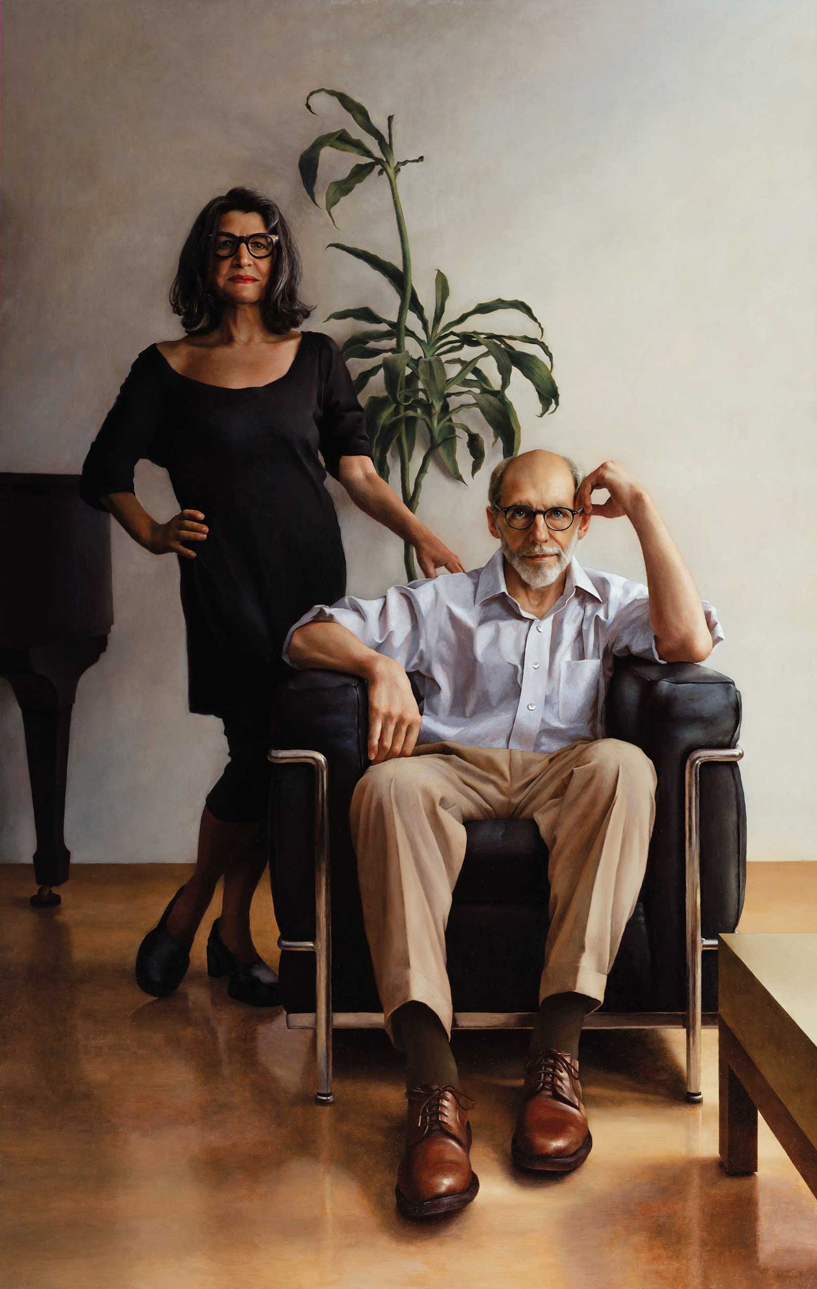
Ken Goshen, The Pause, oil on wood, 60 x 38" (152 x 96 cm)
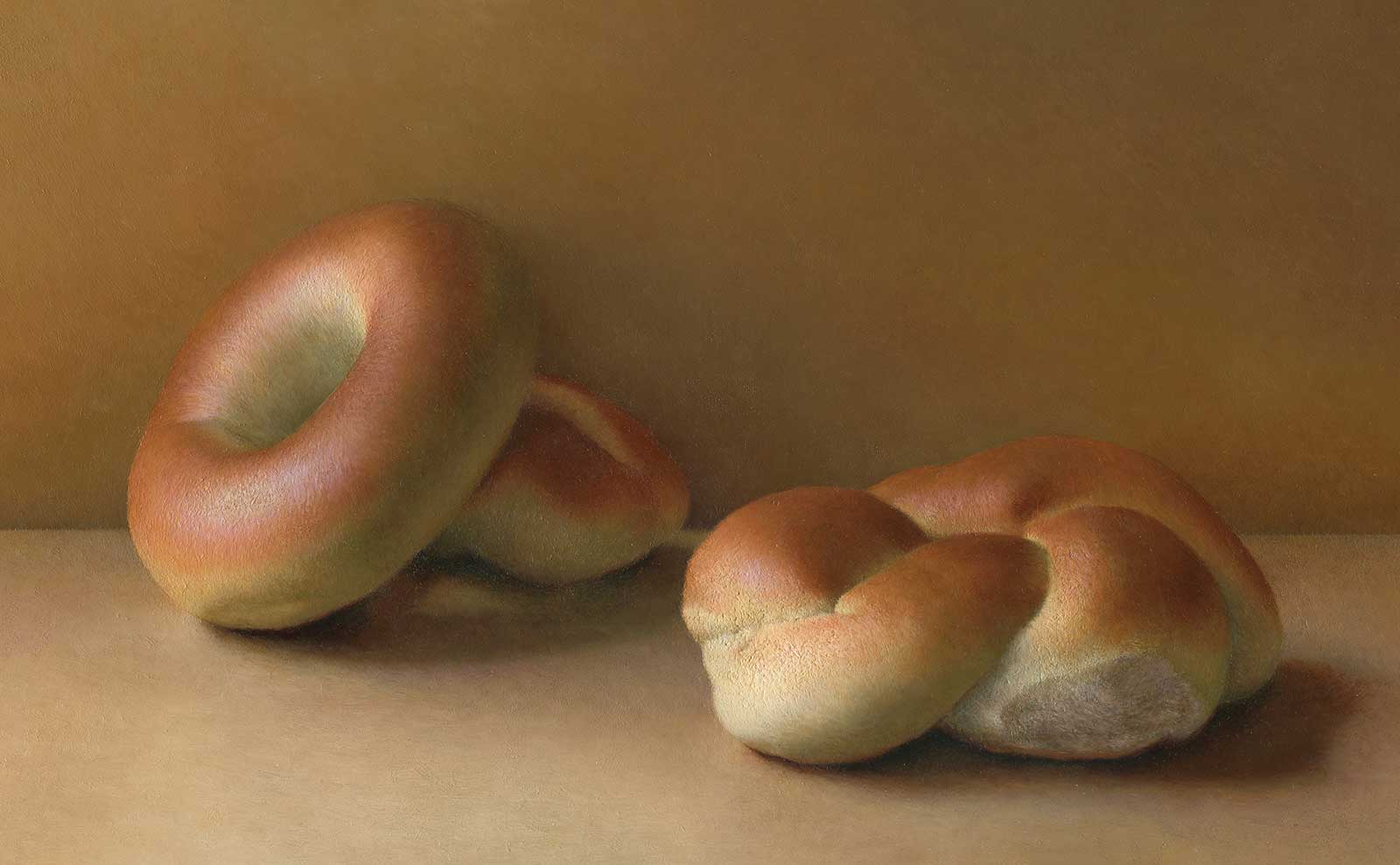
It follows then that finding a compositional idea, for me, begins with exploring oppositional qualities within a subject, in search of potential dynamic harmonies, and conjuring pictorial strategies for weaving them together. Interestingly, I’ve discovered that this process also works well in reverse: a compositional idea can emerge in the abstract and guide the selection of a suitable subject to realize it. Like a thesis question prompting research. Such was the case with a recent painting of mine (the bagel and braided loaf painting featured in this article), which started with the following question: Can a painting that depicts exclusively brown objects—the most mundane color input—still feel rich and engaging? I tried to create an arrangement that would provide me with a rich array of opportunities for creating dynamic harmonies, which I hypothesized could be used to transform the lack of color diversity from a pictorial disadvantage to an aesthetic asset. The absence of vibrant colors accentuates the nuances of values and shapes, allowing these subtler elements to take a central role in defining the artwork’s character and aesthetic appeal. I’ll now use this piece as a test case, demonstrating and analyzing some of the balancing acts that drove its composition.
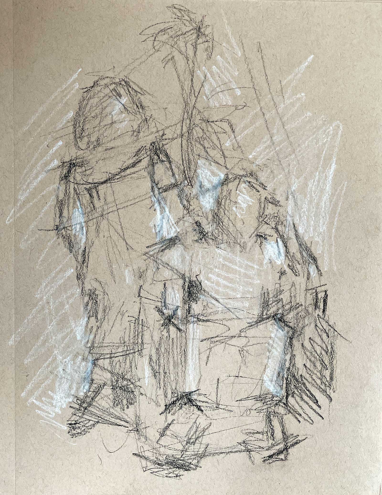
Compositional sketch in charcoal and white chalk on toned paper.
Balancing Light and Shadow
The successful interplay of light and shadow, which each bring distinct benefits to an artwork, is fundamental to compositional success. Light draws the viewer’s attention, guiding the eye toward key focal points and shaping the path of visual exploration. Shadows, on the other hand, add depth and mystery, imbuing the scene with a sense of volume and grounding the elements within their spatial context. In order to set this inherently oppositional relationship in balance, consideration should be given to the quantity, placement and intensity of each of these elements. Additionally, measured value gradations between light and shadow play a crucial role in achieving balance, as it eases the eye’s journey between areas of vastly contrasting visual experiences. Sketching a composition in black and white before starting, and viewing the work-in-progress through a grayscale filter, are useful methods for assessing the balance between light and shadow, ensuring these oppositional elements are harmoniously integrated within the composition. Achieving this equilibrium allows light and shadow to transcend their oppositional roles, unveiling their complementary nature and collectively enhancing the composition’s overall impact. This balance between light and shadow creates a dynamic harmony, juxtaposing clarity with enigma and intertwining drama with tranquility.
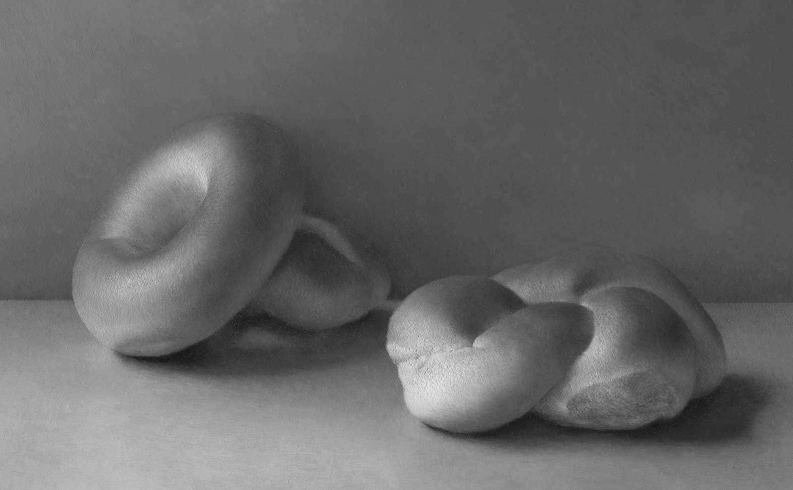
Grayscale version of the painting.
Balancing Contrast and Unity
To build a strong, compelling and evocative composition, it’s important to balance the oppositional qualities of contrast and unity. Contrast is achieved through stark differences in value: it defines forms, carves out space and creates a visual hierarchy that directs the viewer’s attention. Unity, on the other hand, is achieved through regions of value similarity, promoting a sense of cohesion and wholeness.
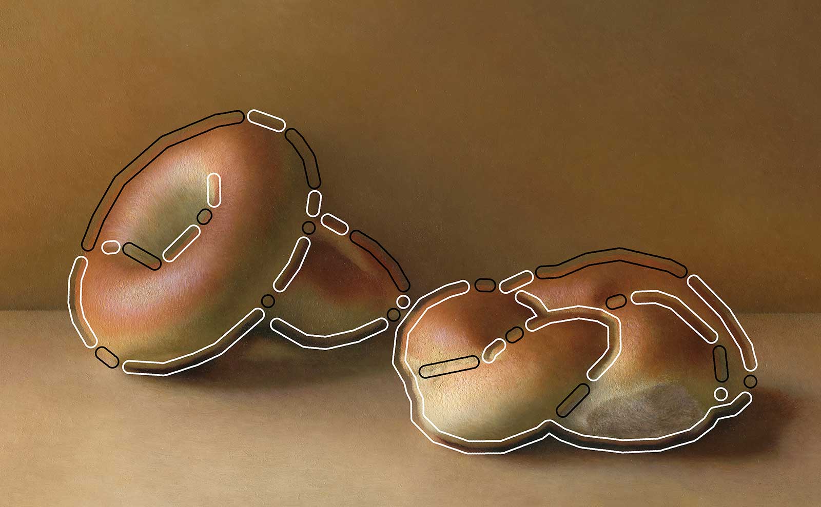
Areas of contrast versus areas of unity.
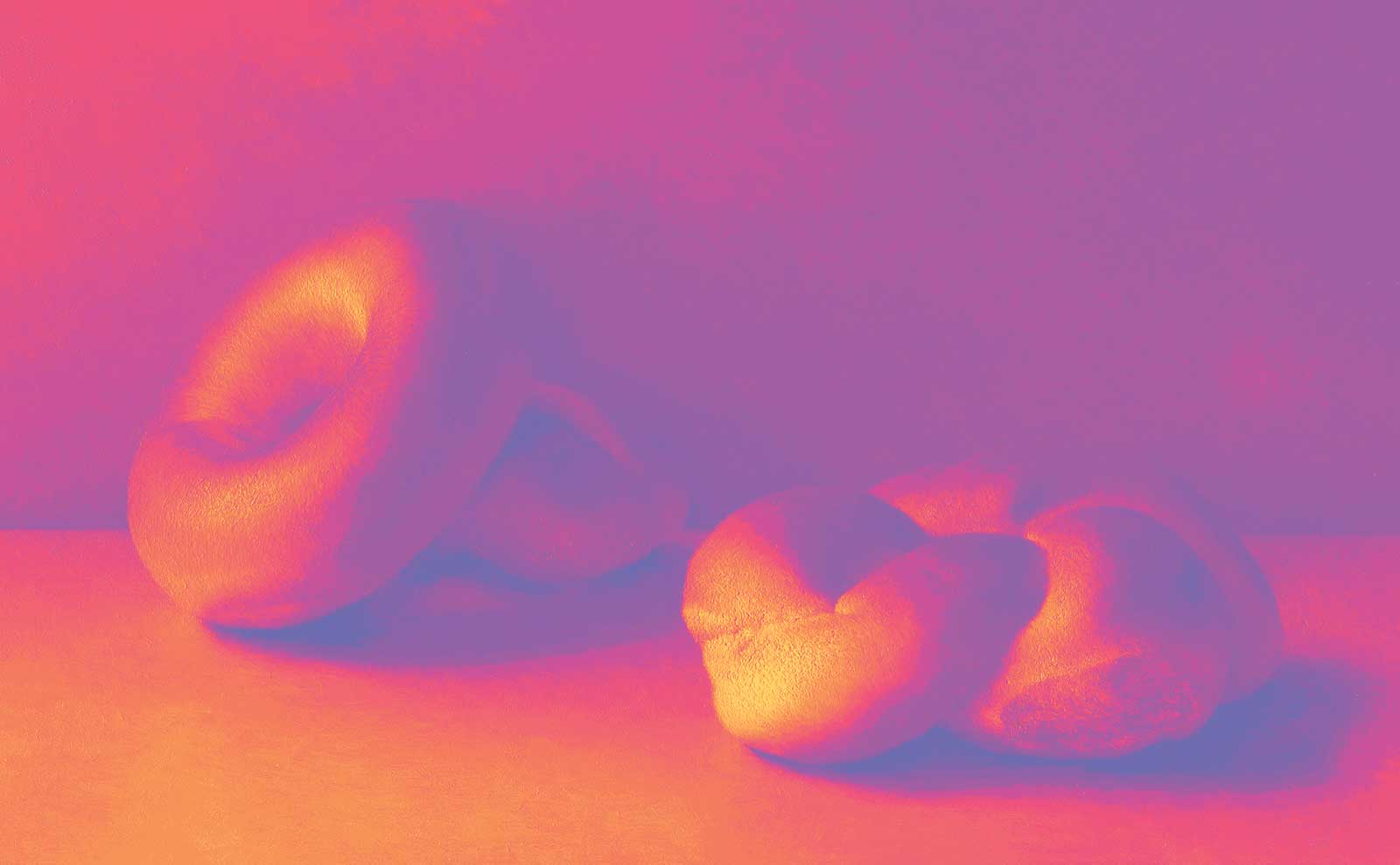
An example of this is illustrated in this section. The white outlines mark areas of value contrast along contours, emphasizing where objects assert their presence against the backdrop, creating a vivid collision that captures attention and underscores the illusion of form and depth. Conversely, the black outlines indicate regions of value unity, where similar values soften the contours, allowing the viewer’s gaze to traverse the scene with ease and imbuing the composition with a calming sense of cohesion. In the grayscale version of this image, note how the removal of chroma and hue reveals the underlying value similarity within the black outlines. As another example, view the image below, in which the painting has been divided into 10 value increments. Each was assigned a color, with yellow being the lightest and blue being the darkest. Regions that share the same color in this diagram share the same value in the painting (even if their chroma and hue coordinates are different). Note how some areas of the objects stand out against the background due to strong value contrast, while in other areas the objects seamlessly blend into the background, due to value similarity.
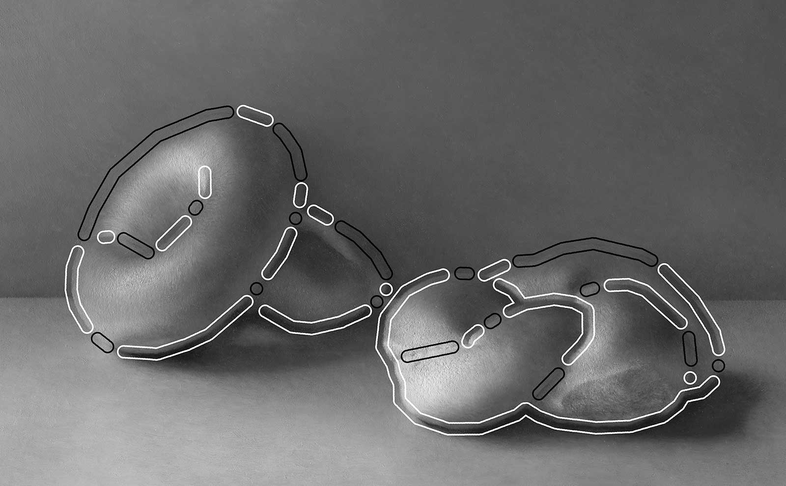
Areas of contrast versus areas of unity in grayscale.
Achieving a good balance between these oppositional qualities is essential for a composition’s success in capturing and maintaining the viewer’s gaze. High-contrast areas with sharp value differences demand immediate attention, providing the initial visual hook that draws one into the artwork. However, an overabundance of this kind of contrast can be visually overwhelming, often deterring extended engagement with the piece. On the other hand, areas of value unity may not captivate instantly, but foster a sense of calm that encourages the viewer to linger and explore further. Striking a balance between these oppositional qualities creates a dynamic harmony that harnesses the immediate allure of contrast while also offering the inviting serenity of unity, contributing to a composition that is both impactful and meditative, capable of arresting the eye and soothing the mind.
Balancing the Natural and Mathematical
Shifting focus from color and value, let’s now explore another critical aspect of composition: balancing oppositional qualities within shapes. A particular favorite of mine is the oppositional relationship between the spontaneous grace of natural forms versus the deliberate harmony of mathematical structures. Imagine a spectrum. On one side of this spectrum lies the natural aesthetic, which brings a sense of authenticity and relatability to the artwork. It allows the painting to resonate with the viewer’s experience of the natural world, imbued with randomness and serendipity. On the other end of the spectrum is the mathematical aesthetic, which contributes a sense of order, symmetry and purpose. It gives the viewer a subconscious satisfaction derived from the artwork’s structural coherence. Finding ways to fuse and balance these antagonists is of profound compositional interest to me, as I believe it holds great potential for enhancing aesthetic depth and complexity. I’d like to share an exceptionally helpful methodology I employed in this painting in order to serve this goal: emergent grids.
Ten-value increment “heat” map.
The key to understanding how emergent grids balance the natural with the mathematical lies in their origin: these grids are not imposed structures, but are derived directly from the canvas’s proportions. This means the lines and geometric shapes suggested by these grids are inherently tied to the physical space of the canvas. As a result, these lines feel natural within the context of the canvas because they are, in a sense, born from it. This concept mirrors a broader understanding in physics: that nature, at its most fundamental level, is governed by mathematical laws. By using these grids as inspiration for arranging our composition, we can strike a balance between naturalistic and mathematical aesthetics in our compositions. This creates a dynamic harmony which achieves a dual impact: on one hand, we evoke a sense of authenticity and relatability, aligning the painting with the viewer’s natural world experiences, filled with spontaneity and narrative potential. On the other, we impart a sense of structured order, symmetry and intention, which subconsciously satisfies the viewer through the artwork’s cohesive structure.

Emergent “diamond” grid.
Balancing Emphasis and Omission
When key lines in the painting—such as the edges of objects, directional gestures or shadows— align with emergent grid lines, they reinforce natural visual trajectories inherent to the canvas’ dimensions. This alignment emphasizes these visual pathways, making them more pronounced and guiding the viewer’s gaze more effectively along them. Therefore, a convergence of multiple emergent grid lines creates a natural focal area within the canvas—an invisible crossroads that beckons the eye to pause and take notice. How we choose to utilize these intersections can profoundly shape the narrative and emotional impact of the painting.

Emergent “star” grid.
By placing a key element or a moment of heightened painterly execution at an intersection, we can capitalize on these built-in resting spots, allowing the viewer’s gaze to settle and absorb the visual experience. This could be a vivid highlight, a sharp edge or a complex texture—any feature that merits attention. Such placements align with the viewer’s instinctive search for visual anchors, satisfying the eye’s desire for resolution and rest within the composition.

Two golden ratio spiral grids.
Alternatively, we might intentionally choose to leave these intersections understated, devoid of contrast or detail. This decision introduces a subtle dissonance into the composition, a deliberate void where expectation meets a lack of visual reward. The eye, drawn to these grid intersections by a natural tendency to seek focal points, encounters a calm or even a blank space, which can inject a sense of tension or unresolved anticipation into the viewer’s experience. This purposeful avoidance of emphasis subverts the eye’s natural resting behavior, compelling the viewer to continue their visual journey in search of resolution.

Emergent “diamond” and “star” grids.
Balancing these oppositional tactics—emphasis and omission—can create a dynamic harmony of push and pull within the artwork. The image with the colored circles demonstrates how emergent intersections of equal potency are activated to four different degrees: strong emphasis (green), moderate emphasis (yellow), de-emphasis (orange) and total omission (red). Deciding how to balance moments of drama and focus with areas of quiet restraint ensures the composition is dynamic, neither stagnant nor chaotic. A balanced sequence of revelatory resolutions and surprising subversions creates a rhythmic visual experience that invites viewers to linger and engage more contemplatively with the artwork. Such rhythmic balance can also make the artwork more memorable, like a catchy beat.
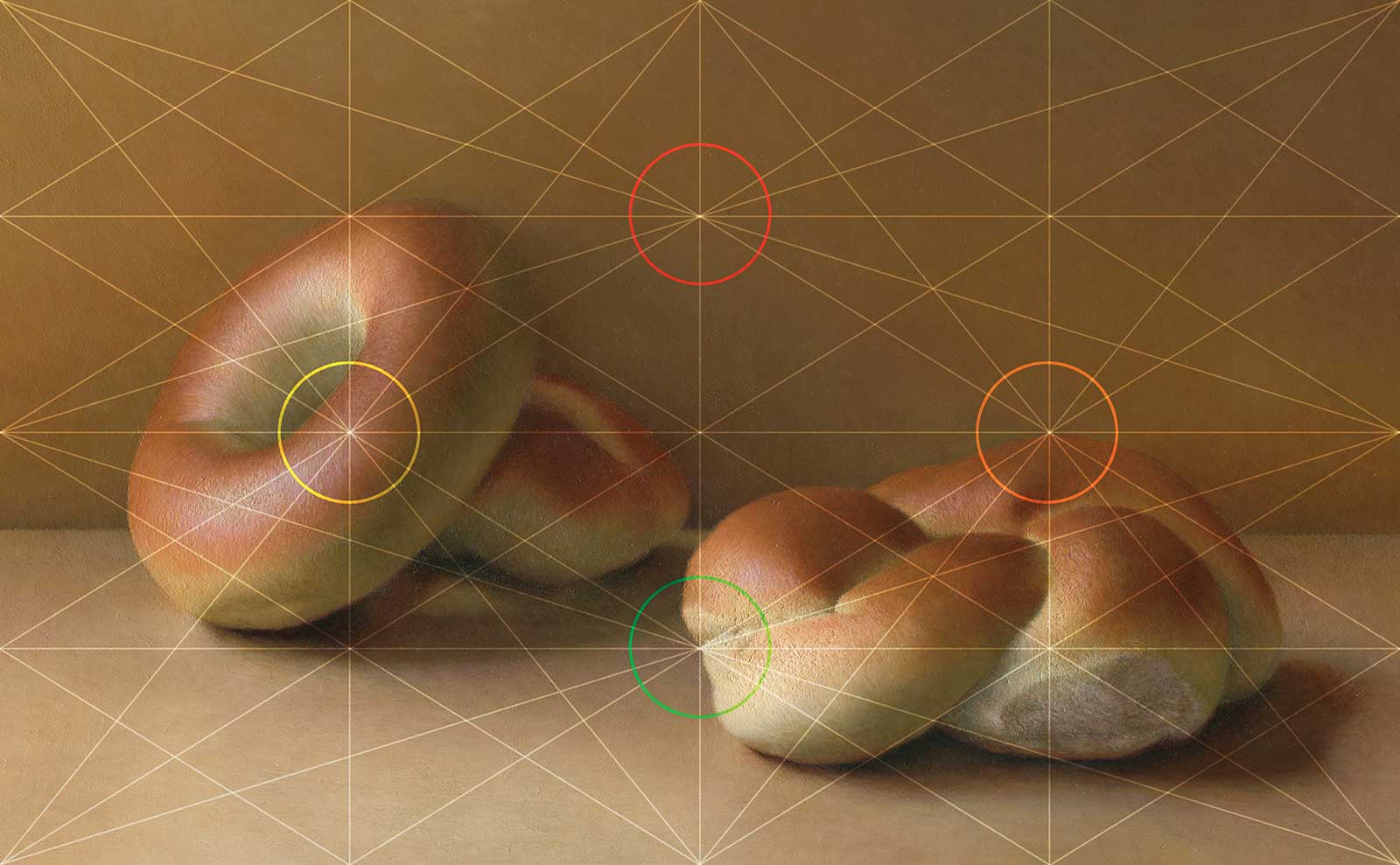
Emphasis to omission activation spectrum.
As I hope this exploration revealed, balancing oppositional qualities in art is a powerful tool for creating successful, engaging compositions. Whether it’s the interplay of colors and values, the juxtaposition of light and shadow, the contrast of distinct forms within a unified atmosphere, or the fusion of natural charm with mathematical order, the essence of a compelling composition rests in finding dynamic harmonies within these contrasts. Other oppositional relationships not covered in this article that I recommend considering include large versus small, complex versus simple, sharp versus soft, textured versus smooth, opaque versus transparent, direct versus indirect and fast versus slow. By embracing these dichotomies, we unlock a richer palette of emotional and aesthetic experiences. Even “uninspiring” visual stimuli, like an arrangement of humble browns, can still be used to cook up a visual feast if you prioritize compositional balance. Reflect on this conclusion, as it may immunize you from ever feeling a subject is “too boring to paint.” As artists, it is our challenge and privilege to continue exploring and experimenting with old and new ways of balancing oppositional qualities under any visual conditions. May this exploration of composition serve as both a guide and an inspiration on your artistic journey, wherever it may lead you. —