


Different subjects appeal for different reasons. This hilltop village in Tuscany grabbed my attention as we drove past. The way the village appears to grow out of the rocky cliff face really intrigued me. I love the gradation from abstract marks to geometric shapes as your eye moves up the rocky surface. The tight color harmony and varied textures adds to the feeling of the village emerging from the ancient rocks.
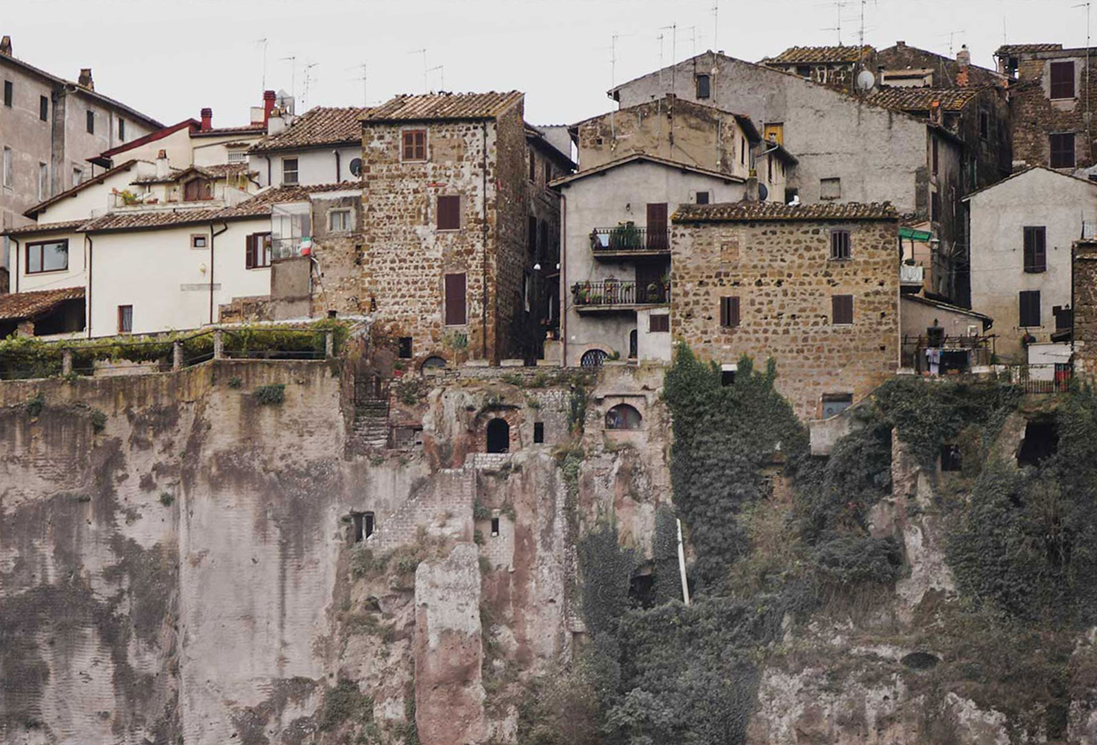
Reference Photo
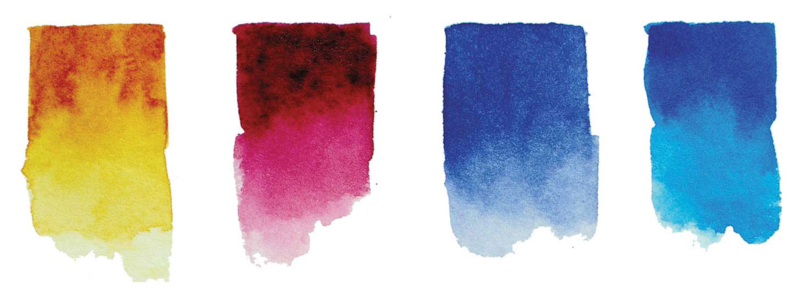
Watercolors
Quinacridone gold, Permanent alizarin crimson, French ultramarine blue, Phthalo blue, Some burnt sienna ink and white gesso
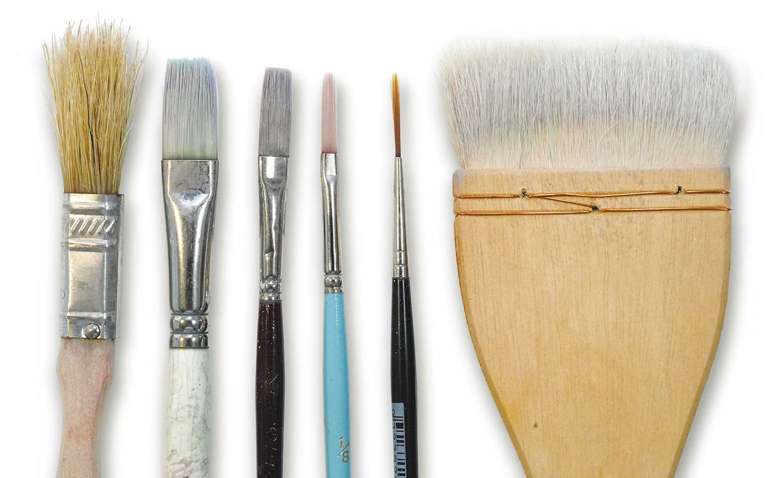
Brushes
½" bristle brush, ½, ¼, 1⁄8" long flat, #1 rigger, 2" Hake
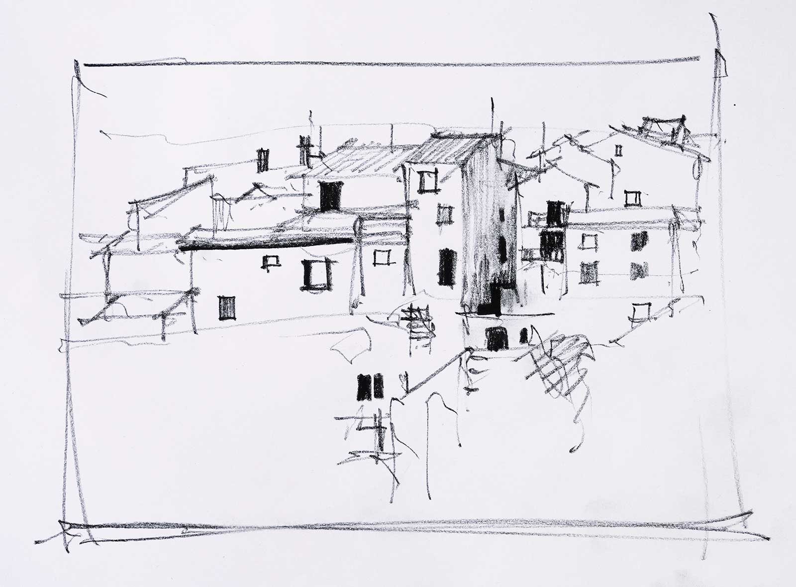 Stage 1
Stage 1
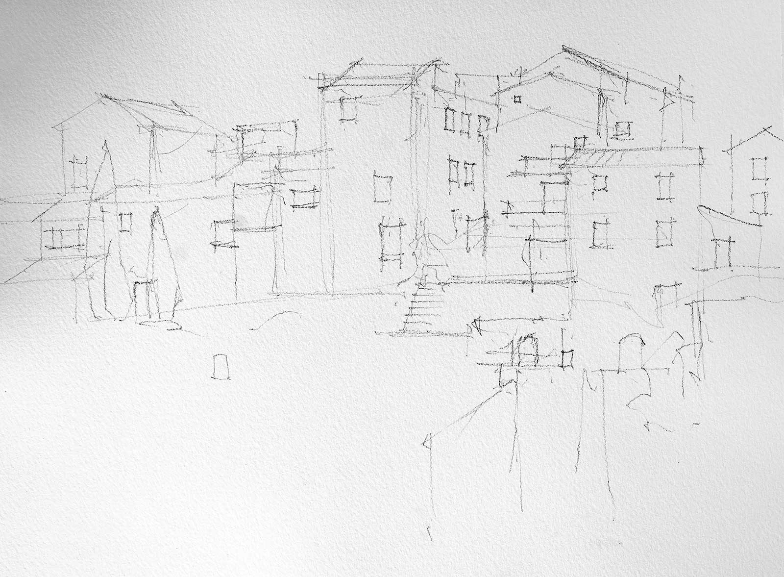
The first thing I did was a rough charcoal sketch to work out how to place the various elements on the paper. The idea of a mark leading the eye up from a simplified abstract foreground to an arrangement of formal geometric shapes appealed to me.
 Stage 2
Stage 2
Once I was happy with the arrangement, I lightly sketched the subject onto a quarter sheet of 300gsm Arches CP paper with a charcoal pencil.
 Stage 3
Stage 3
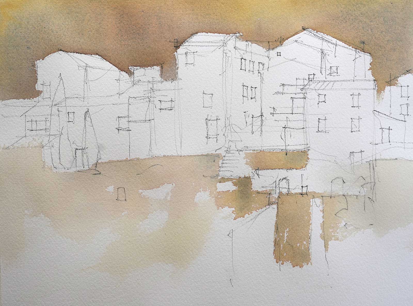
The sky was a warm yellow/brown mixed from quinacridone gold, alizarin and ultramarine. While it was wet, alizarin and ultramarine were dropped in and allowed to spread. The foreground was the same combination of colors but varied in tone with the addition of more water. These washes were all applied with a ½" bristle brush.
 Stage 4
Stage 4
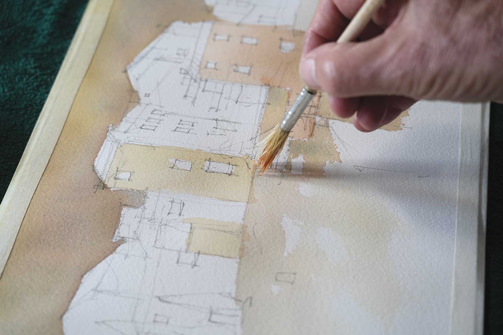
The same brush was used to paint the buildings. Rolling the bristles in the mixture on the palette forms the brush into a point. This allows for reasonably accurate but interesting shapes to be produced. Again the buildings were a mixture of the same three colors, varied slightly from building to building. Some of the buildings in the right hand third of the village were left white at this stage. I want the focal area in this region, so it is important to have white paper here to gain maximum contrast once the darks go in.
 Stage 5
Stage 5
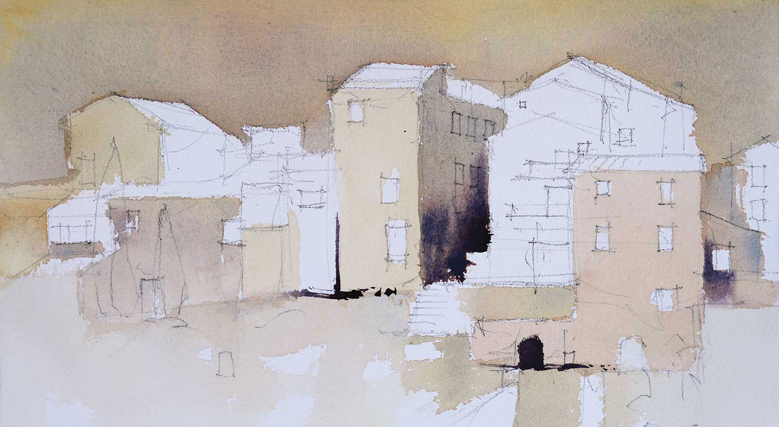
A few dark shapes around the focal area give a better idea of the composition. Some of the buildings on the left were also left white. These whites will be reduced as more detail is added. It is safer to leave more areas of white than is necessary in the early stages of a painting. As the painting progresses the best location for areas of white emerges. White paper is easy to get rid of but much harder to regain once it has gone.
 Stage 6
Stage 6
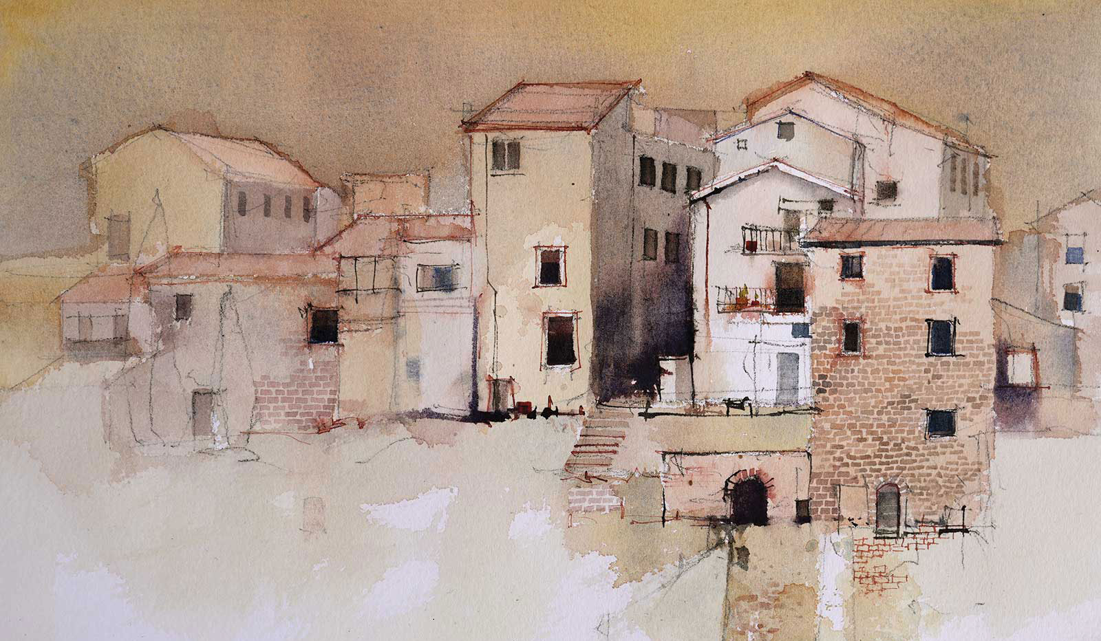
A ¼" flat brush was used to carefully paint some of the dark windows. To keep them interesting the shapes and sizes were varied as were the colors and tones. Some of the foreground white was reduced and the terracotta roofs were put in.
 Stage 7
Stage 7
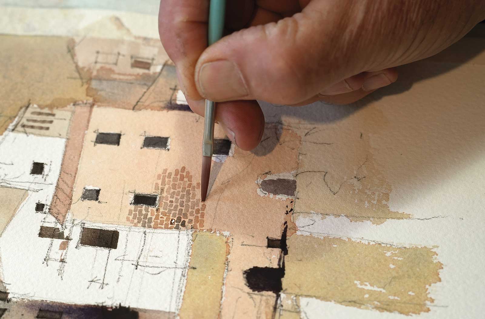
The painting was allowed to dry, then a 1⁄8" flat brush was used to pick out stone and brick textures in some of the walls. This is a slow and tedious job but satisfying once they are finished.
 Stage 8
Stage 8
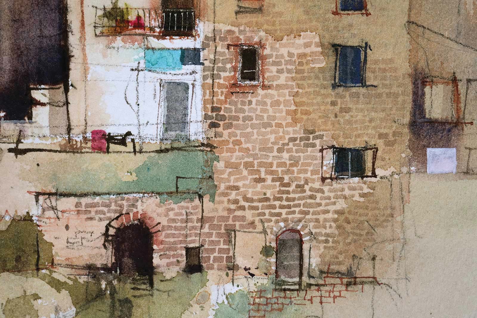
This detail shows the variation in the bricks and stones. The colors, tones, shapes and sizes vary slightly. They undulate and wobble, but because they are generally horizontal and the joints are tight they appear structural and convincing.
 Stage 9
Stage 9
More windows, more bricks and a few burnt sienna ink lines, and we are almost there. The ink was applied with a dip in nib and sprayed with water to make the lines bleed and feather adding to the weathered patina of the buildings.
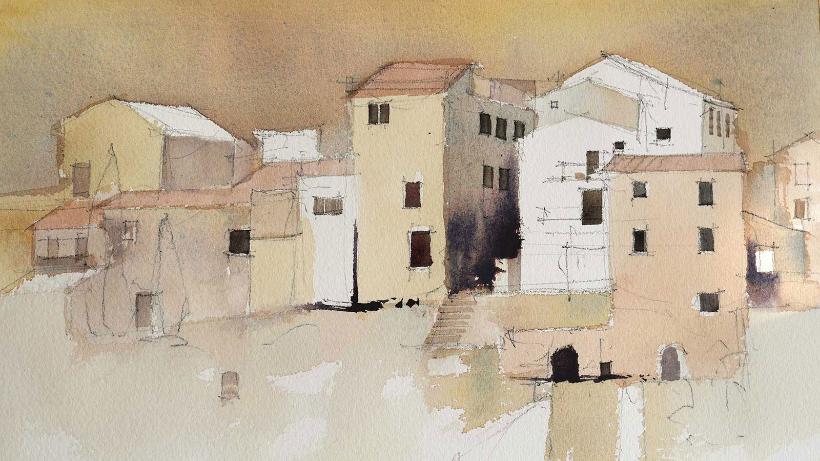
 Stage 10
Stage 10
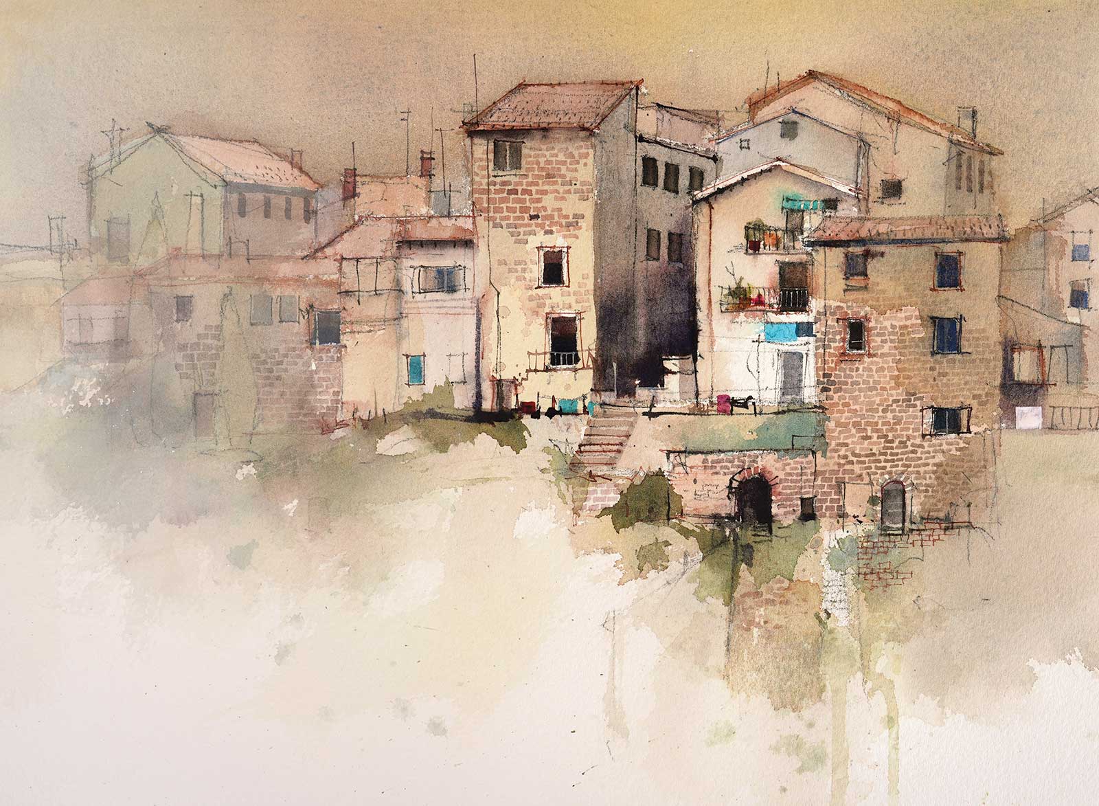
The final step is to add some green foliage (quinacridone gold, alizarin and a tiny bit of phthalo blue) and a couple of spots of turquoise (phthalo blue and a little quinacridone gold) in the focal area. Once everything had dried a rough wash of gesso was put over the buildings on the left. A clean, wet bristle brush diluted the gesso and softened the visible edge. The gesso was gently feathered back with a dry Hake brush one stroke at a time, drying the brush thoroughly on an old towel between strokes. By subduing the left hand side with gesso the composition is tightened up and the focal area is given more prominence.
These intricate subjects are great fun to paint. The goal is to capture the atmosphere and character of the subject rather than produce a photographic likeness. A few missed windows, a building in the wrong place or a simplified roof line have little impact on the atmosphere we create, so don’t get bogged down with accuracy. Work out your composition, get your drawing down with confidence and conviction, then have fun with all those textures and simple, earthy colors. —
Contact at www.johnlovett.com