


I am a realist painter who works in the impressionist tradition. For many years, I was a portrait and figurative artist. During that time, I relied heavily on my drawing skills, which still serve as the foundation for all my work. I have been painting in pastel for more than 50 years, and in oil for more than 30 years. In this article, I will discuss my approach to creating pastel paintings of horses.
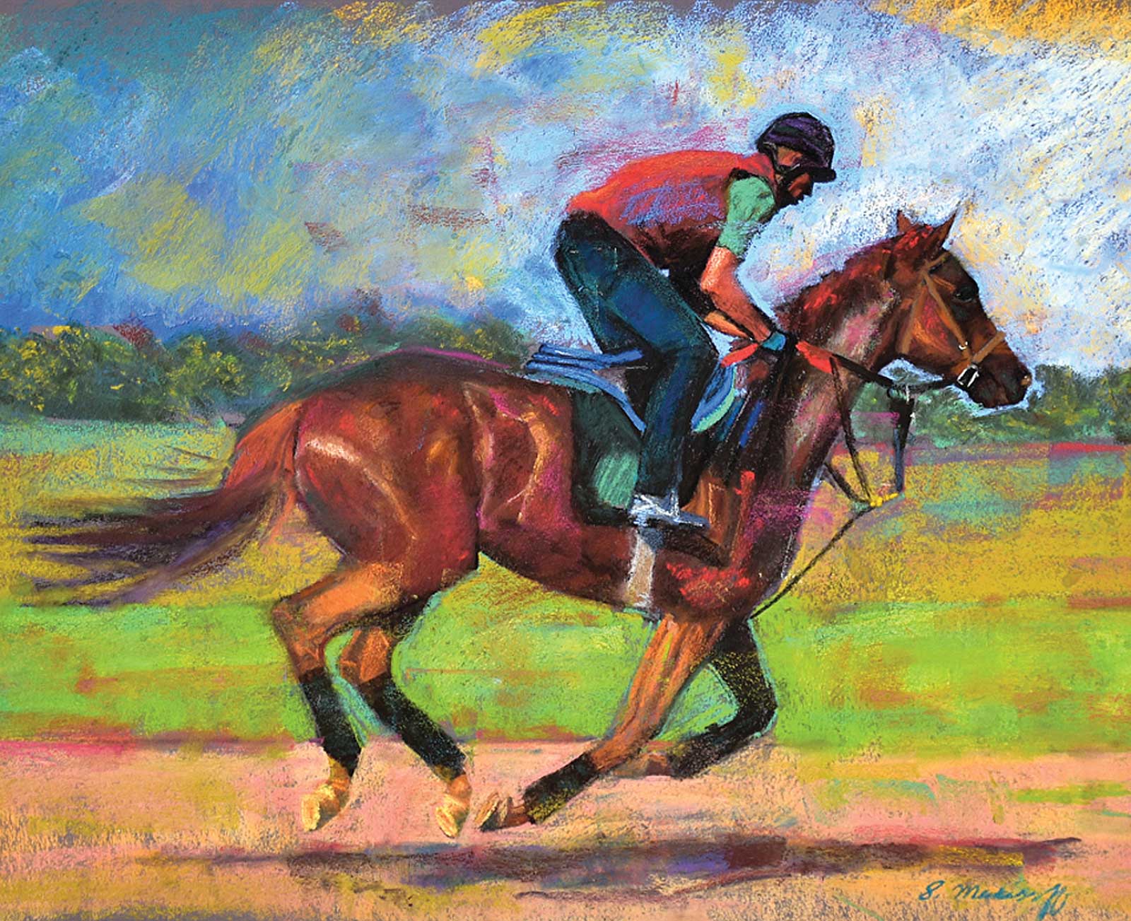
Moving Fast, pastel, 19 x 23” (48 x 58 cm) I shot this photo at Keeneland in Lexington. This was a morning workout to help the horse get warmed up before the races began. I was captured by the sounds, smells and sights of the horse and rider galloping full out at the break of day. I wanted to showcase the horse’s powerful body against the glorious greens and blues in the background. I used interpretive shades of pink and gold to energize the horse as he flew past me, and I scattered these colors throughout the painting to maintain continuity.
I’ve developed a method that works well for me. I begin by taking my own digital photos of horses in their surroundings. I modify these photos on my computer to enhance details and colors. Then, I look for good background shots among my landscape photos that will support the main theme. Working directly on sanded paper, I draw freehand from my references with hard-grade charcoal pencils. After the drawing is complete, I apply multiple layers of pastel. I begin with hard Nupastels for the base colors, and then use soft pastels, such as Great American Art Works, to add life and energy. I work from dark to light, and I apply the brightest and most saturated colors at the end for the strongest effects.
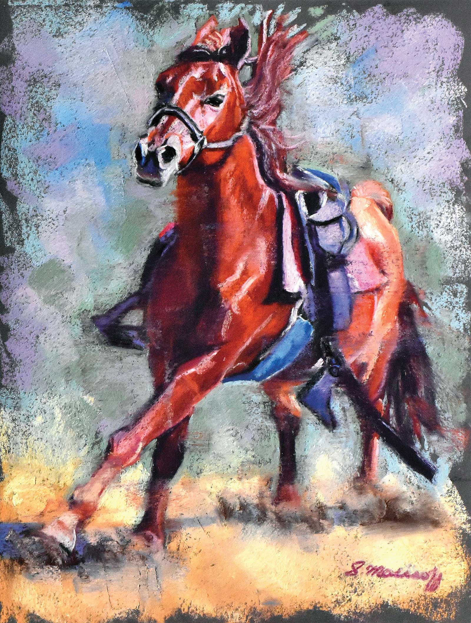
Runaway No. 1, pastel, 12 x 9” (30 x 22 cm) I shot this photo when my friend’s horse got spooked and decided to race wildly around the corral. This is the first of two small pieces I painted to show him in motion. I couldn’t resist catching him as he galloped around with his mane flopping and his eyes on fire. I wanted to focus on his concentration and his long stride as he took flight. I worked with primary colors to show intense emotion and action. I painted the horse in shades of reds, violets and pinks, and the background in shades of green, blue and gold.
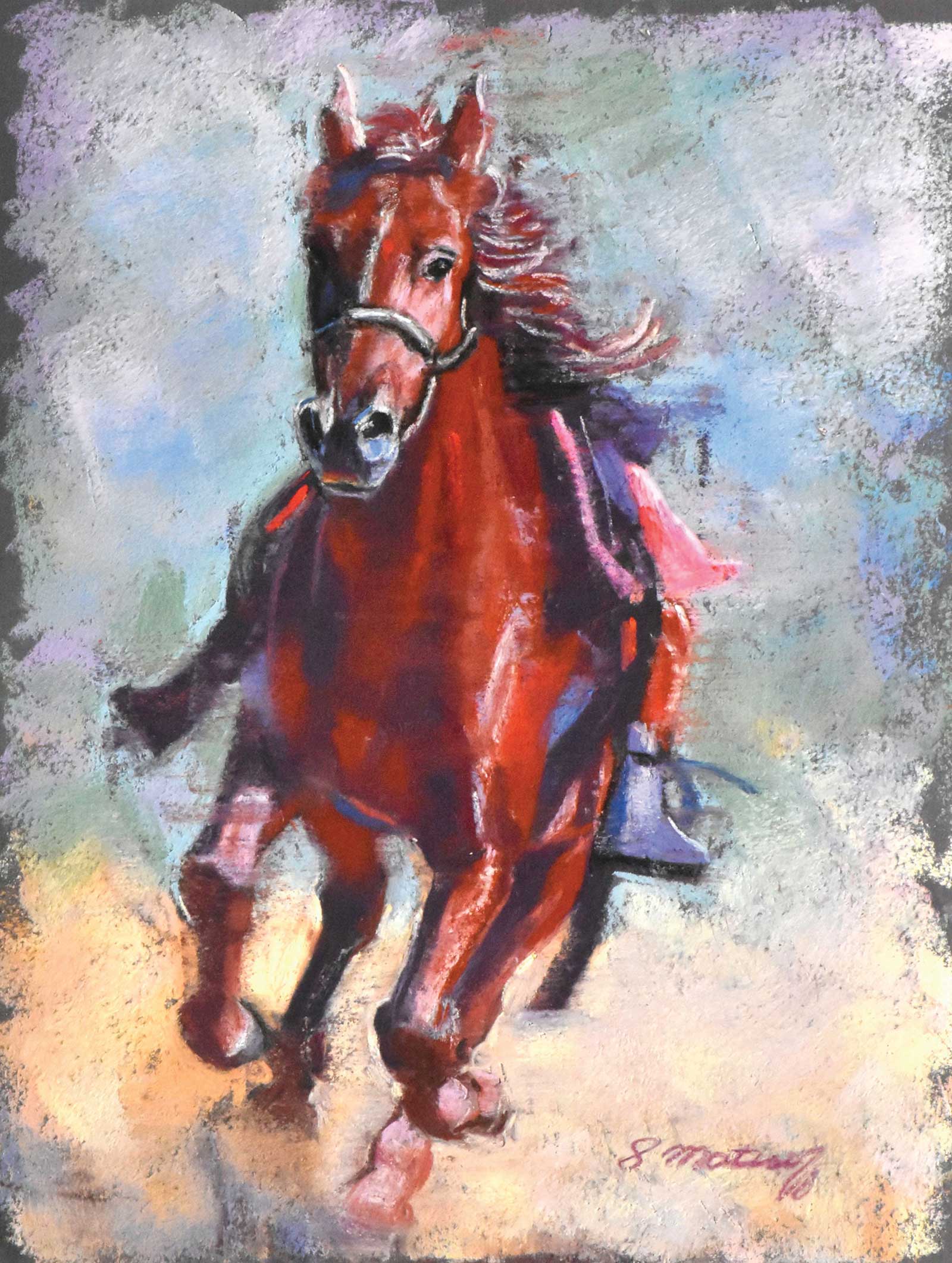
Runaway No. 2, pastel, 12 x 9” (30 x 22 cm) I took this picture immediately after I photographed Runaway No. 1. My friend’s horse was still galloping wildly around the corral, so I just kept shooting until he ran out of steam. My goal for this piece was to show him as he pushed off with his rear legs for extra power. Again, I used a palette of primary colors to indicate passion and energy. I kept the strokes loose on and around the horse to show his agitation. I painted the first layer of color with hard Nupastels, and then overlaid them with softer pastels like Great American Art Works.
I constantly step away from my easel to check on my strokes and color choices. Standing back also allows me to evaluate the hues and values to make sure the final painting is cohesive. I alternate strong, descriptive strokes with loose, feathery scumbling to describe the motion of horses and riders. —
About the artist
 Sharon Matisoff
Sharon Matisoff was born in Michigan and grew up in California. After graduating from California State University, Northridge, she attended classes at the acclaimed Art Center College of Design in Pasadena, California. There, she learned to paint portraits and figures in oil in the impressionist style. This was a life-changing experience, and she developed her painting skills while meeting other aspiring artists like herself.
Matisoff and her husband moved to Kentucky in 2004. In 2013, she met the owner of a horse farm who raised quarter horses. The artist immediately fell in love with them and decided to learn to paint horses. Although she still paints people, she now focuses primarily on paintings of horses in Western, dressage and racing art.
Matisoff’s paintings hang in private collections throughout the United States. She is a juried member of the Kentucky Arts Council’s Kentucky Crafted Program, a signature member of Chicago Pastel Painters, an artist member of Oil Painters of America, and an honorary member of New Jersey Equine Artists Association. Her work can be seen on her personal website and Facebook page. She shares her painting knowledge and technical expertise in several Facebook groups, including Women’s Equine Art, where she is a designated “Group Expert.”
Represented by
The Gallery at The Brown Hotel, Kentucky, USA, brownhotel.com