


My love affair with soft pastels began close to 40 years ago. It is an unfaltering love, but it wasn’t always so. The first time I tried the medium, I hated it. I truly fell in love when I stopped trying to “draw” and started to “paint.” You see, I was getting caught up in the details, as novices often do. Although pastels may look like a tool you should draw with, they can be clumsy, soft and not easy to get a defined line. Once I began to use broad strokes from the side of a piece of pastel, I started to think of them like a paintbrush. The bigger the piece, the bigger the brush. Don’t even get me started on the need to break pastels into smaller, more user-friendly pieces. The number of people I’ve taught who became traumatized at the thought of breaking their beautiful pastel into pieces is astounding. After a lot of hand-holding and trauma counseling, they usually see the benefits.
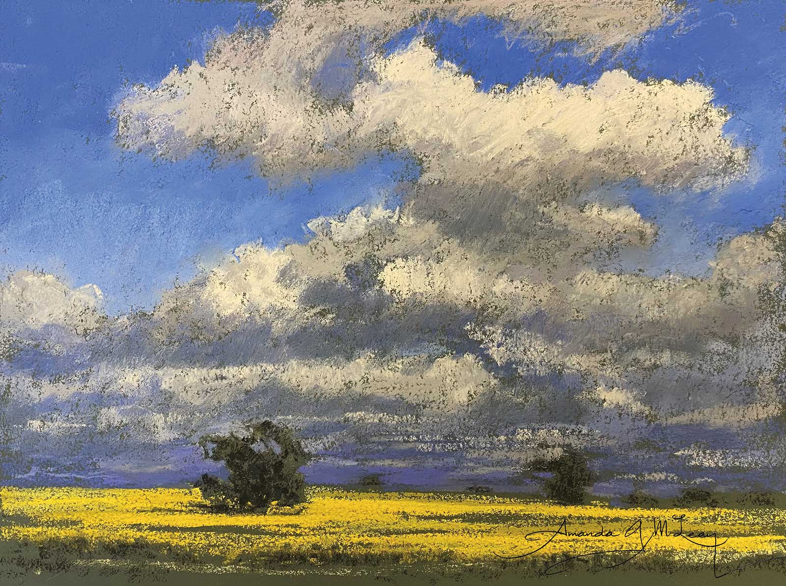
Canola Field, Wimmera District, pastel, 9½ x 12½" (24 x 31 cm) This little work was done on Colourfix leaf green dark. I chose this color paper because I have noted that the shadows on Canola are green. Using this color allowed me to suggest the yellow Canola flowers without the need for detail. The paper color provides dark values and texture for very little effort. The green also works for the bulk of the trees too. I don’t have to worry too much about detail.
I’ve been teaching for over 30 years and I’ve seen a lot of mistakes (hell, I’ve made most of them myself) and misconceptions about soft pastel. One of the most consistent traps I see people fall into is the detail trap. “The Devil’s in the details” couldn’t be truer. If you approach a work worrying about detail, you will often be put off even starting. The novice especially will overthink and obsess about the details. I rarely think about detail because in my process, it is the last thing I do. I approach a work as a collection of abstract shapes. The big shapes are far more important in composition than detail. All the detail (leaves and twigs) in the world isn’t going to make a tree look like a tree if it’s shaped like an elephant!
I start with big abstract shapes, edges and negative space (the shapes around and between objects). I work a lot in the negative spaces: paint the sky around the tree, a cloud or an elephant and, as if by magic you have your tree, cloud or elephant shape. I‘m more concerned with value, shape and edges than detail. If you start with the detail, it just gets in the way of the big shapes. Start big and gradually work your way towards the detail. A little like gradually bringing the picture into focus.
Pastel is about layers. Start with light layers of pastel and the big shapes that are approximately the right value and shape. With each subsequent layer you start to see variations in value, color and shape until all that is left to do is the detail. It’s best as just a suggestion anyway—leave something to the imagination.
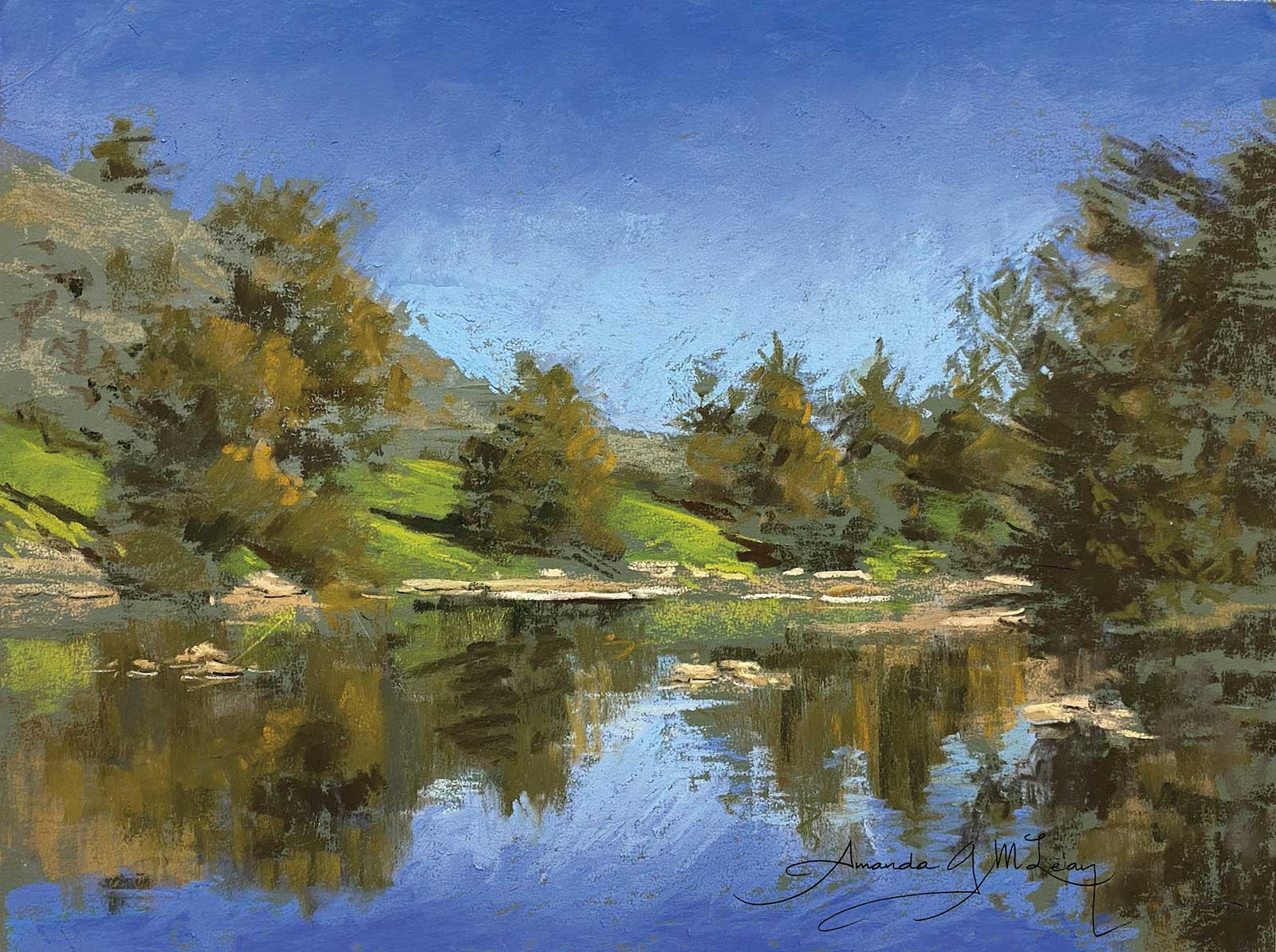
Study, Murrumbidgee River, pastel, 9¼ x 12" (23 x 30 cm) This little study was done on Art Spectrum Colourfix Paper in leaf green dark. The paper has done most of the work in this picture from the bulk of the trees and reflections to the green of the hill in the background. I love subjects like this where the picture is half painted before I’ve even started. I make the paper do the work. I work smarter not harder!
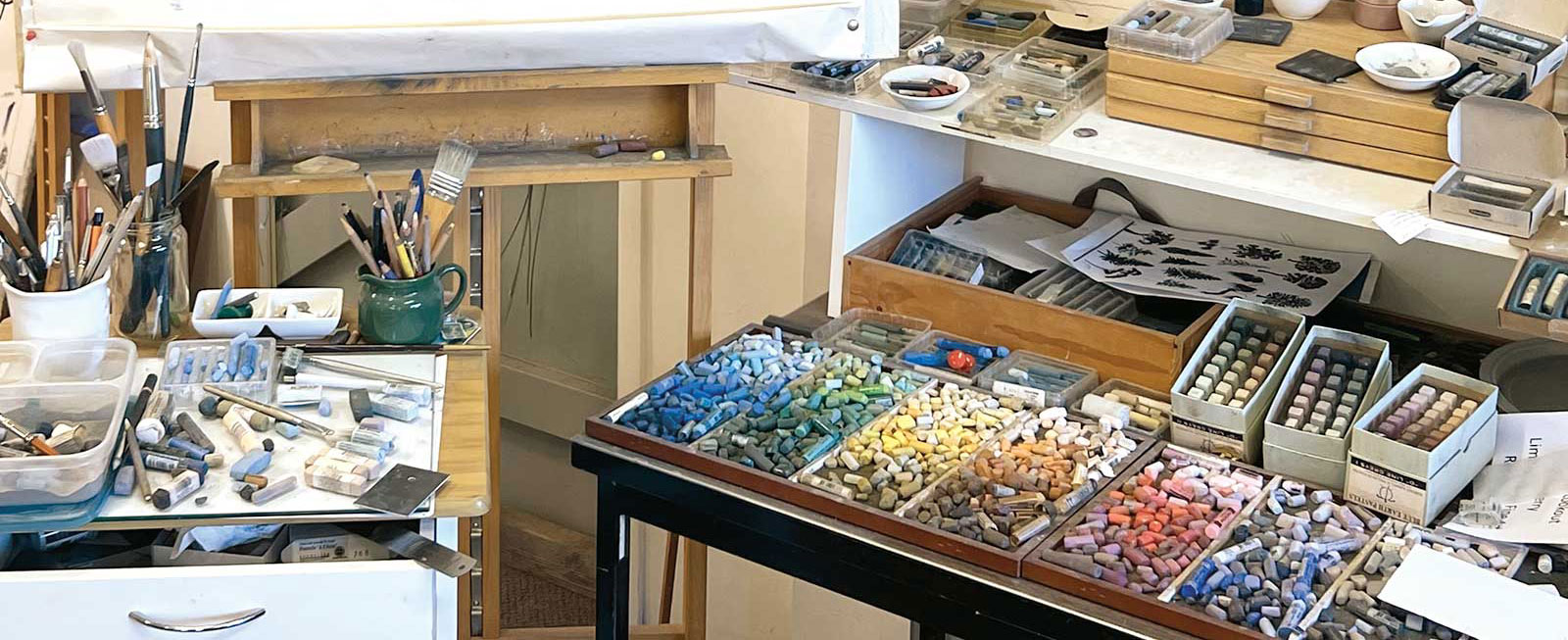
Paper choice is very important to the way I work. There are so many different types and all have different attributes. Often, I choose a paper color and texture to work as part of my subject—that is, I can see the color in my subject. I also choose to leave areas of my paper bare to provide contrast of both texture and color, as I don’t believe in covering it all up. Why else are pastel papers made in a variety of colors?
I don’t believe in finishing one area and then moving on. To do this is to make everything of equal importance. It confuses the viewer, and they don’t know where to look. It’s like all the actors in a movie trying to be the lead role—it just becomes chaotic. Most of your picture needs to be subordinate to the focal point. Most of your detail needs to be in the focal area, not everywhere, and especially not on the edges.
I should mention that I have made many of my own colors, and I have worked with the Australian company Art Spectrum, who then produced many of them.
My Art in the Making Lavender Bay, Tuross Lake
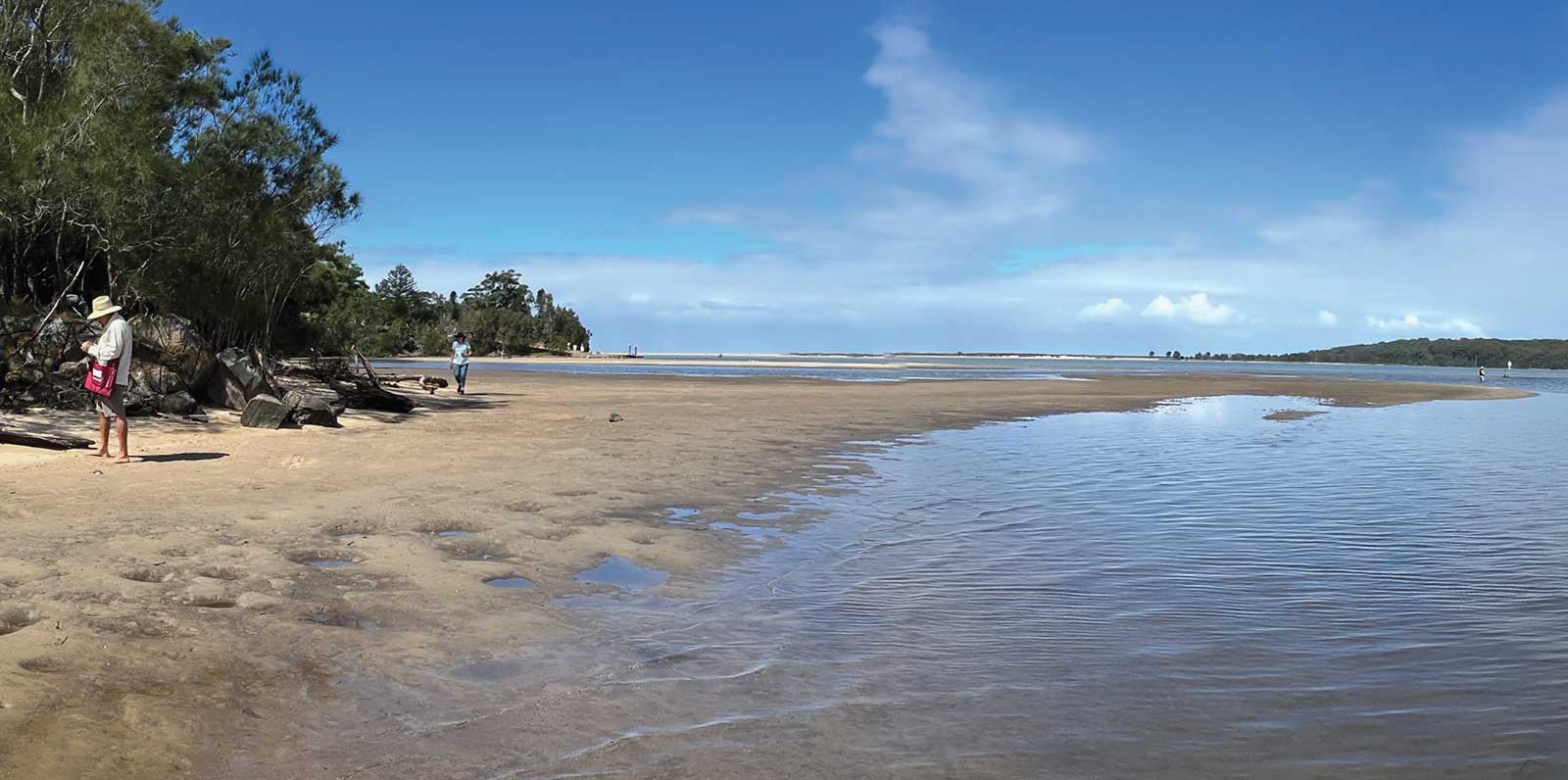
Reference Photo
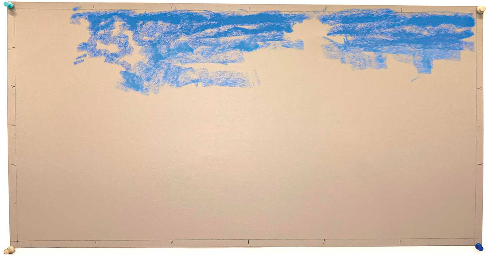 Stage 1
Stage 1
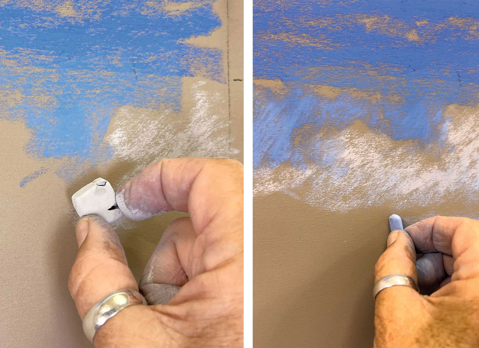
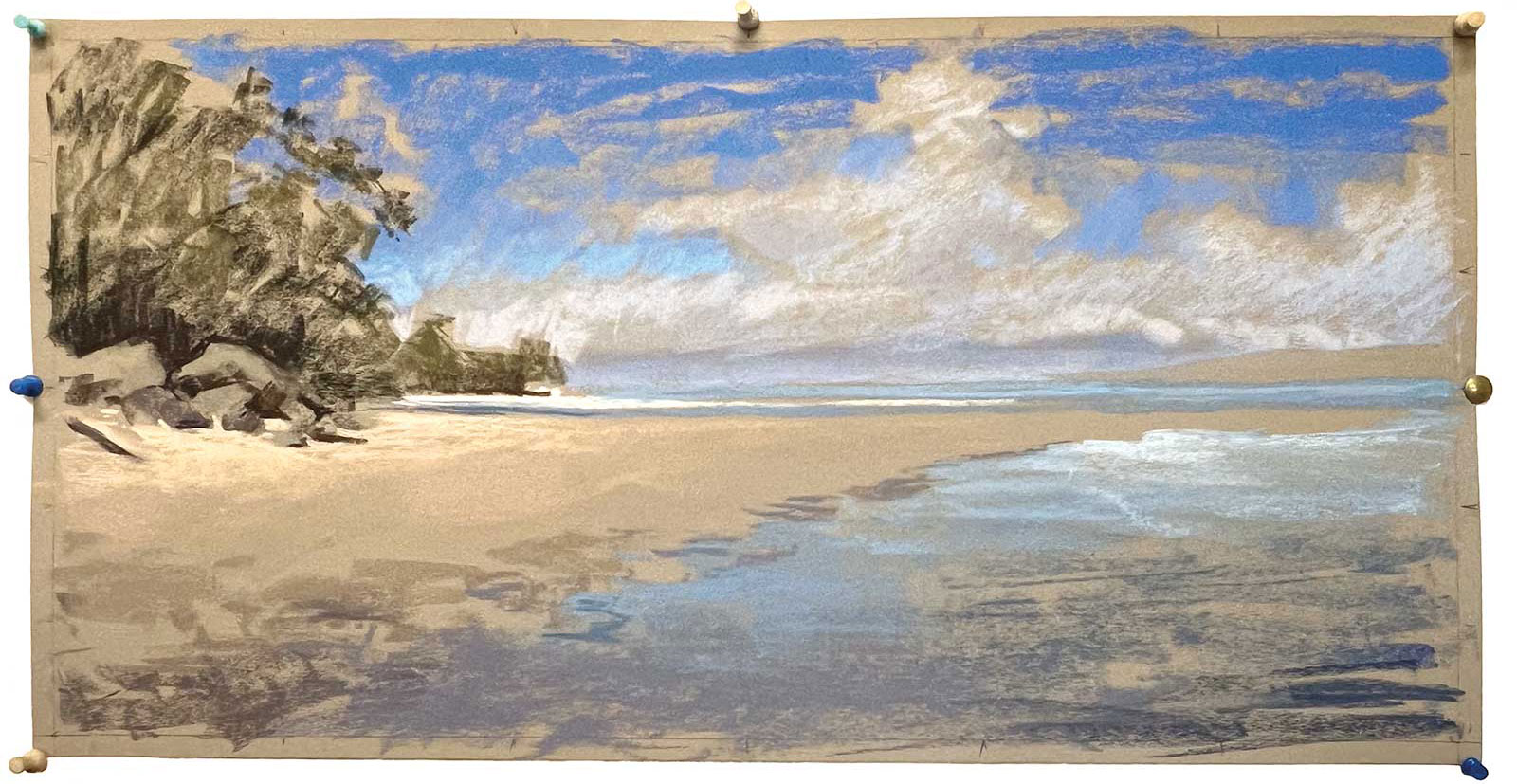
I generally start by choosing the paper type and color. In this instance I have chosen Pastel Premier paper in the color Italian clay. This color will provide texture and color in my sand and warmth in both my clouds and water. I almost never draw my subject in. In my experience it creates a tight work and also encourages the dreaded detail. I have scaled my paper to my reference picture, and I indicate the thirds. This helps me to place my shapes without drawing in. It also stops my focal point from gravitating to the middle of my picture. I generally start at the top and work my way down using mid values, negative spaces and a very light touch. I leave holes that are cloud- or tree-shaped but essentially abstract shapes to begin with. I start by using Girault cobalt blues for the sky.
WHAT THE ARTIST USED
The colors I formulated have been indicated with an asterisk.
Art Spectrum Original Soft Pastels
Phthalo blue v, x; *Blue gray t, v; Burnt umber v, Australian gray p, Australian leaf green dark p, Storm blue Colourfix color
Art Spectrum Extra Soft Pastels
*Cool blue gray a, b, c, d; *Purple gray b, c, d; *Marine blue a, b, c, d; Turquoise b, *Ultramarine gray a, b, c; *Brownish gray c
Girault Pastels
Cobalt blue 353, 354, 356
Mount Vision Pastels
Thunderstorm blue 640, Dark green earth 700
Rembrandt Pastels
Burnt umber .2
Great American Pastels
Burnt Reynolds .5, Earl (gray) .2, Mocha .4, .5; Merlot .1, .2
Additional Materials
Pastel Premier paper in Italian clay, General’s charcoal pencils in white and 4B black
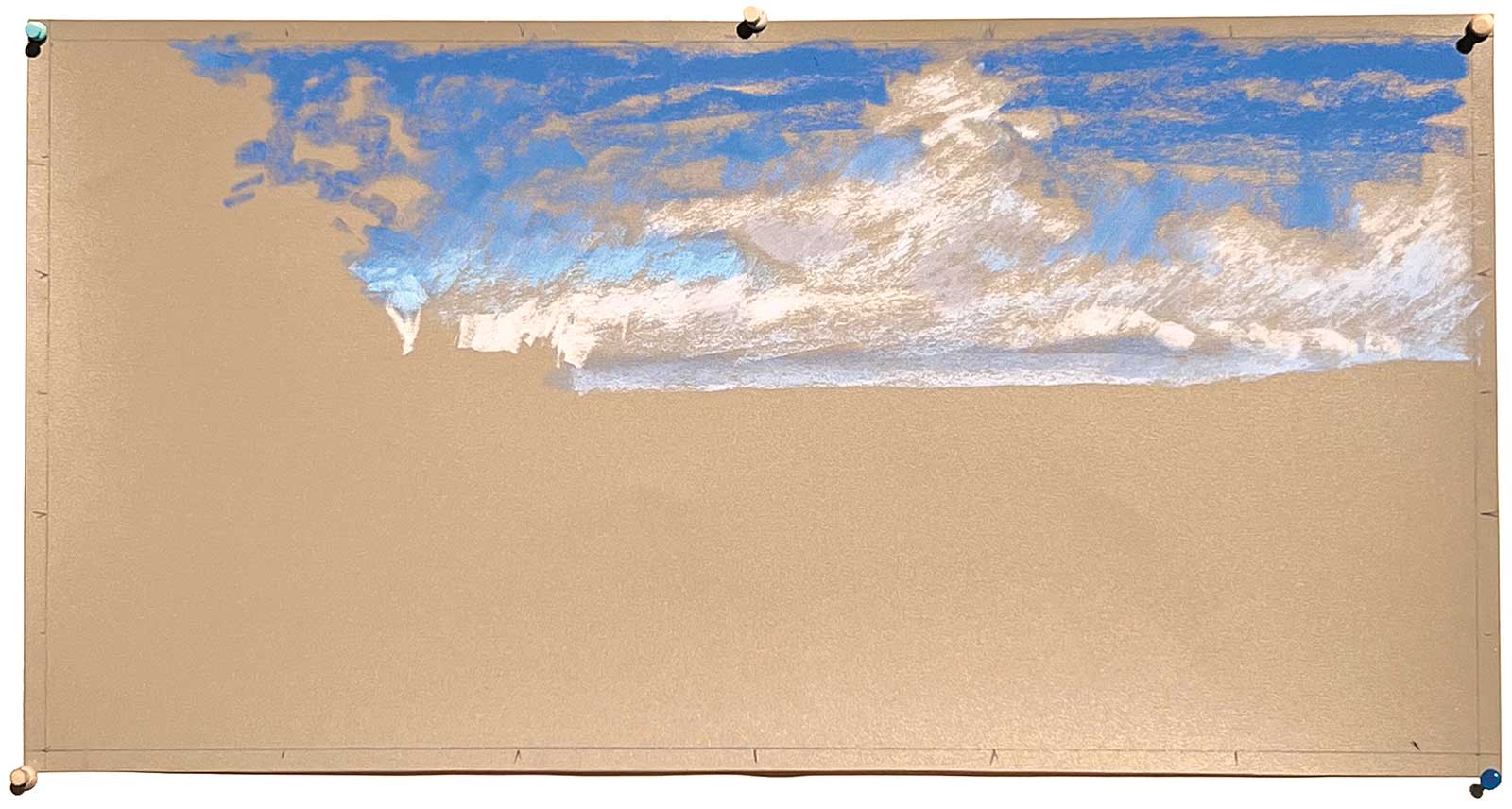
 Stage 2
Stage 2 Starting on the Clouds
Here is a close up in which I am beginning to block in the clouds.
 Stage 3
Stage 3 Continuing Clouds
I add the cloud within the spaces I’ve left. I almost never use white as it is a nothing color. My clouds at this point are very light shades of extra soft purple gray and blue gray from the Art Spectrum original range (these colors and quite a few more are all colors Art Spectrum made using my recipes).
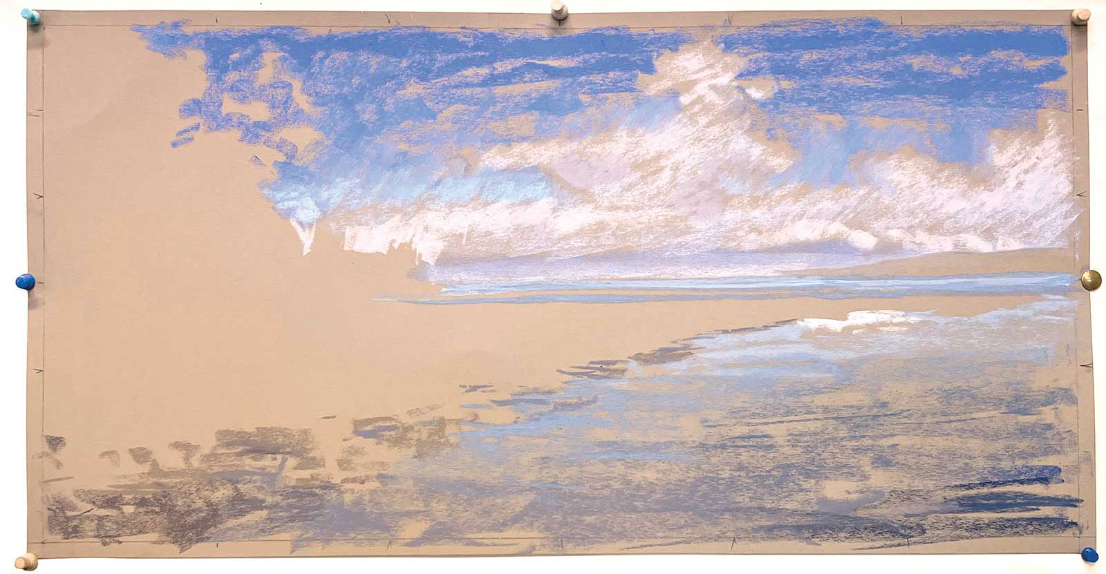 Stage 4
Stage 4 Blocking in the Water
I block in the water, paying particular attention to the gradation from dark in the foreground to light in the middle ground. This is important to attract the eye away from the edge and into the focal area. I used Art Spectrum extra softs in blue gray cool, ultramarine gray and purple gray (more of my color recipes). I used Art Spectrum Colourfix color in storm blue, as well as Mount Vision 640 in thunderstorm blue, Great American merlot and Earl (gray) in the foreground.
My Design and Composition Tactics
- Paper Selection is Crucial: Pastel paper comes in a myriad of colors and surfaces. Choose a paper that complements your work rather than working against it. Leaving areas of the paper bare can help unify a piece.
- Begin Lightly and Build Up Layers: Not all areas of a picture are equal or need to have the same amount of pastel. Some areas may require no pastel, while others may need a light touch or even a heavy application. The amount of underlying color or texture of the paper you want to show through will determine how you approach each area.
- Develop the Entire Picture as a Whole: Avoid finishing one area before moving on to the next. This can make all areas equally important, overly detailed and distracting from the focal point. Working on the piece as a whole can also help you avoid unnecessary work.
- Limit Detail and Keep it Away From the Edges: Save detail for the final stages of the piece.
- Don’t Blend Until the End, and Only Then If It Will Improve Your Piece: Blending is just one of many techniques, it isn’t mandatory. Aim for contrast of texture. Blending pastel can sometimes result in fuzzy, flat, muddy colors.
- Use Compositional Lead-ins to Guide the Viewer’s Eye Toward the Focal Point: Utilize natural lines within your subject and play with light and contrast to help create visual pathways. As the artist, I have the power to orchestrate how viewers perceive and navigate the piece.
 Stage 5
Stage 5 Close Up of Trees
This photo shows a closer view of how I am blocking in the trees.
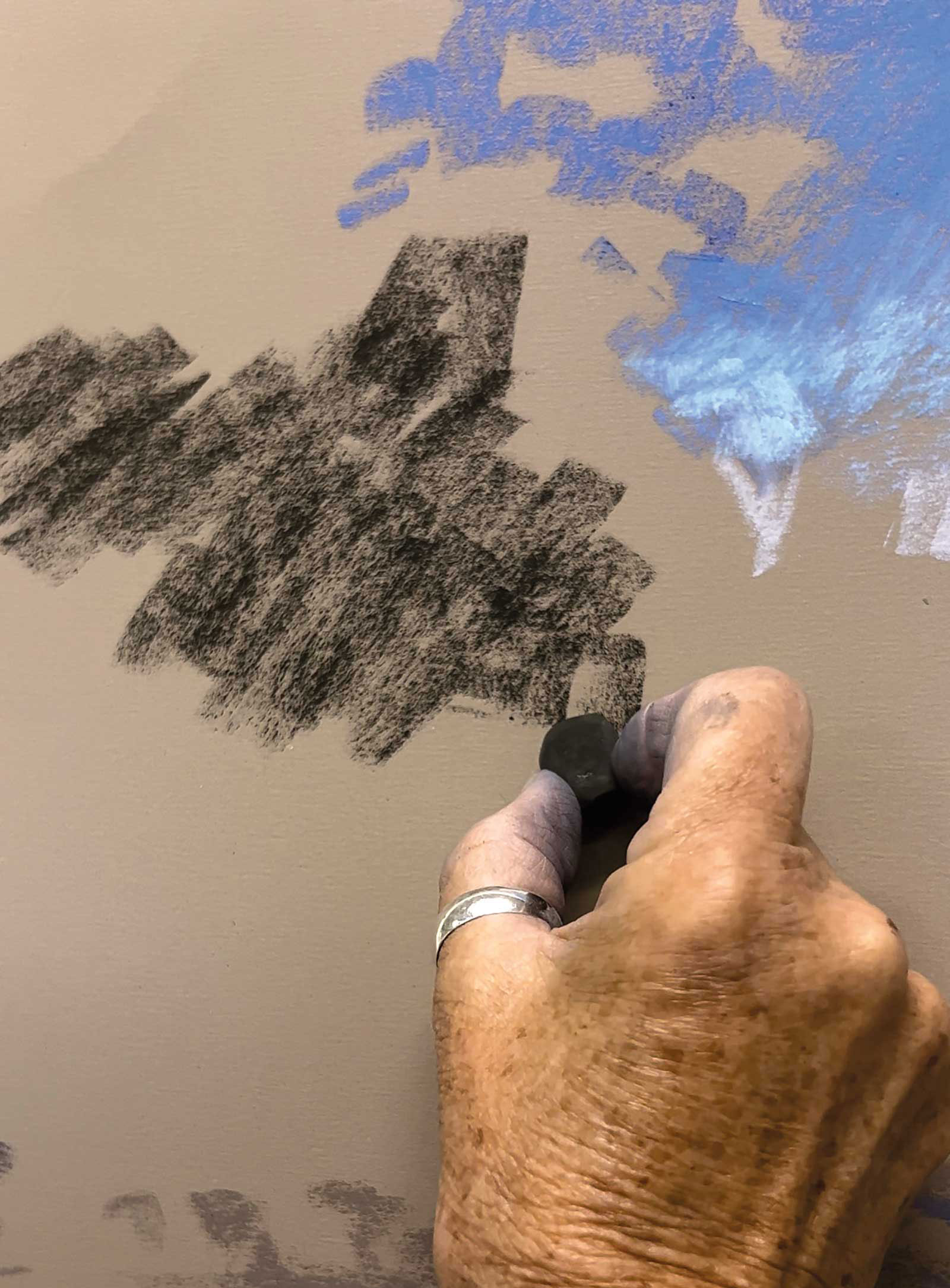
 Stage 6
Stage 6 Darks
Here, I am putting my darks in as just big abstract shapes with foliage (irregular) shaped edges. I used Mount Vision dark green earth as my dark and Art Spectrum Australian leaf green dark as a midtone. I think it is important to set my tonal or value range in the early stages of my work. For the sand, I used burnt umber, brownish gray, Australian gray (not a gray but pinkish) from Art Spectrum and a sand color I made myself. I’m on a quest to create a good set of sand colors. Most pastels are either too pink or too yellow, but then every beach has sand of a different color.
 Stage 7
Stage 7 A Closer Look at the Sand
Here is a close up of the sand. There is a lot of bare paper doing good work for me here, which is what I want from my paper.
 Stage 8
Stage 8 Second Layer
Now for the second layer. I’m looking at refining the colors and values of the abstract shapes just a little more. I’m careful not to get trapped in any one area for too long. I work from top to bottom.
 Stage 9
Stage 9 Third Layer
Another layer is added, refining shapes, colors and value nuances. The rocks on the left are little more than dark blocks on the bare paper. For these I used Rembrandt burnt umber in the darkest shade and Art Spectrum Flinders blue violet D where the rocks meet the trees. I’ve just added a little variation in Art Spectrum extra soft brownish gray. I don’t need to over describe these as they are too close to the edge and will distract from the focal area. The sand in front and to the right of them is light and becomes a secondary focal area (like the actor in a supporting role). Getting caught up with over describing the rocks is a good example of getting side tracked by detail that is unnecessary. I am getting into a little more detail that is necessary now though, like the darker edges on the sand and the distant strip of dark land. This defines the shapes more and creates contrast in the focal area.
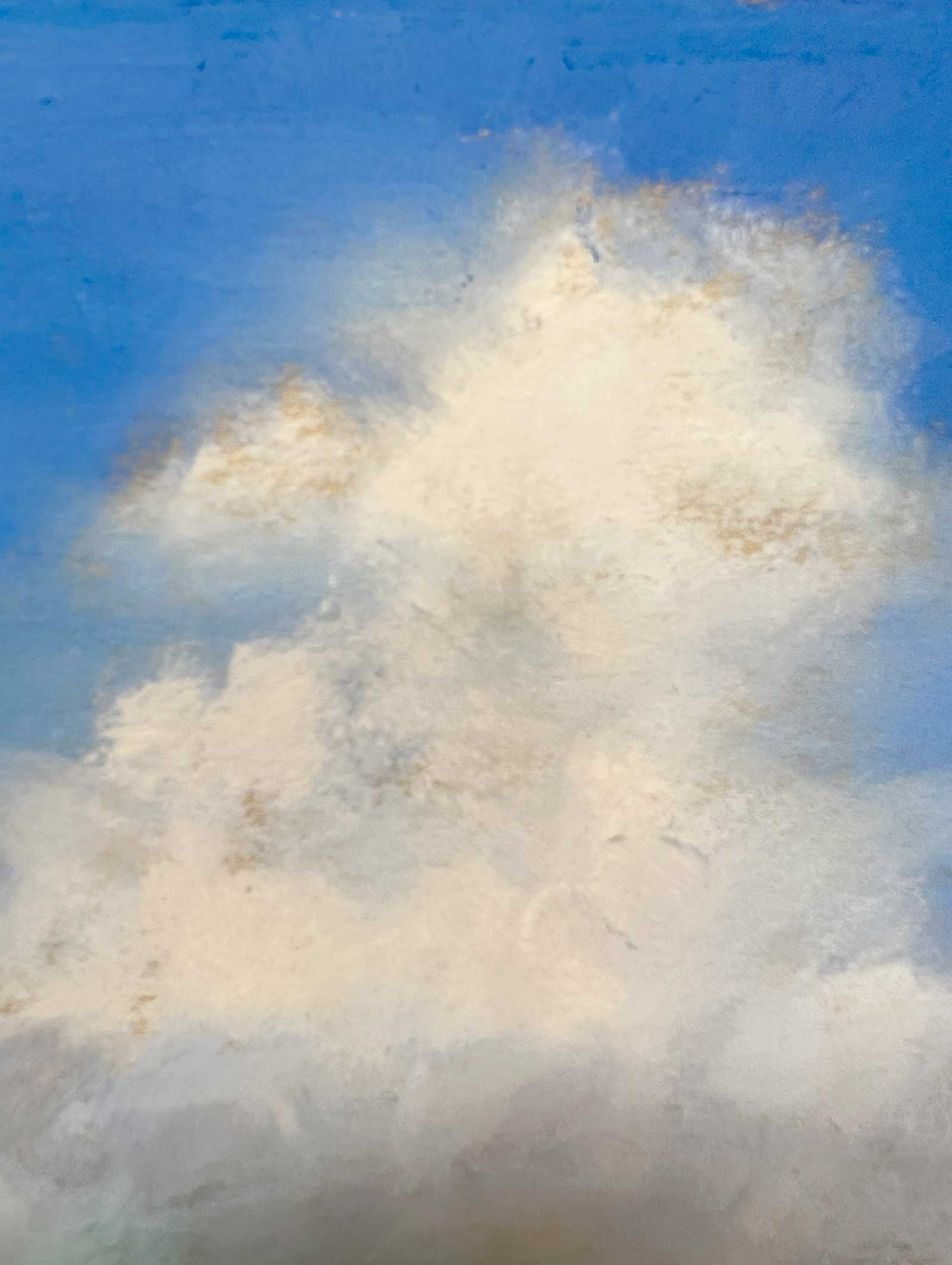 Stage 10
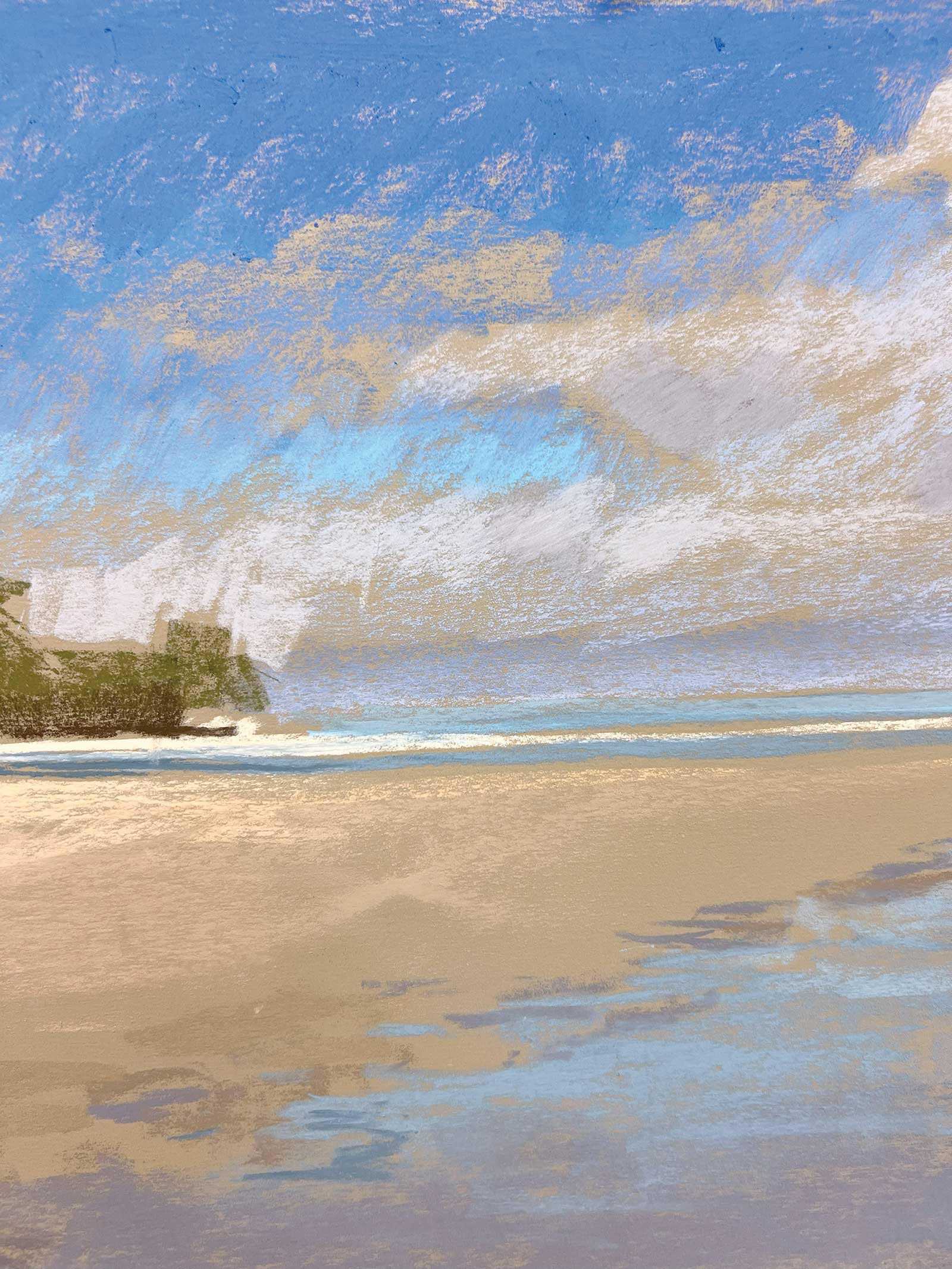
Stage 10 Close Up of Clouds
Here is a closer view of the clouds, showing the warmth of the paper color peeking through.
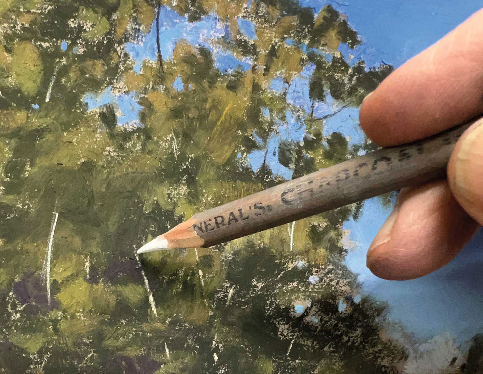 Stage 11
Stage 11 Details
At last, I am adding details with a white charcoal pencil.
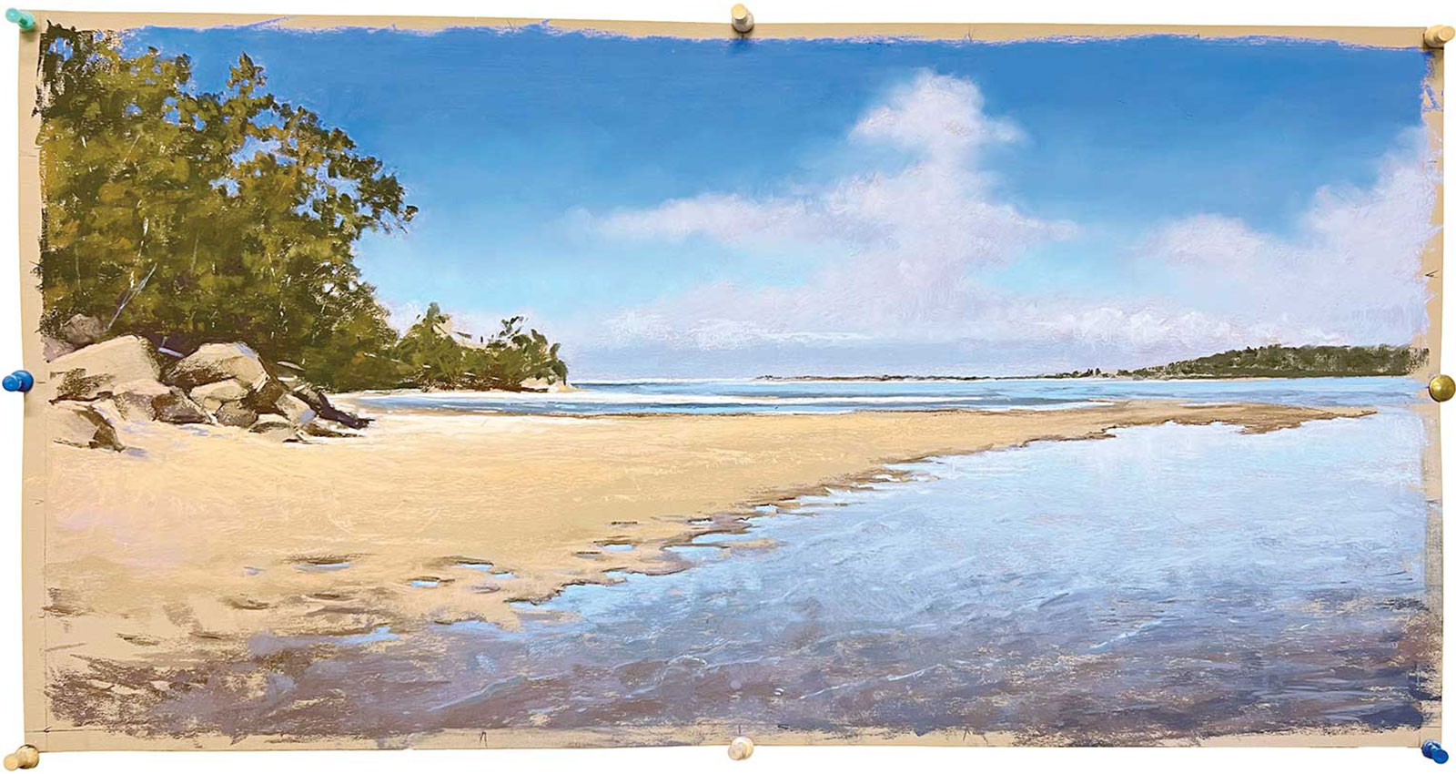
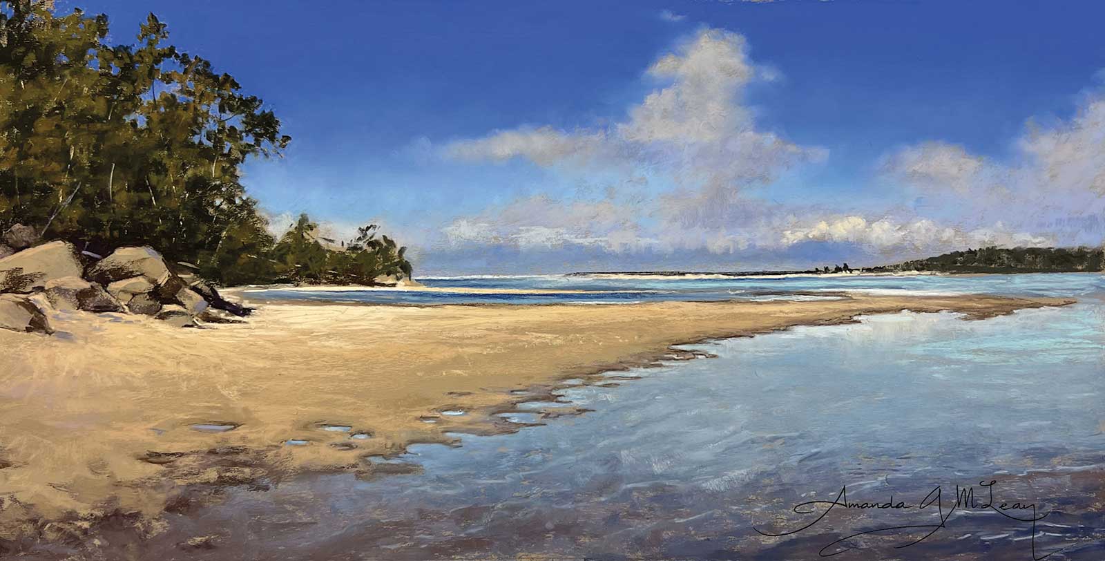 Stage 12
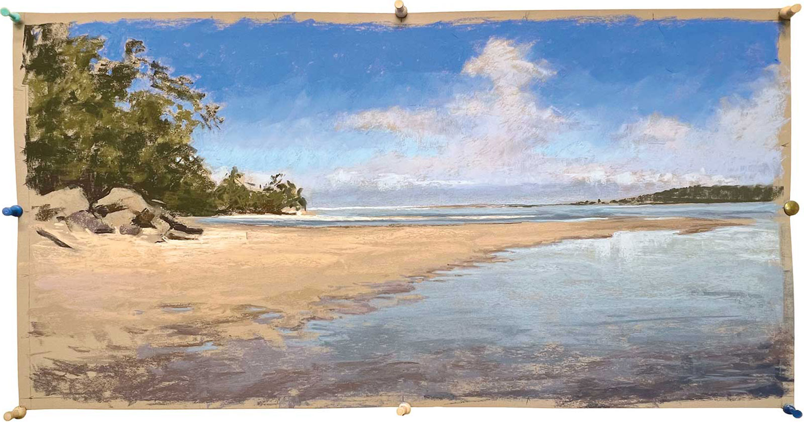
Stage 12 Finished Artwork
Lavender Bay, Tuross Lake, 12½ x 25" (31 x 63 cm) I’ve added a few tree trunks, highlighted, created more contrast and sharpened up the edges in the focal area so they are in sharp focus. That’s what a focal point is! It’s an area of sharper focus and contrast where the viewer’s eye can comfortably rest. To that end I’ve softened other areas so they are either less textured or less obvious.
About the artist
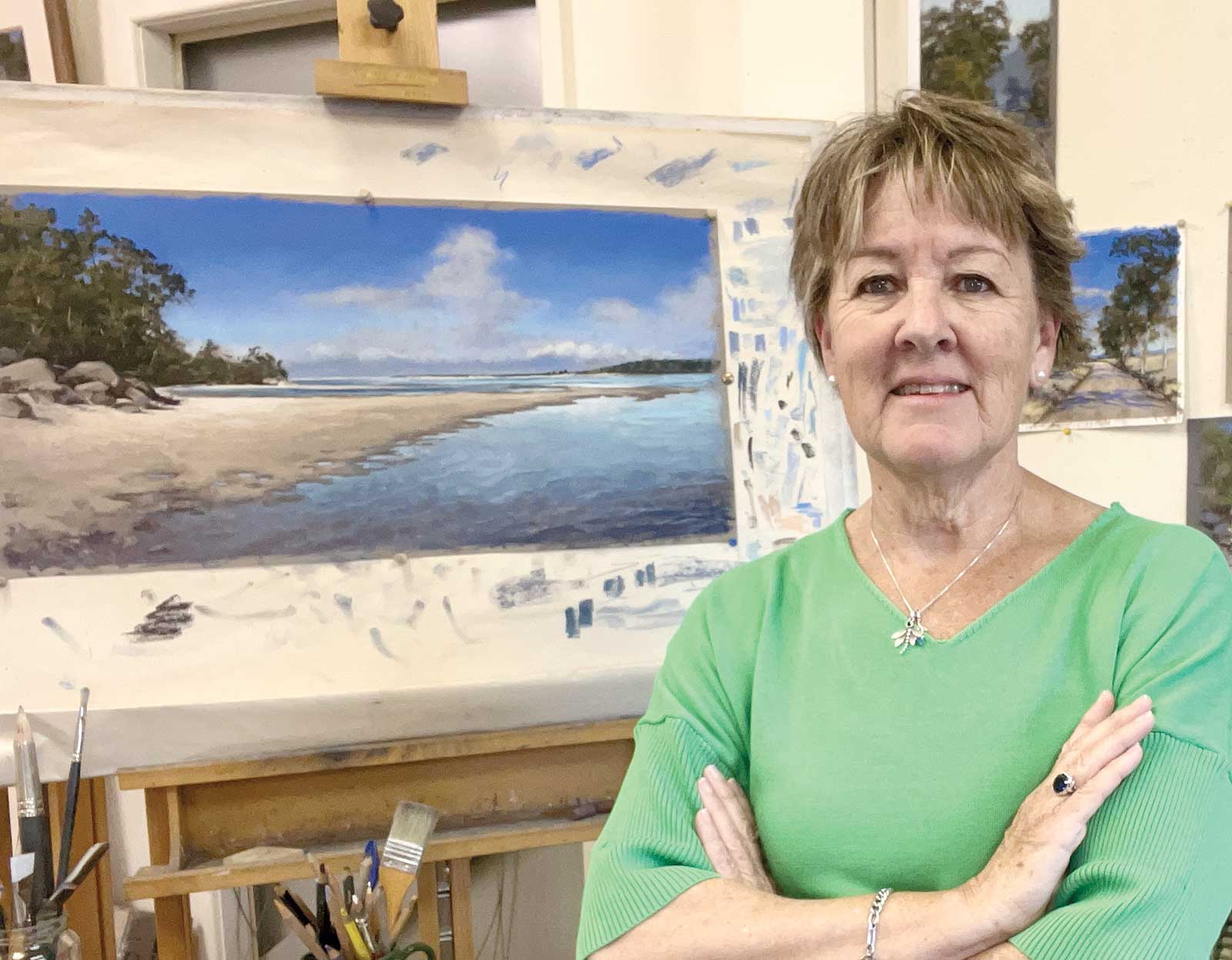 Amanda McLean
Amanda McLean is an internationally renowned pastel artist who has been painting with the medium for almost 40 years. She has a passion for the Australian landscape, and her work is hailed for its sensitivity and “sense of place.” She is renowned for her treatment of both clouds and water.
McLean is a keen “sketchbooker” and she documents her life and travels in her sketchbooks.
She has written extensively for national and international art publications and was an editorial consultant to Australian Artist for many years. McLean also worked closely with the Australian company Art Spectrum to produce a wide range of new pastel colors using her recipes. She has conducted workshops all over Australia and internationally. A popular tutor, she teaches pastel and sketchbook in small group masterclasses from her studio as well as in workshops around Australia by invitation. Her teaching style is positive and empathetic, and she is generous in sharing knowledge. McLean was featured on Color In Your Life, an international art documentary series now available on YouTube.
Contact at
amandamclean.net