


I base my work on a foundation of fundamental academic education. The laws of color, perspective and composition that I learned in nine years of art school and four years of academy have helped me a lot. Additionally, I studied modern watercolor techniques from today’s world famous watercolorists. Modern cotton watercolor paper allows me to work in wet techniques and the new lightfast pigments help me create color harmony.
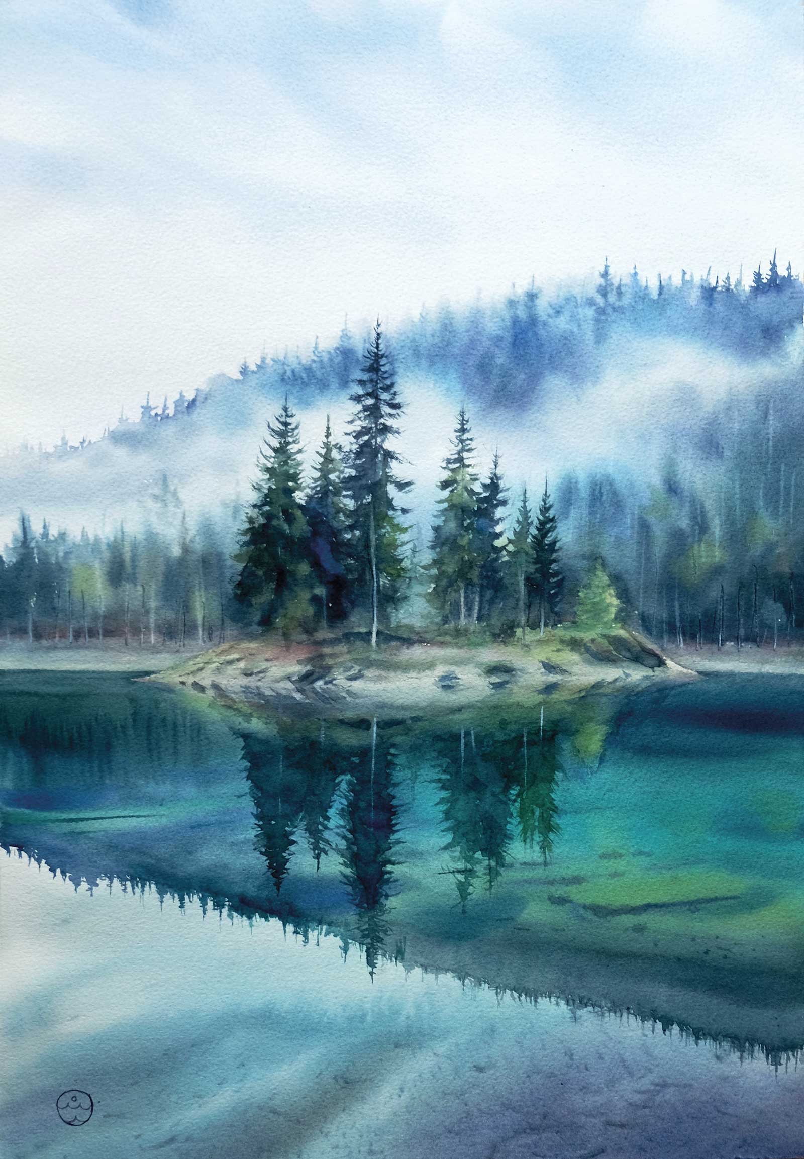
Fog over the island, watercolor on paper, 20½ x 13¾" (52 x 35 cm) In this work I wanted to convey the foggy state of nature and to invite the viewer into the special atmosphere of a mysterious lake in the forest. My aim was to convey the fresh pine scent of the forest by using a related color palette and a wet watercolor technique for the depiction of mist and water. I like the combination of reflections on the water and underwater objects that create depth. This island of trees is a wonderful creation of nature.
Work on a painting usually starts with choosing a site. I always pick this according to my mood and my current mind state—the location must inspire me 100 percent, otherwise I simply won’t start it. In order to portray nature scenes faithfully, I study a lot of material and paint in plein air. I also collect a lot of photo and video material and analyze it in order to find relationships between various aspects of nature. I also closely study the features and behavior of water.
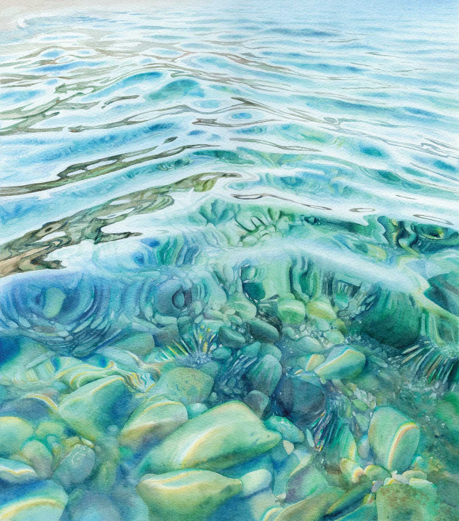
Treasures of the underwater world, watercolor on paper, 16 x 14" (41 x 36 cm) This piece is the second in my Transparency series, and in it I continue to explore the beauty of water refraction and distortion. In this work I wanted to show that the surface of the water, which reflects the sky, hides a whole underwater world full of treasures. We just need to look deeper and we will touch this amazing world, and maybe we will learn the secrets of water.
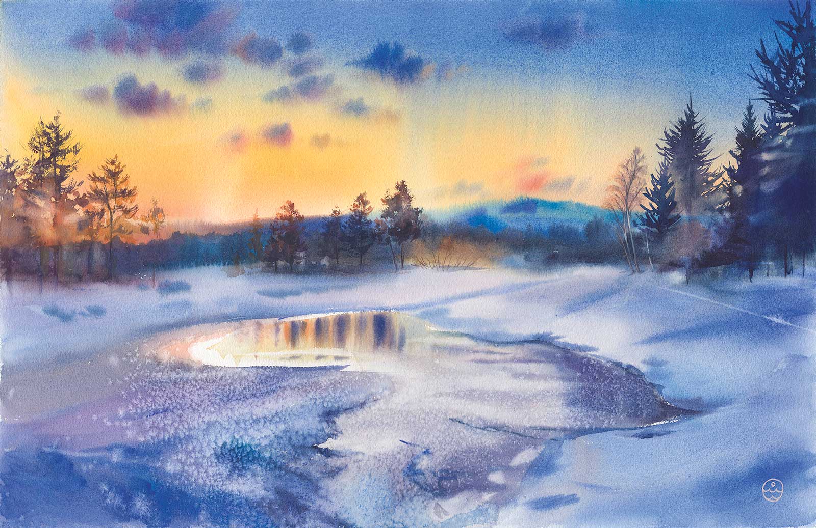
Winter mystery, watercolor on paper, 21¼ x 13¾" (54 x 35 cm) In this work I tried to show that winter is not necessarily about white color—it can also be bright. I’m a big fan of winter sunsets because they look especially dramatic and expressive. Using watercolor effects, I created a texture that conveys the shimmer of snow. I used a wet watercolor technique to achieve an unusually soft and clean gradient in the sky. This work is about contrasts: the contrast of warm and cold shades, the contrast of sunset lighting and cold twilight shadows, the contrast of the textures of rough snow and smooth ice. It is about the unity of opposites, which when united together, strengthen each other.
The tactics behind how you work is very important in watercolor, which is why I always think it through before I start painting. Watercolor is a very dynamic and quick medium that requires courage and flexibility in emerging circumstances that don’t always go according to plan. But it makes it all the more interesting, and watercolor improves mental flexibility. I consider watercolor as a kind of meditation for both the artist and the viewer, allowing us to explore the positive impact that nature scenes have on a person. —
About the artist
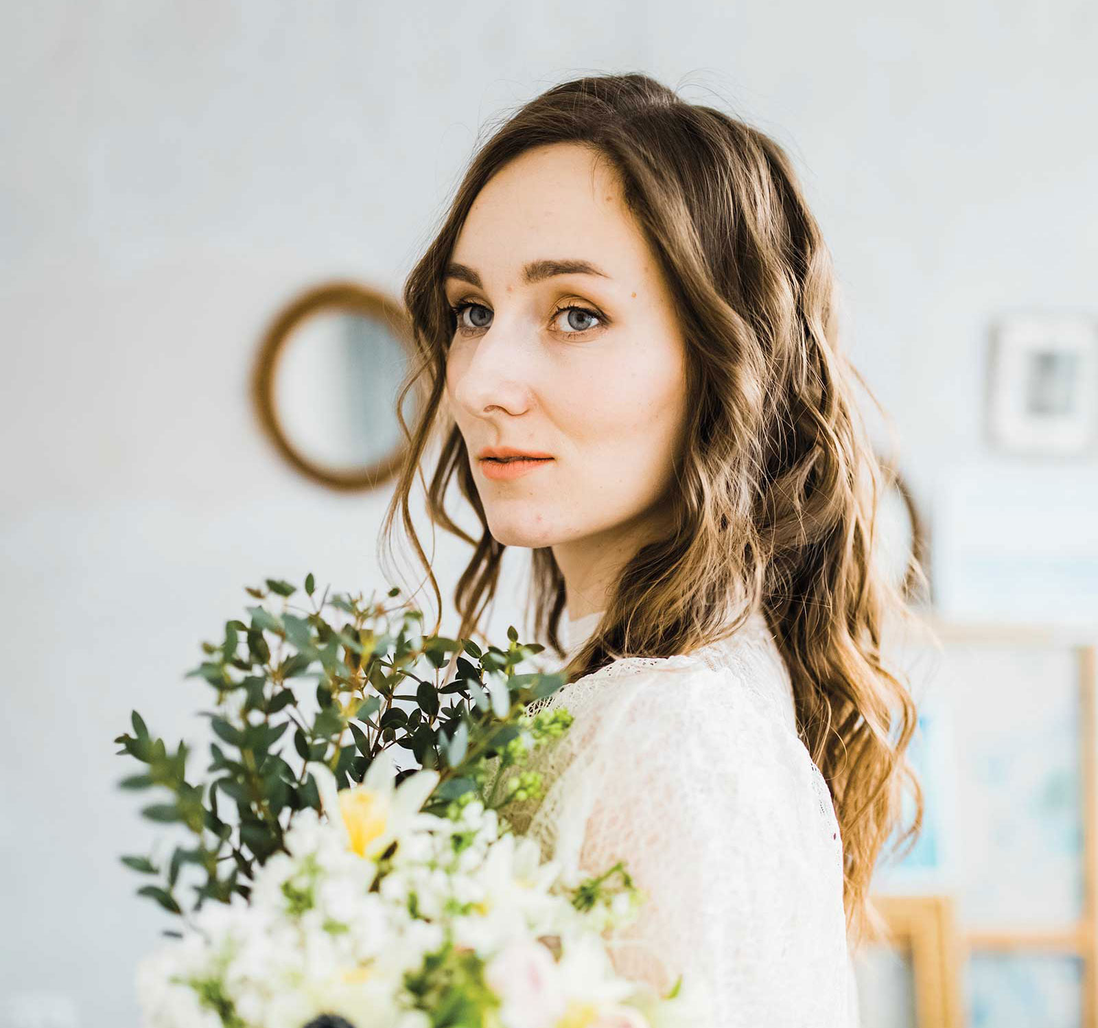 Anastasia Petryaeva
Born in Russia in 1992, Anastasia Petryaeva is a practicing watercolor artist. She graduated with honors from the Academy of Architecture and Art with a degree in industrial design. While she worked as a graphic designer and interface designer for several years, and she is now a full-time artist, wife and mother of two sons.
Petryaeva has been a participant and winner of numerous international exhibitions and competitions in watercolor art. She is also regularly invited to international online exhibitions at the International Watercolor Institute in Japan and an international cultural ambassador of the Canadian paint brand RockWell Art Supplies.
She is the author of several educational video courses on watercolor techniques, including“Watercolor Basics,” “Secrets of Water,” “Transparency” and others, which are popular among watercolor lovers around the world and have been translated into several languages. The artist is happy to help watercolor lovers master the watercolor technique. She especially likes to share her experiences in the field of depicting water.
Petryaeva’s original works are presented in private collections in Russia, Canada, the United States, Great Britain, the Netherlands, Germany, China, Australia, Latvia and more.