


Animals, particularly dogs, have always been one of my major life priorities. Before I was allowed to own a dog as a child I “borrowed” neighborhood dogs. They have continued to be a lifelong passion. When I started to seriously paint it took me a while to realize technique wasn’t enough. Passion was going to make me better and my passion was dogs. When I create, I don’t use a formula, but always use sound principles. When I teach, I try to simplify concepts so as not to overwhelm students. There are many ways to start a painting. One approach may resonate with one student and not another. We bring a lot of ourselves to our paintings. The process I am about to share comes from the idea that you need to draw less and paint more. You will also notice that sometimes one stroke is not a correct stroke so you try again. The end result is always what matters.
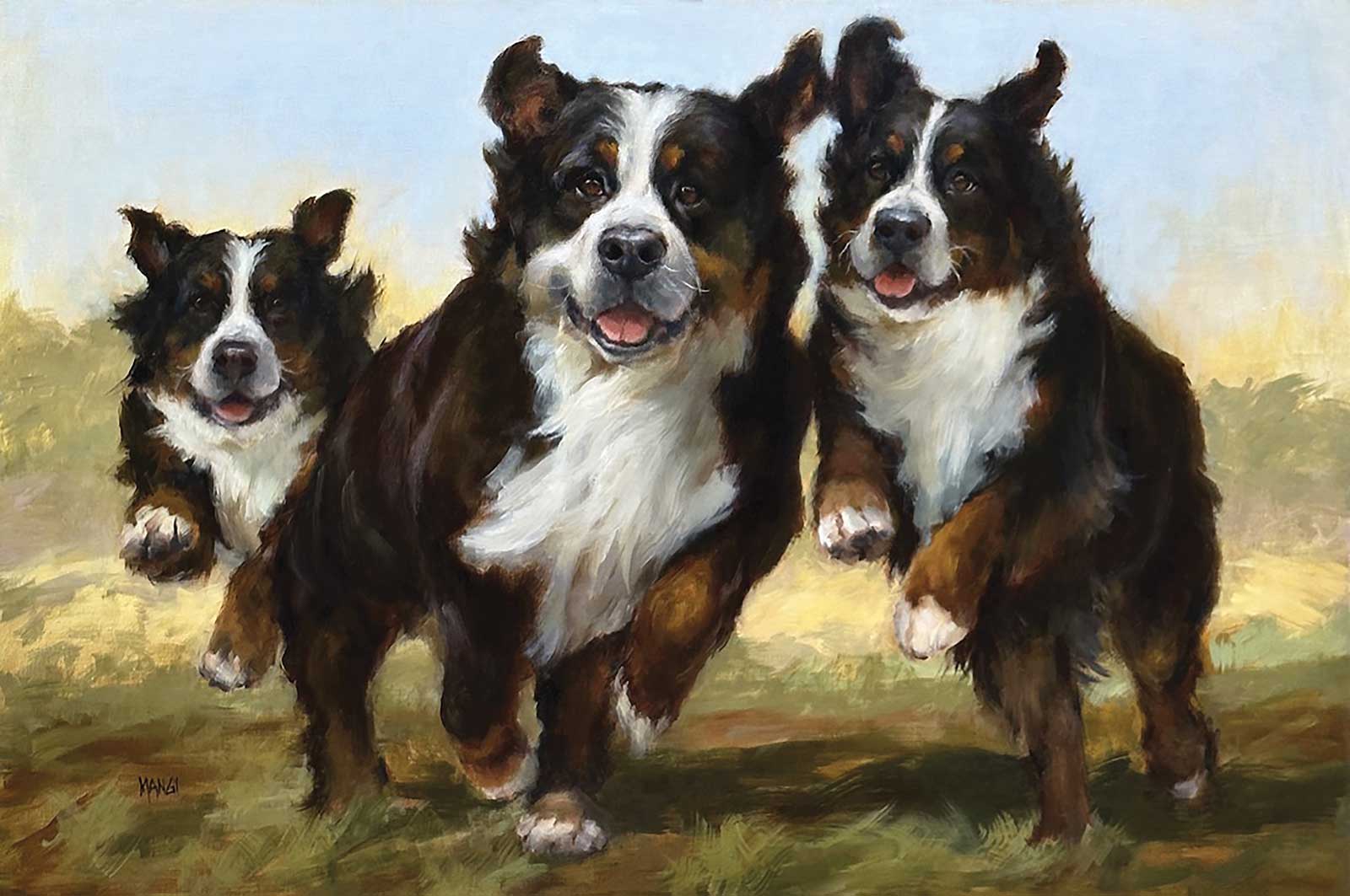
Berner Joy, oil on linen, 24 x 36” (60 x 91 cm)
I love to draw, but when I am doing portraits, I refrain from using too many lines. We fall in love with our drawing and then forget to do what needs to be done for the painting. If you want to draw your subject to better know it, do it. But make no mistake, if you use that drawing in order to paint over it, you will lose the unique quality that paint brings. There are many atelier painters that do wonderful work by putting down a full roadmap of drawn lines. Unfortunately, a lot of students haven’t had the luxury of atelier training. Nor do I think you need it. Many students fall into a pattern of painting between the lines, losing a sense of freedom. It’s freedom in our paint application where amazing things can happen. If you have a detailed drawing that you are heavily invested in, you are less apt to correct it if it’s slightly off. Massing in is a breeze to wipe off and start again.
When I start a painting, I use massing in instead of drawing. Massing in is a fun and easy way of finding size and placement. Then I use a paper towel to define the light from the shadow. The towel becomes a brush. I use it to decide how dramatic or soft the confluence of light and shadow are. I am always cognizant of planes, but I use topography to help visualize the form. It keeps me focused on how everything connects. You don’t paint just one thing at a time but consider the entire subject.
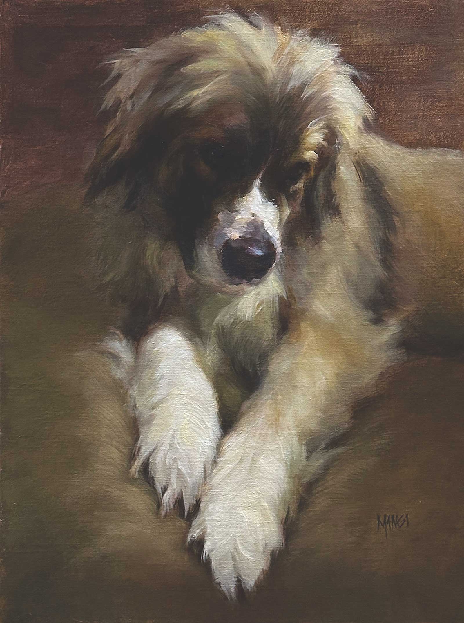
Heart and Soul, oil on linen, 16 x 12” (40 x 30 cm)
My priority is to achieve aliveness in all my work whether through value, brushwork or color. Of course, there’s more to it but let’s keep it simple for now. As much as I want accuracy it’s more about believability. To me, painting perfection is not in the rendering of fine details, but in the process of making a statement. Bigger brushes help to make that statement. To paraphrase one of my teachers, one bold brushstroke is worth ten tentative ones. It can be a telltale sign.
I tend to use filberts more than anything else, but a flat is useful. My favorites change day to day. I use primarily Eclipse filbert brushes by Rosemary & Co., but sometimes I use bristles or their Evergreens. Size matters! Unless I am finishing up and need a tiny touch, the smallest brush will be a size 6, even for a highlight. I stress paint handling and brush control to my students. This demo was done with only two brushes.
I have no problem using darks and then wiping my brush with a paper towel (no Gamsol) before applying lighter paint over the dark. You must use more paint than you think. If I am putting a lighter color over a darker one, I make sure my brush is loaded and use a light touch to put a brushstroke down over that area. If I want to use some of what’s already there, I use slightly more pressure to pick up that underneath paint. Students get into trouble because they keep pressing into the canvas. They have one gear. That’s how they lose color purity. Practice shifting gears.
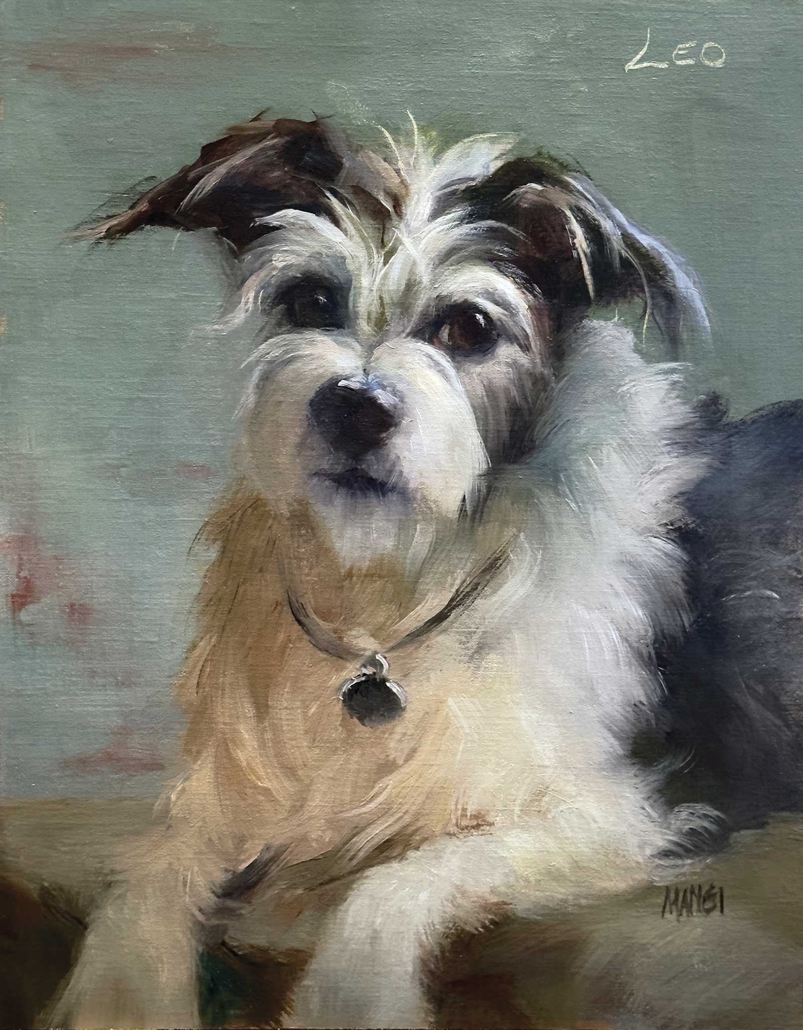
Leo, oil on linen, 14 x 11” (35 x 27 cm)
Of course, using artist grade paint is paramount to success. My paint of choice is Rembrandt because of its smoothness, buttery feel and amount of pigment. I use primarily Raymar C13DP panels because they allow the paint to move. Moving, gliding and mixing is a dream on these panels. It all becomes part of the process. Yes, you can use anything, but your best bet for success is having all the right ingredients. The tastiest cakes are made up of the best ingredients.
Painting from life is a game changer. It’s challenging, but no matter how bad you think you’ve painted you always come out with valuable information. Painting animals on the move may seem stressful, but after the first few attempts you will stop trying to control what’s going on and start putting down larger shapes and less specificity. Believability. Not accuracy. That’s the name of the game.
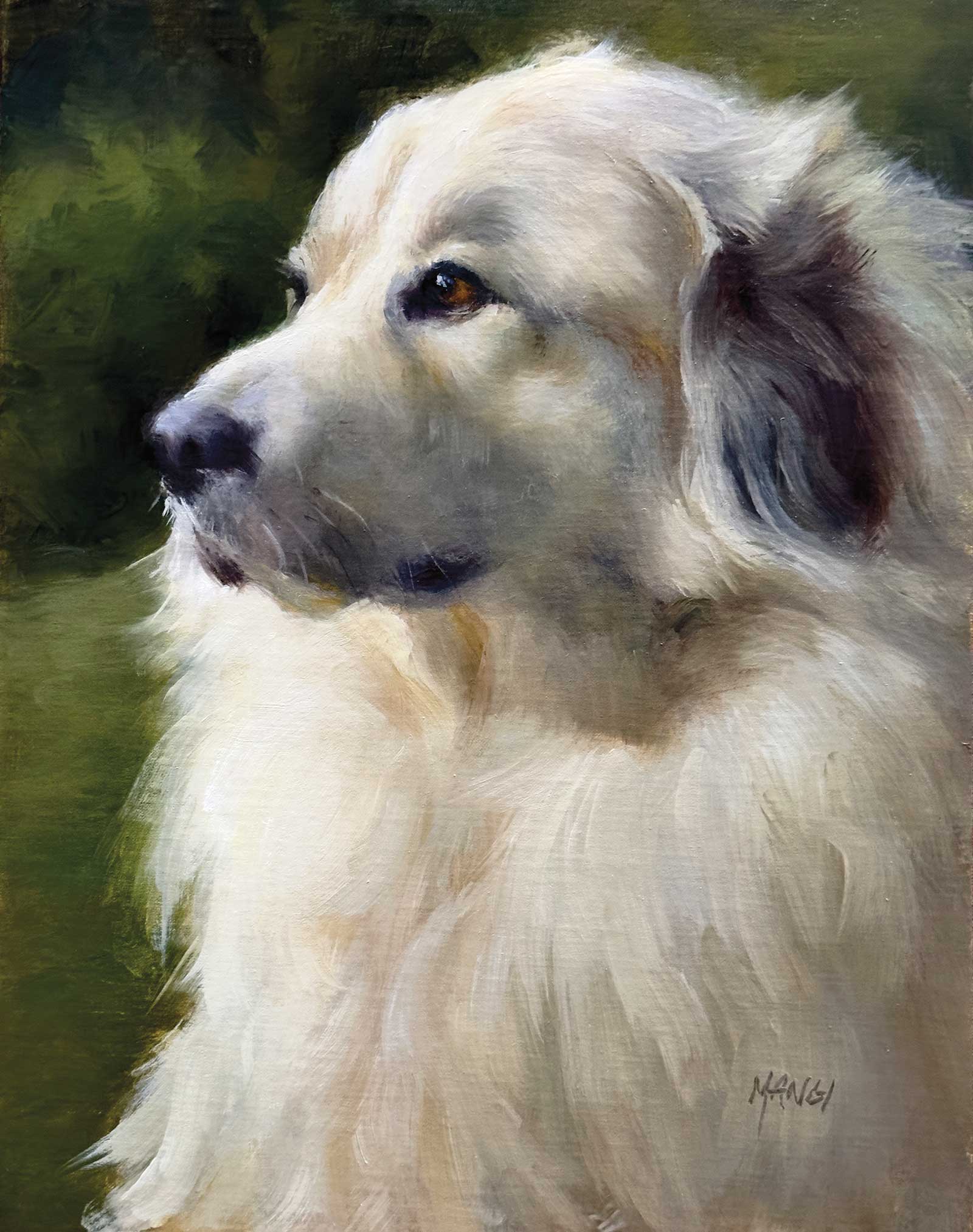
My Art in the Making Luna
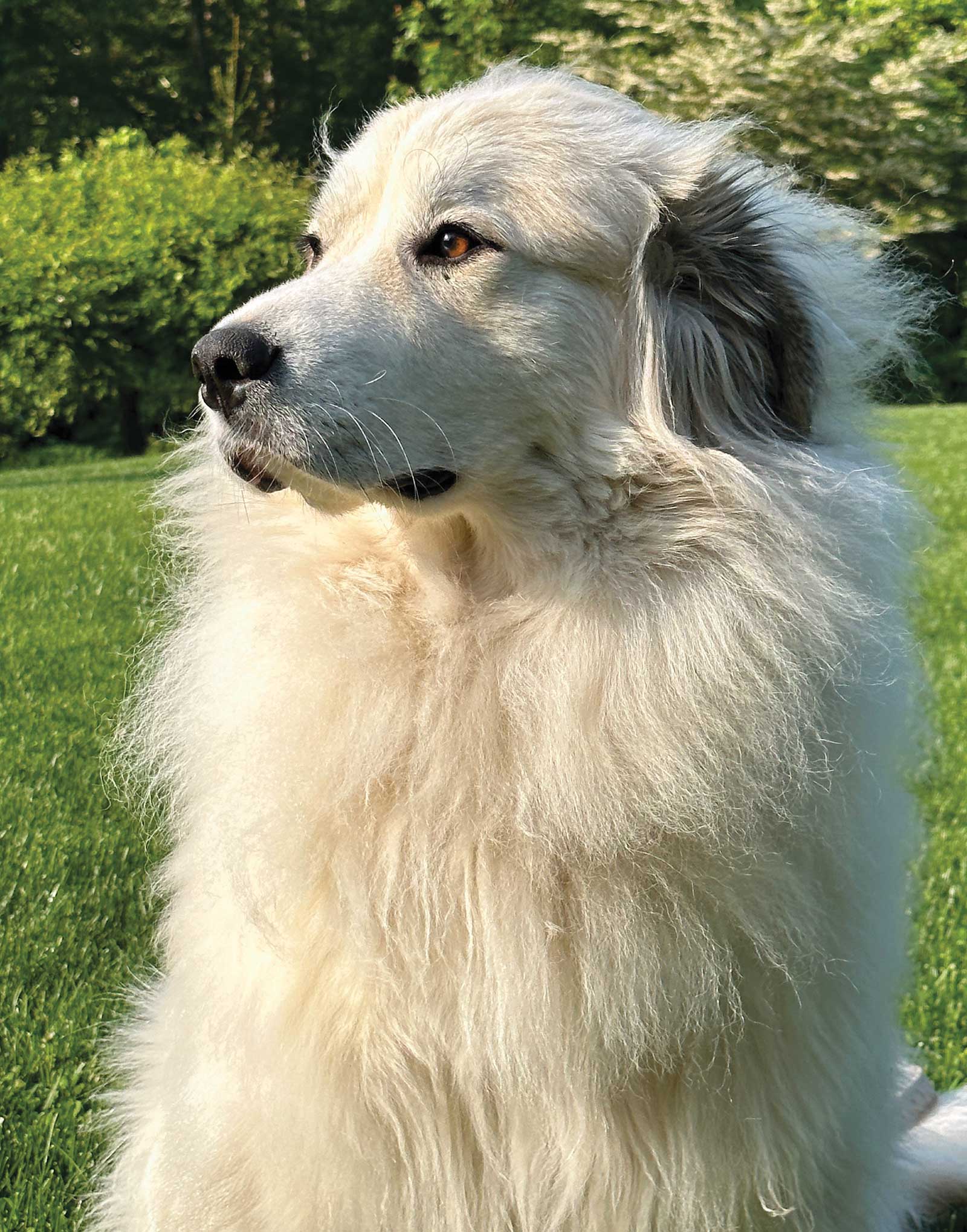 Reference Photo
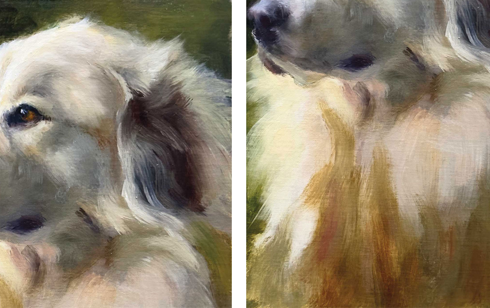
I chose this photo for the regal demeanor of this Great Pyrenees. It also had an interesting light/shadow pattern. I adjusted the warm/cools to satisfy my aesthetic.
 Stage 1
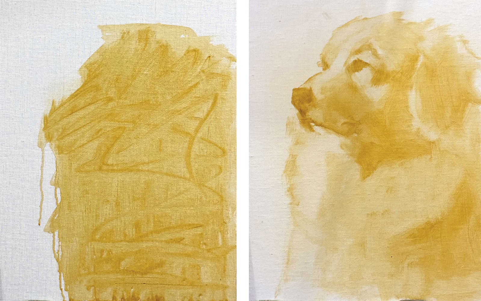
Stage 1 Basic Shapes
Rather than rely on a drawing, I am massing in the basic shape of the dog using transparent oxide yellow and Gamsol. I like to use this color because if things work out I will have a bit of glow showing through. After I established placement I easily pulled out the lights with a paper towel. This was the extent of my drawing. I add some more transparent oxide yellow to indicate darks.
WHAT THE ARTIST USED
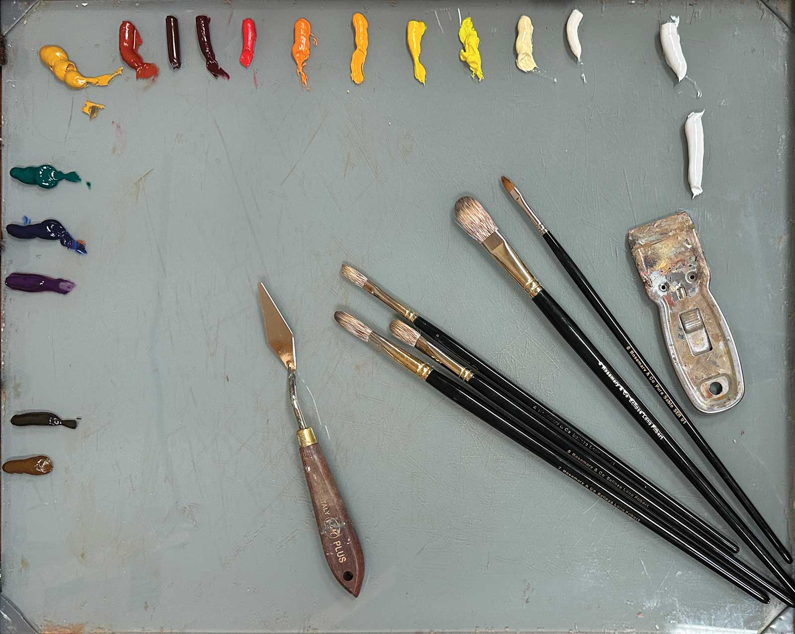
Rembrandt Oils
Ultramarine blue deep, Viridian, Yellow ochre, Cadmium red medium, Cadmium orange, Cadmium yellow light, Cadmium yellow deep, Cadmium yellow lemon, Transparent oxide yellow, Transparent oxide red, Transparent oxide brown, Titanium white, Naples yellow light
Vasari Oils
Terra rosa, Alizarin crimson, Raw umber, Burnt umber
Michael Harding Oils
Warm white
Rosemary Brushes
Eclipse, long filberts, sizes 4, 6, 8; Series 66 sable, cat’s tongue, sizes 6, 8
Additional Materials
Raymar C13DP panel, Palette knife, RGM #45, Galkyd gel, Gamsol
 Stage 2
Stage 2 Eyes and Nose as Anchors
The best place to start for me is always knowing where the eyes and nose are located. I chose the eye closest to me as the anchor. From here everything else will be compared. I’m not overly concerned with complete accuracy at this stage. Restating things can occur at any time. I put in one stroke of transparent oxide red for the eyes and a combination of ultramarine blue and terra rosa for the nose. I deepened the shadow using burnt umber, cadmium yellow deep and a touch of cadmium orange.
 Stage 3
Stage 3 Continuing the Eyes and Nose
I am still using a somewhat large filbert brush (size 7) to put in the idea of the eye and the form of the nose. I modify the color on the shadow side and then place the lights (comprising titanium white, yellow ochre, cadmium lemon and/or ultramarine blue) dragging them into the shadow. This will create a beautiful transition color without mixing it on the palette. Wonderful things can happen here without even trying! There are no hard edges to the eye. I started with a big stroke of transparent oxide red, then used that mixed with ultramarine blue for the outer shape. Then I put a dark stroke in for the pupil. A highlight was added to give it life. I added transparent oxide red and viridian and then topped it with cadmium orange. I will refine it later on in the process. For me, it’s important to see aliveness to keep my interest.
 Stage 4
Stage 4 Color Experimentation
At this stage, I am playing with a bit of color. I’m not committed and anything can be changed. I start to add more fur using a larger brush (size 9).
 Stage 5
Stage 5 Proportions
It was time to make a big decision. Even though the head looks correct, I didn’t think it was massive enough to support the amount of fur on the chest that I wanted. This is a big fluffy dog. I made the nose bigger and pushed the eye back about ¼". Could I have left it the way it was? Absolutely. It would have still looked like this dog. However, my concept was to show off that magnificent head. I am always following the topography, so I added some darks to beef up the structure. Now the proportions look much better to me.
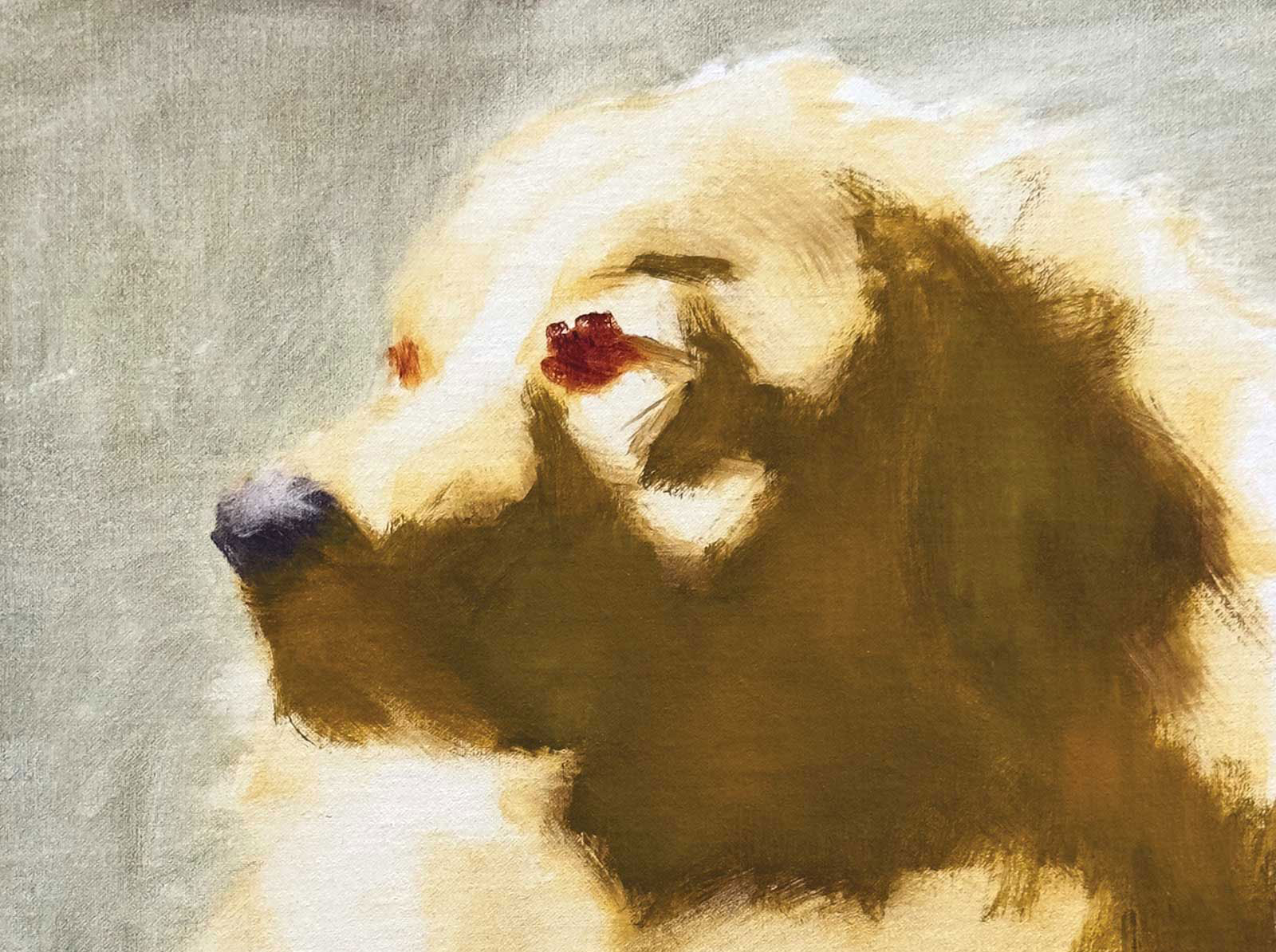
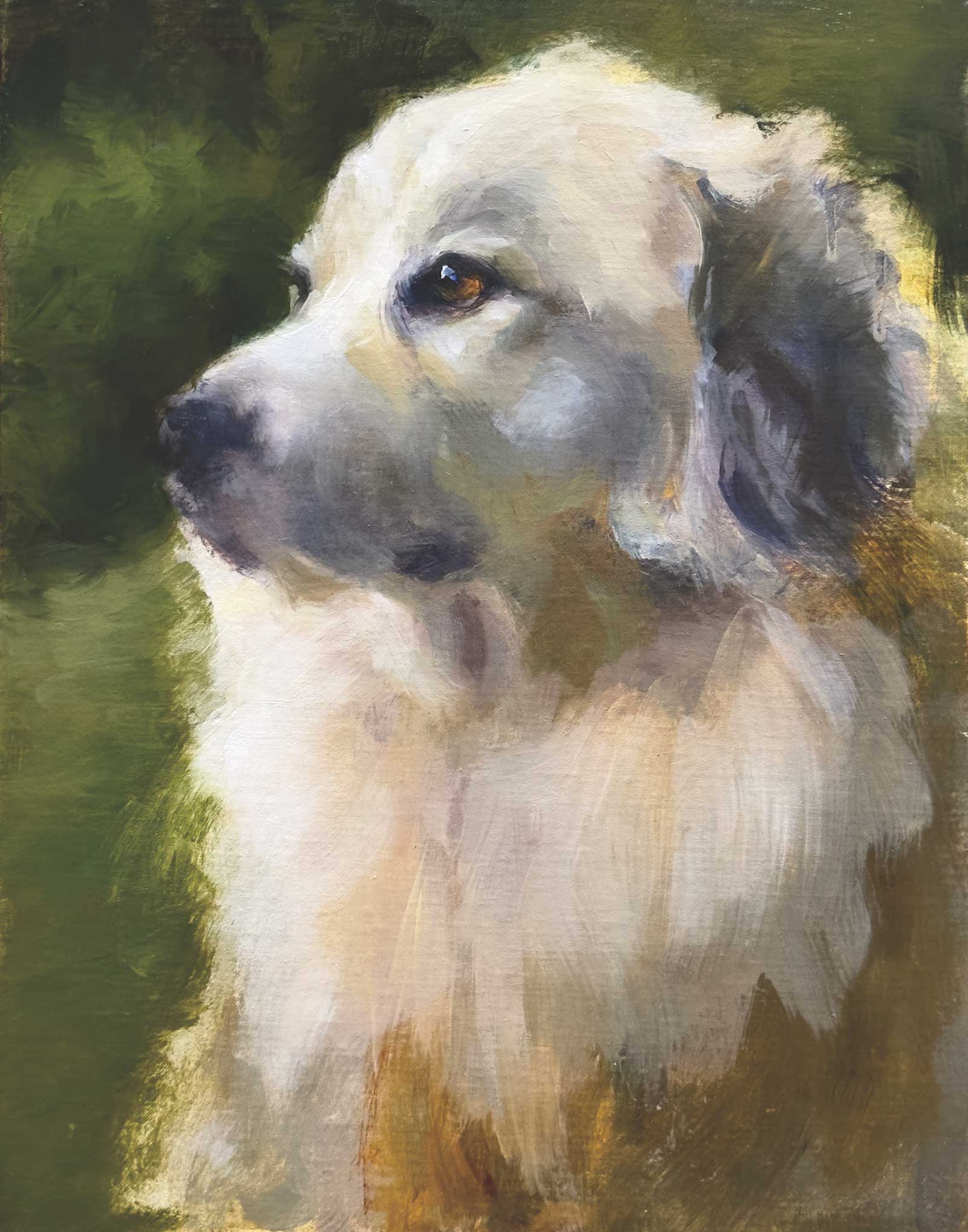 Stage 6
Stage 6 Background and Topography
I added the background and painted right into the fur. I wasn’t interested in much detail for the background. I am using viridian, transparent oxide red, ultramarine blue and yellow ochre. I wanted rich warms and cools to play off the main subject. Now I continue modifying the form, paying attention to the topography. Everything in the light stays in the light. I vary my white mixtures, going from cool to warm following variations in the coat. My main choices are viridian, transparent oxide red, terra rosa, yellow ochre, ultramarine blue and a touch of cadmium yellow lemon. If I don’t like it I can scrape or wipe it off. Cooler colors in the light. Warmer in the shadow.
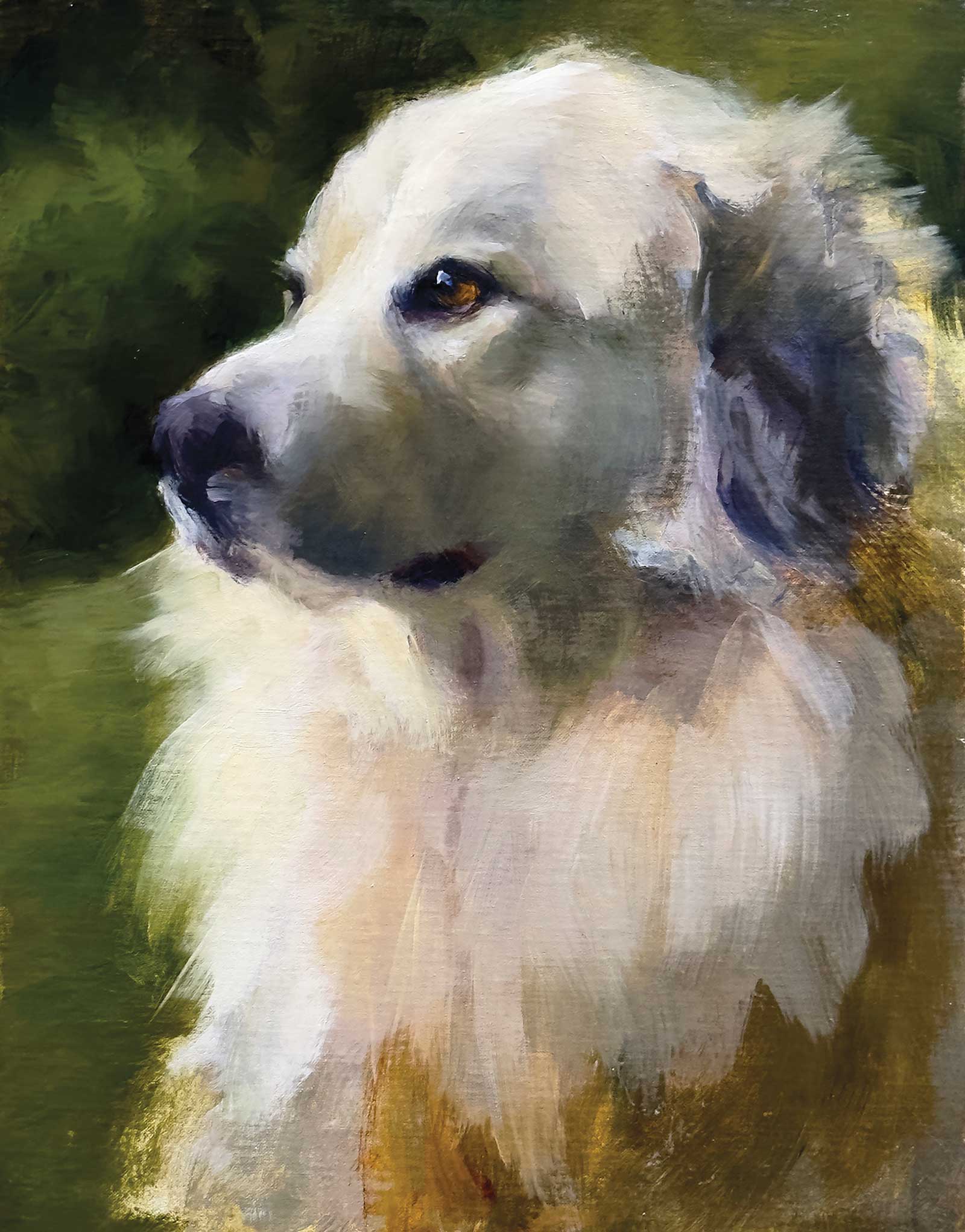 Stage 7
Stage 7 Creating a Sheer Effect
Next up, I pull the fur over the background for a sheer effect. This is not the time to be hesitant. Put the paint on the brush and make a stroke from the body, lifting as you get to the background. If it doesn’t work you can wipe, add more background color and try again! I increased the size of the shadow and enlarged the top and back of the skull.
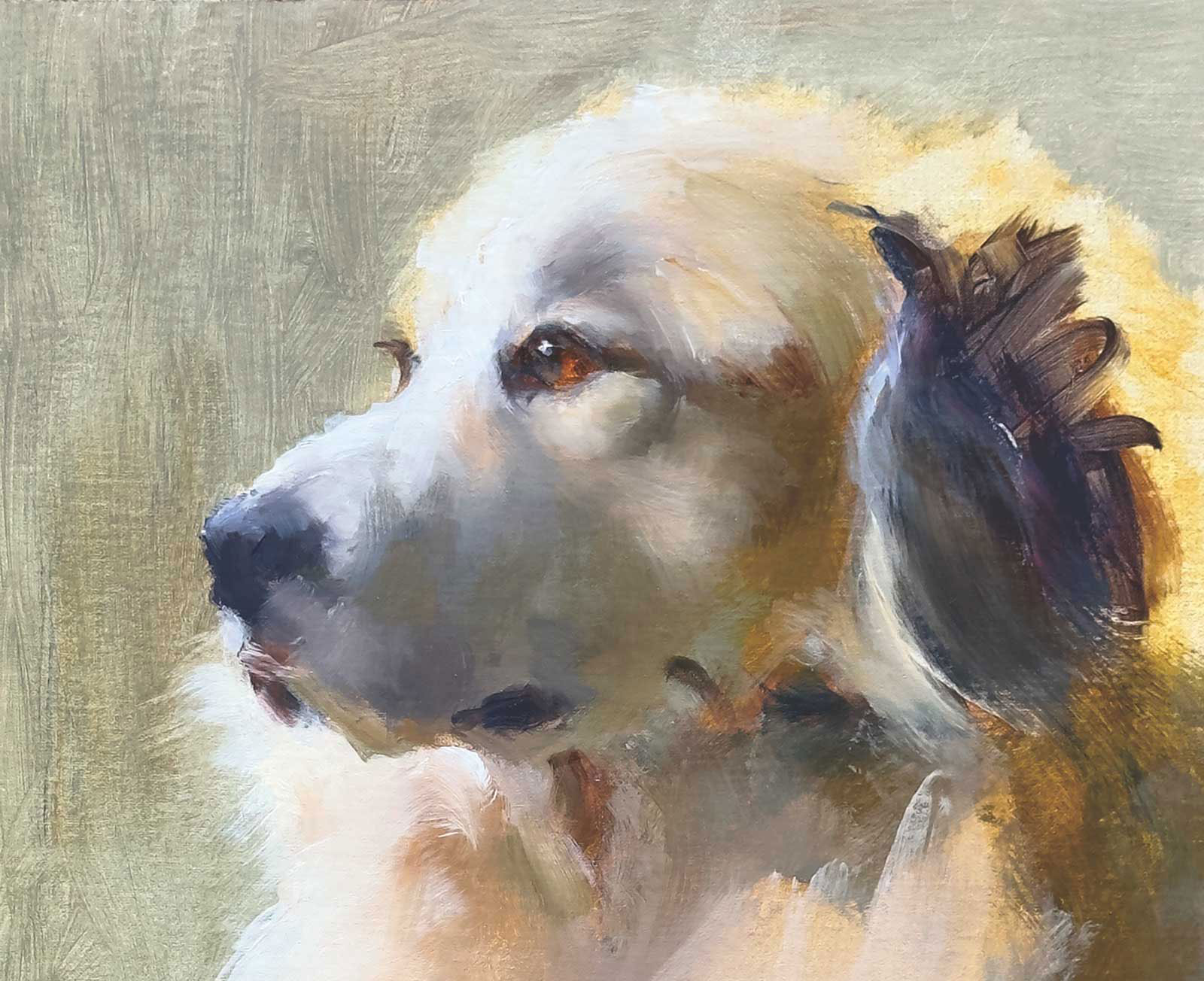
 Stage 8
Stage 8 Adjustments
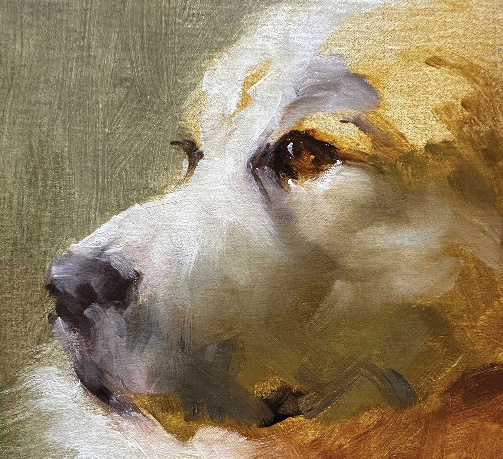
A lot is happening at this point. I’ve been basically playing until now. I studied the form of the ear and added more rich darks of transparent oxide red, alizarin and burnt umber. Then I lightened them with a bit of white to lay over it. Adding ultramarine blue towards the bottom of the ear. The highlighted parts were variations of blue/white, yellow ochre/white, yellow ochre/a touch of cad lemon/white where I needed a more brilliant light. The muzzle needed to be filled out and the chest fur needed some warmth using transparent oxide red, varying it with viridian and yellow ochre. I also downsized the eye a bit.
 Stage 9
Stage 9 Finishing the Chest and Other Refinements
Almost there. I’ve been waiting on finishing the chest so that I could do it all at once. Big strokes, slight shifts in color, making sure everything is there that I need. To paint a white dog you need darks. To lay in the top coat I need a good base. I continued to refine the face by following the topography as I viewed it. The planes of the face are well defined. I am making small decisions.
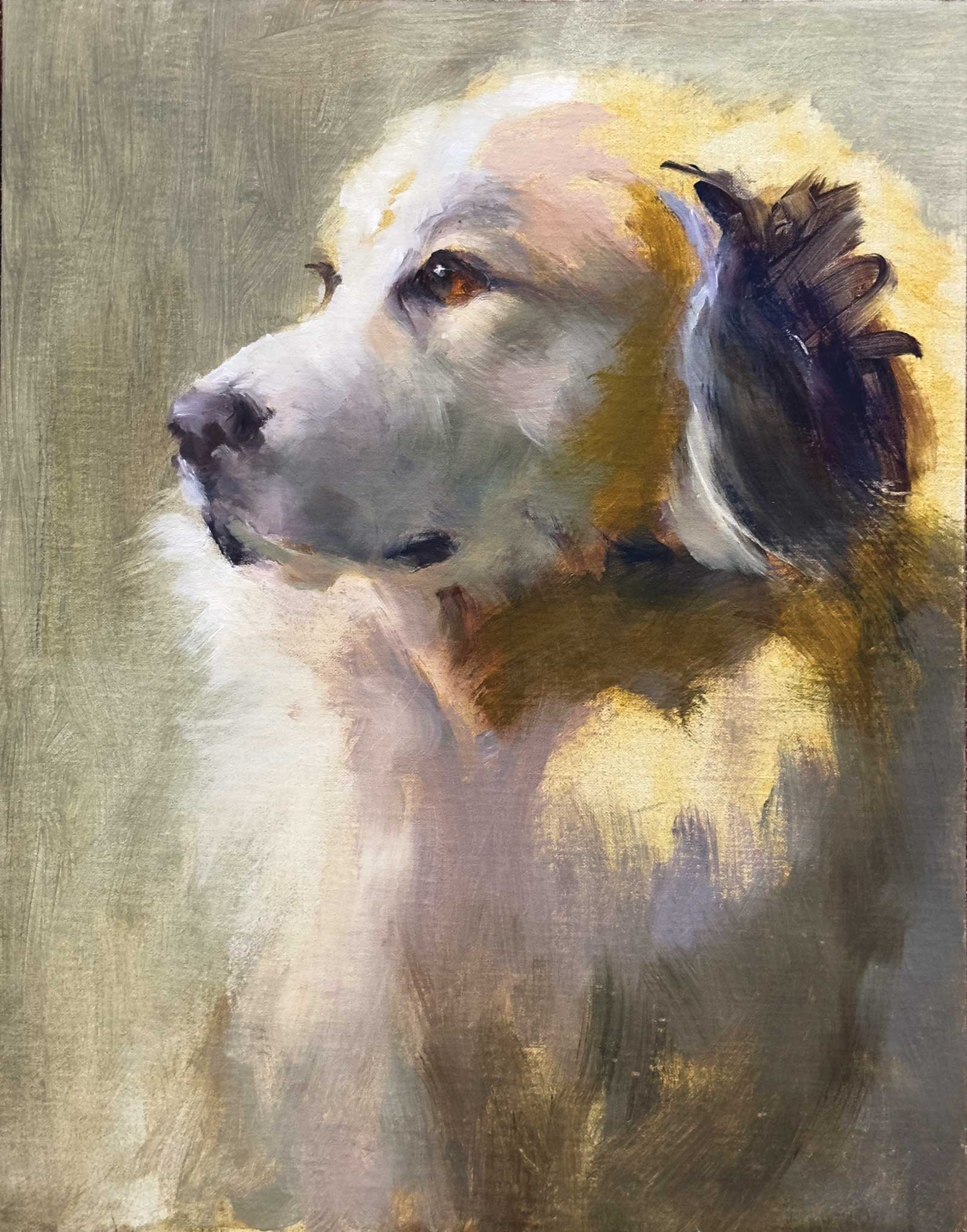
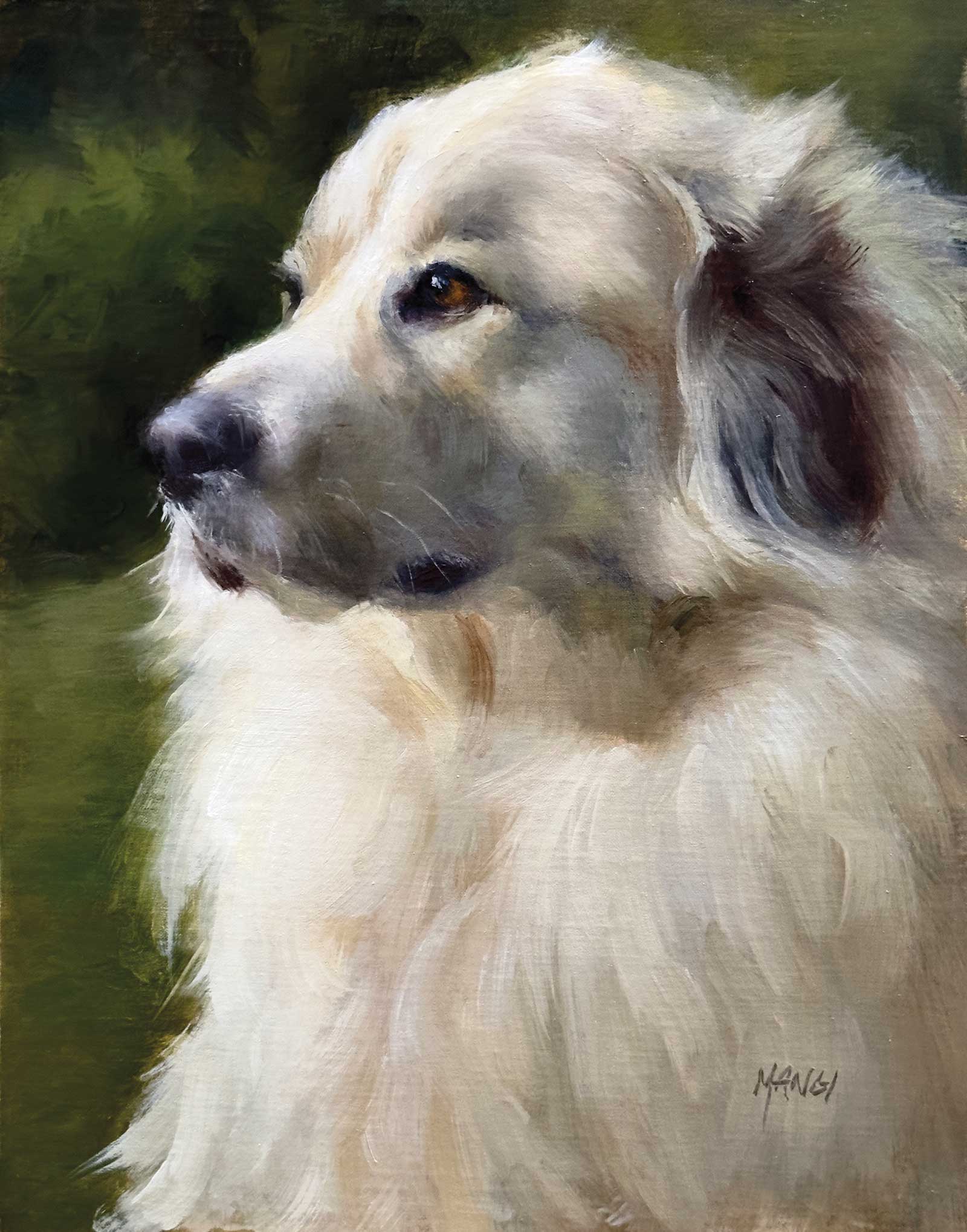
 Stage 10
Stage 10 Finished Artwork
Luna, oil on linen, 14 x 11” (35 x 27 cm)
How do you know you are done? When you’ve accomplished your original idea? In this case, I wanted to convey the majesty of this particular dog and her intelligent demeanor. Anything more is just the same.
About the artist
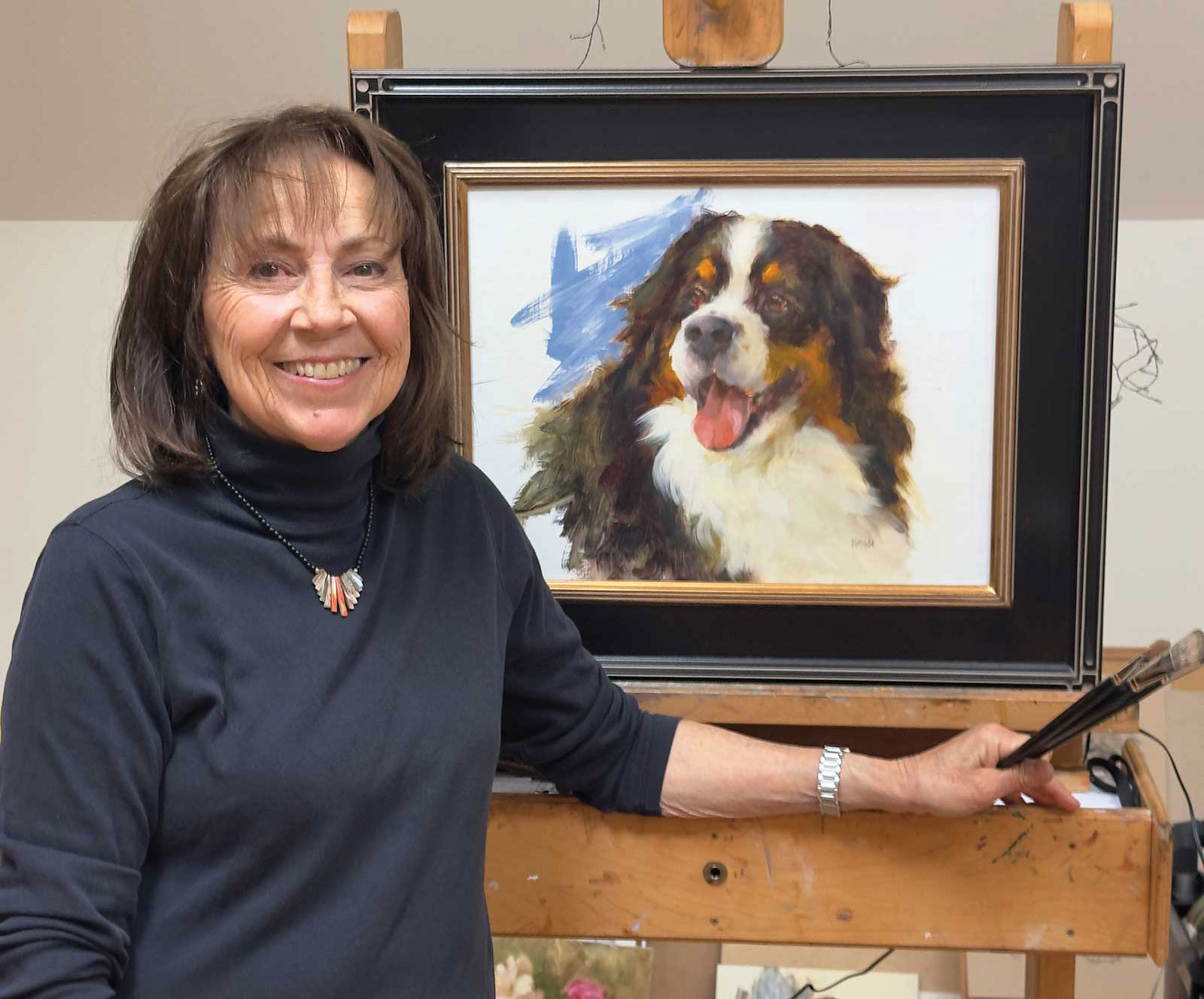 Johanne Mangi
Art has always found a place in Johanne Mangi’s life. Her art development has been self-directed. It was a life changing event when she discovered Richard Schmid and the Putney Painters in Vermont and was eventually invited by Schmid to become an official member. This group has produced some of the best representational artists today.
Painting from life has always been a part of Mangi’s process. Live dogs are present in all her workshops. They provide a lively atmosphere along with valuable information. Maybe a bit of chaos too! Using her own pack of dogs has helped interpret and create what she sees when painting from photographs for commissions. This process is captured in the DVD “The Fine Art of Painting Dog Portraits” as well as “The Fine Art of Painting Horse Portraits” published by Streamline Publishing. They quickly became classics, changing the perception of “pet painting.” She drew inspiration from classic 19th-century animal painters. Since 2010, Mangi has been the first to promote the idea of dog portraits being classified as fine art.
Following in Richard Schmid’s footsteps she established the Third Floor Studio consisting of like-minded working artists. They meet regularly in her Third Floor Studio in an environment conducive to painting, sharing experiences and encouragement.
Mangi’s work has garnered many awards and accolades and is collected nationally as well as internationally. She teaches workshops throughout the United States, finding it challenging to control her schedule. It’s imperative to leave time for painting and experimentation. She is a much sought-after commission artist. She is a juried member of the following: Salmagundi Club NYC, Oil Painters of America, American Impressionists Society, Inc. as well as the Portrait Society of America.
Contact at
johannemangi.com