



I have always been at home under the open sky. To try and capture in paint the beauty and mystery of nature is a joy like no other—it is like coming home.
My happy place has always been in nature. I have done a lot of traveling and camping all over the country and abroad observing natural beauty of all kinds. I have a special interest in trees and skies, sunsets and sunrises. Over many years I have painted plein air and sketched many outdoor scenes to use as a basis for the large studio work I like to do. I use some photography but don’t depend on it too much lest I lose the freshness of the scene. Often I paint from memory or my imagination.
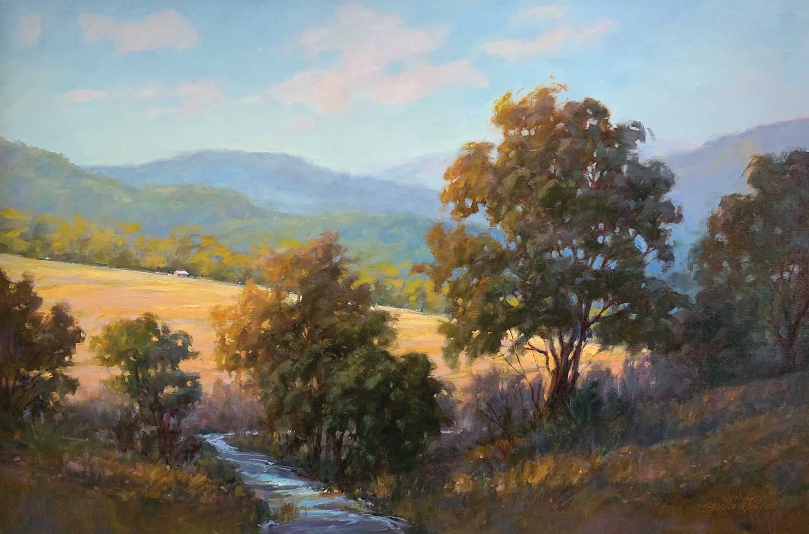
High Country Gold, oil, 24 x 36" (60 x 91 cm)
My love of drawing led to working as an illustrator, until I realized I just wanted to paint. I have loved painting with oils for as long as I can remember. I love the possibilities of application and the very nature of this medium, which allows me to get the quality of color and texture that I want.
Design, composition and placement of elements are always important to me in a landscape. I hope to draw the viewer to “travel” into it by providing a lot of perceived distance and maybe take a little vacation there! The essence of painting a landscape, for me, is to try and share in some way what I felt about the beauty or importance of the scene. I hope to provide a way the viewer might experience that place in some way themselves.
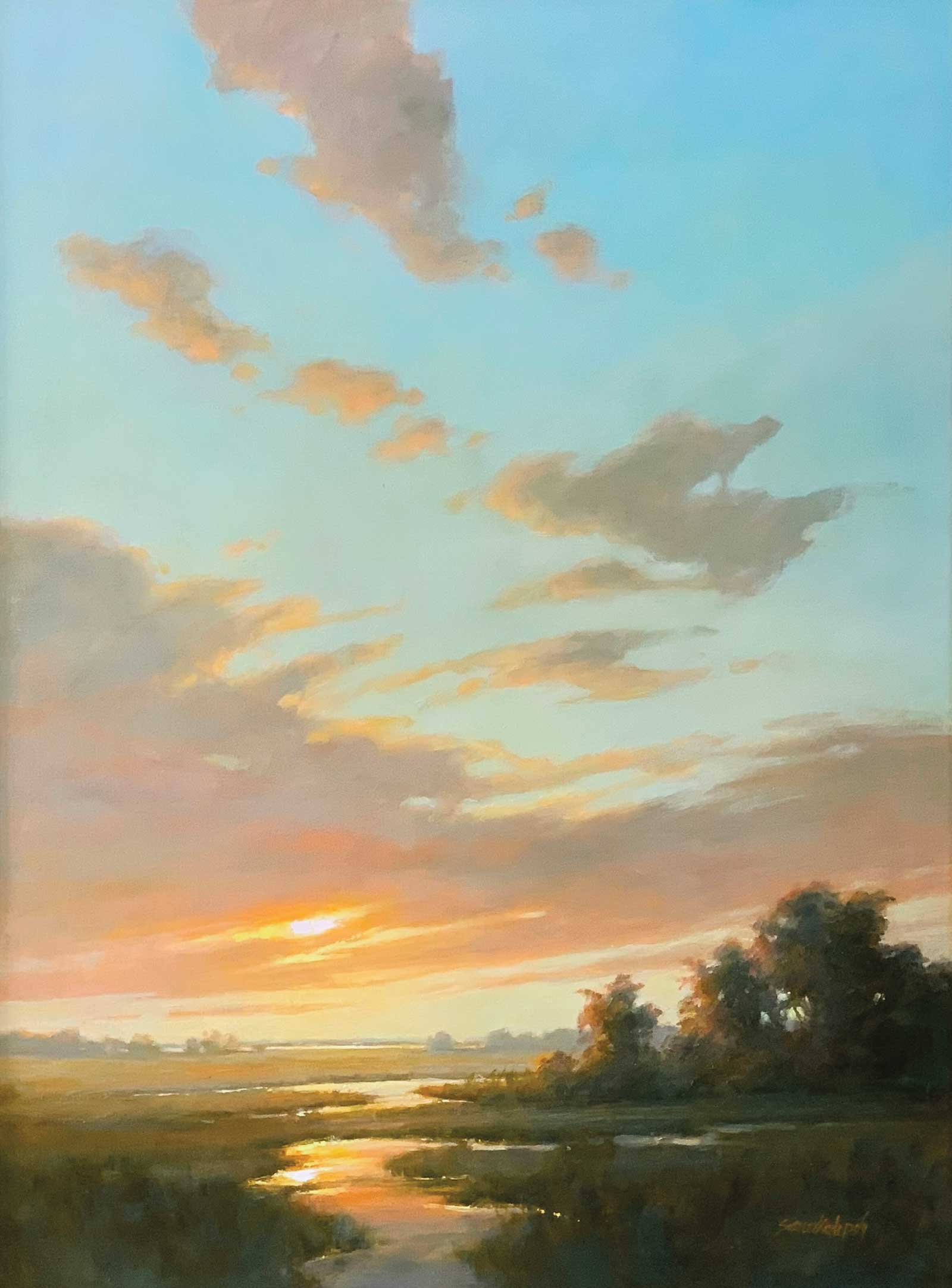
Early Morning Light, oil, 40 x 30" (101 x 76 cm)
I rarely paint exactly what I see, making sure trees are all shaped and spaced differently. This means I often change them from the original scene. I did this in my demonstration by making the road off center and having three trees on one side and one on the other and varied the color of the bark and leaves, etc. Variety is incredibly important. I make my own grays using the complementary colors that I am already using to keep it harmonious. I think the “grays are the glue that holds everything together” in a painting.
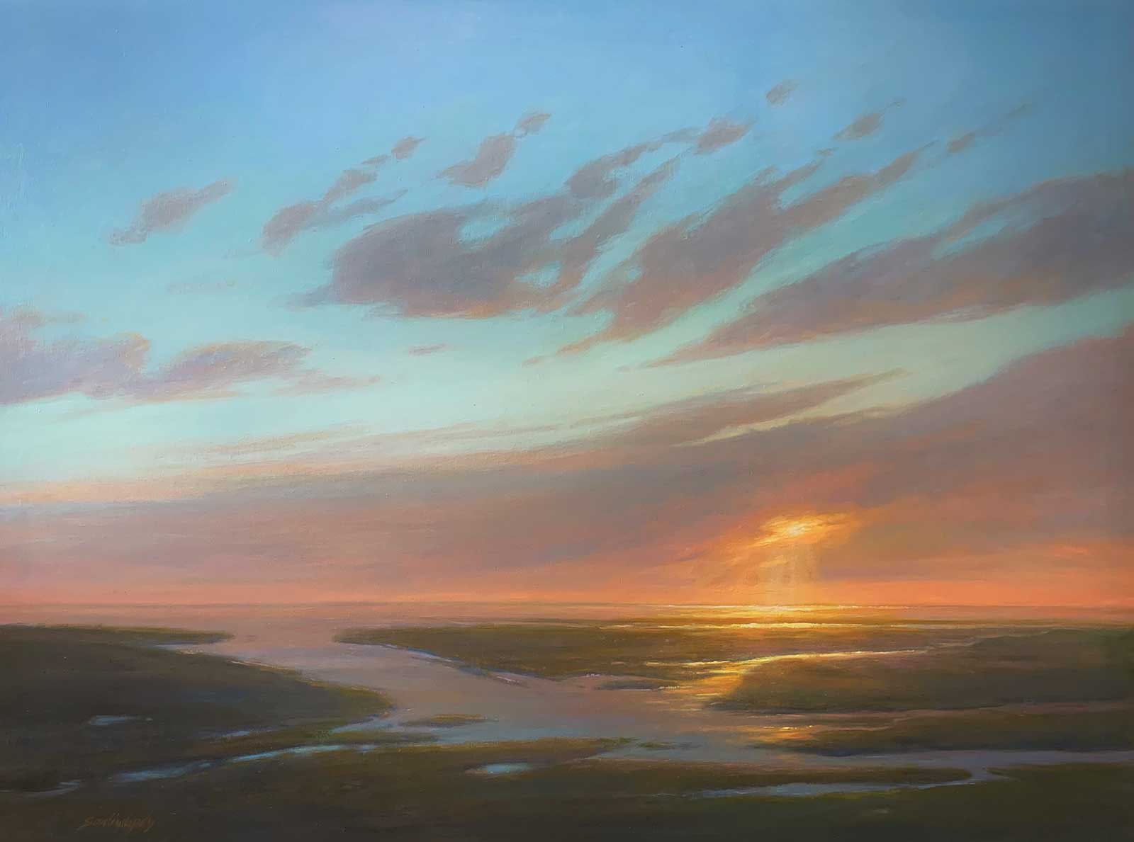
Soaring, oil, 36 x 48" (91 x 121 cm)
The passage of light is also very important to me. I like to show how the light moves in a scene, where it comes into the painting and how it lights the elements it touches, as well as where it leaves. I especially love backlighting. I like to keep the background light, soft and ethereal using brushes and then work my way forward to find an occasional “sparkle” as it lights the elements in the foreground where there is more detail. I like to pull certain things forward with warmer colors and more texture to create more dimension. This is where I do much of the work with a palette knife, which is very satisfying. I am always working towards putting as much distance as possible between the farthest and closest elements.
My Art in the Making Where Dreams are Made
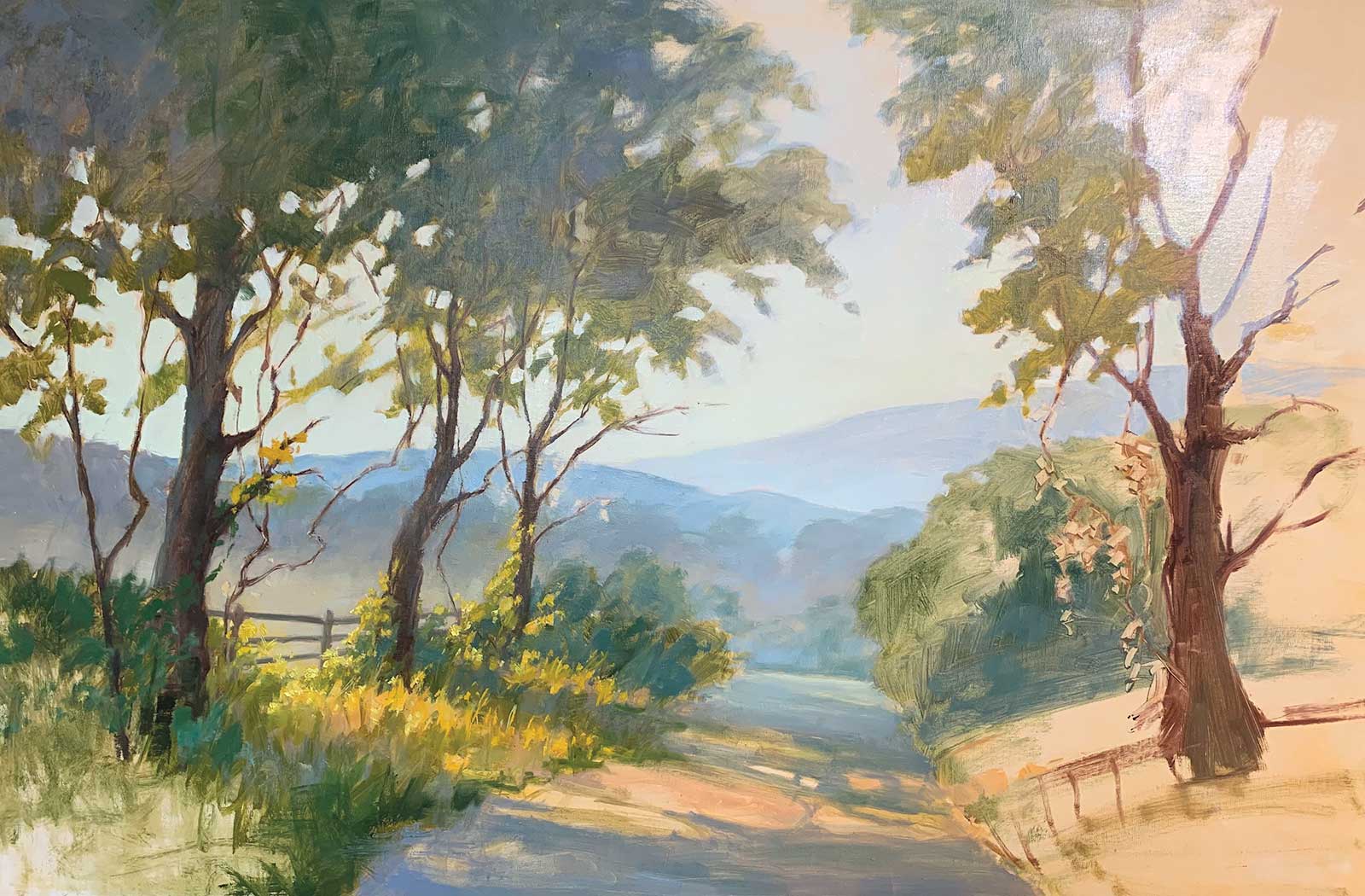
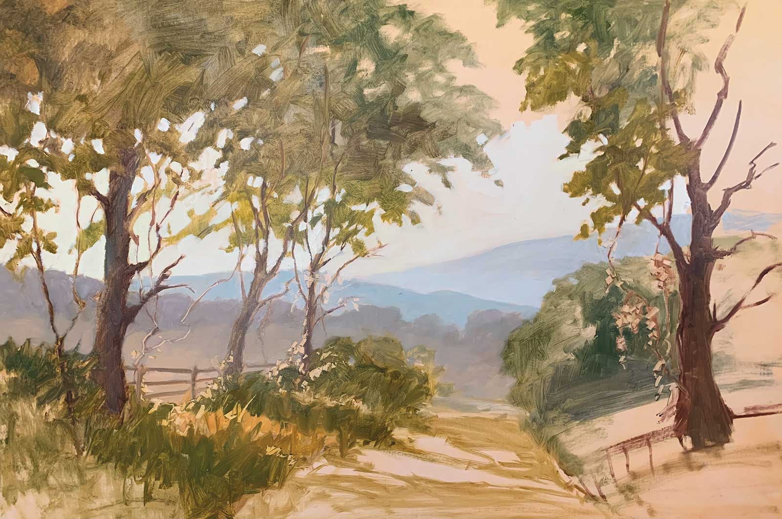 Stage 1
Stage 1 Basic Design
I started on a 24 by 36" linen oil-primed stretched canvas that has been toned with a thin coat of cadmium orange oil paint mixed with a small amount of safflower oil and rubbed in with a soft paper towel and left for several days until dry. Next, using a medium-sized brush I started sketching in the basic design and composition with a range of warm to cool neutral colors, mostly using sap green and alizarin and maybe some blue or Indian yellow to show the warm and cool, light and dark, side of the trees, I then designated the main focal point, or subject, which is where the sunlight shines through and across the road. I will have a secondary smaller focal point to compliment the first and draw the eye across to the other side since it is a long horizontal. I am careful of the organic shapes, keeping them varied and not static. These beginning steps are very important.
 Stage 2
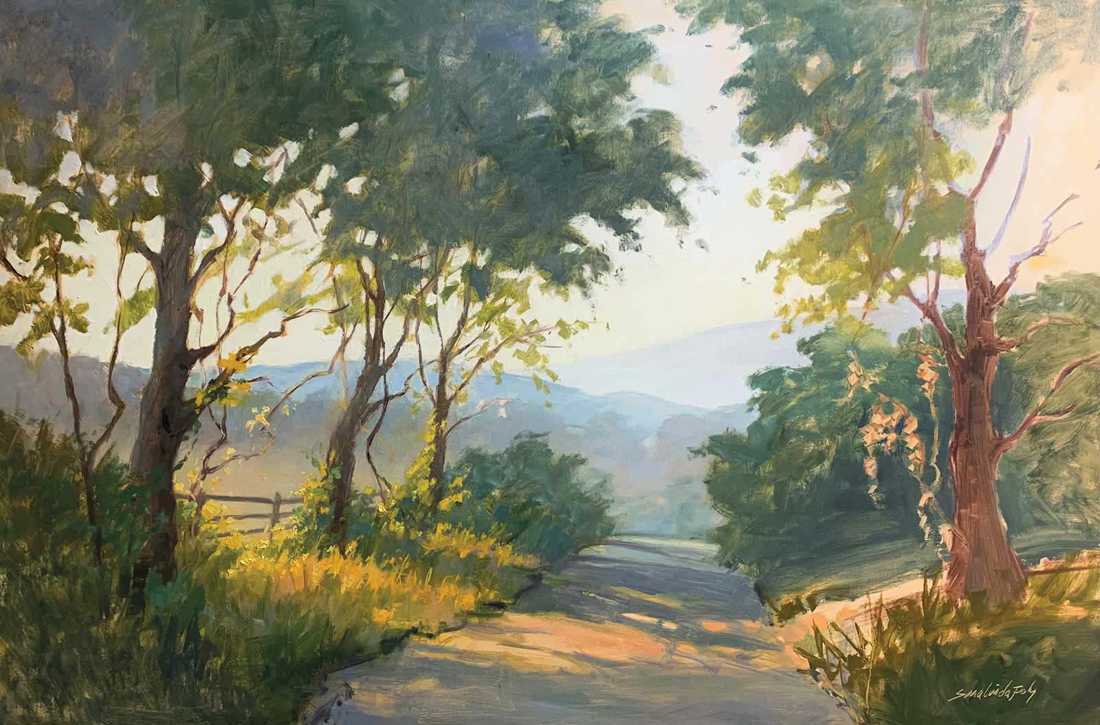
Stage 2 Establishing a Focal Point
Once this was dry I began to anchor the focal point with more color and detail, deciding on the shape and how it would spill across the road and hit the tree on the other side. I blocked in the darker areas and decided which things I wanted the light to hit and left some of them unpainted, as the leaves hanging down near the tree on the right. I continued to show the cool and warm areas, adding more blue and letting it dry a bit, but not completely.
 Stage 3
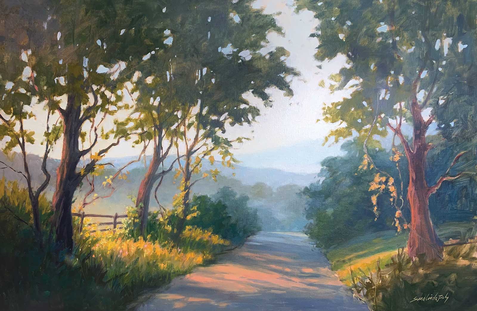
Stage 3 Filling in the Trees
This time I started filling in more of the trees, again keeping in mind the cools in the shadow side of the trees and thought more about how the shadows would lie across the road. I changed some of the shapes of the trees and started adding leaves to hang down. I also added some warmer colors to the foreground, though the sides will mostly be cooler for contrast. While the foreground is still wet, I used a wipeout tool to adjust a few things and also to sign it. I like my name to be scratched down to the tone color but subdued.
 Stage 4
Stage 4 Atmospheric Perspective
Now I worked to enhance the colors, strengthening the distant blues but keeping it soft to show atmospheric perspective. I filled in the areas that needed darkening or more or different color and made sure everything was feeling balanced. I filled in the “sky holes” with the sky color, sometimes a bit darker. I warmed up parts of the foreground then worked to make sure there were a lot of varieties of color and value especially in the greens from front to back.
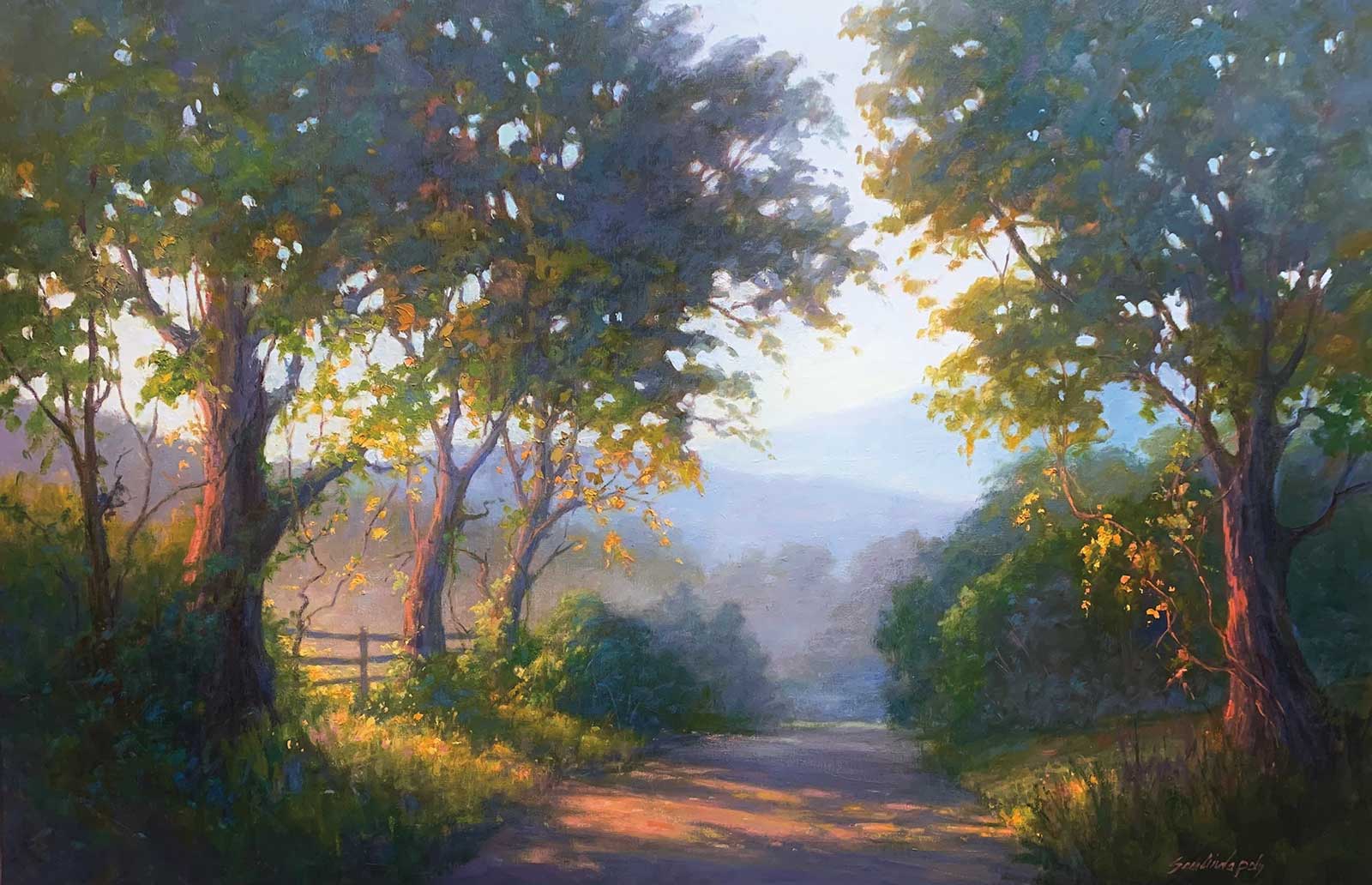 Stage 5
Stage 5 Finished Artwork
Where Dreams are Made, oil, 24 x 36" (60 x 91 cm) Finally, I am carefully making all adjustments in color and adding the “sparkle” or points of light, making sure these have a variety of interesting patterns. I also added more violet to help push the yellows forward. I love how violet can be used in different tones and strength, both in the distance and in the foreground.
About the artist
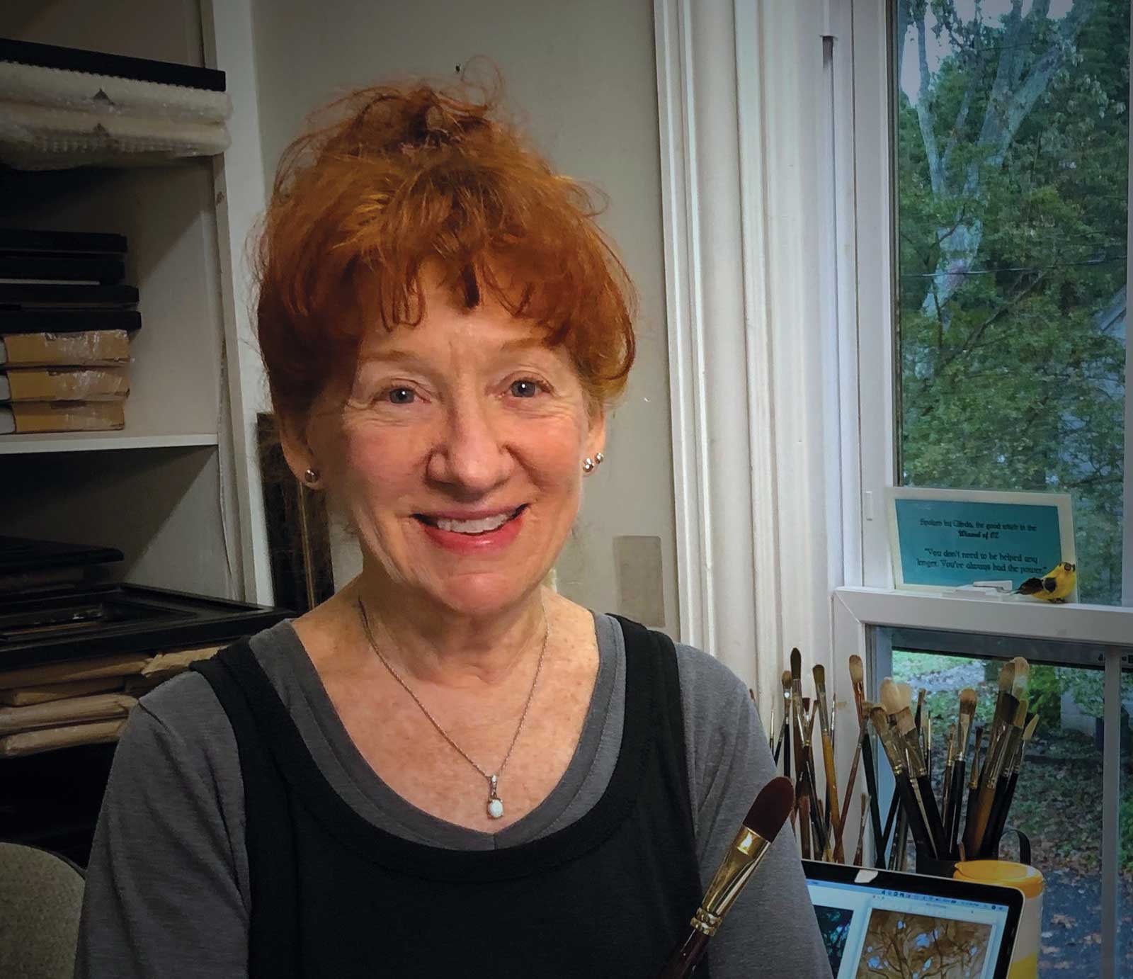 Sara Linda Poly
Born in 1945 and raised near Philadelphia, Pennsylvania, Sara Linda Poly has spent many years living, traveling, painting and teaching in the United States, Europe and Mexico. Known for her radiant light and her sweeping skies and landscapes, she is the winner of numerous awards and a participant in many local and national shows. Her most recent honors include showing her work at Plein Air Easton and the National Waterfowl Festival in 2020 and the Oil Painters of America Exhibition in 2019. Currently a full-time painter and instructor, Poly lives and maintains a studio in Easton, Maryland. She is represented by Berkley Gallery (Virginia), Principle Gallery (Virginia and South Carolina), Warm Springs Gallery (Virginia) and Troika Gallery (Maryland).
Contact at
saralindapolystudio.com