



My choice of subject matter represents the beauty of nature in all its forms, taking into account all stages of the aging process—from the tightly furled flower bud right through to the very end of the plant’s life cycle. This is because there are so many interesting and unexpected changes that take place in shape, color and texture as a plant grows and matures.
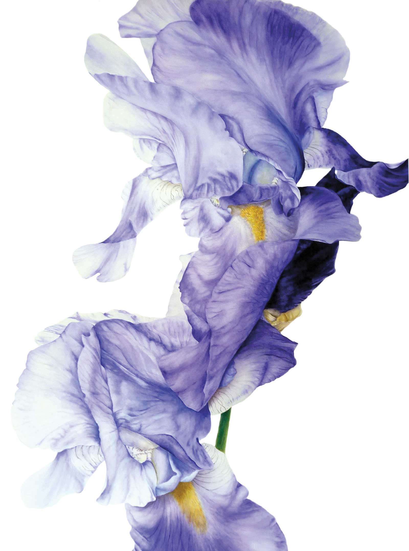
Blue Iris, watercolor, 43 x 31½" (110 x 80 cm) I wanted these two pale blue irises to flow into one another, like a cascade of soft petals. My aim was to capture as much movement as possible and have the petals fade out at the edges to create a feeling of fragility and lightness. I painted layers of water with my pigment gradually fading out, and then I used the contrast of the darker bud behind to really add impact and depth to the overall image.
Searching for inspiration means that I have to stop and really take notice of my environment, honing in on the beautiful, complex details in nature that exists all around us, from the sculptural structures and shapes that a plant or flower can weave as it grows, to its tiniest details and surface patterns that can be easily missed in the blink of an eye.
As I spend a lot of time out in nature deciding on which subjects to paint, I opened an online painting school to help and encourage others to get out into the healing powers of nature while learning new skills to further their own creative journey. I provide dozens of step-by-step tutorials to help people learn the skills needed to paint using my method. And once you’ve mastered the techniques, a whole new world of creative possibility opens up.
Although my tutorials are painted at a more manageable size, when I do my own work for exhibition or commission, I like to paint my subjects large. I enjoy the impact that a painting delivers when it is at least ten times its original size, and I also think it reminds people to slow down and really look and see what is around them when they are out and about during their daily routines. It promotes a more mindful approach to life and encourages a more settled, peaceful state of mind.
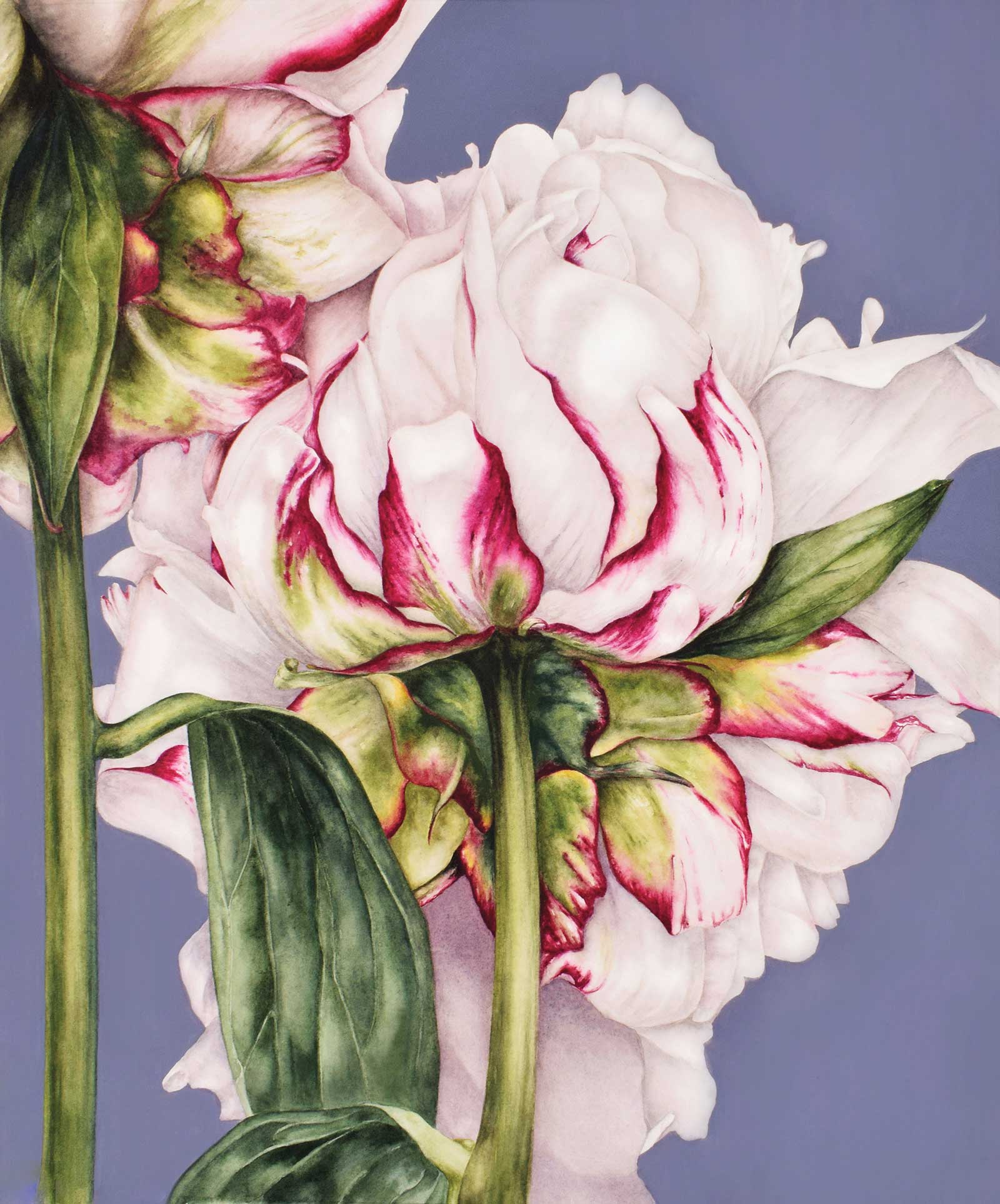
Peony on Blue, watercolor, 25½ x 21½" (65 x 55 cm) I usually paint my subjects on a white background as I like them to really stand out. I don’t want to detract from the main subject or its details, but I decided to experiment here. I used blue gouache to create a solid matte background so that the peony itself would still stand out and remain the central focus, while creating a more colorful overall image.
I mainly use a wet into wet technique as this allows me to create smooth transitions between my lighter and darker tonal values within the same petal or leaf. I like to start off by dropping in a thicker, more saturated consistency of my mix and then use my brush, clean and barely damp, to pull the paint out into the lighter surrounding areas. Working in this way I find it easier to create areas of intense, rich color. I find that while using watercolor, one of the most important things is to make sure that I retain the lighter areas and highlights, because once lost, they are very difficult, if not impossible, to retrieve and this results in a flatter looking image overall.
Working onto a damp surface also helps any texture or detail that I apply to soften into the background layers and look more natural. Toward the end of a painting, I also sometimes use a wet onto dry method. This is usually to deepen areas of color or shadow or to add definition and fine detail, but I am always aware of keeping my lines and edges soft and natural. I especially like to build up layers using color and pattern to create textured surfaces. When I’m creating a textured surface, I make sure each layer I apply dries thoroughly, so that when I add a patterned texture over the top, the underneath layer is not disturbed. And because of the transparent nature of watercolor, the texture, pattern and color will show through, creating a multi-layered effect that adds depth to my painting.
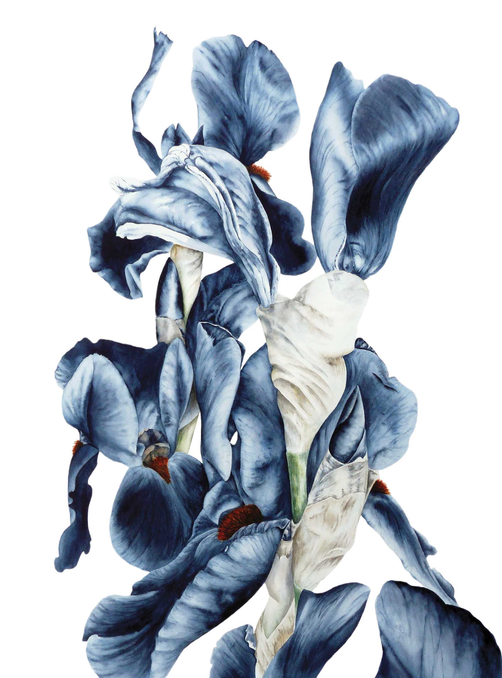
Iris Bouquet, watercolor, 23½ x 15¾" (60 x 40 cm) I originally thought I might add more color as I went along to this tumble of dark irises, but I liked the tonal contrast I was achieving using just one color, so I continued, just adding water for the lighter tones and then a more saturated pigment for the darkest. I added just a touch of burnt sienna and cadmium yellow for the stamen and the stems. It was a good exercise in creating form through tonal value.
I like to focus on the juxtaposition of strong solid structures against the fragility, lightness and grace that can be found in all stages of the plant’s life cycle. I find that watercolor lends itself to capturing the lightness and fragility of my subjects while still allowing me to build up layers to create deep, dark contrasts within the shadows and more solid areas of my subject.
My aim in painting these larger-than-life subjects from nature is to draw people’s attention to the wealth of beauty in the natural world on our doorsteps.
My Art in the Making Peony Bud
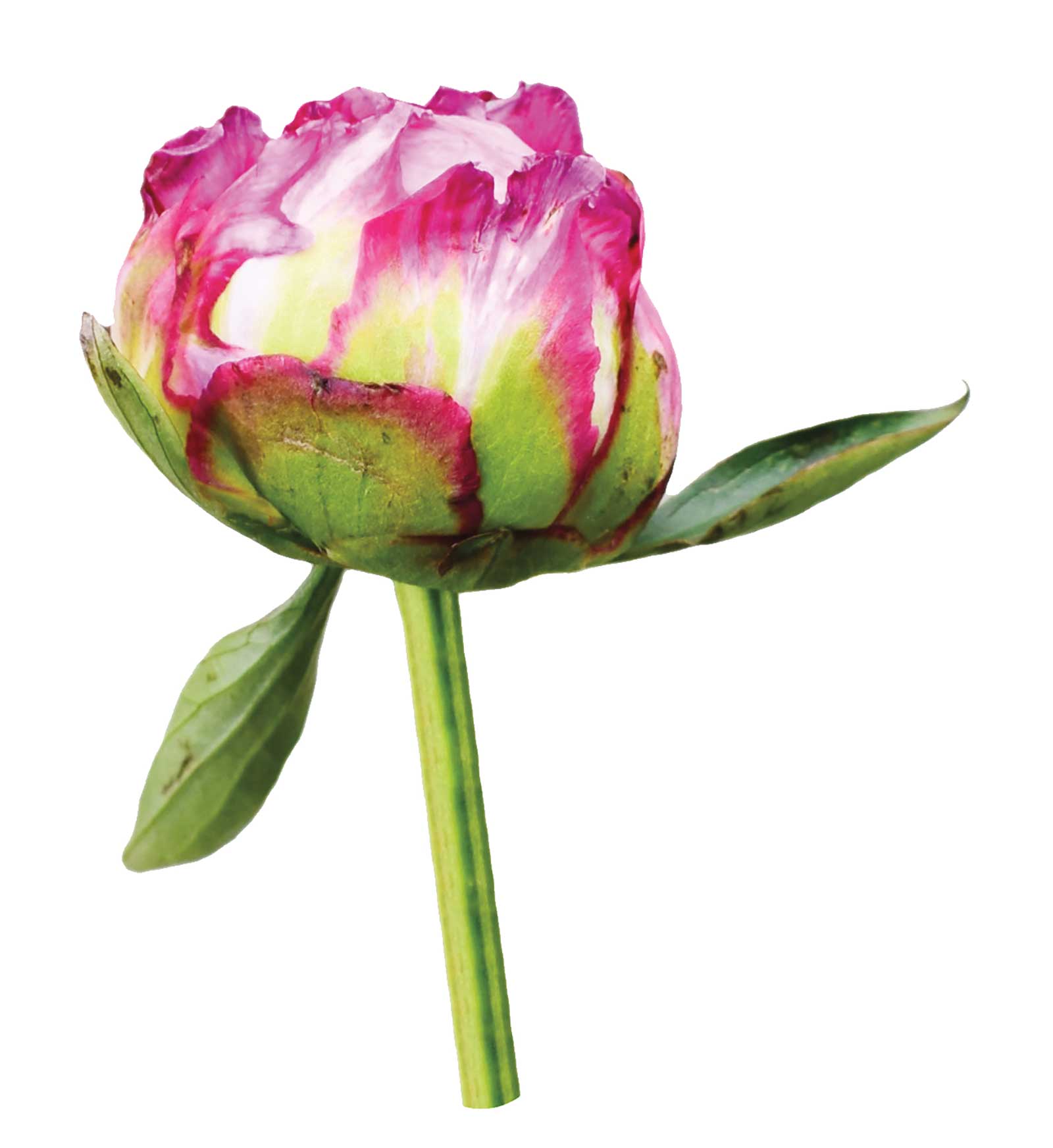
Reference Photo
 Stage 1
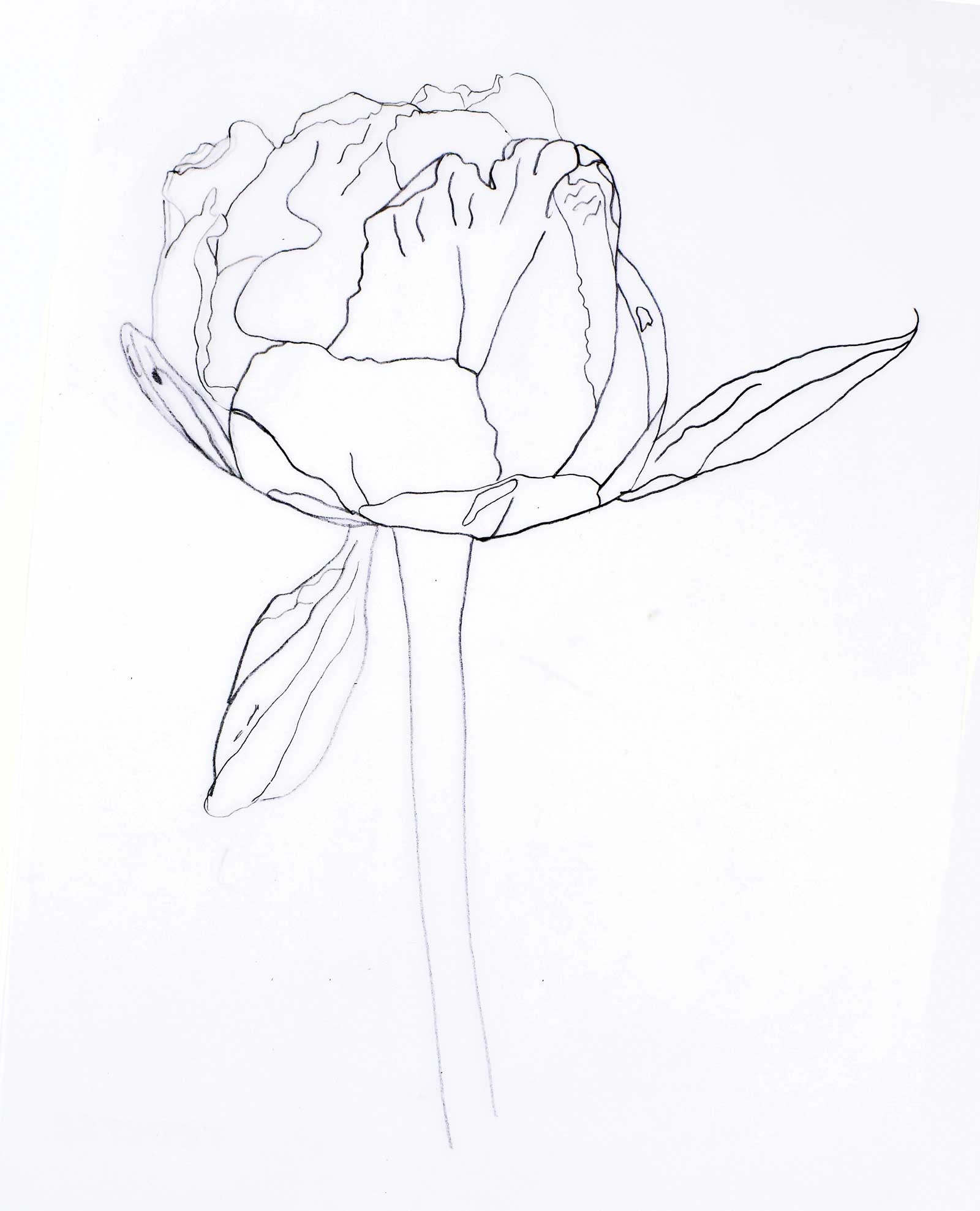
Stage 1 Drawing
Once I’ve drawn the outline of my peony bud onto my watercolor paper, making sure to be very precise with the edges and any details, I’m ready to start.
 Stage 2
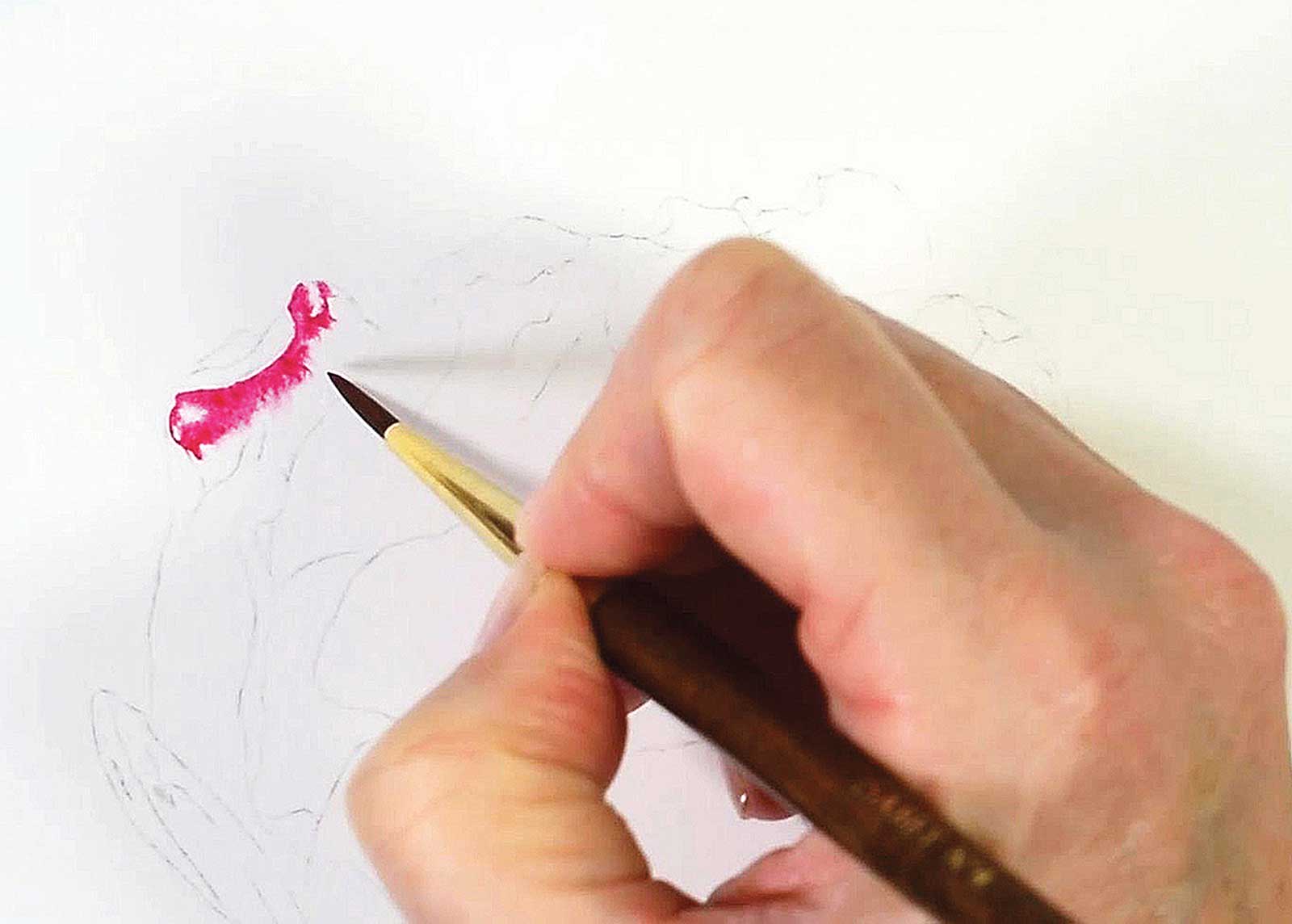
Stage 2 Edges of Petals
I paint in the pink areas around the edges of the petals. I’m using a wet into wet technique so that I get a smooth covering without creating hard edges within the petals.
 Stage 3
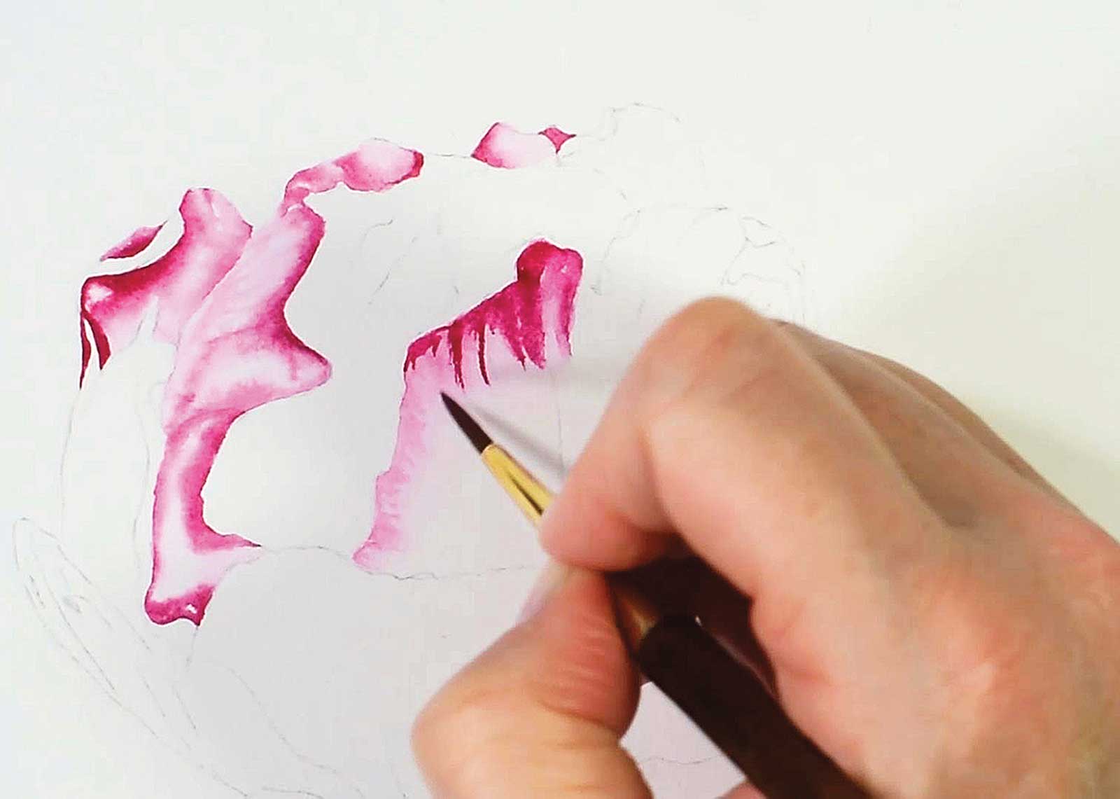
Stage 3 Building Form in the Petals
Using a wet into wet method of painting allows me to blend my darker pink into the lighter and white areas to create shape and form within each section of the petal.
 Stage 4
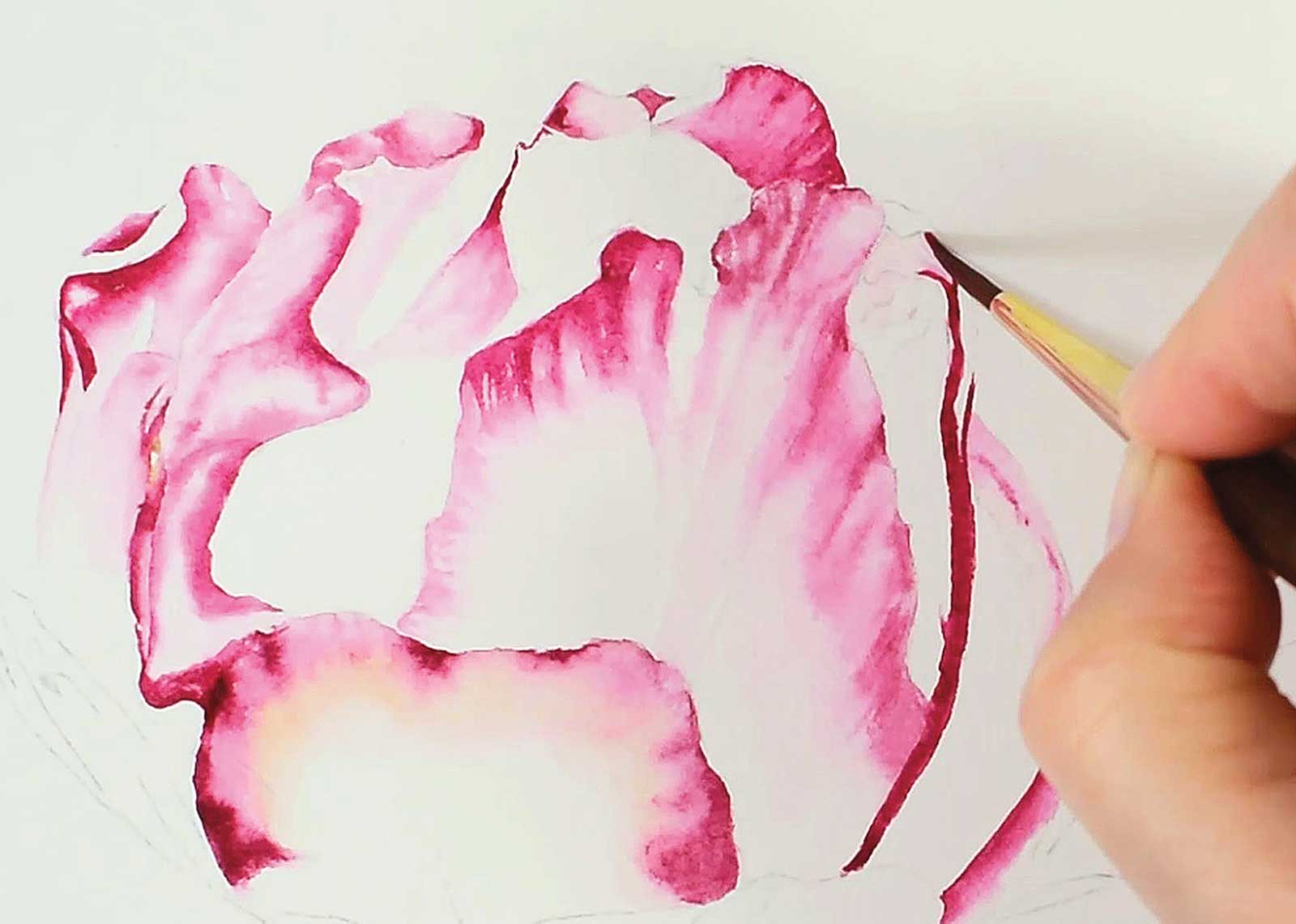
Stage 4 Darkening Areas
Letting my first layer dry, I come back in with a saturated consistency of my pink to darken up certain areas, letting the edges of the paint gently dissipate to create a natural edge.
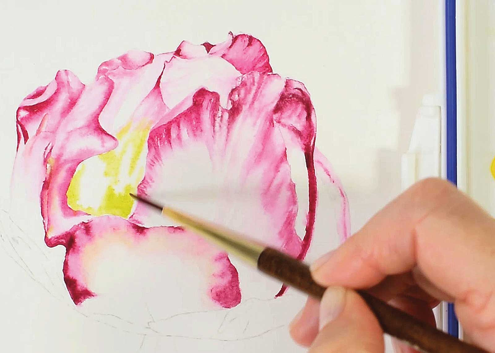 Stage 5
Stage 5 The Greens
Once I’ve completed the pink areas and let them dry completely, I start to introduce the green areas starting with the lightest green and again using a wet into wet method.
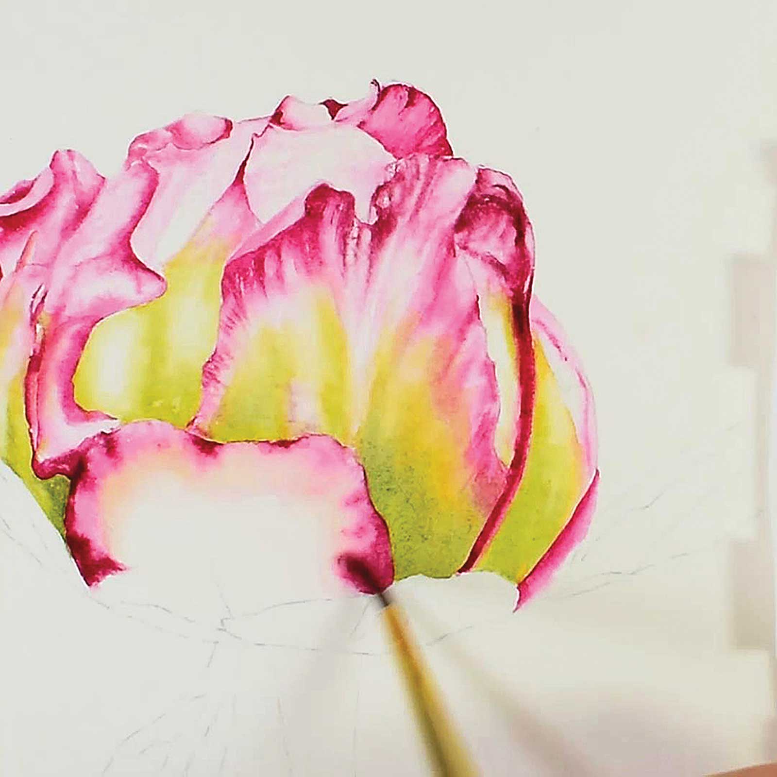 Stage 6
Stage 6 Blending
I blend the green into my pink and white areas, making sure not to muddy my colors, so I have to carefully control how wet my paint and my paper are in order to control where the paint flows.
My Design and Composition Tactics
- Choosing Your Subject
- I like to spend a lot of time looking until I find a certain shape, color or composition that really speaks to me. It may be a combination of all three, but you know it when you see it!
- Wet into Wet
- I use this method most of the time as it allows me to create smooth transitions between colors and light to dark values. It also helps me keep control over the quality of edges that I want, but I do control the amount of water I use very precisely.
- Blending colors
- It’s important to keep my colors “clean” while I blend one color into the next on my paper to avoid them becoming muddy, so I make sure my paint and paper are not too wet and lightly blend at the edges where they meet, always making sure I’m using clean water.
- Creating Contrast
- Contrast—the difference between the light and dark elements on the image—is so important as it creates form and depth in my paintings and helps create a realistic look.
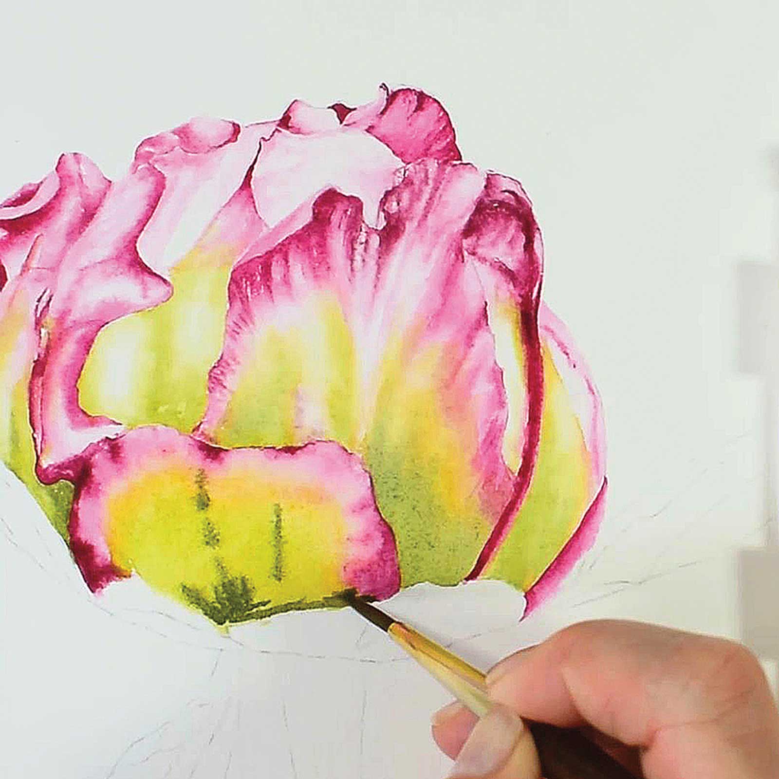 Stage 7
Stage 7 Depth of Color
Then I add my darker green to build up the depth of color where needed, while the first layer is still wet, so that the lighter and darker green merge into each other at the edges.
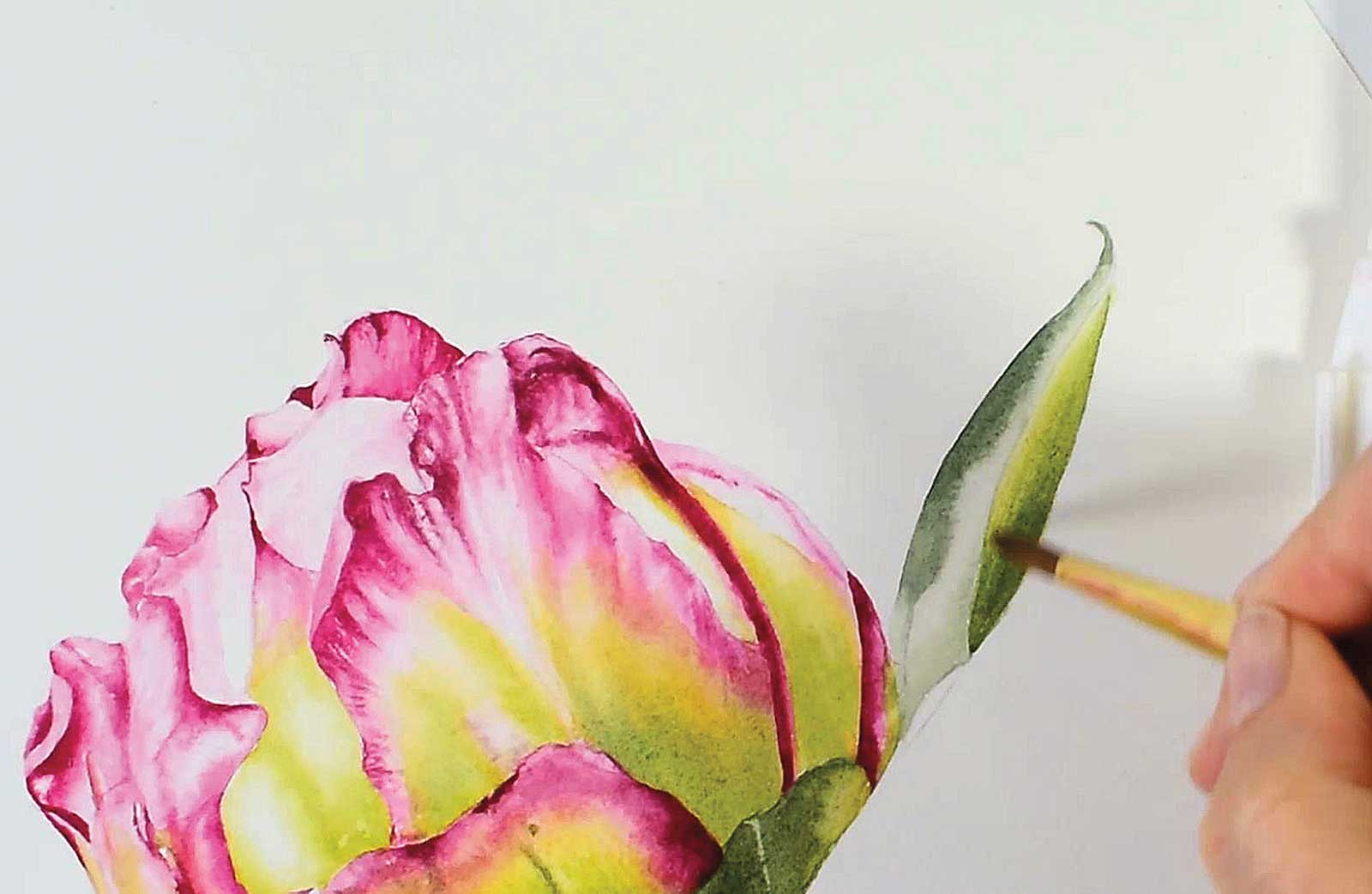 Stage 8
Stage 8 Painting the Leaf
Then I come over to paint in the leaf using various hues of green to add form and depth. I paint onto a barely damp surface and make sure I retain the lighter edges.
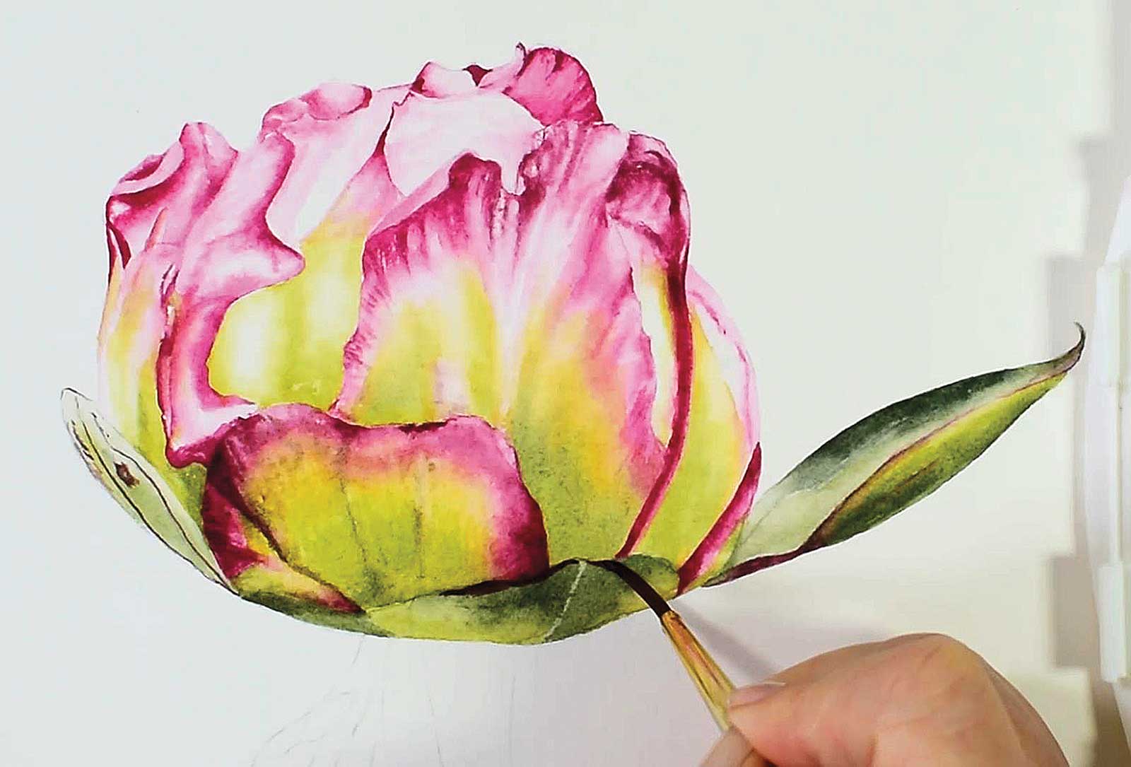 Stage 9
Stage 9 Refining the Flower
I work over my flower, adding definition, darkening the shadows and adding in any finer details. This stage creates contrast between the colors of the petals and creates a truly realistic three-dimensional image.
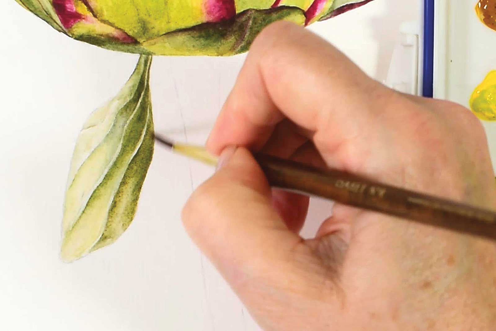 Stage 10
Stage 10 Second Leaf
I paint in my second leaf, again painting onto a lightly damp surface as I want to keep the edges, veins and any details soft, but without losing definition.
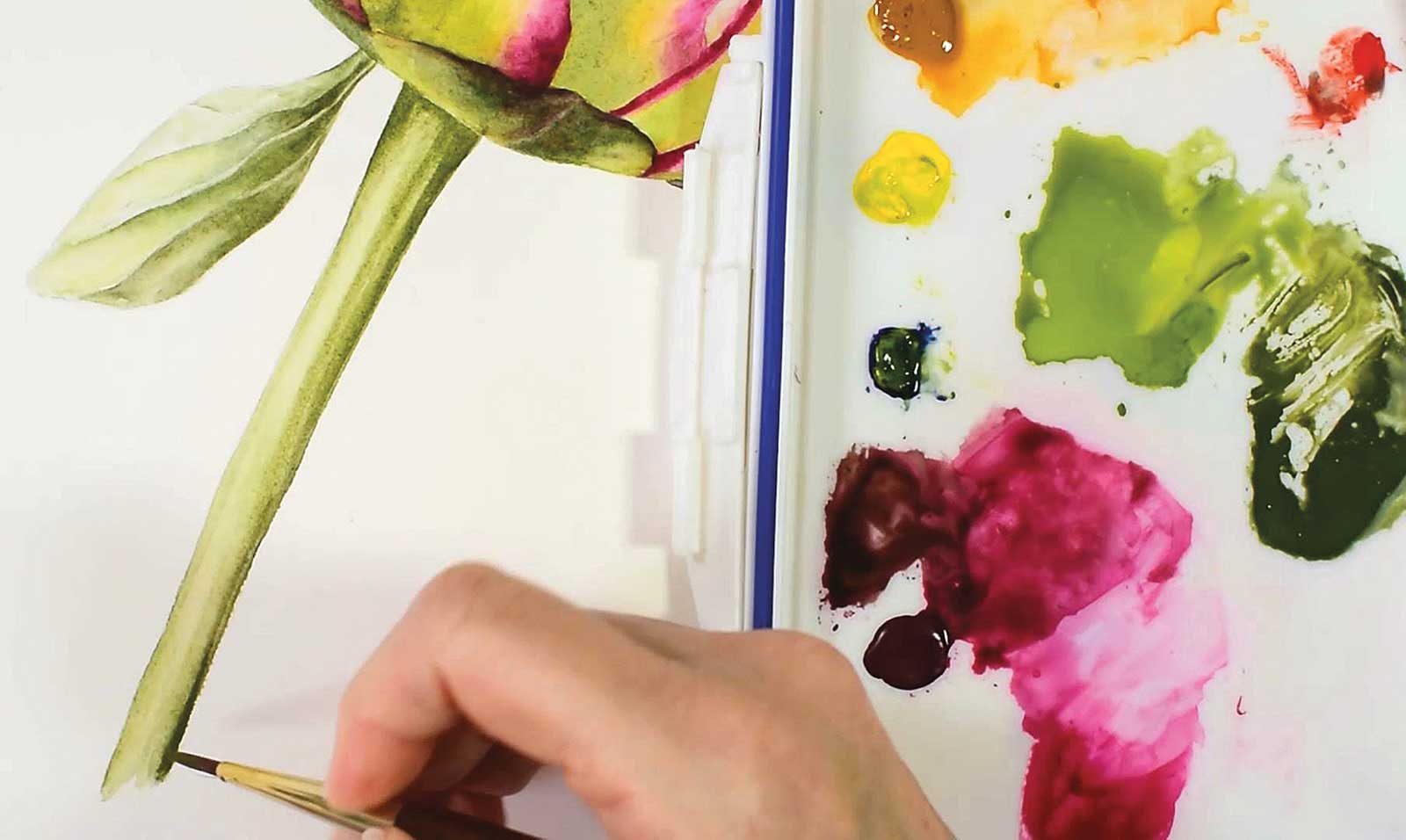 Stage 11
Stage 11 The Stem
While painting the stem, I leave a highlighted area down the center. This creates the illusion of a curved surface as the light is hitting the highest point of the curve.
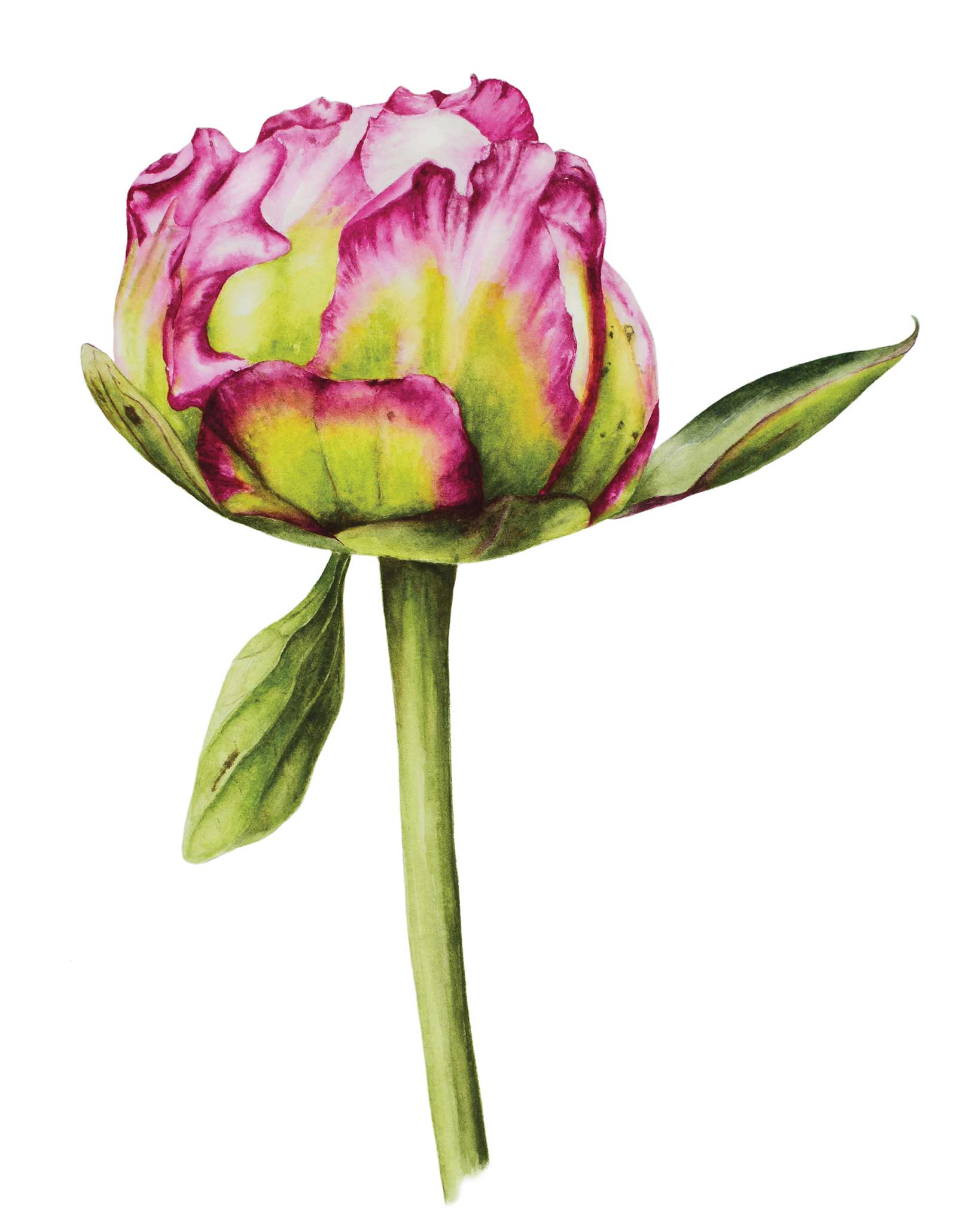 Stage 12
Stage 12 Finished Artwork
Peony Bud, watercolor, 15¾ x 12" (40 x 30 cm)
About the artist
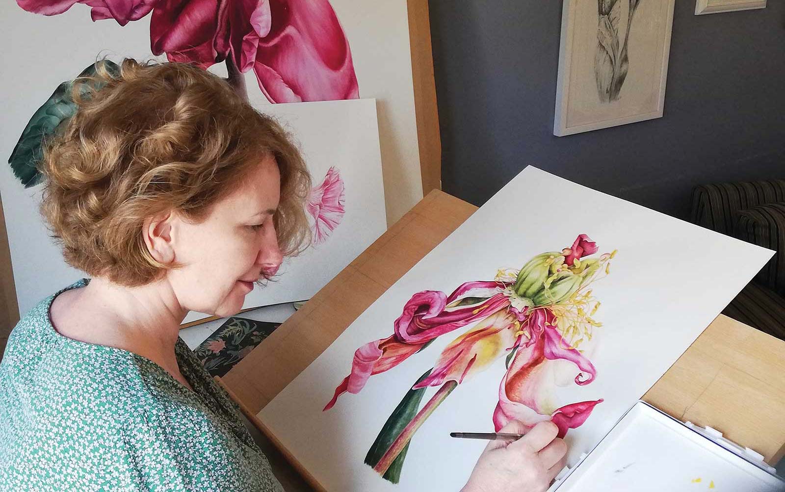 Marie Burke
Marie Burke runs an online watercolor tutorial membership club. It is her mission to help people explore their own creativity while gaining an increased sense of wellbeing through their connection with nature. She has had a creative passion for all things artistic since childhood. After studying in both the UK and Sweden, she finally settled on watercolor as it perfectly reflects the qualities that can be found in her choice of subject matter.
Burke started out working with abstract sculpture inspired by plant life, and this naturally transitioned into her painting, this time choosing a more realistic representation of nature.
She has exhibited widely and has award-winning paintings in private collections around the world. Her work has also appeared in magazine articles and as book cover art and can also be found in collaboration with soft furniture designer Voyage Maison.
The artist lives in Glastonbury, UK, where she runs the Watercolor Members Club, alongside widely exhibiting her own work. This Peony Bud demonstration is offered as a free online tutorial, which can be found at marieburke-art.com.
Contact at
marie_uk@yahoo.com
marieburke-art.com