


When I painted my first watercolor portrait of my toddler son 10 years ago, I discovered something very special that would greatly influence my artistic direction. I found out that I love painting faces, carefully mapping out their subtle nuances of colors, shapes and lines. In a recent series, I’ve delved into painting watercolor portraits of myself, my friends and family. My introspective self-portraits are contemplative and capture subtle emotions during cherished, ephemeral moments in my life. As I slowly and carefully build up the soft washes, I strive to capture more than just my likeness, but my feelings and internal experience at that time. In my portraits of friends and family, I offer viewers a glimpse into the beauty and complexity of human relationships, celebrating the richness of our shared moments. My affection for each subject is visible in the gentle brushstrokes and the delicate hues I’ve chosen to create them. I find the slow and steady process of painting in this meticulous way is both meditative and grounding.
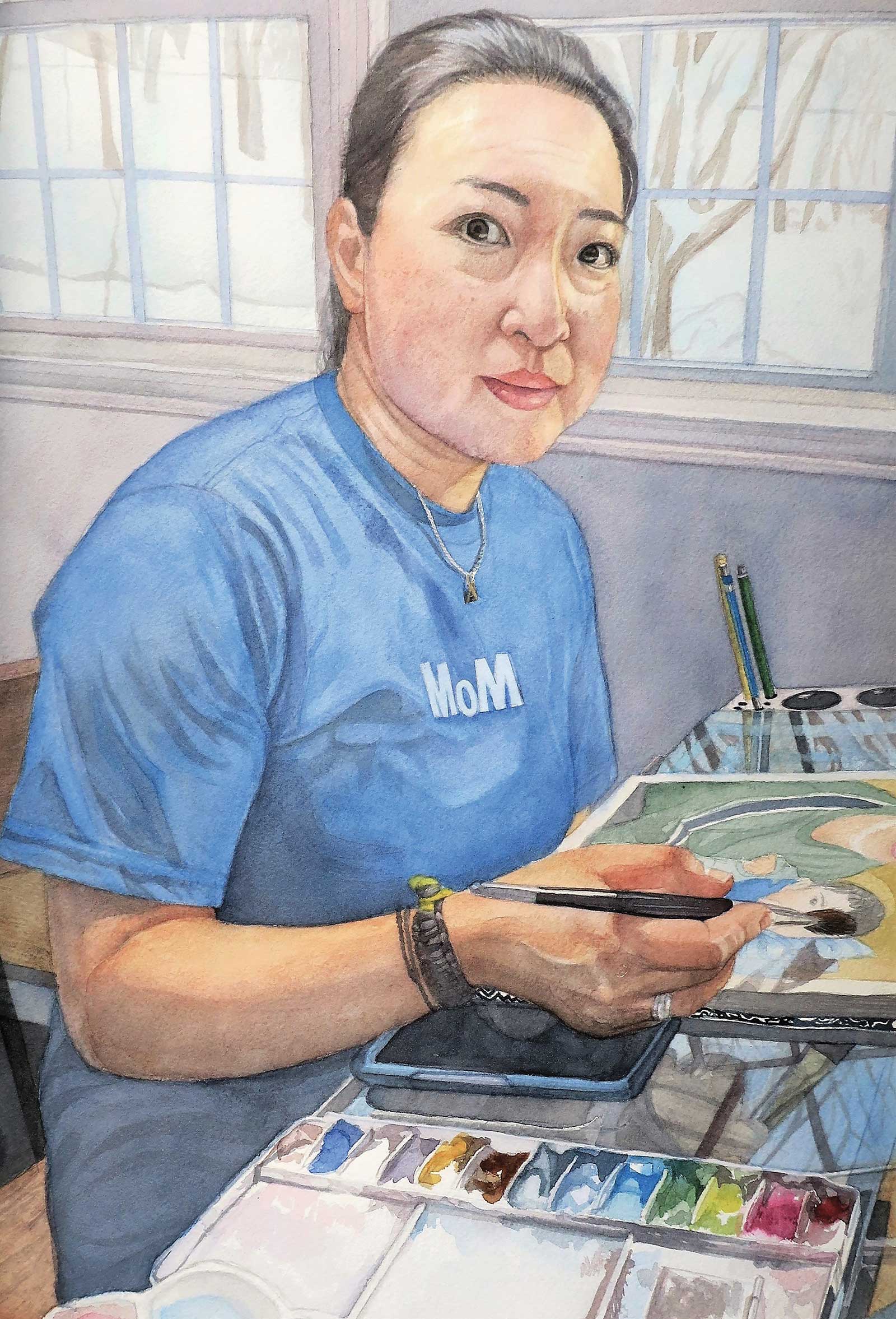
Winter Watercolor, watercolor on paper, 18 x 13" (45 x 33 cm) This is an important self-portrait, the first in my series of paintings of myself. It captures me in the act of painting with an inspired look on my face wearing a T-shirt that says “MoM,” a play on words with MoMA, the Museum of Modern Art.
To achieve this sensitivity and subtlety in my work, I’ve developed various go-to techniques. I use just a little bit of water and even less pigment on my brush and very slowly and patiently build my colors up, waiting in between washes for the watercolor to dry. This process creates a luminous and subtle effect. I often paint wet on dry, which also helps me control the application of the paint. Generally, I use round brushes sized 4 to 7, and reserve the larger mop or flat brushes for backgrounds. I use a wet-on-wet technique for areas of the skin where I would like to have subtle transitions. I emphasize the main features of the face such as the eyes and mouth with darker lines and contours, while the rest of the face is kept soft and subdued.
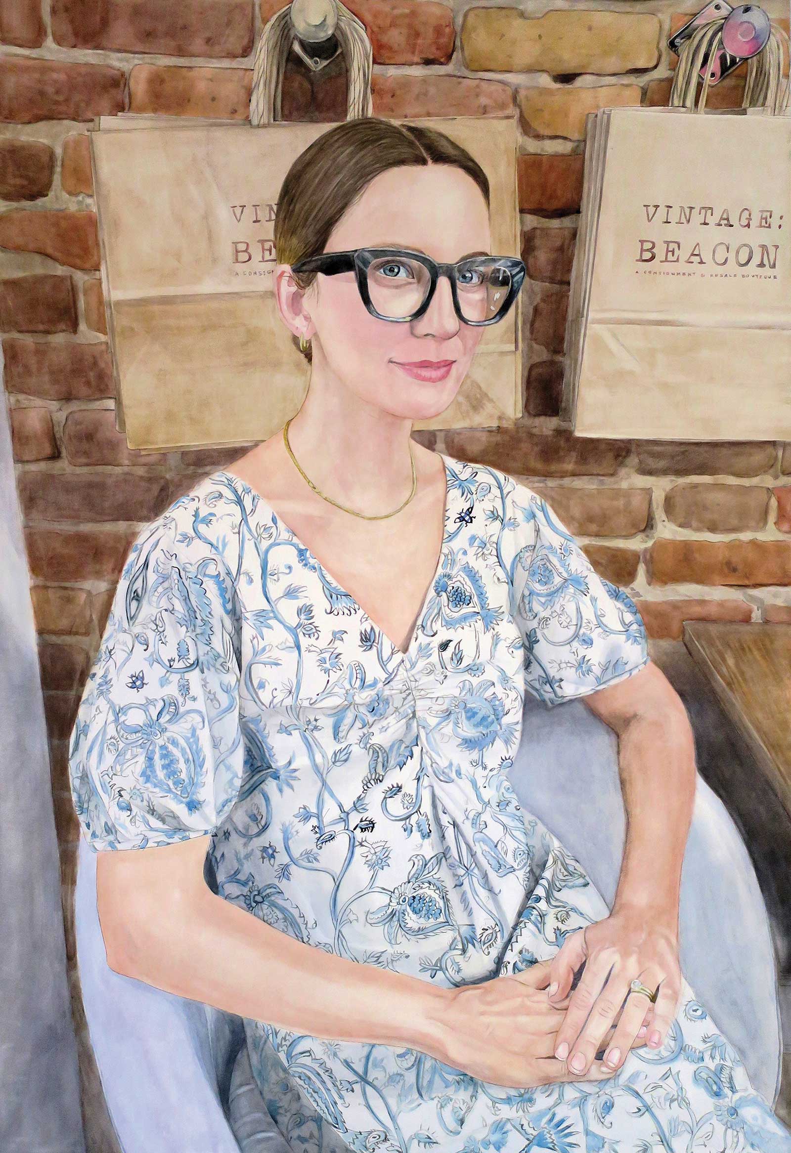
The Shop Keeper, watercolor on aquabord cradled board, 36 x 24" (91 x 60 cm) This painting depicts a lovely person who helped me when I was shopping in a cool boutique. I immediately asked her if I could take a photo of her for a painting as I wanted to capture her striking and eclectic vibe.
For my process to be effective, I must plan carefully. Because it’s difficult to lift large areas of pigment in watercolor painting, this planning is essential. Using the right tools is important too. Whenever I need to erase or blend an area, I use a handy blending brush. I also use masking fluid and masking tape to help me protect the white of the paper to achieve and retain highlights.
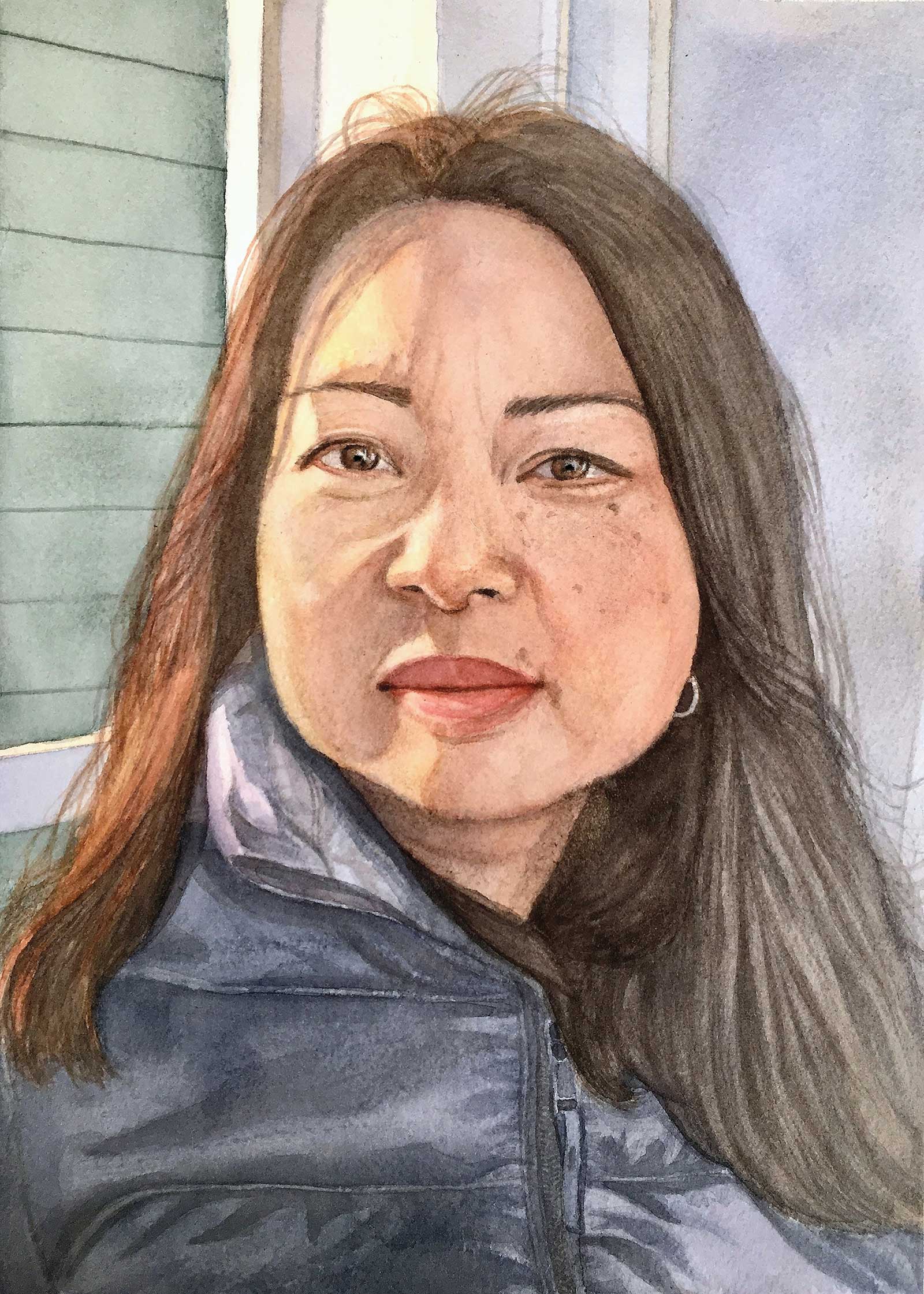
Maki, watercolor on paper, 12 x 9" (30 x 22 cm) This is a portrait of my sister. I painted it with a sepia underpainting first to capture the contrasts between the areas of shadows and the highlights on her face.
When I first began painting in watercolors I worked on smaller-sized paper (9 by 12 to 10 by 14"). My favorite paper is Arches 140-lb cold press. If I don’t want to stretch my paper, I sometimes use 300-lb paper, which is rougher and thicker. As I continue to grow and evolve as a watercolorist, I have challenged myself to paint on larger pieces, up to 24 by 36". I use Ampersand Aquabord for my larger work so that I won’t need to frame my finished painting with glass or acrylic. The clay surface has a different, slicker feel than the Arches paper, and I like both for the different ways they accept pigment. I usually paint in my studio using photo references, but I also look forward to drawing and painting from a live model whenever I have the opportunity to do so.
My Art in the Making Liz
 Reference Photo
 Stage 1
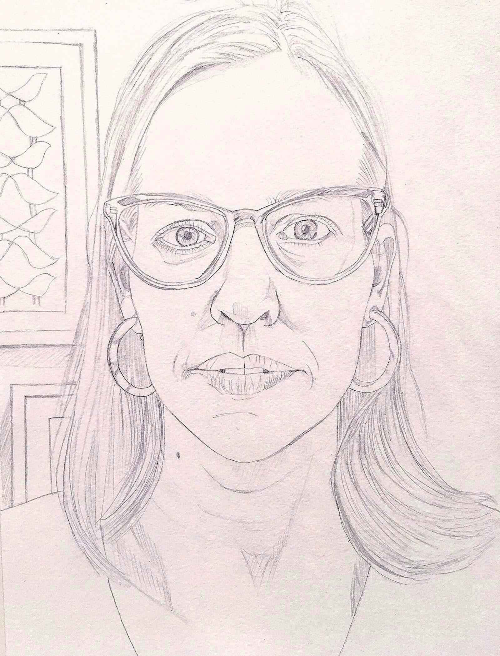
Stage 1 Sketch/Underdrawing
In this critical first step of a painting, I typically sketch my portrait carefully onto the vellum, and then using a burnishing tool I transfer the drawing from the vellum onto the watercolor paper. Drawing on vellum first allows me the ability to erase and correct my drawing. On watercolor paper, it’s always hard since graphite is hard to erase, and erasing on watercolor paper can be tricky. I use a very hard lead 6H pencil on watercolor paper for the underdrawing. Take your time to get the proportions of the features correct.
WHAT THE ARTIST USED
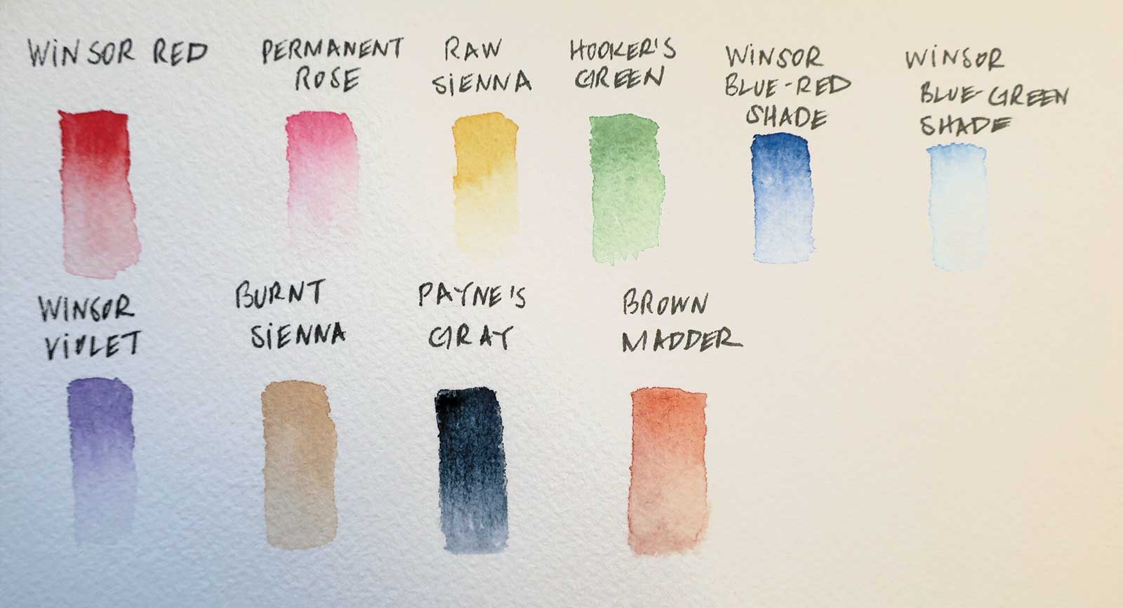
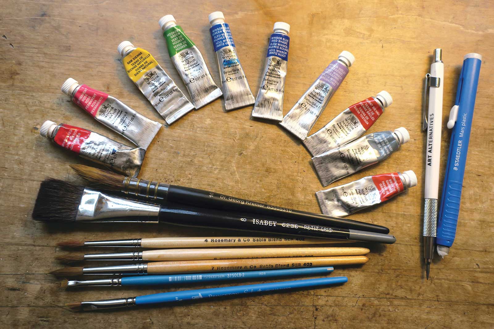
Winsor & Newton Professional Grade Watercolors
Winsor red, Permanent rose, Raw sienna, Hooker’s green, Winsor blue red shade, Winsor blue green shade, Violet, Payne’s gray, Burnt sienna, Brown madder
Brushes
Rosemary & Co. round synthetic/sable blend brushes 402, sizes 4, 5 (for details), 7 (for hair and larger areas), Isabey flat squirrel wash brush, size 8 or 10 (for background), Dr. Georg Kremer synthetic/squirrel brush, size 10 (for larger areas), Princeton chisel blender brush, sizes 2 and 4 (for blending and lifting)
Paper
Arches 140-lb cold press paper (in blocks) or separate sheets with Gatorboard support
Additional Materials
Graphite clutch pencils, 2B (for the transfer), 6H (for underdrawing), Vellum, Potter’s tool for burnishing the tracing from the vellum to watercolor paper, Eraser, Masking fluid (and a pointy, inexpensive brush to apply it), Rubber cement pickup eraser
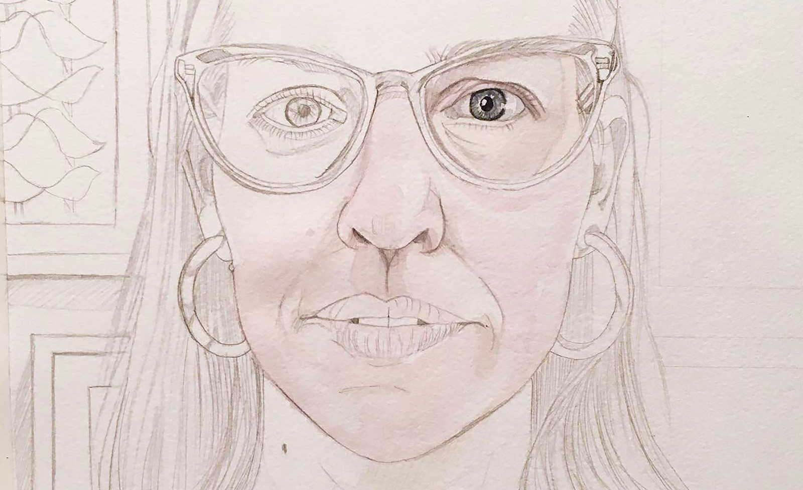 Stage 2
Stage 2 Painting First Layer of Skin Tone and Eyes
I paint very light washes of pigment section by section. I often mix permanent rose with raw sienna and a touch of hooker’s green (to neutralize the flesh tone) for my caucasian skin tones. I keep my transitions in the skin tones very soft and gradual. I work wet on dry and use water to soften my edges. Early in the painting, making “eye contact” with my subject helps me connect with the person, and I can start to envision what the rest of the face should look like.
 Stage 3
Stage 3 Painting First Layer of Hair and Glasses
Soon after I paint in the first or second layers of very thin wash over the face, and after the eyes have been carefully rendered, I start putting a light all over wash on the hair using the lightest tone I see in the hair (watered down burnt sienna mixed with raw sienna). I begin to model the glasses and use masking fluid to mask the white areas/highlights in the glasses and on my subject’s face.
My Design and Composition Tactics
- Directional lines can be dramatic or they can be subtle. I like to think of the stronger lines like a steel chain. My mid-strength directional lines are a piece of rope, and my finer, more subtle lines are the strength of a piece of string.
- Take many photos of people that interest you, even if they are strangers. Don’t be afraid to ask if you can photograph someone for a portrait. In most cases, they will be flattered. Start designing your compositions from the moment you start taking photos of your subjects.
- Constantly go through your photo library for inspiration and ideas. Remember to look through older photos, too.
- Before I start painting, I get a full-scale photo reference of my subject printed. Try not to work from a photo on a phone or a small photo that’s not in focus. Remember to crop into your subject’s face so that the face is clearly the subject of the composition.
- Plan out the location of your lights and darks before you start painting. For example, when I paint a portrait I make sure the area around the face, such as the hair, is darker than the face so that the face will stand out. Also, painting the background darker than the subject often creates a striking design due to the contrast it creates.
- If the background is darker than the subject, masking your subject before painting in the background could be helpful.
- Do not use white paint except for emergencies. The white of the paper peeking through is what should create the highlights.
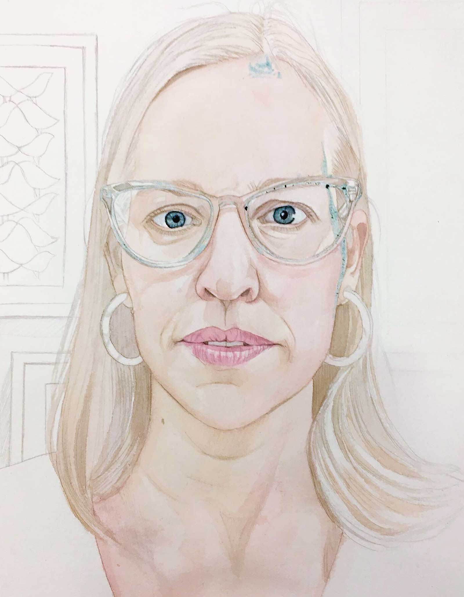
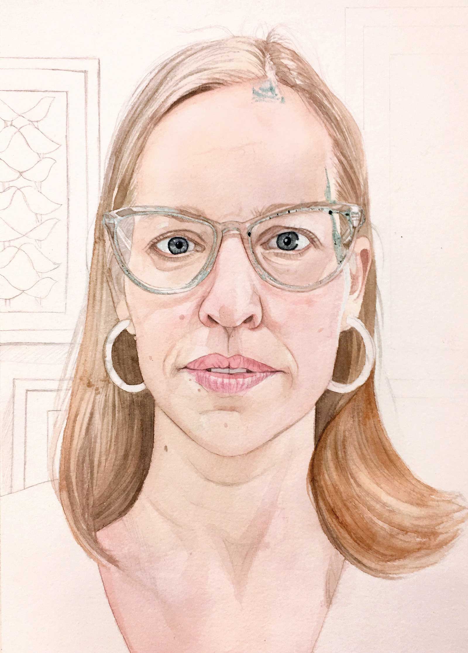 Stage 4
Stage 4 Darkening Initial Layers on Face and Hair
The portrait is slowly emerging and coming to life! I apply more layers of color to the face by slowly sculpting it. I apply the paint along the contours and the volume of the face. I begin to paint the shadows in the hair (with a mixture of burnt sienna and Payne’s gray) especially darkening the areas that surround the face to create contrast against her skin.
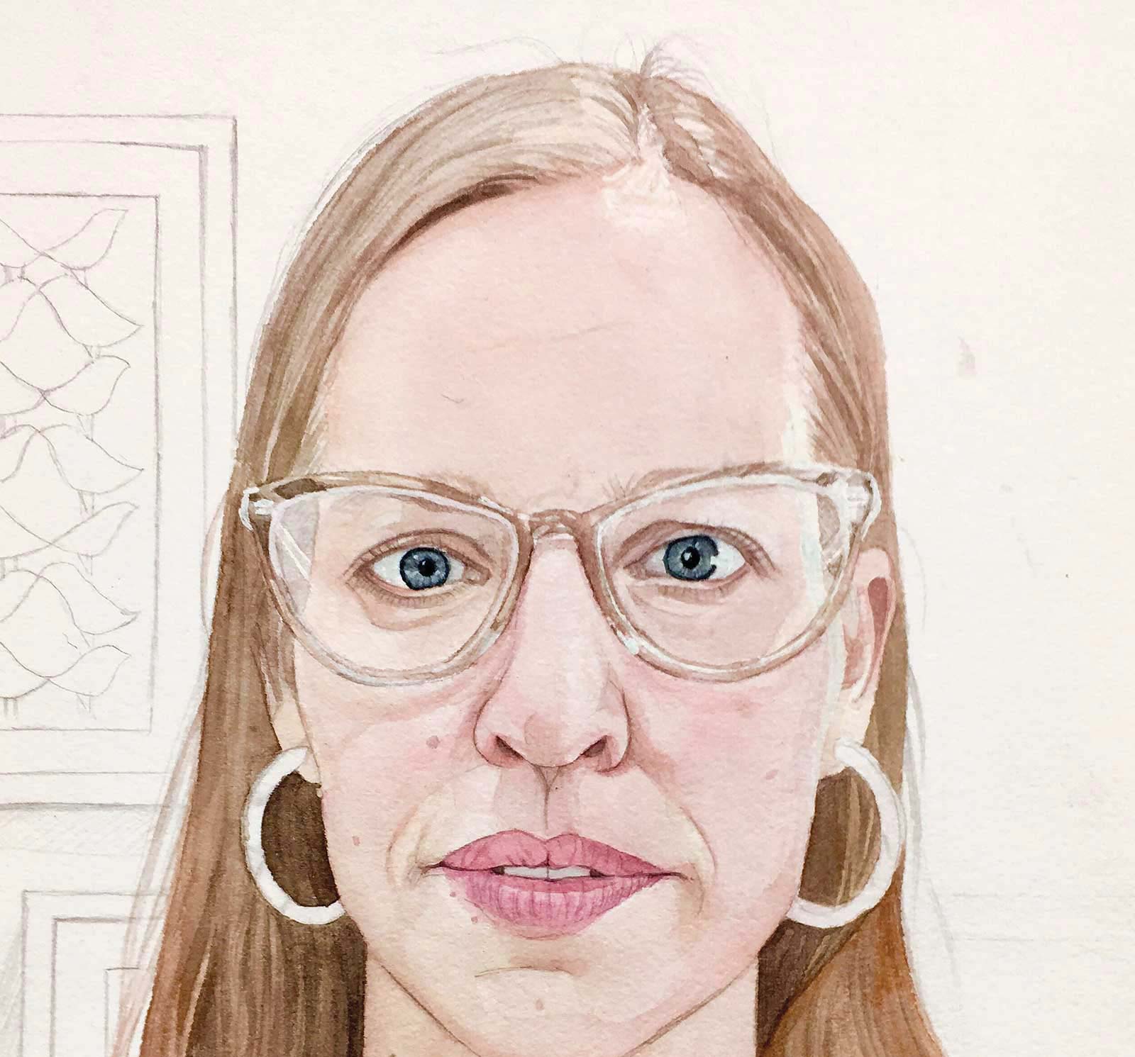 Stage 5
Stage 5 Removing the Masking
At this stage where the face is almost finished, I remove the masking fluid using a rubber cement pickup eraser. As you can see the highlights have been retained. I continue to darken her hair and skin. My process is slow, and sometimes I paint many light transparent washes over each other to achieve a luminous and rich appearance.
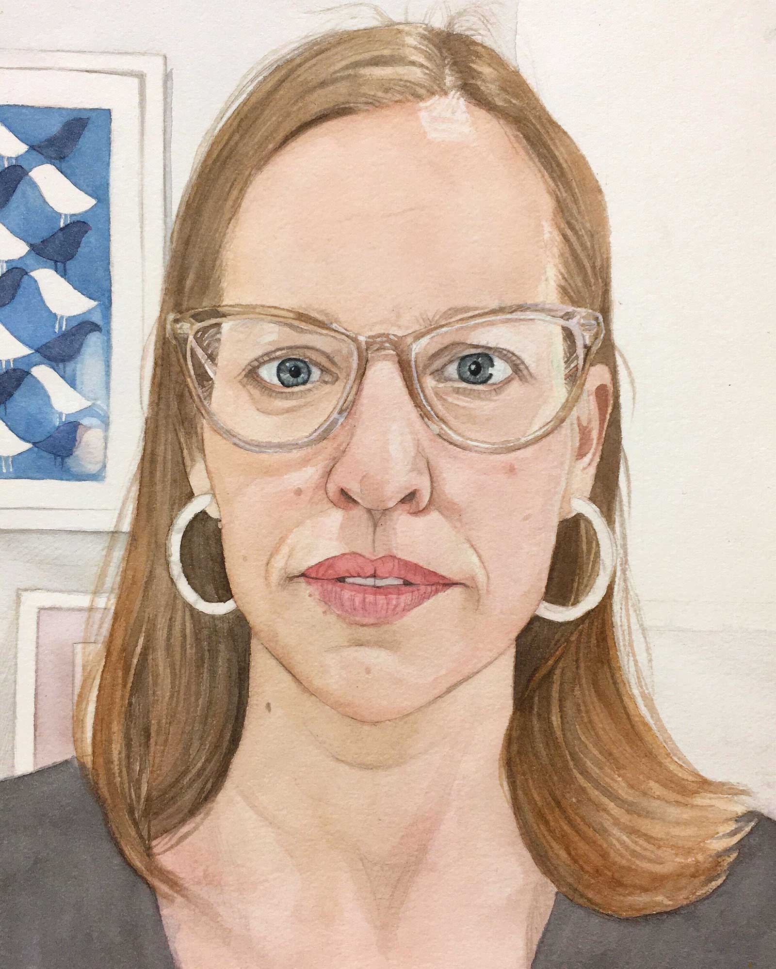 Stage 6
Stage 6 Painting the Background
I paint the details on the background of the scene, two framed paintings hanging on the wall, and paint the light blue wall behind the subject. Because the wall is lighter than the subject’s hair, I don’t need to worry about the edges. Even if I overlap the hair with the blue paint slightly, it won’t be visible.
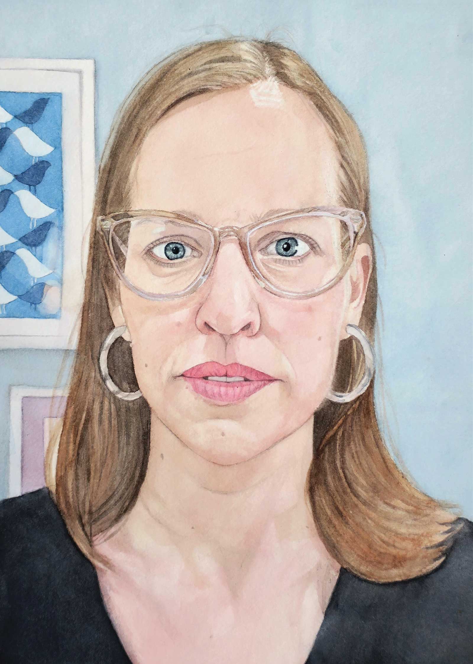 Stage 7
Stage 7 Finished Artwork
Liz, watercolor, 15 x 11" (38 x 27 cm) The highlights, including the white sparkle in her eyes, help give the portrait life and dimension. By keeping the background relatively simple and neutral, the focus of the viewer is on the subject’s intense gaze. The blue complements the warm tones in her skin and hair.
About the artist
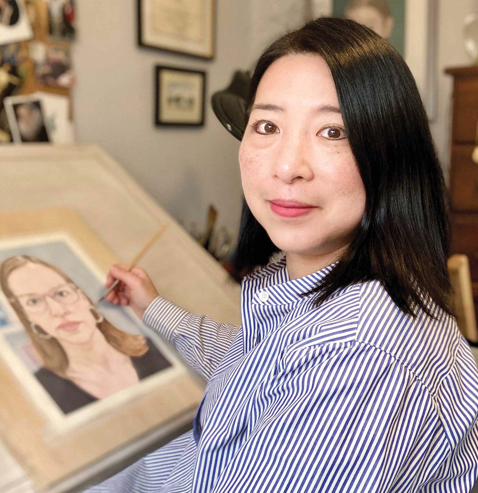 Aki Kano in her studio
Aki Kano is a New York-based representational watercolor painter and instructor. She received her BFA from the University of Michigan’s School of Art and later, following her passion for fashion design, attended the Fashion Institute of Technology in New York City.
Her meticulous and sensitive watercolor paintings, which consist mostly of portraits, have been accepted into prestigious juried shows in galleries worldwide, the Salmagundi Club and museums, and have won numerous awards. She has been the President of the American Artists Professional League since 2021, a non-profit organization founded in 1928, consisting of over 600 of America’s most accomplished realist artists. Kano is an honorary member of the Salmagundi Club, a juried member of the Catharine Lorillard Wolfe Art Club, a juried member of the International Guild of Realism and a member of PoetsArtists. She is represented by 33 Contemporary online at Artsy.net and is having an online solo show through the gallery, titled Face to Face, this July 2024. This year she is one of the jurors for the Spain-based 2024 Almenara Art Prize competition.
Kano is very excited that five of her watercolor portraits reached the moon via the Lunar Codex in February 2024. The Lunar Codex includes the works of more than 30,000 artists, writers, musicians and filmmakers from 161 countries. To learn more visit lunarcodex.com.
Represented by
33 Contemporary on Artsy.net, artsy.net/partner/33-contemporary
Contact at
aki@akikano.com
www.akikano.com