



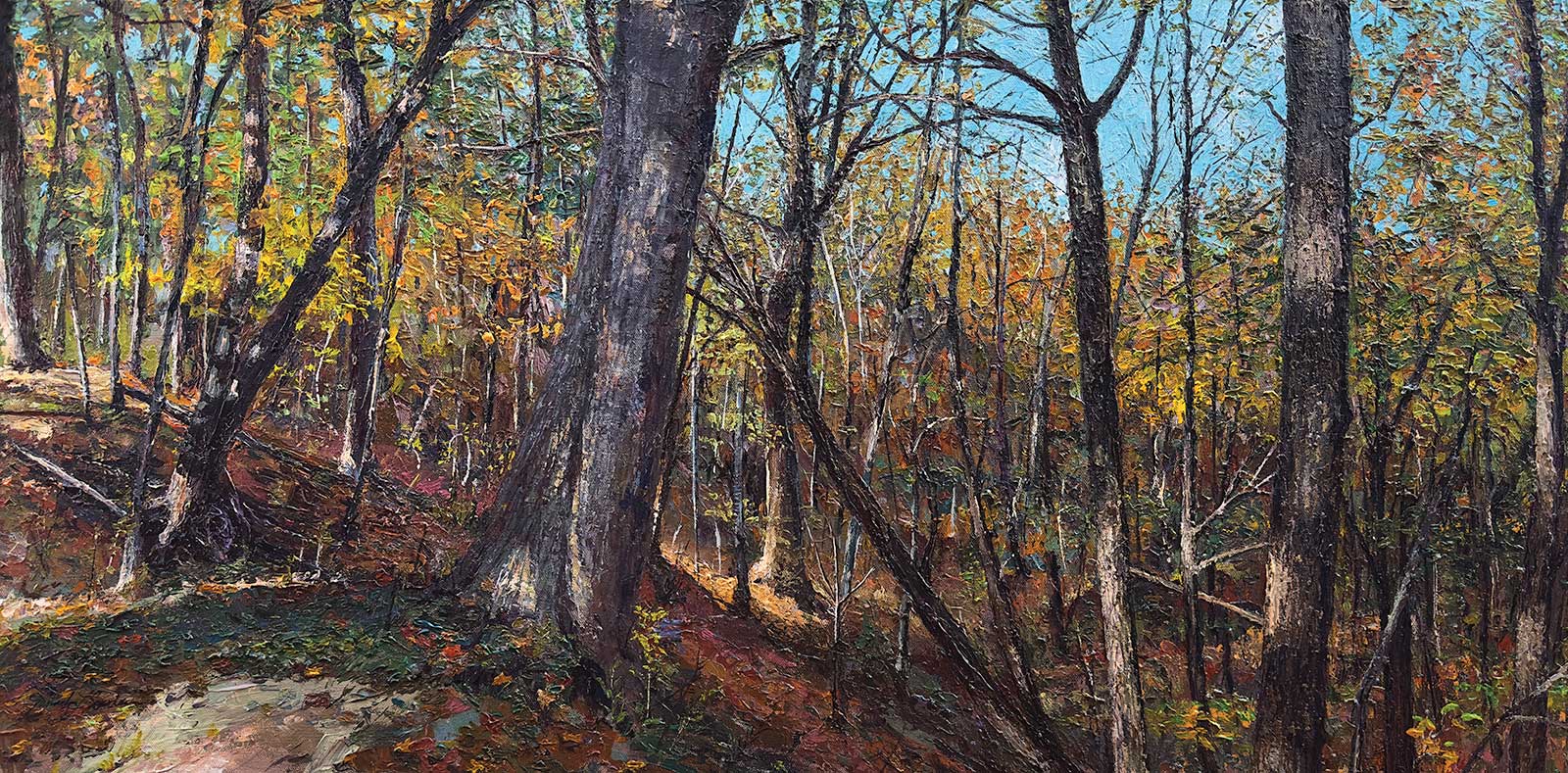
 Brecksville Ridge, acrylic, 20 x 40" (50 x 101 cm)
Grand Prize
Grand Prize is a four-page editorial feature in American Art Collector magazine
Jennifer Sowders
Ohio, USA
Shrouded in Nature
Growing up in rural Ohio surrounded by farmland, woods and a stream, artist Jennifer Sowder is a natural realist at heart. “While my friends in town rode bikes and played all summer, I found myself adventuring and studying nature. I moved back to my childhood home in 2012, and thereafter, a plein air painting group reawakened my inspiration to study and explore but this time through landscape painting,” she says. “Gardening has always gotten me outside and inspired, but traveling and looking for showstopping scenes fuels my work—I am blessed to be able to walk out my studio door and go on a hike on our property and be enveloped by nature.”
Light is an important element in Sowders’ art (she used to paint with her plein air group weekly), chasing the perfect light for her nature scenes. “I have had some outings where the sun hasn’t shone and yet the color, texture and value in the scape have satisfied my requirements for a painting,” she says. “But I’ve also leaned up against a tree for 10 minutes waiting for the light to break as well!” While the artist primarily paints in acrylic, she also works with watercolor, watercolor pencils and ink.
“I began painting acrylics with a palette knife during the 2021 Covid lockdown,” she reflects. “Because it was an impromptu decision, I didn’t prepare the canvas with any white-knocking washes. I simply did a quick sketch on the white ground and began painting. Not always, but this method has ‘stuck’ with me because I value the fact that it forces me into building texture and more color variation simply because I’m doing more mark-making than allowing a generic colored ground to peek through the painting.”
She adds that while she loves painting landscapes, she’s fond of portraiture as well. “Again, something that stemmed from Covid lockdowns—in spending so much time with family. Because painting with a palette knife can be such a physical ordeal, especially with a larger canvas, painting in between my acrylic work with a landscape or my genre/portraiture series (both utilizing watercolor on Yupo) gives me a little bit of a rest. Not to mention, never getting bored. I find myself already dreaming of the next painting in an opposing series at the end of one I’m currently working on.”
My Inspiration
I am most inspired by dense landscapes from trips I take, like this one from the Cuyahoga National Valley Park, specifically in Brecksville, Ohio. Especially during my favorite season of fall; not only for the beautiful show of color but the quality of autumnal light. The specific trail I took led out onto a peak of a ridge where both sides had steep slopes. It was an adrenaline rush in watching my step, so as to not fall headlong, but also because the light was so magical slipping through the dips in the ridge, making a marvelous dance of light and dark in the scape.
My Design Strategy
I don’t consider myself a photographer, but I really do look for scenes that carry a balanced and yet magnificent view. I look for a “lush-and-loaded” scene full of color, texture and dappled light, and this scene checked off all the boxes. I took hundreds of pictures that day in the fall of 2022. I did stick closer to my reference image because the accuracy in object size helped to push the depth in my painting. The light and color did the rest.
My Working Process
For Brecksville Ridge, I put a banded ground wash down on the surface of the painting before I laid my sketch down. The palette knife was definitely the workhorse in my painting. I started with sky and then concentrated on dark values. Next, definitive patches of color, and then the painstaking development from the highlights, through the middle-grounds and back into the darks. Next, I combed over the surface of the painting several times to cover up any ground poking through, dotting thick paint with a silicone-tipped implement. Lastly, I used paint-laiden string in a whipping fashion for creating some of the tree branches.
Contact Details
Email: mongalleryandart@gmail.com
Website: www.MONgallery.us
Second Prize
Second Prize is a two-page editorial feature in American Art Collector magazine
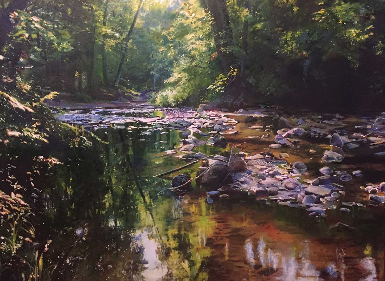 If I Could Walk On Water, oil, 30 x 40" (76 x 101 cm)
Dan Knepper
Ohio, USA
My Inspiration
This is the easiest question to answer. I went to the mountains, and I found my path. I realized this is what I want to paint—this feeling, this connection, this discovery, this moment. I want to paint these last wild places and the wildlife that inhabits them in such a way that standing before my paintings you are transported to the moment, in that place. I want you to smell the sagebrush and pine, marvel at the sparkle on the water cascading and plunging to fall from dramatic heights, taste the dust kicked up by the bison or cowboys working the herd and breathe in the West.
My Design Strategy
I was at Quest for the West and realized I had moved back to look longer at the painting I’d just left. What a revelation! I try to use strong design to bring the viewer in from across the room, and then color and detail to keep the viewer transported into this place at that moment. My colors are the slightly saturated chroma that we remember from being there rather than the disappointing colors captured by a camera.
My Working Process
My working process begins with taking good reference photos, which often means planning to be in the right place at the right time of day, sometimes hiking before dawn to be there, or sometimes just facing in the right direction to allow descriptive light to illuminate foliage, or reflect as well as pass into water. I vary angles and exposures. I’m always experimenting with my painting process so it varies from painting to painting. I’m a bad example. I often get caught up in details too quickly, so I’m trying to make myself start with the large areas and gradually work toward the details.
Contact Details
Email: danknepperart@yahoo.com
Website: danknepperart.com
Third Prize
Third Prize is a one-page editorial feature in American Art Collector magazine
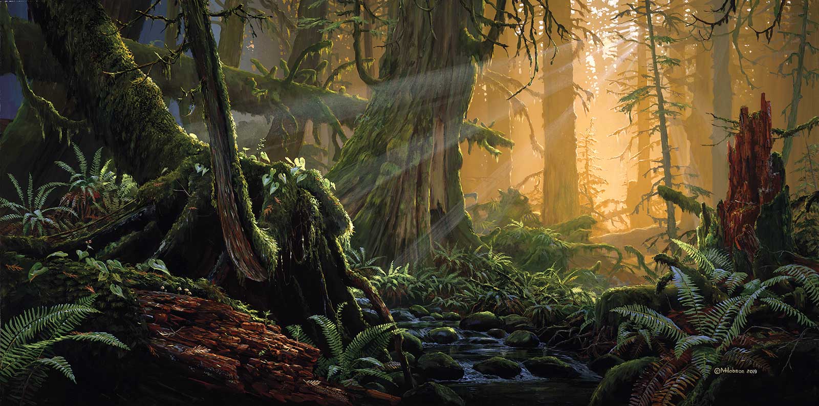 Sun Rays In The Forest, acrylic, 32 x 64" (81 x 162 cm)
Mark Hobson
British Columbia, Canada
My Inspiration
I’m fortunate to be living on the west coast of Vancouver Island where there still exists stands of unlogged ancient forests, so most of my paintings are celebrations of the natural world. Many of the cedars are over a thousand years old, and over time the forest floors have acquired an endless variety of complex shapes as layers of fallen trees overlap with one another. These scenes appear utterly chaotic, but every species of tree, moss or fungus has its own specific role. Within the chaos everything has its place. As a trained biologist I love the way it all fits together. It is this interconnectedness that I wanted to portray.
My Design Strategy
A cohesive composition of a complex forest scene is tricky. The design evolves from hours of observation. Creating the feeling of such an expansive subject within the confines of a canvas is a challenge and took a few days of planning. Maintaining the randomness of the forest and not making it look contrived or organized is important to the overall impact. There were a few pieces that I wanted to include to tell the story: the large old cedar, a stream, some twisted young cedar, a fallen tree, mosses, ferns and rotting wood. The wood adds an important reddish brown color to the overwhelming greens.
My Working Process
To start I layered multiple coats of acrylic paint with sponges, making a gradual transition of warm colors to cooler gray. Once dry I painted the sky holes using a mixture of white and cadmium orange, working in the various tree species shapes. Next, layers were added from the most distant to the foreground using raw sienna. To keep the perspective I premixed these colors and stored them in air-tight containers. This is a crucial step since the acrylics dry darker than when applied, which makes it impossible to create aerial perspective. Keeping the ferns and moss-covered logs fairly dark at the beginning is helpful. Once the canvas was covered, I went in and carefully added sunlit highlights to the edges of various shapes. The last nerve-wracking step was the streams of hazy sunlight. To keep straight masking tape was used on each ray. With the canvas lying flat I wiped over with a moist sponge and a dilute mix of cadmium orange and white. Before it dried I removed the tape and quickly ran my finger along the edges to soften the harsh edges.
Contact Details
Email: art@markhobson.com
Website: markhobson.com
Finalists
Each receives an Award Certificate and a one-year subscription to International Artist magazine PLUS having their work seen worldwide by international galleries looking for new talent.
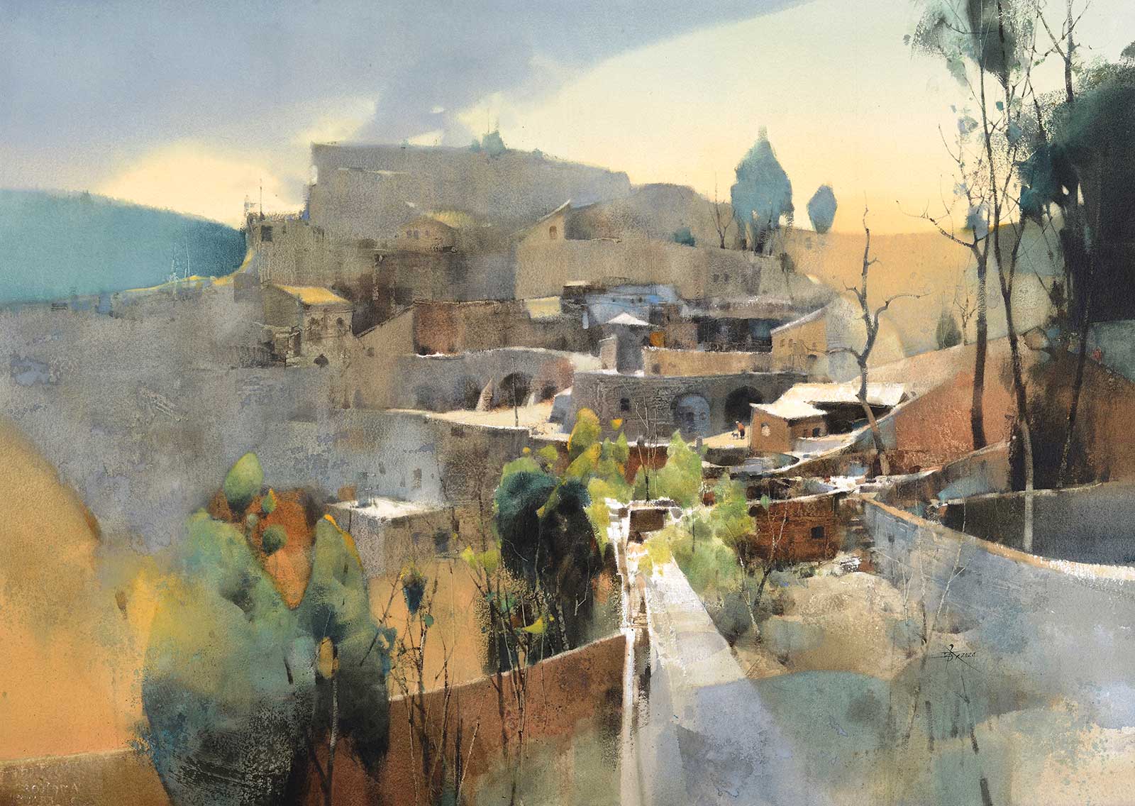 Potala Palace on the Loess Plateau, watercolor, 29½ x 411/3" (75 x 105 cm)
 Chien Chung Wei
New Taipei City, Taiwan
My Inspiration
In September 2023, I was invited to visit Jinzhong City in Shanxi Province, China, where there is a village over 400 years old called “Dongjialing.” It was named a famous historical and cultural village in Shanxi Province in 2009. Surrounded by mountains, the quaint houses of the village are layered on the slopes, creating a spectacular and breathtaking sight that fills one with surprise and admiration! At that moment, I decided that I would paint a large watercolor with the theme “the Potala Palace on the Loess Plateau” to commemorate this memorable trip.
My Design Strategy
I started by determining the colors of various elements, such as the yellow earth, gray old houses, red brick walls, bright yellow sky and dark green trees. After simplifying the shapes of these elements, I then allocated suitable areas and positions. My interest in two-dimensional composition far exceeds that of representing real three-dimensional spaces. In the process of design, I emphasized the rhythmic sense of abstract lines, which is the secret weapon I use to unify the image.
My Working Process
Since this watercolor painting has a long side exceeding 100 cm, I had to use a flat painting technique to fill in the areas with color blocks before delving into the details. I often repeatedly wash the color blocks to adjust the brightness and hue, ensuring that each individual color block complements the overall design. Additionally, I use a palette knife on some color blocks to create interesting textures and scratches, making the image rich and enduring to behold.
Contact Details
Email: hibariprince@gmail.com
Website: facebook.com/hibariprince
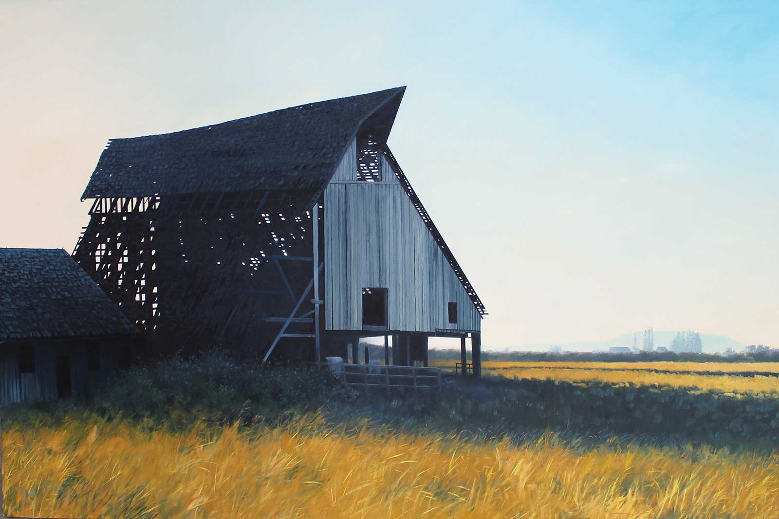 Icon, oil on canvas, 48 x 72" (121 x 182 cm)
Andy Eccleshall
Washington, USA
My Inspiration
This painting depicts a beautiful old barn just south of Edison, Washington, in the Skagit Valley. Subjects like this fascinate me. It’s the untold story. Who built it and why? What is their story, and why was it left to decay? Since I completed the painting the old barn has been torn down, and I’m honored to have been able to capture it before it was gone. The drama of the structure in shadow against the bright, minimal landscape made for a striking composition, especially on such a large canvas.
My Design Strategy
This painting is composed with an emphasis on balance. Warms and cools, positive and negative spaces, light and dark. The sky changes subtly from warm white on the left to pale cerulean on the right. The contrast of the barn in shadow is enhanced by a hairline of manganese, which runs around the outside of the structure. The visual weight of the barn balances the light of the open sky and the warmth of the grass below.
My Working Process
I like to create plein air color studies. I find it the perfect starting point for a studio painting. Once I have my study I begin working out the composition with a series of thumbnail sketches, in this case working with the golden ratio to establish important intersections within the painting. The canvas is toned and then the entire composition is blocked in, slowly getting refined with each additional layer until I am satisfied with the overall feeling of the painting. I always want the viewer to be able to “feel” the painting, the sun, the wind, the rain.
Contact Details
Email: ajeccleshall@gmail.com
Website: andyeccleshall.com
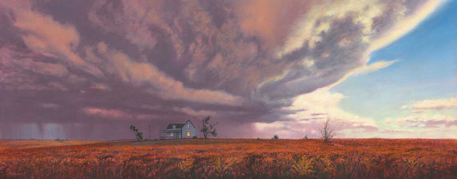 The Safe House, oil on canvas, 16 x 39" (40 x 99 cm)
Mark Harrison
East Sussex, UK
My Inspiration
This painting is part of a series of metaphorical American landscapes called Point Of Light, all of which are variations on the theme of the individual—you, me—within the natural world and society and how we deal with them. I see turbulent times ahead (the storm clouds) so we need to find a nurturing space within ourselves to get us through them (the house).
My Design Strategy
All of the paintings in this series are designed to take advantage of the panoramic canvas format, which gives them a wide angle cinematic feel. It is composed so that the storm clouds dominate the painting with the lonely house exposed on the featureless Kansas landscape. But there is hope—a beautiful light still bathes the scene, the lights are on in the house and maybe the storm is passing away to leave a brightly lit fall landscape.
My Working Process
I give the canvas three extra coats of gesso (sanding between coats) to fill in the weave a bit before I loosely sketch in the basic shapes and proceed to a tonal underpainting using a mix of burnt sienna and dioxazine purple oil paint thinned with Liquin and applied with a rag and brushes. This stage allows me to tweak any compositional problems that may arise before I proceed to color. Changes are made as I go along with the basic reference usually left far behind by the end.
Contact Details
Email: msgn.harrison@gmail.com
Website: paintingsbymarkharrison.com
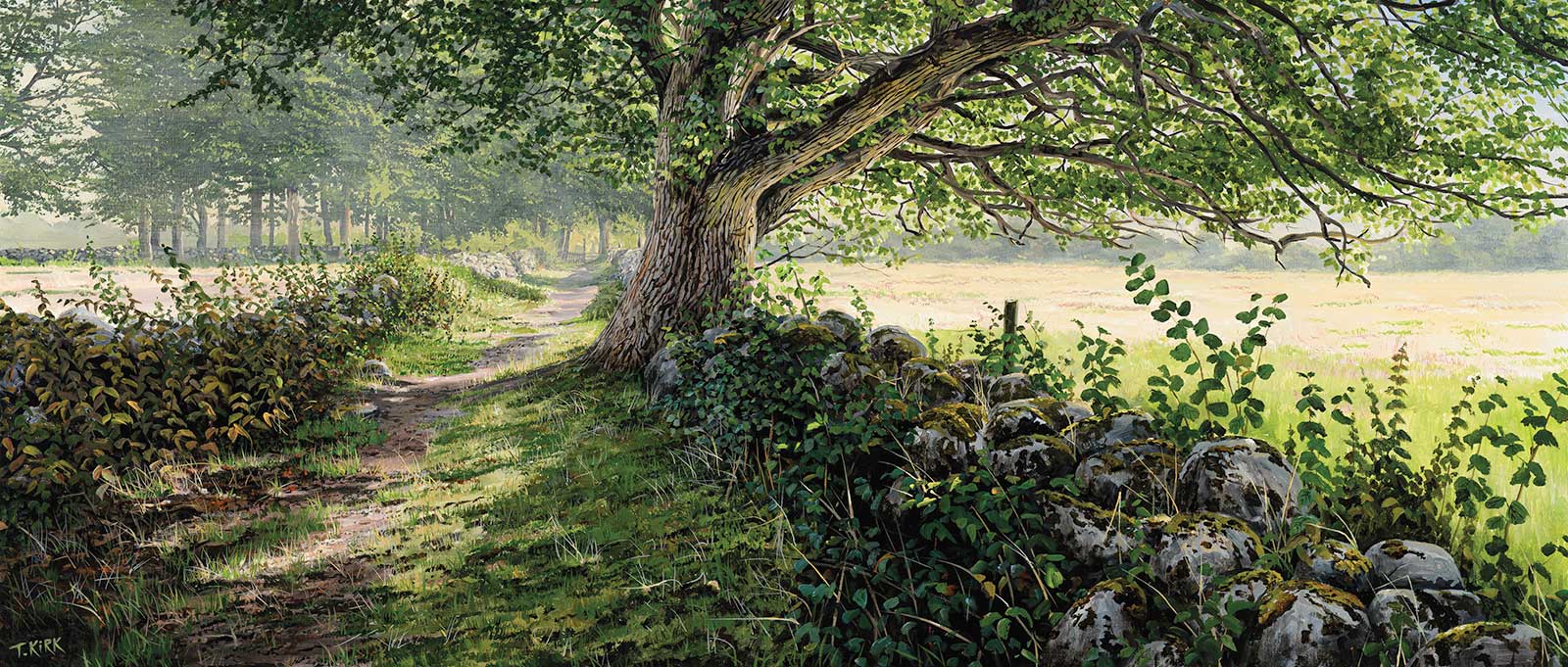 Summer Walk, acrylic, 23½ x 55" (60 x 140 cm)
Troels Kirk
Skåne, Sweden
My Inspiration
Walking down this ancient stone-fenced path on a warm afternoon in the early summer is really all the inspiration I need. This place begs to be painted—I love the simplicity of such a place. Just a tree, a path and summer. Sitting in the shade of a hazel bush sketching gives you time to closely observe the effects of haze, the variety of colors and tones, and really feel the mood of the place.
My Design Strategy
Back in my studio I use photos and sketches to compose the scene. Rather than an exact depiction, I aim to recreate the feeling of sitting there in the shade. I make the final compositional sketch, placing the main tree and stone walls to guide the eye down the path. The high contrast in front and the softness of the background haze establishes the depth of the scene. Wedges of light fields provide a backdrop for foreground details.
My Working Process
The stretched Belgian linen canvas was given very light washes of yellow and blue to establish the backdrop and sky. Working in layers from back to front, I added more and more detail, contrast and saturation. A rich variety of greens, from very warm to icy blue, were used to create depth and rich shade. The bluish gray of the stones and the pink of the dirt path are colors also used in the oak bark details.
Contact Details
Email: info@troelskirk.com
Website: troelskirk.com
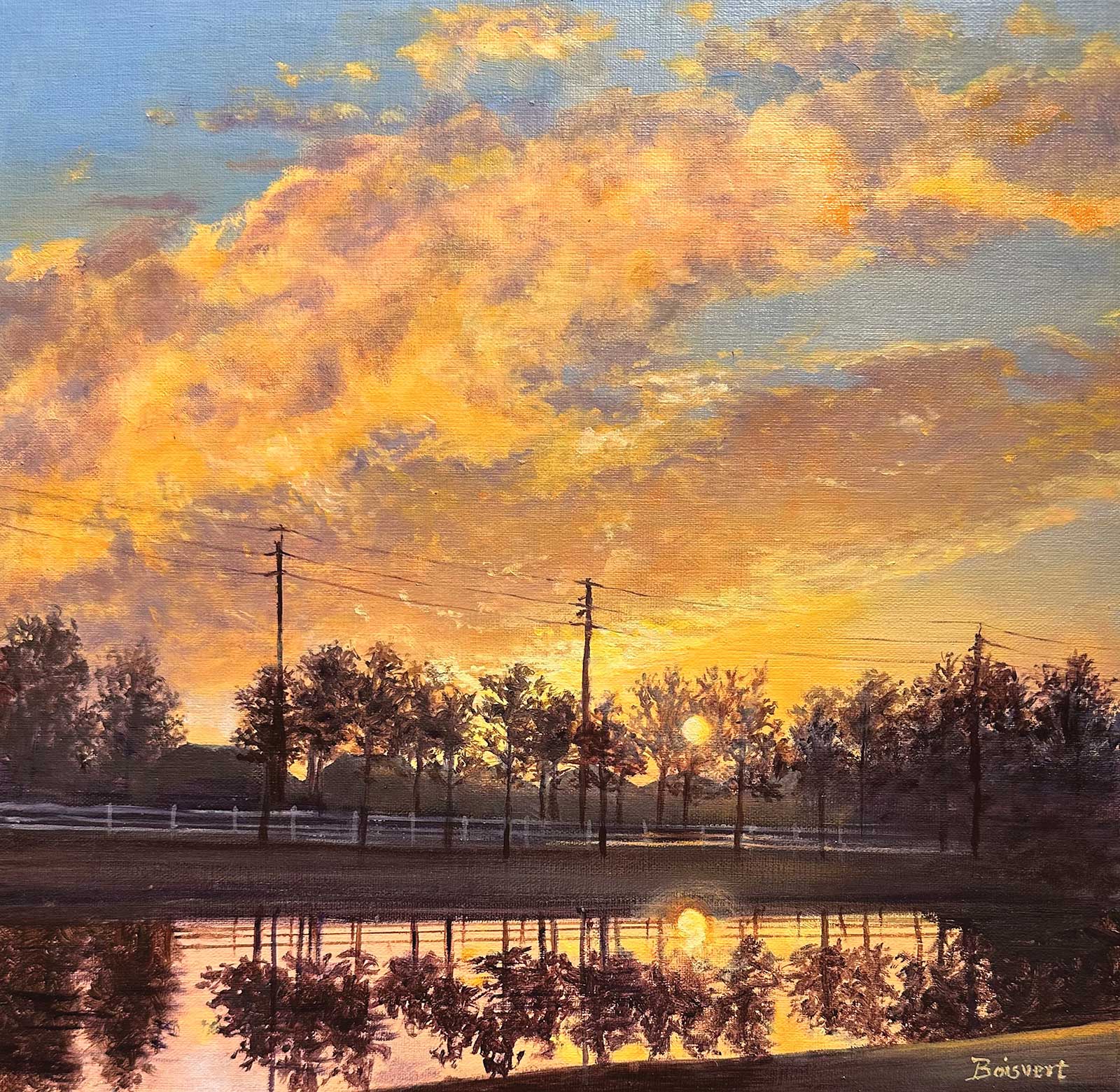 Evening Glow, oil on linen, 12 x 12" (30 x 30 cm)
Linda Boisvert DeStefanis
Connecticut, USA
My Inspiration
Waterscapes are my favorite subjects. I constantly watch for the beauty in nature and try to capture it on my canvases. On this day, I rushed out to catch the sunset over this pond, with the telephone wires and the street in the distance. It became my next challenge. In my work, I like to create the feeling of distance between the foreground and the far away objects. I also loved the glow of the sun coming through the trees at the end of the day and the reflections on the pond in the foreground.
My Design Strategy
As an oil painter who loves detail and works in realism, I love working on smooth surfaces like linen and the ability to blend with oils. I find that sometimes my subjects require a rectangular size, but I often want to challenge myself and work out a design in a square. My challenge was to sketch it out and create a successful composition for this beautiful “evening glow.” I knew that the brushwork for the distant fence, street, homes and telephone poles would be difficult, but these small details are what make this painting special.
My Working Process
Once I’ve sketched my design onto the linen canvas, I begin by mixing paint for the background of the sky. I used fine detail Liquin mixed with a little Gamsol to create an underlayer. For the sky, I used some cobalt blue with white and added a bit of orange in some of the areas where the clouds will reflect the setting sun below. Eventually, I would add the lavenders into the clouds. I also placed the darks below and wiped out where the light streak of the pond below would reflect the sky above. I work in layers, and it would dry overnight before I added the next layer. The final details are added when the underlayers are fully dry. I enjoyed this piece and felt I was successful in my challenge.
Contact Details
Email: lbdestefanis@gmail.com
Website: destefanisfineart1.com