


After a lifetime of painting, I want to take a moment to pause and reflect on the pure joy of a creative pathway. What a privilege it has been to be a professional artist and a teacher of the principles of painting across the globe. I cannot imagine anything more satisfying even with the bumps and lumps included. Each difficulty needed to be used as a time to reassess and perhaps change direction.
I have had the absolute privilege of spending time under the guidance of some of the world’s leading artists—Daniel E. Greene, Judith Carducci and Tony Ryder to name a few.
Listening to and working with those who have trod the path is invaluable and incredibly inspiring. It urges us onwards and clarifies our vision, and in my case, it gave me the realization that I had something worthwhile to say. I chose to invest myself in the pursuit of understanding the fundamentals of painting so that my voice could be eloquent and be given freedom of expression.
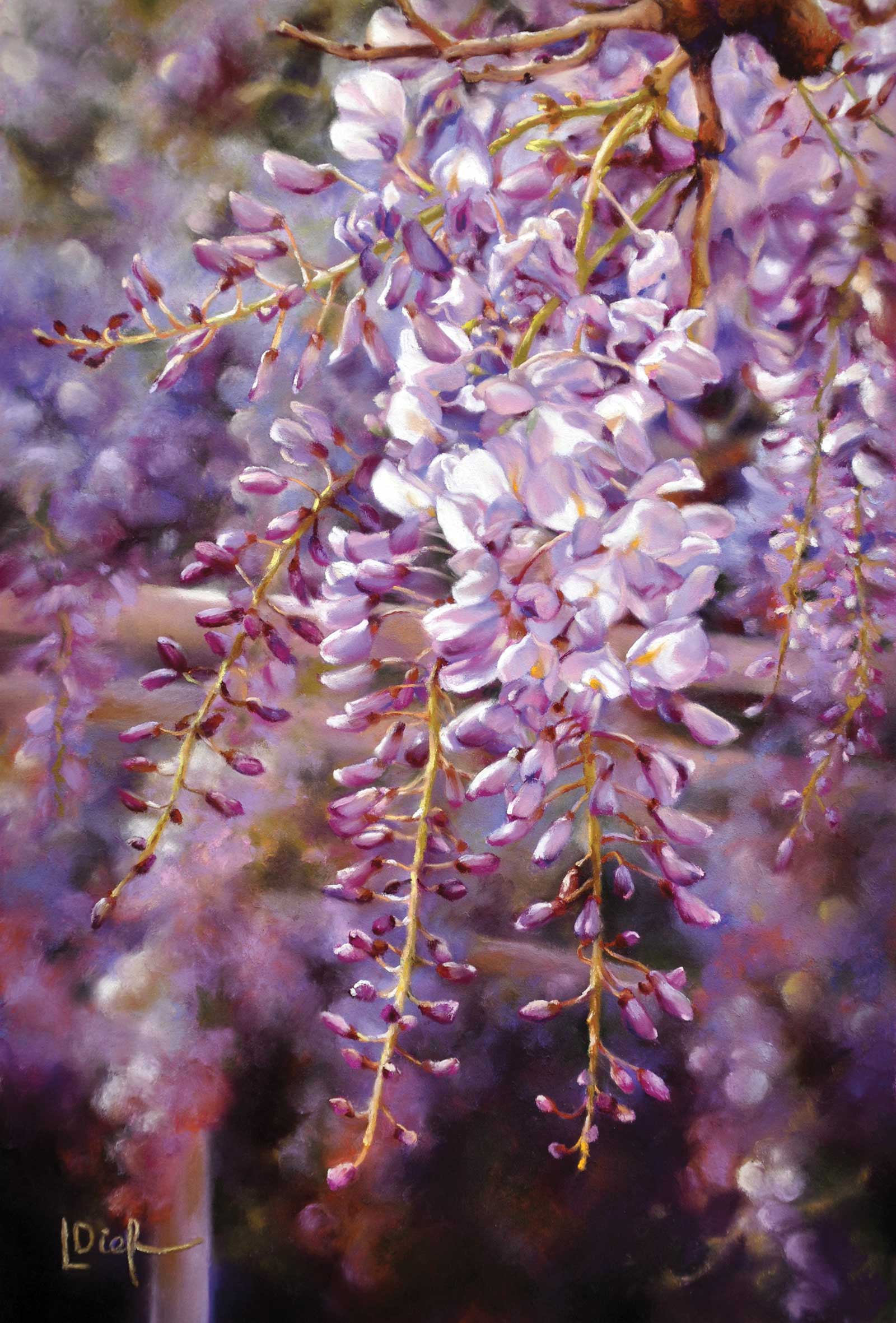
Purple Splendour, pastel on Fisher 400 pastel paper, 24 x 16" (60 x 40 cm) This was when I discovered the benefits of using underpainting when facing complexity. I lightly applied a mid tone of purple gray pastel to the cream paper and then liquified it using odorless solvent on a soft square brush. You might ask, “Why not start with a colored piece of paper?” Well, colored paper is static whereas the pastel that I have used in the underpainting (once dry) is still mobile and able to be inherited into the subsequent layers of color. It helps save a lot of effort and unifies the whole composition. You can take your underpainting further than just one color, and this is especially useful for plein air or demonstrations.
Even now, I enjoy taking the opportunity to go into a new learning environment with artists whose work I admire. We each have different approaches but each has the common denominator of the technical understanding of line, value, color and edge. It is invaluable to hear the same story but perhaps described in a different way and also to see the possibilities of a different approach. I never want to lose the buzz of excitement when a lightbulb moment hits. I never want to stagnate. I always want the joy of adventure.
We each have our own unique personality and our own individual way of mark making that sets us apart. This is our “hey look at me” platform in painting. It is to be cherished but can change and mature with each new experience and more easel time. I’m certainly painting different subjects with a more practiced hand and eye than when I started out. Painting is less of the battleground of hoping for the best and is now a more informed freedom.
A final word on being a student: whenever you go into a new learning environment, go with your mind open and your receptors on high alert. Go with a sense of eager anticipation and expectation, not with fear and dread. Nervousness is okay but harness it as a positive energy, not a negative one. Rise to the challenge of stepping outside of your comfort zone and go on a voyage of discovery, even if the end result is the discovery that it is not the direction you want to go. You have allowed yourself to put in place one more stepping stone of your life’s journey. Always remember that a perceived failure is simply paving the way for success and a deeper understanding of yourself.
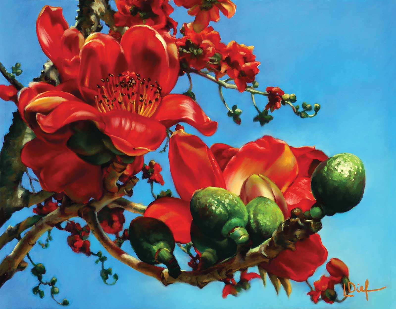
Rhythm on Blues, pastel on Fisher 400 pastel paper, 15 x 19" (38 x 48 cm) This was my demonstration painting for the Centenary of Pastel celebrations in China where I was one of six international pastellists invited to take part. It was an amazing honor and an experience that I won’t forget in a hurry.
On another note, understanding how to make a good composition and the understanding of the technical areas of painting is like having a safety net of information. These are areas of logic and problem solving that inform our inspiration and expression. A well-composed painting will demand the viewers’ attention, will shout the inspiration of the artist and bring the eye back to the painting again and again to be filled with any number of emotional responses.
Composition is like the narrative, the storyline that takes us from beginning to end and back again. A poor narrative will leave us confused and disengaged, but a good narrative will thrill us, entertain us and make us want to keep reading to the very end. It’s all about taking the time to explore compositional tactics such as cropping, format, eye level and color harmony, shape and value relationships to achieve something different. Composition sets the scene, personality of mark puts an individual, descriptive stamp on it and the technical areas of line, value, color and edge are employed to bring it to fruition.
My Art in the Making Incandescent
 Stage 1
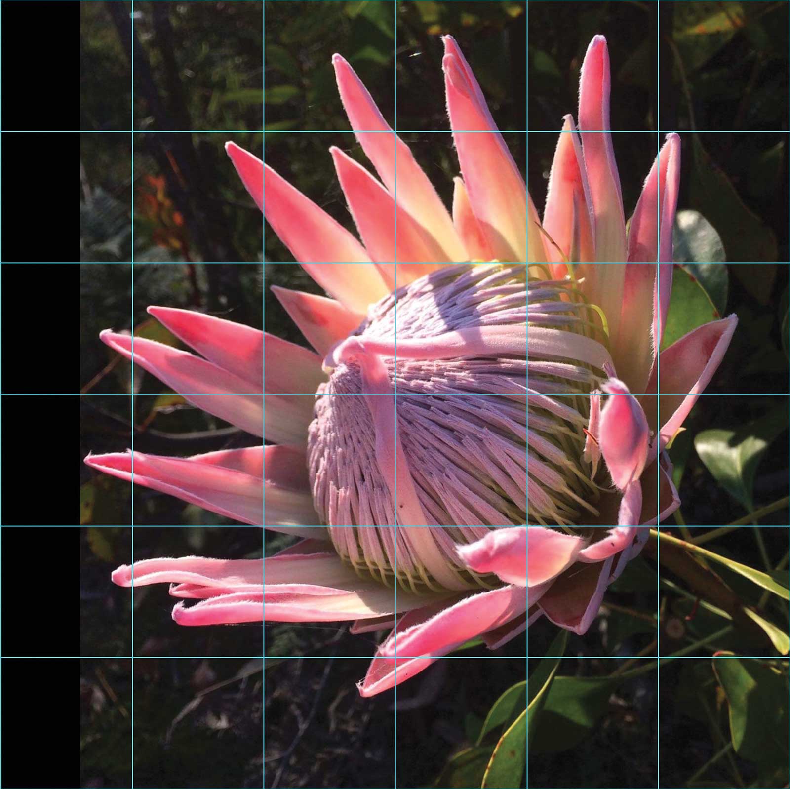
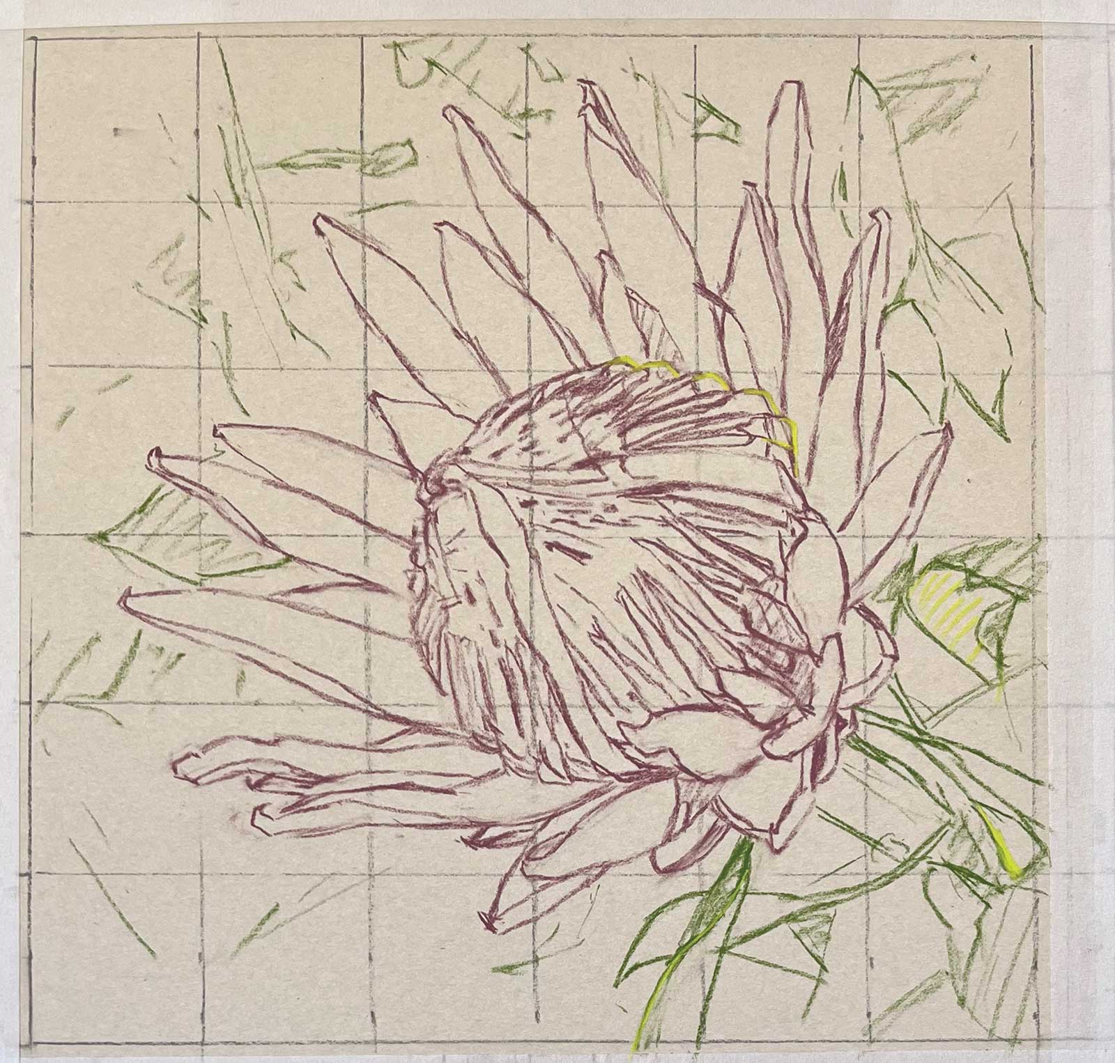
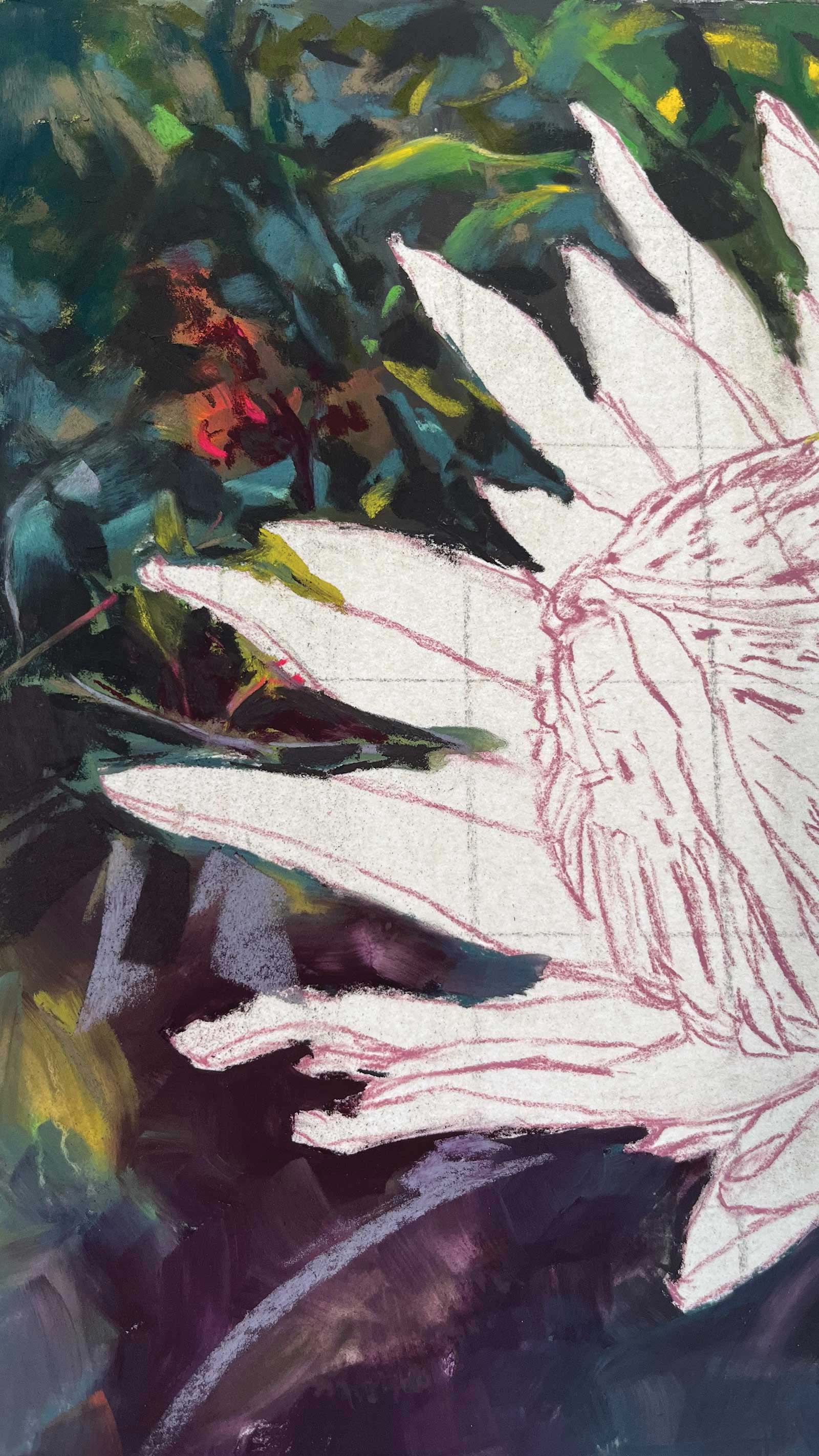
Stage 1 Gridded Reference
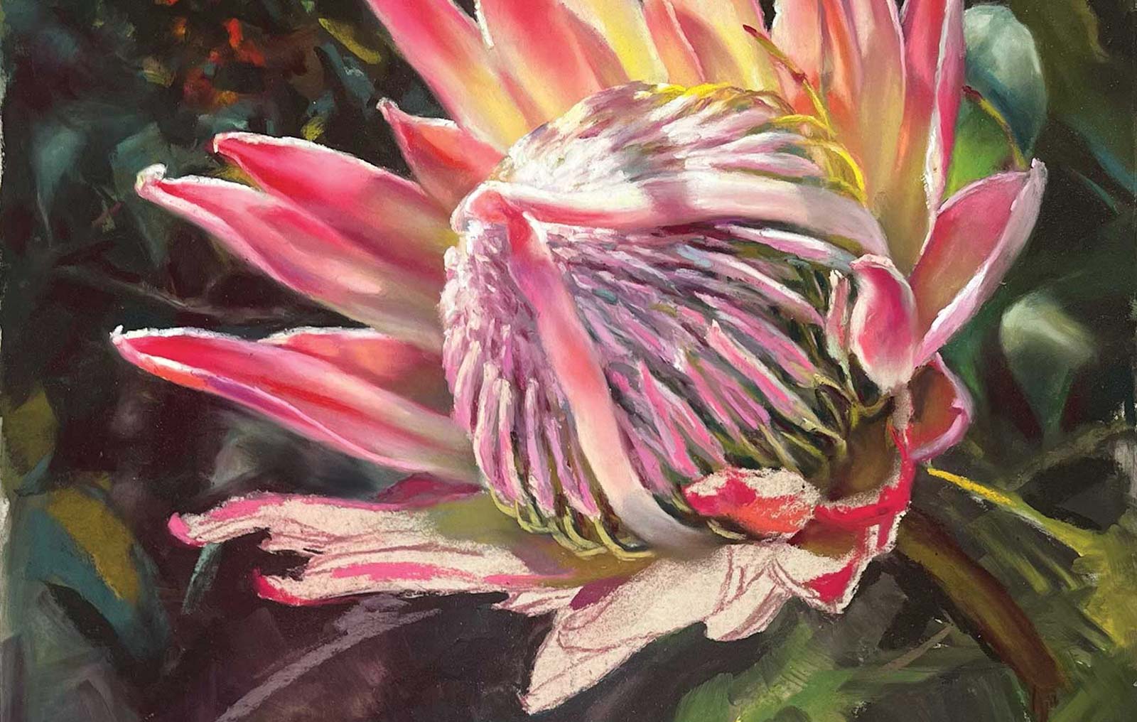
I use a grid app on my iPad to grid the photo and simplify my drawing process. The grid gives me bite-sized pieces of information and helps with getting each part of the composition into the right drawing relationship. I add a bit to the left hand side of the photo so that I can have a square composition and also allow some space from the edge of the petals to the edge of the painting.
WHAT THE ARTIST USED
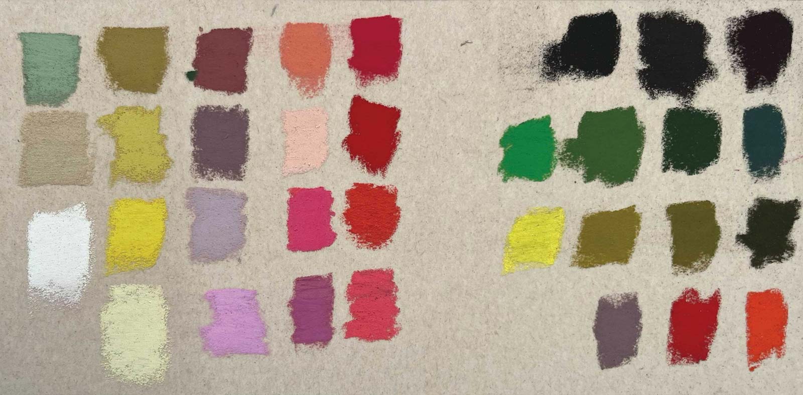
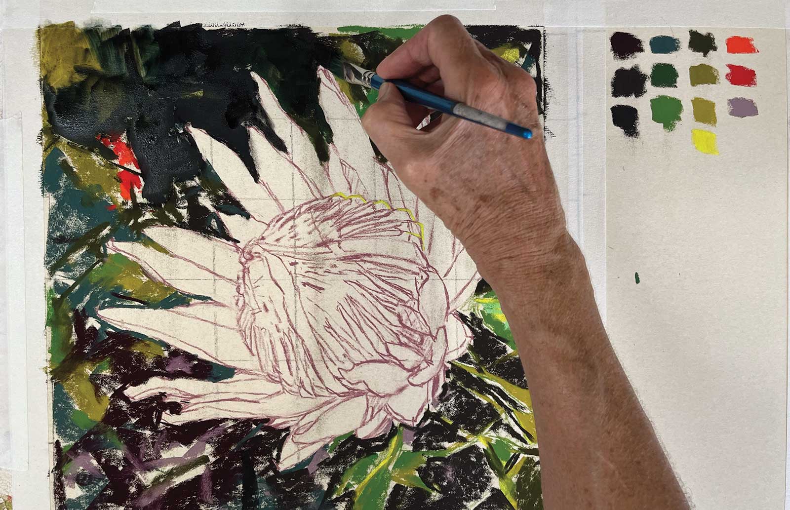
Because I have long ago lost the wrappers from my pastels I’ve done color swatches of all the colors that I have used. These are from a variety of brands, including Terry Ludwig, Sennelier, Unison, Great American Artworks, Holbein and Art Spectrum. My process for color selection is to first acknowledge the value of the color (whether it is dark, mid or light) and then to identify the type of color. When I look at any given color, I first identify the dominant color, whether it is a red, blue or yellow. Secondly, I identify what type of red, blue or yellow. Is it a red, a blue red or a yellow red? Then I determine whether it is a fully saturated bright, which means it has one or two colors (e.g. red and yellow) or if it’s a slightly brown looking color, which means it has all three colors. On this color principle, I can basically replicate any color I am looking at as long as I have the correct pigment. When you view the colors side by side in the swatch it is much easier to identify the color differences in terms of what I have just described. The top section of colors is what was used for the background with the lower section for the flower.
Additional Materials
Fisher 400 pastel paper, ¼" angle shader brush, NEEF 995, Paper towels, Pastel pencil in a color appropriate for the flower (for drawing the subject), Kneadable eraser, Soft square brush, Odorless solvent
 Stage 2
Stage 2 Initial Drawing
I then decide how much larger than the reference I am going to make my painting. I scale it up keeping the 6 to 6 ratio. I now have a 12 by 12" composition and draw a 2" grid directly onto the paper using a pastel pencil. I don’t press too heavily when drawing the grid because I don’t want to score or damage the paper. I then draw my flower using a pastel pencil in a color appropriate for the flower.
 Stage 3
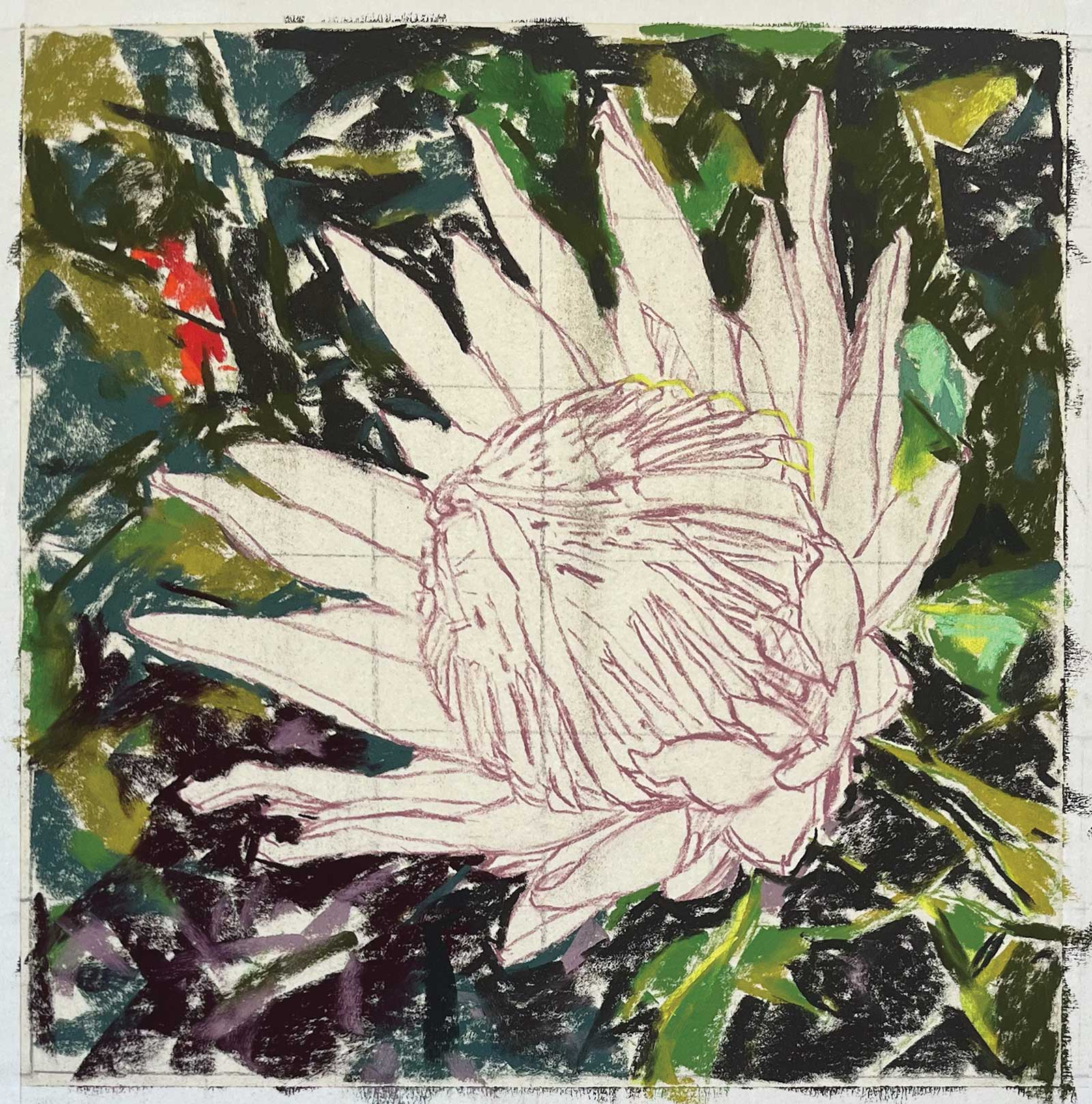
Stage 3 Dry Underpainting
I’m going to do some underpainting in the background to give me a base for the more abstract shapes. I use a variety of darks with some leaves suggested to support the flower.
 Stage 4
Stage 4 Wet Underpainting in Progress
I then use some artist’s odorless solvent and a soft flat brush to liquify the dry pastel.
 Stage 5
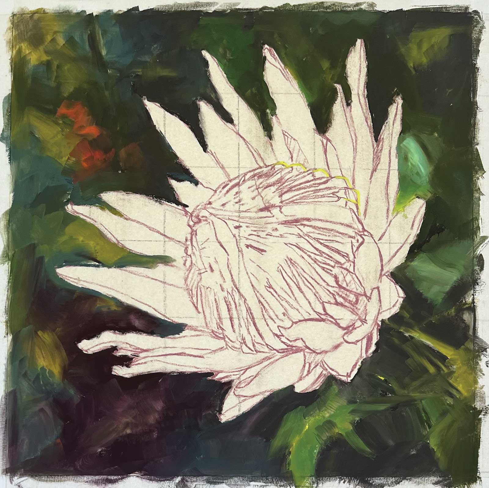
Stage 5 Underpainting Now Dry
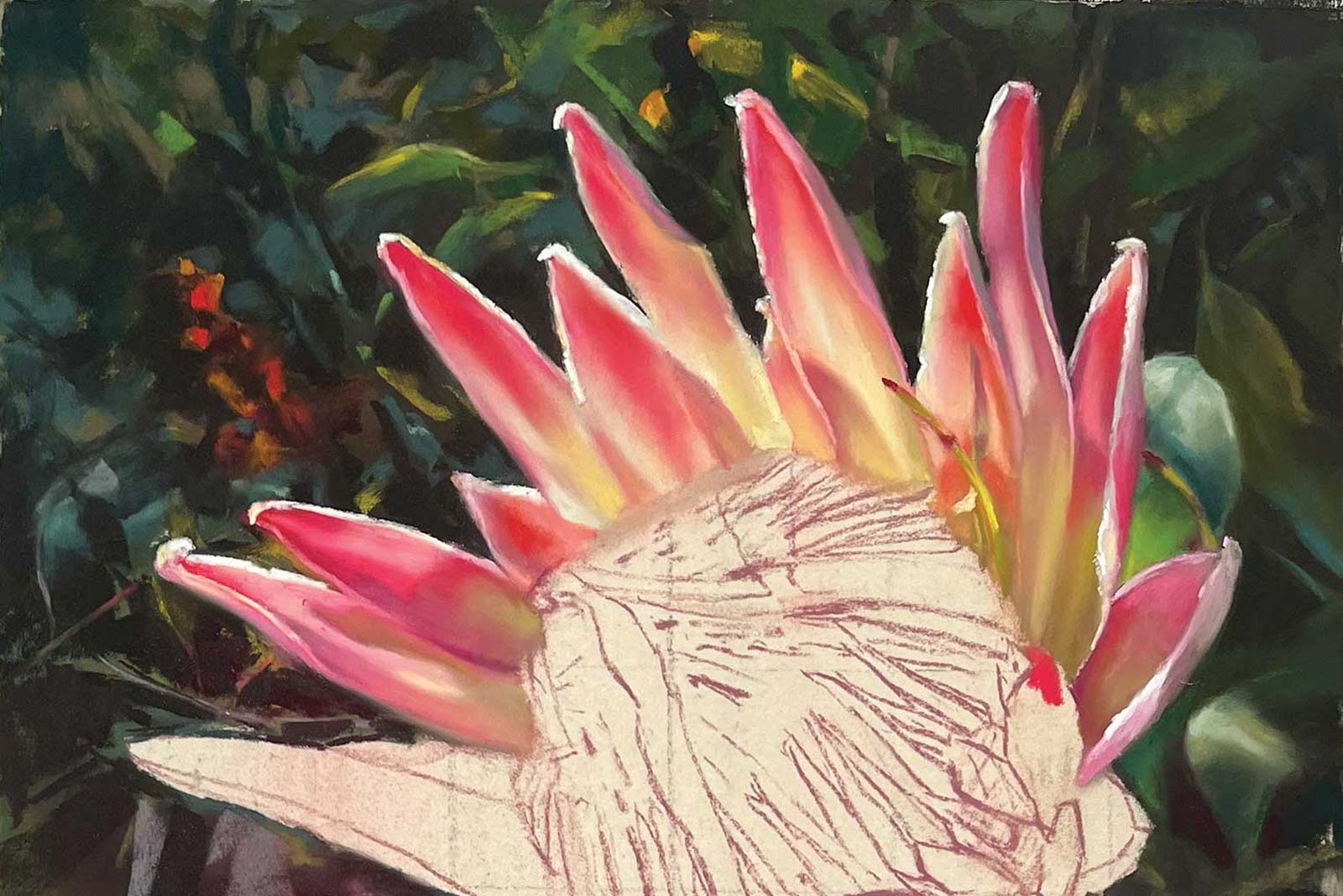
This is then left to dry before continuing. Once it is no longer cool to touch then it is ready to work on. The lovely part about using underpainting is being able to use negative spaces to find shapes amongst the chaos. I could have a plain dark background, but I want to create a sense of the environment.
 Stage 6
Stage 6 Preparing the Background
I spend a few minutes tidying up my petal edges with a soft angle brush. Basically I’m getting rid of loose dust that might dirty the clarity of my petal colors. I then work out the color harmony of the background and work from whatever is behind to whatever is in front. Here is a close up of the underlying combination of colors in the background that I use before blending sculpturally with my ring finger.
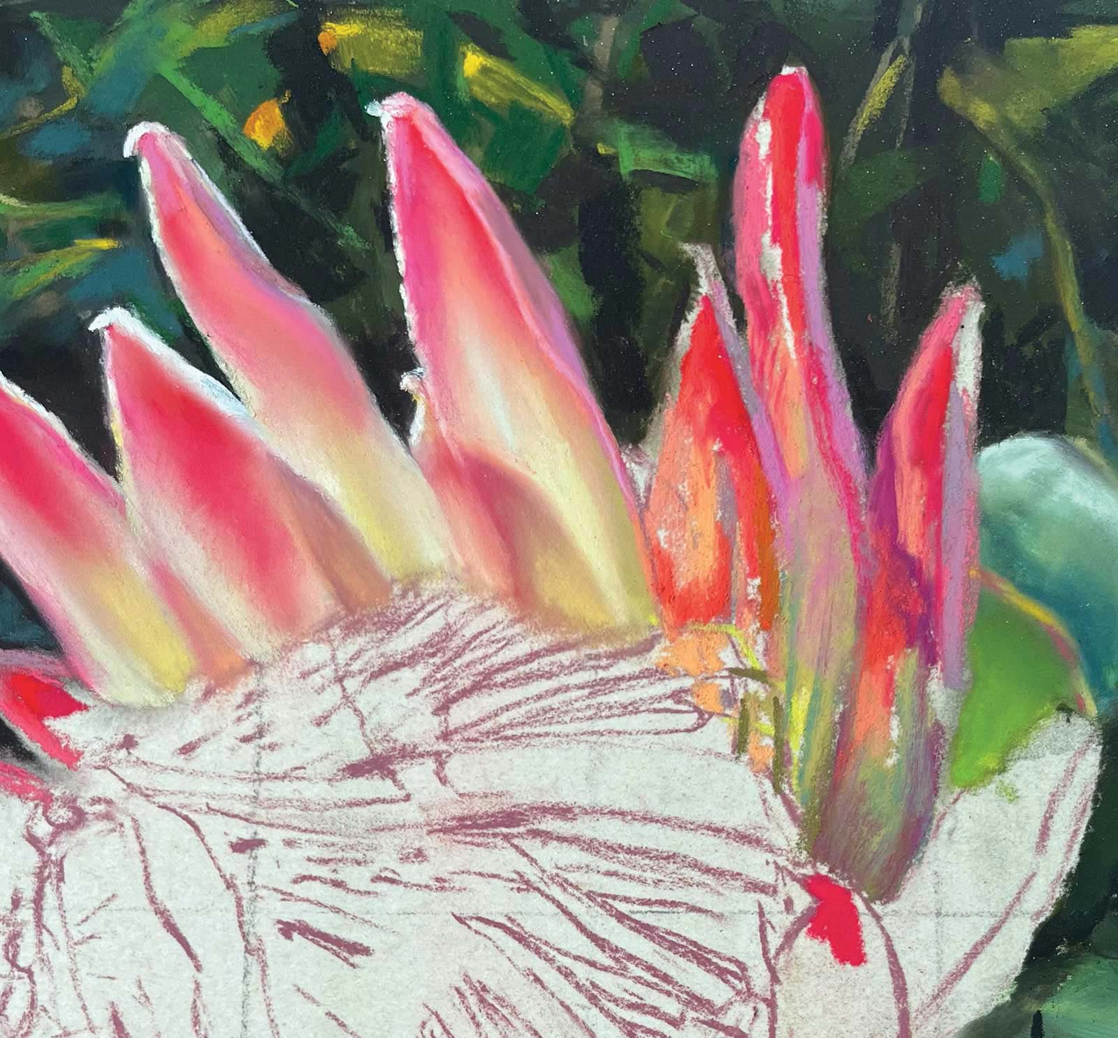 Stage 7
Stage 7 Outer Petal Detail
I then get onto the petals at the top and side of the stamen area. You can see here the progression from laying down the colors on the right to the ones that are blended on the left.
 Stage 8
Stage 8 Top and Side Petals Completed
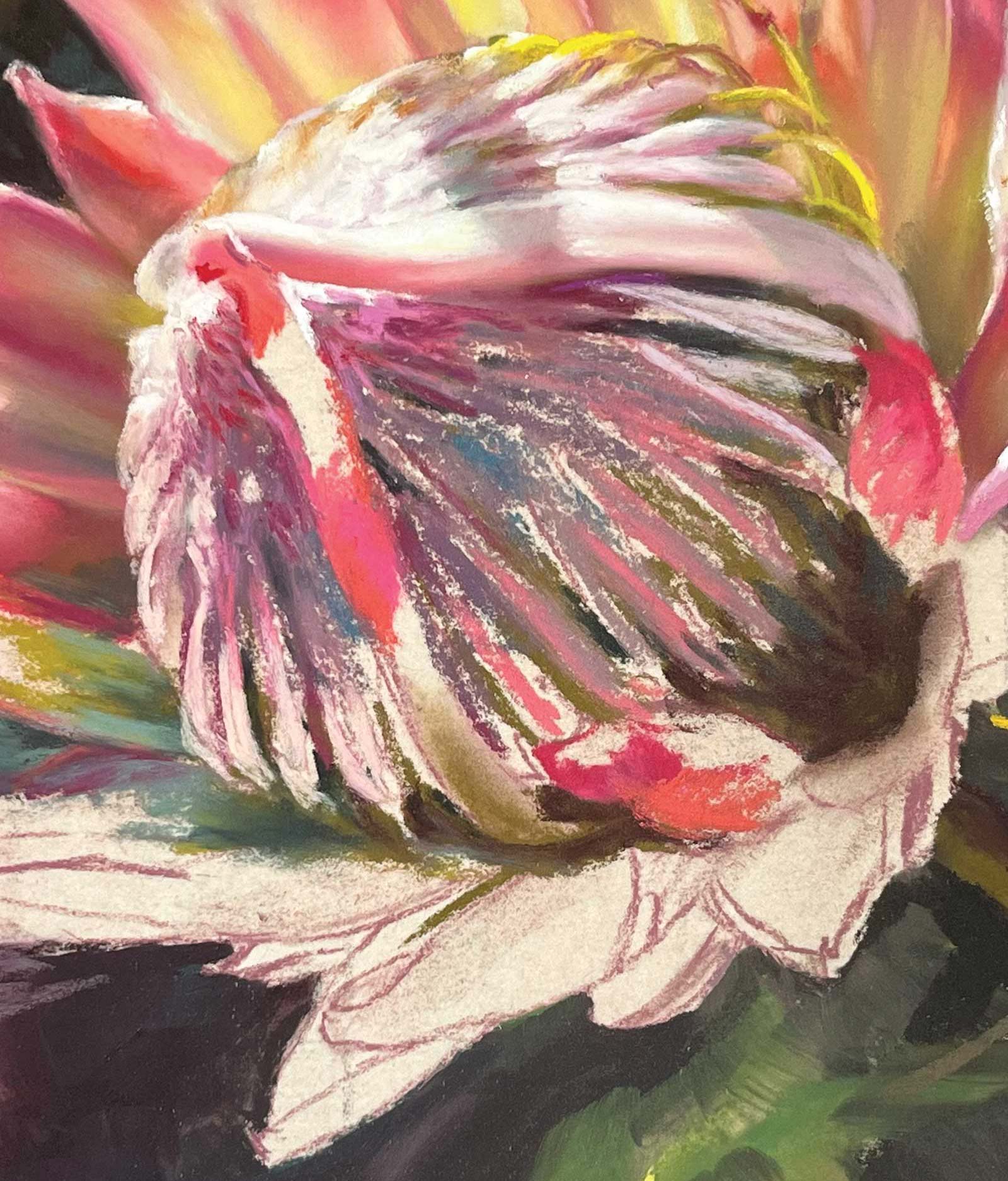
Having completed the top and side petals I’m ready to attend to the stamen area.
 Stage 9
Stage 9 Central Stamen Detail
It looks very messy, but the bottom stamen area shows how I prepare for the mids and lights. Lots of squinting is required to see value relationships and to not get sidetracked by detail too early.
 Stage 10
Stage 10 Central Stamen Progressing
I’m making more progress on the stamen by playing backward and forward with the negative and positive spaces.
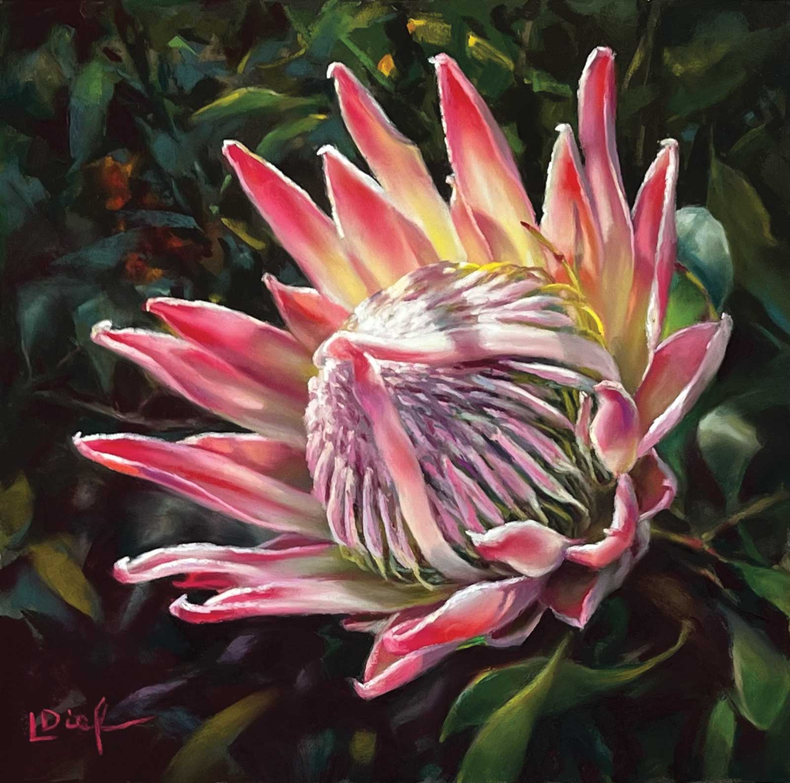 Stage 11
Stage 11 Finished Artwork
Incandescent, pastel on Fisher 400 pastel paper, 12 x 12" (30 x 30 cm)
I finish the remaining petals and background, and the piece is now complete.
About the artist
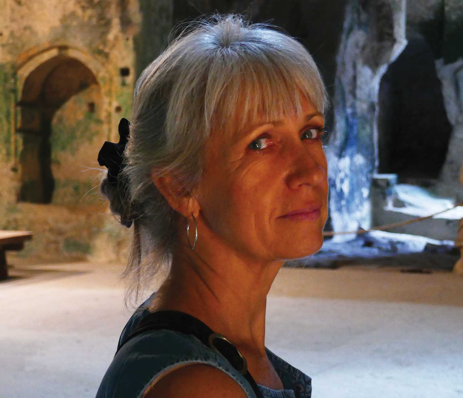 Lyn Diefenbach
A professional artist for more than 30 years, Lyn Diefenbach has had many sold out solo shows and been featured in a host of international and national exhibitions and magazines. Due to her global influence, she was invited to demonstrate at the Centenary of Pastel celebration in China, one of only six international guests. She has also judged several competitions, a testament to her skills and reputation. The pursuit of masterly quality and technique is her highest priority. Diefenbach’s work is imbued with a lifetime of practice and is a celebration of her faith and of life. Her diverse portfolio includes portraits, seascapes, still life and florals. Diefenach’s ability to communicate and enthuse has entrenched her as a sought-after international tutor. Currently, she is a Master Pastellist with the Pastel Society of Australia; a Pastel Society of America Signature Member; and an International Association of Pastel Societies Eminent Pastellist.
Contact at
lyndiefenbach@gmail.com
www.ldief.com