



In this demonstration, I will break down how to paint a successful cocktail painting using the indirect method of painting. An indirect method of painting means that I don’t paint directly on the canvas but instead complete a drawing on paper, transfer it to the canvas. From there, I build the painting up in stages.
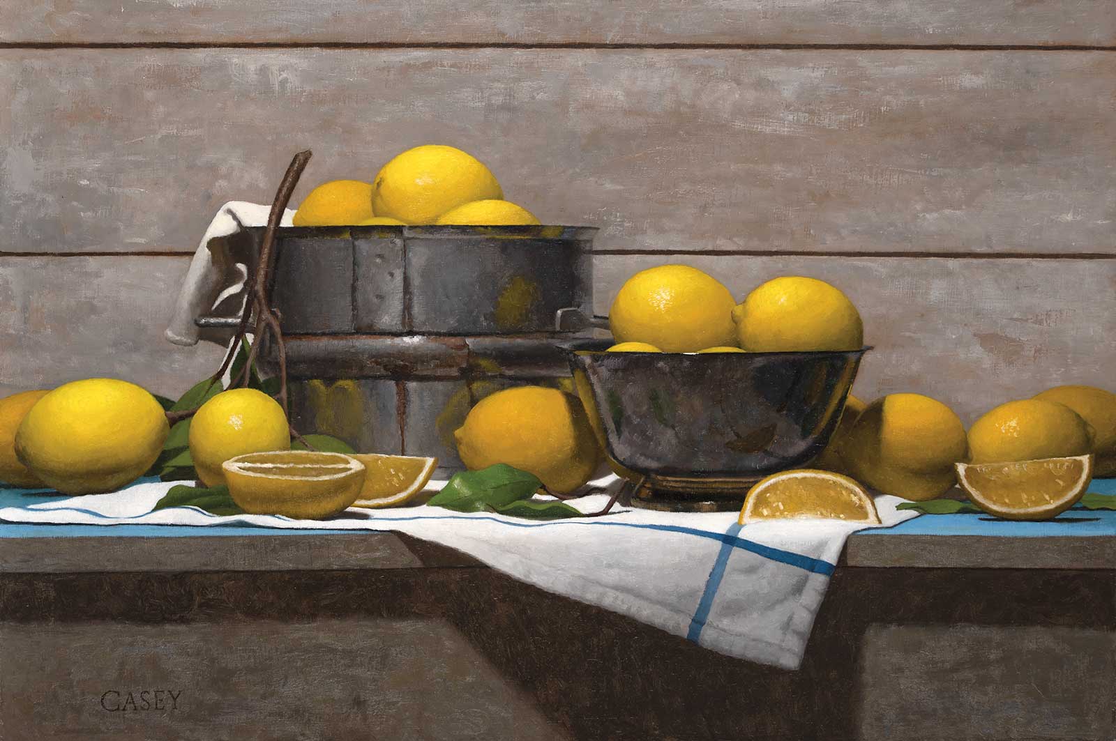
Lemons in a Silver Bowl, oil on panel, 16 x 24" (40 x 60 cm)
In my training to be an artist, I found that my temperament fit more with an indirect approach. Breaking a painting down into smaller steps allowed me to focus on each step and master each individually. In the past, I had tried the direct approach with little success. After understanding the indirect approach to painting, I was then able to paint in a direct painting method (painting directly on the canvas).
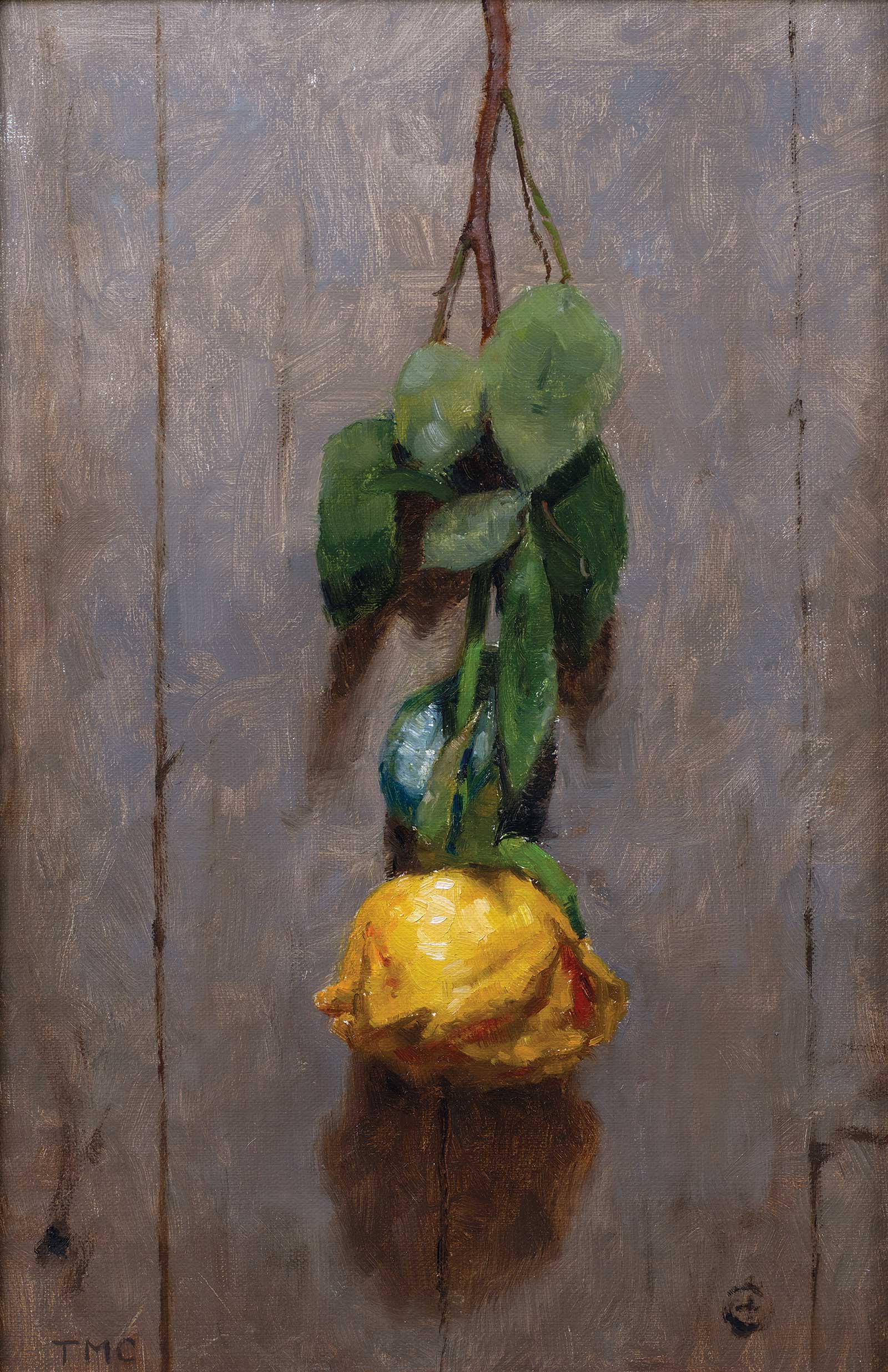
Yellow Rose, oil on linen panel, 12 x 8" (30 x 20 cm)
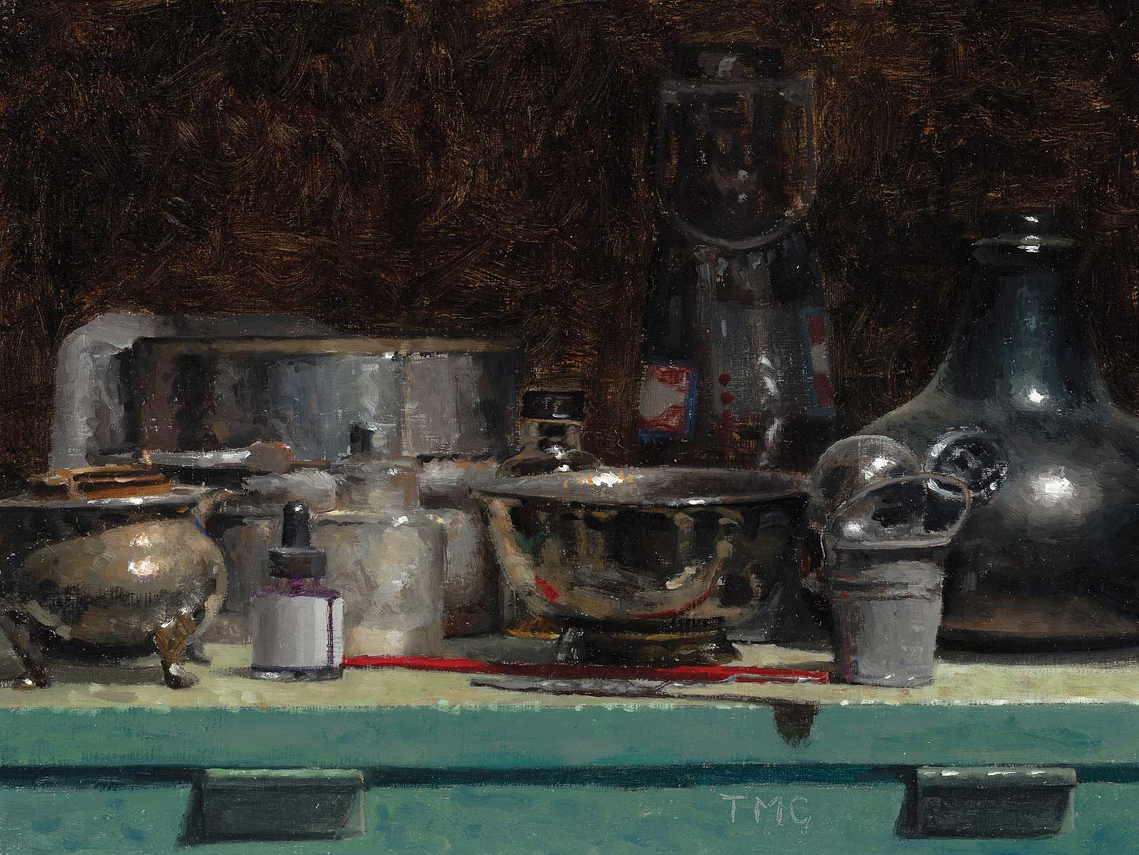
Collection of Bottles, oil on panel, 6 x 8" (15 x 20 cm)
This painting is one of a series of cocktail paintings for a book titled Cocktails, A Still Life: 60 Spirited Paintings & Recipes. The book pairs cocktail paintings with recipes and features more than 60 paintings and recipes. It was printed and distributed by Running Press book publishers in the summer of 2022.
My Art in the Making Hanky Panky
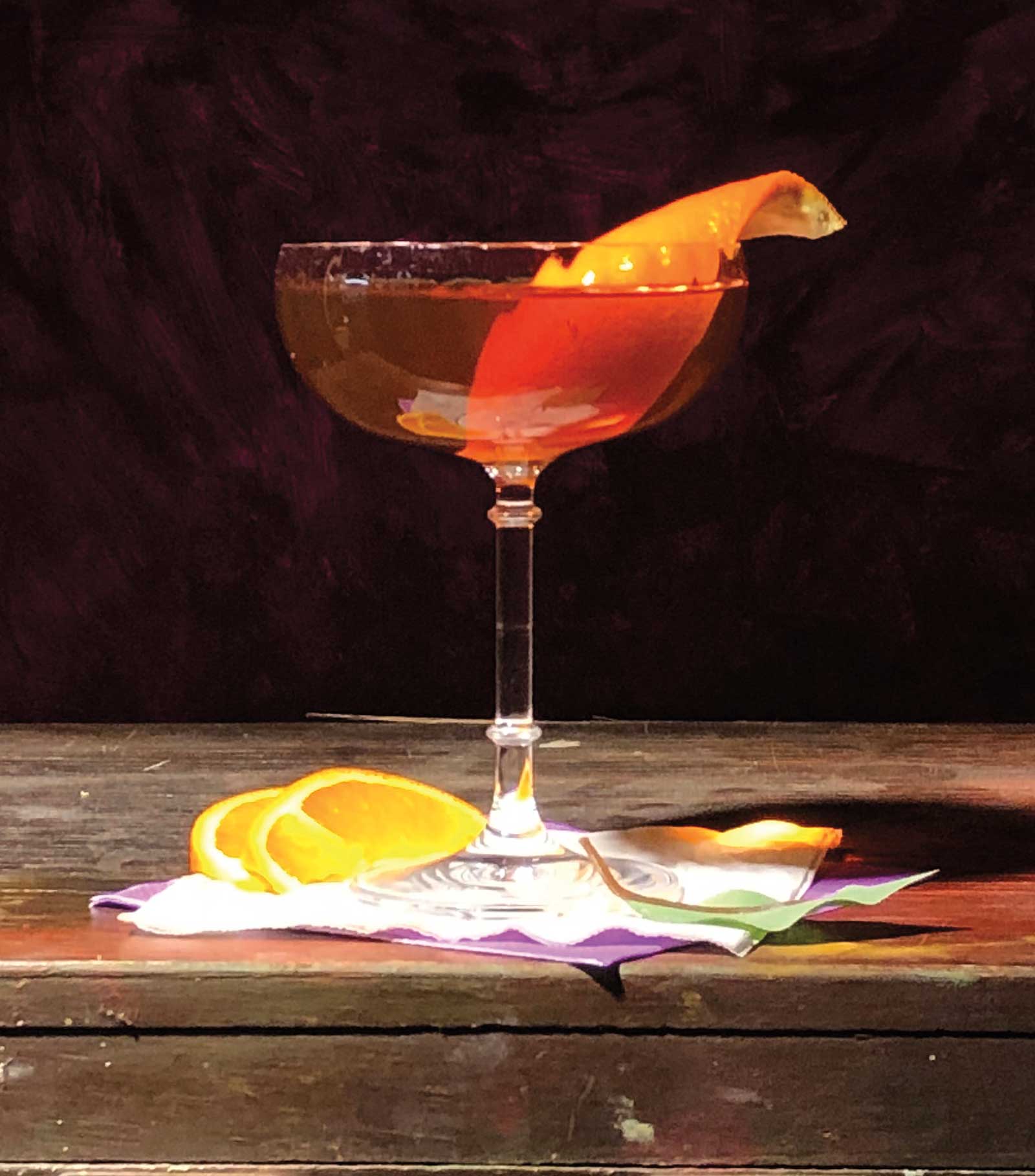
Reference Photo
This painting was completed using an indirect approach to painting. A drawing was completed first, transferred to a panel, and then the painting was built up in stages over a few sessions. The idea came from the history of the cocktail called the Hanky Panky. The original recipe is a pre-prohibition recipe from the early 20th century (the Savoy Hotel). I worked with authors, Christine Sismondo (America Walks Into a Bar) and James Waller (Drinkology), as they were the writers for the book project. We decided to add this cocktail to the book because it was one of the only recipes created by a woman.
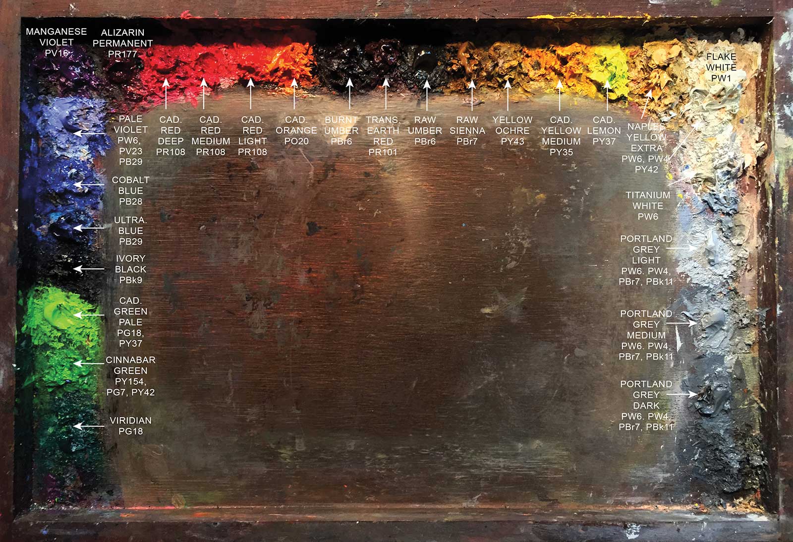
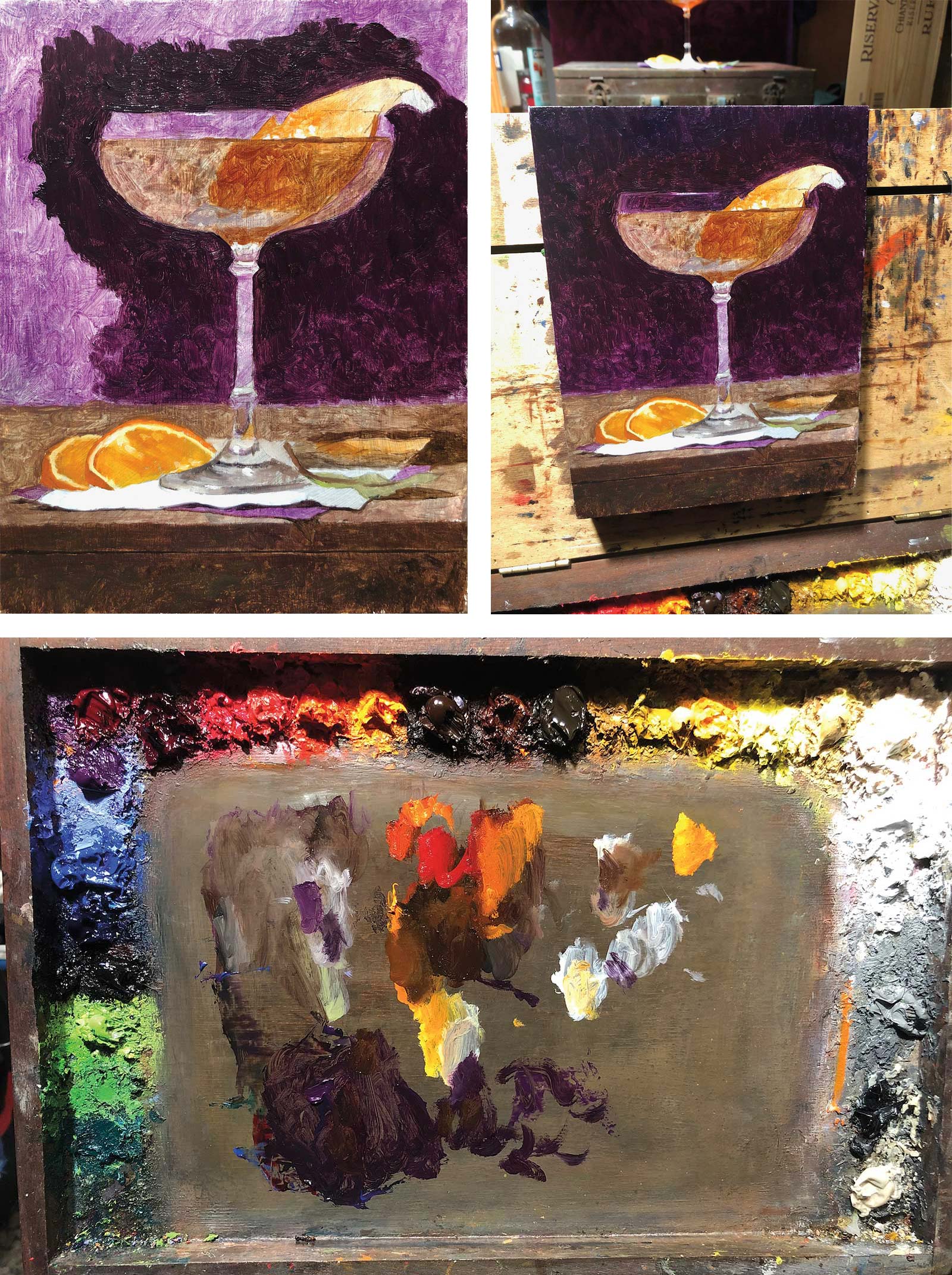
I’ve listed all of the colors on my palette with the corresponding color index numbers (CIN). The color index number is more important than the marketing name as it will tell you precisely what color paint is in the tube.
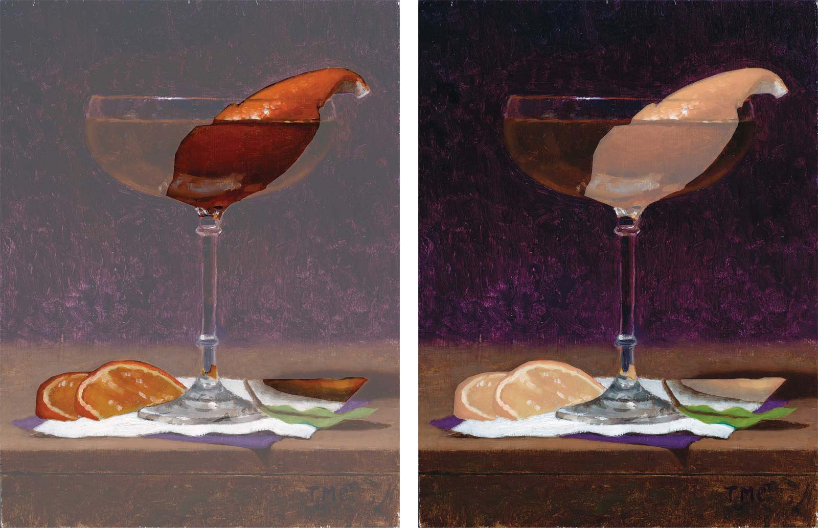 Stage 1
Stage 1 Working out the Composition
With guidance from the research, I gathered the correct glass (coupe), garnishes (oranges) and some cocktail napkins, and placed them in a composition. I used iced tea as a stand in for the liquid. The orange garnish was cut into different shapes (slices, peels, twists) so that I could move them in and out of the composition as needed. My goal when composing is to have unity and harmony in the piece. To build unity, I repeated the orange in three areas to move the eye through the piece. I also did this with the repetition of the purple in the background and the napkin. The contrast of the one green leaf adds variety to the composition and completes the triadic color scheme. I also wanted the composition to feel natural, as if this were served at a bar and someone walked away for a moment. The liquid of the cocktail is an orange hue, so I decided to use a contrasting purple napkin to balance the piece. Purple is a color that is mysterious but also symbolizes royalty, so it worked well with making this painting feel regal.
 Stage 2
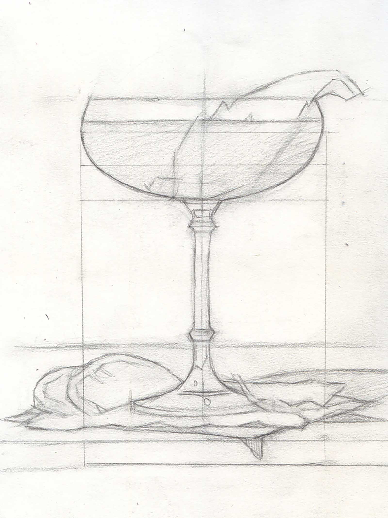
 Stage 2 Drawing on Paper
The first step is to accurately draw the set-up on paper with a pencil. Spend as much time as possible to make a good drawing, checking the structure and the proportions as needed. At this stage, I’m looking for the contour of the shapes and notes on the light and shadow. This drawing focuses on the contour of the objects, the comparative scale, and a sense of the light and shadow at this stage.
 Stage 3
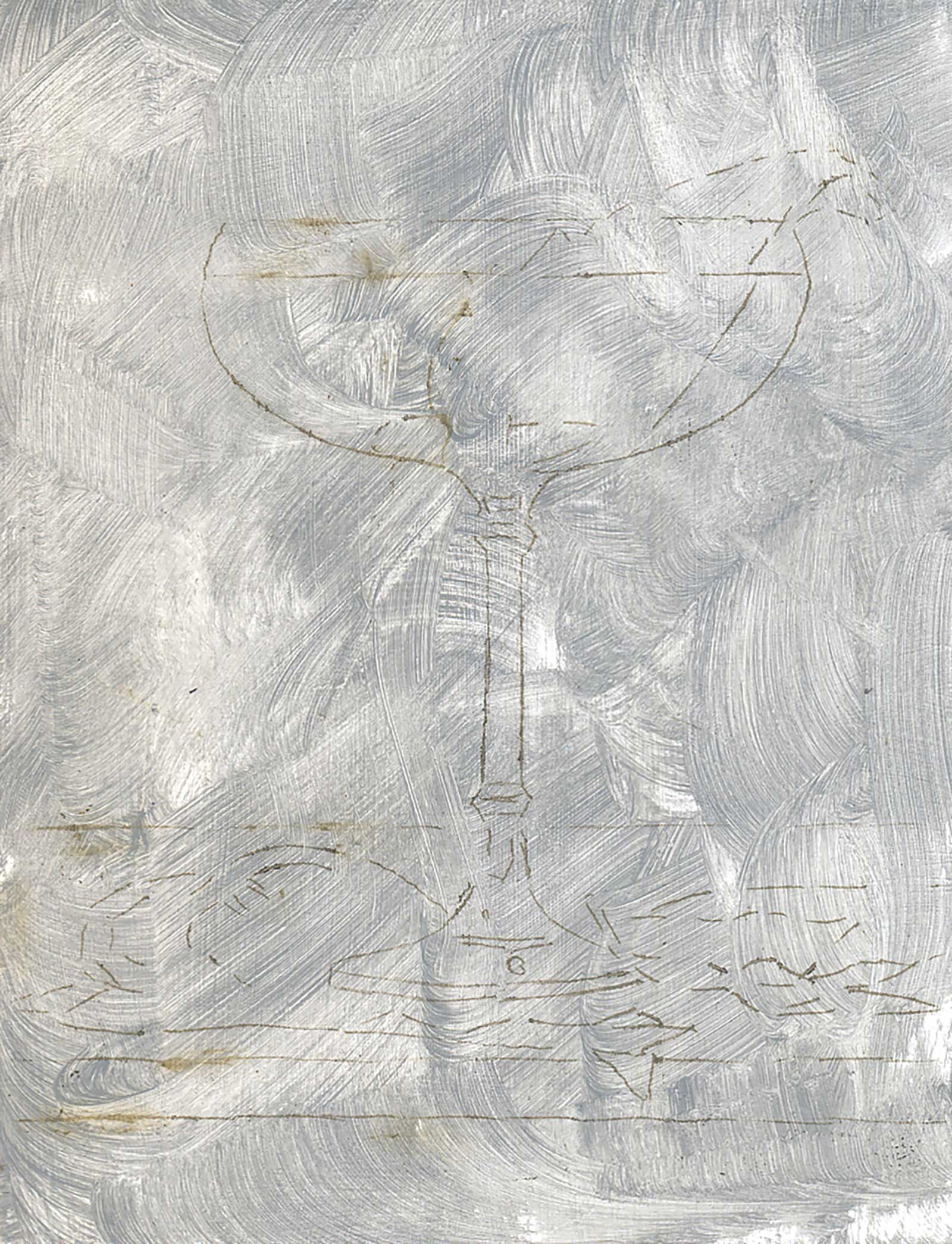
 Stage 3 Transferring Drawing to Panel
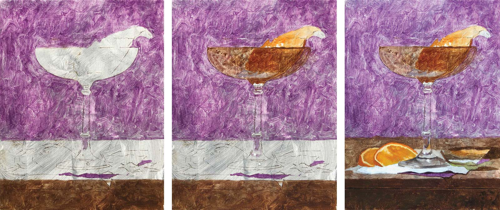
This panel was prepared with a scumbled layer of gray gesso to preserve some of the white of the canvas. I then make a copy of my drawing to the scale I would like the final painting to be. I use a carbon transfer method to transfer the drawing onto the surface. This can be done by using burnt or raw umber and rubbing it into the back of the printout. I then tape the panel to my canvas and trace over the lines with a pen. This acts as a stylus to transfer the drawing to the canvas.
 Stage 4
Stage 4 Underpainting/Wash-in
I begin by adding a thin wash of paint to the whole panel. I do this by using a touch of Gamsol to thin the paint and brush it onto the surface with a soft nylon brush (Trekell Spectrum brush). Don’t use too much Gamsol as you’ll weaken the paint film, but try to cover the whole painting with thin paint. This is the first gathering of information. This stage is as simple as putting down a note of purple or orange. I can then use this to get closer to what I see.
 Stage 5
 Stage 5 First Pass of Paint
The next step is to add a first pass of paint with no medium or solvents. I use the underpainting as a guide and adjust the color as needed, tweaking the color and value but holding onto the drawing as much as possible (the drawing is our guide). For instance, the purple underpainting appears to be too light and chromatic, so I’ve deepened the color to match closer to what I see (manganese violet with ivory black).
 Stage 6
 Stage 6 Second Pass of Paint
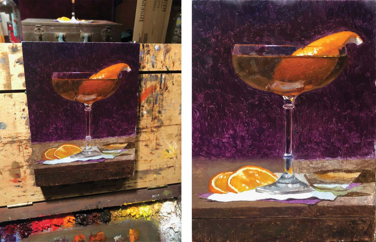
Now that everything is covered with a first pass of paint, I’ll make adjustments. Each layer of paint is added over the last layer to give the visual effect of depth in the paint.
 Stage 7
 Stage 7 Final Look
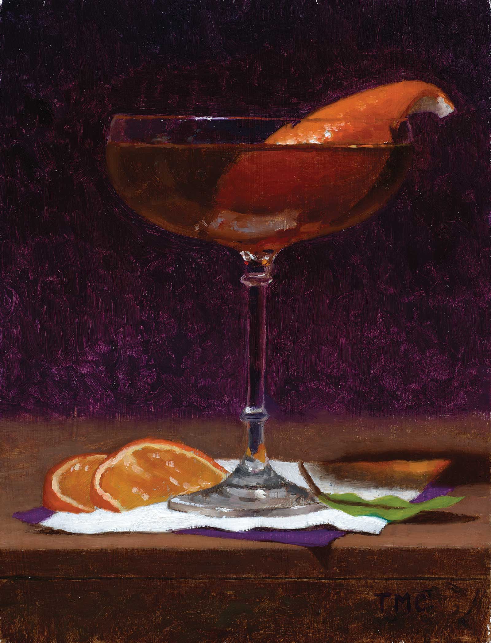
Hanky Panky, oil on panel, 8 x 6" (20 x 15 cm)
Be sure to take a break when needed to see the painting with fresh eyes. When the painting feels good after I see it with fresh eyes, I’ll then sign it in an area of the painting that does not steal the show from the painting. The most important things to work on are the drawing and the value structure. If you nail your drawing and apply the right value structure, you’ll have a solid painting even if the color is off. Value is the structure of the color and describes the form we see. The color is really the icing on the cake.
About the artist
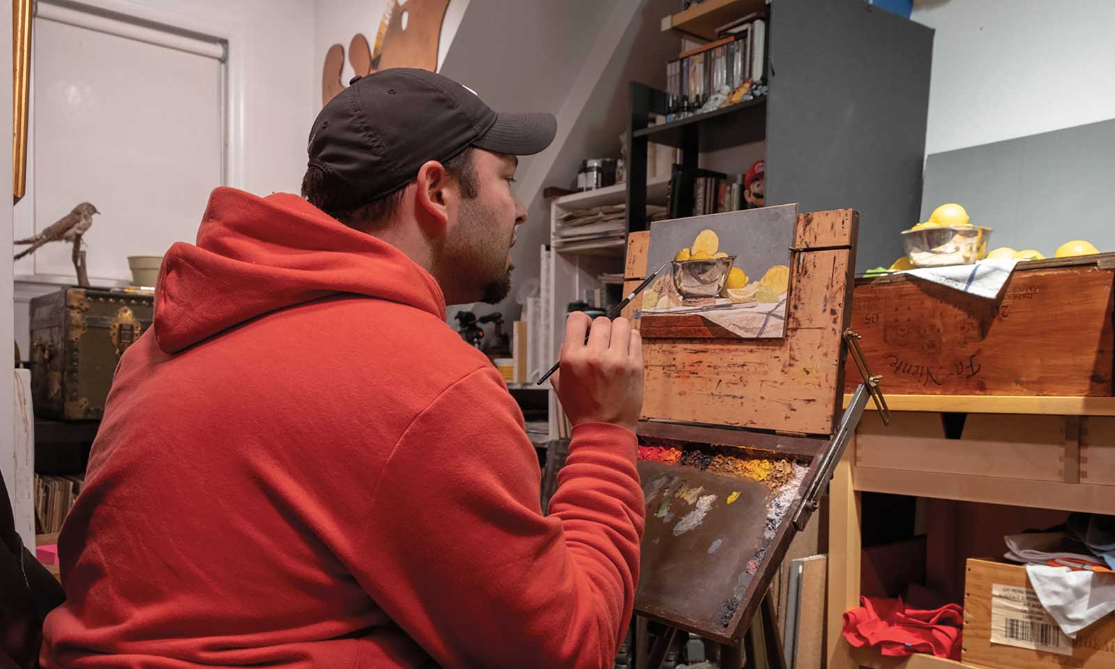 Todd M. Casey’s
Todd M. Casey’s paintings have won numerous awards. Most recently, he won first place four times at the Portrait Society of America’s Members Only Competition and placed first in oil painting with the Allied Artists of America in 2015. His work can be found in collections throughout the United States, including Rehs Contemporary Gallery in New York City and Simie Maryles Gallery in Provincetown, Massachusetts. In recent years, Casey has made the transition from painter to author and teacher. He published his first art book The Art of Still Life in 2020 and his second book The Oil Painters’ Color Handbook in August of 2022. His work is also featured in Cocktails, A Still Life, by Christine Sismondo and James Waller, which was released in August 2022. When not painting, writing or illustrating, Casey teaches classes for the Massachusetts College of Art and the Academy of Art University Online, the Art Students League of New York and through private online classes and workshops.
Contact at
toddmcasey.com