



The method of creation an artist chooses often gets overshadowed by their creations. While the finished piece is where the artist’s pride lays, the tools that birthed that piece carry a part of the story. The paintbrush is so iconic an artist’s tool that it evokes less curiosity from an audience about its use. The same cannot be said for the sight of a painting knife. This tool has a short but rich history, only having gained traction since the 1800s. The palette knife was once reserved simply for mixing paint, but artists like Rembrandt and Matisse saw its value for adding to their art what the brush could not. Though the traditional palette knife is still used for mixing paint today, the artist now has a range of painting knives in different sizes that create the distinct imagery its pioneers pursued.
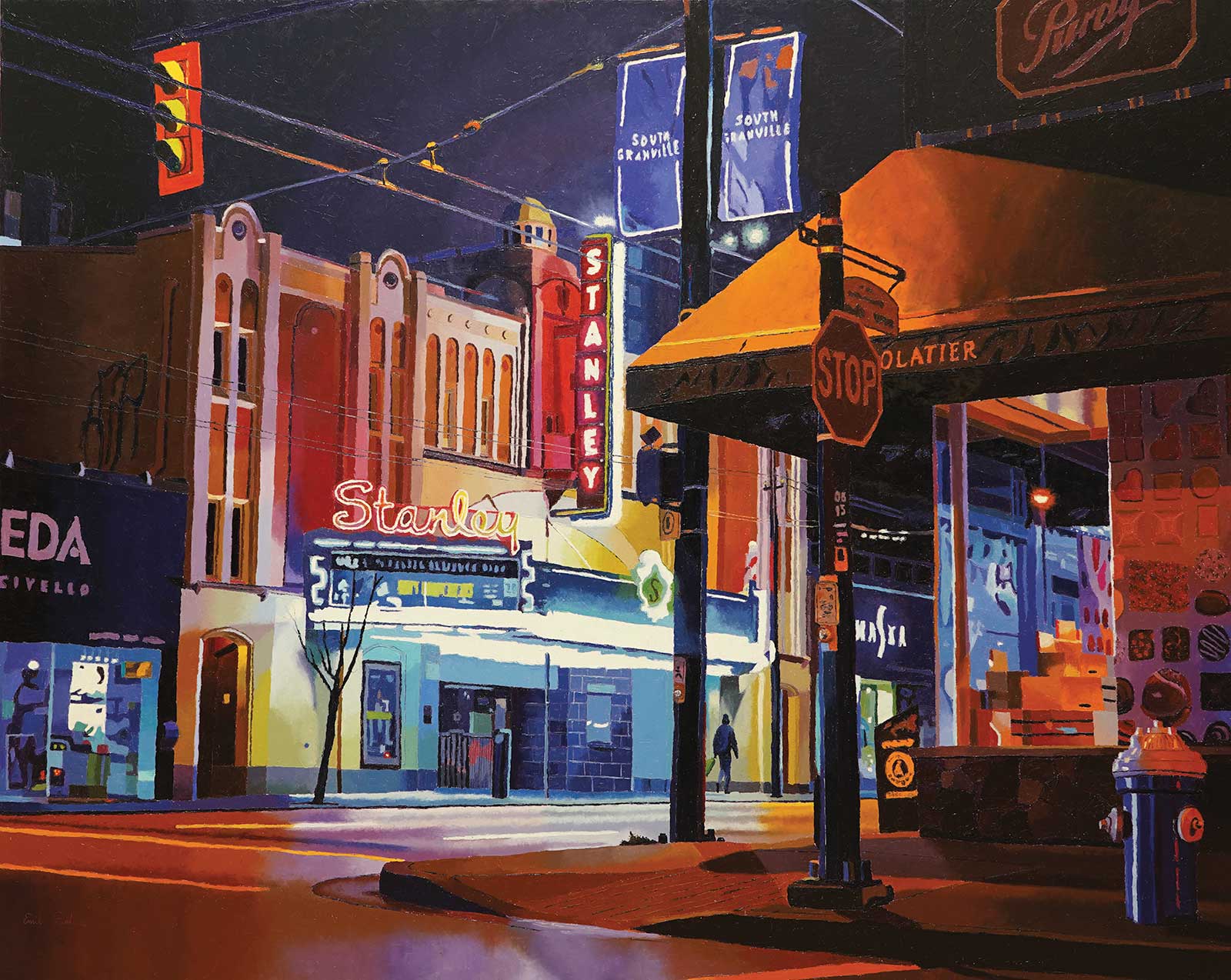
South Granville, oil on canvas, 48 x 60" (121 x 152 cm) The Stanley Theatre is an example of Art Deco style architecture and originally opened in 1930 with the neon signs being added in 1947. Fortunately, it still stands today after once being slated for demolition. I really enjoy the bright electric colors that bring the city to life at night. I also enjoy painting the reflections on curved surfaces, such as the fire hydrant in this piece.
In my work, I use only palette knives both to mix and apply paint. I’ve tested most sizes and shapes of palette knives but have settled on using DeSerres 2909. In this demonstration it is the sole palette knife that I used for the painting, and in my past decade of painting with palette knives, it’s the smallest one I’ve used thus far. The size along with the very pointed tip makes it ideal for details and for maintaining control over placement of paint.
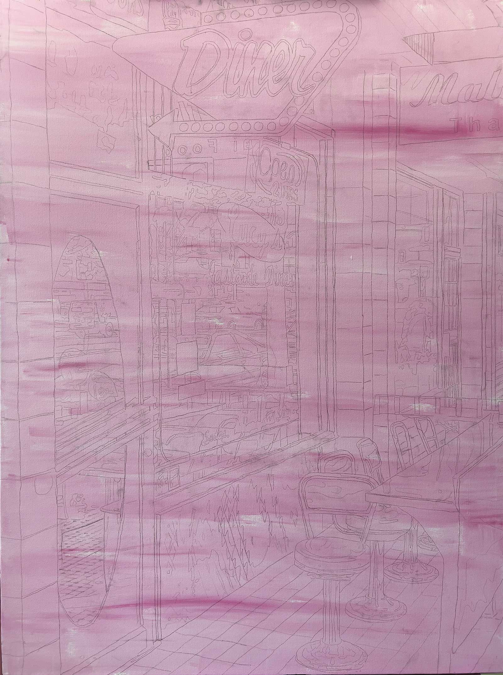
When beginning a work, I tone my canvas by applying a thin layer of acrylic paint mixed with gesso. In this demonstration, I have toned my canvas with pink. Toning your canvas will take you from the jarring effect of a stark white background to a more grounded starting place with mid-tones. The bright white of a blank canvas tends to shift our perception of colors because of the stark contrast it creates against most colors. By starting your piece against mid-tones, you’ll give yourself a better position to assess colors from.
From there, I continue with a light pencil sketch based on my reference photo and then go straight into painting. As a painter who has long worked with oil paint, the technique I return to again and again to bring out the subtly saturated and slightly intensified look I strive for is the alla prima method. Whereas the more traditional approach to oil requires placing layer upon layer of paint while waiting for each layer to dry before continuing. With the alla prima technique, you are placing wet paint on wet paint. For many artists, this technique allows for a speedy process and possibly the completion of a painting in a single session. However, I work at a steady, deliberate pace, completing small sections at a time.
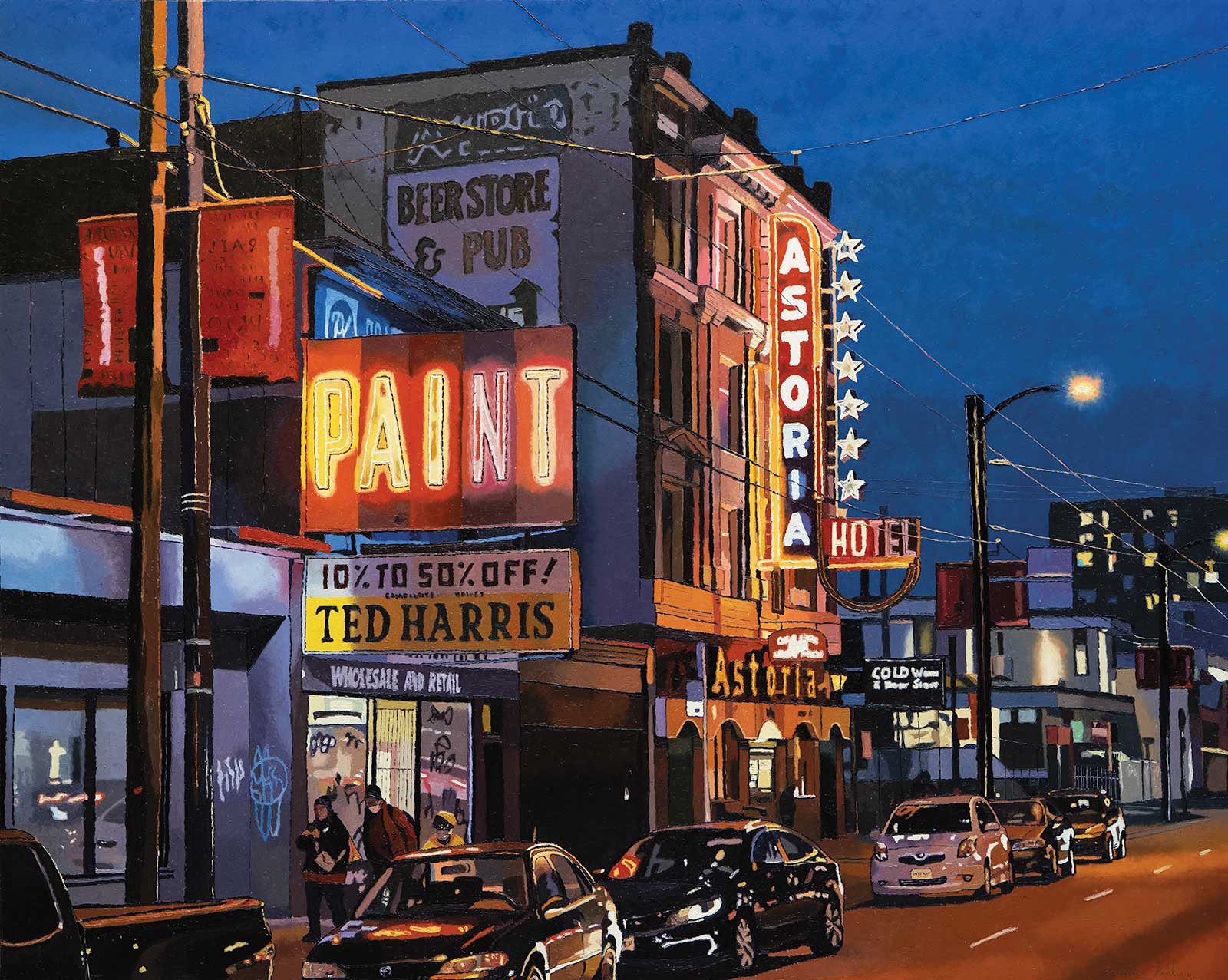
Affinity, oil on canvas, 48 x 60" (121 x 152 cm) Affinity means to have a spontaneous or natural liking of something. This scene encapsulates this word for me, from the vibrant colors that come alive in the night, to the reflections on the vehicles, to the neon sign. I enjoy painting different light sources at night, especially neon signs. The fact that this one says “paint” makes it particularly appealing to me. This painting depicts a scene from the Strathcona neighborhood in Vancouver, British Columbia.
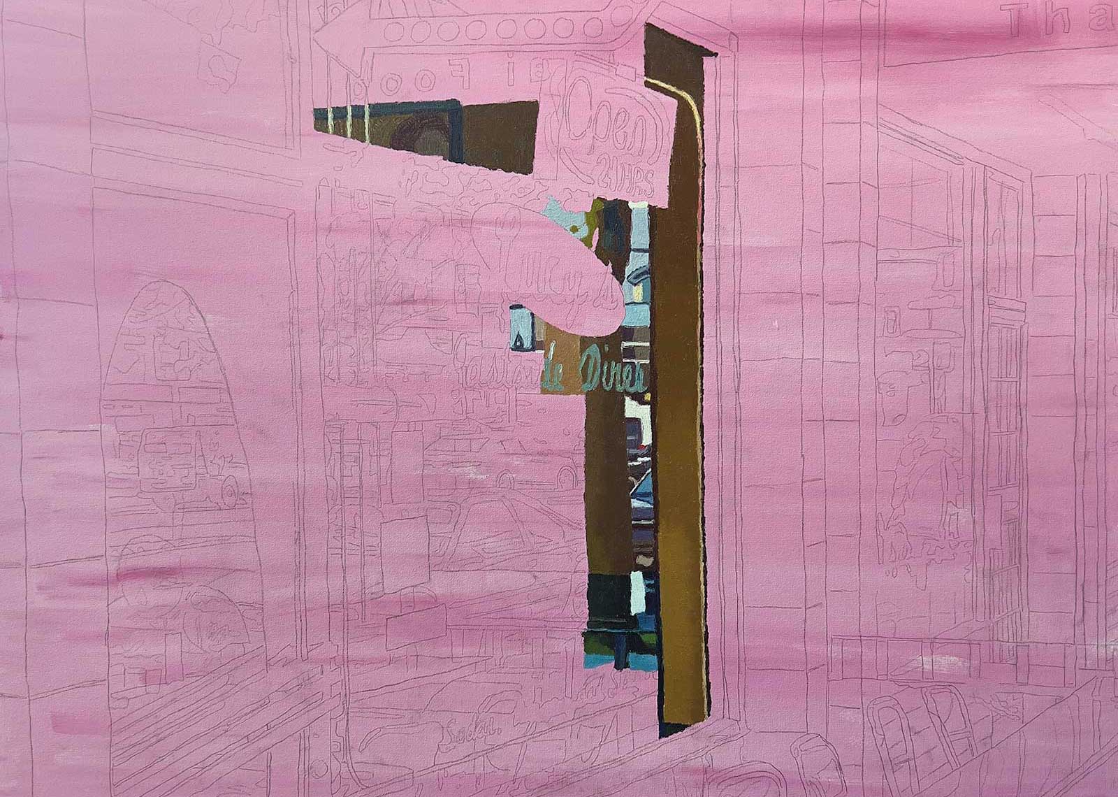
I often work from the farthest point back, which is typically the sky. However, in this demonstration, I start with the edge of the window to help give myself a structure to see where I am in the painting. Then, I circle my way out to the edges of the canvas.
In terms of color, I strive to create a rich and slightly more vivid than natural color palette in my work. I currently work with a limited palette of titanium white, alizarin permanent, French ultramarine blue, phthalo blue green, cadmium yellow, yellow ochre and chromatic black. Try experimenting with color to find what suits your work when using this technique. I prefer French ultramarine to create a rich night sky and phthalo blue-green is often my preference for accents, such as for the green of a stoplight or street signs. One practice of mine for keeping my colors on target is to regularly refer back to my reference photo to assess my color and tone.
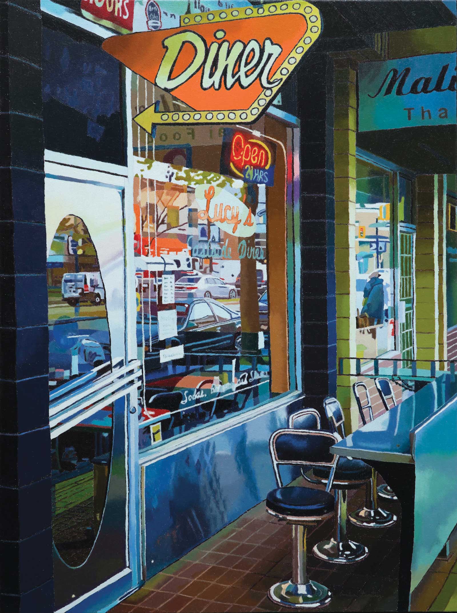
Every painting has a process behind it, whether strictly technical or psychological and emotional as well. This piece, Lucy’s Diner, is no exception. Beyond the process is the question, why paint this? All the details we often miss around us are present in this work, from the layers found within the reflection of a window to the colors reflected from a simple “open” sign. There is no historic landmark or luscious landscape in this work; it’s the kind of in-between moment that doesn’t make it onto postcards. Yet, those in-between moments are where we live most of our life. This work captures and appreciates that in-between space—the road trip to the designation, the conversation in the waiting in line for the museum, and the walk that leads up to the landmark. It’s easy to romanticize the ending, but the middle is where life happens.
My Art in the Making Lucy’s Diner
 Stage 1
Stage 1 Priming the Canvas
I have primed the canvas with gesso mixed with acrylic paint and completed my drawing based on a photo reference. The canvas size is 48 by 36".
 Stage 2
Stage 2 Creating a Reference Point
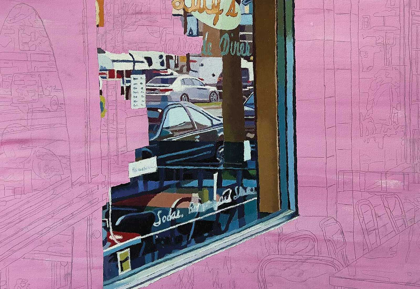
I chose to start with the window edge and planned to do the main window first. With so much detail, I wanted to start with a significant line to use as a reference point.
 Stage 3
Stage 3 Distant Details
I continue to fill in the window, focusing on the items further back such as the vehicles. Since the “open” sign is closer to the viewer, I am waiting to paint that part and I am circling towards it.
 Stage 4
Stage 4 The Diner Sign
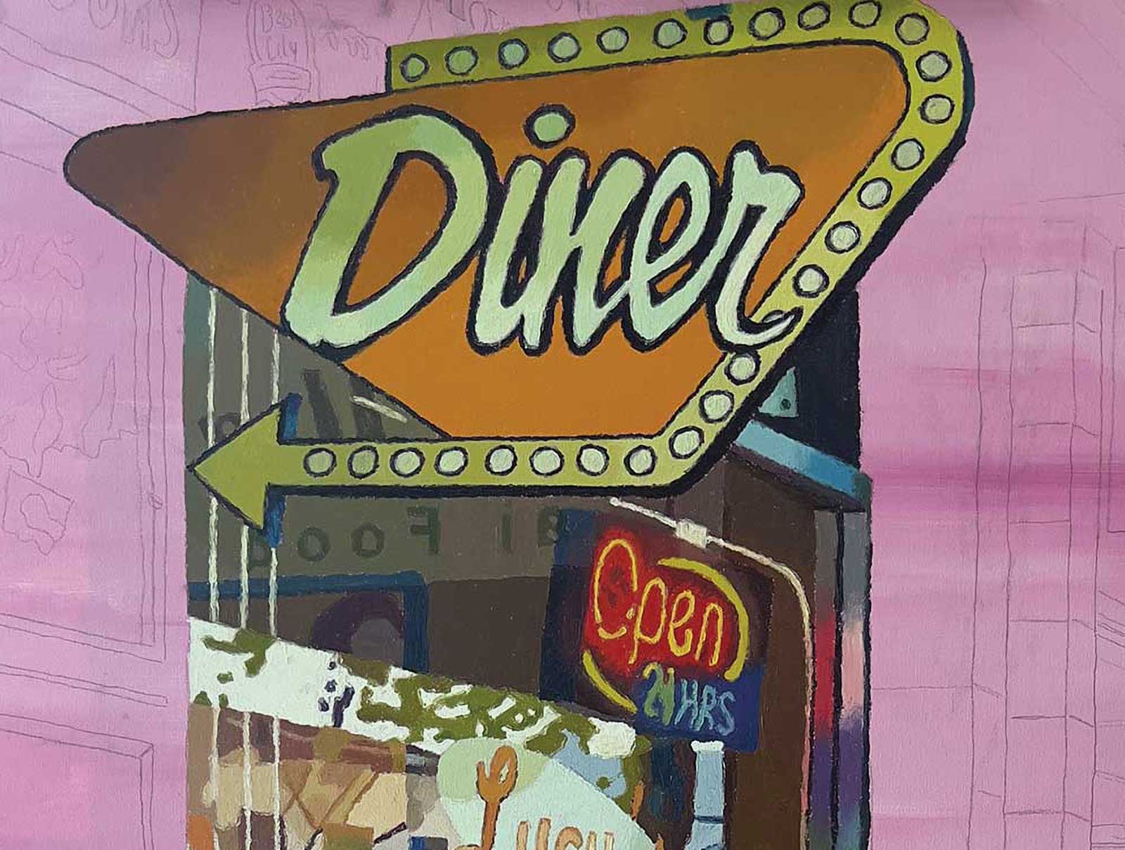
With the window complete, I wanted to paint an important focal point next, the diner sign. I often like to paint larger focal points relatively early on in the painting process.
 Stage 5
Stage 5 Gradients
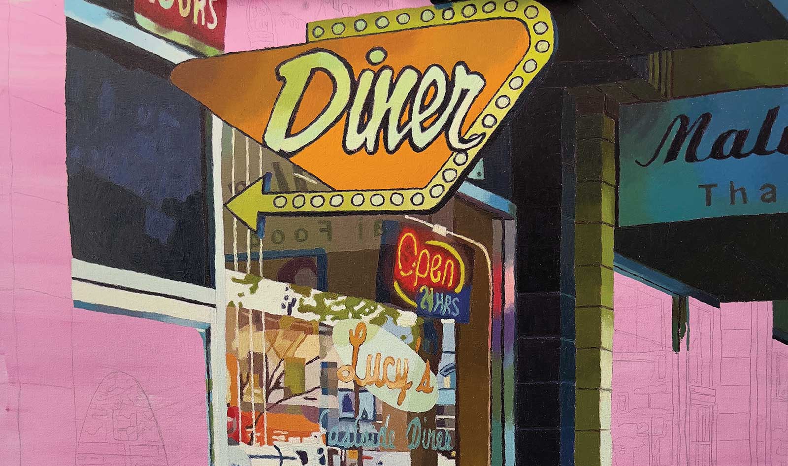
I am paying close attention to the gradient within the greens and blues on the brick and sign. I intentionally cropped the image to cut off the name of the blue sign to focus on the diner.
 Stage 6
Stage 6 Countertops
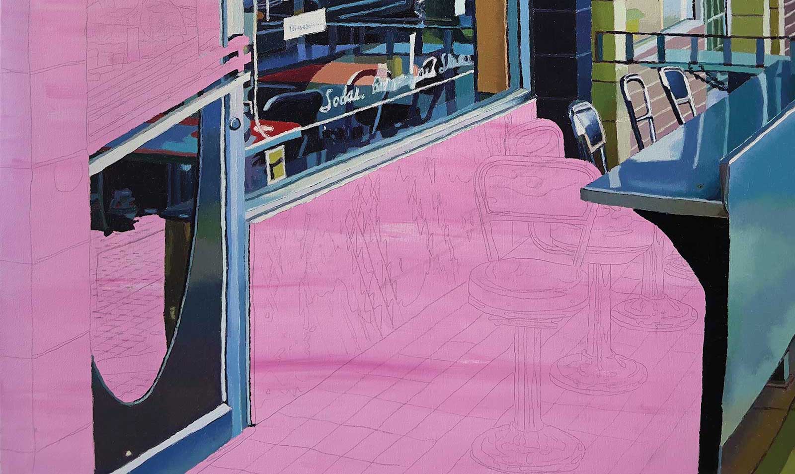
I have completed the reflective surface of the countertop and have begun the bottom half of the door and interior of the restaurant. Again, I am attentive to subtle changes in the gradient.
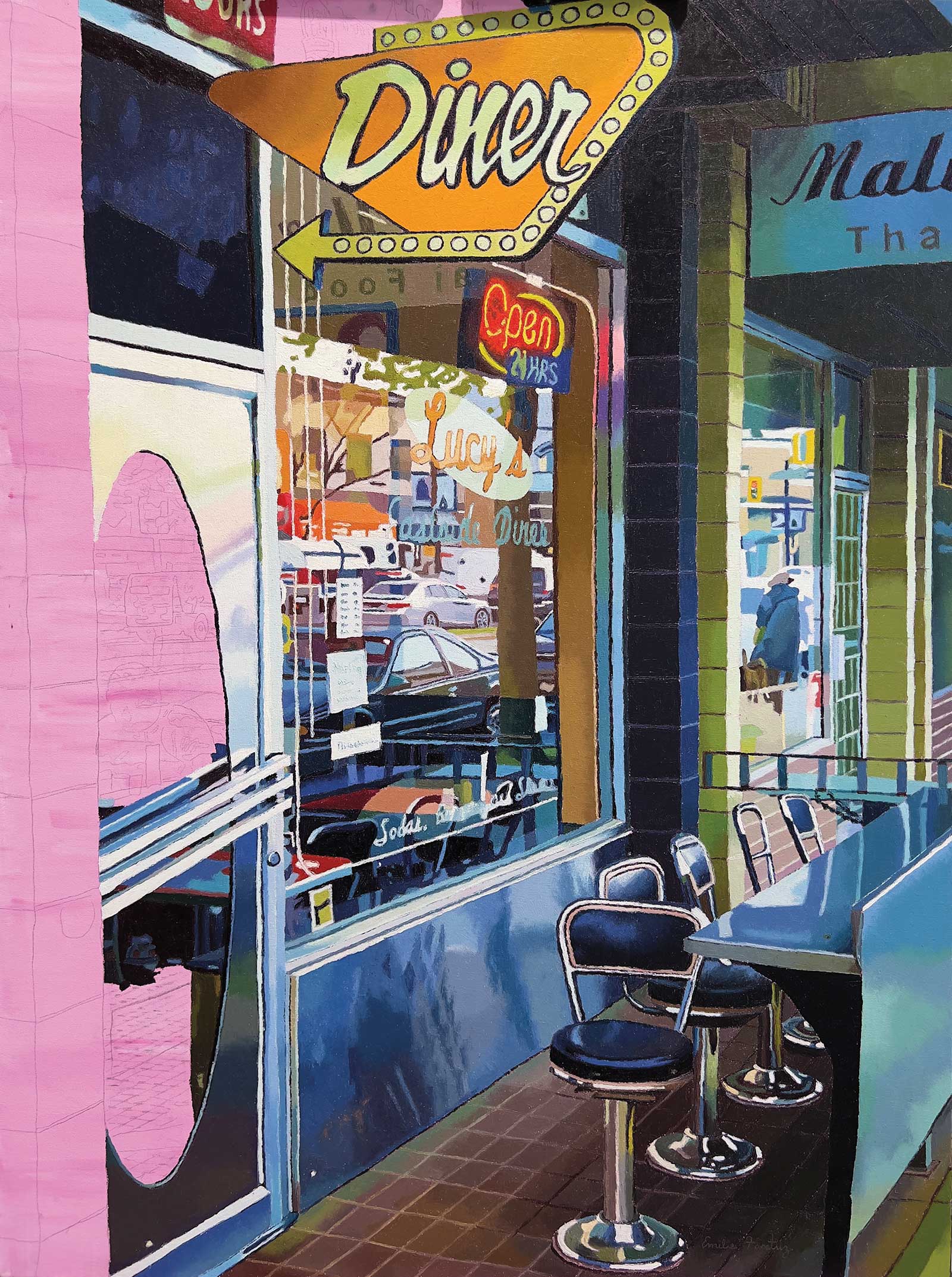 Stage 7
Stage 7 Assessing Color
I am constantly referring to my reference photograph to see how the surrounding colors are reflected in the chrome and other reflective areas as I paint the chairs, back wall and tile in front of the restaurant.
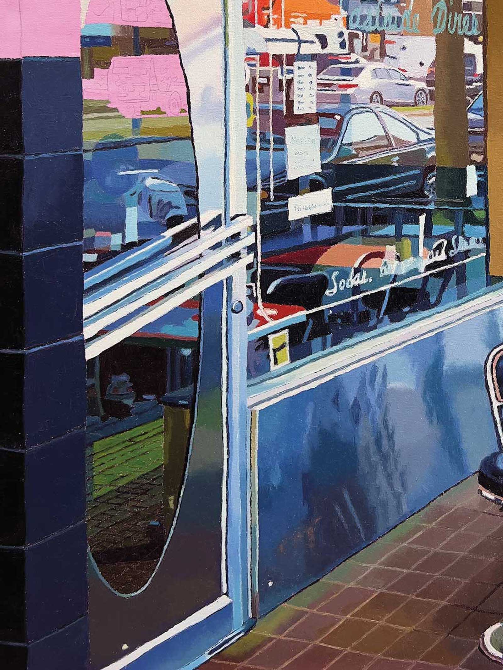 Stage 8
Stage 8 Final Details
I am circling up towards the top by painting the brick on the left side and also completing the window on the door that looks into the restaurant. I carefully paint the figure in shades of blue.
 Stage 9
Stage 9 Finished Artwork
Lucy’s Diner, oil on canvas, 48 x 36" (121 x 91 cm)
About the artist
 Emilie Fantuz
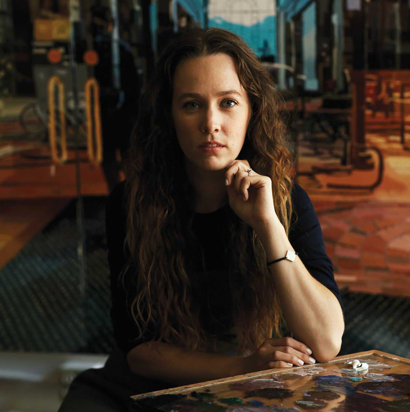
Emilie Fantuz is an American-Canadian artist known for her large-scale paintings depicting reflections and nocturnal urban landscapes. Her palette knife paintings combine technical elements of hyperrealism with an abstracted stylization that is distinctly her own. Through reflected imagery and complex compositions, Fantuz investigates the perception of color and light inspired by the beauty of everyday scenes. Fantuz’s work has been featured in exhibitions throughout Canada, the United States and the United Kingdom and can be found in public collections including Bucci Developments Vancouver, Henry Ford Hospital and The Bank of Ann Arbor, and in private collections around the world including Canada, the United States, France, China, Caymen Islands, Switzerland and the Netherlands.
Represented by
Christina Parker Gallery, Newfoundland and Labrador, Canada, www.christinaparkergallery.com