


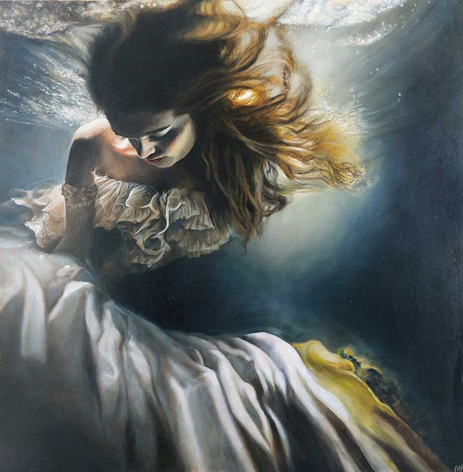
 Tides of Inner Struggle, oil on paper, 18 x 18" (46 x 46 cm)
Nadia Ferrante Lazio
Italy
Grand Prize is a four-page editorial feature in American Art Collector magazine
Emotionally Engaging
The style of Nadia Ferrante’s artwork is that of figurative and imaginative realism, in which the artist aims to depict reality from her own personal perspective through the use of symbolism, lights and colors. “It’s important for me, especially in the use of oil colors, to convey a sense of delicacy and softness in the strokes, avoiding visible brushstroke marks,” she says. “To achieve this, I employ several layers of color, often thin glazes, before defining the details.”
Another technique she deeply loves is soft pastel, which she considers equally impactful in its rendering capabilities compared to oil.
“I draw inspiration from the theme of women’s condition in contemporary society, exploring interpersonal feelings, reflecting on our connection to today’s society, and delving into the complexity of human relationships,” says Ferrante. “I am motivated by the opportunity to portray the human figure and the ability to capture, in an image, the entirety of a personality.”
While her primary focus is on the representation of the human figure—delving into the intricacies of its portrayal and the dynamic interplay within the human form—Ferrante also aspires to convey a narrative within her artwork, incorporating symbolism, inspired by the Renaissance and Baroque masters. “The invaluable aspect for me is eliciting a response from the viewer that indicates a comprehension of my artistic intent. The goal is to communicate profound meanings and emotionally engage the observer, aiming to create an artistic experience that transcends mere visual representation,” says Ferrante. “This approach seeks to echo the depth and storytelling prowess of historical artistic periods while resonating with contemporary sensibilities.”
My Inspiration
This artwork is inspired by the observation of contemporary society and the condition of women. It reflects on the complexity of wearing different masks in various daily life contexts. The desire to conform to societal and familial standards often oppresses us, symbolized by the woman immersed in water. Initially providing a sense of security akin to amniotic fluid, prolonged immersion becomes potentially lethal. In an internal struggle, we seek protection in conforming to external expectations, unaware of the inherent oppression. This artwork prompts intense reflection on the subtle line between social adaptation and the loss of one’s identity.
My Design Strategy
In this composition, I aimed to capture the essence of water and the immersion of a human body within it. The bluish light creates a captivating contrast with the cool tone of the skin, accentuating the warm golden hues of the hair and dress. Despite water’s potential treachery, it becomes a conduit back to warmth through the interplay of light. I began with my own photographic references, adding the dress and hair to evoke the sense of immersion. The process commenced with hand sketches, followed by refined photo editing to enhance position, atmosphere and lighting.
My Working Process
For this artwork, I embraced the lightness and subtle texture of vintage cotton paper. A part of a collection gifted by a painter, I sought to breathe new life into it. Employing a non-absorbent acrylic base as a primer, I aimed to shield the paper and preserve its colors over time. Steering away from pronounced brushstrokes, I favor a homogeneous surface without visible impastos or disruptions. Consequently, I employed a technique involving multiple thin layers of oil paint and glazes, thinned with liquin and a minimal amount of liquid solvent. Concluding with the addition of subtle details to fortify the piece, I completed the work with a final varnish.
Contact Details
Email: nadiaferranteart@gmail.com
Website: www.nadiaferrante.com
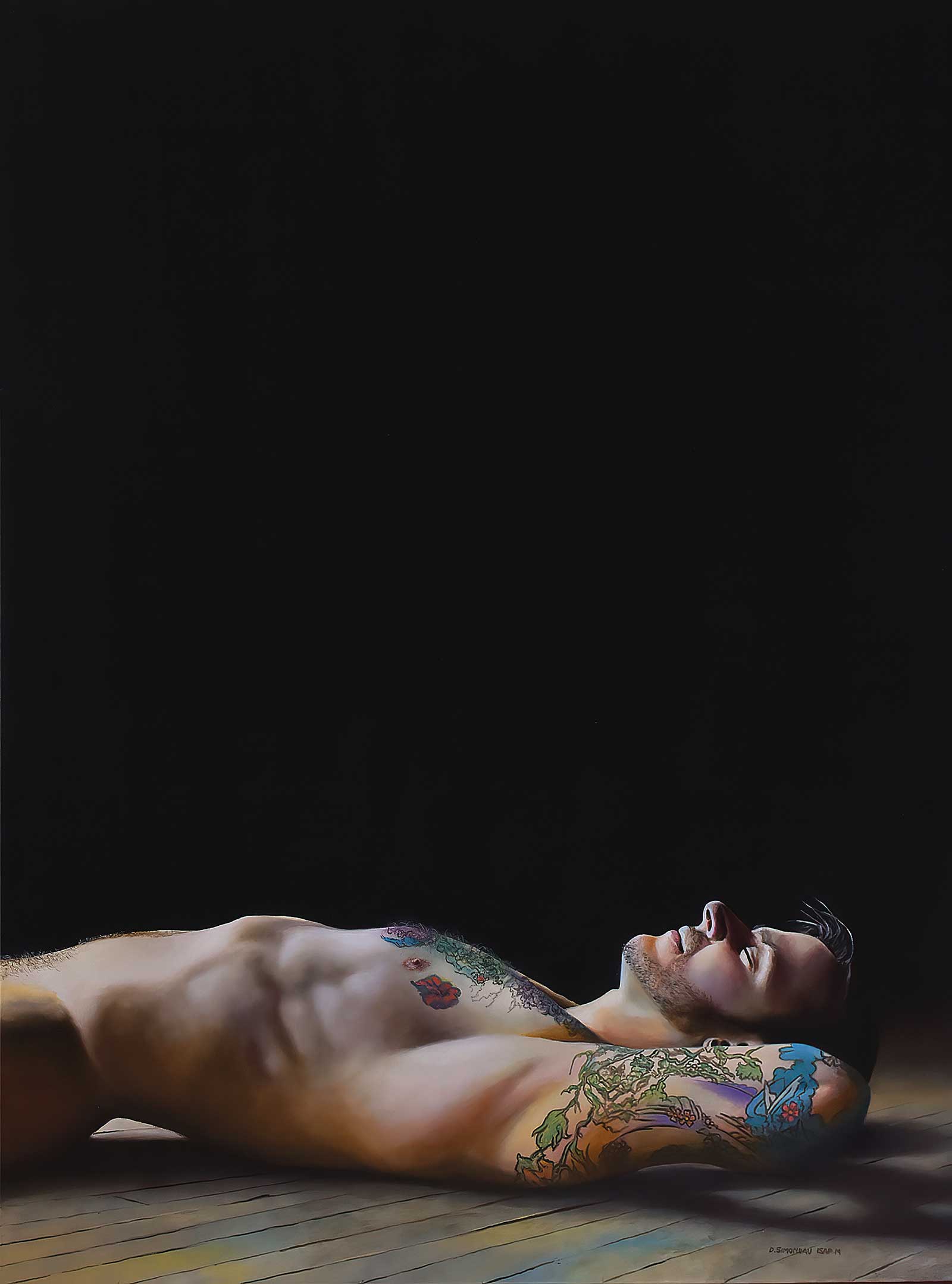 In the Eye of the Storm, acrylic on canvas, 40 x 30" (101 x 76 cm)
Dan Simoneau Wisconsin
USA
Second Prize is a two-
page editorial feature in American Art Collector magazine
My Inspiration
The inspiration for this painting arose during the pandemic. I was seeing all the conflict regarding vaccinations and safety measures and felt I was in the middle of a large storm. I thought back to my youth when I experienced being in the eye of a hurricane and seeing the sun shining down while dark storm clouds were swirling around me. In this painting, the turmoil is represented by the dark space above the figure weighing down on him. The light hitting him represents the inner peace and tranquility experienced through closing out the world, even temporarily.
My Design Strategy
I tend to lean toward non-traditional composition in my work. In this instance, I intentionally composed approximately two-thirds of the top of the painting as dark space to create the sense of foreboding and heaviness. Placing the figure low in the picture plane was intentional to complete that feeling. Another common theme in my work is strong use of light and shadow. I’ve been an admirer of Caravaggio and his use of chiaroscuro and have incorporated the technique into most of my work. Chiaroscuro lends itself well to drama and helps tell the story I intended.
My Working Process
I draw my composition onto the canvas before I begin and place all my intended base colors on the entire canvas first. This sets the tone for the finished work and gives me a good foundation for the remaining layers of paint. Once the base is in place, I work section by section using transparent and semi-transparent washes of color to build depth and form. Though I work section by section over the whole canvas, I don’t complete one section fully before moving to another. This helps keep cohesion throughout the work.
Contact Details
Email: dan@dansimoneauart.com
Website: www.dansimoneauart.com
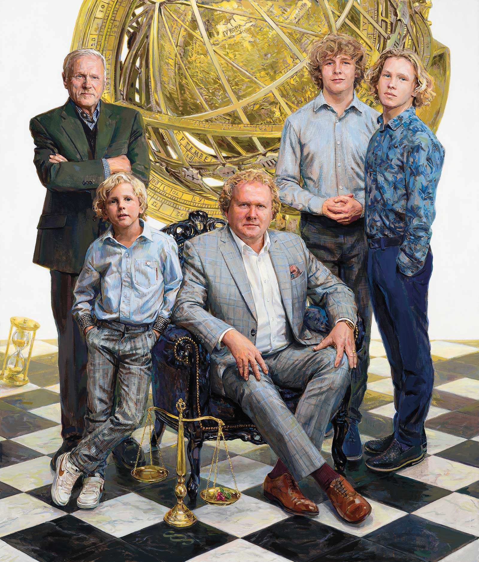 Mr Tõnis Pohla with His Father and Sons, oil on canvas, 53 x 45" (135 x 115 cm)
Aapo Pukk Harju
Estonia
Third Prize is a one-page editorial feature in American Art Collector magazine
My Inspiration
I received a phone call with a request to paint a portrait for the 50th birthday of a businessman. I was told he was a man who had everything and collected art. Tõnis called me, we and our spouses met, had some tea and biscuits and had a discussion. Out of this grew the idea to paint a portrait of the men of this family. Since Tõnis’ father Vello held several important positions in politics and culture, he wanted him in the picture too, out of respect for his father. For example, Vello was a member of the Parliament of Estonia and the editor-in-chief of the Sirp cultural weekly. And naturally, the picture would include all the boys. His spouse was not included in the image at this point. Pictured from the left: grandfather Vello, little son Harald, Tõnis himself, son Paul and son Mihkel.
My Design Strategy
I started at their home, where the painting would eventually go on display. The measurements increased significantly and a spot was found for the painting in the living room, a place of honor opposite the fireplace. I invited all the men who would be in the painting to visit me at my studio. From the very start, when I had my first meetings with Tõnis, I started to envision certain paintings from art history, including Hans Holbein’s The Ambassadors from 1533, and Johannes Vermeer’s The Art of Painting, from the mid 17th century. I was envisioning that air of formality, turning one’s face towards the viewer for a moment. I also thought about parallels with Holbein’s paintings of Henry VIII from 1536. A certain sense of surface, showing the momentary patterns of the ornament on the fabric of life. I respect art history, but I live in modern times. My sitter respects art history and lives in modern times. I have wondered why my paintings often come with slightly different styles and aims. Because the people who end up in my paintings have different styles and aims. Tõnis’ art collection includes both classic as well as very modern art.
My Working Process
I started with raw umber and turpentine, then I covered it with retouching varnish, and only then added one-fifth of damar varnish and continued with raw umber. After each layer, I thinned the layer of paint in the evening. One layer after another. The models came to sit for me several times for hours at a time. Sometimes I also painted from photographs. The aim was to get to the smallest of details without losing sight of the whole and without losing myself. The entire process of painting took about two months.
Contact Details
Email: aapopukk@gmail.com
Website: www.aapopukk.com
Finalists
Each receives an Award Certificate and a one-year subscription to International Artist magazine PLUS having their work seen worldwide by international galleries looking for new talent.
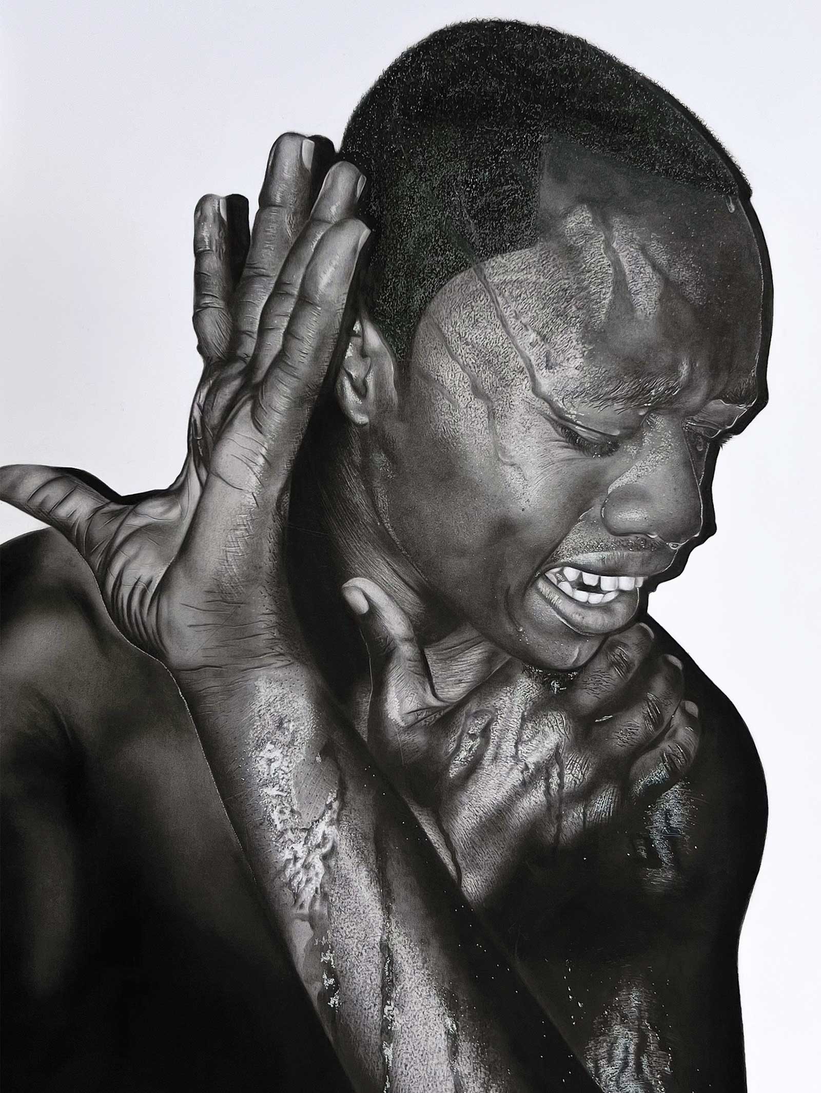 Solitude, charcoal pencil on paper, 34 x 23" (87 x 60 cm)
Talent Mudarikwa Harare
Zimbabwe
Finalist
My Inspiration
Solitude is creativity’s best friend and a refreshment to our souls, giving you space to think about your feelings, ideas, hopes, problems and experiences. Past mistakes and traumas that never got to be answered creep in and leave you restless, stuck in a body that wants to go on but with a mind that’s tired of living as a human. Drawing is my source of happiness and the only act that calms and brings me inner peace.
My Design Strategy
Art can be used as a way of emotional and psychological therapy; it helps individuals in managing intense emotions and trauma, fostering self-awareness by decreasing stress and anxiety. I feel heard and understood when I draw, so in doing my drawings I’m aiming for viewers to experience this deep connection in their minds and hearts from their very first glance. My hope is that it triggers a certain feeling that brings healing or happiness to some souls that never got to share their stories.
My Working Process
Firstly I look within myself for a subject that better explains my feelings at the moment. I get to connect with the drawing mentally and emotionally. In my drawing process I use the grid method whereby I will be capturing almost every detail that is in the reference grid and putting it on paper. I use Gioconda charcoal pencils on 300gsm paper. It takes over 150 hours to complete. Once finished, I apply a fixative to the drawing so it won’t smudge.
Contact Details
Email: 26munashetalent@gmail.com
Website: www.talentmunashe.com
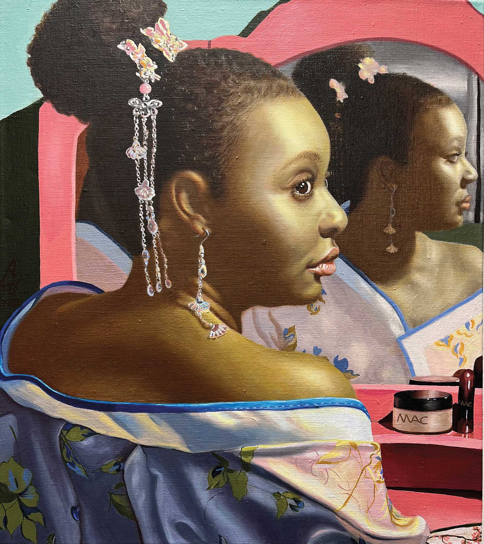 Cydney with a Chinese Traditional Garment Han Fu, oil on linen canvas, 16 x 14" (40 x 35 cm)
Liuqing Ruth Yang
West Virginia, USA
Finalist
My Inspiration
I am a portrait painter in oils, valuing the traditional painting skills developed by European masters. My artworks are greatly informed by the master painters Raphael and Caravaggio, particularly their religious works, which are inspirational as a Christian. In this painting my inspiration came from Old Master Johannes Vermeer’s Girl with a Pearl Earring. I am creating a new connection between history and contemporary art theory and melting Chinese culture with African-Americans.
My Design Strategy
I researched contemporary painters examining and crossing cultures and painting methods such as Kehinde Wiley and Kurt Kauper. My paintings are tied with traditional painting techniques to explore Christian icons, symbolism and culturalism, but replace the historical landscape with contemporary components such as a pink makeup table and makeup products. I used Vermeer’s pose for the portrait but removed the Western clothes and jewelry—a reinterpretation of the beauty of culturalism. My model is a African-American girl who wears a Chinese traditional garment, Hanfu, with China Ming Dynasty headgear and earrings.The reflection of the mirror creates a three-dimensional space. I want my painting to torch our time and let the audience feel that artwork is immediate, shortening the distance between art and the viewer’s life.
My Working Process
I explore individual humanism and personal subjectivity through multiple layering techniques for the underpainting and colors. I focused on sensitively describing the three-dimensional space of the characters and their dynamic, vivid body language. This artwork employs a green background to make a strong, chiaroscuro contrast to the hot pink color of my subjects. This was a very tedious, mentally and physically laborious painting process of repeated modification. Also, I hand made my own high-quality linen canvas and wood frame, as did many of the Old Masters.
Contact Details
Email: ruthyangartist@gmail.com
Website: www.liuqingruthyang.com
 Connectivity, oil on canvas, 60 x 60" (152 x 152 cm)
Diana Tremaine
Montana, USA
Finalist
My Inspiration
All of my work is inspired by what I see around me on a daily basis. I have watched my daughter and her friends navigate the world of social media for many years now. It is omnipresent, a new reality they must learn how to live with, embracing the possibilities and avoiding the pitfalls. Connectivity makes no judgment but rather provides a bit of zeitgeist into this unique era with this specific demographic.
My Design Strategy
With all of my work, composition and a design that leads the eye into and around the entire image is of the utmost importance to me. I want the negative shapes to be as compelling as the “subjects.” I never want my viewer held or stuck in one spot. Rather I want the eye to glide across the image from side to side and top to bottom like an effortless ice skater.
My Working Process
My figurative paintings all start in my mind with a concept of what I want to say and how best to do that. I then set up and direct my models according to this vision. From dozens of reference photos I draw the image in paint on the canvas, adjusting here and there until the composition is strong. My painting process is then extremely physical, always adding and subtracting based solely now on the needs of the image.
Contact Details
Email: diana@dianatremaine.com
Website: www.dianatremaine.com
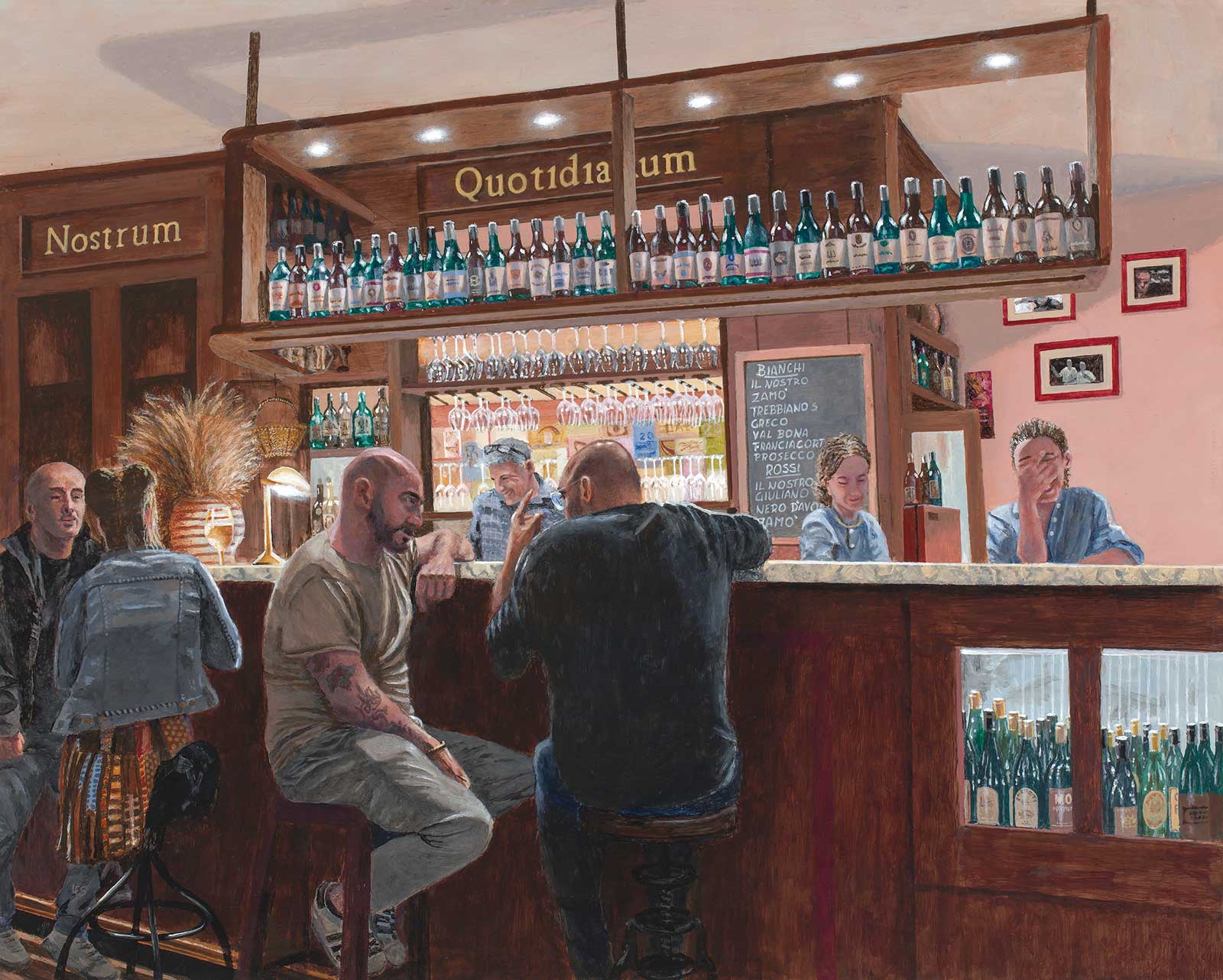 Bottega del Vino, acrylic on gessoed panel, 16 x 20" (40 x 50 cm)
Len Swec
Connecticut, USA
Finalist
My Inspiration
My wife and I visited Perugia, Italy, where a restaurant named Bottega del Vino became our favorite. It had an intimate atmosphere, a friendly staff and customers, and a somewhat retro-looking wood-paneled bar area. But, I didn’t think about doing a painting until I saw, in one of the photos I had taken, a server attempting to suppress her laughter at something the owner-bartender had said. Then I noticed customers in conversations in other photos and decided it could all make an interesting ensemble.
My Design Strategy
During our visits, I had taken a number of photos of the staff, the bar area and customers who came and went. The bar made an obvious focal point, with its display of wine bottles and glassware, the strong backlighting contrasting with the subdued lighting in the dining area. I combined elements from several reference photos into a single composition to emphasize both the intimacy of the setting and the contrasting lighting.
My Working Process
After creating a poster print-out at the 16 by 20" size of the painting, I transferred a few relevant outlines to a gessoed panel using transfer paper. I painted the back walls and lettering first, then moved to the bottles and glassware, knowing this would occupy most of my time. The figures were done last, concentrating on how the backlit bar threw most of the details of the figures into shadow. I applied multiple layers of thin color glazes to create depth and subtlety of color in those shadows. The final step was to emphasize the bright overhead and bar lights and the reflections they created.
Contact Details
Email: len@lenswec.com
Website: www.lenswec.com
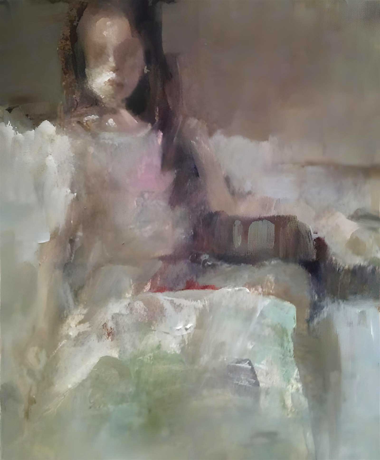 White Skirt, oil, 10 x 8" (25 x 20 cm)
Ann Rudd
North Carolina, USA
Finalist
My Inspiration
I love the experience of quiet contentment. I look for it, appreciate it and am generally intrigued when I see people sitting quietly, alone with their thoughts. I like to explore peaceful, introspective moments, as in this painting, using soft edges and neutral tones.
My Design Strategy
My paintings start with a river of dark value running through the shadows and out to the sides for structure. After finding a focal area, I tend to melt the subject into the atmosphere, without a lot of detail. In order to solve the problem of filling the background, I divide it into three horizontal bands of different values. This provides an intuitive game of choices and edge-play, completing the work with a variety of lost and found edges. I challenge myself to lose as many edges as possible.
My Working Process
I started with a warm surface tone, anchored by black areas for depth, and found a meandering river of raw umber. The top band in this painting is dark and merges into the hair, with the face emerging. The thick white paint on the upper lip and cheek adds an abstracted, sculptural look, which I felt was interesting. I carried the white skirt palette knife texture across the lower band, like frosting on a cake. The middle band has medium tones, soft edges, the hint of arms, a splash of pink for the garment and some green, rhythmic stripes under an arm, suggesting a pillow. The subject, with a confident expression, relaxes into her sofa.
Contact Details
Email: heyannie@bellsouth.net
Website: www.annruddonline.com