


As a contemporary portrait artist, my goal is to capture the complexities of human emotion by blending realism with creative color choices and the natural nuances of watercolor, celebrating the fluidity and unpredictability of the medium. I use bold brushstrokes, leave visible layers and let the watercolor drip, bleed and bloom—allowing the process to remain transparent and authentic.
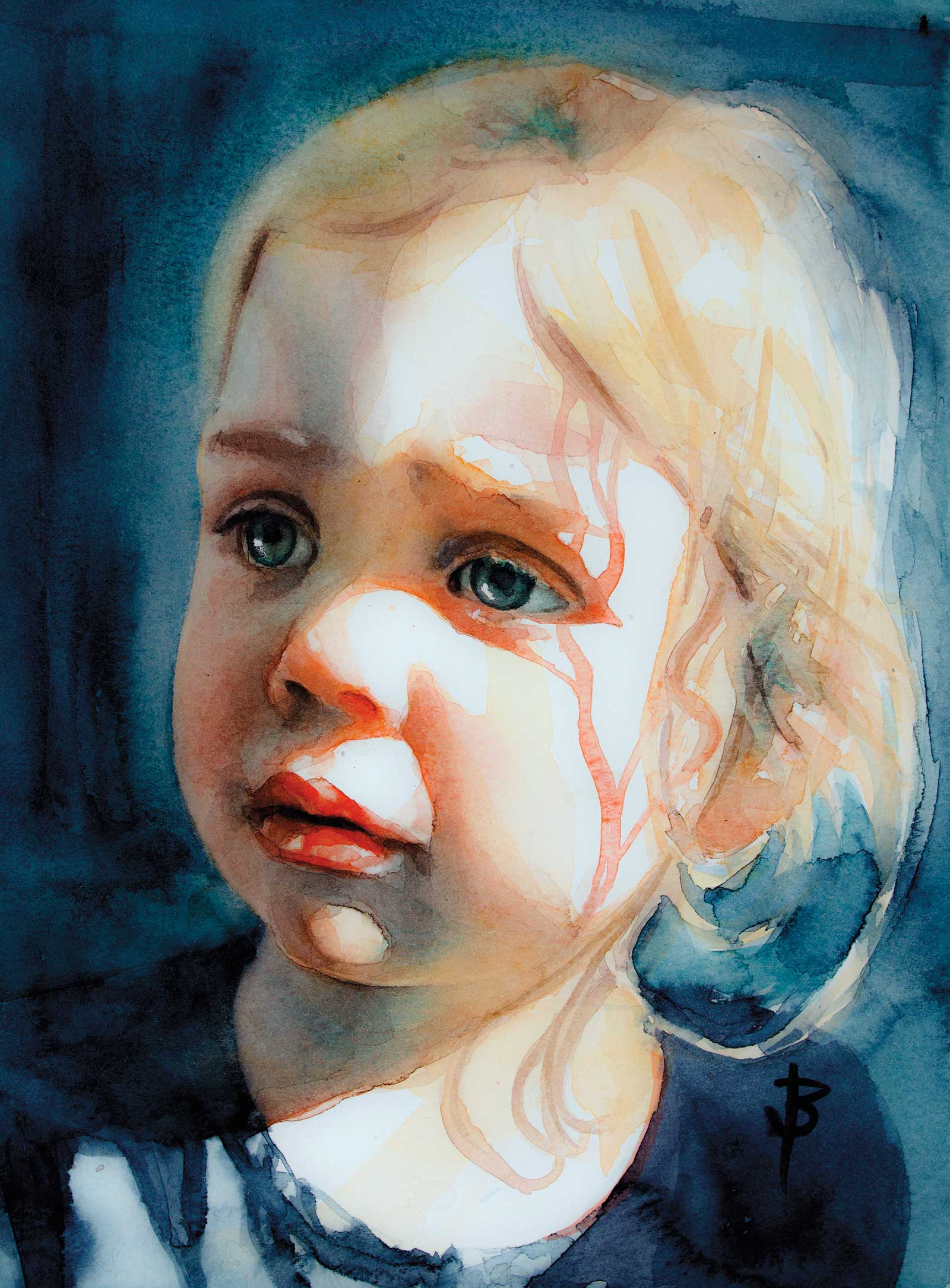
Tori, watercolor on paper, 9 x 12" (22 x 30 cm) Most of my paintings feature elements that showcase the organic, unpredictability of the medium. Here the blooms in the watercolor contribute to balancing realistic representation with creative expression.
When I begin a painting I always start with a very precise drawing, as I find that allows me to be loose and carefree during the painting stage.
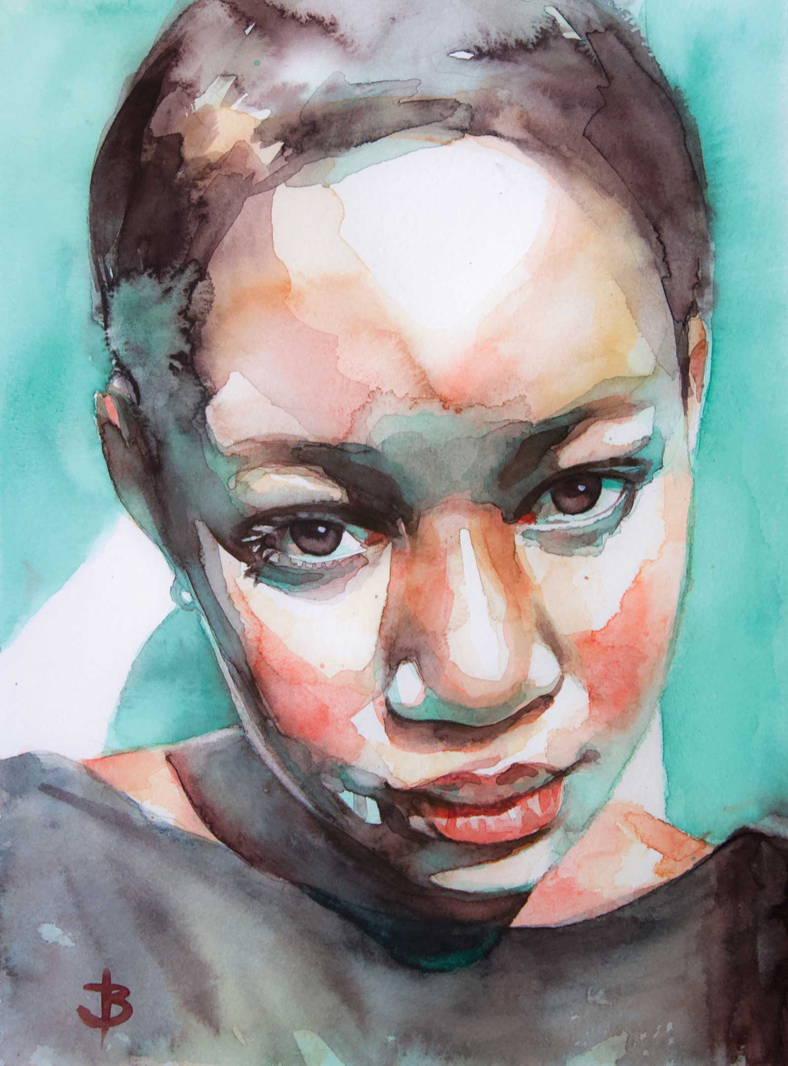
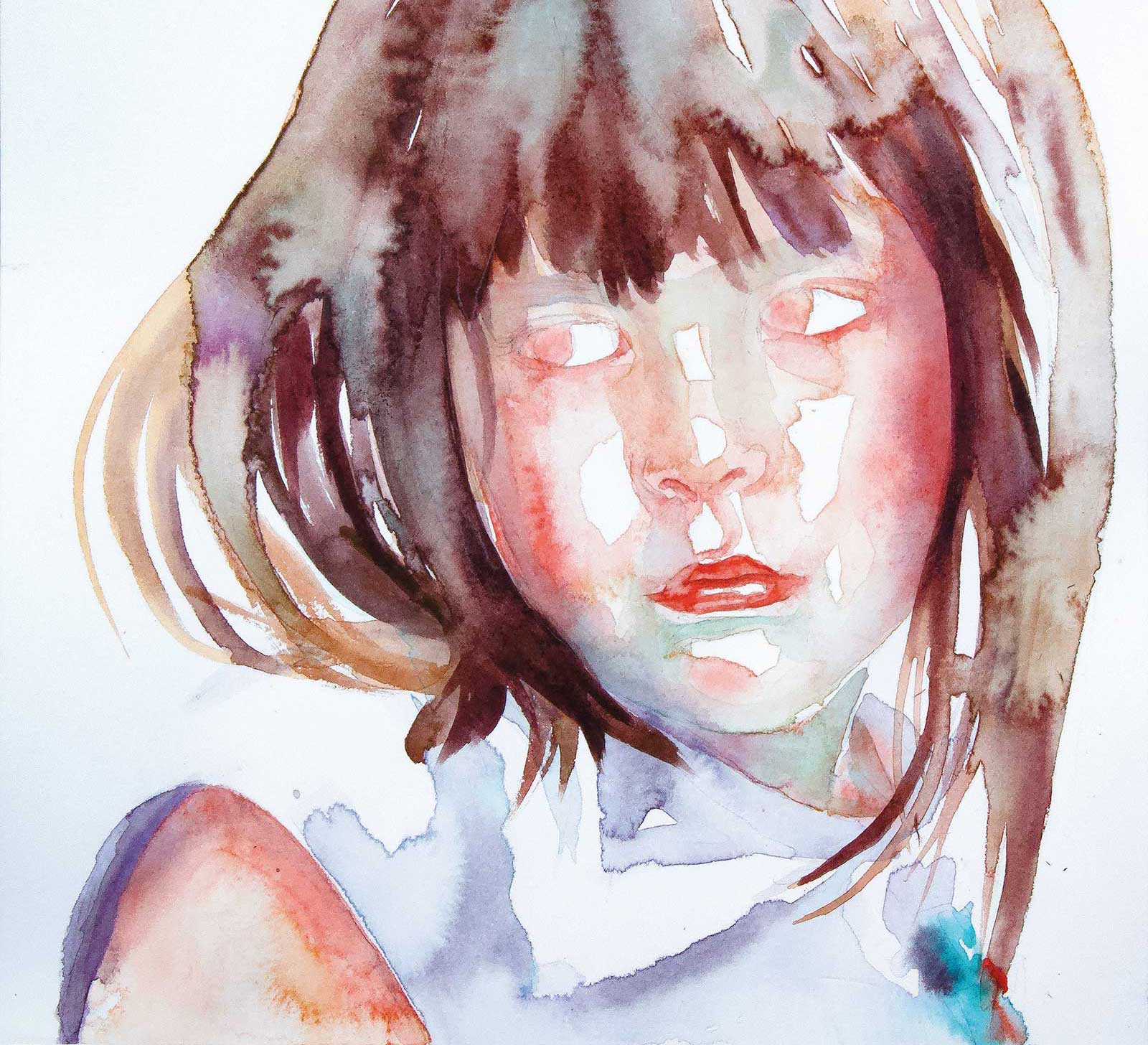
Duality, watercolor on paper, 9 x 12" (22 x 30 cm) In this artwork, my aim was to portray the striking contrast between the radiant sunlight illuminating one side of her face and the shadow engulfing the other side. Additionally, I sought to convey the emotion reflected in her expression. To achieve the focal point, I incorporated hard edges and harnessed the white of the paper to enhance the contrast. On the shadow side, I utilized soft edges to create a sense of depth, making it recede, conveying the angle of her facial position.
As my palette is typically made up of transparent pigments, any pencil work will be visible at the completion of the painting unless erased early. I remove as much of the gesture lines from the sketch as possible before commencing the painting. I also use a soft pencil (2B) for two reasons: so that the pencil won’t dent the paper and the linework can be erased even after a layer or two of paint has been applied. I erase the remainder of the pencil after the first couple of layers have dried.
Working wet on dry with a large brush, my first layer of paint is raw and spontaneous.
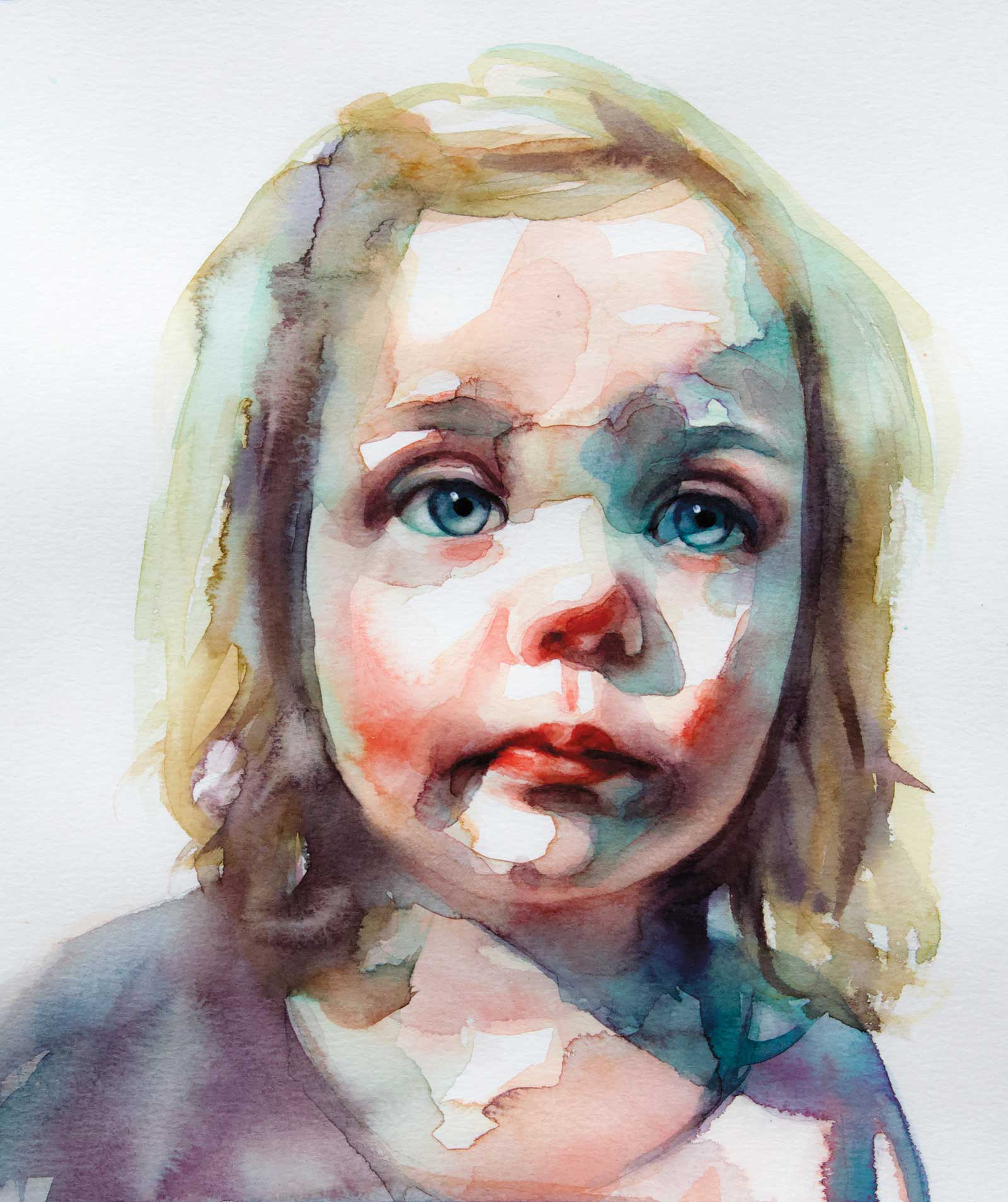
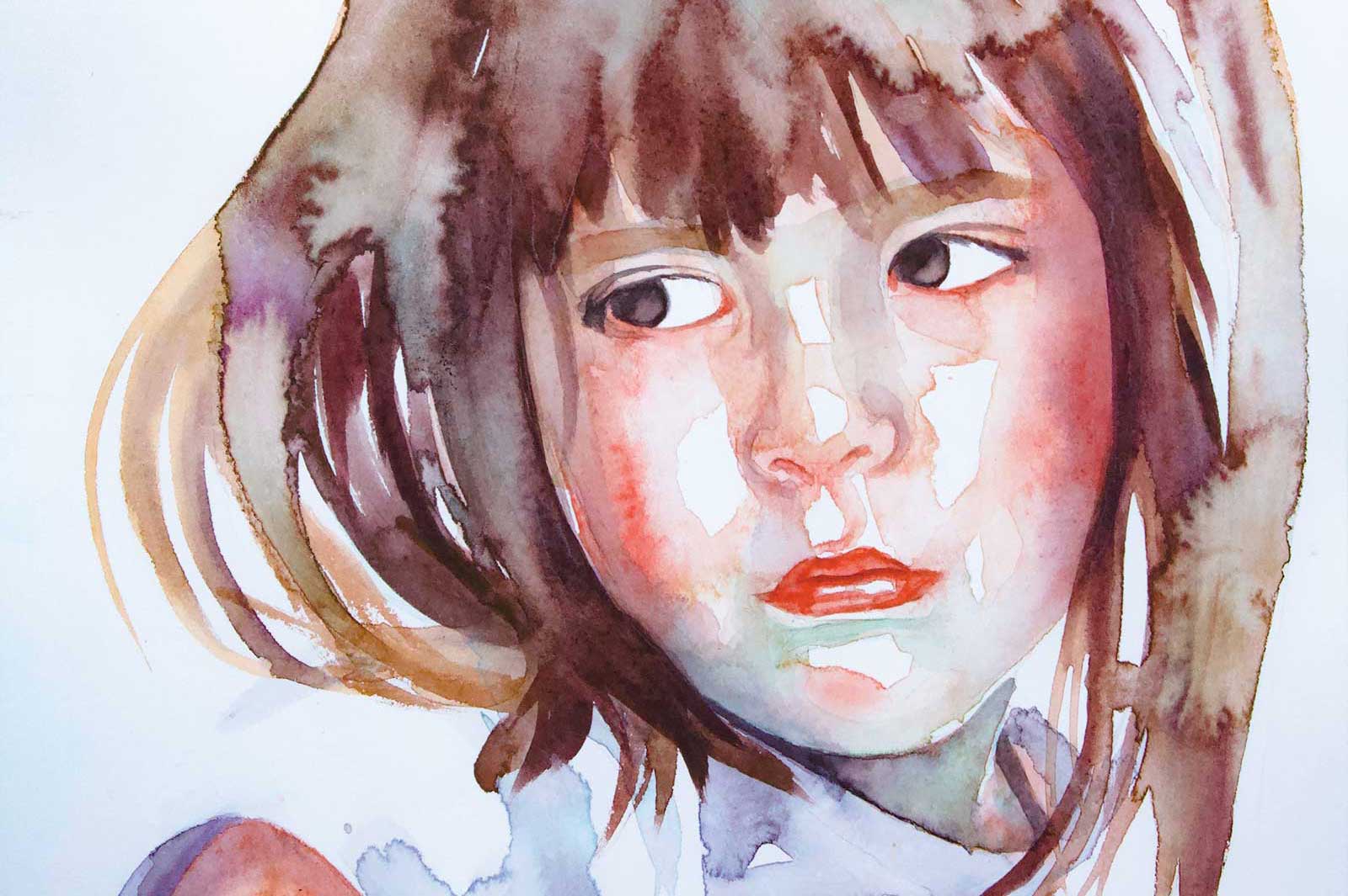
Brianna, watercolor on paper, 9 x 12" (22 x 30 cm) I frequently opt for minimal detail in the background, clothing, and hair, emphasizing the subject’s face as the central focus. In this painting I’ve gradually built up the detail in her face with multiple layers of glazing, creating a much greater sense of depth drawing her face forward.
I mix colors on the paper, encouraging the paint to flow across the connected shapes and allowing the runs and blooms to happen where they will. Once the initial layer is dry, additional layers are then applied using a combination of glazing and working wet into wet, depending on the area of the painting.
The following demonstration will provide further detail into my process.
My Art in the Making Nena
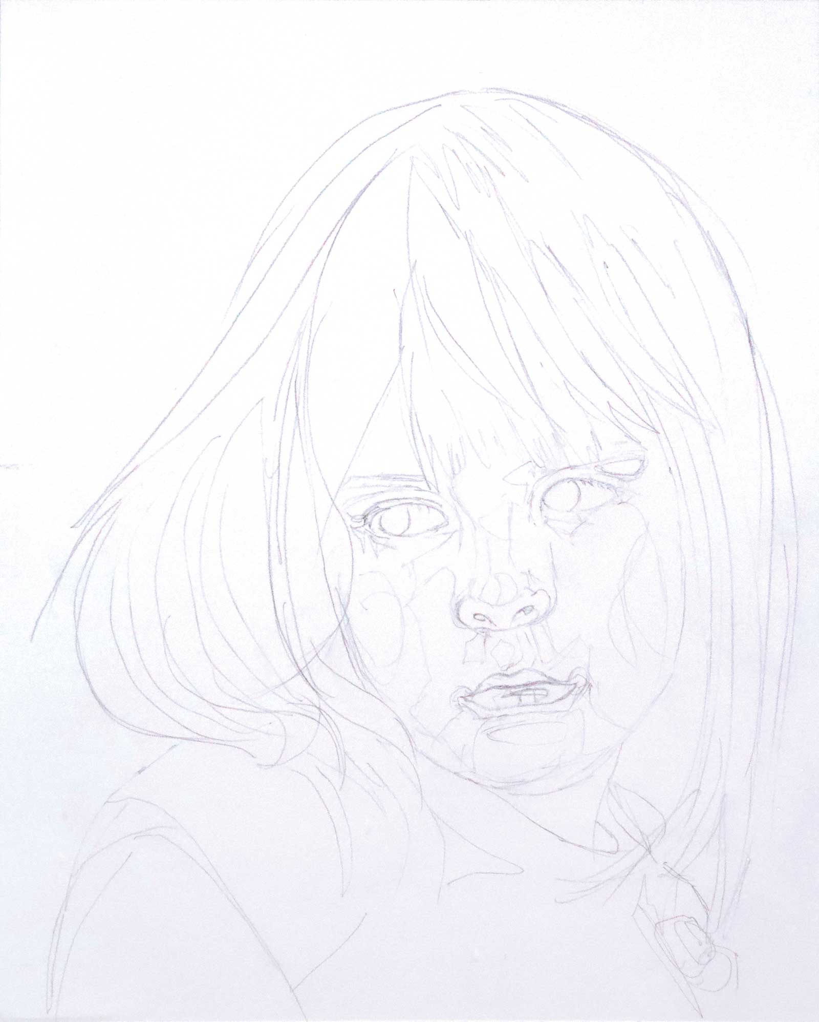
 Stage 1
Stage 1 Composition and Design
I tend to compose my portraits using a tight crop, focusing on the expression and capturing the emotion conveyed. I also take the opportunity during this stage to exercise some artistic license. For this painting, I pinpoint areas where I want to exaggerate the highlights on her face to create more interest and introduce a greater range of values.
 Stage 2
Stage 2 Selecting a Palette
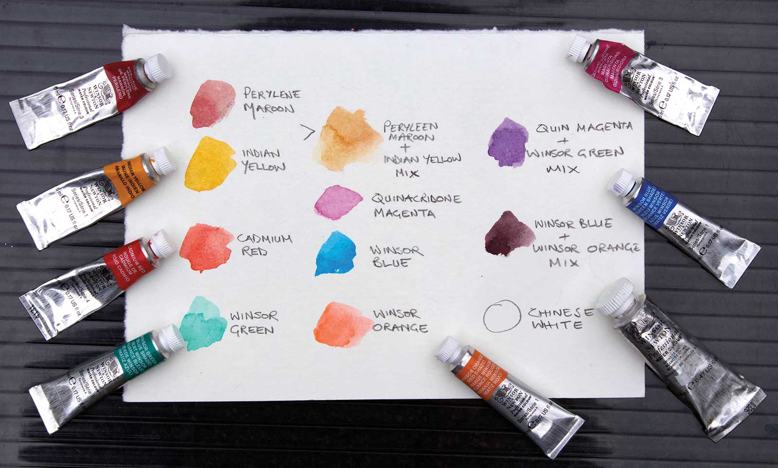
I use a simple palette consisting primarily of transparent watercolor pigments. This helps keep the luminosity of the colors throughout the painting. I prefer to mix my own darks so that I can control the transparency and hue. I take care to preserve specific areas of the paper, leaving them white, and use a white watercolor pigment solely for the specks of reflected light in the eyes.
 Stage 3
Stage 3 Initial Sketch
I spend a lot of time on the drawing stage ensuring proportions are accurate. After erasing any unnecessary linework I’m left with the general outline. I also pencil in any areas I want to keep as highlights (the white of the page).
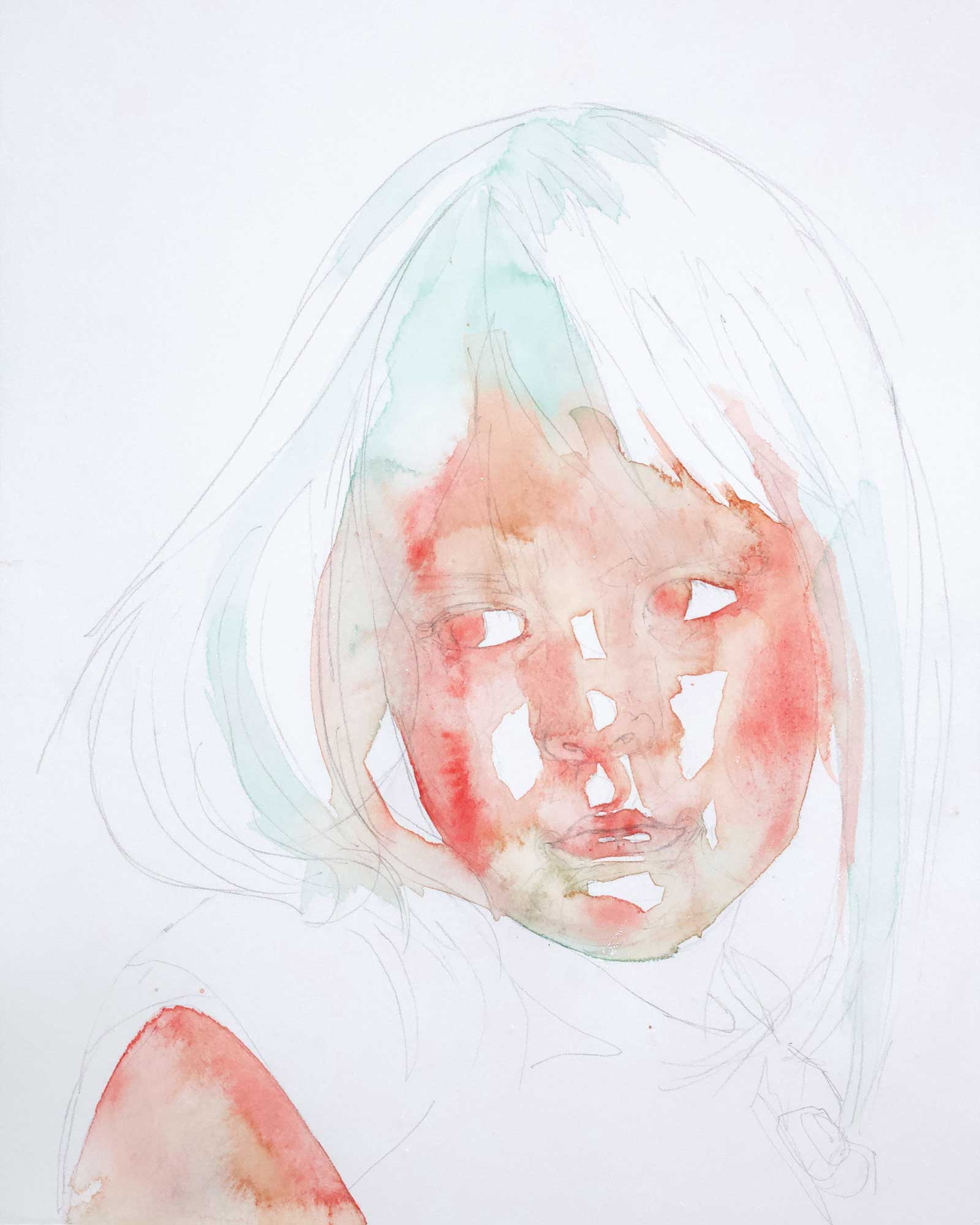 Stage 4
Stage 4 First Wash of Skin Tones
My first layer utilizes large brushstrokes, hard edges and lots of water. Using a large brush (round size 12), I work quickly, connecting the shapes and ensuring I preserve any highlights I want to keep. I’m using my flesh tone mix of perylene maroon and Indian yellow, cadmium red and Winsor green (blue shade). When adding the green, I exercise caution to avoid muddying the complementary red pigment. I use minimal brushstrokes and leave the pigment undisturbed once it’s down, refraining from overmixing the colors on the paper.
 Stage 5
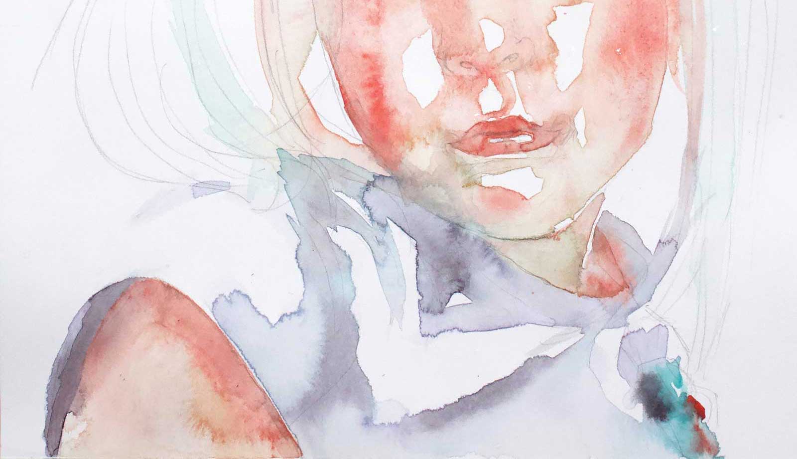
Stage 5 Continuing the First Wash
I continue the wash down the paper to include her clothing, which I want to keep very loose and impressionistic, keeping the focus on her face and her expression.
 Stage 6
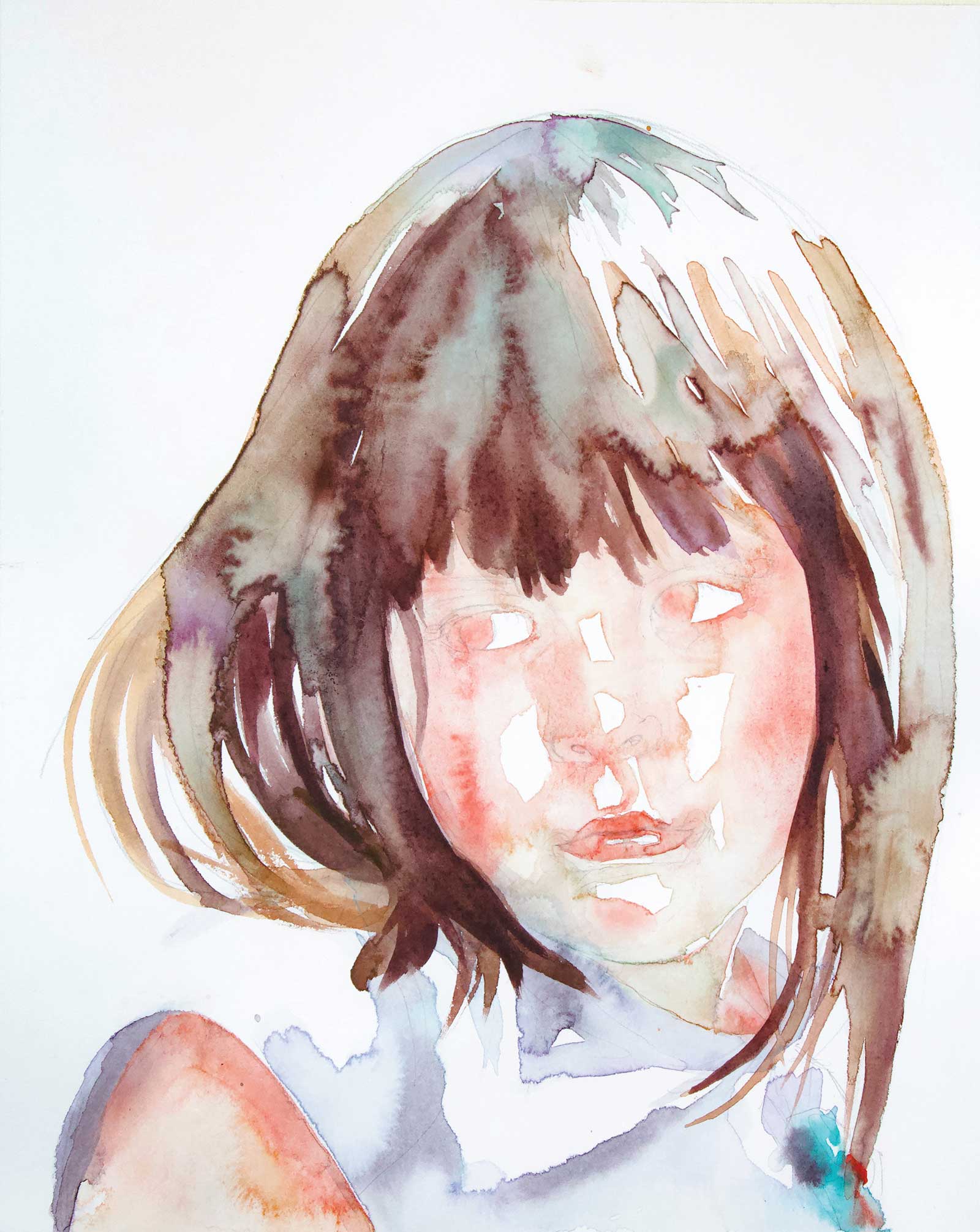
Stage 6 The Hair
I work on the hair alla prima, adding more pigment wet into wet until achieving the desired values. Incorporating various color mixes with different water ratios produces lovely natural bloom effects and textures when you lay the artwork flat. To purposefully create a bloom for adding texture in specific areas, I apply water to regions that are almost dry. The water causes a backrun of pigment, resulting in the desired bloom effect.
 Stage 7
Stage 7 Build Value with Glazing
Using the same skin tone colors, along with the addition of the purple mix, I continue to develop the values on her face, neck and shoulder. I layer the watercolor with highly diluted glazes, gradually shaping the contours of her features, creating a sense of depth and dimension. The translucent nature of these glazes plays a crucial role in preserving the luminosity of her skin.
 Stage 8
Stage 8 Adding Darks
Using my dark mixes, I add her irises, indicate her lashes and add the darks under her chin. I also continue to gradually build value to areas of her face. As I build on the layers of paint I use soft edges to balance the hard edges of the initial wash.
 Stage 9
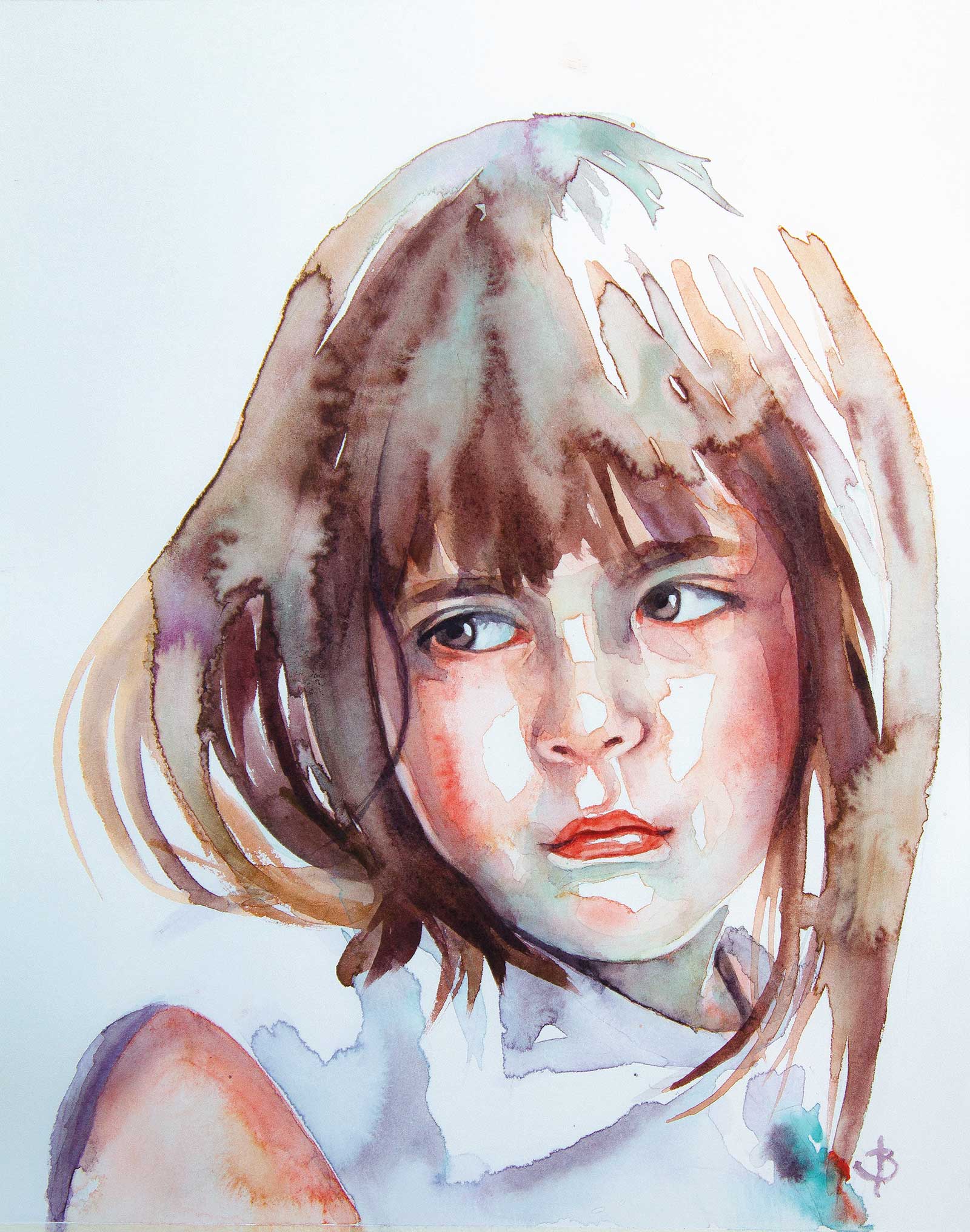
Stage 9 Finished Artwork
Nena, watercolor, 12 x 9" (30 x 22 cm)
I continue to build value to areas of her face and add further detail where needed, such as the strand of hair and the white highlights in her eyes. The glazes on her face result in a nice array of color variations that balance with the colors throughout her hair and clothing.
About the artist
 Jenny Barnes
Jenny Barnes is a self-taught artist based in Melbourne, Australia. Her contemporary portraits feature a delicate interplay of color and transparency, creating a sense of luminosity and depth. Barnes focuses on capturing the emotion and vulnerability of her subjects, inviting the viewer to engage with their inner world. She shares her passion for watercolor portraiture through online demonstrations and workshops. Her work can be found in private collections worldwide.
Contact at
jennykbarnes@gmail.com