


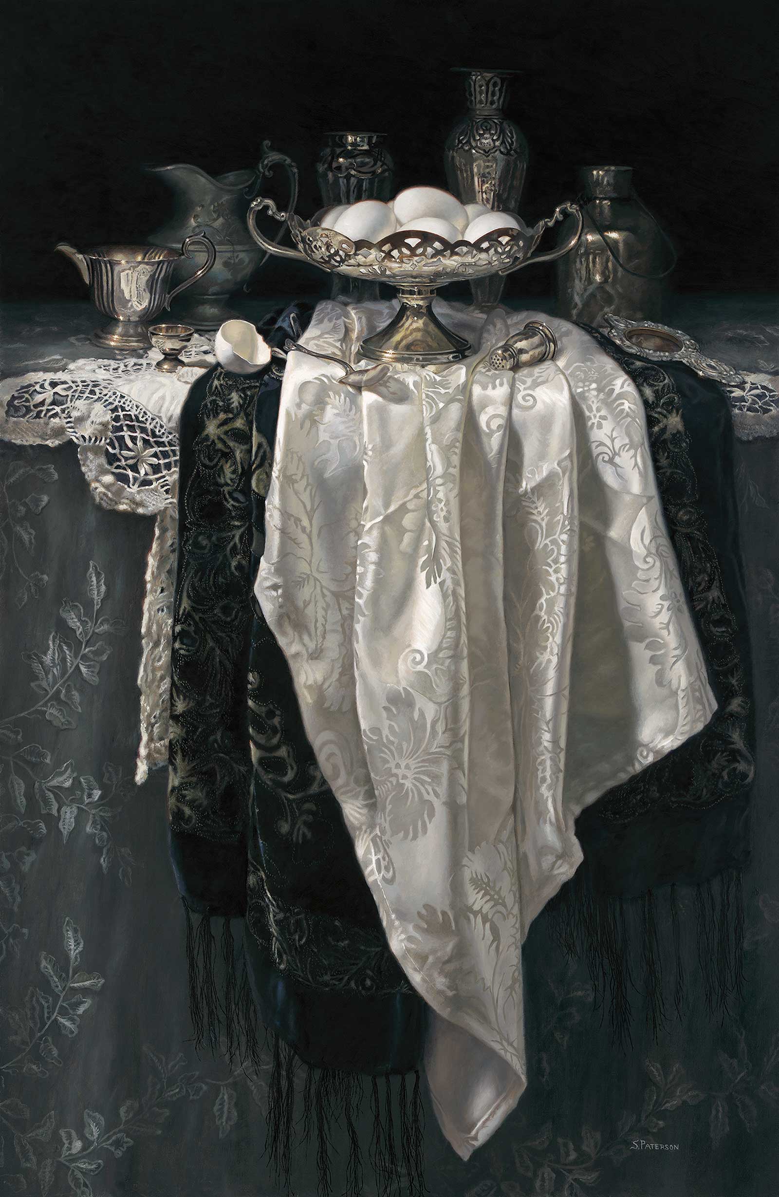
 Elegance, oil, 37 x 24" (93 x 60 cm)Grand Prize is a four-page editorial feature in American Art Collector magazine
Susan Paterson
Nova Scotia, Canada
Beautiful Objects
Canadian artist Susan Paterson is inspired by 18th-century Dutch still life, desiring to paint the beauty around us that we rarely take the time to notice. She looks to beautiful objects, especially antique silver, as subject matter inspiration for her still lifes. “My studio is filled with wonderful pieces I have collected or that were given to me,” she says, adding that lately she’s been working on more complex arrangements of these objects, always with a dark background to give it “a sense of space and mystery.” This can be seen in her Grand Prize piece, Elegance.
Working from life is an important element of Paterson’s work, as direct observation helps her get a better sense of the objects and their qualities. “It helps me to ‘see’ them better, sometimes helping me to figure out what exactly is being reflected in the silver. I love intently studying my set-ups, noticing things that many would have passed over and helping the viewer to see what I see.”
Paterson worked in watercolor for years, using photos as references, before switching to painting in oils from life. “It was a struggle for a while, but taking that chance has paid off and has been incredibly rewarding.” She also paints plein air landscapes. “It’s a whole different way of working,” she says, “and I enjoy occasionally getting out of the studio and doing some quick, little studies.”
My Inspiration
This is a casual arrangement of beautiful objects on a lavishly covered table. I was inspired by the textures of the fabrics; rich cut velvet, shiny damask, intricate lace and delicate embroidery. The fabrics are almost monochromatic, and I loved how they complemented and contrasted with each other. I collect antique silver and linens; I love the patina that age gives them and the craftsmanship that is apparent in the details. I’m also inspired by the smoothness and simplicity of the eggs and how they contrast with the lush textures and patterns in the set-up.
My Design Strategy
I draped the fabrics over the edge of the table, alternating the dark and white patterns, putting the white tablecloth in front. I wanted the fabrics to take up most of the painting, as I wanted to emphasize their textures. Then I placed the filigree dish and eggs in the center, making the whites in the eggs and the tablecloth the brightest whites and the center of attention. The background items, arranged around the central dish, add interest and lead to, but do not take away from, the main subject. Limiting the colors in the composition helps to bring out the subtleties of the warms and cools in the whites and gives the work cohesion.
My Working Process
I carefully choose the objects I want to paint and spend time arranging and rearranging them in a black box. The box allows me to control the light falling on my set-up. As I’m arranging, I’m also playing with the light, trying to come up with a pleasing composition. I do a drawing on paper, trying to be as accurate as possible and then I transfer it to the primed panel. I start with a color underpainting, loosely blocking in the larger shapes. In the second layer I refine the shapes and add some detail, adjusting values and colors as I go. In the final layer I add more detail and make any corrections that are needed.
Contact Details
Email: susanpaterson14@gmail.com
Website: www.susanpaterson.ca
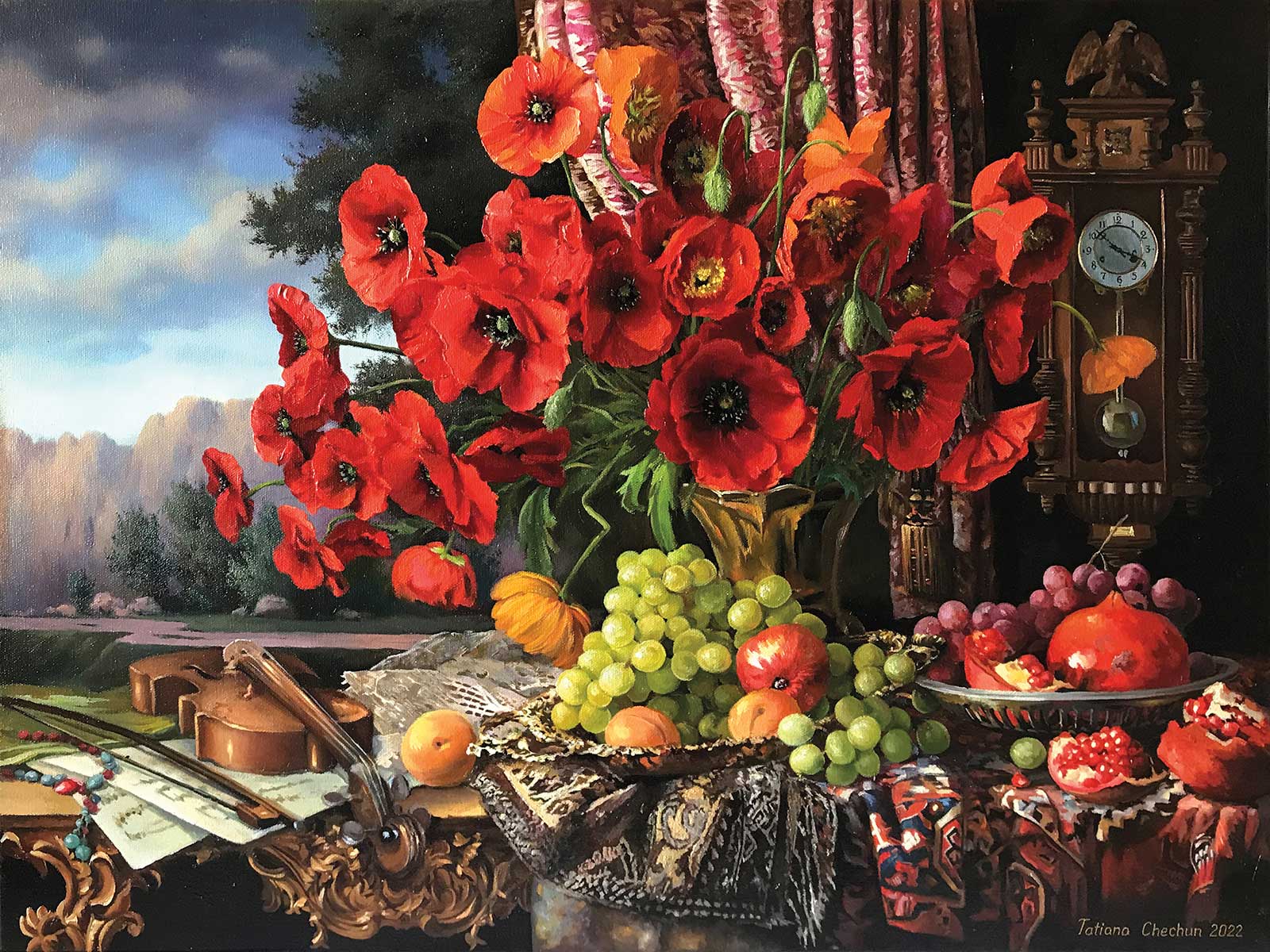 Still life with poppies, oil, 17¾ x 23½" (45 x 60 cm)
Second Prize is a two-page editorial feature in American Art Collector magazine
Tatjana Chechun
Vilnius, Lithuania
My Inspiration
In this painting I wanted to combine the concepts of “eternity” and “moment,” showing that material things (fruits, vases, carpets) exist next to eternal time and music. Poppies, like the flowers of dreams, can connect these concepts. If you pull back the curtain that covers our world a little, you can see the path of knowledge that you need to follow in order to understand more.
My Design Strategy
I have a very vivid imagination and can simply close my eyes and imagine a finished composition. Of course, the human brain creates images from personal experience and what it once saw. Sometimes I remember where I saw a detail, returning to it to study the nuances. And of course, I constantly learn from other artists: composition, color solutions, the feel of forms and the manner of transmitting light. This helps me develop as an artist, and I always hope that the next picture will be better and more interesting than the previous one.
My Working Process
My husband and I work in the same studio workshop, so I always have an adviser, a teacher and a strict art critic nearby. Realism is a very complex technique that requires a lot of time, knowledge and skill. Just using imagination is not enough—you need to accurately understand the laws of nature and images. This is a layer-by-layer technique and each layer must dry (oil paint takes a long time to dry), so it will not be possible to quickly create such an image.
Contact Details
Email: chechechun@mail.ru
Website: www.instagram.com/tatjanachechun
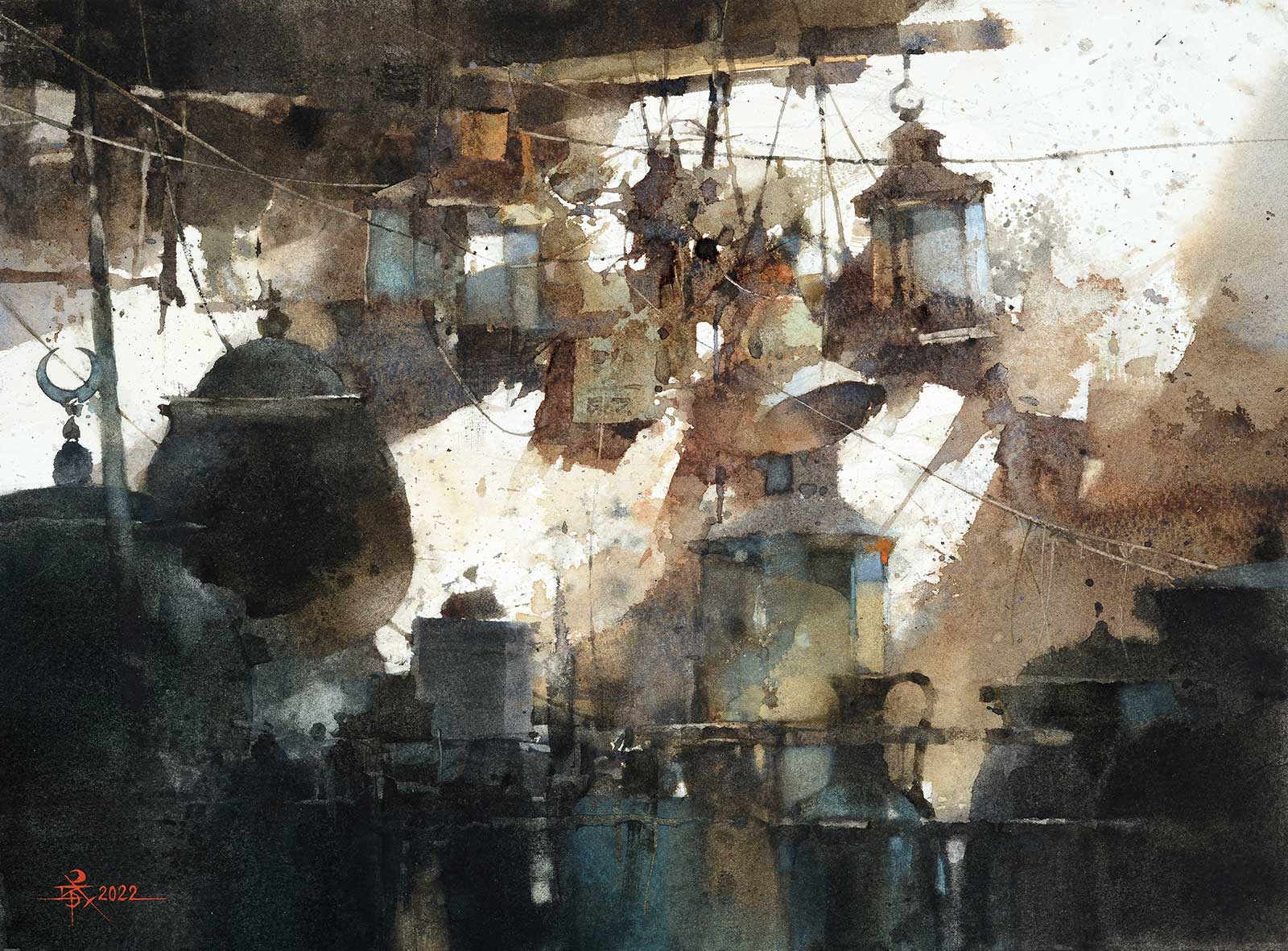 Just Light Your Own Light, watercolor, 10½ x 14½" (27 x 37 cm)
Third Prize is a one-page editorial feature in American Art Collector magazine
Chien Chung Wei
New Taipei City, Taiwan
My Inspiration
In 2016, while hosting a watercolor workshop in Istanbul, I wandered through the ancient markets filled with shops selling various Turkish lamps and pots. These exquisite lamps hung on walls and rooftops, gleaming brightly under the sunlight, casting beautiful shadows. In 2018, I demonstrated the painting Just Light Your Own Light to my students using watercolors, and it became one of my favorite pieces.
My Design Strategy
Due to the suboptimal angles of the reference photos I had taken, I decided to reposition, adjust the angles and change the quantity of these Turkish lamps. My goal was to create a composition that was stronger and more perfect in form. I divided the painting into two parts: the lamps hanging on the old wall in the background became the focal point, emphasizing the play of light and shadow. In the foreground, there was a cluster of lamps in the shadows, contrasting the light in the background.
My Working Process
I started by focusing on the central area, emphasizing the abstract expression of watercolors, allowing them to flow freely and avoiding excessive realism. I aimed to convey the “impression of the subject” rather than the subject itself. Then, I painted the “dark masses” in the foreground, completing the initial stage of color blocking. Four years later, I placed it on the easel, spending half an hour each day contemplating it, identifying all the issues. A month later, I began the final stage of modifications, striving for perfection.
Contact Details
Email: hibariprince@gmail.com
Website: www.facebook.com/hibariprince
Finalists
Each receives an Award Certificate and a one-year subscription to International Artist magazine PLUS having their work seen worldwide by international galleries looking for new talent.
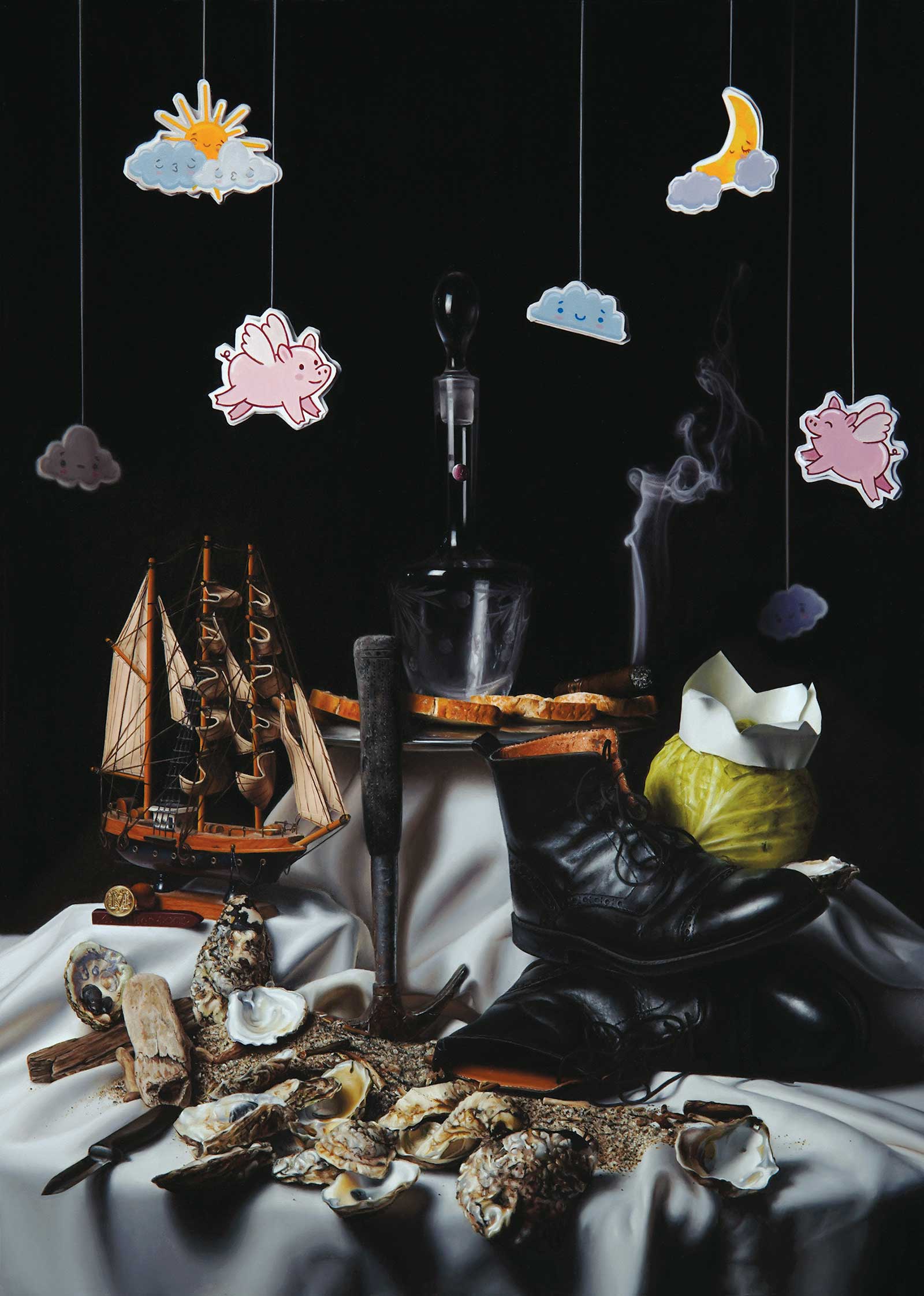
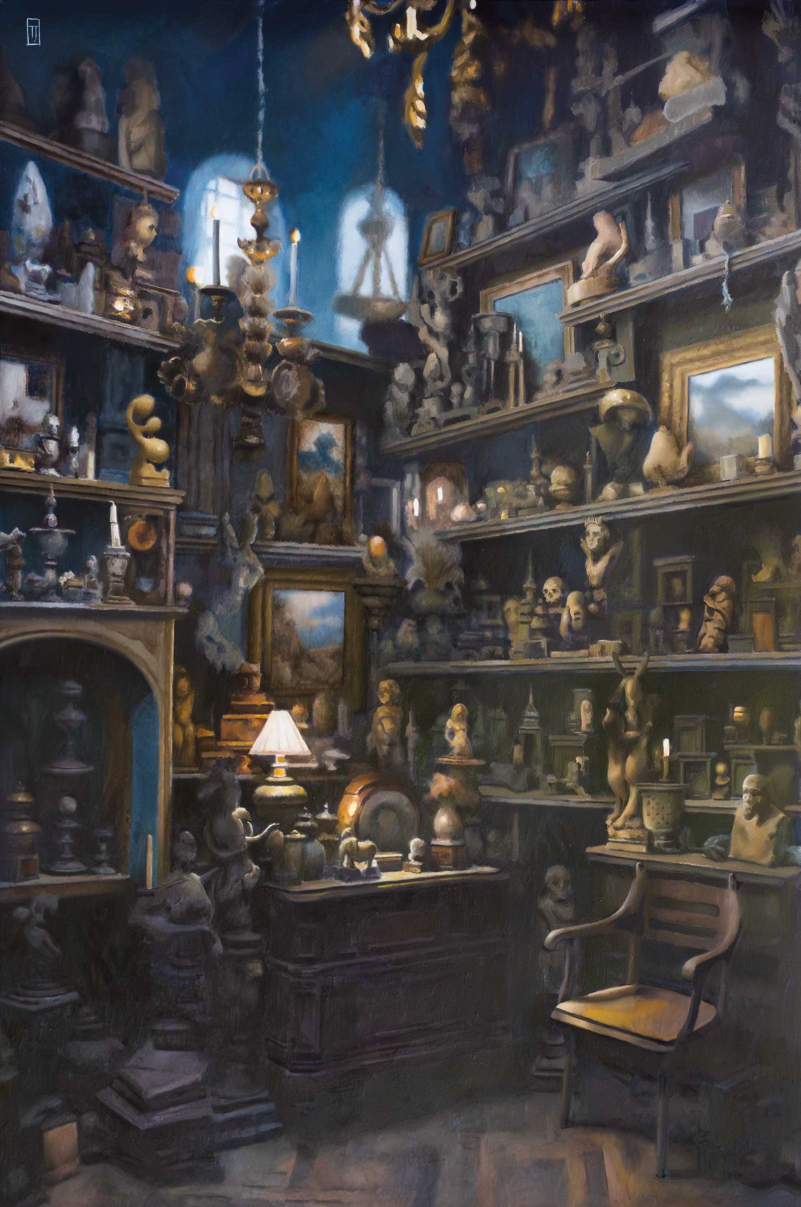 Whispers of the Past, oil on panel, 30 x 20" (76 x 50 cm)
Timothy Jahn
New Jersey, USA
My Inspiration
The inspiration for my new painting, Whispers of the Past, stemmed from a captivating journey to India. While exploring a packed antique dealer’s storage room, I was entranced by the sheer abundance of hidden treasures. The desire was to create a scene that was visually overwhelming yet inviting, allowing viewers to lose themselves amidst the myriad details.
My Design Strategy
In crafting this artwork, my design strategy centered on capturing the interplay of light within the image. By meticulously defining shadow and light sources, I aimed to harmonize two distinct light elements. This careful balance not only enhanced the visual appeal but also created a captivating ambiance, reinforcing the notion that past treasures are hidden gems waiting to be rediscovered.
My Working Process
Once I pinpointed the shadow pattern, I could methodically craft the impact of light on every object and its immediate surroundings. A deeper understanding of the light source’s angle and intensity enabled me to efficiently shape the forms of each item. I often liken this process to painting the nuances of light in a landscape, albeit with higher contrast, making the global effect more apparent and engaging for the viewer. This approach brought Whispers of the Past to life, preserving the magic of hidden relics under the gentle touch of sunlight.
Contact Details
Email: timothywjahn@gmail.com
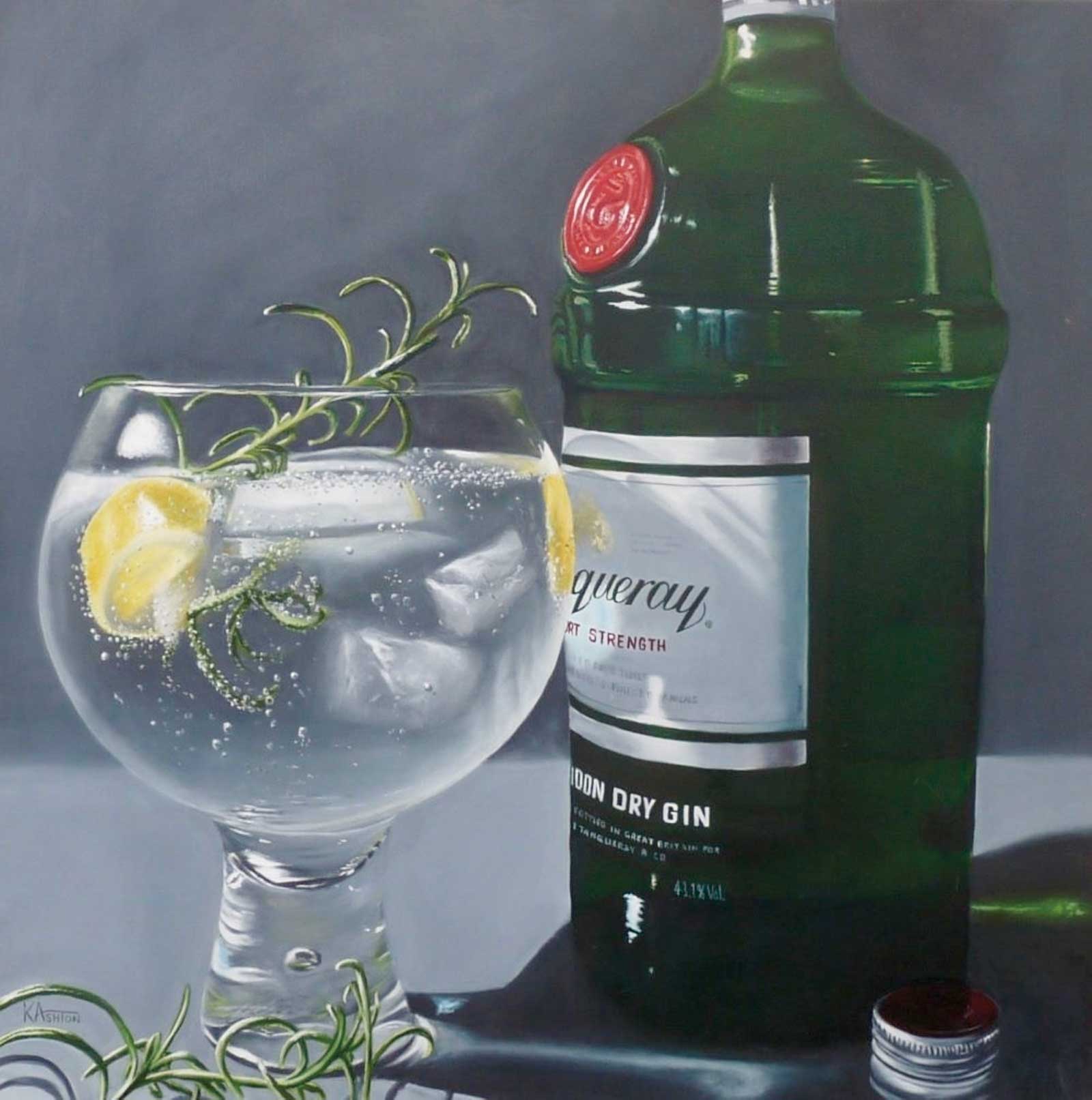 Rosemary’s Baby, oil, 30 x 30" (76 x 76 cm)
Kay Ashton
Warrington, UK
My Inspiration
I was commissioned to do a gin and tonic still life, which inspired me to create a group of paintings on that theme. Having a fascination with glass and reflections, it was perfect for me, so I created the series at the same time as the commission. The specific brand used is also one of my favorites, too, which ensured that the subject contents did not go to waste once the initial stages had finished.
My Design Strategy
I researched everything about the humble gin and tonic, giving me ideas for each painting. I wanted them to stand alone as a piece of art as well as part of the series. I photographed hundreds of compositional ideas; eliminating this, adding that, different angles, etc., before scrutinizing individually for possible paintings, then building on that through cropping the image. Further sketches ensued until I was happy with the result.
My Working Process
Once the design was drawn on the toned canvas, working from an array of printed, hand-drawn and digital images, the blocking-in stage included noting the lightest lights and darkest darks. Many layers of glazing went into the painting and during the drying times I could study it so any changes could be made on the next layer. Rosemary’s Baby was done simultaneously alongside the rest of the series to ensure cohesiveness, except for the final detailed layers.
Contact Details
Email: kayashtonfineart@hotmail.com
Website: www.kayashtonfineart.com
 The Tale of the Curious Oysters, oil on panel, 20 x 14" (50 x 35 cm)
Maxwell Miller
Ohio, USA
My Inspiration
The Tale of the Curious Oysters depicts the story of “The Walrus and the Carpenter,” a poem by Lewis Carroll from his book Through the Looking-Glass. From the sun shining in the middle of the night, to the pigs with wings, to the oysters in their demise—all the objects in this painting appear in some form within this classic whimsical poem.
My Design Strategy
My design strategy was based almost exclusively on the 17th-century Flemish still life paintings that typically depicted food items. You can see that influence in things like the knife hanging off the edge of the table. This technique was often used to give the impression of depth within a painting. To pair with the painting, I also built a replica of a Dutch ripple mold frame with Flemish corners to solidify the style.
My Working Process
The part of this process that was most engaging to me was researching and composing the still life. As I researched, I sketched out some ideas to build a framework for the piece. I then used these sketches to compose several different versions of the image in different orientations. Once I decided which arrangement communicated best, I drew the reference onto the panel. I applied a simple first layer, then finished with a high-detail second layer.
Contact Details
Email: mrmaxwellgmiller@gmail.com
Website: www.maxwellgmiller.com
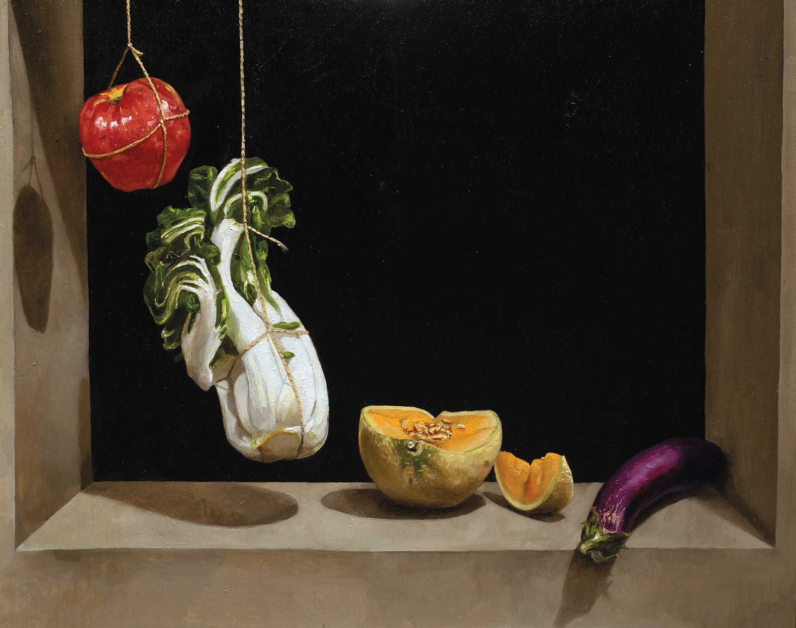 Still Life with Apple, Bok Choy, Melon, and Eggplant, oil on panel, 24 x 30" (60 x 76 cm)
Charlie Antolin
California, USA
My Inspiration
My painting pays homage to Still Life with Quince, Cabbage, Melon, and Cucumber by Juan Sánchez Cotán. Cotán’s painting brings to mind the metaphysics of Plato in the way it renders both the inner essential form and the outer appearance of the objects depicted. The background void seems too perfect to be real and lends a metaphysical aura to the work.
My Design Strategy
I wanted to preserve the gentle downward slope of objects and the large empty space of Cotán’s painting. There were certain essential qualities of “appleness” that I wanted to hit like roundness, redness and shininess, but before I made each mark I tested my prior idea against observation of the fruit in front of me. My aim was a synthesis of rationalism and empiricism, rendering both the idea and appearance of each item.
My Working Process
I made a grisaille, let it dry, and then thinly applied color on top, with thicker highlights. I drew each individual fruit and vegetable one at a time, finishing one completely before starting on the next. Working with fresh produce presented challenges. The apple and the eggplant lasted for weeks, but the bok choy and melon perished within two days. It was hard to keep the bok choy still as it gently swayed and rotated due to the relatively long pendulum arm of the string.
Contact Details
Email: cantolin4@gmail.com
Website: www.charlieantolin.com
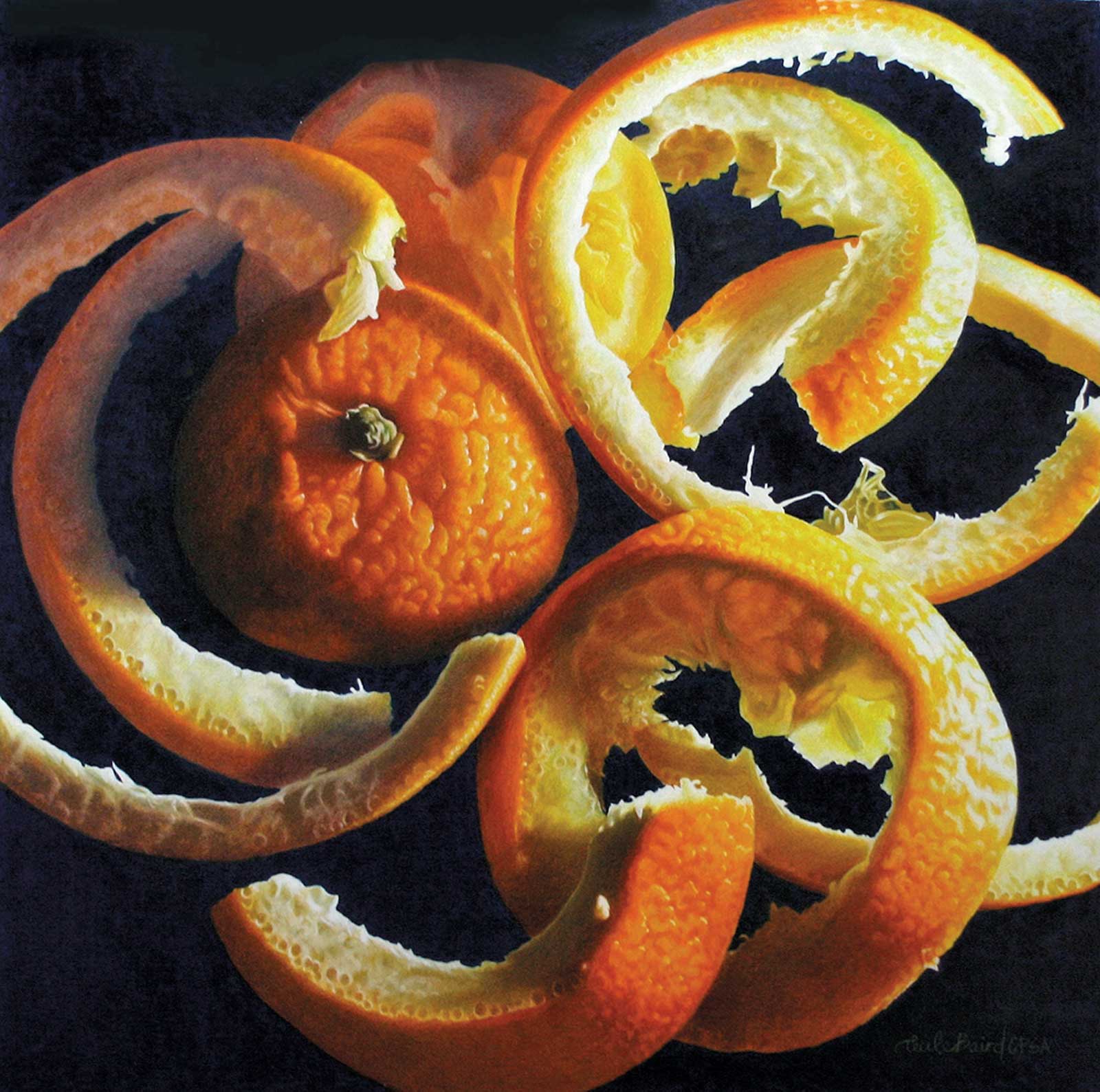 Circle of Life, colored pencil on Stonehenge paper, 16 x 16" (40 x 40 cm)
Cecile Baird
Ohio, USA
My Inspiration
Getting viewers to see very familiar everyday objects in a new light has always been my inspiration. Most people never notice the way a banana peel drapes so gracefully, the amazing color and structure of the inside of an artichoke or the translucence of the inside of an orange slice. By highlighting the unique qualities of my subjects with dramatic lighting and color I hopefully inspire others to appreciate the beauty all around us everyday.
My Design Strategy
The subject matter for Circle of Life was an unexpected gift. I had just finished setting up, lighting and photographing a picture of orange slices. While the lighting and camera were still on I decided to eat the orange slices and just laid the rinds down as I finished each. Then I looked down and couldn’t believe my eyes. I couldn’t believe orange rinds could be so amazing. I loved the repetitive shapes, the color, the textures, the lighting. It was perfect!
My Working Process
My favorite surface for my colored pencil art is Stonehenge white paper. I use primarily Luminance pencils by Caran d’Ache with some Prismacolor. I like to make my own dark backgrounds. I put in my dark background first with Luminance Prussian blue and black. By putting in my darkest dark first I am able to judge all other values more accurately. I blend all the colors together on a heated Icarus Board which softens the pigment for a smooth look.
Contact Details
Email: ceci@bright.net
Website: www.cecilebairdart.com