



Painting a still life is a great way to get to know your materials and just have fun with paint, because it’s not a very demanding subject matter—not like landscapes, especially not like painting outside where the light and weather change at a moment’s notice.
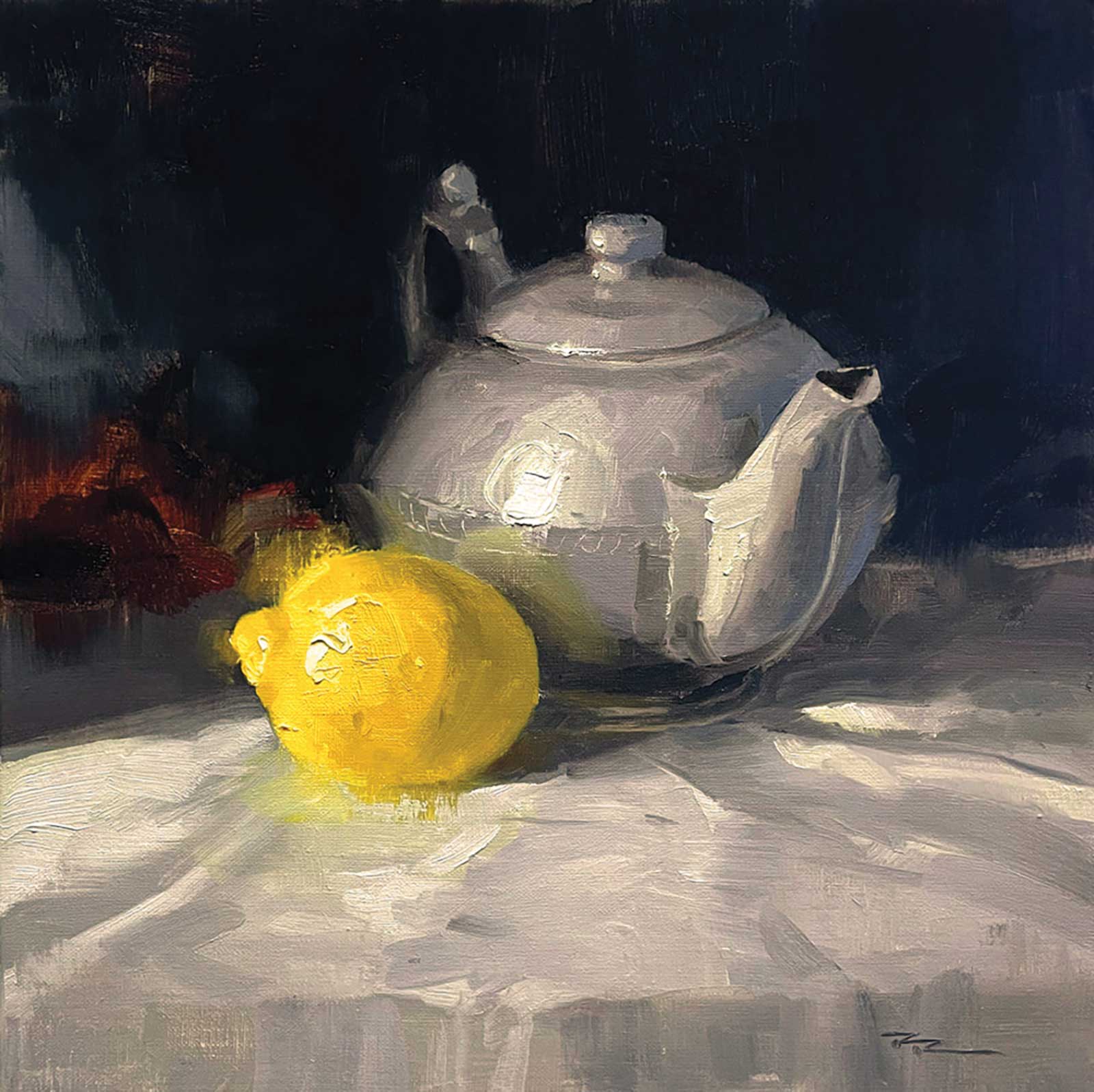 Richard Robinson, Lemon Tea, oil on canvas, 12 x 12" (30 x 30 cm)
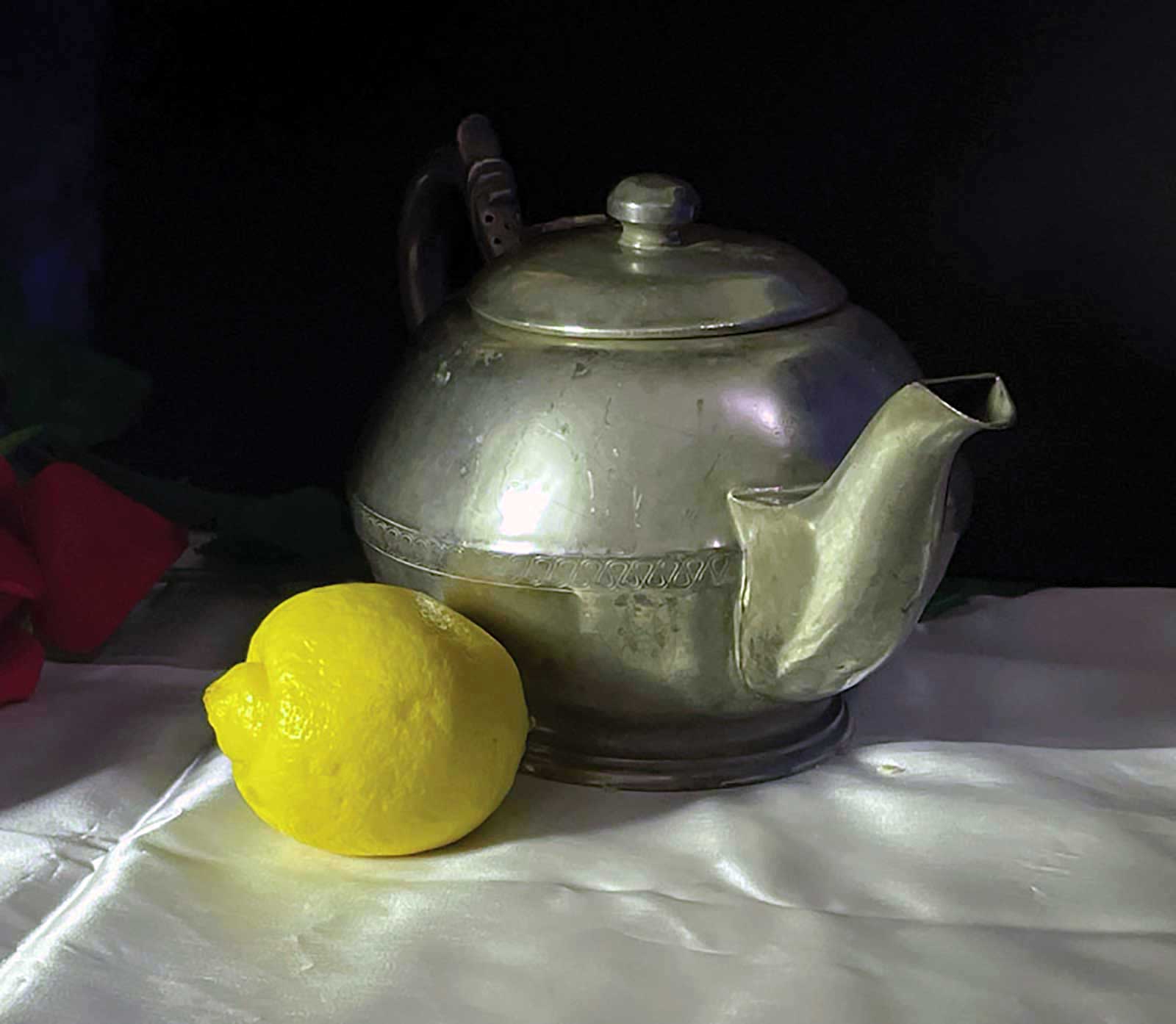
Reference Photo
You can really have fun with your materials, spend some quality time with your paint brushes in that creative space and simply see and paint, taking your time and enjoying the process. Simplicity doesn’t equate to dullness. It’s an opportunity to infuse our work with a sense of elegance and harmony. A humble teapot, bathed in single light, becomes a study in tranquility and stillness. We can explore all its nuances and subtleties, inviting viewers to pause and savor the moment with us.
Student critiques
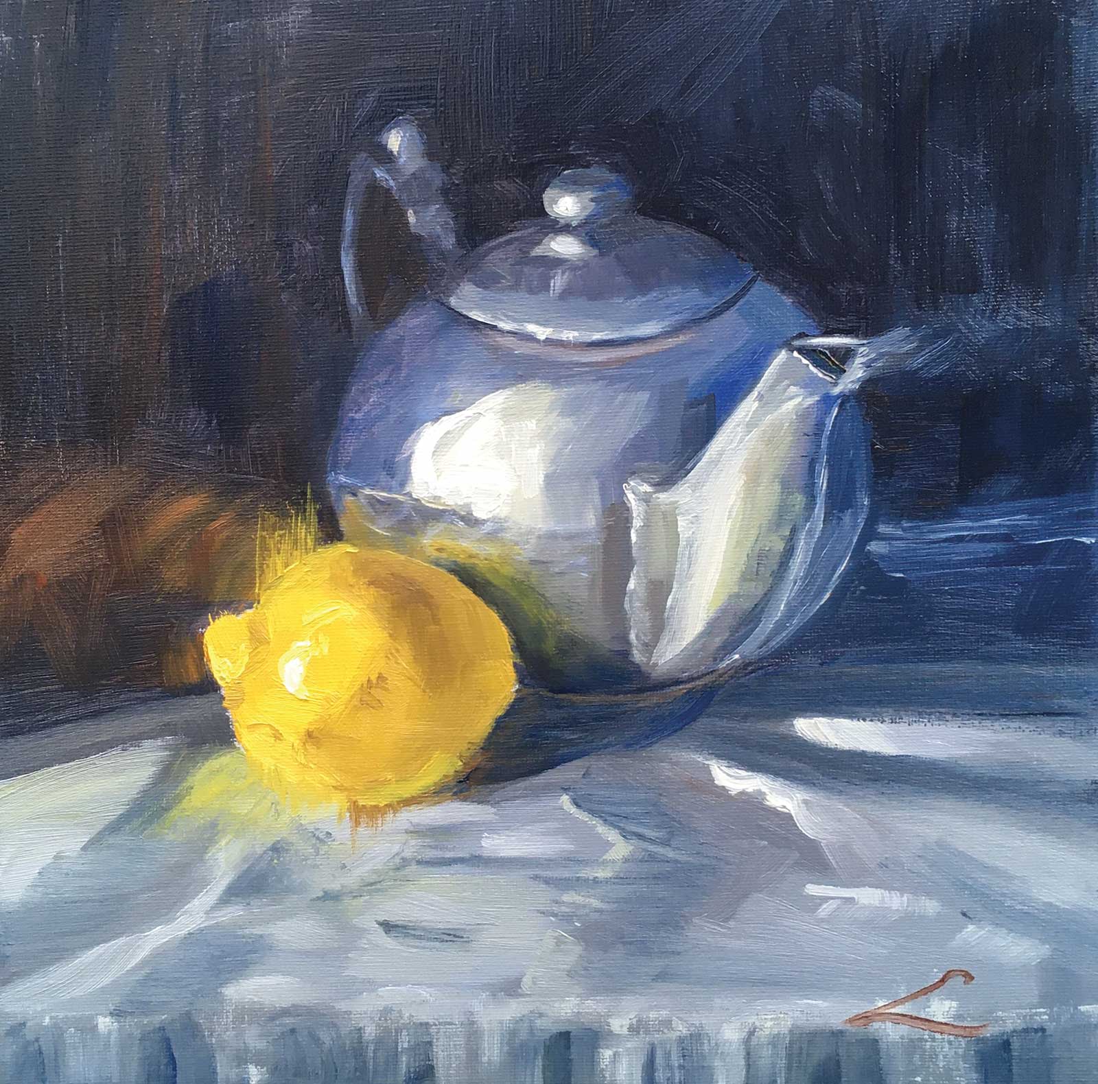 Lemon tea, oil on canvas, 12 x 12" (30 x 30 cm)
Elena Sokolova
Beautiful work, Elena—great brushwork, color, tonal modeling and I like your addition of the steam coming out of the teapot. Nice. The drawing is pretty accurate too, except for those tricky ellipses that we build the teapot with. They could be a little better. Very tricky, I know. Mine are far from perfect too. It’s worth having a really close look at those and seeing how they curve steeply right at their very ends. Other than that, all good!.
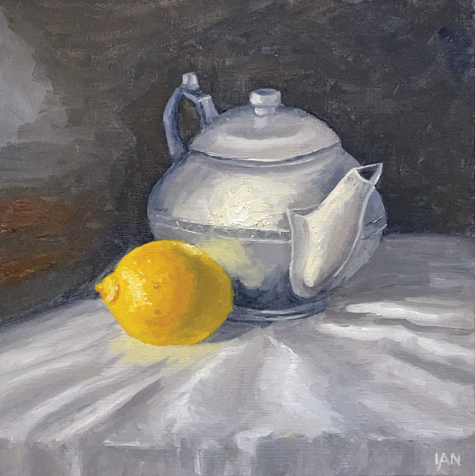 Still life
Ian States
Still life - my first try at this genre Nice one, Ian. Love the brushwork, especially the impasto stuff in the highlights. That lemon is beautifully modeled too—great job there. The drawing is pretty decent, just a bit wonky on those ellipses. I would’ve liked to have seen the teapot merge a little with the background in the darks to avoid that cut-out look. Looks like the darks in the teapot could go a little darker overall to give it more roundness. The brushwork was the winner of the day. Beautiful!
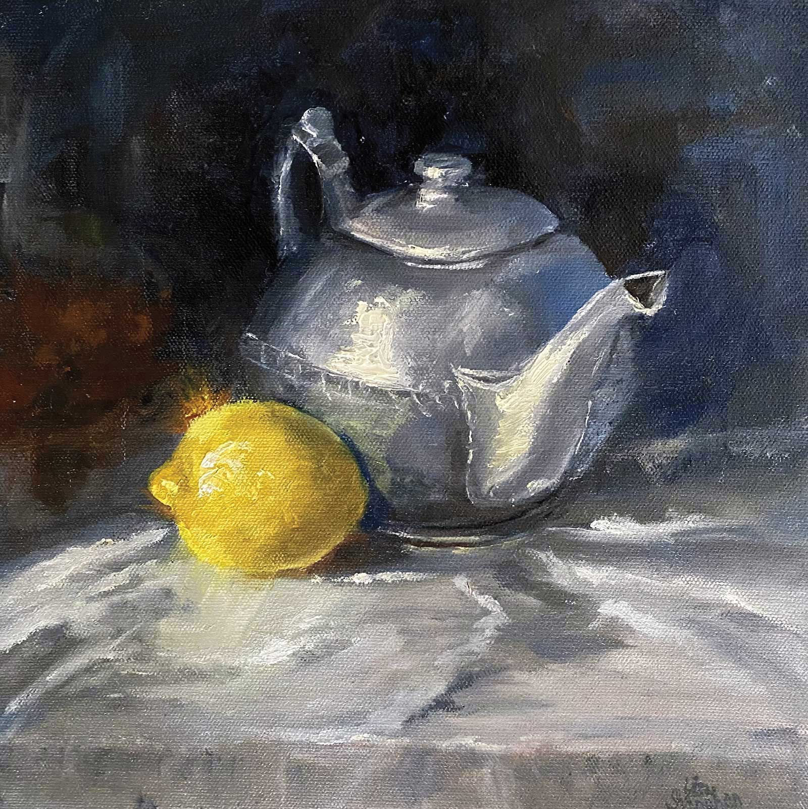
Lisa Shanahan
Nicely done Lisa! You’ve really captured the shiny metal and lemon texture. The cloth folds are not quite as convincingly rendered, but overall a lovely effect. Your middle ellipse went a little straight on the left, but that’s easily fixed. Looks great!
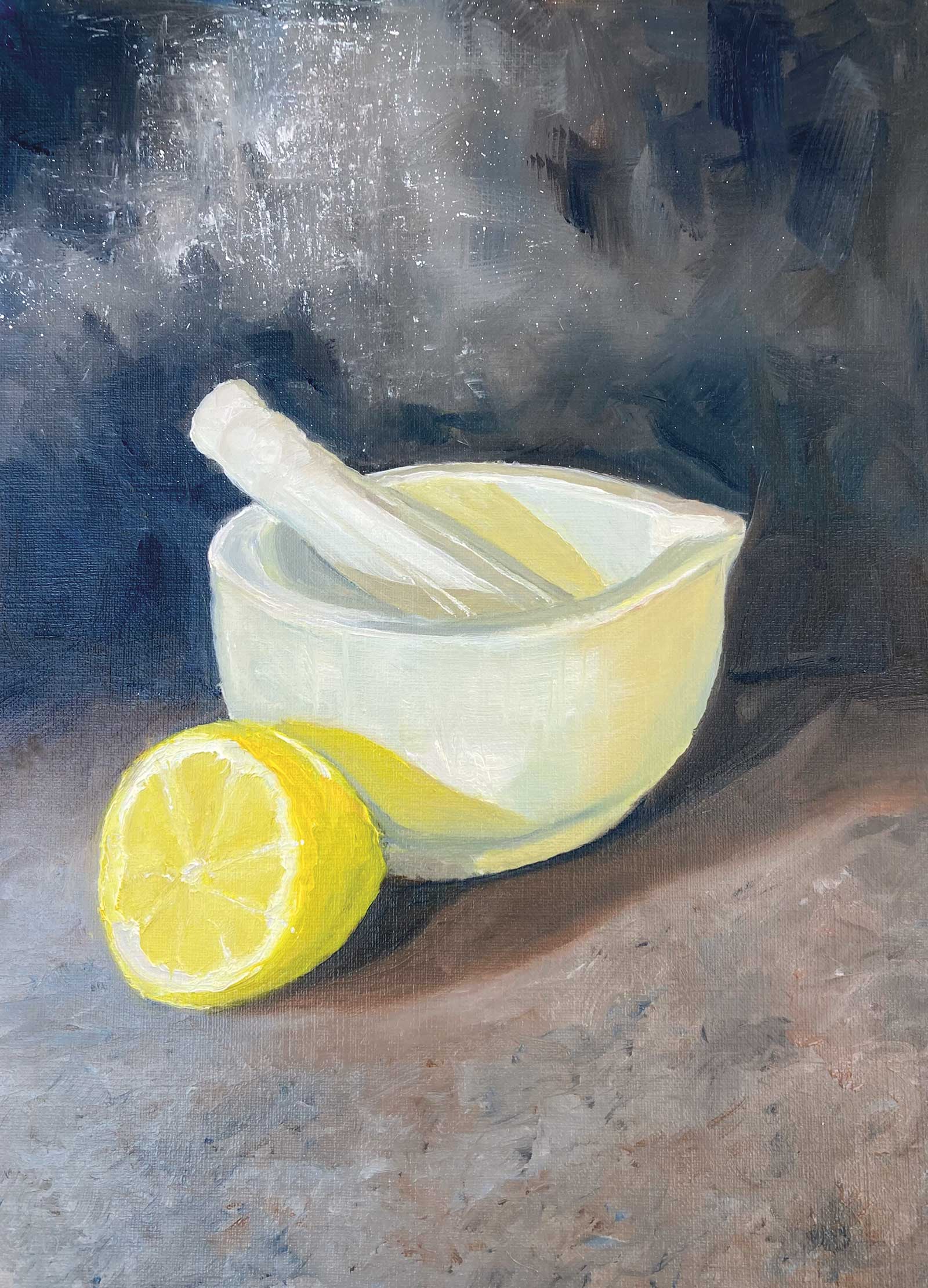 Bench Top Still Life in Oils
Geoffrey Geeson
Good work Geoffrey, great attention to detail and subtle shifts in color. Pretty decent drawing, but paying attention to symmetry around center lines will help you be more accurate. Looks to me like the shadow sides of your objects are a bit too light, which on the one hand gives a nice glowing appearance, but on the other tends to flatten the 3D form. It’s easy enough to check this by editing the photo of your painting on your phone and increasing the darks or the contrast to see what a difference that makes and if you might prefer it. Good job.
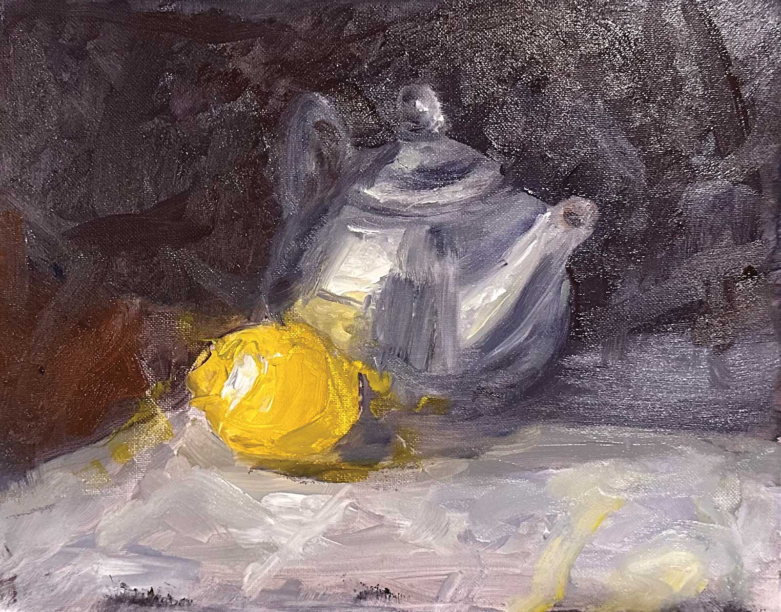 lemon and the pot
Magdalena Lipinska
Hi Magdalena, it sure is difficult to photograph dark paintings without reflection on them, right? I had the same problem and ended up Photoshopping it to get it right. So, I’m loving the gestural paintwork here, the looseness of the whole thing. I especially love how the lemon came out. Personally I’d like to see a little more care taken with some key parts of the teapot like the end of the spout and the area around the main highlight. That’s just a matter of switching gears a little, slowing down and perhaps using a finer brush—not necessarily smaller, but with a crisp end on it. Aside from that, beautiful painterly work!
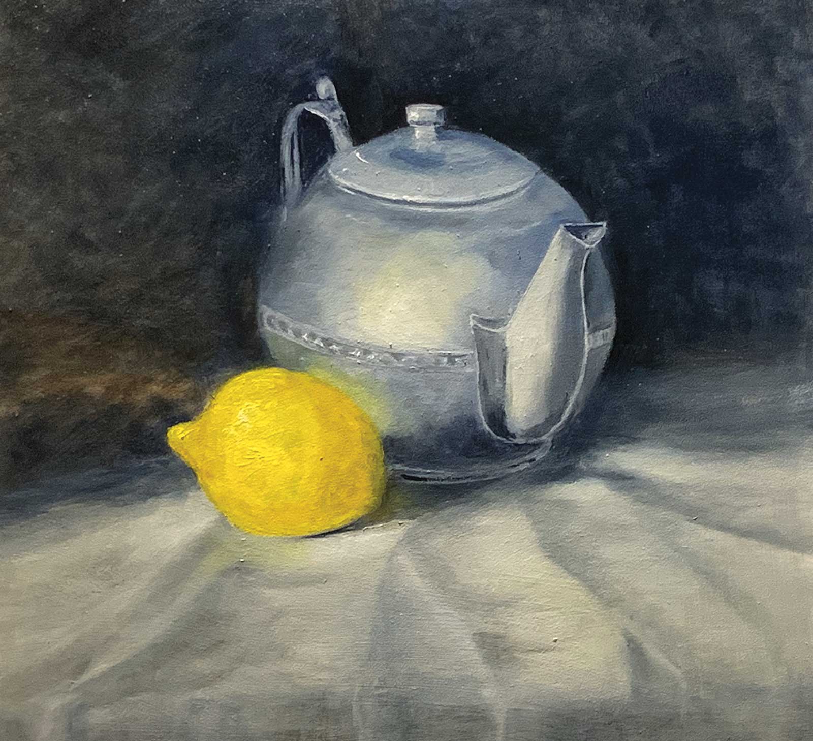 Lemon tea, 13 x 12" (33 x 30 cm)
Mark Price
Hey Mark, great to see you taking the time to really knuckle down and assess what you’re seeing in the forms here. It’s a brain workout for sure. Some really nice modeling there in the teapot and cloth. Your lemon could do with darker shadow plains to make it rounder. The button handle on the lid could grow to the right a bit to make it more central and you could try darkening some of the background further to remove the fluffy texture which, to me, seems to compete a little for attention. Keep up the good work!
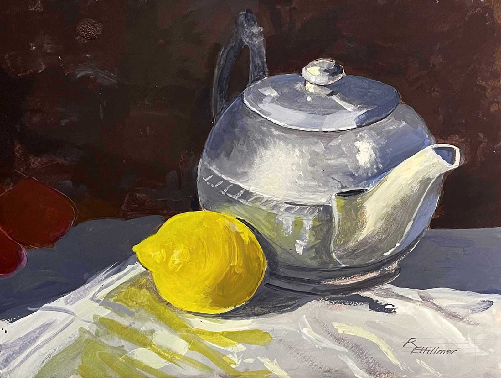 Lemon Tea, acrylic
Eric Hillmer
Great to see this done in acrylics, Eric. Always harder to get that wet-in-wet look but it has its own benefits. The color and drawing are good overall. The base ellipse of the lid is a little too round. Interesting to see it with a brown background. The composition is interesting too—feels like they’re staying in the light on the right to avoid whatever is lurking over there in the shadows. The lemon is suspicious. The lemon’s cast shadow on the teapot is particularly well done and holds the whole painting together. Some of the highlights within the shadows and halftones of the teapot are not helping to enhance the form, they are actively confusing it. You can keep those for interest but with less contrast would help. Good job!
About Your Tutor
Richard Robinson is one of New Zealand’s premier outdoor painters. You can view his extensive online lessons at www.mypaintingclub.com.