


Over the course of the past several years I’ve become enamored with the look of fruits and flowers, and I’ve found almost all of my artistic inspiration in the garden. Organic subjects are visually stimulating, ever-changing, and the variety of colors and textures is seemingly endless. In my still life work I like to consider each fruit or flower in the same way I would consider a human face for a portrait. My goal is to see the subject as an individual and unique specimen. No two lemons are the same—some are oblong, some are fat and juicy looking, some have color variances and abnormalities, and others appear to be perfect. I try to convey that individuality by rendering each subject with a high level of detail, giving attention to the specific curves, textures and nuances of the subject I’m drawing.
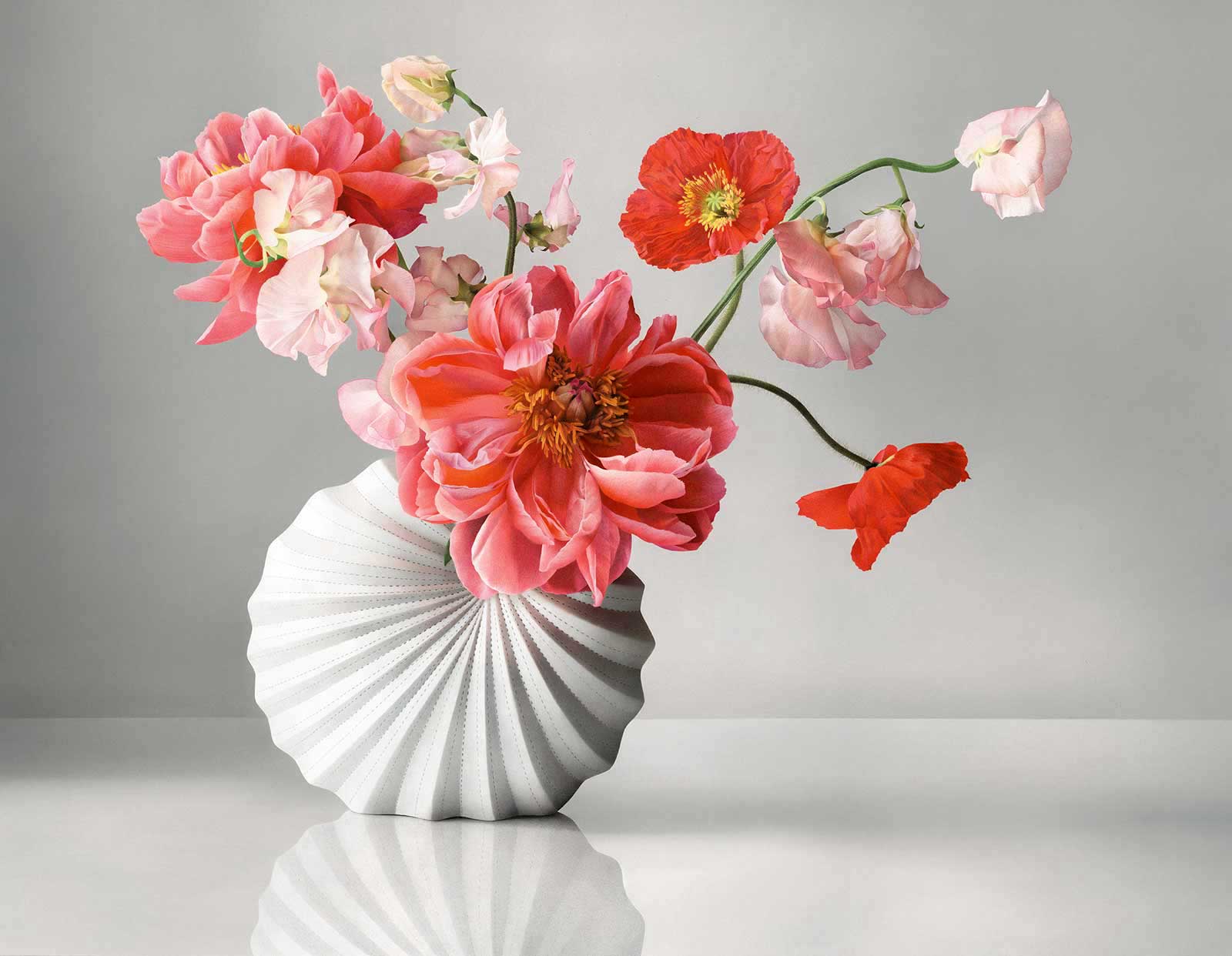
Primavera, colored pencil with PanPastel on sanded pastel paper, 34 x 44" (86 x 111 cm)
My work is primarily made with colored pencils. My pencil technique was born through trial and error and has slowly evolved through years of mistakes and discovery. I’ve learned that paper can reach a saturation point with colored pencils, such that the pencil pigment will not stick in those areas where the paper has become fully saturated with wax. Textured papers can hold many layers of pencil, and applying the pencil in light layers can yield a drawing with great depth and vibrancy. Certain brands of pencil are waxier than others, and some oil-based pencils are as chalky and blendable as a pastel pencil. After getting to know pencils so intimately through this trial and error process, I’ve settled on a technique and set of materials that suit my thirst for detail and nuanced color.
I work in light and even layers, building depth as I construct the drawing. I keep my pencil very sharp so that I’m able to fill in the grooves of the paper as I work. I use several brands of pencils, notably the Luminance set by Caran d’Ache. They’re high quality, long lasting, deeply pigmented, soft, lightfast wax-based pencils. I also often work with Caran d’Ache Pablos and Prismacolor Premiers.
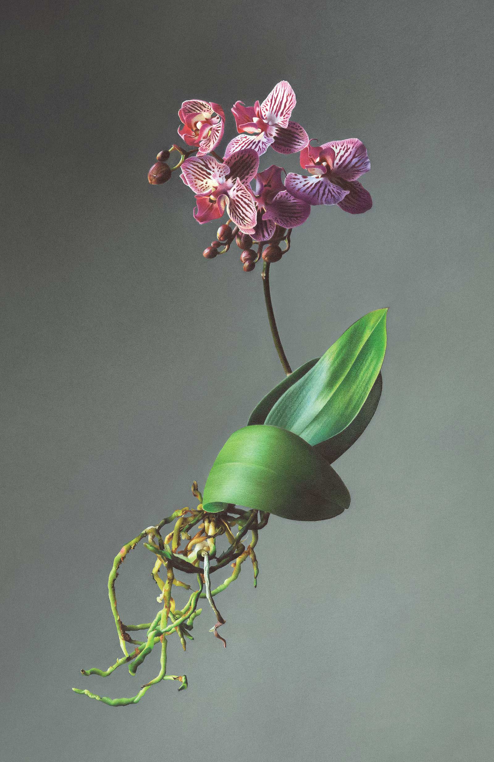
Black Sea, colored pencil with PanPastel on sanded pastel paper, 21 x 14" (53 x 35 cm)
The grainy texture of my drawings comes from the sanded pastel paper surface, which has a fine grit that feels similar to sandpaper. Canson Mi-Teintes Touch sanded paper can hold a dozen light layers of colored pencils without becoming oversaturated with wax and without the top layer of paper flaking away. I use the texture of the paper to help create the look of textured surfaces, similar to the ones you see on the lemon rinds in this demo.
My technique of layering colored pencils on a sanded surface works well for me, but the process can be painstakingly slow. That being said, I’ve recently started supplementing my drawings with PanPastels. They cover a large surface area in very little time, and I use them to build depth in the background of my drawings. I apply them with an art sponge, blending two shades of color into a seamless gradation. For this demo I covered the entire paper with PanPastels and then “sketched” the lemons by erasing the pastel. I started by erasing an outline, and then erased the inside of the lemons entirely until the paper was restored to a relatively clean state. I never combine the pastels and pencils on top of each other, but rather, work with them side by side.
I love to paint, I love to sculpt and I love drawing with charcoal and graphite, but colored pencils have captured my heart. I enjoy being able to introduce colored pencil work to those who are curious, and I hope this demo helps to pique your interest in colored pencils as well!
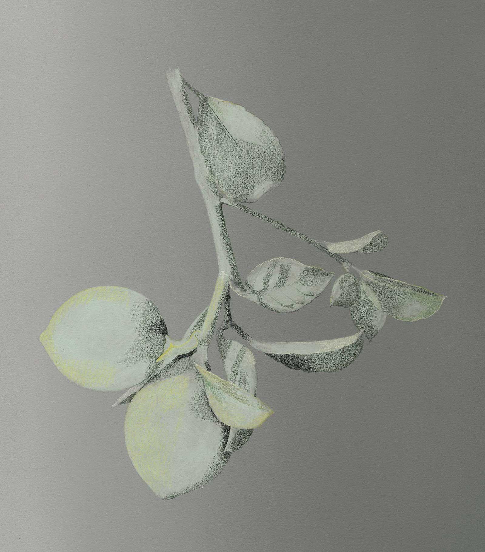
My Art in the Making Limones
 Stage 1
Stage 1 Applying PanPastels
Apply PanPastel to your paper with an art sponge, using even strokes and medium pressure. Apply the lighter neutral gray pastel to the left side of your drawing, and then flip your sponge over to a clean side and apply the darker neutral gray to the right side of your drawing. Wipe your sponge on a paper towel to clean it off, and then gently blend the two tones together in the middle of your paper, adding more pastel as you blend if necessary. Use your eraser to “draw” out the lemons. Erase the pastel out entirely until the paper surface is relatively clean.
 Stage 2
Stage 2 Shadows and Some Highlights
Using dark phthalocyanine green, sketch in your shadows. Keep a light touch and make sure your pencil is sharp so that you can begin filling in the grooves of your paper. Use yellow chartreuse to build some of the highlights in the lemons.
 Stage 3
Stage 3 Depth and Detail
Begin to add depth and detail to the leaves. You can do this with kelly green, moss green, spring green and green ochre. Continue to keep your pencil sharp and take your time. In the areas where you’ve begun adding detail, you should no longer be able to see the paper surface peeking through.
 Stage 4
Stage 4 Building up the Colors
Apply phthalocyanine green and moss green to your top leaf as a base layer. Apply grass green, olive yellow, spring green and yellow chartreuse to your lemon. I find it helpful to build the drawing as a whole, rather than finishing one section at a time. This can prevent you from becoming overly focused on a single section of the drawing in a way that will disrupt the overall look of the piece.
 Stage 5
Stage 5 Base Layer in Bottom Lemon
Fill in the base layers of the bottom lemon. The paper should still be showing through a little bit at this point, and you’ll be able to use the texture of the paper to your advantage as you start creating texture on the surface of the lemon rind.
 Stage 6
Stage 6 Balancing Texture in Bottom Lemon
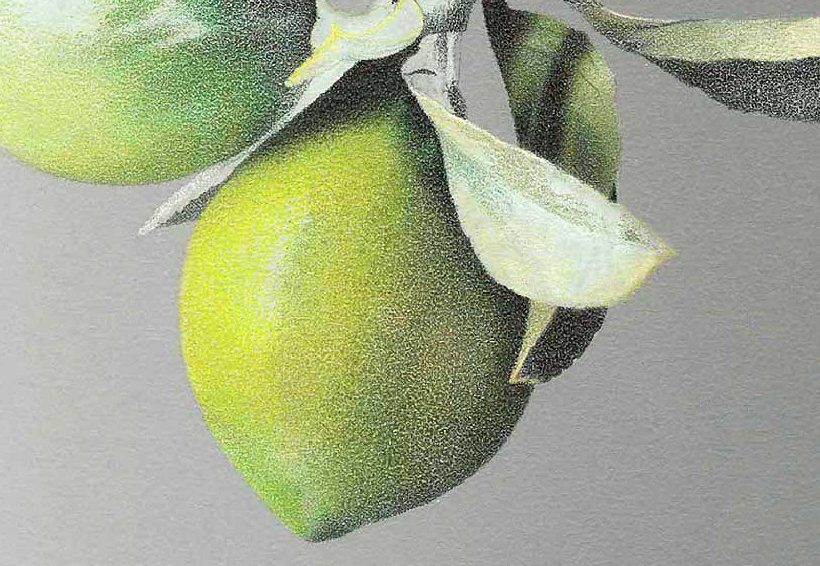
Start to develop texture in the bottom lemon. You’ll want to be careful not to add too much texture to your drawing, as that can make it look busy and overworked. Focus on adding texture in the area where the highlight of the lemon meets its shadow. To render the texture, extend the shadow of the lemon into the highlight by applying small dots of green ochre where the highlight and shadow meet. The further away from the shadow you get, the more dispersed the dots should be. These dots will mimic the stippled texture of the lemon skin.
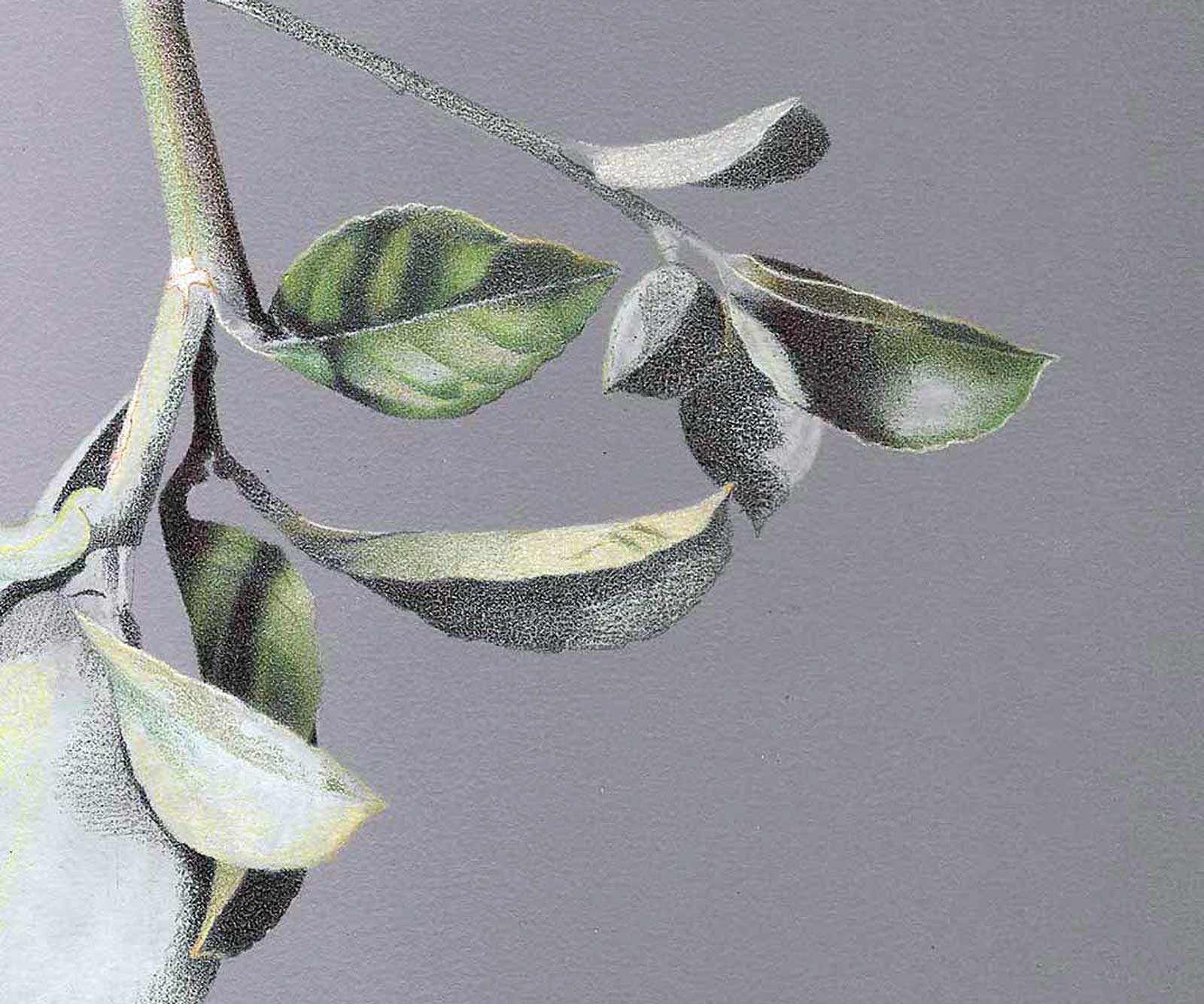
 Stage 7
Stage 7 Layering in Pencil
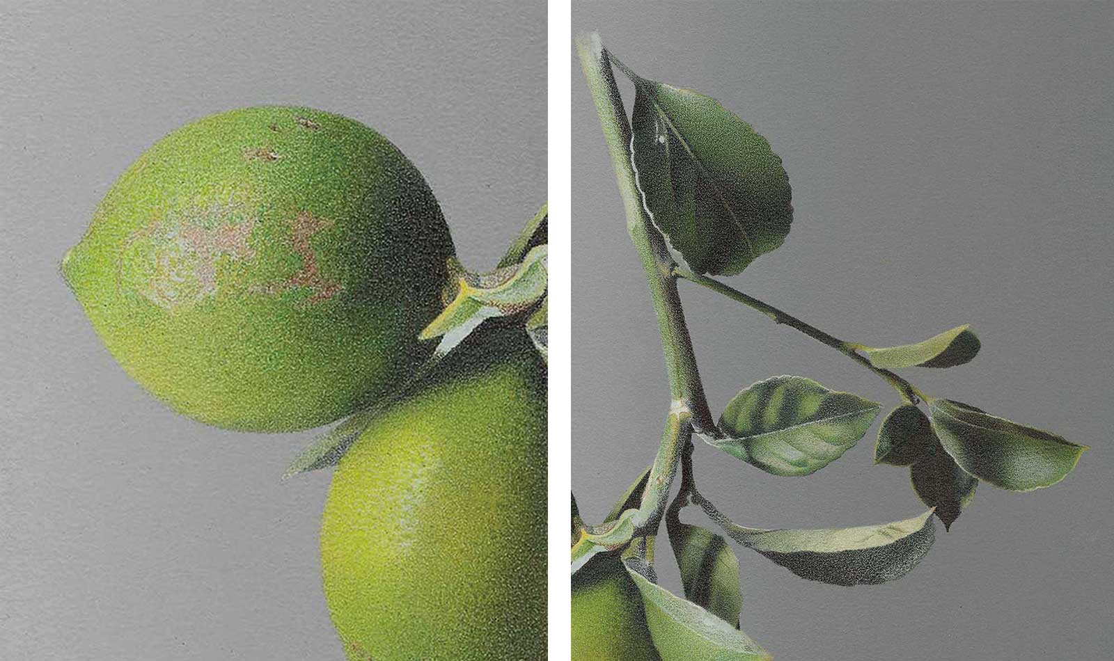
Continue to add layers of pencil to your drawing until the paper is entirely covered and no longer showing through your pencil layers. Add texture to the top lemon in the same manner as the bottom lemon, with small dots of dark color on top of your lighter colors. Extend the shadow of the lemon into the highlighted area with small dots. Use burnt umber, raw umber 50 percent and white to create the blemishes on the top lemon.
 Stage 8
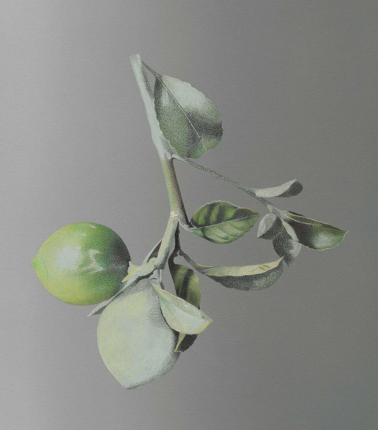
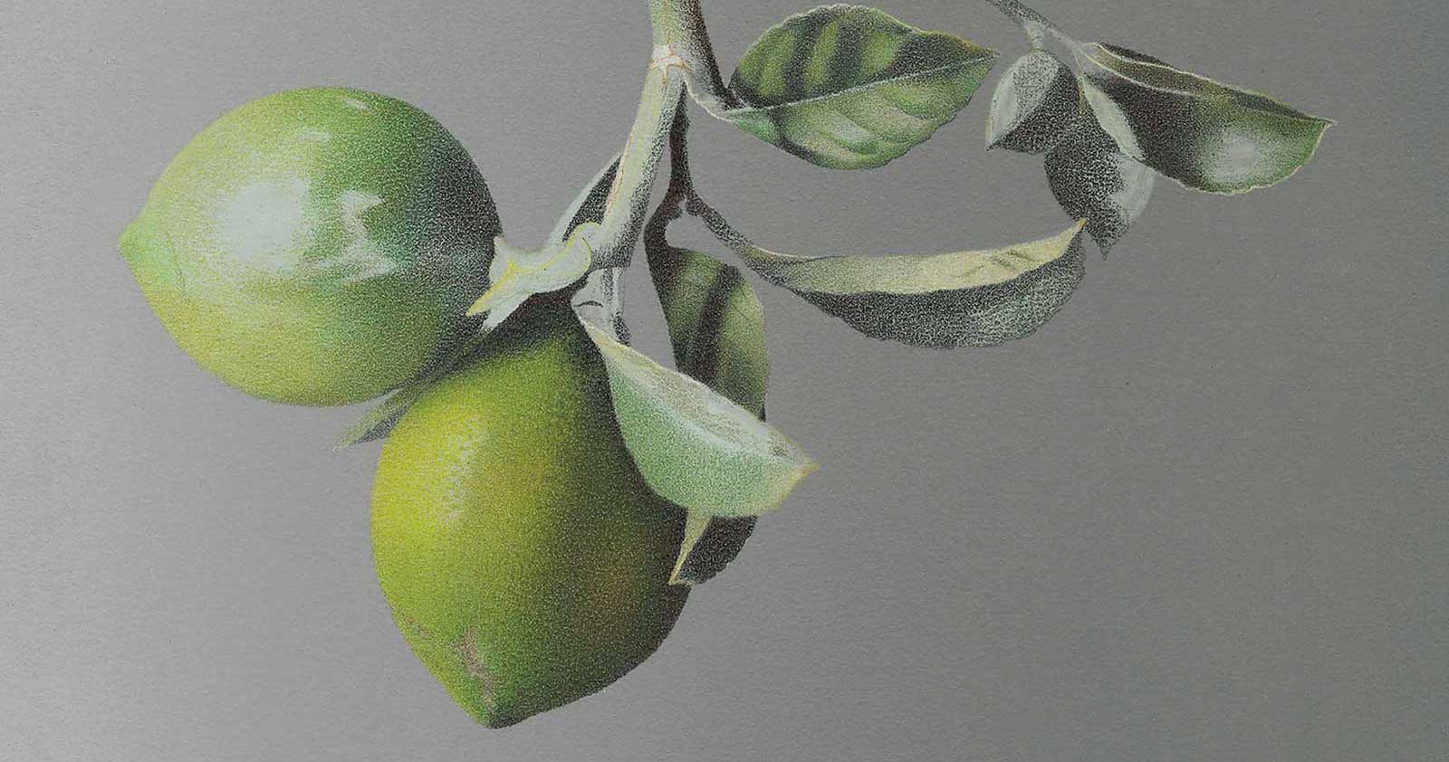
Stage 8 Finished Artwork
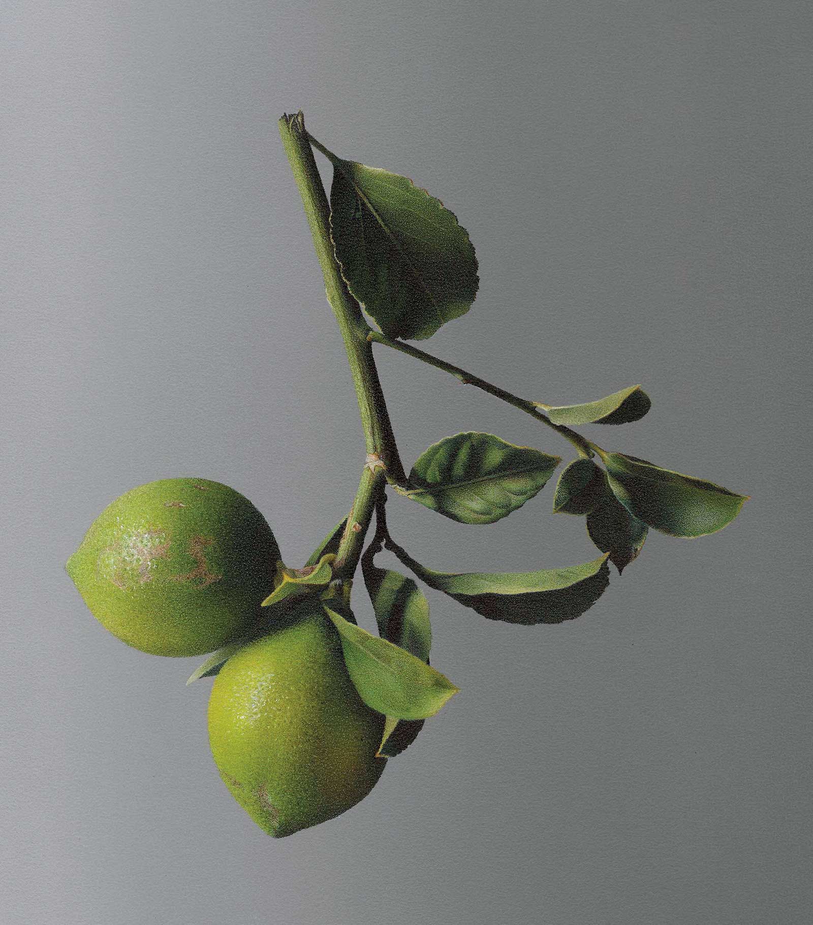
Limones, colored pencil with PanPastel on sanded pastel paper, 8½ x 7½" (21 x 19 cm)
Before you finish your drawing, step away to examine the composition as a whole. You can turn your drawing sideways or upside-down to shift your perspective, revealing mistakes you may have made or details you may have missed. Apply small white dots to accentuate the highlights of the lemons, and use dark indigo and carmine lake to deepen the shadows in the leaves.
About the artist
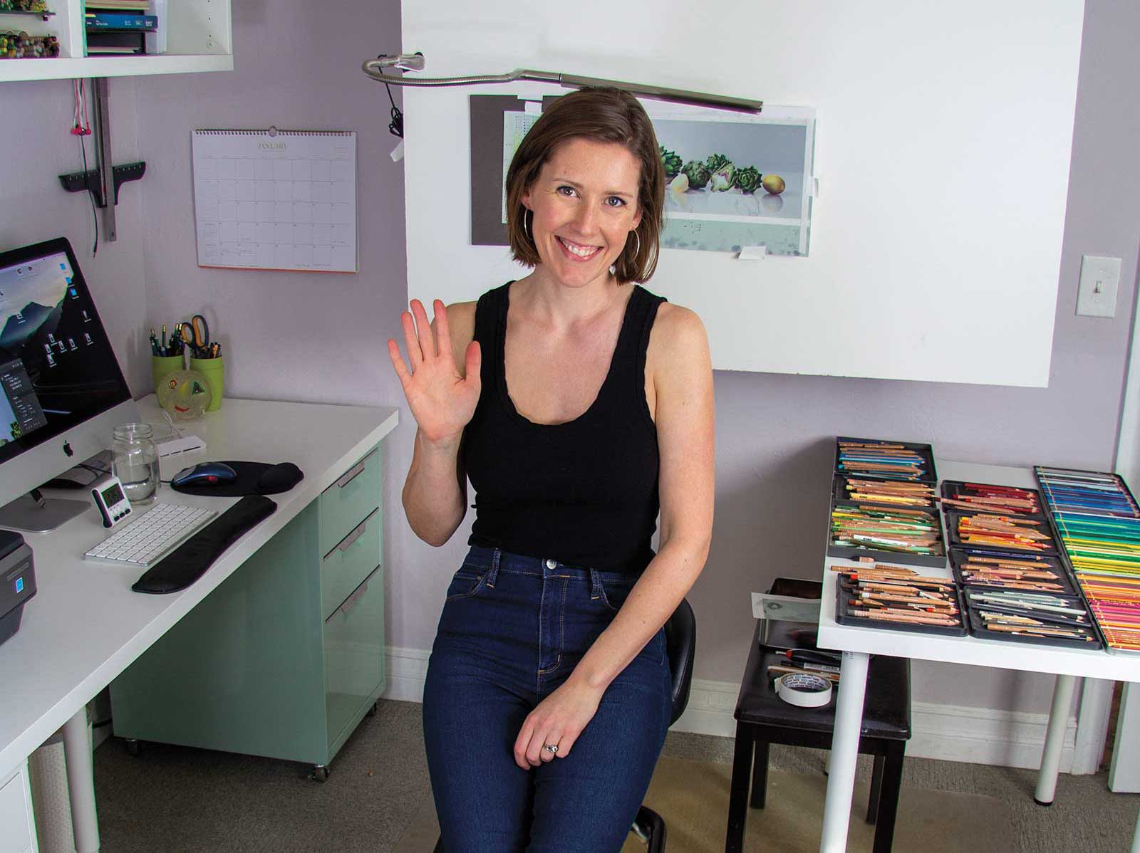 Megan J. Seiter in her studio
Megan J. Seiter is an American artist specializing in colored pencil still life realism. Originally from Rhode Island, she received her BFA from Maryland Institute College of Art, and in 2009 moved to California to pursue her career as an artist. Seiter is an active member of American Women Artists, International Guild of Realism, Colored Pencil Society of America and UK Coloured Pencil Society. Her work has received awards through International Artist, ARC Salon, UK Coloured Pencil Society, International Guild of Realism and American Women Artists, among others.
Contact at
www.meganseiter.com