


My watercolor practice has been fueled by over 50 years of hiking through the mountains, forests and deserts of the western United States. I grew up in Oregon, where as a kid, everything held wonders—from small rocks and tree roots along the trail to thundering waterfalls that suddenly materialized out of the mist up ahead.
It was not until I took a watercolor class in college that I found a way to share the fullness of what I loved about the natural world with other people. I began to carry a small set of watercolors and some paper in my pack when leaving on a hike. The paints provided much more than the opportunity for “plein air snapshots” of my travels. Having them along changed something in my brain. Wherever I went, I realized I was having an internal conversation between what I noticed in nature and what I noticed when pigment flowed on my paper. The evening sky might look like a graded wash, or a bloom of viridian pigment might remind me of those trees across the river. I began to see with watercolor eyes, and nothing has been the same since.
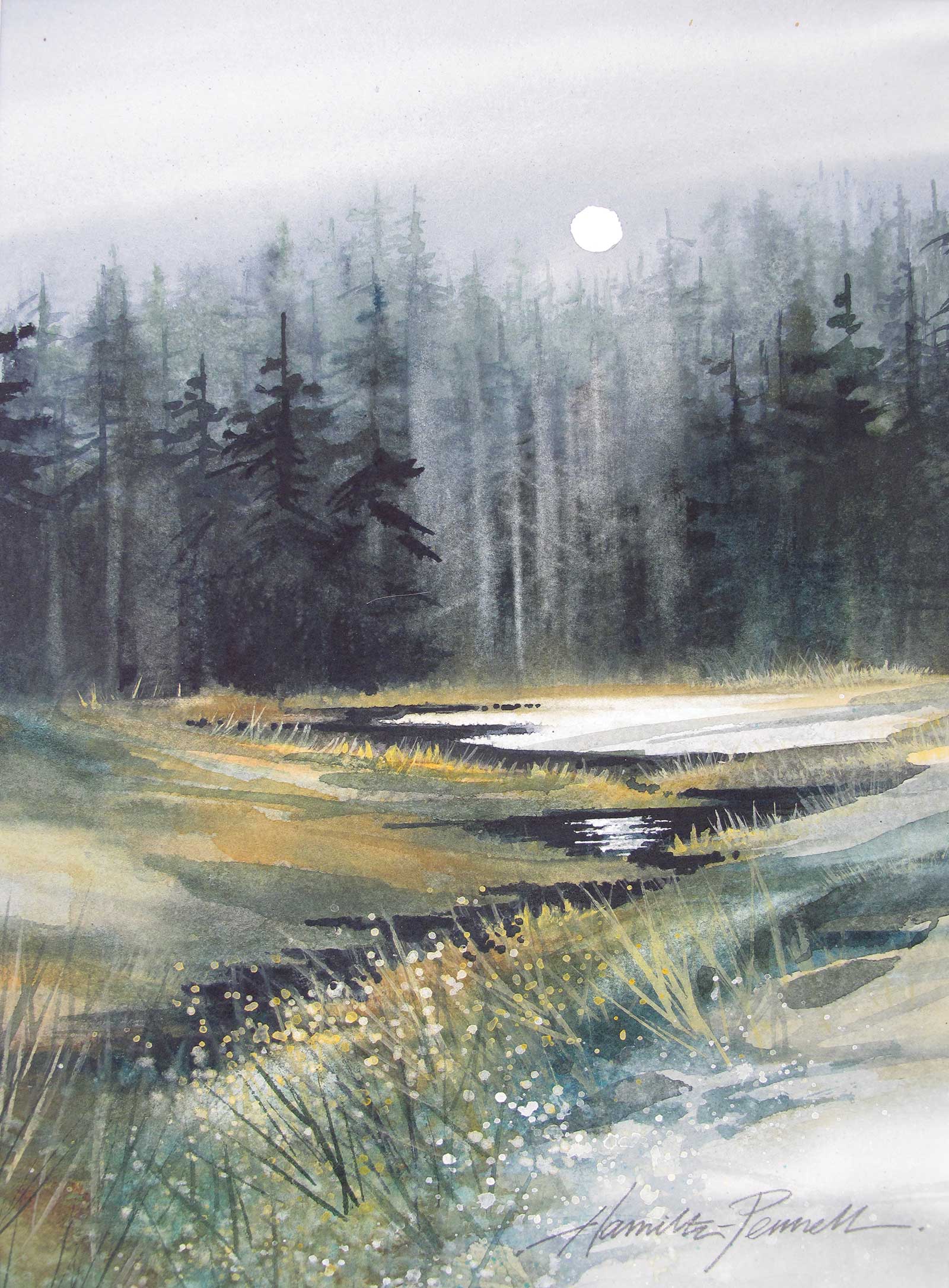
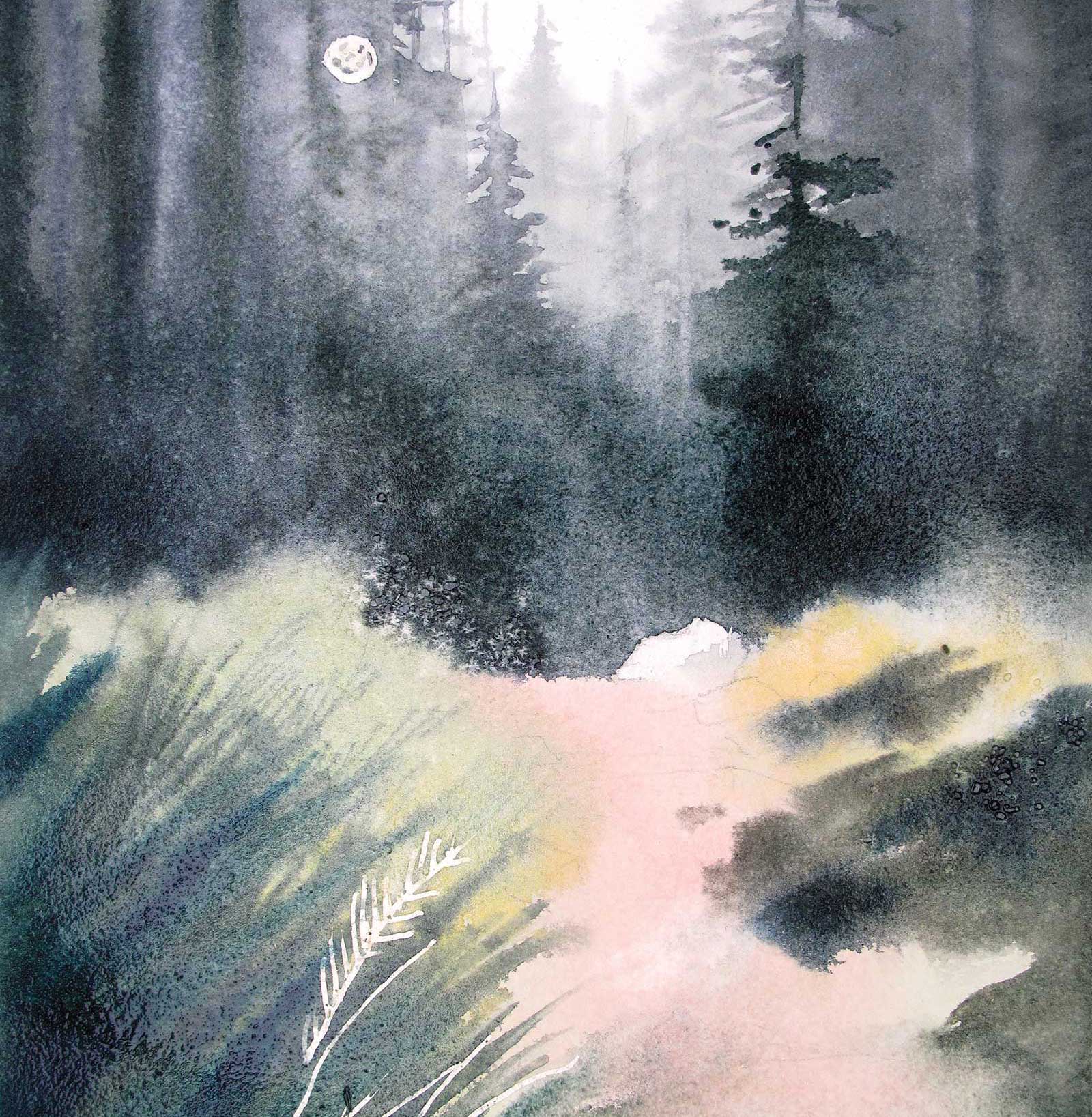
Where the Moon Pays Attention, watercolor on hot-pressed paper, 11½ x 9” (29 x 22 cm) This landscape was painted in a more traditional way, starting at the top and moving downward with soft edges at the bottom of each successive layer. I preserved some of the white paper to give a hint of snow and allow the suggestion of moonlight to bathe the foreground.
My goal as an artist has been to create paintings that feel like my experiences in nature. It is more like writing a poem about what I love than simply using paint to depict a scene. I have never felt compelled to follow traditional rules of watercolor such as maintaining the purity of transparent washes. Instead, my quest has been to let this often unpredictable medium move in ways that capture nature’s subtle moods and mysteries. This requires experimentation. And this experimentation involves an immediacy that keeps me “trying to make the best of an emergency,” as John Singer Sargent said about painting with watercolor.
I have found ways to improve my odds on taming these unpredictable processes. To begin, I prepare a number of surfaces so that I can launch a series of paintings using the same experimental technique. This way I don’t feel too tied to the success of one particular effort. The stakes are lower and I can paint with abandon and boldness. I typically work on smaller (10 x 14”) sheets of 140# paper that have been stretched on Masonite boards so they can hold up to extensive rinsing and scraping (see stage 2 of my demonstration on the following pages).
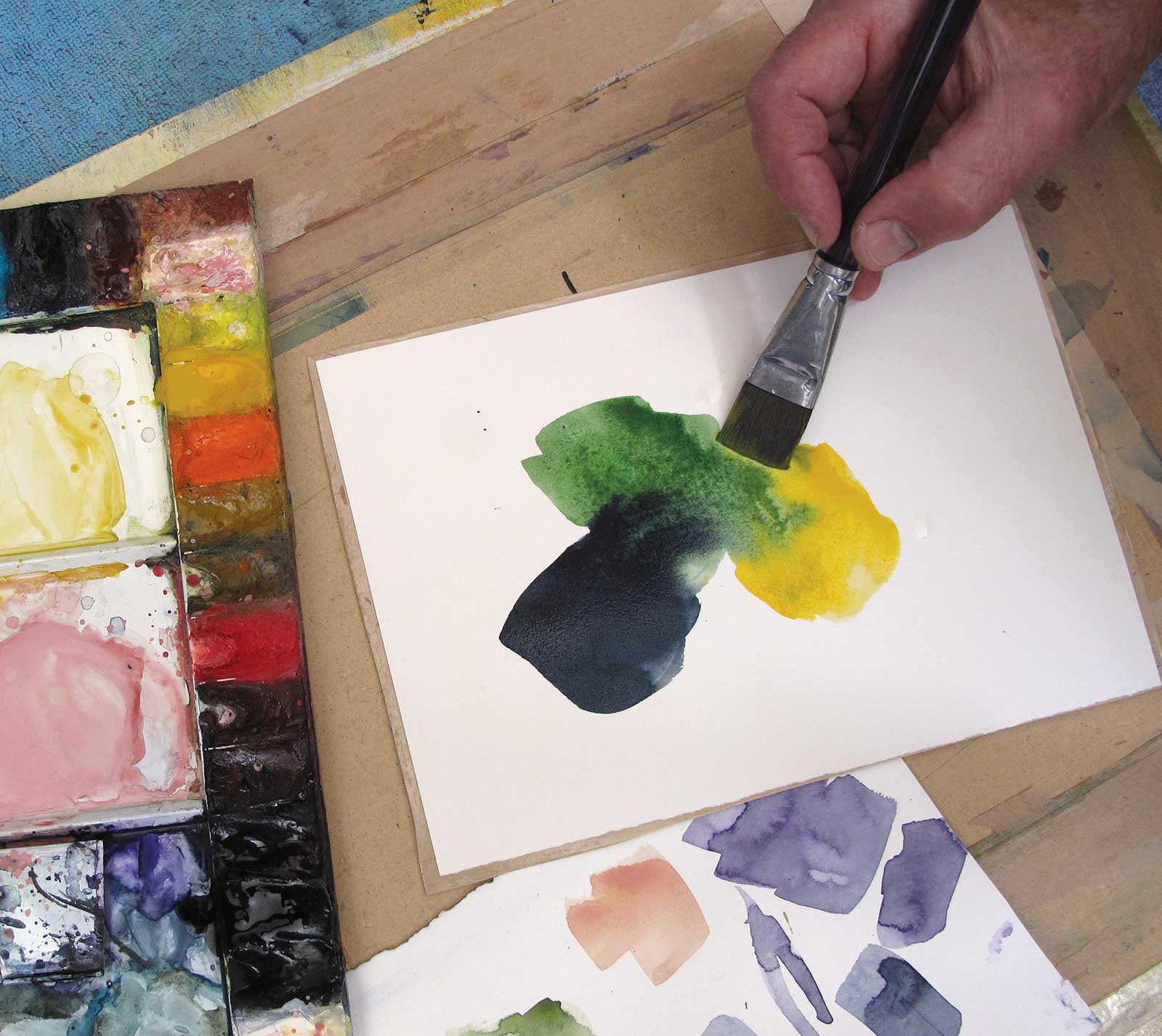
Before starting a painting, I create several exploratory paint swatches. I put wet strokes of pigment next to each other on small practice sheets to watch how they blend or to test the harmony of a three-color combination (see stage 3). All these small practice experiments allow me to approach a painting with some confidence along with enough uncertainty that the whole venture stays exhilarating.
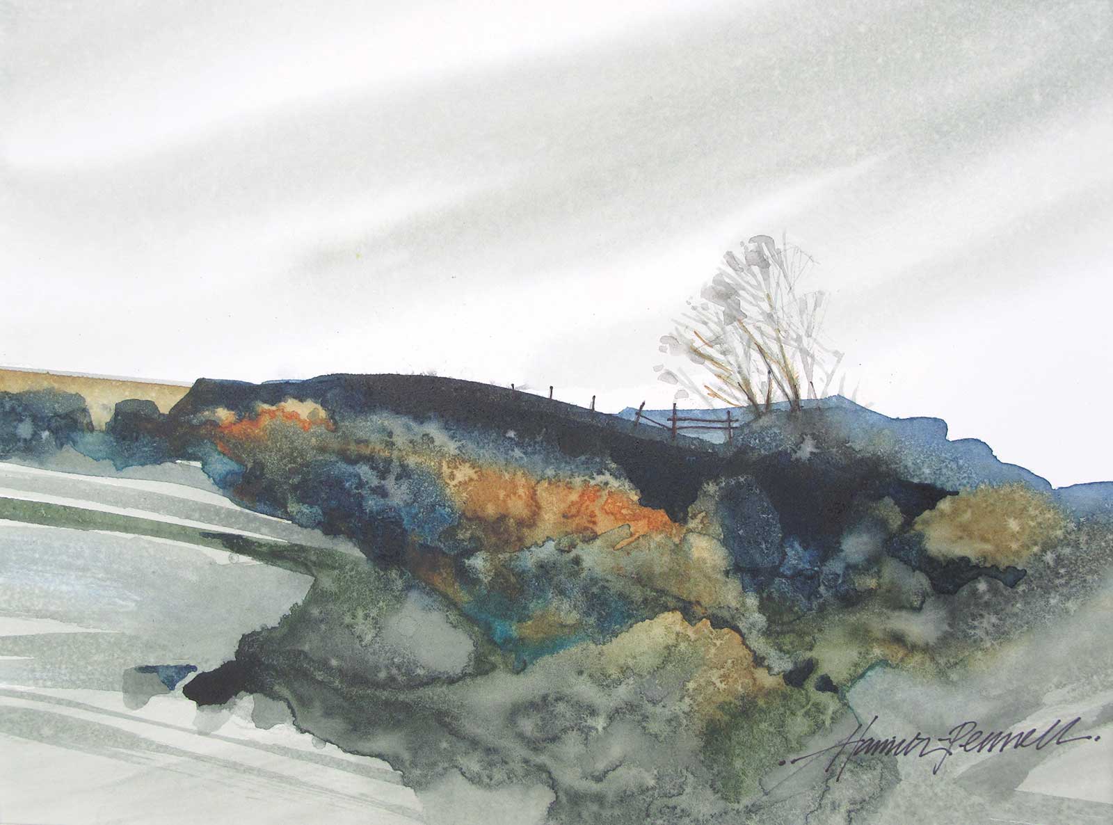
Windblown, watercolor on hot-pressed paper, 8 x 11" (20 x 27 cm) This is an example of my strategy of “painting the foreground first.” I let a mix of indigo, raw sienna, viridian green and quinacridone gold flow together on wet paper. I blotted up spots of pigment with paper towels and splattered additional pigment and clean water onto the mix as it dried. Once dry, I added the sky, the distant cliffs, the trees and fence.
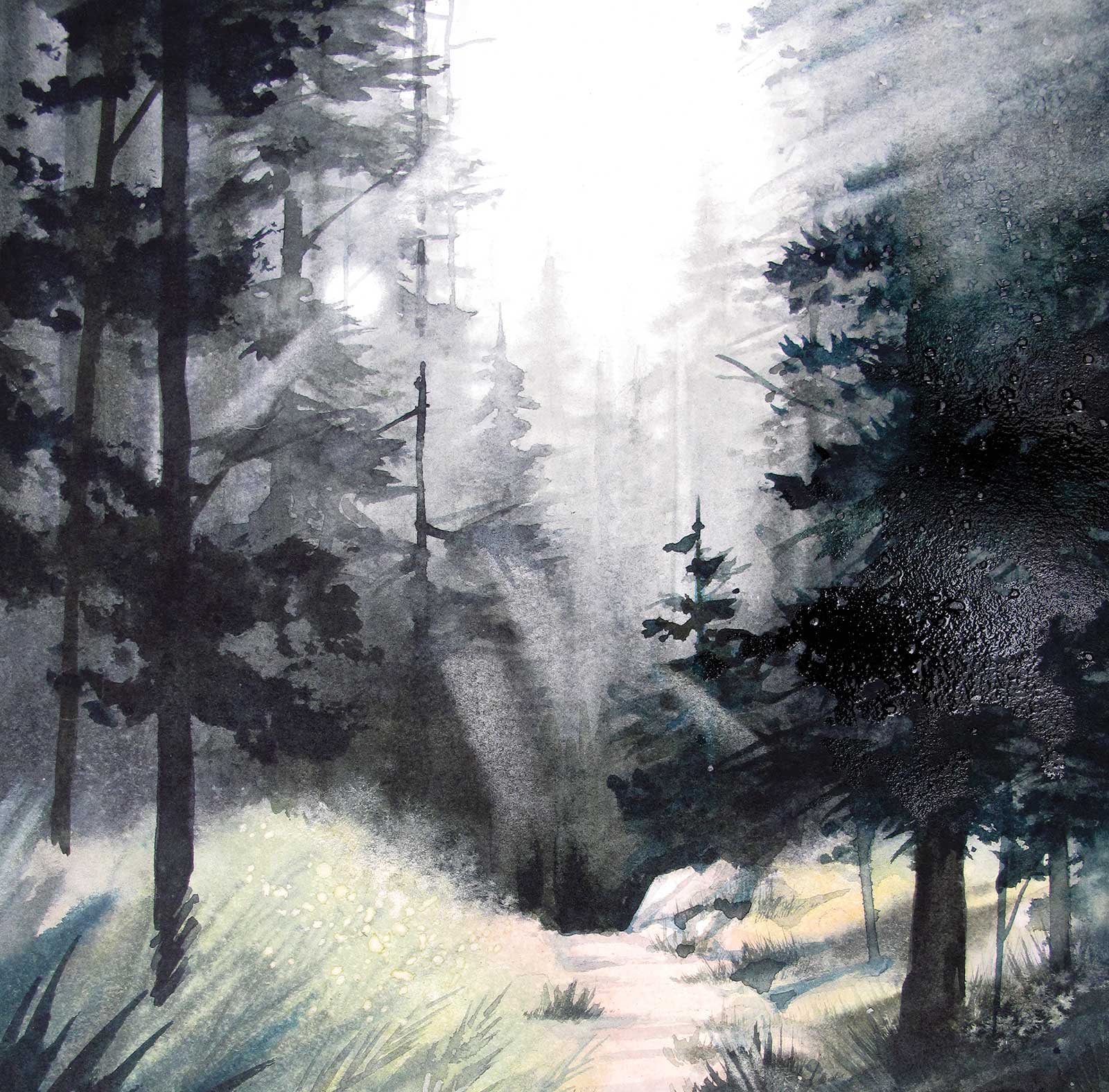
For atmospheric effects, I usually paint on wet paper and continue to mist the developing painting while adding more pigment. I change the angle of my board to let pigment flow and gradually darken the values of my strokes over successive glazes of wet, drippy pigment (stage 5).
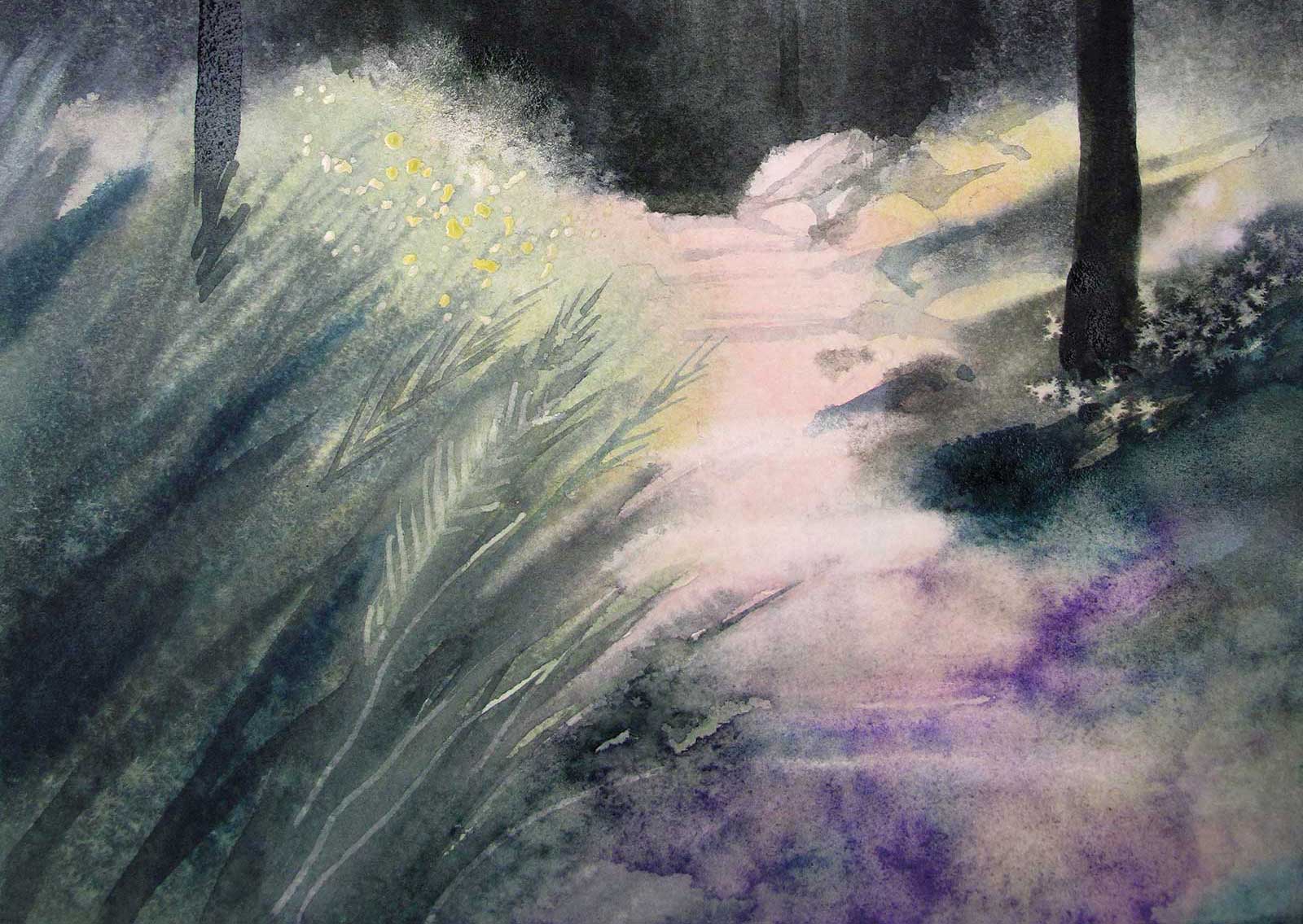
For rich and unique textures, particularly in the foreground, I often begin with splashes of intense color on dry paper. I can then scrape, spray and blot this area using a variety of tools and papers. I let this area dry partially and then re-wet it by dropping clean water or additional color onto the surface with a toothbrush. As this method runs the risk of creating a muddy mess, I sometimes begin by painting the foreground first, and only finish the painting if the foreground texture is successful.
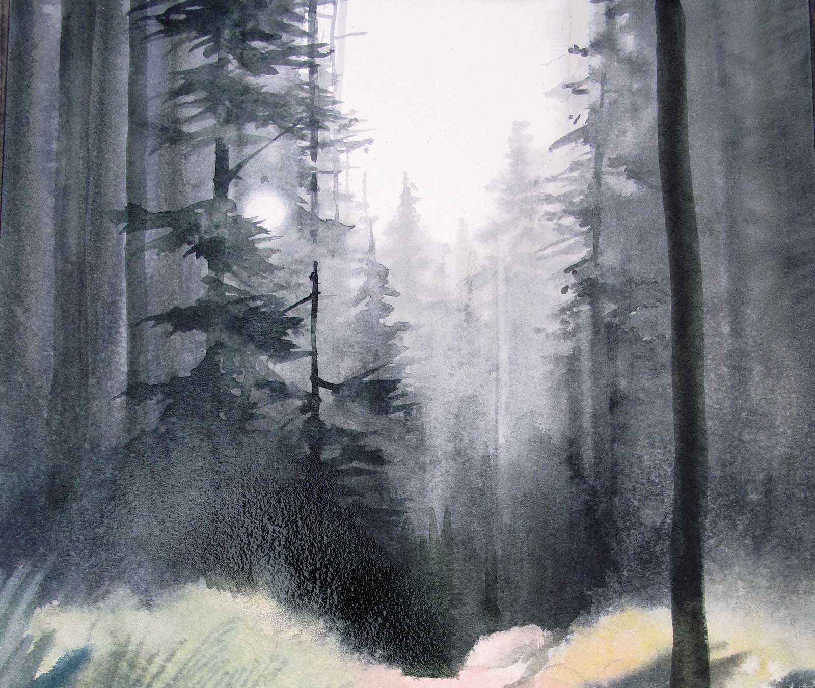
While maintaining this experimental mindset, I am looking for a certain magic to happen on the paper. I’m trying to capture a misty atmosphere, exciting and unique textures, and an overall quality of light that gives the painting a glow. It is a challenge to not overwork the painting. In the end, I want it to look as if the paint itself did the work, as if the painting were the result of a juicy and wonderful accident rather than painstaking brushwork.
The internal conversation between my paintings and my observations of nature has continued for decades now, and I can hear it wherever I go. The beauty of our fragile planet continues to guide my decisions about what to paint, and now I have years of memories to draw on as well: the patterns in those rocks up near the ridge, the color of light on morning trees across the lake, the electric indigo pulse of that storm near the pass. All of these memories whisper to me as I watch paint flow across my paper. I watch and wait. I want to be there when the magic happens!
My Art in the Making Morning Hike, Cape Perpetua
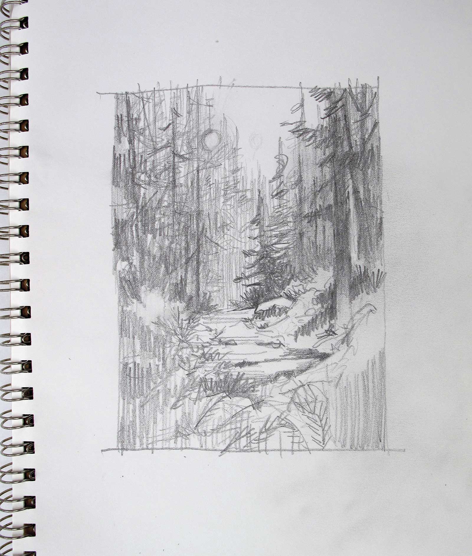 Stage 1
Stage 1 Sketch
I begin with a pencil sketch to plan a path of light into the painting to where the greatest difference in value draws the viewer’s eye.
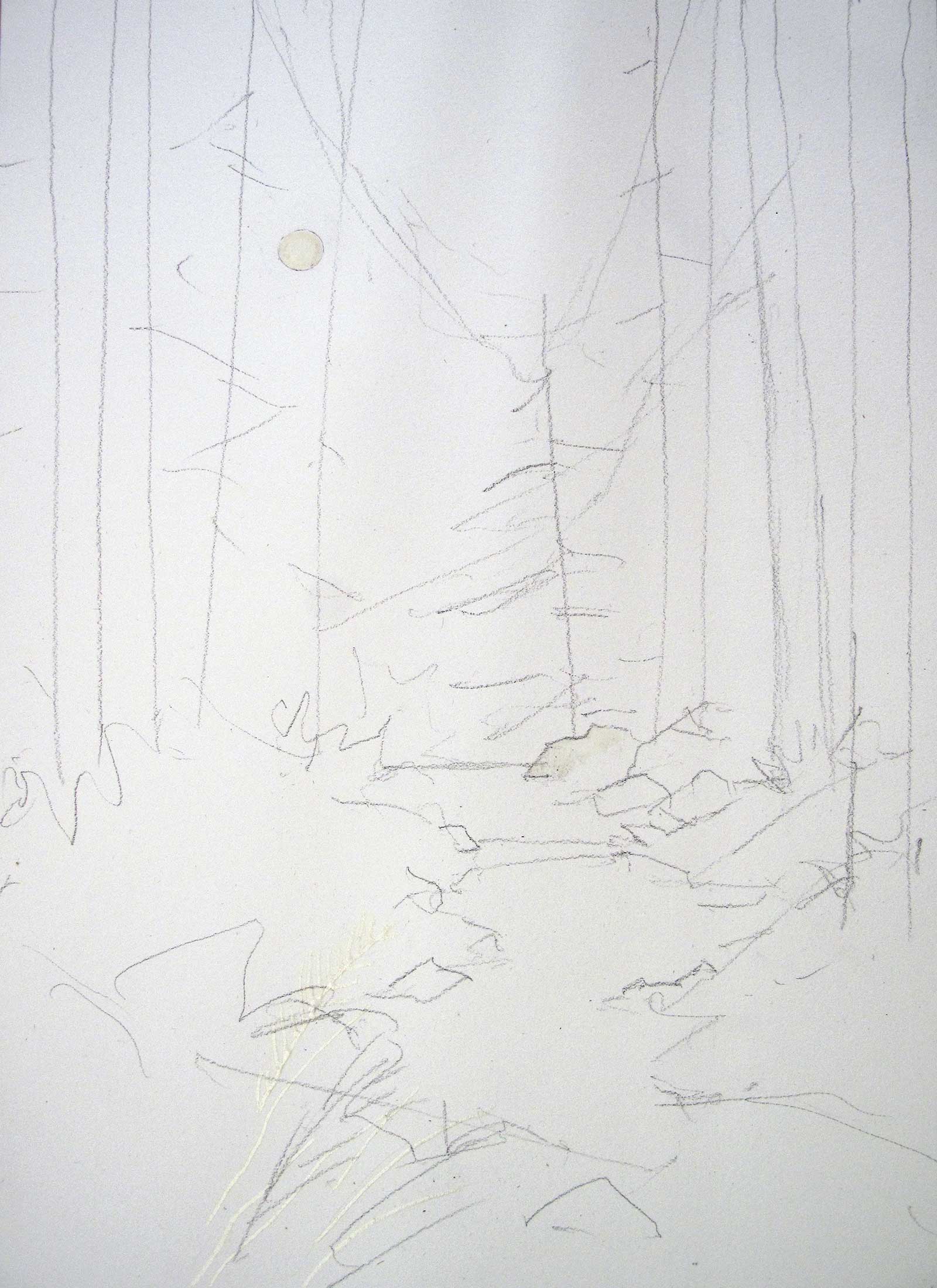 Stage 2
Stage 2 Basic Shapes
I soak my entire painting paper in water and tape it to a Masonite board using gummed paper tape. After this dries, I roughly indicate basic shapes with pencil and mask the sun spot.
 Stage 3
Stage 3 Experimenting with Color
On small test papers, I try out color combinations for my planned painting to see how colors blend and react to processes like splatter or lifting. I check options for darkening or lightening a color.
 Stage 4
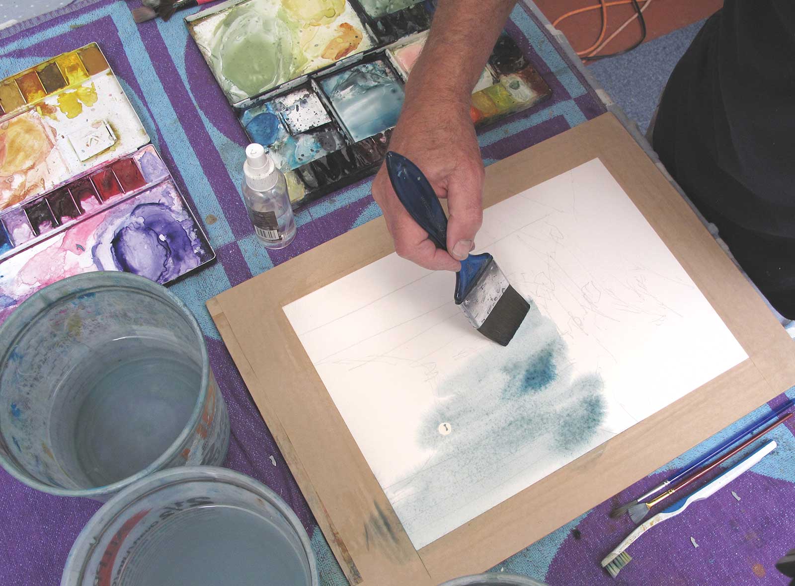
Stage 4 Laying in Payne’s Gray
Using a soft 2" flat brush I cover the top half of the prepared paper with clean water followed by upward strokes of Payne’s gray mixed with cerulean blue to suggest the background trees.
 Stage 5
Stage 5 Colors of Foreground
While the paper is still wet, I quickly add foreground color using a mix of sap green, olive green and raw sienna, making sure the edge against the dark trees stays soft, wet and organic.
 Stage 6
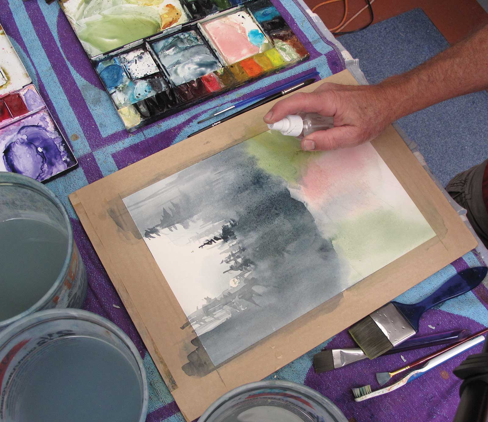
Stage 6 Using Mist to Build Texture
I continue to apply a fine mist over all of the painting surface to create a texture to both the forest and the foreground vegetation. I add the path using titanium white and cadmium red deep.
 Stage 7
Stage 7 Trees Come to Life
I add tree shapes using a gradually darker mix of Payne’s gray, cerulean, sap green and sepia, misting and blotting the trees with a crumpled paper towel.
 Stage 8
Stage 8 Grass and Fern
I add darker pigment to the foreground, including Prussian blue and Da Vinci violet to create grass and fern shapes. I splatter water onto the foreground and add a few grains of kosher salt.
My Design and Composition Tactics
Create a Pathway of Light
The light tends to be what captures my attention on a hike. When I design my painting, I want my viewer’s eye to be captured by the light as well. I plan the painting (using a value sketch) to lead my viewer’s eye to the point where the darkest values meet the lightest values (see stage 1).
Use a Spectrum For Harmony
By choosing a palette of analogous colors (next to each other on the color wheel, like yellow, yellow-green, green) I can be confident that there will be a sense of calm harmony in my painting. I particularly look for new ways to express the “greens” of nature, such as mixing Prussian blue and sepia or ultramarine blue and raw sienna (see stage 3).
Paint in a Series
To eliminate some of the anxiety of painting with such an unpredictable medium, I work on three or more starts of the same subject at the same time.
 Stage 9
Stage 9 Diffused Light
I begin lifting some of the dark forest pigment from the upper right corner and near the foggy sun using a 1" flat brush, rinsed and squeezed into a terry cloth rag.
 Stage 10
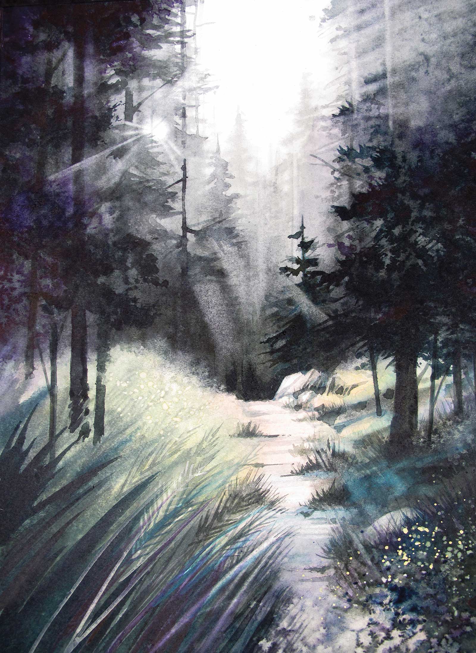
Stage 10 Finished Artwork
Morning Hike, Cape Perpetua, watercolor, 14 x 10" (35 x 25 cm)
I add a light glaze of cobalt turquoise to the foreground, and then use a ½" flat brush rinsed and pulled edge-wise to lift lines of light near the sun.
About the artist
 Robert Hamilton-Pennell
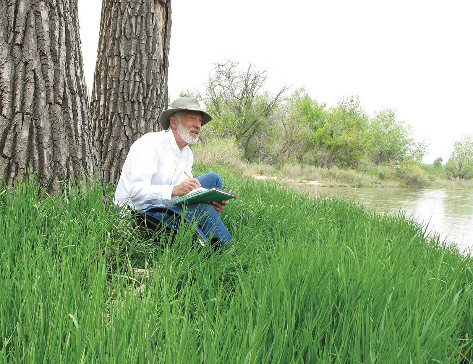
Robert Hamilton-Pennell is an artist and teacher who grew up in the Willamette Valley of Oregon and studied art, architecture and education at Washington State University and the University of Oregon. He has been teaching and painting for more than 40 years in Denver, Colorado, where he lives with his wife Christine. He sells his work through his home studio in Denver and on his website at www.hpwatermedia.com, where you can sign up for his newsletter, Studio Reflections.
Contact at
www.hpwatermedia.com