


Setting the pace with big, expressive marks from the outset of a painting is an important part of my practice in order to allow the energy to flow and get the painting “moving.” My style is loose, energetic and spontaneous. With large palette knives and brushes, I usually like to dive into a painting with fast-moving applications of wet-in-wet paint, sometimes using a retarding medium to slow down the drying time of the acrylic paint, thus allowing for more paint malleability. Once this is dry, I move towards more considered blocks of color, adjusting how the colors sit together. I look for pattern and design in the paint marks, which I then “tie together.”
The paintings are built up in a series of layers, some in thicker, impasto paint and some more fluid. Often paint is covered over or knocked back to reveal hints of hidden layers beneath. I enjoy this continuous process of revealing, hiding and accentuating and am constantly open to changing parts of a painting so that the work remains alive and open to possibility. As I have naturally evolved towards abstraction, my work has become increasingly experimental, and I enjoy pushing boundaries, taking risks (not being too precious about making mistakes!) and not getting too tied up with technique.
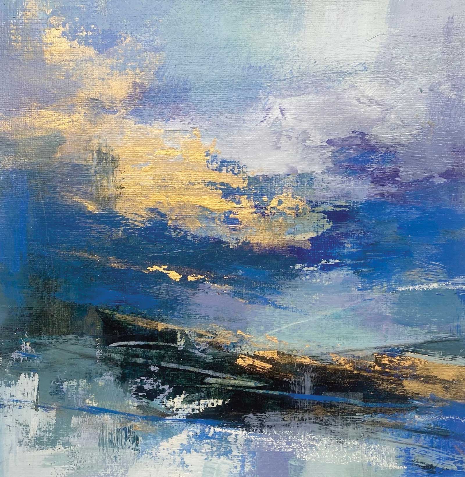
Gold Cloud, acrylic and gold leaf, 17¾ x 17¾" (45 x 45 cm) This was painted in soft body and heavy body acrylics and gold metallic acrylic. Gold leaf (24k) was applied which catches the light and makes the purply blue sky sparkle.
Glazing is an important part of my process, and it is always a joy when transparent glazes appear to make the paint beneath glow. Sometimes I use an acrylic glazing medium, as in the sky area of this demo, and sometimes I just add a little water.
More often than not I work from imagination, but if I do use one of my reference photographs, I only take certain elements from it, such as basic compositional structure or part of a cloud formation. I tend to use black and white reference photographs, which aren’t tied into any color structure.
Generally, I use one or two small painting studies as inspiration for a larger piece of work, although I avoid creating a scaled up version of a small study as I believe each piece of work should be allowed to develop on its own and be considered an individual work in its own right. Small painting studies and sketchbooks are a big part of my painting process. I love to make my own concertina sketchbooks, which I particularly enjoy as I like the way they flow as an extended piece.
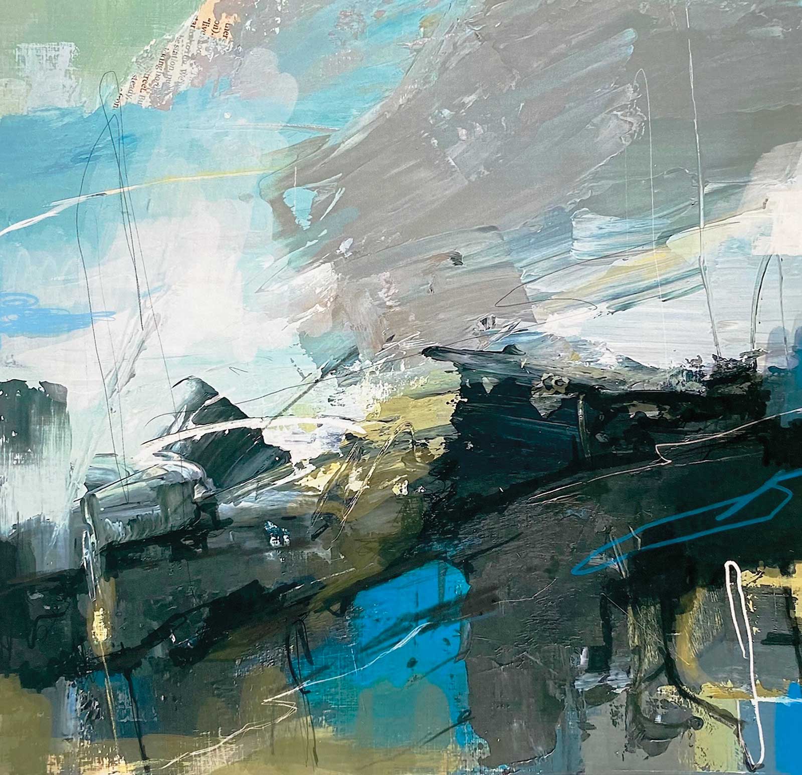
Light and Shadows, mixed media, 23½ x 23½" (60 x 60 cm) I wanted to create a sense of chaos in this rocky landscape painting. I used acrylic marker pens for some of the linear marks and some newspaper was collaged into the sky. I have glazed with Olive Green over some blue areas and have introduced some Olive Green tints into the sky. Much of the painting was done with a large palette knife.
Inside my sketchbooks I often keep color notes and little color swatches to remind me of color mixes I have used. I love experimenting with color mixes, trying out subtle mixes of olive grays and tints, muted lilacs and desaturated reds for example. Where I have a large area of muted color I will often break that up by scoring through it with a primary or vibrant color (sometimes using a thick oil pastel).
I use a variety of different brands of acrylic paint, Winsor & Newton, Liquitex and Golden being three of my favorites. I enjoy working with a limited palette (sometimes just the three primary colors and a black and white paint), as I find it fascinating how many subtle color variations can be mixed from so few colors. I also like to introduce my favorite pre-bought mixes such as Winsor & Newton Artists’ light red (used in this demo), which produces so many gorgeous muted pink tints.
For larger paintings, I usually work on panel or canvas. In this demonstration, I have worked on a wooden panel. Sometimes I like to sand back paint, which can reveal some interesting textures and colors underneath that can then be worked over. I also enjoy the smoothness of panel, and I love the way the paint seems to glide over the surface.
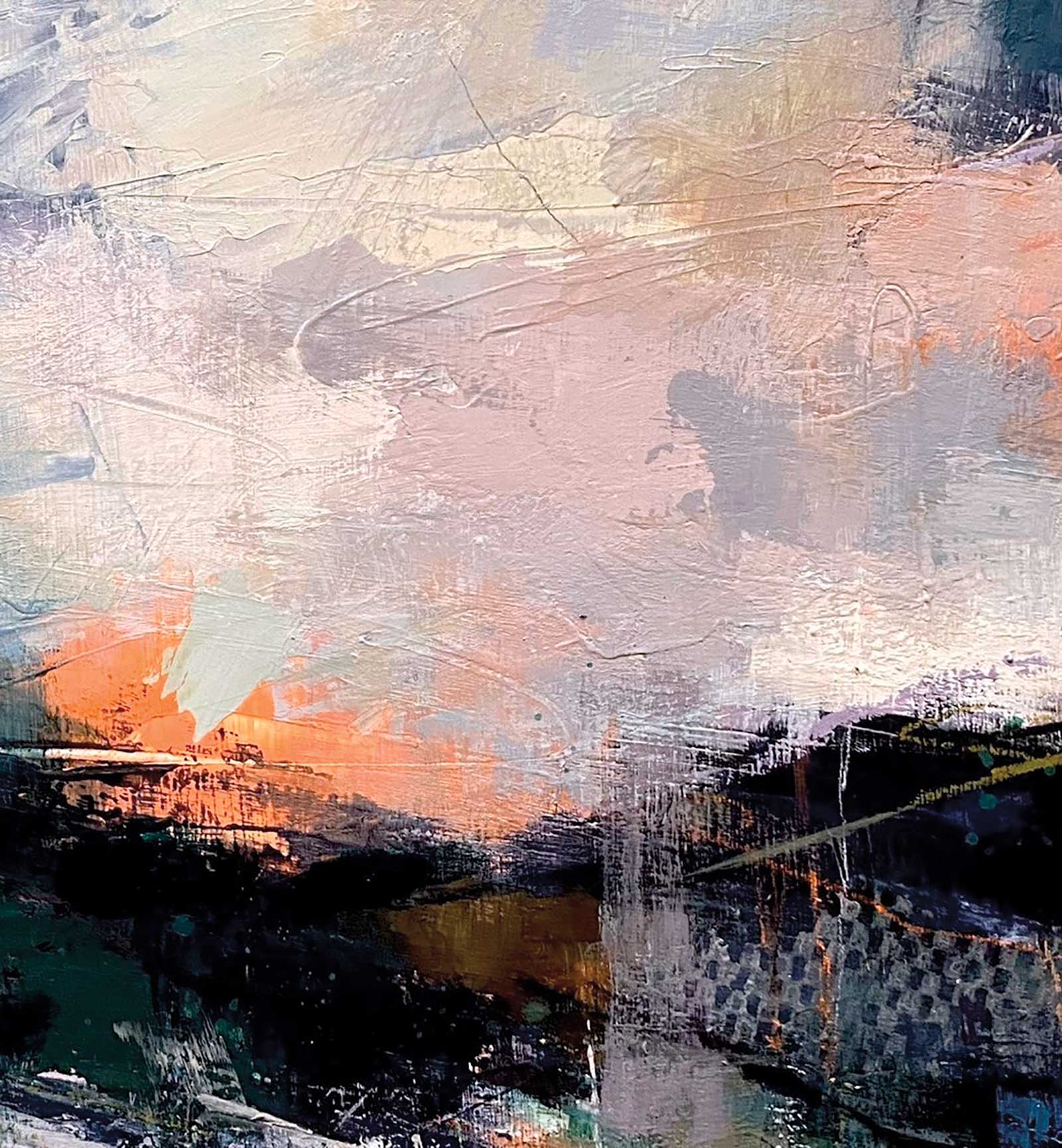
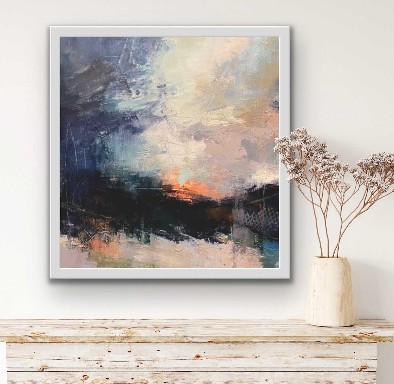
This painting demonstration is fundamentally about energy and atmosphere. I wanted to relate a feeling of looking up into a big, open, infinite sky and draw attention to how the softness of the clouds contrast with the raw, organic structure of the moorland and rocky areas. I always aim to create abstraction without losing atmosphere.
My Art in the Making Dusky Moor
 Stage 1
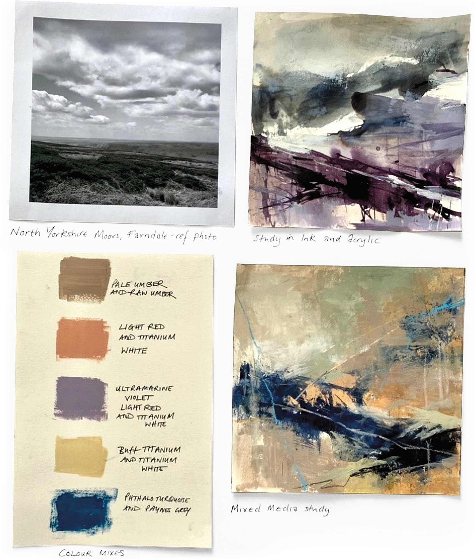
Stage 1 Reference Studies and Color Swatches
Inspired by the North Yorkshire Moors, I rough out some ideas for the color scheme and the basic composition—a big, atmospheric sky over a sloping moorland beneath, painted in muted, dusky tones. The color swatches help me decide on colors I want to introduce.
WHAT THE ARTIST USED
Smooth, prepared wooden panel, Heavy body acrylic paint, Acrylic matt medium, Acrylic gloss gel medium, Acrylic glazing medium, Slow-Dry retardant medium, Charcoal, Oil pastels, Inktense pencils, Acrylic satin varnish, Pastel fixative, Anti-slip fabric roll, Stay-Wet palette, Large palette knives (10 and 12cm), 1", 1½", 2” and 3" flat acrylic synthetic brushes, flat silicone color shapers and hardware store brushes
Main Colors (Black, white and three primaries)
Titanium white, Mars black, Indanthrene blue, Yellow ochre, Alizarin crimson
Additional Colors
Cadmium orange, Payne’s gray, Raw umber, Light red, Green gray, Blue gray, Ultramarine violet, Phthalo turquoise, Terracotta
 Stage 2
Stage 2 First Layer
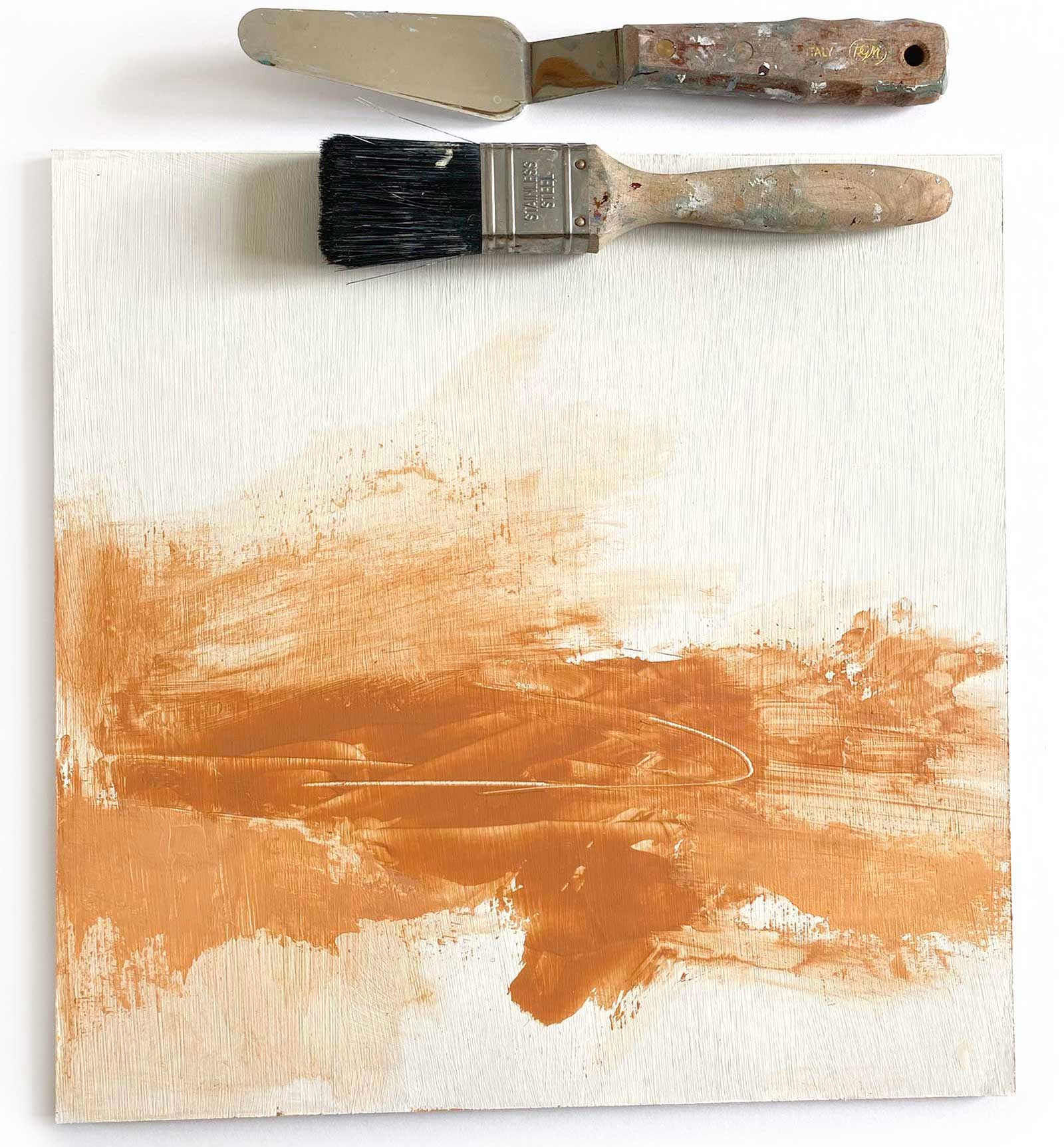
Working on a wooden panel (which has been pre-sealed with GAC 100 and gessoed), I quickly apply heavy body acrylic in a warm terracotta using a 2" flat acrylic brush and large palette knife.
 Stage 3
Stage 3 Raw Umber and Scratching Through Wet Paint
Once this layer has dried, I work over the terracotta with raw umber acrylic, scratching through the wet paint to reveal the terracotta beneath. I also introduce some Payne’s gray and indanthrene blue.
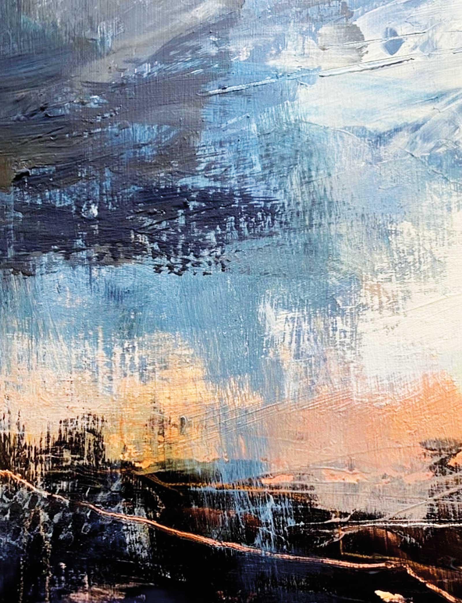
 Stage 4
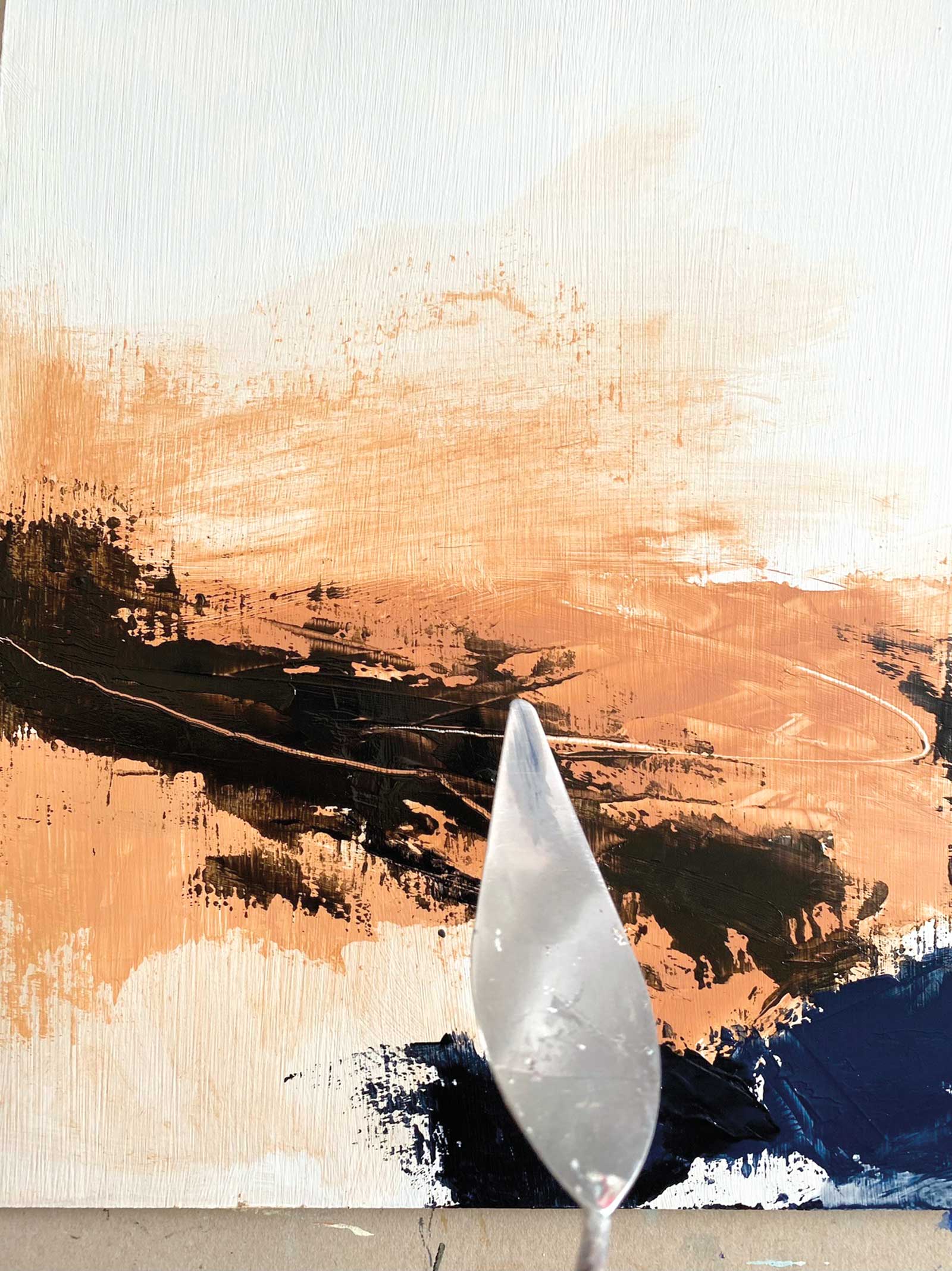
Stage 4 Blocking In
I start to block in larger areas of color with a 2" and 3" flat acrylic brush and large palette knife. I have introduced a green gray mix for the sky.
 Stage 5
Stage 5 Stay Wet Palette
My “Stay Wet” palette stops my acrylics from drying up. I usually have two or three of them on the go during a painting session. I sometimes make my own using a Masonite tray or flat plastic container, absorbent materials such as sponge cloth/felt/kitchen roll and parchment paper on the top.
 Stage 6
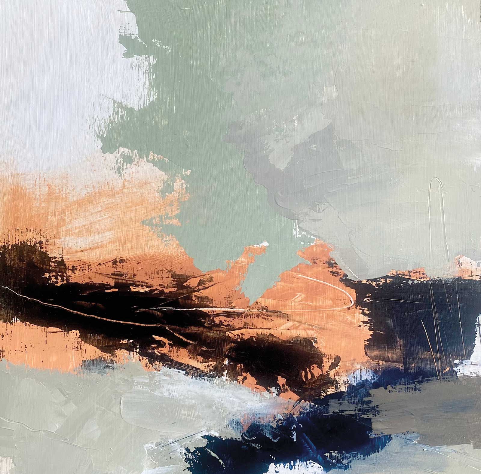
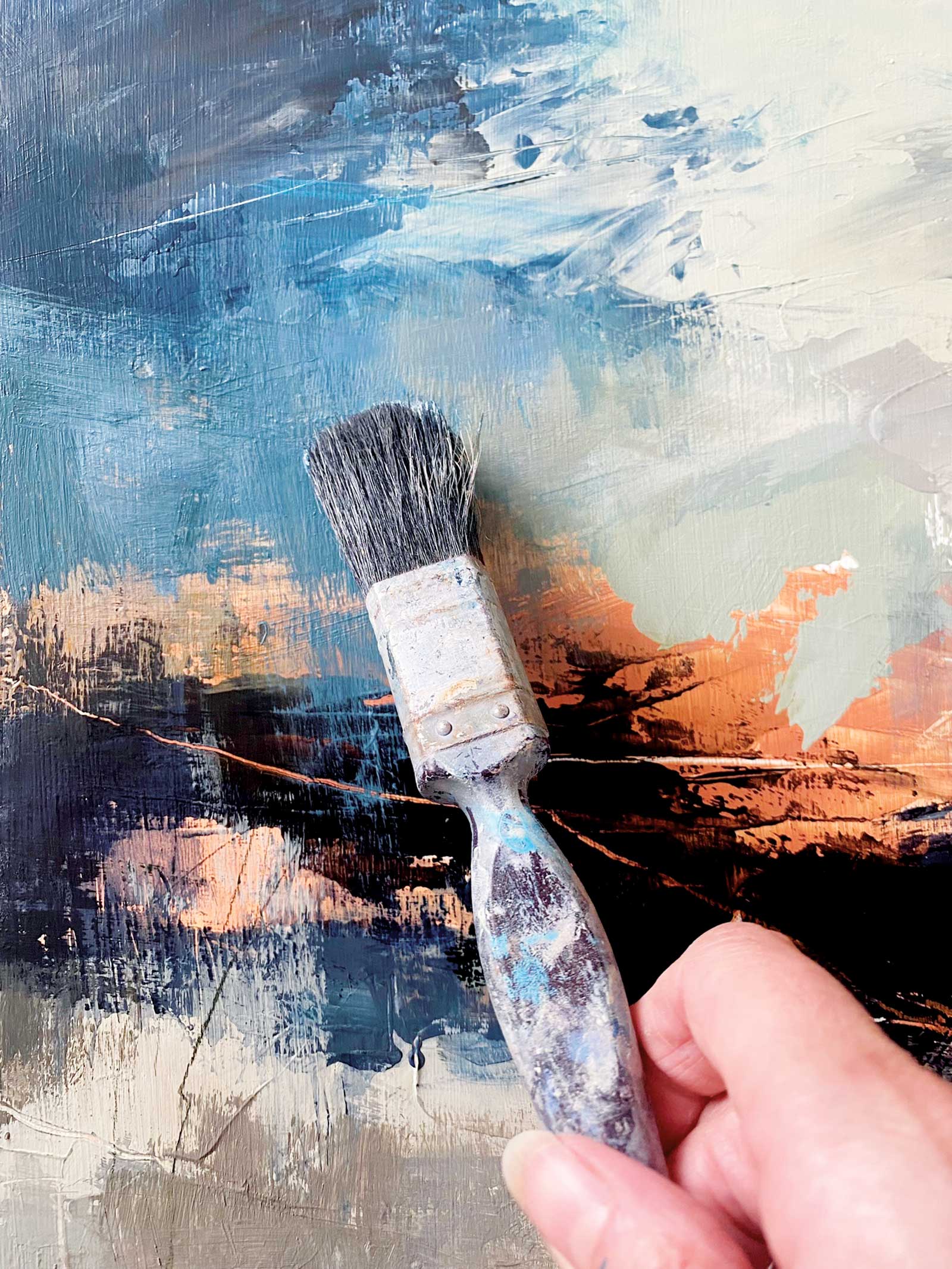
Stage 6 Dry Brush Dragging
I love to vary my brushstrokes to keep the work feeling fresh and alive. Here I am dragging the blue gray painting downward over the orange sky using a dry brush method.
 Stage 7
Stage 7 Applying Dry Media
Introducing linear marks to break up areas. Here I have used Inktense pencils and an orange oil pastel.
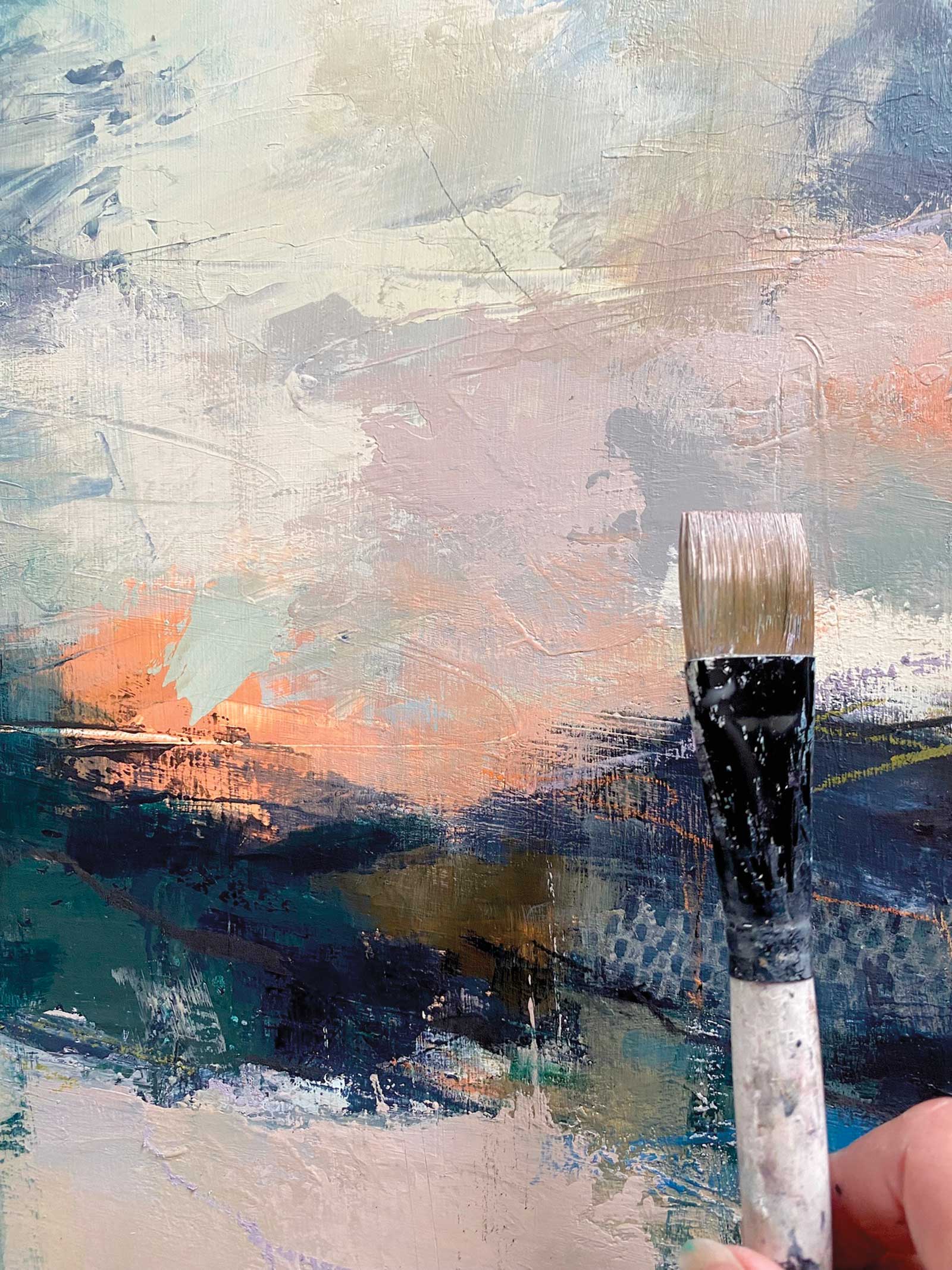 Stage 8
Stage 8 Muted Pinks
Now I am creating some muted pink tones using mixes of pale umber, raw umber and ultramarine violet.
 Stage 9
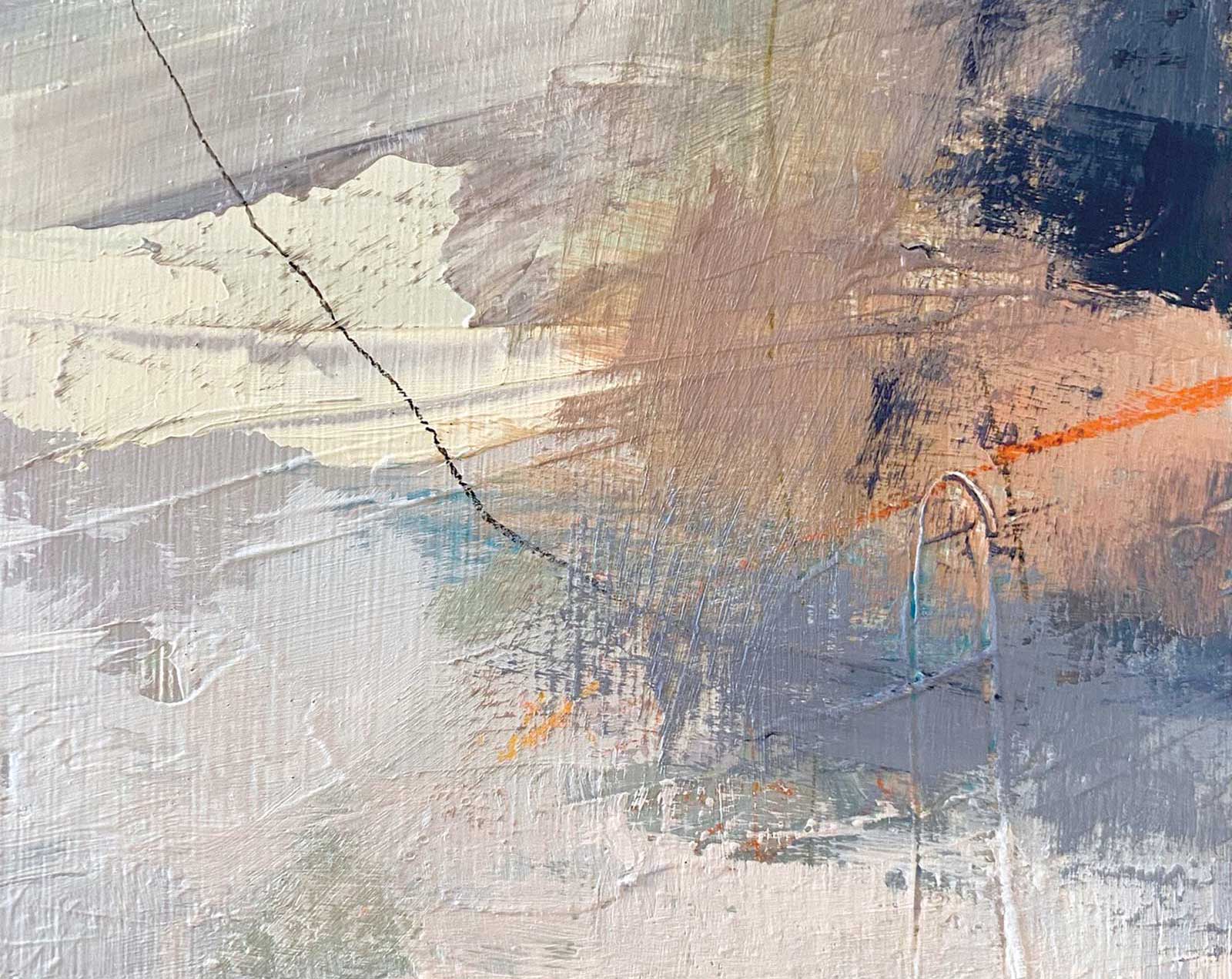
Stage 9 Textures
I’m loving the interesting textures and interplay of thick and thin paint.
 Stage 10
Stage 10 Close Up
I’m always on the lookout for interesting print and collage materials I can introduce into my paintings. The checkered area has been printed on with a piece of anti-slip fabric roll.
 Stage 11
Stage 11 Finished Artwork
Dusky Moor, mixed media, 13¾ x 13¾" (35 x 35 cm)
I fix all dry media using a pastel fixative. Once dry, I apply a coat of gloss gel medium. This brings out the luster of the colors, helps to seal the oil pastel and other media (I never apply heavy layers of oil pastel and find the gel medium deals with any potential tackiness and scratching) and acts as an isolation coat prior to applying an acrylic satin varnish.
About the artist
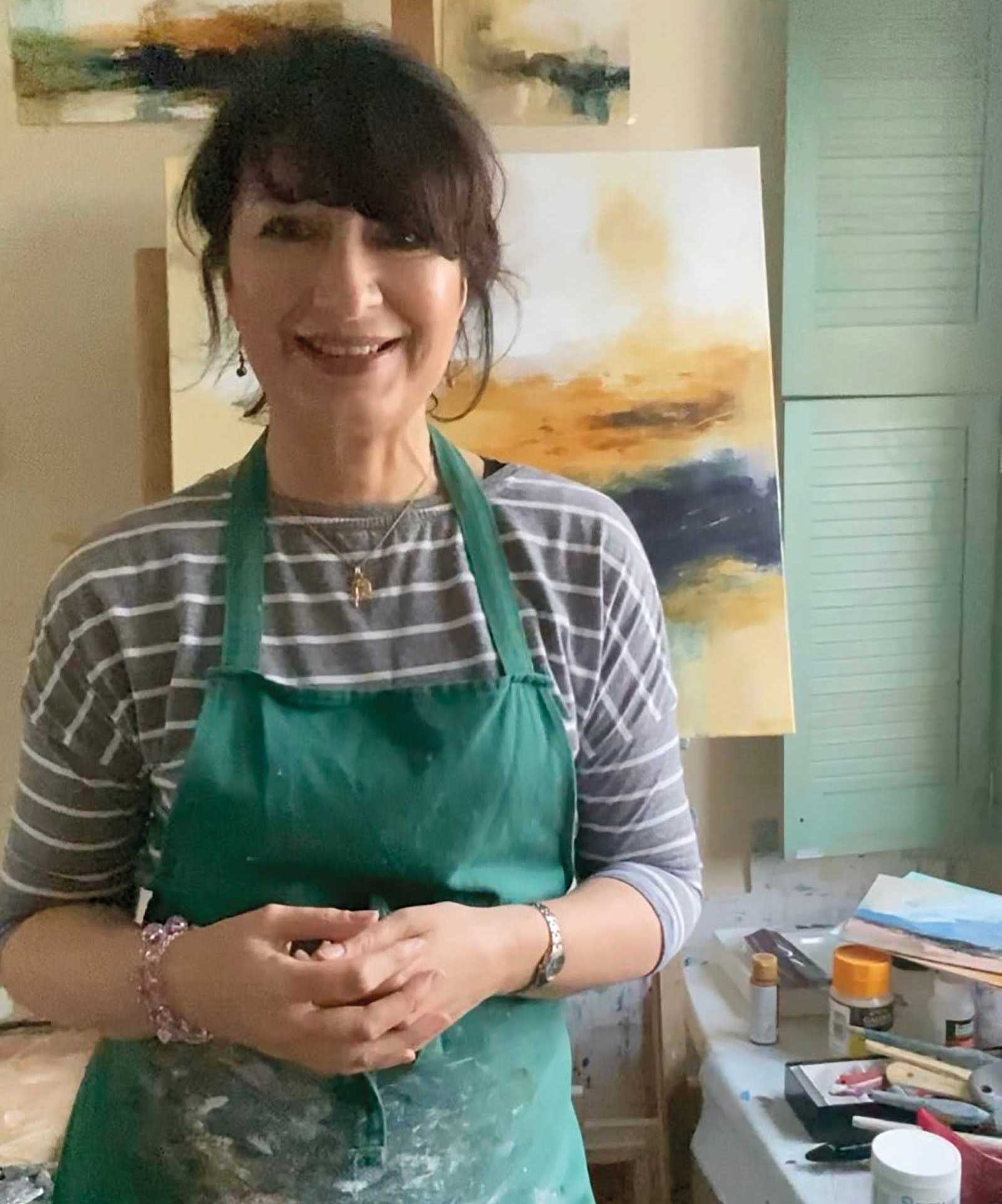 Luisa Holden in her studio
Originally from North Wales where she trained in fine art at the North Wales School of Art and Design, Luisa Holden has lived most of her adult life in North Yorkshire, based just on the outskirts of York. The North Yorkshire Moors and coastline is a constant source of inspiration for the artist and features heavily in her work as well as the Northumberland and Cornish coastlines. She also loves to paint vibrant, abstracted flowers and still life.
Primarily working in acrylic and mixed media (sometimes employing collage and gold leaf), Holden often favors a muted, unifying color palette, enjoying the interplay of neutral tones with bright color. She loves unpredictability, preferring to capture a “sense” of a picture rather than relating too much detail. Big, gestural marks, textural layers and sgraffito (scratching through wet, buttery paint) are characteristics of her work.
Exhibitions include Mall Galleries (London), Ferens Gallery (Hull), Great North Art Show (Ripon Cathedral), Beningbrough Hall (National Trust, Beninbrough), Huddersfield Art Gallery, Blossom Street Gallery (York), Helmsley Arts Centre, Dean Clough (Halifax), The Station Gallery (Richmond) and Highgate Contemporary Art Gallery in London. Additionally, she was elected a member of Leeds Fine Artists (established 1874) in 2018, and in 2022, and was elected Associate Member of the Society of Women Artists (established 1855). Collections of her work can be found in the United States, Sweden, Germany, Ireland and Australia.
Represented by
The Leaping Hare Gallery, North Yorkshire, UK, www.theleapingharegalery.com
Wychwood Art Gallery, Oxfordshire, UK, www.wychwoodart.com
Contact at
www.luisaholdenart.co.uk