


Grand Prize is a four-page editorial feature in American Art Collector magazine
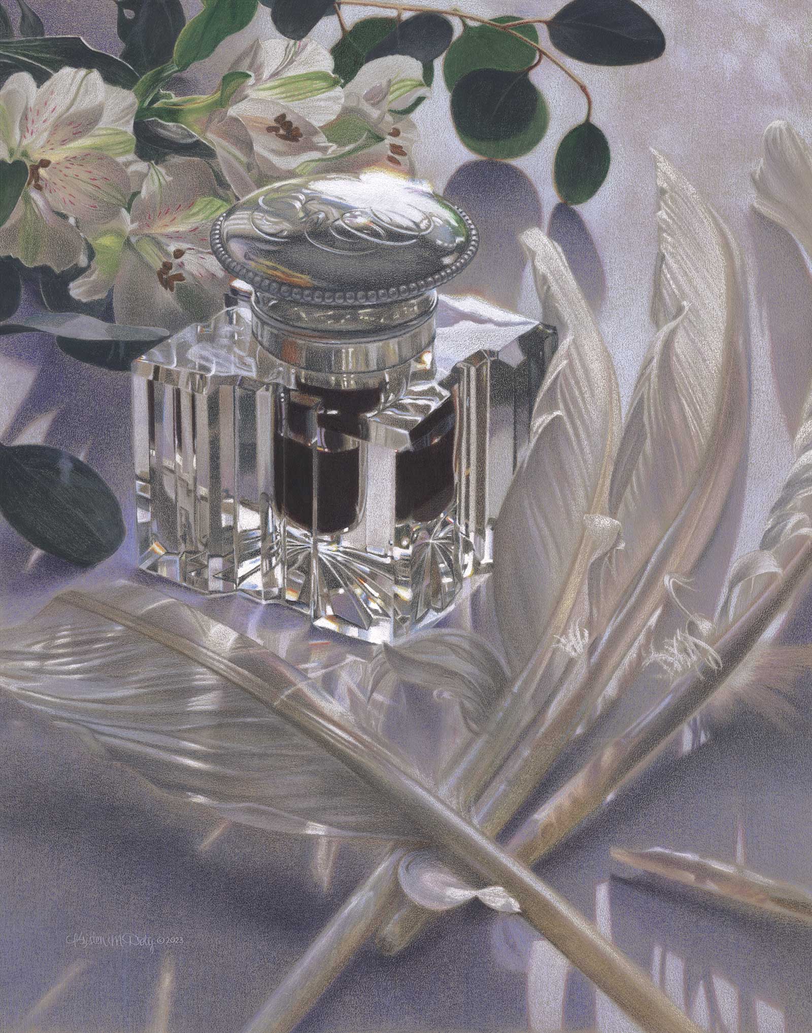 Preparations, colored pencil, 21 x 16½" (53 x 41 cm)
Kristen Doty
Washington, USA
Shine On
When Kristen Doty was very young, long before she knew she’d be an artist, she and her father would look at one of his art books, Behold My Glory. In particular, Doty was drawn toward two Georges de La Tour paintings: Saint Joseph the Carpenter and The Madeleine with the night light called La Madeleine Terff. “[My father] would point to the details and marvel at how someone could use paint to capture a flame, or the light falling on and coming through skin and fabric, or the folds of the fabric of Joseph’s shirt sleeves. This must have contributed to my propensity to paint in a realistic style,” Doty reflects.
Her paintings, which include landscapes, still lifes and elements of nature, are rendered in a soft, realistic style. “Details always catch my attention, and I am drawn to complex and challenging subjects,” says the artist. “Sunlight can further illuminate objects in such a way that is stunning and breathtaking. These are the initial sparks that move me to paint. But deeper than beauty and details, there is a story or connection to the subject. I tend to follow the often-heard advice for artists: ‘paint what you know and paint what you love.’”
In one painting, you might find a glass vase filled with water, shimmering in the sunlight—and in another you might glimpse an expansive canyon, or perhaps a closely cropped composition of gerbera daisies. “The subject, together with intriguing details and the light and shadows of a scene inspire me, and I wish to convey the emotion of viewing something beautiful that instills awe and wonder or stirs a memory from a moment captured in time,” says Doty. “For me, realism is the means to express what I am seeing, experiencing and want to share.”
The artist works in a variety of mediums, including colored pencil, pastel, watercolor and oil.
My Inspiration
Flowers and leaves are always inspiring as living things of beauty. Quills and inkwells are functional, beautiful and particularly meaningful as I am also a calligrapher. When combined with natural sunlight, the sparkle in the glass and translucence of objects creates a visual effect that is exquisite. Since most of the quills are still uncut and the inkwell lid is closed, this scene is about “preparations.” These items might be used to create invitations or placed near a guestbook for friends and family to sign at an anticipated marriage, or at a more reflective memorial or celebration of life. Both occasions have happened recently: a niece’s joyful wedding and the passing of dear calligraphy friends. For the latter, we are never truly prepared.
My Design Strategy
My intention with every artwork is to create an engaging and evocative composition by arranging elements in an intriguing and visually appealing way. Still life scenes are very flexible and have many possibilities for good compositions. Careful placement of the objects and their position relative to the light source is important to orchestrate how all the shapes, including their shadow shapes, and all values, relate to each other and the edges of the painting’s surface. The different textures of the glass, engraved silver, feathers, flowers and leaves all provide additional interest, and the overall gestural lines present in the arrangement of these items lead the viewer in toward the center of interest—the inkwell.
My Working Process
For a still life, to compose and capture the ever-changing sunlight and shadows, I take many photographs while adding and removing objects and rearranging the set-up. Working from these and life, I create a line drawing of major shapes using a grid for accuracy and scaling up, and transfer that to a toned sanded pastel paper. The shapes are further adjusted, and details are added during the process of applying many layers of colored pencils, which also achieves the values and colors needed. For this tonal painting, warm and cool grays were used throughout. In the darkest and lightest areas, solvent was applied to blend the pigments and smooth them into the texture of the paper before adding more layers.
Contact Info
Email: contactkd@kristendoty.com
Website: www.kristendoty.com
Second Prize is a two-page editorial feature in American Art Collector magazine
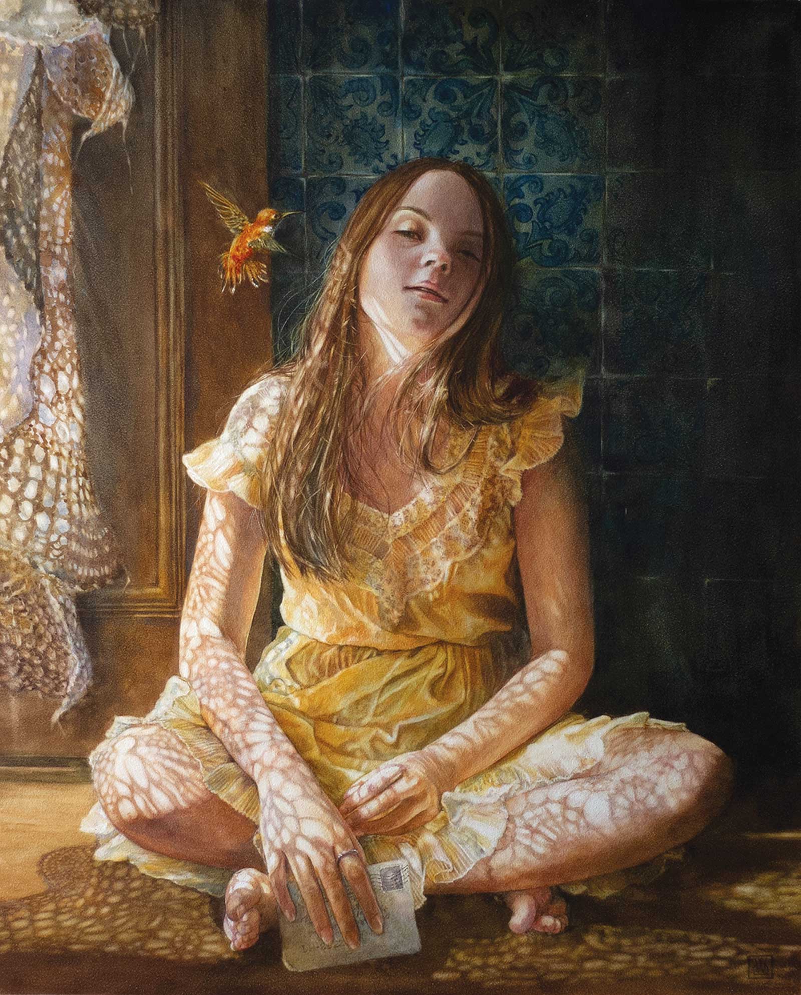 Talking to a Humminbird, watercolor on aquabord, 20 x 16" (50 x 40 cm)
Daniela Werneck
Texas, USA
My Inspiration
It was late winter when my niece came from Portugal to spend three weeks posing for me. The sunlight is very beautiful at my entryway in winter, when it enters through the glass of the door and “bathes” my whole entrance. I really wanted to paint that light! While I was painting, a Brazilian song came to my mind frequently, and I ended up painting part of it, which basically says, “if a hummingbird enters the door of your house to kiss you, it was me…if you miss me, write me a love letter.”
My Design Strategy
I paint through photos. I have models for photoshoots and shoot them as much as I can. After reviewing the images on my computer, I select those that have good body language and save them in another folder, then I let my imagination flow. Often, there is more than one photo used as a reference to compose and portray a single person. All the background and other elements usually come from other photographic references or from my own imagination. After I have the idea of the composition created in Photoshop, I start the design.
My Working Process
I do a very simple drawing as a guide, then I start applying thin layers of watercolor on a small detail, usually from the eyes, and I finish this small area to the end. This small, completed area will encourage me to finish the whole painting. I start my paintings on a dry surface because I like to start from the small details; the wet-on-wet technique I use later in the process on large areas, skin, backgrounds and especially on soft edges. I let the painting rest for a while before finishing it with a spray varnish.
Contact Info
Email: danielawerneck@live.com
Website: www.danielawerneck.com
Third Prize is a one-page editorial feature in American Art Collector magazine
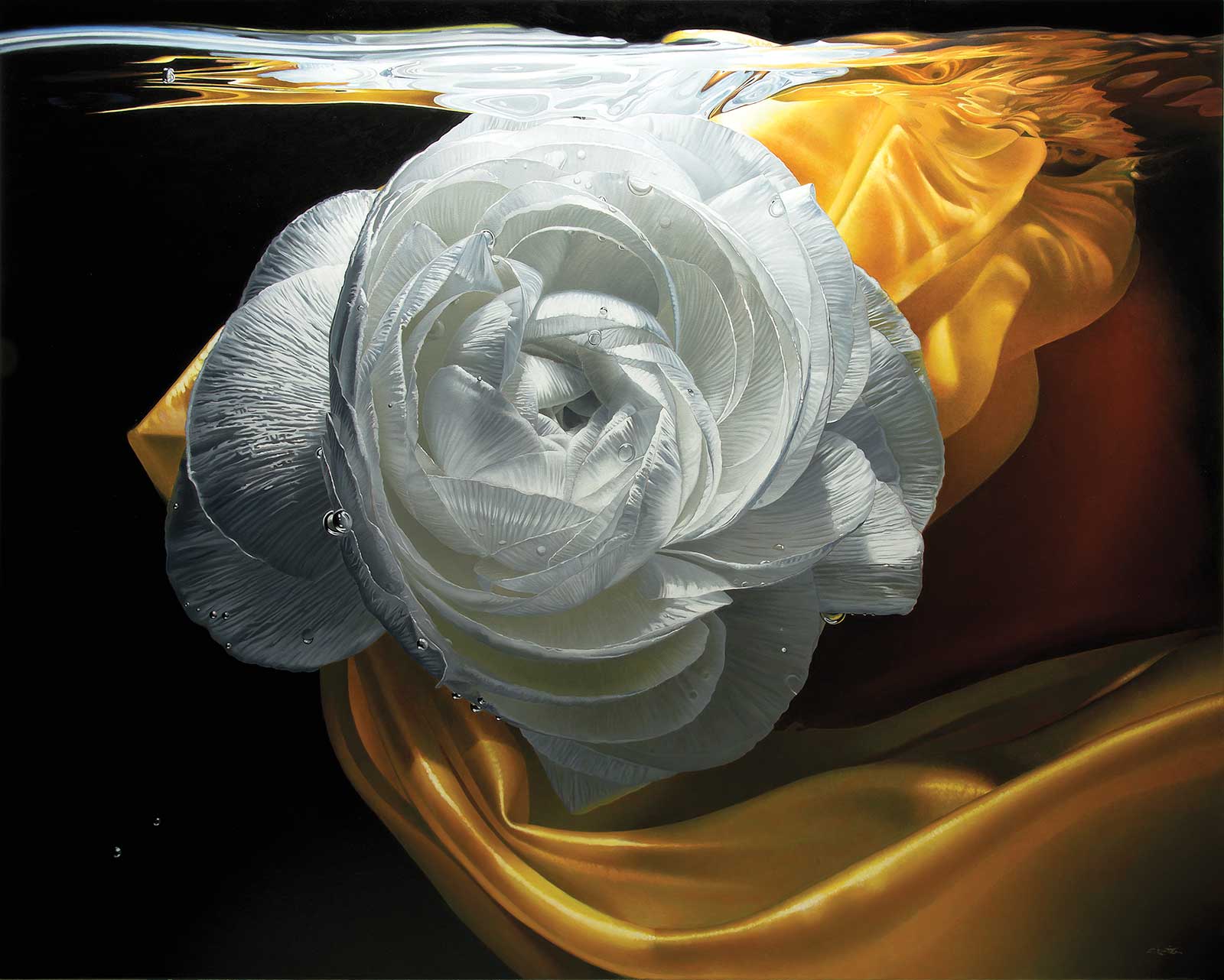 Serenity, oil on canvas, 48 x 60" (121 x 152 cm)
Francois Chartier
Quebec, Canada
My Inspiration
Inspiration is very tricky. Sometimes it is everywhere around you, and sometimes nowhere to be seen. “Inspiration is for amateurs, the rest of us show up and get to work.” Every time I see something of interest, I make a small sketch or take notes in a small book I keep handy. Once a year in late spring/early summer when the flowers are glorious, I take my book of inspiration and take a whole month to photograph all the ideas that I had noted throughout the year. Through the thousands of pictures I take, five or six images will be considered. Three or four will make it as paintings. I then have my subject matter ready for a whole year.
My Design Strategy
I like to stage my subject. When a composition looks interesting, I will try different arrangements and lighting. Very often, the lighting makes the difference between a nice image and a fantastic image, one that will keep my interest for the few months I will need to complete the painting. I like to paint small subjects on large-scale canvases. They are like magnifiers for the smaller details—magnets that attract viewers.
My Working Process
I prepare my canvas with a few coats of gesso that I sand for a smooth surface. I will put a medium gray all over, print the subject to size and trace it with graphite carbon. If I’m using transparent color, I will do grisaille to get a richer color (the yellow in Serenity). At the end, I will do glazing to balance color or to darken some areas. Very often the subject decides for me in which order exactly I will paint it.
Contact Info
Email: francoischartier.art@gmail.com
Website: www.francoisc.com
Finalists
Each receives an Award Certificate and a one-year subscription to International Artist magazine PLUS having their work seen worldwide by international galleries looking for new talent.
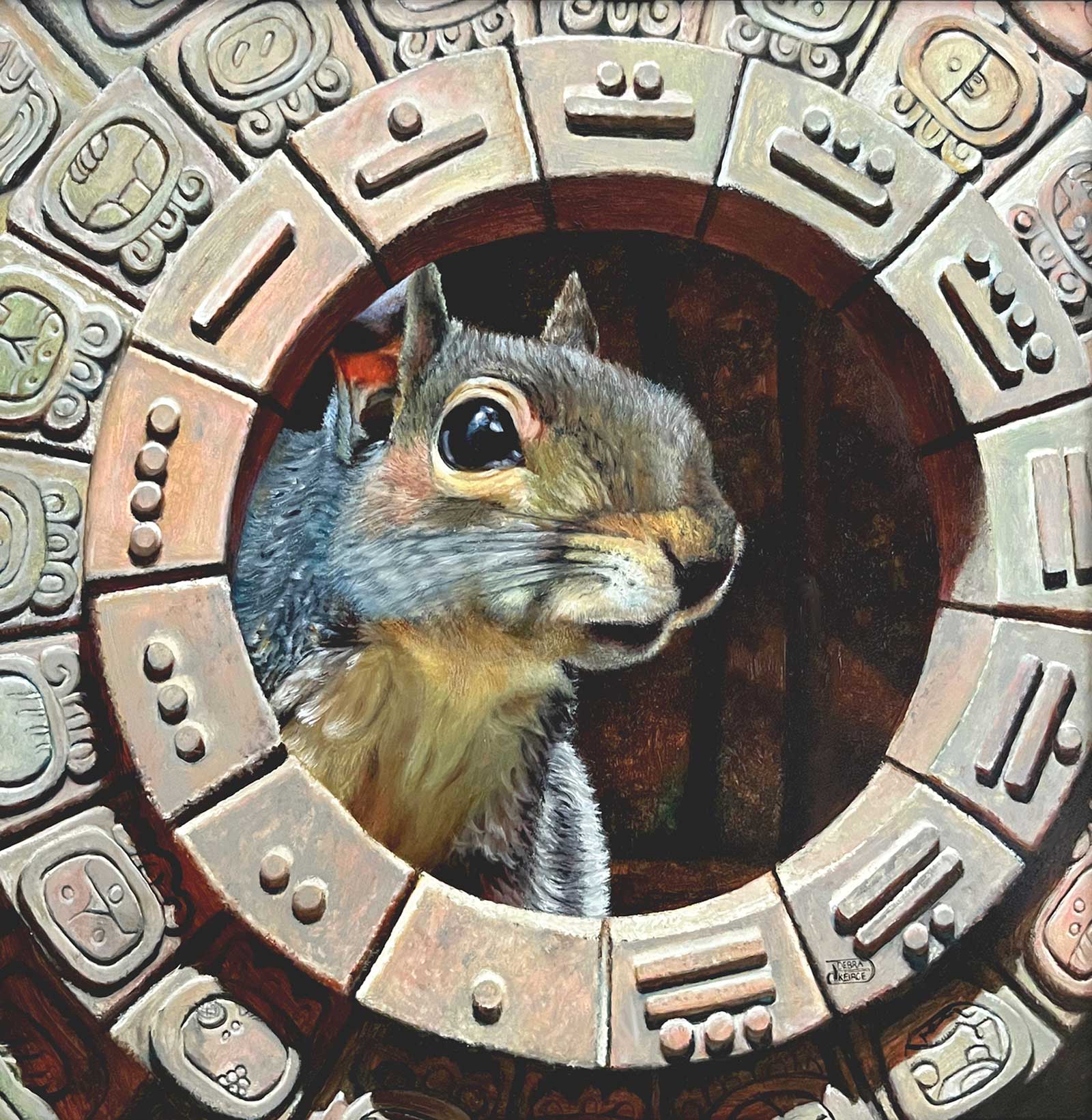 Time to Gather, oil, 12 x 12" (30 x 30 cm)
Debra Keirce
Virginia, USA
My Inspiration
At the Smithsonian Museum of the American Indian in Washington, D.C., there is a Mayan calendar statue in the entrance area. I was in Belize talking to a Mayan just a few months before the calendar cycled again. There were rumors going around that the world would end when the calendar restarted. It didn’t. Round and round we go, never ending, always in pursuit of something.
My Design Strategy
I strive to tell a story that evokes emotion in every painting I create. In this piece, my goal was to have people wonder at the stone and symbols and maybe start to form their own ideas. I also wanted to paint a squirrel with an expression that makes the viewer stop, take notice and relate.
My Working Process
I am an indirect painter. I paint in layers and each layer has just one job. When they are all applied, they work in concert to depict the shapes and colors I hope will convey realism. I often continue layers of paint application until higher levels of realism are attained.
Contact Info
Email: deb@debkart.com
Website: www.debkart.com
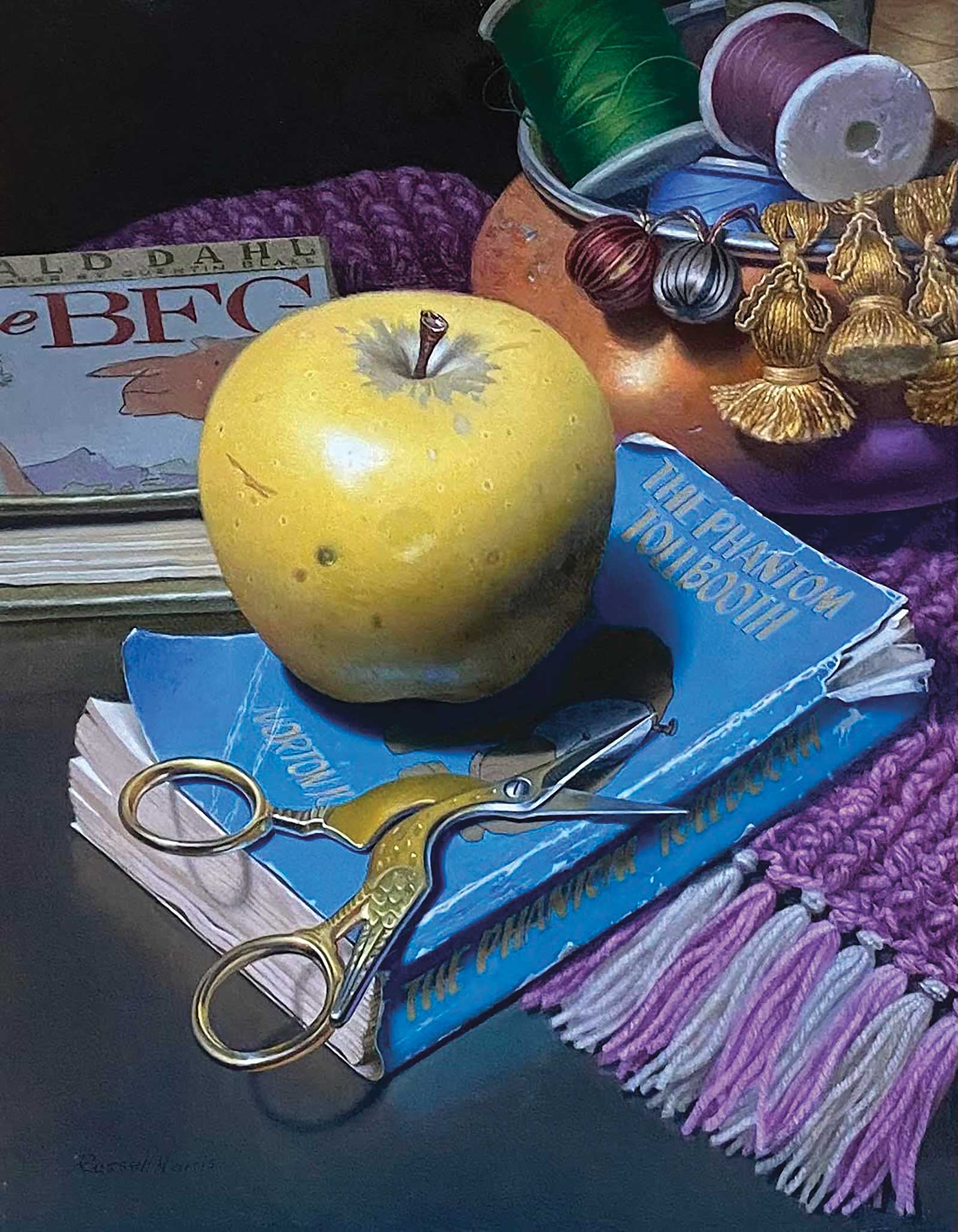 Charlie’s World, oil on linen on panel, 10 x 8" (25 x 20 cm)
Russell Harris
Illinois, USA
My Inspiration
Charlie’s World was a commissioned still life painting for my former student’s 18th birthday. The objects in this painting reflect her personal interests, as well as illustrate a range of textures, hue saturations and values. Inspired by 17th-century Dutch still life painters, I used similar painting techniques such as chiaroscuro, glazing and impasto.
My Design Strategy
Before starting the design, I met with the client to discuss objects that best describe her as a person. Several objects were selected and a few objects were used symbolically. After receiving all of the items, I made multiple thumbnail drawings in order to find the right composition. I decided that the final arrangement needed to be viewed from above in order to capture the importance of each item.
My Working Process
In preparing my painting surface, I glued linen to a panel and applied four coats of rabbit skin glue and four layers of white lead. After allowing the surface to dry for one month, I made a linear drawing of the objects using raw umber oil paint. I typically work from thick to lean when applying layers of paint. After three months of drawing, refinements and color adjustments, the painting was complete.
Contact Info
Email: harrisstudio52@gmail.com
Website: www.russellharrisart.com
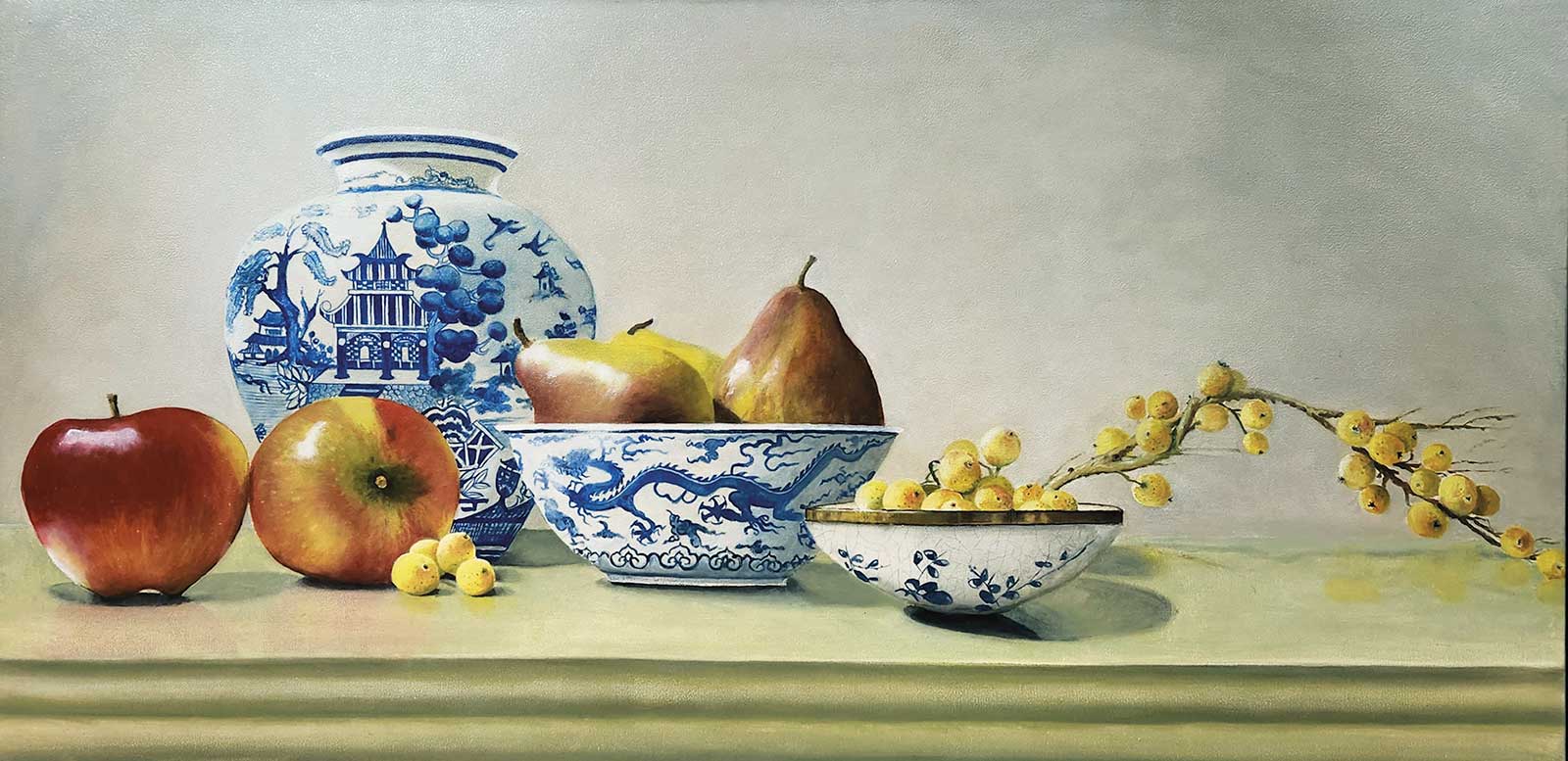 Porcelain and Fruit VI, oil on linen, 24½ x 43½" (62 x 110 cm)
Dennis Whalen
New South Wales, Australia
My Inspiration
I have a great love of antique Asian porcelain and have been collecting pieces for several years now. Having lived in Japan for three years and traveling often to Asia from Australia, Asian culture and simplicity in their art greatly influence me. A few years back I started incorporating these beautifully crafted pieces of porcelain into my works.
My Design Strategy
I have recently tried to create more contemporary pieces that would fit into both modern and traditional décor. I choose what porcelain pieces I would use then choose fruit that would complement them perfectly but needed something that would help the viewer travel through the painting. I found the branch of yellow berries and placed it into the setup to tie the composition together and give the viewer a path to travel through the painting.
My Working Process
I paint in oil using the Flemish technique. So I start out by laying down the painting using only raw umber. This allows me to get all the tonal values set. I then paint the next layer in grayscale; this starts to give the work dimension. Now comes the color glazing. I don’t mix colors—instead laying one glaze upon another to achieve the colors I want, sometimes up to 15 glaze layers, finally adding strong highlights last in thicker paint.
Contact Info
Email: dennispat698@gmail.com
Website: www.denniswhalen.com
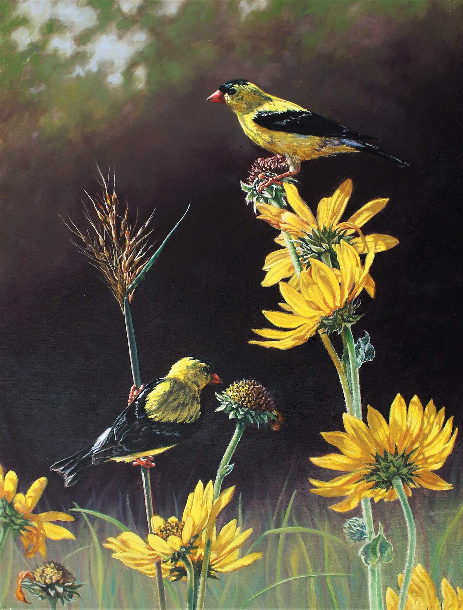 Gold in the Morning Sun, oil on canvas, 16 x 12" (40 x 30 cm)
Deborah Brees
Illinois, USA
My Inspiration
American goldfinches are such bright, joyful little birds in their lemon-yellow summer plumage. They come to the sunflower and prairie fields around my house in late July and early August to nest and feed, flitting from sunflower to sunflower. I welcome hearing their song and watching their bouncy flight pattern. As a natural history artist, I painted many goldfinch bird models for museums, science and visitor centers, and was eager to paint them on canvas.
My Design Strategy
The American goldfinch birds love eating the seeds of the sunflower. This vision creates an interesting yellow on yellow image. Their vivid camouflage makes them hard to spot among the flowers. I wanted to convey that feeling of having to search the picture to find the birds. I drew several small sketches, placing the birds and the flowers in various positions until I felt the composition was right. A dark background makes the yellow pop.
My Working Process
I am outdoors a lot and find the easiest part about painting wildlife artwork is coming up with ideas. I constantly have a line-up in my head of what I want to start next. Being familiar with many mediums, I prefer oils and work from life, photos and memory. Using a pastel grid to transfer my sketch to canvas, I do a thin overall underpainting before painting in earnest, generally moving from background to foreground.
Contact Info
Email: debbreesart@gmail.com
Website: www.debbreesart.com
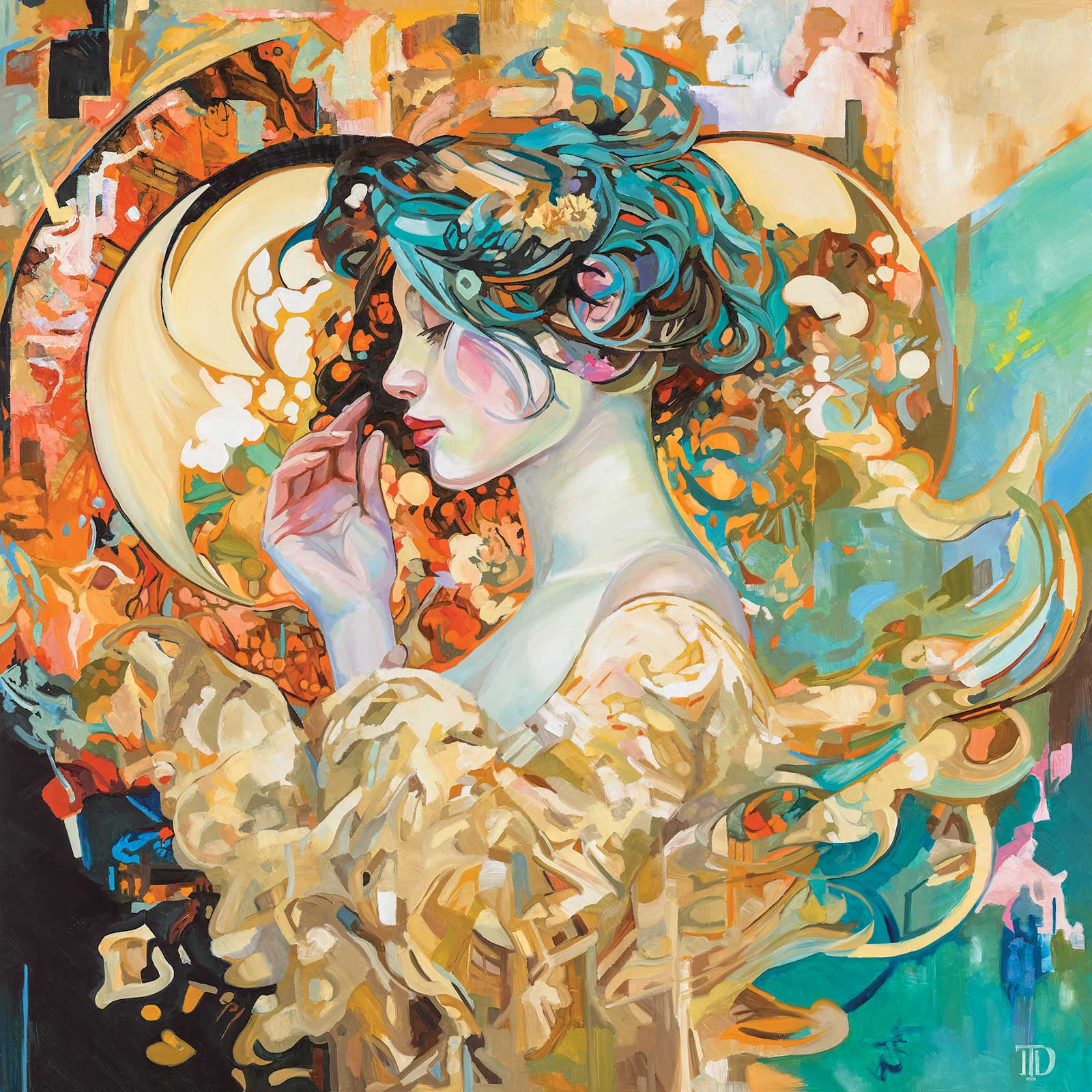 Dreams of Paris, oil, 36 x 36" (91 x 91 cm)
Toby Davis
Idaho, USA
My Inspiration
First, I have always loved the natural flowing lines of art nouveau. Over the past couple of years, I started seeing a lot of AI images that, at first, I ignored as just a fad. Eventually, I decided that it was probably not going away, and to survive the future, I should figure out how to use it as an artistic tool.
My Design Strategy
Generally, most AI images aren’t something I would consider a complete reference for a painting, but I became enamored with the bizarre creations that it sometimes produces. The “mistakes” were sometimes really beautiful, and I discovered that small parts could be collaged to create some amazing reference material to paint from. Because it’s not sentient, AI has no boundaries toward the absurd, and I have found a lot of creative inspiration from purposely trying to make it stumble into the unimaginable.
My Working Process
The genesis for this painting came from an AI image that included her dress. It looked to me like a loose painting of cascading gold sequins moving and glistening in the light. The rest of the initial image wasn’t painting worthy. But, with a digital mosaic, some additional anatomical references and a few more edits in the painting process, I was able to make a finished painting that references art nouveau with a modern twist.
Contact Info
Email: tobydavisart@gmail.com
Website: www.tobydavisart.com