


I had a penchant for the classical paintings of the Old Masters since I was a kid. Learning the classical techniques since I was 13 and teaching students for more than 20 years now have instilled an even deeper passion in me and reinforced my desire to continue my artistic development in the direction of contemporary realism.
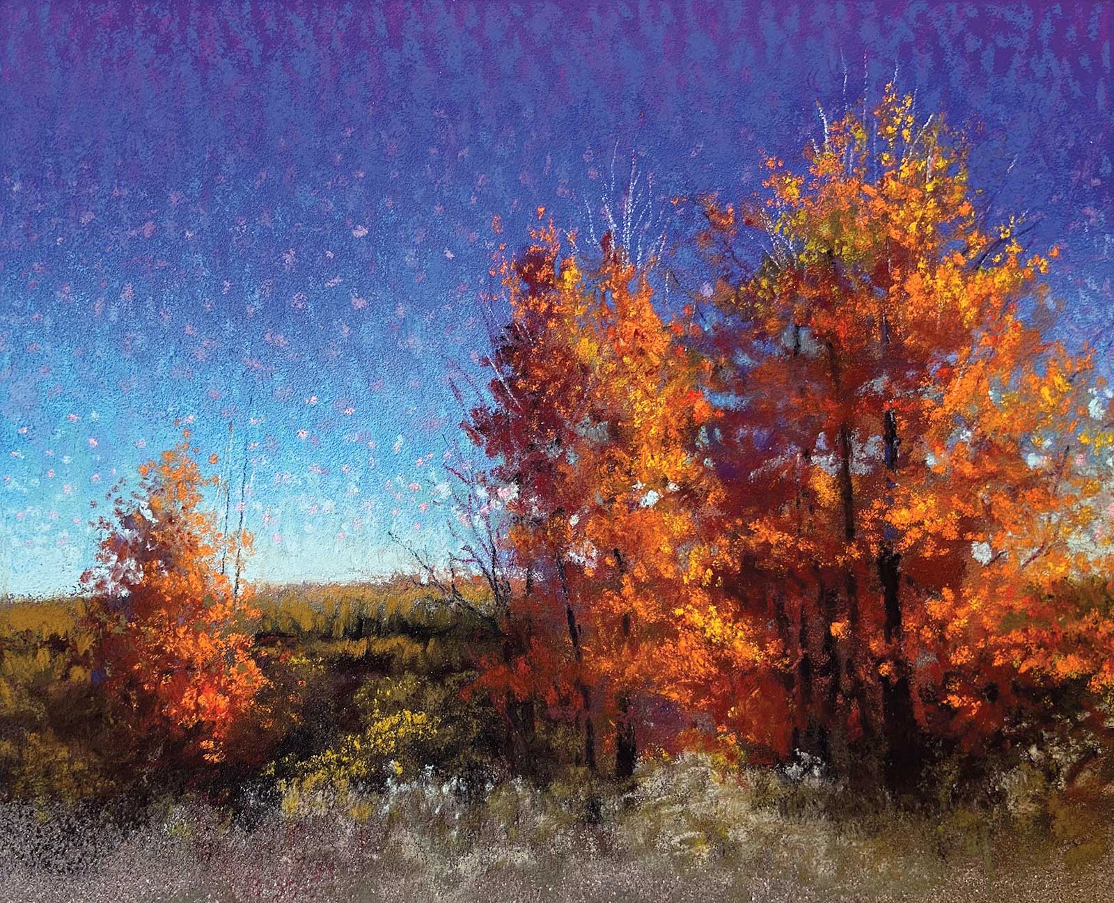
Fall at Heartroot, soft pastel, 5 x 6" (12 x 15 cm) To better convey the amazing colors of autumn, I allowed myself to go a bit more saturated to give it that extra punch. I worked very loosely in an effort to convey this fresh and vibrant day in the eastern townships of Quebec.
I have always loved painting the portrait and the figure as I found them to be the most expressive subjects to paint, but in the past few years, I found myself being equally fascinated by how much emotion can be communicated in a landscape. Lately, I have been combining both. I find that picturing someone in their most natural environment helps me tell a richer story about them. It also allows for a wider range of textures and infinite possibilities when it comes to composition. When I combine the figure and the landscape, my intention is to blur the division that is often felt between us and nature. When I see my subject walking around in a field, I don’t see them as being in the field, I see them as being an integral part of it, as if at this very moment, the field and the light couldn’t exist without them there. What I want to feel is the love and the deep sense of belonging that this person—my subject—feels toward this place. This love, this connection then becomes the subject, and this is what I try to capture and communicate in my work. While I paint, my goal is to provide the static image with the emotional content that it needs in order to come alive. Uniting sensibility and subject together, whether in a portrait or a landscape is the main goal of my painting journey.
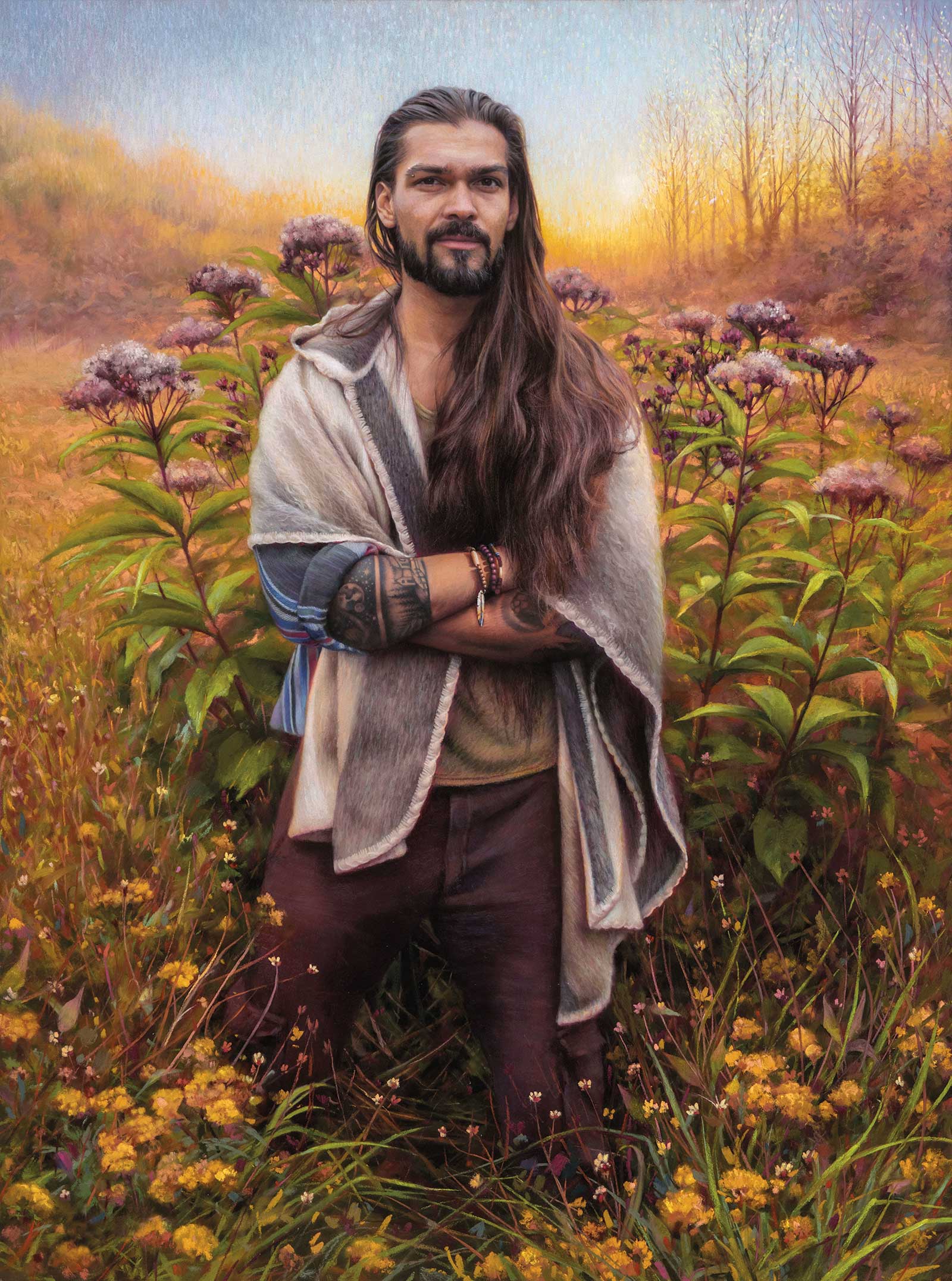
Gold Embrace, soft pastel, 31 x 23" (78 x 58 cm) Painting this one was a lot about taking my time rearranging the elements of the landscape into a composition that would make him look like he was an integral part of his surroundings, part of nature, growing with it, rooted in the same earth and made out of the same matter. I wanted to recreate the light and the colors that my camera—or should I say my photography skills—were not able to capture in a single shot.
Although I have thoroughly enjoyed oil painting as a medium and had a lot of fun experimenting with it in the past, I have exclusively been working with soft pastels for the last 15 years. Putting my brushes aside was not a huge compromise since soft pastel was the first medium I fell in love with during my early years of art school. I find soft pastel to be extremely versatile. It has allowed me to successfully fulfill my need for achieving the finest details. As my approach is leaning more and more toward a looser one, I love that this medium also offers a lot of freedom when it comes to creating a more painterly look. While the sharpened pastel pencils and the harder sticks are used for precision and details, using the side of the larger, softer and creamier sticks allows me to quickly lay the general tone and color masses to efficiently create the general feel of the composition in the first simple few strokes.
I get immense pleasure from the process. I take each step of the process very seriously and spend as much time as I need; I never rush things. One of my teachers used to say, “it takes the time that it takes,” and I often remind my students of this as well. When each stage of the process is well completed, it lays the ground for the next step and the painting flow becomes effortless. I love that every painting comes with its own unique challenges, but if I have set myself up for success with a process that helps me make good decisions right from the start and along the way, then these challenges won’t be impossible to solve. They will simply take me out of my comfort zone and force me to think in a new way, which often leads to interesting discoveries, different effects, new textures or a fresh way to see things that I can usually apply to a future work.
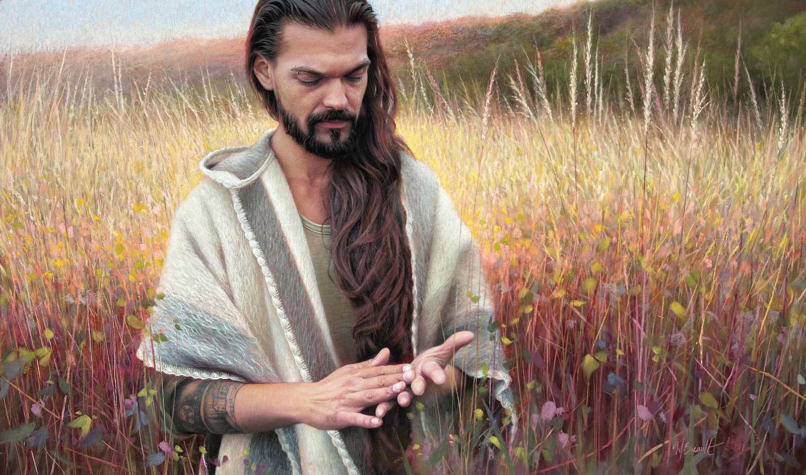
Toward the Within, soft pastel, 18 x 31" (45 x 78 cm) I decided to frame the composition of this one much closer to the subject to make it more intimate and make the viewer feel like they are there with him in the field. I had to greatly simplify the details and the textures of the tall grass so as to not distract from the subject, turning it into a more impressionist background.
While I don’t necessarily start a painting in the exact same way every time, my approach always remains very methodical. Even though I don’t copy them, I first make sure that I have good photo documents with all the information I need, including interesting lighting and enough details. I start with a simple yet accurate sketch. This helps me feel confident that I have a good composition and that I’ll have a straightforward guide that shows me where to apply the color masses. When I start applying the colors, I sometimes use pastel pencils very loosely and create a fine transparent layer of interlaced colors to give the general feel of the whole scene. I circle around the whole surface to not work too long on a specific area before moving on to the next. When the whole painting progresses all at once, it helps me harmonize the different elements. When I work on a looser landscape, I start applying colors in broad strokes using the side of the pastel stick to cover more ground. I am not looking to saturate the paper, so I only lightly caress the surface with the stick to leave a thin layer of pigments on the paper. This allows me to overlap many layers with different colors and obtain more vibrancy. I continue to circle through the painting adding layers of pigment, correcting shapes, adjusting tones and building textures in certain areas that need it most, such as in the foreground or in the parts of the painting that receive the most light.
My Art in the Making October Light
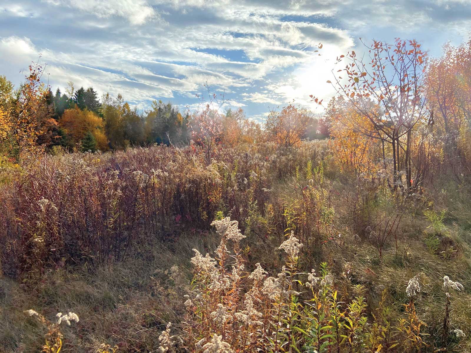
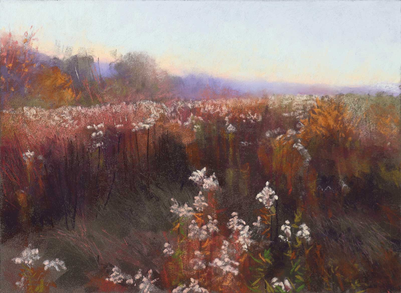
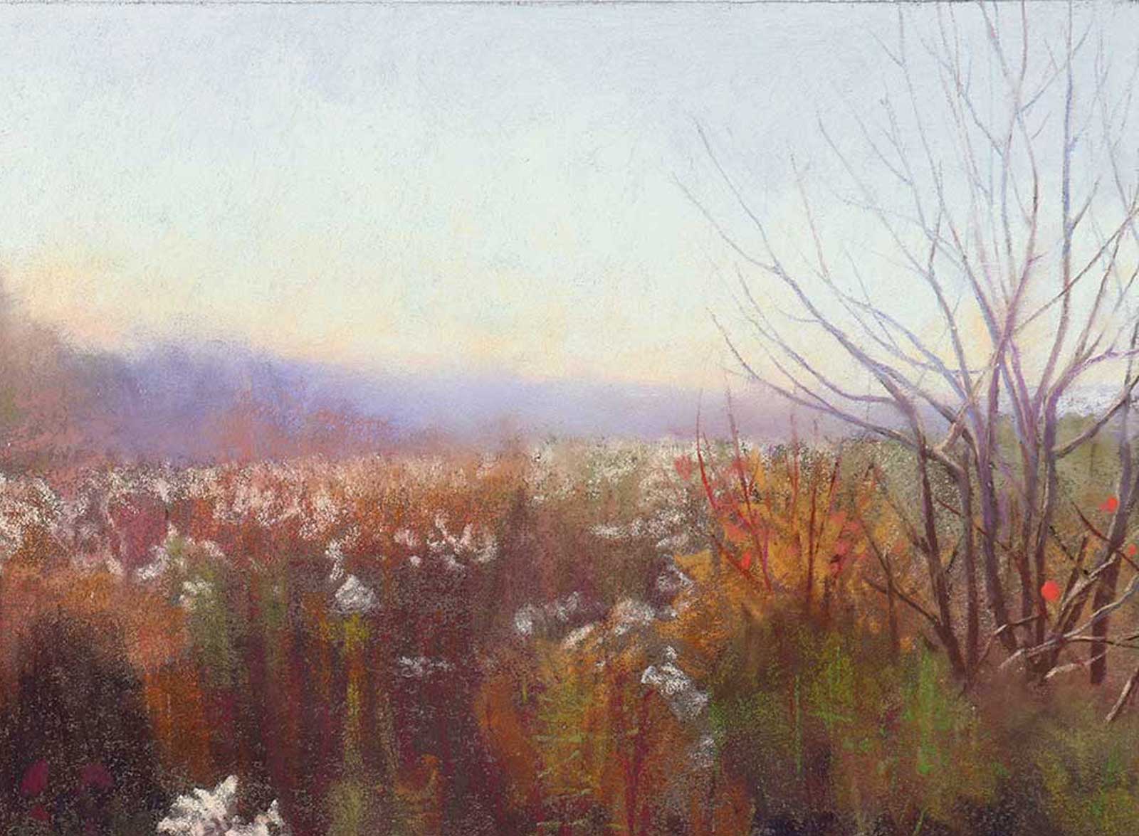
Reference Photo
This scene offers us a beautiful perspective and a horizon line suggesting distant trees and mountains. The long grass in the foreground, having been trampled, suggests the presence of Hercules the horse and Arthur and Palero, the donkeys, residents of the Heartroot community farm in the village of Audet, near Lac Mégantic in the Eastern Townships of Quebec.
The techniques used are more direct and free than my figurative work. There is no precise architecture, nor human to proportion well. A super simple but precise drawing will serve as our guide for the direct application of the masses of colors. The details will be worked over this first layer in small touches and thicknesses.
 Stage 1
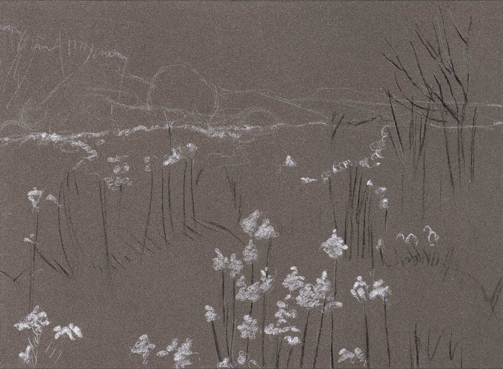
Stage 1 Sketch
I start with a loose but accurate sketch. The medium tone paper will help me evaluate the tones of the colors I will lay on it. Two different tones of lines give me a sense of the light and shadows right from the start.
WHAT THE ARTIST USED
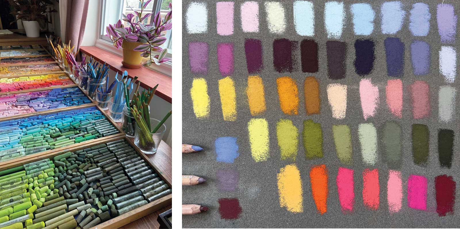
While I usually use a variety of soft pastels ranging from very hard to super creamy, I uniquely worked with my softest sticks for the creation of this landscape. I used a selection of Blue Earth pastels. Those super soft rectangular sticks allow me to lay them flat on the paper for the color masses or use the sharp edge to create finer lines. I only used pastel pencils to do the fine lines of the tree, and for the signature.
The paper I chose is the sanded paper pastel card from Sennelier in the color dark gray. I cut it to size, allowing a ½" border all around for easy handling and to be able to tape the paper on all edges to my drawing board. The dimensions of the painted surface is 11 x 15" and the paper is cut 12 x 16".
 Stage 2
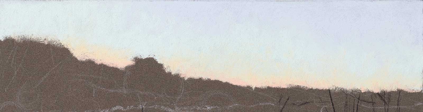
Stage 2 Tone and Color of Sky
Deciding on the tone and color of the sky helps me create the contrast I want and frame the horizon line. I create a gradient from colder colors at the top of the sky to warmer and lighter colors closer to the horizon.
 Stage 3
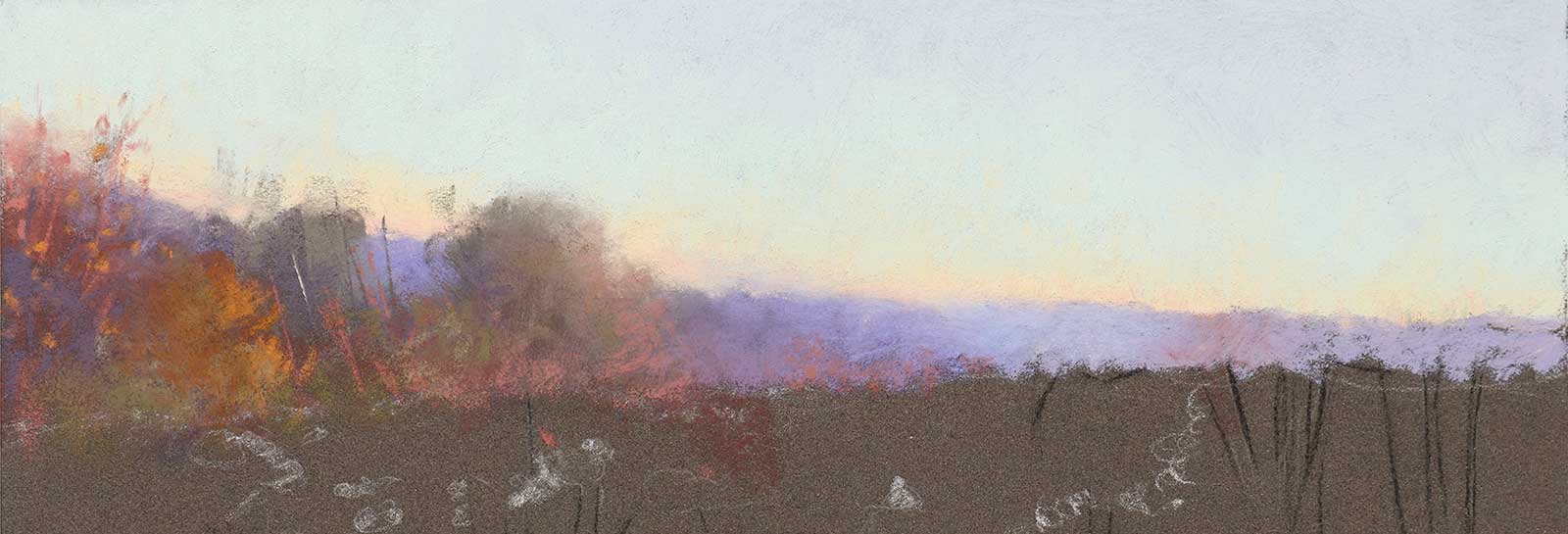
Stage 3 Tree Line
In a very loose manner, I choose what the tree line will look like. I simplify it, use cooler colors for the further elements and keep everything less defined to make sure it’ll visually stay in the distance. I lay my pastels flat on the paper to cover more ground and get a gentle touch that leaves translucent layers of pigments.
 Stage 4
Stage 4 Starting on the Field
Using the sky as my reference for my lightest tone and the paper as my medium tone, I start creating masses to reflect the colors of the field, adding the dark masses to give it more depth and get a general feel of the whole picture.
 Stage 5
Stage 5 Contrast
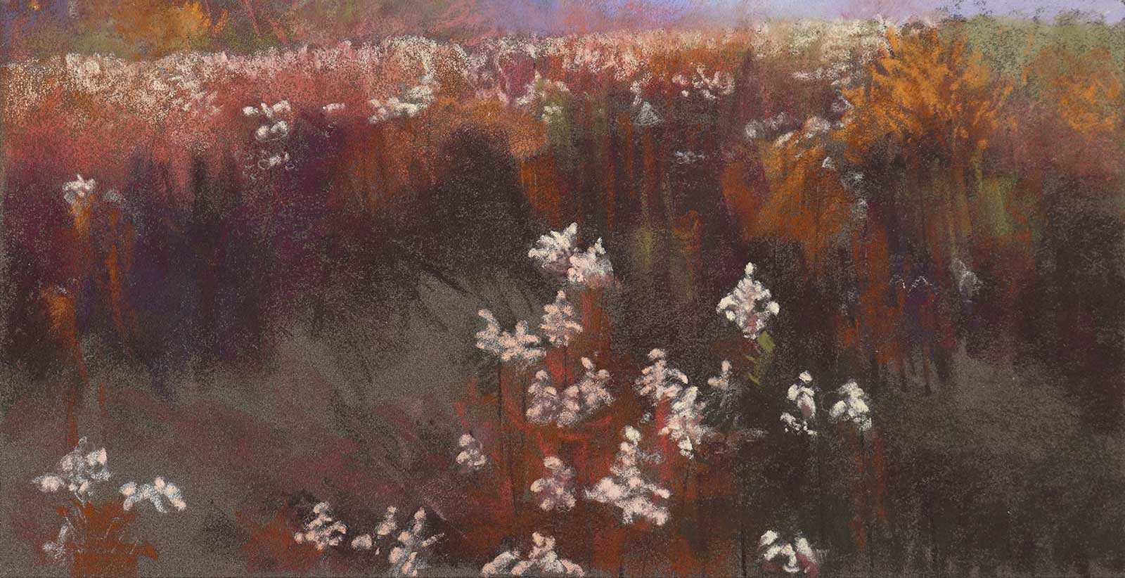
More contrast is added by lightening the flowers in the foreground and surrounding them with a slightly darker tone. Those shapes are getting refined here but will only be detailed at a later stage.
 Stage 6
Stage 6 Light and Perspective
As I am keeping an eye on the whole painting, comparing tones, colors and shapes, I add lighter and darker colors to improve the sense of light and perspective. I also softened the edge between the sky and the mountains in the distance to create more depth.
 Stage 7
Stage 7 Midground Tree
This is where the tree starts growing. With a pastel pencil, I create the shape of the tree with simple fine lines to make sure that I like the design before committing to thicker and darker branches. At every step, I keep refining the overall piece, adding little touches here and there to slowly bring it to completion.
 Stage 8
Stage 8 Refining the Branches
Once I like the shape of the tree, I refine the branches using three different tones of pencils. A light, a medium and a dark color are used to create a sense of tree dimension.
 Stage 9
Stage 9 Leaves and Flowers
Leaves and flowers are added as little impressionistic touches using more vibrant colors. Textures are added everywhere using the very creamy pastel sticks, using the corners for the smaller touches and the side of the stick for longer lines.
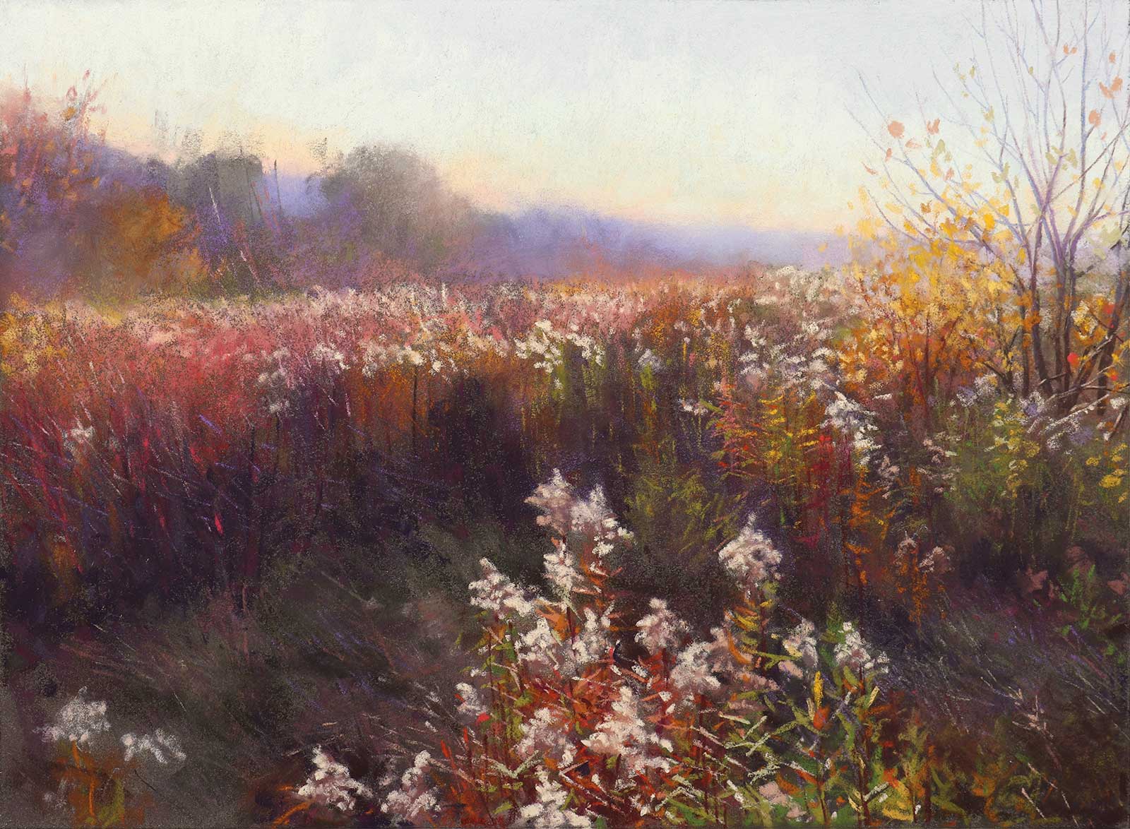
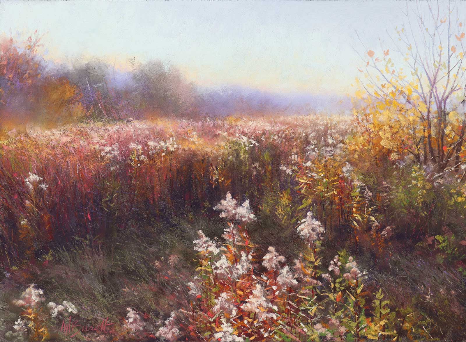 Stage 10
Stage 10 Finished Artwork
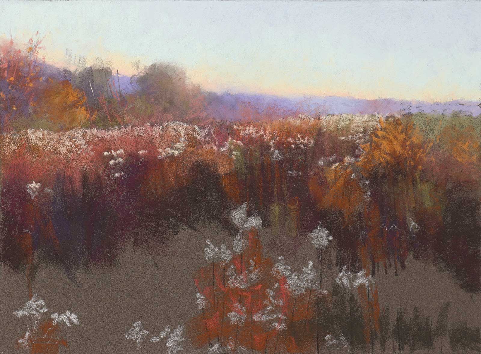
October Light, soft pastel, 11 x 15" (27 x 38 cm)
Here, shapes are refined and tones are adjusted to beautify the sense of light. Some edges are softened while others are sharpened. Touches of colors get added everywhere for a more vibrant and luminous feel. At this stage, I often use the bristle brush to scratch off some pastel and create different effects.
About the artist
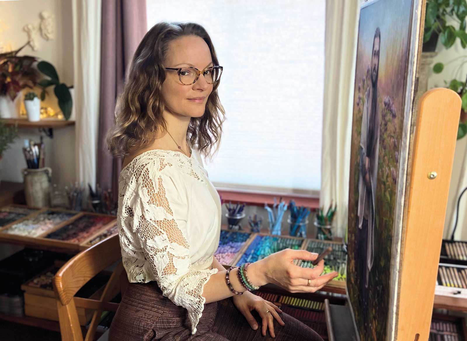 Melissa Breault
Melissa Breault is a Canadian artist dedicated to the study and revival of traditional drawing and painting techniques. Trained in the methods of Old Masters, she specializes in portraiture in the style of classical realism but also takes great pleasure in painting the landscape. At the age of 13, Breault was one of the youngest students enrolled in a local art program in Montreal, where her interest in drawing was transformed into a real passion for fine arts. This is where she studied the foundations of classical drawing and painting in charcoal, oil, watercolor and soft pastel, which became, throughout the years, her medium of choice.
Teaching alongside her mentors for six years allowed her to deepen her understanding of the fundamental drawing and painting techniques while giving her the invaluable opportunity of helping students achieve higher levels of realism and harmony in their own work of art.
Breault opened her own teaching studio in 2009 in Montreal where she currently resides. Her pastel work has received numerous honors, publications and awards, including her recent International Artist Award at the 16th International ARC Salon. Currently, she is the vice president of the Pastel Society of Eastern Canada (PSEC), and was named Master Pastelist within PSEC in May 2022. Breault is also a Signature Member of the Pastel Society of America and the Portrait Society of America.
Contact at
www.melissabreault.com