



Oil pastel is a very specific material to paint with and is unlike almost any other medium (pastel artists usually call their works pastel paintings, not drawings). There is, however, a great reward in using them due to their dense, intense colors and vibrant surface textures.
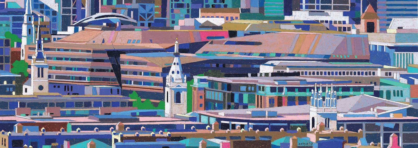
One New Change, oil pastel on paper, 9½ x 27" (24 x 69 cm) From the rooftop of the Tate Modern Gallery in London, you can see the new retail building of One New Change spreading through the city. It is a deliberately camouflaged building being executed in a range of similar dark brown shades of material, and I wanted to bring out this characteristic out in my work. The horizontality of its brown window lines contrasts with the four white towers of the city churches designed at a much earlier time. The format of the painting follows the horizontal theme.
Unlike chalk pastels, which can be found in pencil form and sharpened to a fine point, oil pastel painting sticks become blunt very quickly when sharpened. This is due to their soft, lipstick-like consistency. Different artists overcome these characteristics in their own ways. Some use the pastels in combination with oil paints and melt the oil pastel with linseed oil. They can also be spread with a palette knife. Others simply work on a very large scale to overcome the detail problem and do not bother to sharpen their pastel sticks.
My approach is more precise and now depends on combining oil pastel with acrylic ink on colored paper, utilizing the best characteristics of both mediums. It arises in part from my architectural and illustration background. I only started painting full time around 9 years ago after retiring as an architect. My subject matter is often complex urban roofscapes, street scenes or architectural landmarks. These subjects demand a level of sharper detail to work properly.
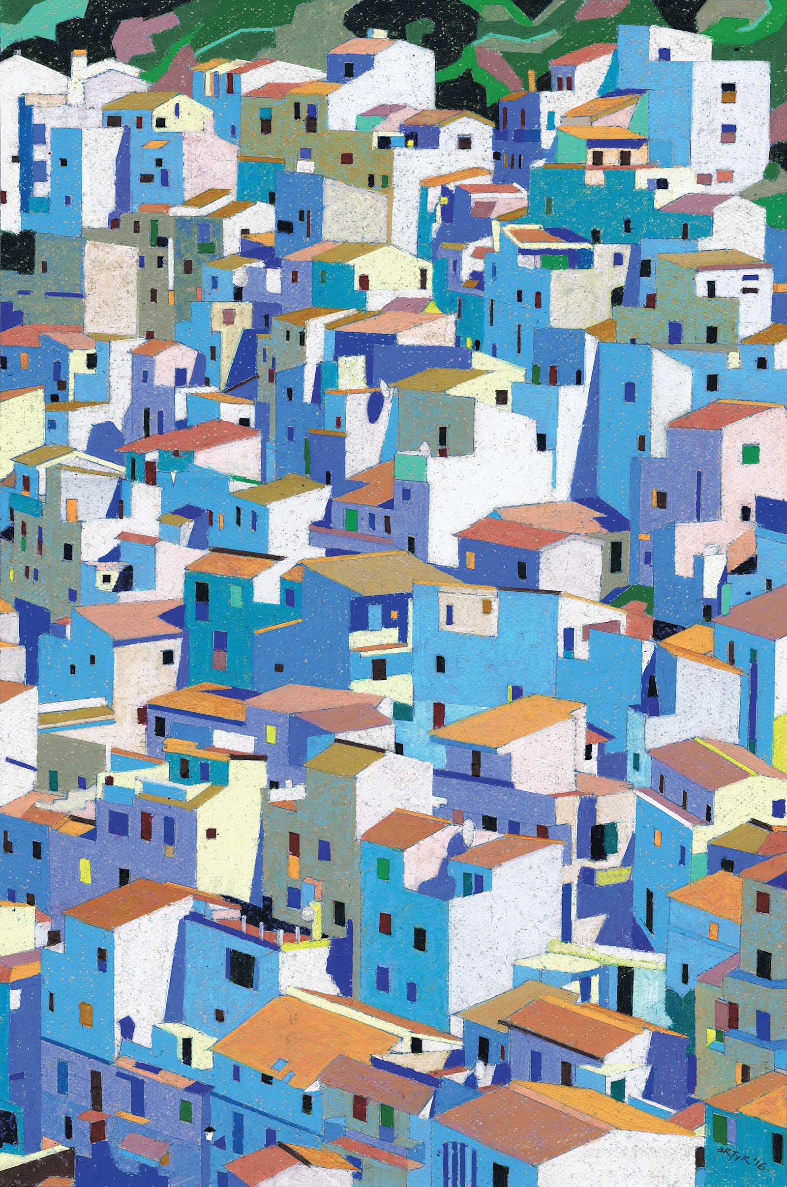
Casares, Andalucia, Spain, oil pastel on paper, 23 x 15" (58 x 38 cm) This was a commission that I was very happy to undertake. The steeply rising blocks of white houses gave me the chance to create a complex composition of cool blue shadows and white walls, which are cubist in flavor. A sliver of green at the top of the painting holds the composition down. There are a large number of shades and hues of blue utilized in the shadows and some blues modified with ochre to give variation and to prevent the whole painting from becoming too cool.
The size I work at is around 55 by 40 cm or smaller, whether horizontal or vertical in format, which is not large for an oil pastel. My earliest oil pastel work from around eight years ago consisted of very pure oil pastel blocks on colored paper with no acrylic underpainting. To achieve the sharp edges I desired for the architectural subjects, I employed an old-fashioned stainless steel erasing shield, which I worked against the edge of. This requires meticulous cleanliness and frequent cleaning of the shield. I also used thin clear acetate stencils produced with a scalpel in a similar manner for special shapes such as windows.
This approach gives a consistency of finish that pulls even the most colorful paintings together. I have always used colored paper as a ground since the start of my oil pastel work. The neutral tone is excellent in guiding the selection of darker and lighter added tones and also provides a warm or cool background that can affect the whole feel of a work.
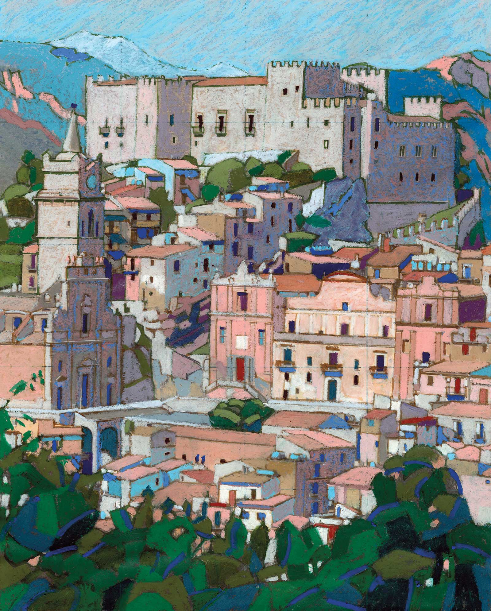
Caccamo, Sicily, oil pastel on paper, 14 x 11" (36 x 28½ cm) Sicily is full of attractive hill towns like Caccamo, and there is a medieval castle above the town as well. This combination was irresistible for a pastel painting using brown acrylic ink as an underpainting and contrasting this with the warm hues of the village housing. The dark stylized mass of vegetation in the bottom of the painting forms a base for the town to rise above.
I apply the oil pastel quite thickly, sometimes as pure color and sometimes in more complex mixes. I avoid dark mixes that look muddy and kill the primary color hue. There are generally three levels of application in my work: light, which leaves a lot of paper color showing through; medium, where the colors begin to dominate the paper; and heavy, which is my favorite surface treatment, but which generally leaves a grain of background paper color visible.
In the past year or so I have used less shield and stencil work and replaced it with a strong acrylic ink underpainting using a fine brush. This is added with dark and light tones contrasting with the medium toned paper. The sharpness of the underpainting allows me to add the oil pastel on top more loosely, using less shields and stencils and gives the opportunity for incorporating more detail for my architectural subject matter. I have included some of the earlier and later work in this article for comparison purposes. The worked example below is the latter acrylic/oil pastel technique in the development of a rare interior for the Mesquita in Cordoba.
Given my subject matter, the intensity of color that I employ is deliberately heightened and is not intended to be too naturalistic. This is due to my sheer enjoyment of the oil pastel colors. Currently, texture is also important to me in that the combination of acrylic ink and oil pastel allows me to depict more ambitious subject matter more successfully.
Patterns are of great interest to me because of my architectural background. My choice of subject matter is often driven by the idea to explore a pattern combination. Roofscapes provide a perfect subject in the way that the individual forms react, stack up and repeat themselves.
My Art in the Making Mesquita, Cordoba, Spain
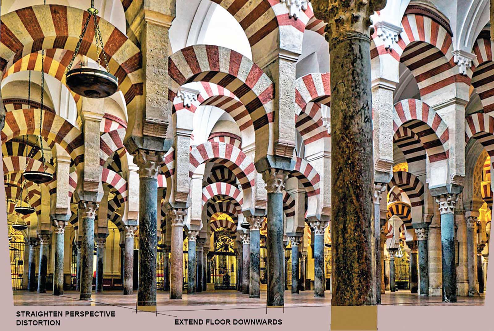
Reference Photo
My Design and Composition Tactics
- I choose architectural subjects that have repetitive patterns in them—for example, roofs. This way, you can literally build the composition as an overall texture.
- Ignore local color initially and concentrate on achieving a color harmony between cold and warm areas of the painting. I often cut skies out of my pastel paintings, and when I do include them, they can be silver or even green if it suits the subject.
- Use common colors across the picture, not just in one area. For example, cold blues as shadow edges and highlights for both buildings and landscapes. Doing this ties a painting together as the eye seeks commonalities.
- Use intensely saturated colors but only in small areas. Generally, the larger the area of color, the more I tone down the saturation. This means that no one strong color dominates.
 Stage 1
Stage 1 Choosing the View and Color Rough
I work on my references, distorting photos and sometimes cropping or extending them to get the perfect proportions and view that I want. The first stage of my work is to make a color rough, not worrying about drawing.
WHAT THE ARTIST USED
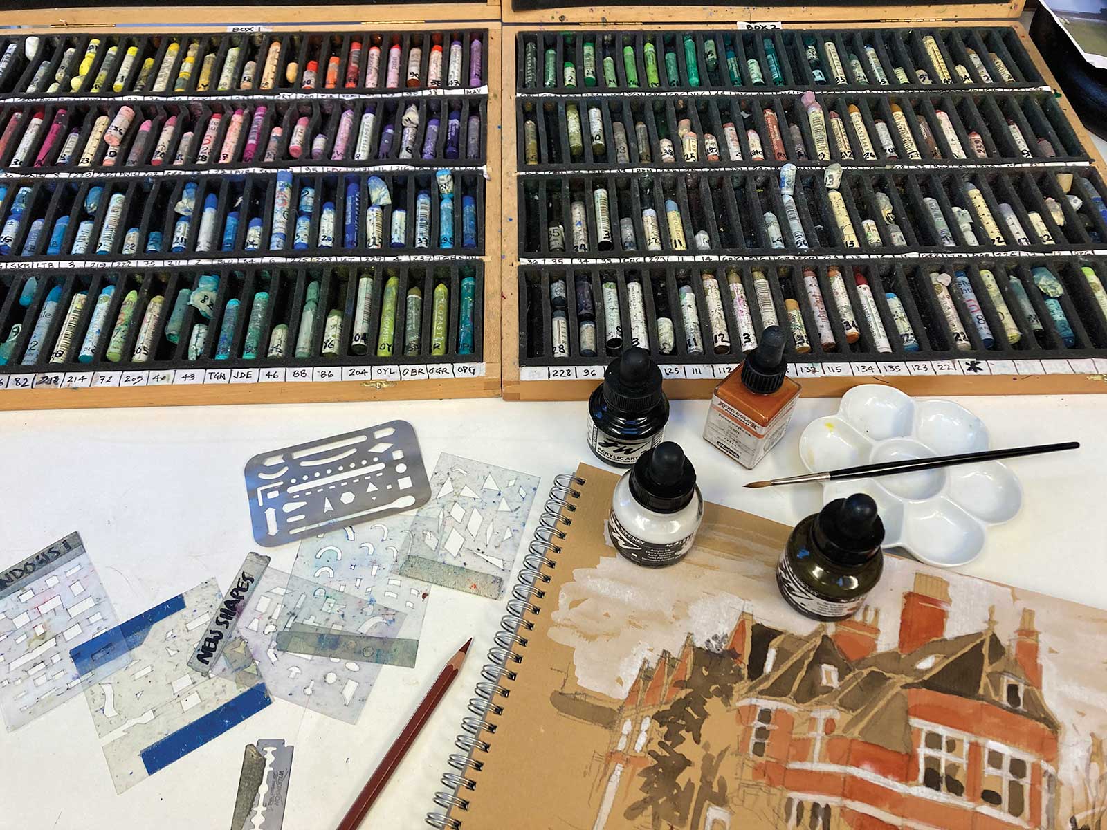
Sennelier Oil Pastels
008 - Bordeaux, 239 - Red brown, 090 - Chinese orange, 091 - Chrome red, 028 - Pink, 202 - Geranium lake light, 230 - Rose ochre, 077 - Pale pink madder lake, 038 - Vermilion, 018 - Bright yellow, 240 - Light English red, 232 - Terracotta, 025 - Flesh ochre, 242 - Chrome brown, 099 - Titanium buff, 013 - Yellow gray, 209 - Violet ochre, 212 - Mummy, 228 - Charcoal, 224 - Medium gray, 014 - Light gray, 017 - Violet gray, 223 - Cold gray, 222 - Phthalo blue, 080 - Indigo light
Caran d’Ache Neopastels
067 - Mahogany, 493 - Granite rose, 050 - Flame red, 031 - Orange yellow, 059 - Brown, 007 - Dark gray, 004 - Steel gray, 002 - Silver gray, 401 - Ash gray, 402 - Light beige, 491 - Cream, 001 - White, 159 - Prussian blue
Acrylic Inks
Rowney sepia, Black, White
Additional Materials
Canson Mi-Tientes 160 gsm paper in warm light gray, Winsor and Newton no. 3 sable brush, Caran d’Ache Supracolor in burnt sienna, Stainless steel erasing shields, Handmade acetate stencils
 Stage 2
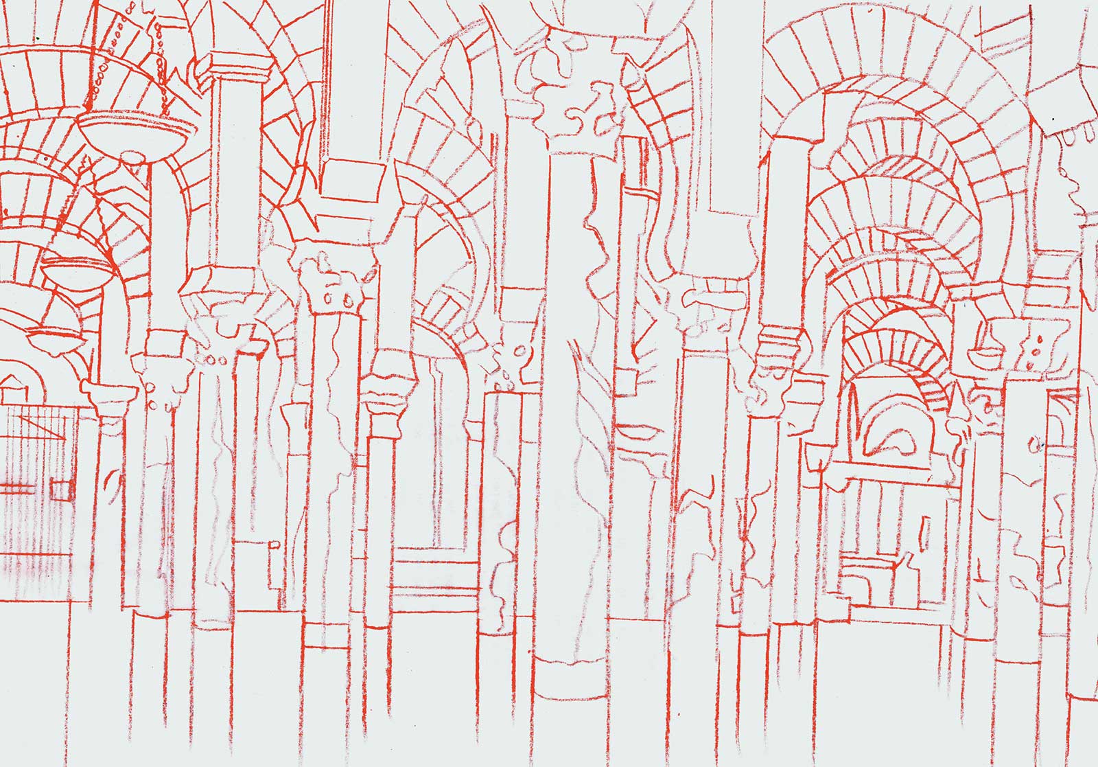
Stage 2 Outline Underdrawing
On colored paper (the smoother side of Canson) a rough drawing of the main outlines of the design is done in a sympathetic colored pencil. In this case a burnt sienna, as this can still show through on the finished work.
 Stage 3
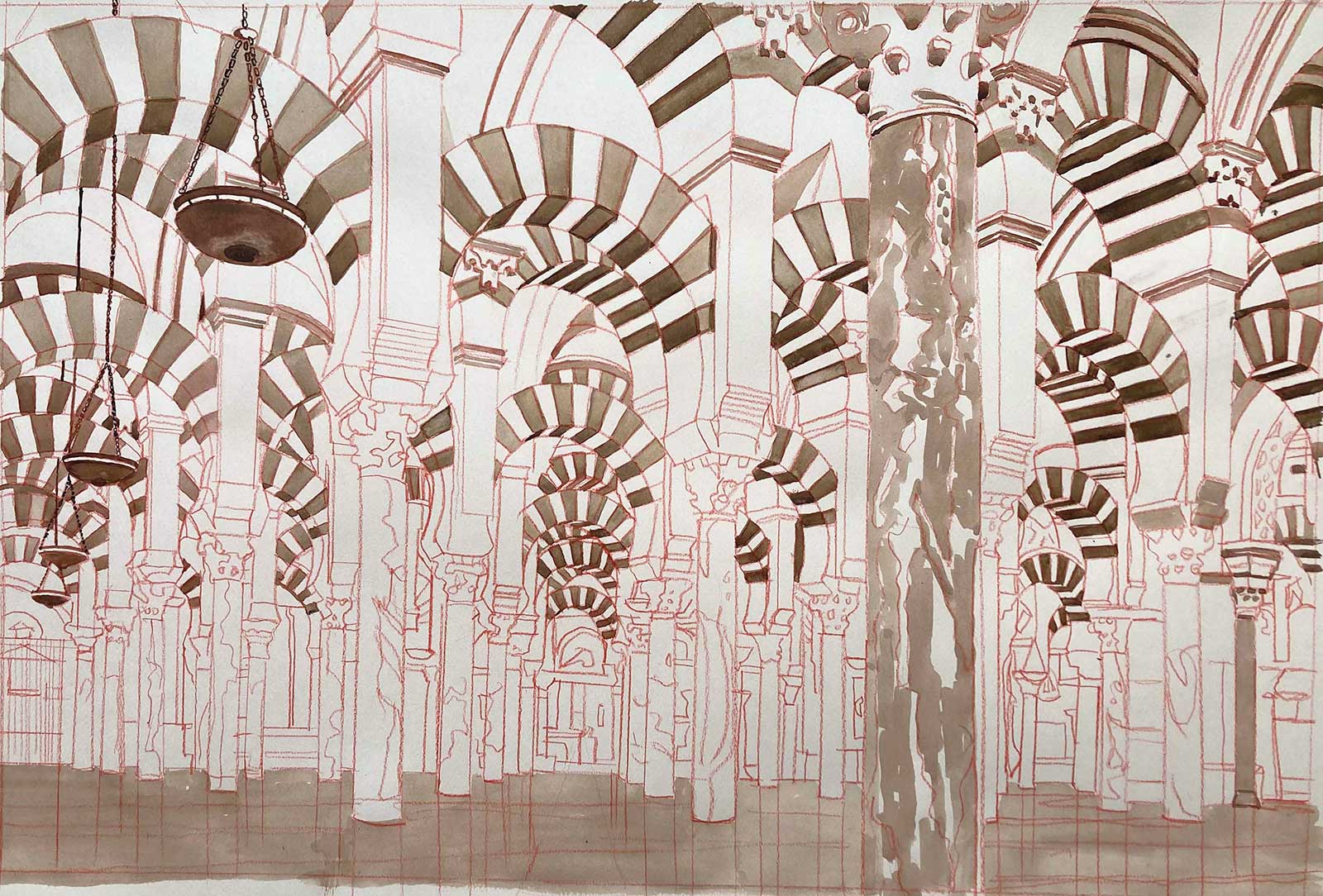
Stage 3 Acrylic Ink Underpainting
Acrylic ink is worked over the drawing tonally to correspond with the final tones of the oil pastel. Some sharper details are also added in at this stage to be left to show through the oil pastel layer where it would be difficult to draw them in oil pastel on its own.
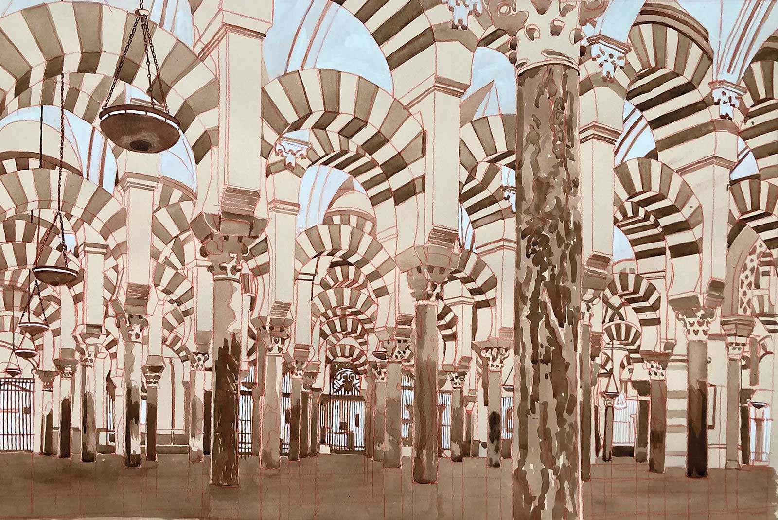 Stage 4
Stage 4 Highlights and Deep Darks
The acrylic ink underpainting is finished using white for areas where a glow is required in the color. This includes the white ceiling panels and the area of the Baroque church grilles at ground level in the distance.
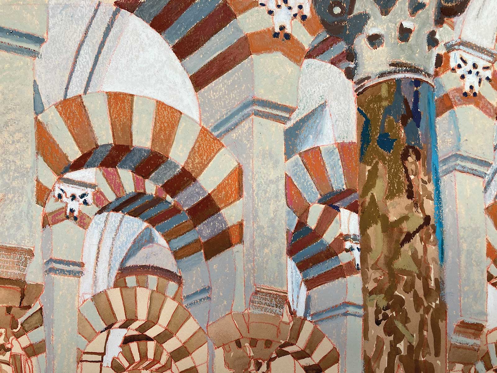 Stage 5
Stage 5 First Layer of Oil Pastel
The base layer of oil pastel shown here is a test to establish the main colors of the stonework. At Cordoba there is a strong contrast between the voussoirs in the arches—orange stones alternate between gray stones, giving a fantastical pattern to the arches.
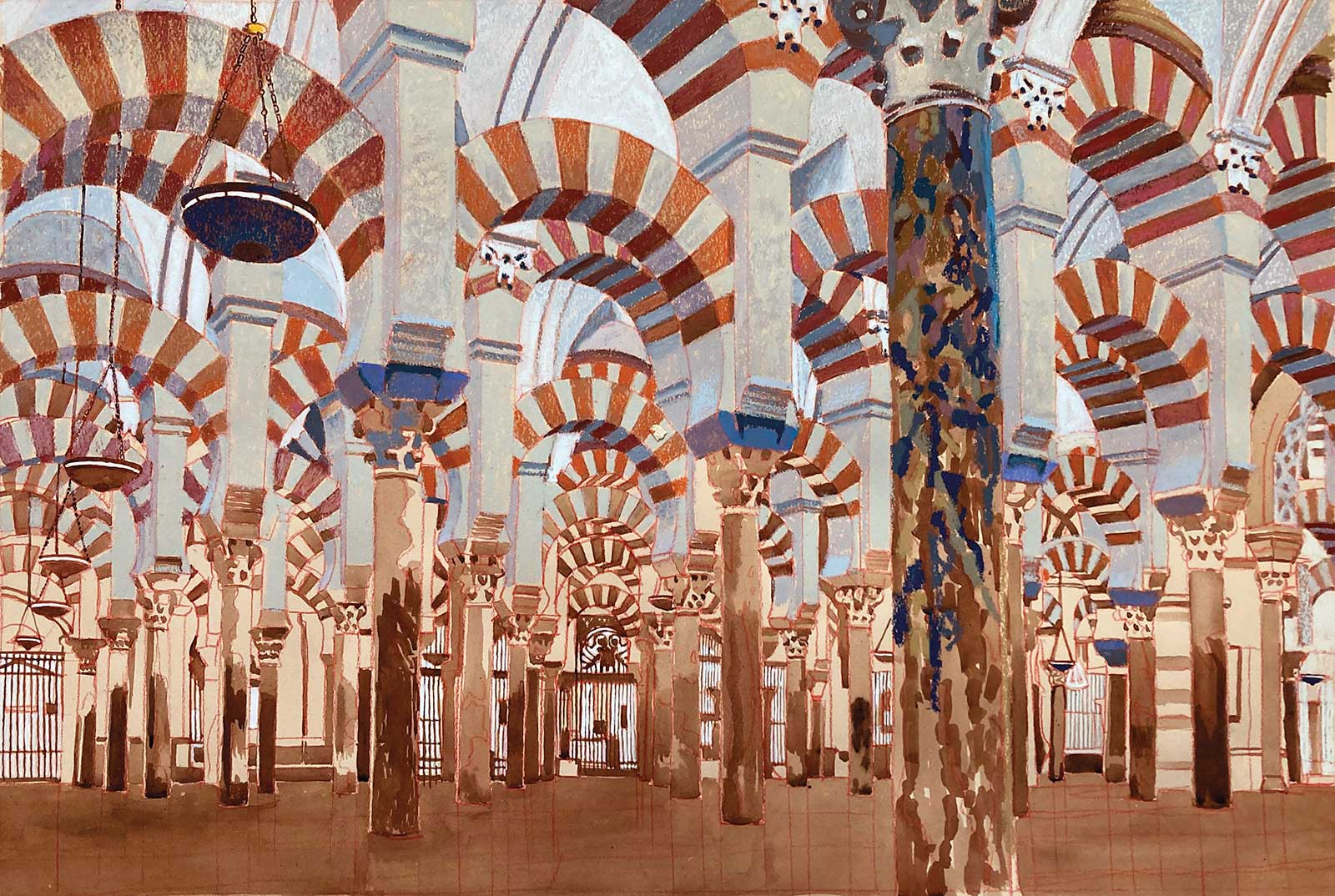 Stage 6
Stage 6 Working from the Top Down
Oil pastel is easily smudged and cleanliness is required at all times. It is, therefore, easier to work downwards initially to get the main areas of color established. It is also easy to remove dirty pastel as it can be scraped away with a razor blade or scalpel.
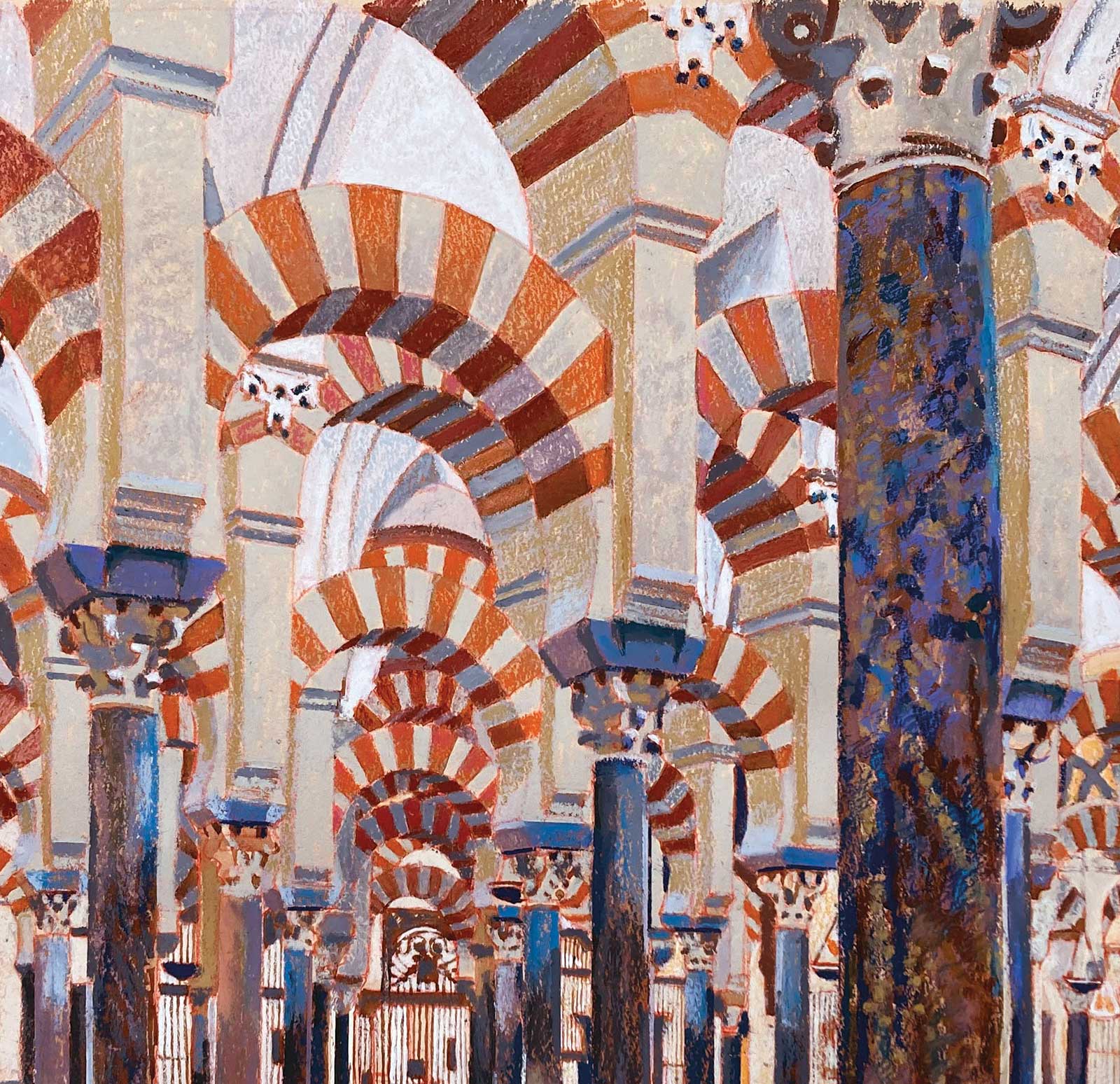 Stage 7
Stage 7 Second Mixing of Colors
The colors needed enhancing with more shadow on one side of the arches and with more color intensity on the orange stones. There are pink, red and brown colors added into the orange to give variety and definition.
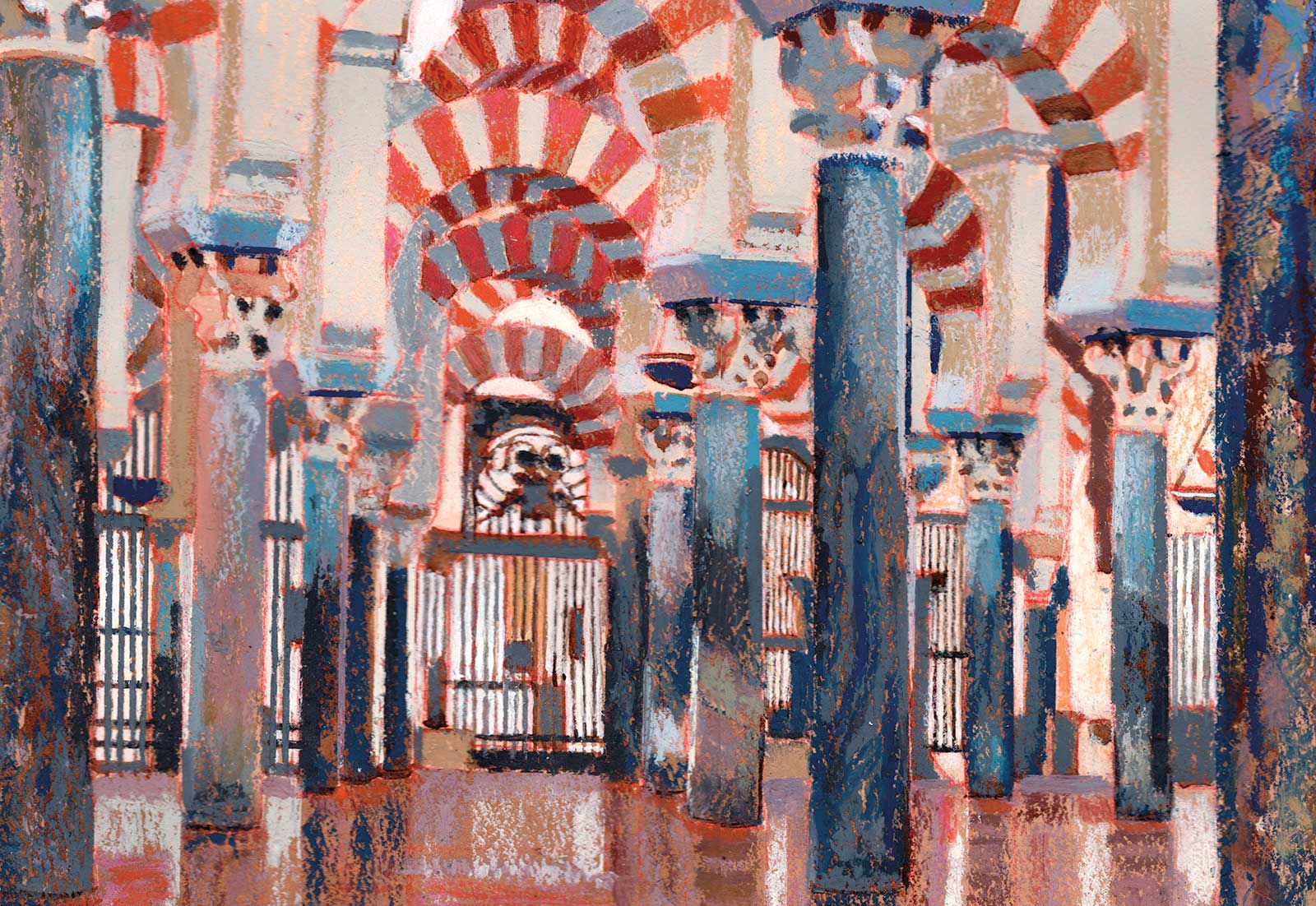 Stage 8
Stage 8 Reworking Areas
The oil pastel can kill underlying detail, and it is sometimes necessary to go over the lost details with acrylic ink again to restore them. This is the case with the grilles here, which were re-ruled in using a dark ink.
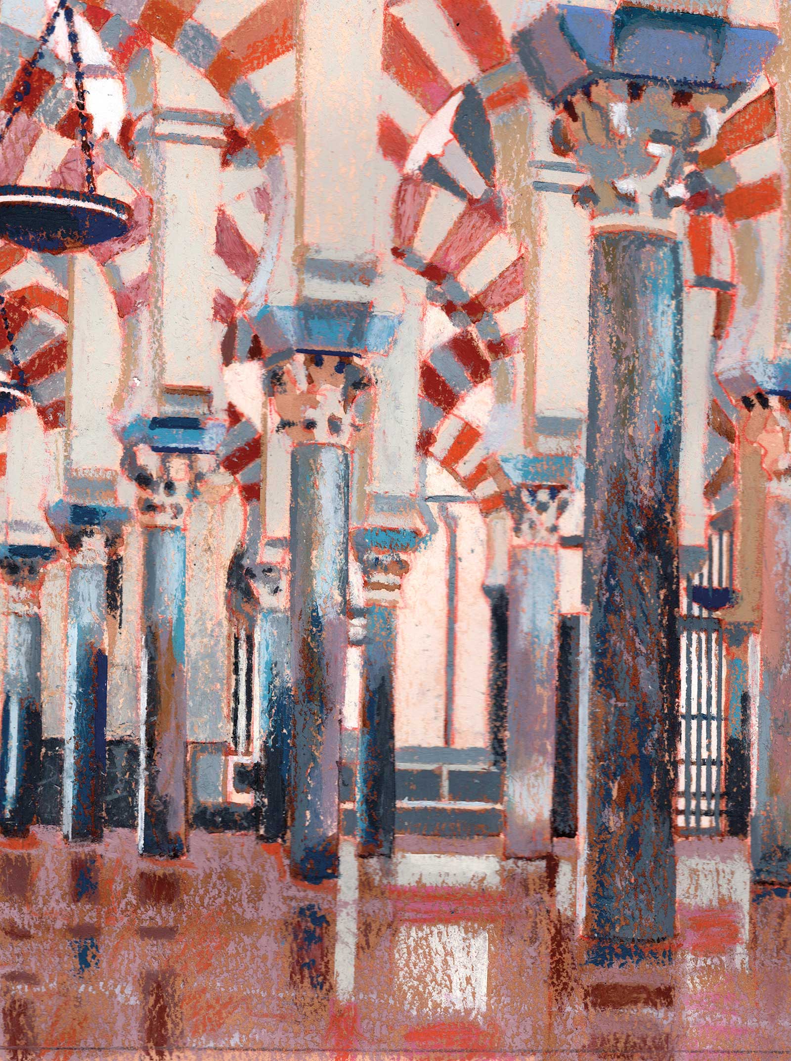 Stage 9
Stage 9 Highlights and Reflections
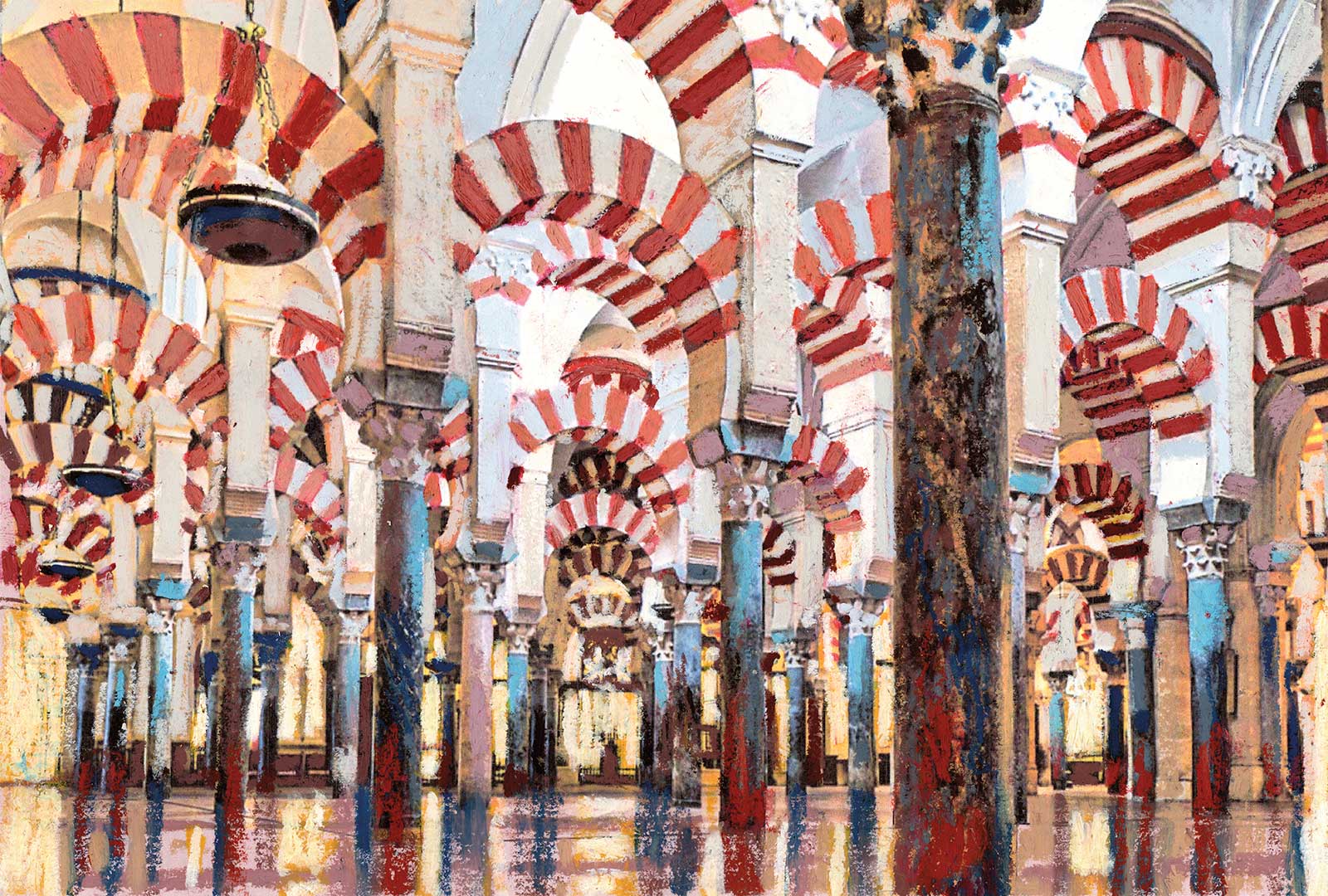
This is where the blue and rust orange highlights were added. Blue on the marble columns and the rust orange as reflections in the floor to bring it alive. The big marble column has several layers of color on it over the underpainting to give it depth and intensity.
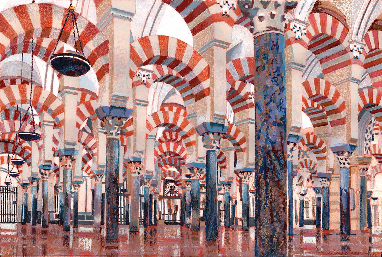 Stage 10
Stage 10 Finished Artwork
Mesquita, Cordoba, Spain, oil pastel on paper, 14½ x 21½" (37 x 55 cm)
A lot of reflections have been added to the floor, which were not in the original reference. The yellow artificial light on the left of the reference has also been left out, implying that the top light is all natural. This gives a lighter feel to the whole view.
About the artist
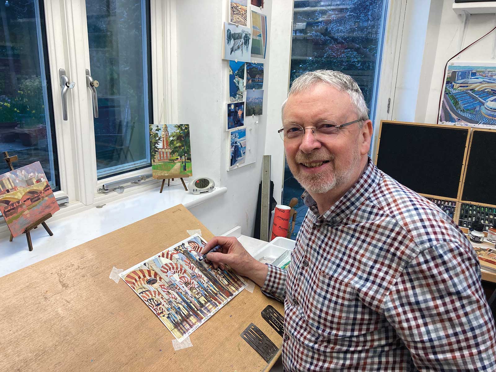 Richard Rees in his studio
Richard Rees has no formal training as an artist but has been drawing and painting since his teens. He retired from being an architect in 2012 to finally concentrate on illustration and painting. He is chairman and a fellow of the UK-based Society of Architectural Illustrators and has been a member since 1986. Since taking up full-time painting he has exhibited at the Royal Academy in London and regularly at the Mall Galleries (also in London) with the Pastel Society UK. In 2021, he became the Pastel Society president.
He has had several solo shows in London, at Abbott and Holder and at the Royal Automobile Club and is regularly invited to mixed pastel shows in England, France and Scotland. He has won prizes for his work and has been featured in several pastel-oriented publications. His next project is a commission to document the Italian hill village of Colletta di Castelbianco in Liguria.
Contact at
rees888@btinternet.com
www.artyrees.com