


I paint with colored pencils, using them in a way that creates the visual depth of oil paints and emulates the color transition and vibrance of watercolors. I strive to instill these painterly qualities in my portrait drawings. When I began to experiment with colored pencils and different solvents, I was able to achieve those attributes. I found solvent to be the key to smooth color application and blending with colored pencils. This technique allows me to create portraits with greater depth, eliciting the inevitable “I can’t believe this is colored pencil!”
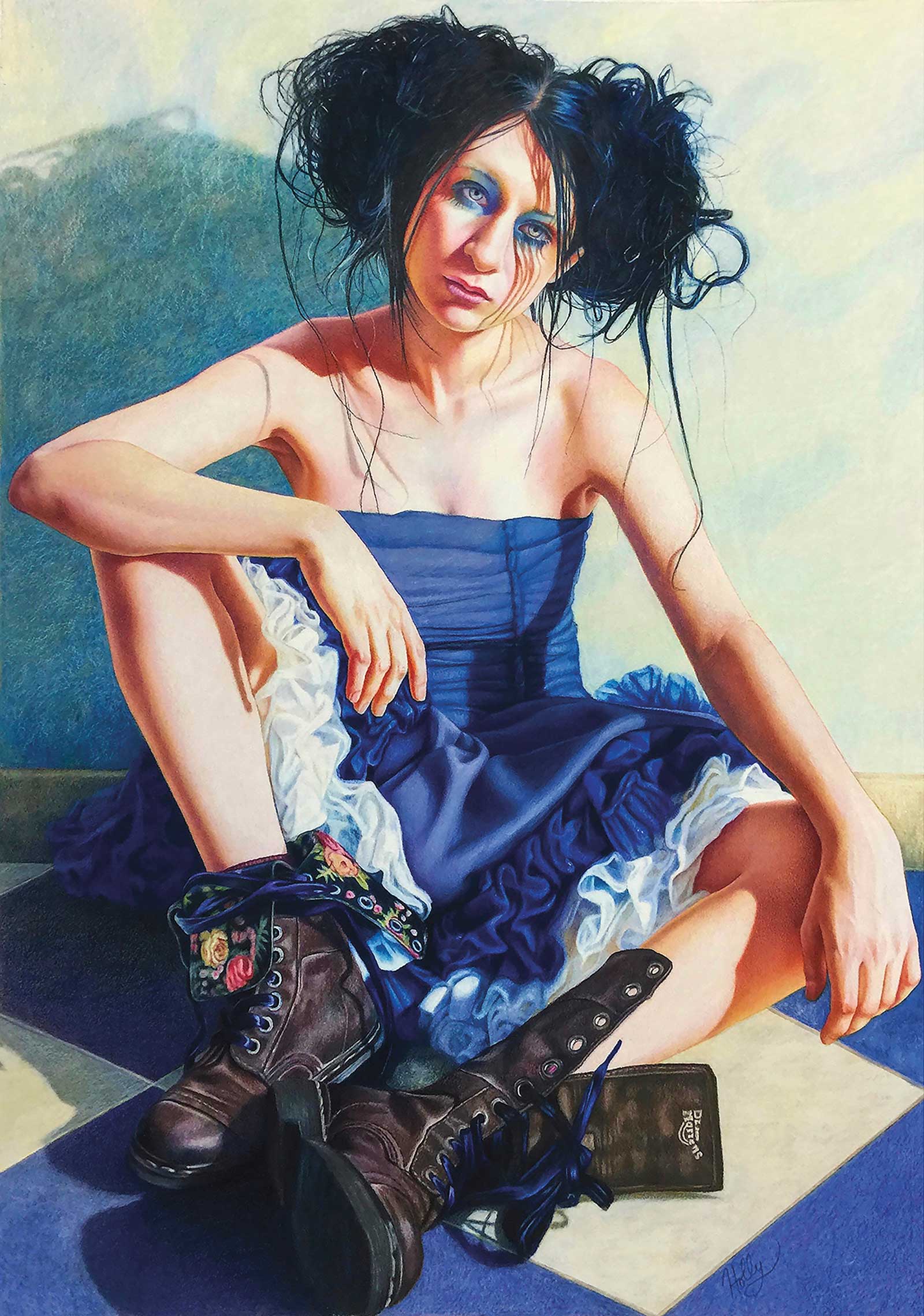
Last Dance, Prismacolor colored pencil on Arches watercolor paper, 28 x 20" (71 x 50 cm) This is the last of the dancing shoes series of portraits. In this piece, I experimented with color saturation, texture and color transition.
My portraits often tell a surreal story of the subject with fanciful images and vivid, over-saturated colors. A flowering vine across a window, water lilies in a pond, even tangled Christmas lights add fuel to my imagination and inspire visual motifs for drawings. Nostalgia for old technicolor movies and children’s fairytale stories also influences my subject matter. Once an idea forms, I look for a model to realize that image. This “burden” usually falls onto my daughter Abigail, who has the unique ability to express the wanted emotion through her face and body language. She is also “game” enough to be submerged in water or decorated with whatever props I need. I am blessed to be an artist and mom. I will take hundreds of photos of my subject and also use other collected reference material. I have photo files of walls with textures and graffiti, fish, birds, etc. I spend a long time combining images in my sketchbook, getting the right feel and visual balance.
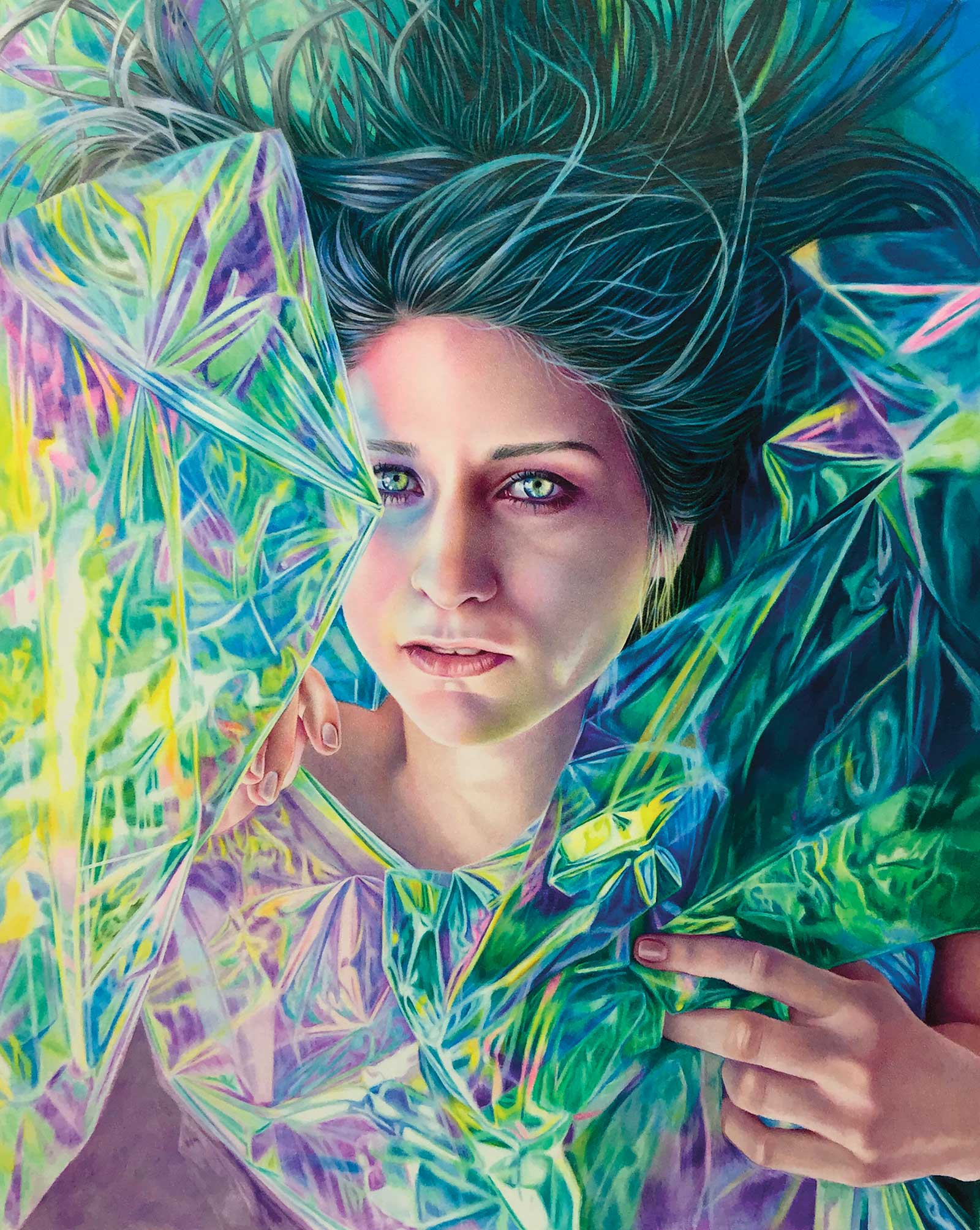
Aurora Borealis, Prismacolor colored pencil and Derwent Inktense water-soluble pencils on Arches watercolor paper, 20 x 16" (50 x 40 cm) My daughter Abby uses iridescent and colorful material in her art practice. This portrait of her was inspired by the beauty she creates.
My love of colored pencils started many years ago with the discovery of Bernard Poulin’s colored pencil workbooks. The books had been left behind in my classroom by the previous art teacher—little did they know of the gift I was given! I’m eternally grateful for that discovery and unknown benefactor. I had no idea what could be achieved by the oft-overlooked medium until I started buying books by other colored pencil artists. A new world had opened up for me; I could express my love of color with a pencil that is already so natural for me to use.
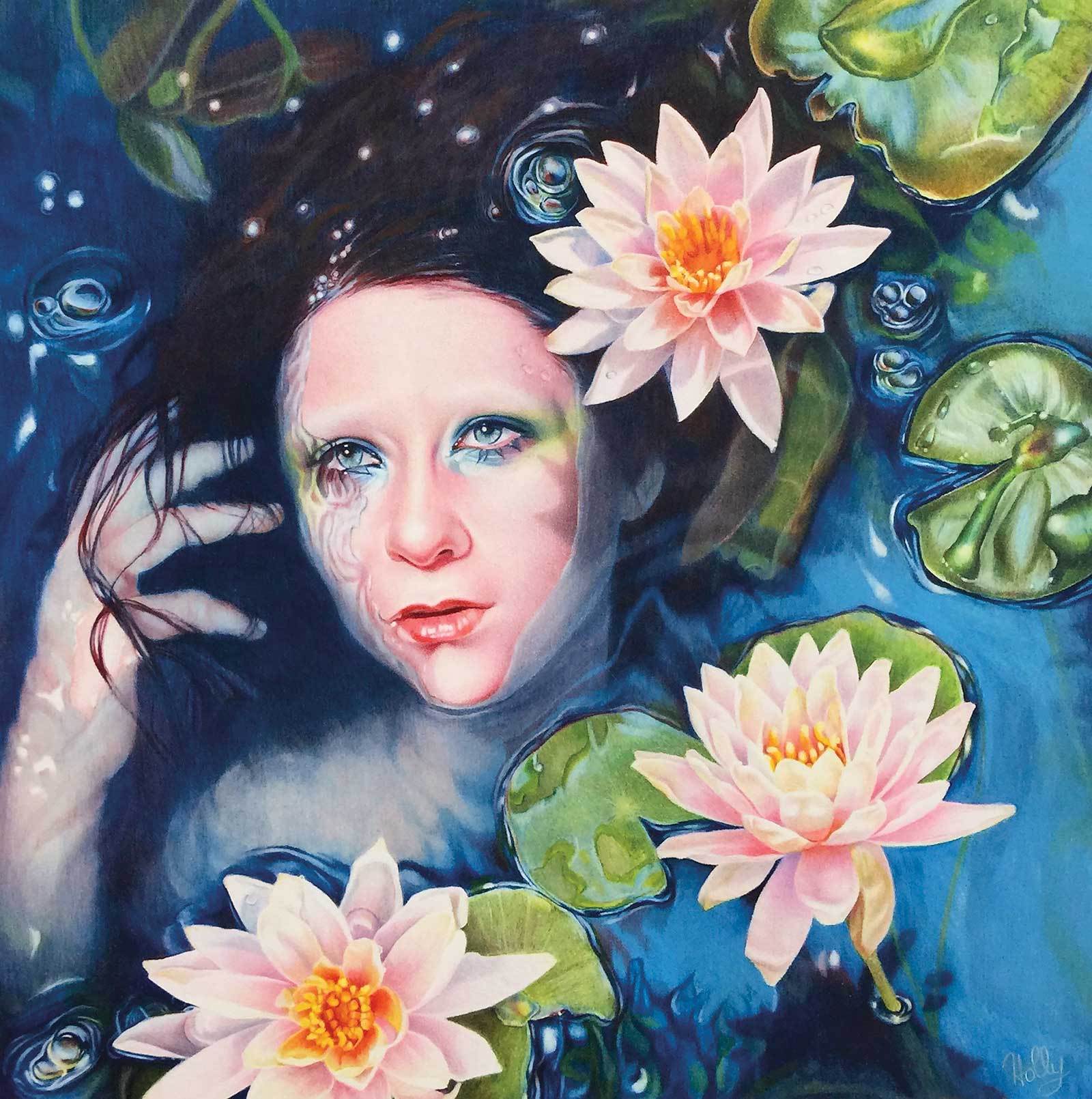
Waterlily, Prismacolor colored pencil on Stonehenge paper, 16 x 16" (40 x 40 cm) There are so many elements in this portrait, technically and emotionally. The smooth surface of the paper, usage of complementary colors, visual balance and intensity coalesce. Living in a desert I get fixated on water, wanting to convey the cool tranquility of a pond and the smooth glowing texture of the skin and flower petals.
My style of color application morphed from using fine point colored pencils in many light layers, to a bolder approach utilizing solvents with a more intentional color palette. I didn’t need the fine point and tons of layers to fill the paper’s texture with color. The solvents liquefy the wax in the colored pencil and push the color into the hills and valleys of the paper. The paper I found best for my sometimes rough method of scrubbing colors is Arches cold-pressed 140-lb watercolor paper. This paper is also excellent for adhering to boards and varnishing for the more painting-like appearance of glassless framing. I’ve experimented with different colored pencil layering techniques and paper textures, incorporating methods learned from the many painting and colored pencil workshops I’ve attended over the years. I choose my paper texture to complement the image, using smooth Stonehenge paper for precise or smaller drawings, and Arches watercolor paper for larger less detailed portraits where coverage is essential.
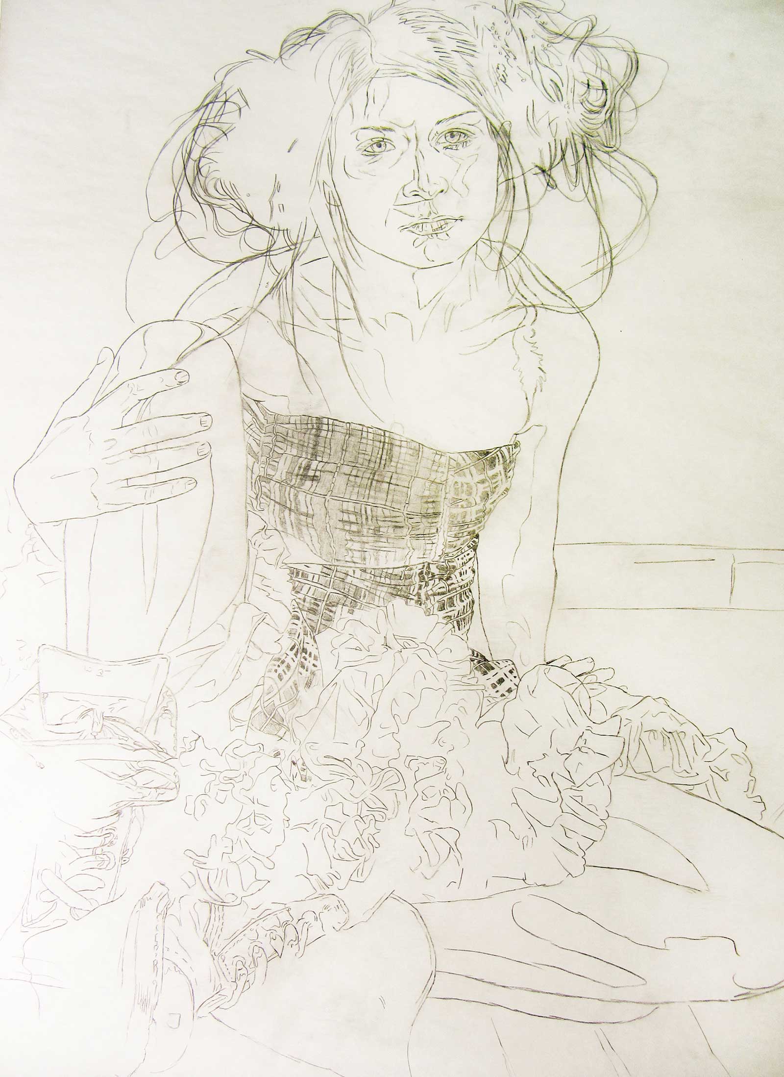
My Art in the Making Dancing Shoes IV
Having a teenager/young adult daughter, I was fascinated by her unique and personal sense of style. I wanted to capture Abby’s rebelliousness in a portrait. This particular photoshoot was so successful I did a series of drawings from the many photos taken. Selecting source imagery is the most time-consuming part of the process; going over each photo, comparing expressions, body position and shadows.
 Stage 1
Stage 1 Compositional Sketches
After selecting an image or combination of images, I’ll incorporate them into various compositional drawings in my sketchbook. This is where I experiment with shadows, background and cropping.
 Stage 2
Stage 2 Initial Drawing
I print my reference photo in black and white at the size I want the finished portrait to be. With tracing paper I block out the figure, then go back and redraw details, adding different elements from the other reference material.
 Stage 3
Stage 3 Starting on the Face
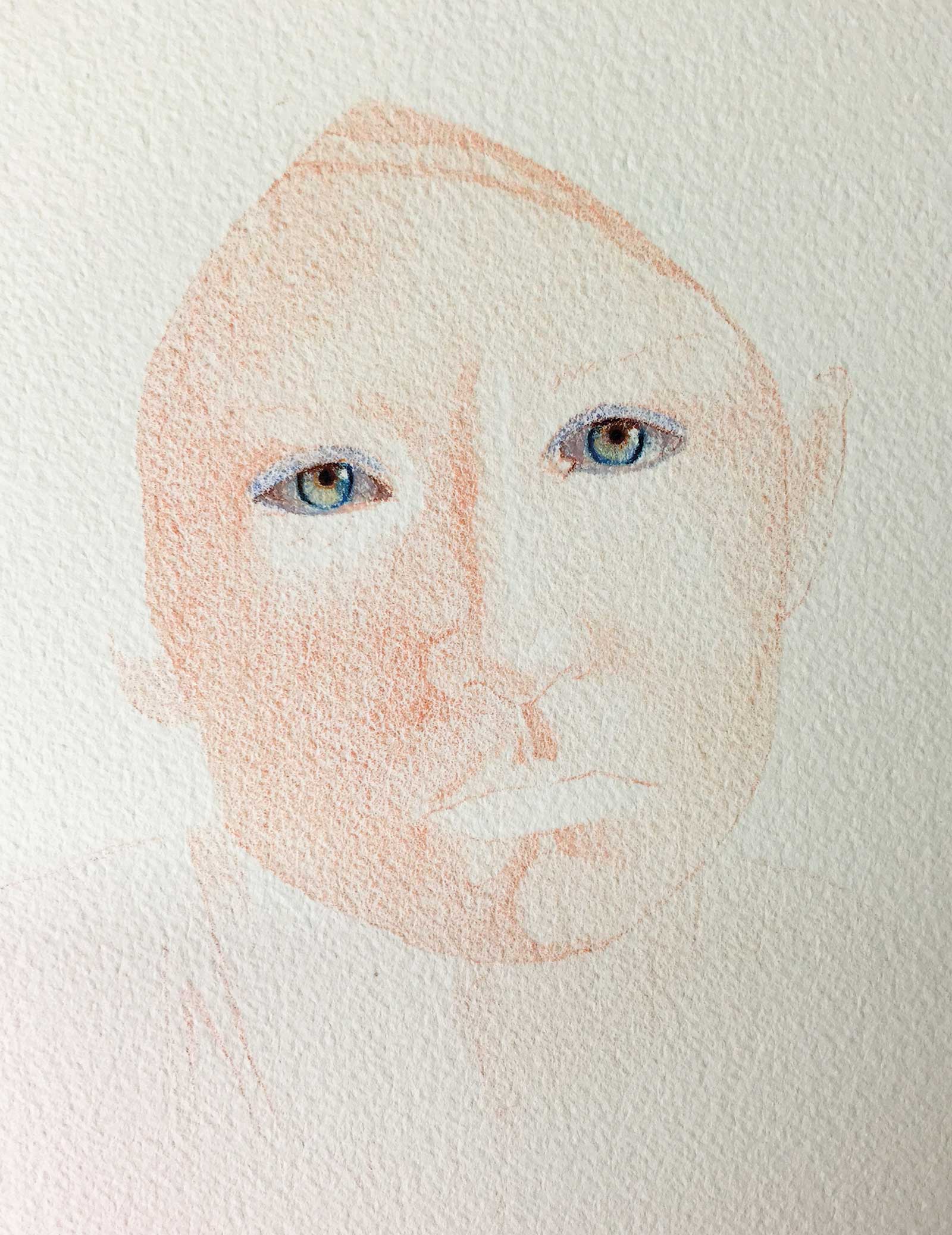
I place the preliminary drawing on my light table, on top of which I selected Arches 140-lb watercolor paper as my drawing surface. With the light on, I lightly trace the face details with peach. I start my color washes with cream, then the peaches, pinks, oranges, and reds over the face area leaving the white paper as highlights alone. For the eyes, I layer blues, grays, reds and oranges with medium pressure.
 Stage 4
Stage 4 Building Color
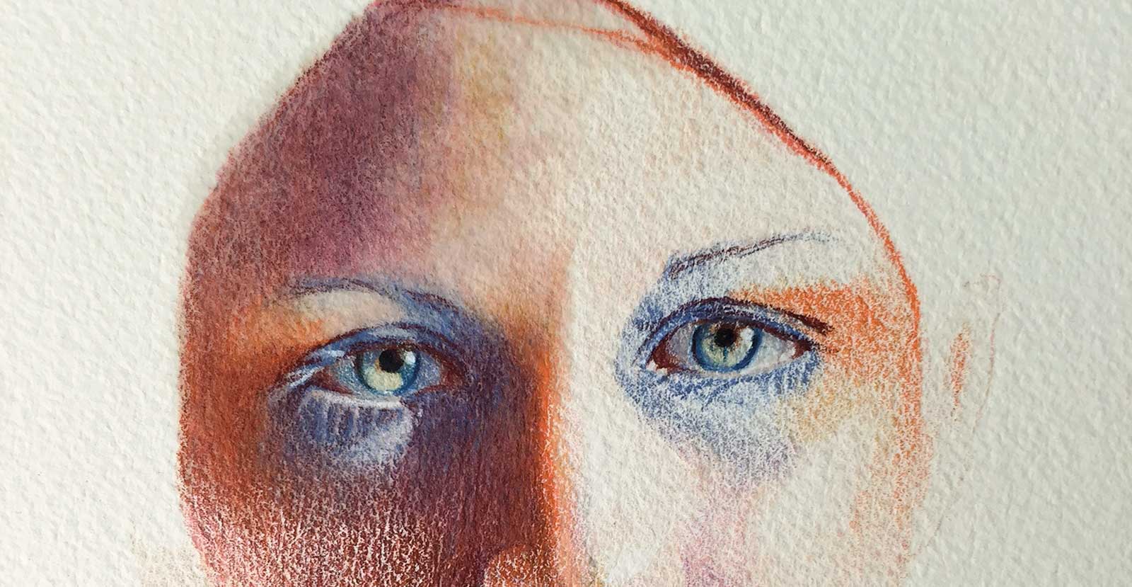
Gradually I build up the shadow colors with different pinks, oranges, yellows, blues and reds. I make sure to not muddy the colors by keeping each color transition slightly isolated with not too many different colors overlapping in the layers. I also deepen some colors by adding more layers and slightly heavier pressure.
 Stage 5
Stage 5 Blending Color
This is the fun/scary part! Using odorless turpenoid and a small short-haired soft brush, I very carefully “touch” the different colored areas from light to dark, cleaning the brush in between. This allows the solvent to blend the color into the paper. The gesture is more like a gentle tap of solvent, as opposed to brushing, which would move the pigment around unnecessarily.
 Stage 6
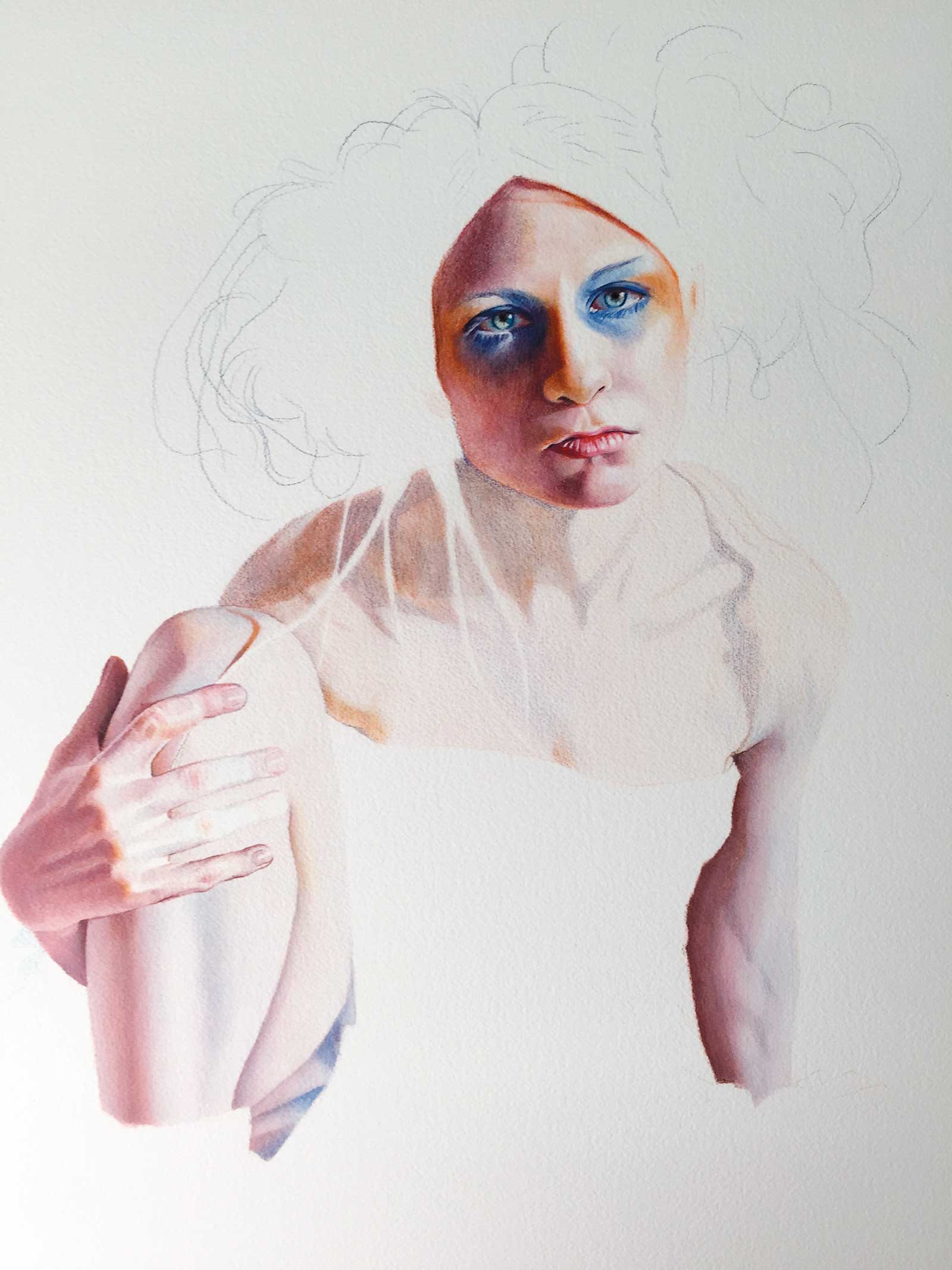
Stage 6 Blocking in the Rest of the Body
After the area dries, you can apply more colored pencil to saturate or white pencil to tone down and soften. Be careful when tapping with solvent—you don’t want to accidentally remove layers by applying too much. It’s best to practice this technique beforehand so you get a feel for the different textures you can create.
 Stage 7
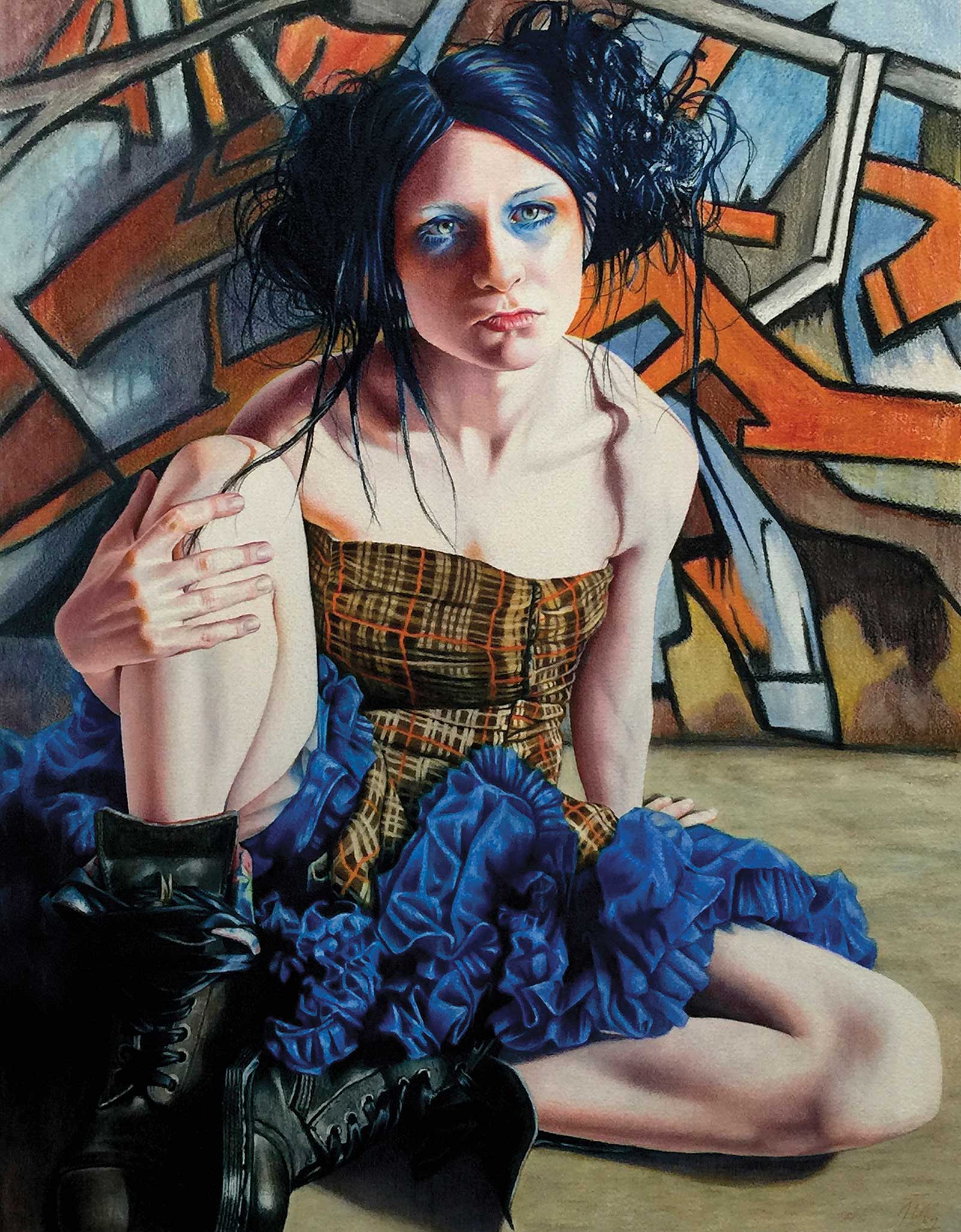
Stage 7 Finished Artwork
Dancing Shoes IV, Prismacolor colored pencil on Arches watercolor paper, 23 x 18" (58 x 45 cm)
Lastly, I fill in the background area with the oranges, burnt ochre, yellow ochre and blues using heavy pencil pressure. I used a stiffer brush to scrub the color with the odorless turpenoid to give it a rougher texture.
About the Artist
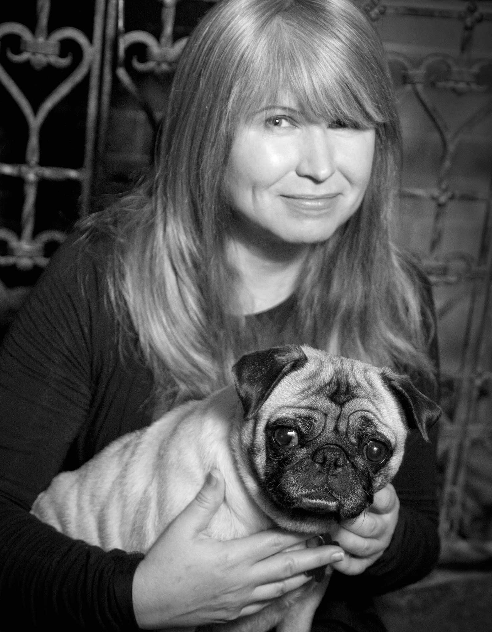 Holly Siniscal
Holly Siniscal is a signature member and CIPPY award recipient of the Color Pencil Society of America (CPSA). Primarily working with wax-based media such as Prismacolor and Verithin colored pencils, her masterful technique incorporates solvents to achieve glazed layers and painterly effects. Her portraiture has been featured in numerous art publications, and she is also a regular contributor to various colored pencil magazines and books including the Strokes of Genius series, sharing her unique drawing methods. Blending moments of photorealism and classical portraiture with more stylized and modern fantasy elements, her iconic images interpret archetypal characters and themes. Her artwork has been exhibited in various galleries and museums across America.
Contact at
hollyarts1@aol.com
www.hollysiniscal.com