


Grand Prize is a four-page editorial feature in American Art Collector magazine
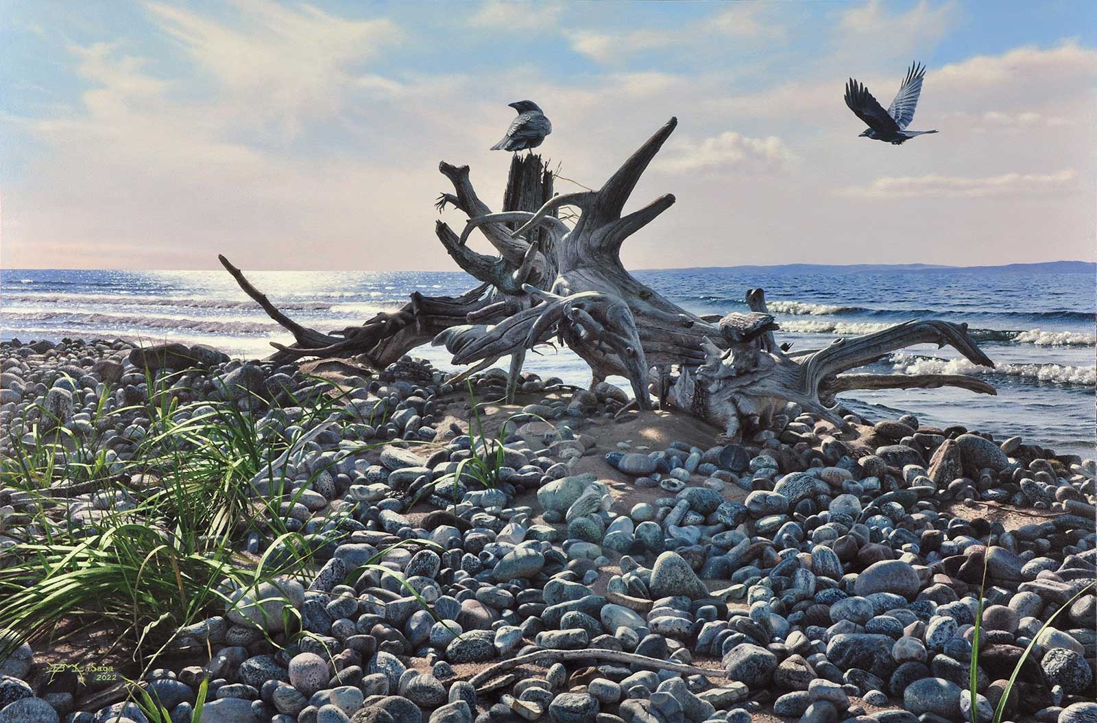 Along The Beach, acrylic on Masonite wood panel, 20 x 30" (50 x 76 cm)
Brian LaSaga
Newfoundland, Canada,
Rugged Shores
Painting out of his studio in his hometown of St. George’s, Newfoundland, acrylic painter Brian LaSaga is continuously inspired by the beauty of his home. An island on the easternmost part of Canada, Newfoundland is filled with rugged coastline, marshlands, rivers, ponds and forests, all teeming with wildlife as well.
LaSaga describes his work as high realism, hoping to accurately render what he sees and feels in the landscape—and through that rendering, ignite a spark of inspiration in his viewers. “Capturing the essence and textures of my subject is very important and painting it in a realistic style is the only way I can convey it properly,” he says. His paintings capture crashing waves against craggy cliff faces, gnarled wood on sandy shores, snowy forests and much more.
“I find inspiration in nature. Hiking and kayaking is something I’ve done [frequently] over the years, and I’m always inspired by our local land and coastal scenes,” says LaSaga. “Weathered elements would be my strongest themes.” His winning piece in the Seascapes, Rivers & Lakes Challenge—an acrylic on wood panel titled Along The Beach—depicts a group of crows inspecting driftwood on the beach amidst piles of stones, with gentle waves rippling in the backdrop.
My Inspiration
My inspiration for this painting was from a kayak trip to a local island called Sandy Point. The north side of this island is scattered with driftwood of all sizes and shapes. A feast for the eyes for any photographer or artist. The abstract qualities take on many interesting shapes, and I take hundreds of photographs from various angles and different times of the day. Many bird species nest on this island including the endangered piping plover. The island is now declared a bird sanctuary by the Nature Conservancy of Canada. Crows have been incorporated into many of my works over the years, and they will appear in upcoming pieces as well.
My Design Strategy
Driftwood lends itself to a very unique design, which nature creates effortlessly and painters can sometimes struggle to capture. I personally love the challenge. I work from my own photos, and at times, I may move elements around until I arrive at something I like. In this piece, I had taken photos from different angles and ended up with this image as my final working reference. Using photoshop, I placed the crows from other photos I had taken and moved them around various areas in the piece until I arrived at this final result.
My Working Process
I first prepare a ¼-inch Masonite wood panel with four coats of gesso on both sides using a paint roller. The last coat is sanded with 220 fine sandpaper. A pencil drawing is then prepared and transferred to this panel. I use heavy body acrylics building multiple layers to achieve interesting textures, richness and three dimensional forms. The quick drying is a bonus at this stage. I’ve always felt that my paintings are a series of corrected mistakes. Acrylic offers this to me because of the quick drying time. A pain for some artists but a bonus for me. I only use water with acrylics. I always work from back to front to achieve an overlapping effect. I mix paint with a palette knife but use various brushes to create special effects throughout. Painting accents in the proper places is key, and acrylics allow me to do this rather quickly since they dry so fast. My skies are blended visually with acrylics rather than physically as oils would allow.
Contact Details
Email: brianlasaga@gmail.com
Website: www.christinaparkergallery.com
Second Prize is a two-page editorial feature in American Art Collector magazine
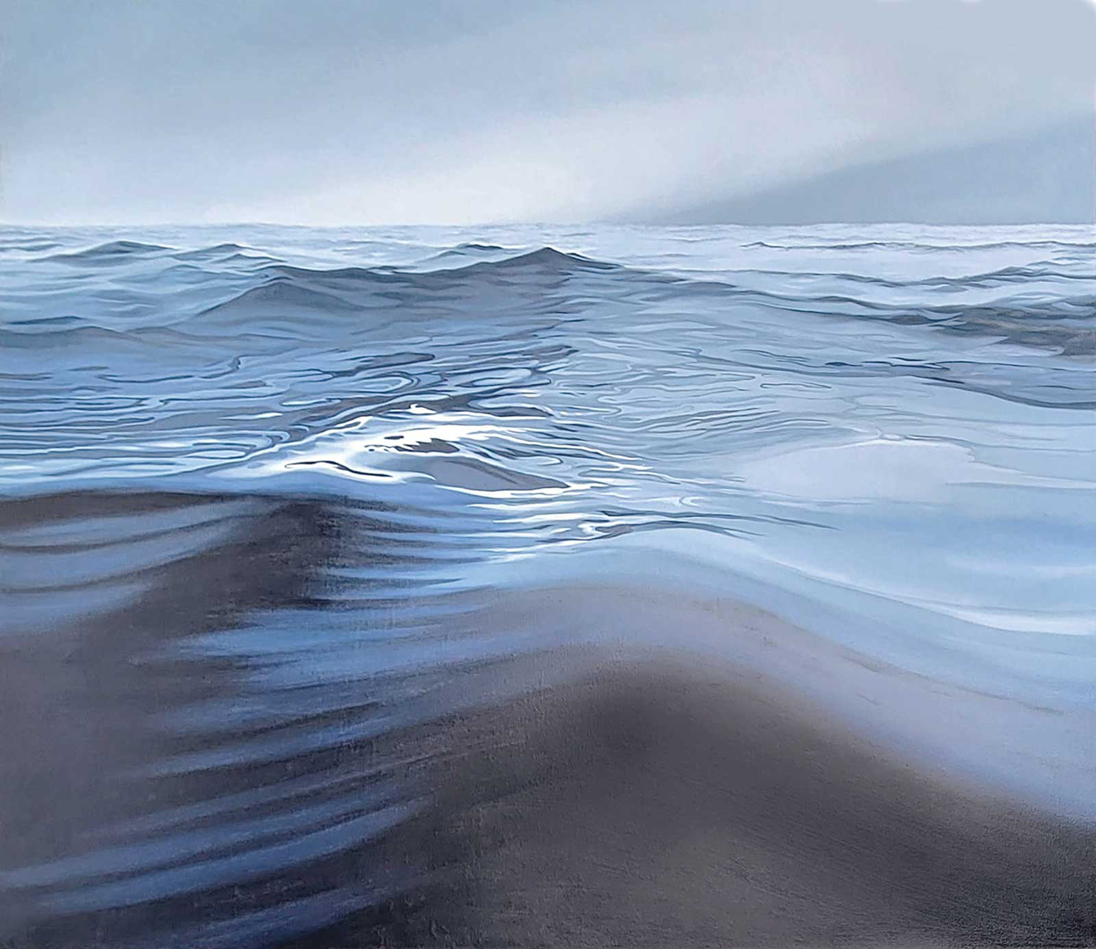 Blue Serenity, oil on canvas, 48 x 60" (121 x 152 cm)
Andrew Eccleshall
Washington, USA,
My Inspiration
I am attracted to drama and mood in landscapes. My goal is always to have people “feel” the painting. In this instance, my inspiration was a dear friend who has a lot of major challenges. She wades into the water every morning off of Vancouver Island, British Columbia, all year round, whatever the weather. It grounds and focuses her for the day. Her images from some of these morning dips are breathtaking and were the inspiration for Blue Serenity.
My Design Strategy
I eliminated everything from the scene except for the water and sky, focusing my attention on the motion. I wanted the viewer to feel as though they were in the water, feeling the rise and fall of the waves. Keeping the details simple and the color fairly monochromatic allows all the attention to be focused on the rolling forms and the tantalizing light play in the mid ground.
My Working Process
I work in oil on canvas or linen and always start by toning the canvas. For water scenes such as this, I initially work wet into wet using large brushes, creating the general forms and tones of the painting. After some drying time I work back into the piece, sharpening some forms and adjusting tones while keeping to the original palette. The final stage involves increasing and reducing contrasts and highlights. I will also use glazing techniques to unify some of the structures. A painting like this can look almost complete fairly quickly but will take a month or so of subtle adjustments to get it to where I’m finally happy with the atmosphere.
Contact Details
Email: ajeccleshall@gmail.com
Website: www.andyeccleshall.com
Third Prize is a one-page editorial feature in American Art Collector magazine
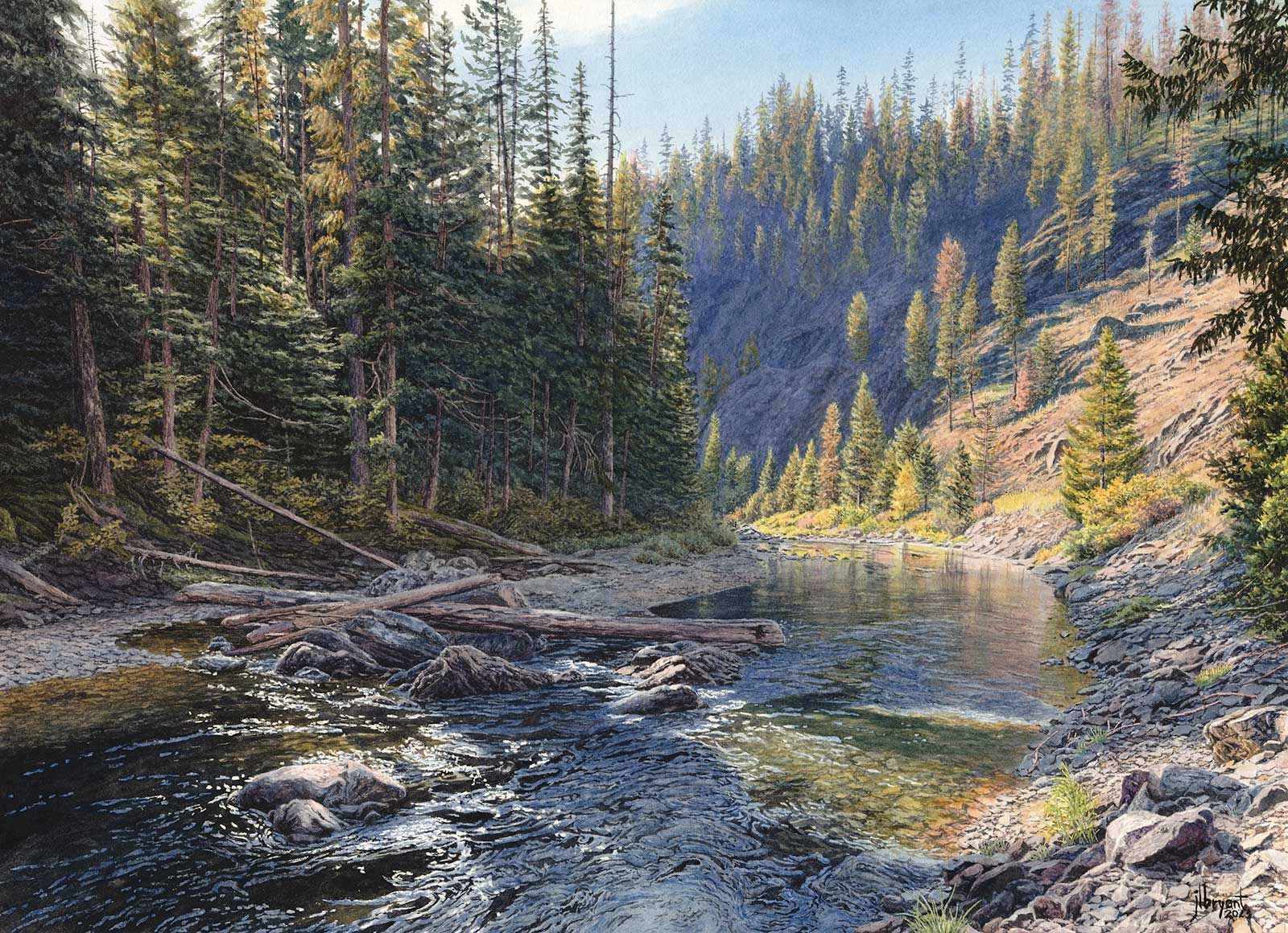 St. Joe River Near Tumbledown Creek, watercolor, 14½ x 20" (36 x 50 cm)
Jessica L. Bryant
Idaho, USA
My Inspiration
The St. Joe River’s status as a designated Wild and Scenic River is testament to the phenomenal landscape. I love climbing down to this spot. In spring, the water can be pretty high, but into the summer and fall, exposed rocks provide places to perch. I can sit here for a long time, taking in the sound of the water, watching the meditative qualities of ever changing ripples and identifying the patterns of movement. Often in deep shadow, the dappling of light along this bend was particularly mesmerizing that day, and I saw the potential to build a good painting.
My Design Strategy
Capturing the personality of the Joe, as it’s known by locals, was my main priority. I always endeavor to faithfully convey a sense of place that feels authentic to the unique qualities of a landscape. This is a favorite area for fly fishers, so I know that if I get it right, they will know exactly what spot I’ve painted and will feel the sun and hear the water. For me, it’s akin to painting the portrait of a beloved friend. Accuracy is important, as are the emotional qualities of the subject. Composition and value structure are key.
My Working Process
Once my compositional structure was determined, I worked top down: sky, mountainside, distant riverbank, forest on the left, and the water. I paid careful attention to the value shapes in the water. To keep them organized in my mind, I lightly shaded in some of the darkest areas and blocked them in first with a neutral dark. The quality of dappled light was a priority for me, so I built my values and warm versus cool areas carefully, ensuring that everything contributed to supporting the feeling of that light. Lastly, I finalized my value structure, ensuring it supports the mood.
Contact Details
Email: jessicabryantstudio@gmail.com
Website: www.jessicabryant.com
Finalists
Each receives an Award Certificate and a one-year subscription to International Artist magazine PLUS having their work seen worldwide by international galleries looking for new talent.
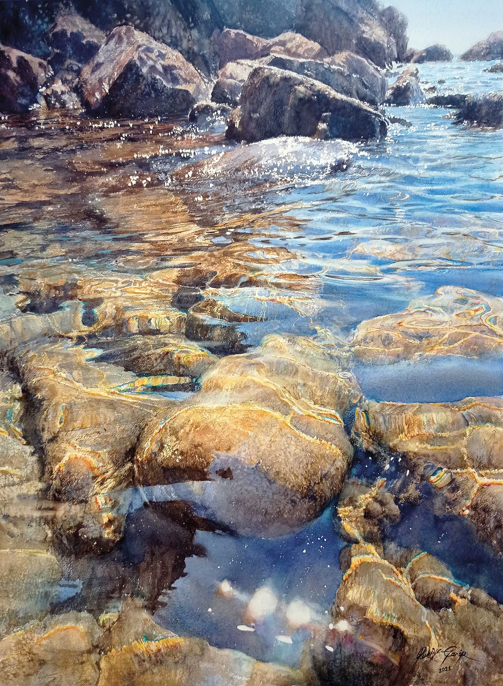 Phaselis, watercolor, 30 x 22" (76 x 55 cm)
Rukiye Garip
Balıkesir, Turkey
My Inspiration
Phaselis was a Greek and Roman city (700 B.C.) on the coast of ancient Lycia. Its ruins are located in the Antalya province of Turkey. While on vacation nearby, I embarked on an exciting adventure. As I made my way from the land to the shore, the ruins of the ancient city seemed to beckon me toward the sea. When I reached the sea in the magical atmosphere of history and nature, I just had to paint this breathtaking view. What impressed me the most was the movement of the blue sky and the brilliant reflections of light on the water. The sunken rocks and scattered ruins beneath the translucent waves looked like hidden treasures waiting to be discovered in this watery realm.
My Design Strategy
I waded into the water to capture the rocks and the reflections in the water and carefully navigated between the rocks. Immersing myself in the landscape, I tried to experience it firsthand, not as a distant observer. I took several photographs from various angles to put together the perfect composition. I spent a day experimenting with color and texture to find the right way to use blue, yellow, light and dark juxtaposed with the dynamic light reflections of the water.
My Working Process
I used masking fluid to protect the shimmering areas in the water and applied a salt effect to enhance the texture of the rocks. The pinnacle of exhilaration was capturing the contrast between the darkest and lightest parts of the large rock in the lower center section, making it stand out among the intricate details of the surface. After seven days of work, the painting was completed.
Contact Details
Email: rukiye@garip.me
Website: www.instagram.com/rukiyegarip
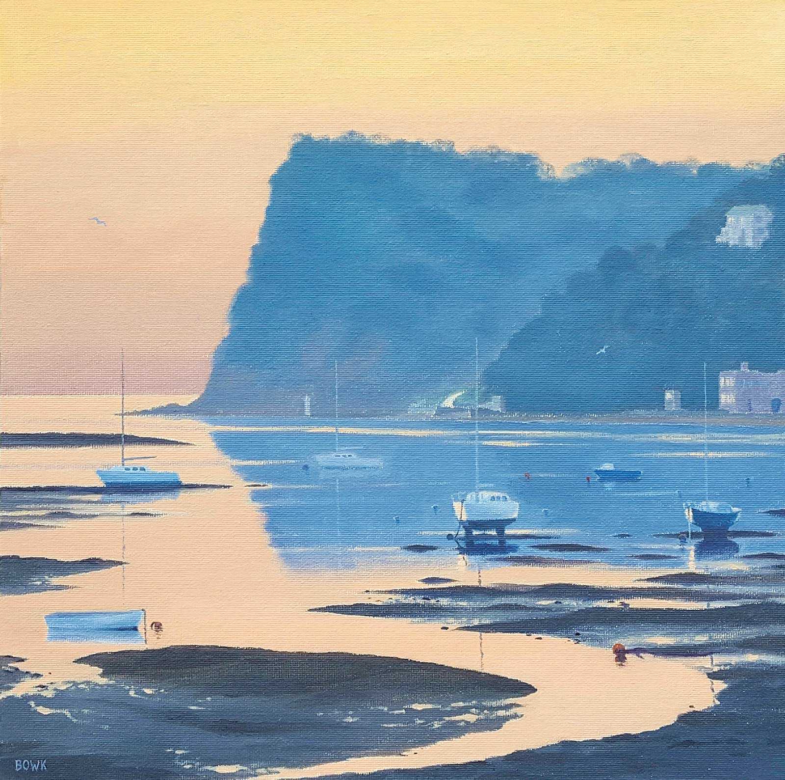 Daybreak Over the Estuary, oil on canvas board, 12 x 12" (30 x 30 cm)
Keith Bowcock
Devon, UK
My Inspiration
I am often beside the water with my camera hoping to find a special scene or moment. I found one mudflat image with a curved channel, which I thought could be an interesting foreground lead-in. The Ness headland in Shaldon is one that I have depicted in many paintings, but I fancied a different mood than “normal daylight” for this piece. I have always loved the special light over the sea before the sunrise, so how about combining the above?
My Design Strategy
I wanted to capture a feeling of calmness in the painting, a new day dawning, full of hope, as yet unsullied. I decided that the slackness in the water at low tide would give me that feeling, combined with a limited color palette to be restful on the eye, choosing the complementary muted blues and oranges.
My Working Process
I sketch the composition onto white gessoed canvas. I then go straight in with oils. Colors: alkyd titanium white, cadmium yellow, cadmium orange, burnt sienna, raw umber, ultramarine blue, alizarin, veridian and dioxazine purple. Key concentration areas: the atmospheric change in color on the horizon, extra color layered on the water to suggest flat calm, the differing levels within the mudflats with small wet areas reflecting the sky, and the touch of orange in the windows catching the sky color.
Contact Details
Email: kg.bowcock@hotmail.com
Website: www.facebook.com/bowk4
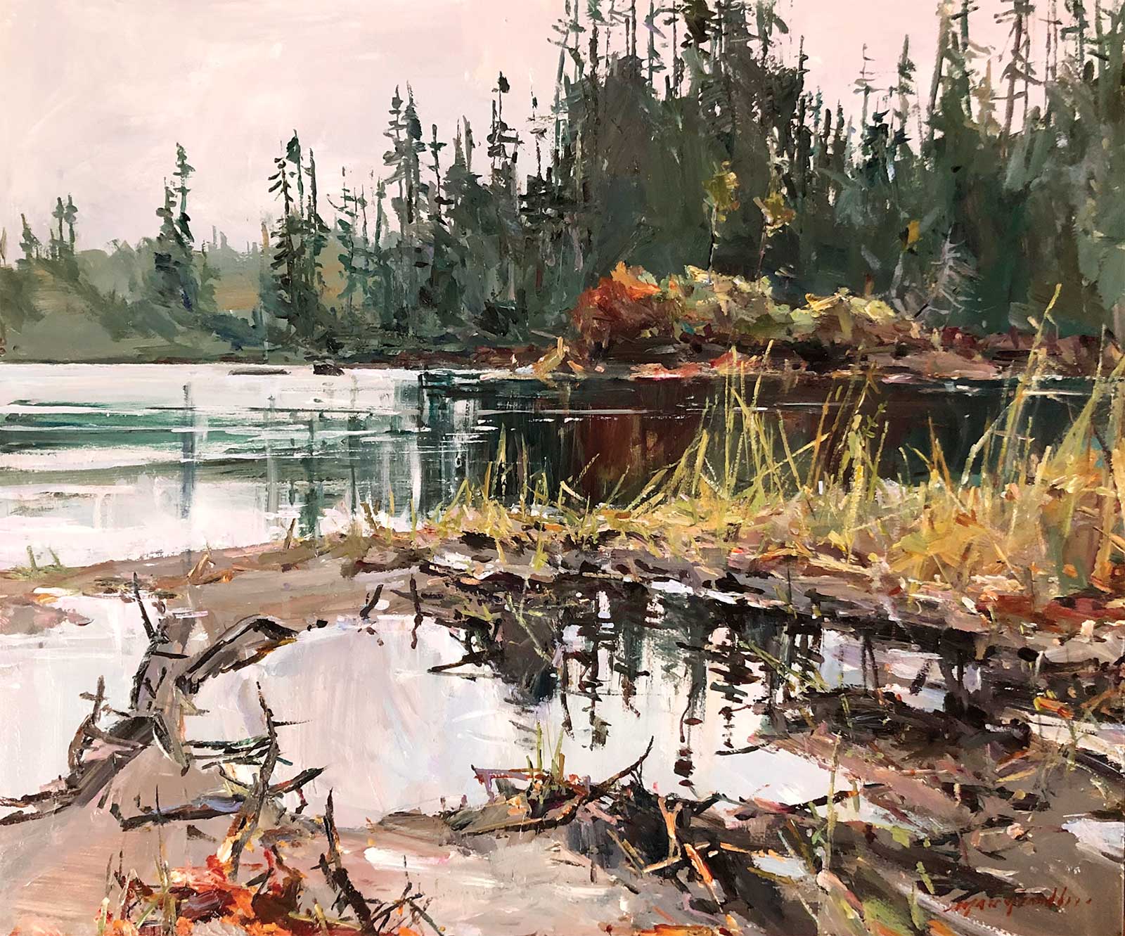 Morning on the Monts-Valin, acrylic, 20 x 24" (50 x 60 cm)
Marc Grandbois
Quebec, Canada
My Inspiration
This piece is a good example of my love for the northern wild landscapes we have up here in Quebec. Late fall scenes are some of my favorite subjects, when the last warm colors explode in that evergreen kingdom—like a show finale expressing resilience before the snow covers the entire land.
My Design Strategy
My design approach varies when I work in plein air compared to in the studio. Outdoors, it starts more with a candid feeling of the scene. I decide on the angle I feel will do justice to the subject. I tend to use the upper part of the painting to give the context to the viewer with more realism and use the foreground to express things more abstractly. Also, I try to keep my palette very limited while still maximizing the mixes of the colors to get variety and interesting colored grays.
My Working Process
I painted this piece on site in the Monts-Valin Park sitting in my car (the temperature was just above 32 degrees Fahrenheit!). I paint mainly on Masonite board coated with white wall latex primer. This kind of surface is more adapted to acrylic than canvas in my opinion. I always start on a white surface, quickly drawing the main lines with a brush. I build my palette progressively during the process. As I like to say to my students, the less colors used, the easier it is to get a good harmony. A bit like inviting people to a private party, you don’t call the ones that would kill the atmosphere! A smaller but interesting group makes communication fluid between all the guests.
Contact Details
nelina@live.ca
www.marcgrandbois.com
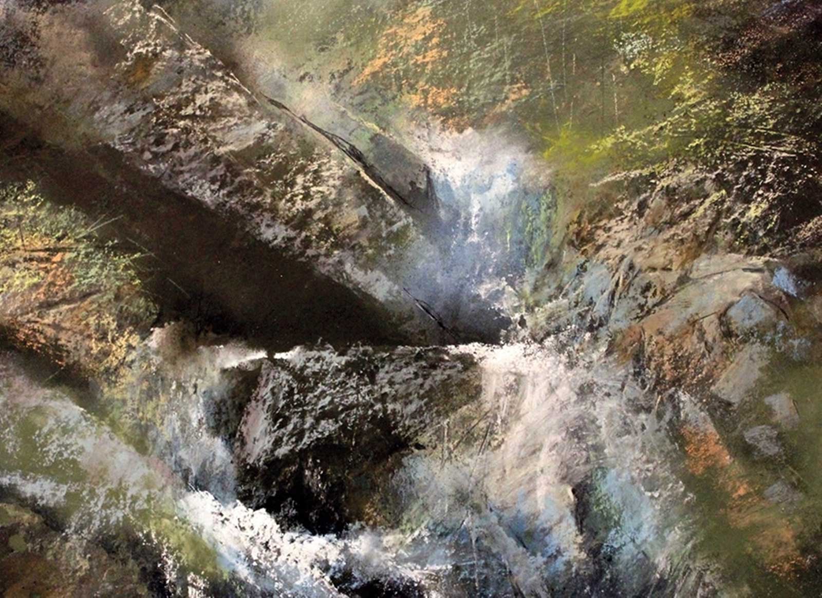 Antero Spring, pastel, 16 x 20" (40 x 50 cm)
Stan Bloomfield
Arizona, USA
My Inspiration
Loving nature, I’ve made both Colorado and Arizona my lifelong homes. Mount Antero, a 14,000-foot peak in central Colorado, has been a particular love for both its fantastic scenery, and as an added bonus, its aquamarine crystals. Rocks, fallen trees, as well as mountain streams are a favorite source of material. Antero Spring is not a place but a combination of memories. Indeed, all my paintings are not of a specific place but an expression of my past experiences.
My Design Strategy
I like to begin a painting with a powerful abstract pattern; use of a dominant value, color or object. For Antero Spring, a dominant diagonal shape (triangle) is repeated with a smaller horizontal. Contrast is created through dark hard-edged rocks countered by soft-edged water. This conflict is hopefully balanced by the mid tones of the remaining rocks. These impressionistic rocks create unity and harmony throughout the work and balance the hard-edged shapes.
My Working Process
Each painting for me is an experiment in material (ground) and application of the media (pastel). Working on Crescent Illustration Board, I lay in an overall value pattern (notan) using hard pastel sticks (Nupastel or Cretacolor). To create texture, I wash off the image and reapply pastel. I do this as many times as necessary to achieve the desired effect. Happy accidents occur, leading me in new directions. This approach is a result of my years in watercolor. Soft pastel is then used to restore value and color. I tend not to finish all areas, leaving the viewer to mentally connect the dots.
My Contact Details
Email: stanbloomfield@suddenlink.net
Website: www.stanbloomfield.com
 Pyree Evening, oil, 48 x 36" (121 x 91 cm)
Philip Miles
New South Wales, Australia
My Inspiration
I wanted to enter a selective art show, which rejects about half of the entries that come in, so I needed something strong and not easily overlooked. I went through my photograph library and found this scene, which I shot one evening in a nearby rural area. I loved the light on the water at the time, and the simplicity of this particular shot had the visual power I was looking for.
My Design Strategy
I normally begin by cropping a photograph to match the canvas size in a way that gives me a sound composition. I may add or remove some details but try to stay faithful to the locality I’m portraying; here I changed nothing significant. I chose a limited palette, using Richeson oils in green gold and olive green plus titanium white, Naples yellow, cobalt blue, vermillion and a little lemon yellow for the distant field.
My Working Process
I began by marking in the basic shapes and then used masking tape to block out the areas of reflected light to avoid accidentally marking them (in the final painting these would remain unpainted gesso). I then did a turpentine medium underpainting of all the darker areas using a large flat brush and let that dry. Finally, I worked slowly over the whole painting using linseed oil as my medium, beginning with the lighter areas.
Contact Details
Email: philmilesartist@gmail.com
Website: Facebook - Philip Miles Artist