


For me, as an artist, the two most important things are composition and color. I’m always using the basic elements of art—line, shape and form—to design the composition of my paintings. I am creating a world within the canvas and inviting you into it. I want you to feel a sense of place, that there is more beyond the edges of the canvas. Color is also an important element of art and something that I choose to use in excess. Color is about feeling and emotion and not necessarily about what we see or what we think we see, but what we feel.
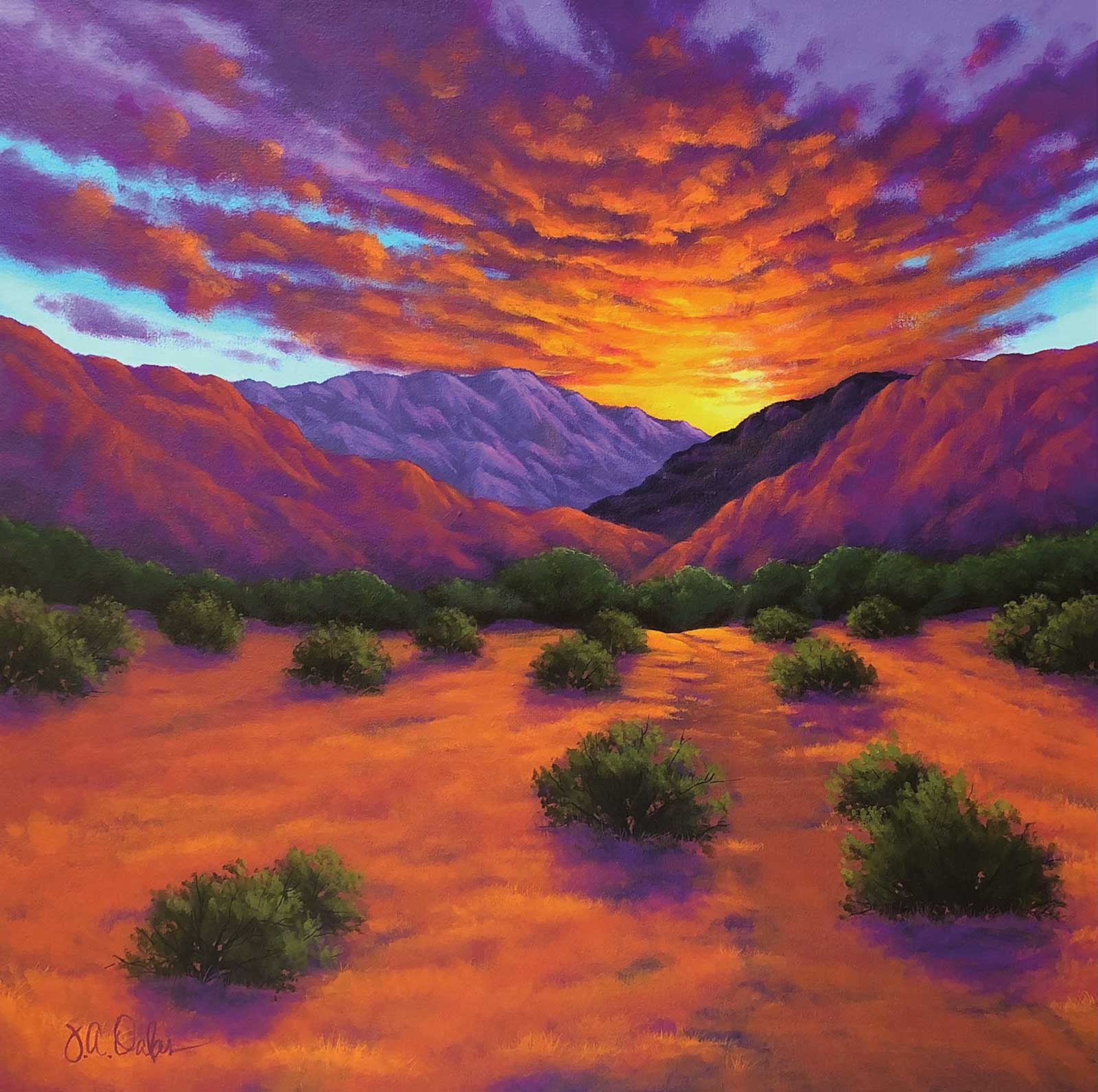
Pure Bliss, acrylic on canvas, 24 x 24" (60 x 60 cm) I saw this beautiful sunset one afternoon but didn’t have my phone to take a picture or my sketchbook. When I returned home I did a quick sketch of the sky. Later I added the mountains and foreground from some of my other reference photos.
Each composition starts with an image—somewhere I’ve been, something I’ve seen or a photo I have taken. In my mind I immediately start to break down the scene, thinking about the distance and volume of the shapes. But for me, the real key is a sense of movement and leading. I love movement; the pull of things moving back in space or a path leading you into the distance. Cast shadows, groups of rocks or vegetation push the viewer to wonder what’s beyond. Sometimes I can only achieve this through using multiple reference images in order to keep the composition interesting. Adding what I think the scene needs that nature has not provided. Making you feel as if you can walk into one of my pieces or put yourself into that place and time, even for just a moment, is my wish.
I love warm colors, and so I paint with them to evoke feelings of the first brilliant seconds of sunrise and the last fiery moments of sunset. I express those feelings through the use of bold, vibrant highlights and shadows of violet hues. I want my paintings to be bold, happy and alive! The colors of nature are not meant to be mimicked but emphasized. The color must call out to you and make you realize what you have been missing. No one knows the true color of things, all beings see things differently. But color and the emotions they evoke can be felt by all.
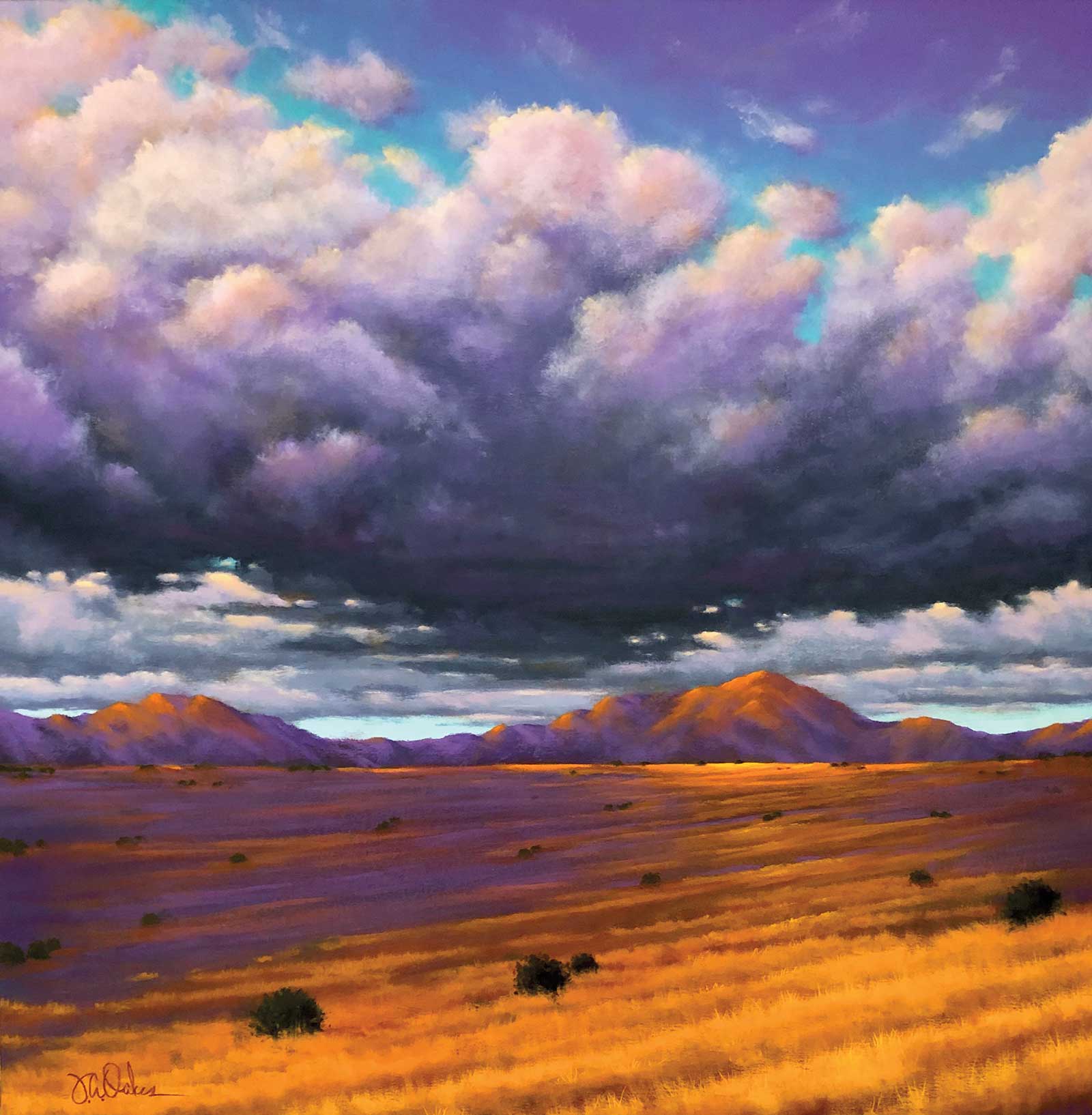
Storm’s Edge, acrylic on canvas, 30 x 30" (76 x 76 cm) So many times the inspiration for a painting is something I see when I’m driving. These fleeting moments have a similarity or familiarity that makes them seem, to me, underappreciated. This painting is a combination of so many landscapes driving in rural, wide open places.
Over many years I have developed the very specific palette of colors that I use. It started with primary colors and experimenting with different color schemes. Once I had my favorite scheme, I searched for colors that were similar to the color mixes I was making with primary colors. And even though I’m using a color scheme, I like to push the limits of that by using every version of those colors and maybe even a few that are unexpected. This way I can keep the artwork exciting for the viewer but also for myself as I paint it.
Art is something different for everyone. Not just the casual viewers, art lovers or critics, but for those of us that choose to create as well. Each artist is on a journey to find their unique voice; what they paint, how they do it and why. I paint landscapes because I love nature, the earth and natural scenes of mountains, fields and trees. I appreciate our connectedness and dependence on the earth as well. Focusing on composition and color is a means to an end. Creating interest with composition, and sometimes even controversy with color, is what I do. All this is done in the hopes that it will slow us down, all of us, just long enough to appreciate nature and everything it has to offer. Every painting is a challenge to examine or reexamine the colors of our world and reconnect with mother nature. Take the journey with me and enjoy the beautiful colors!
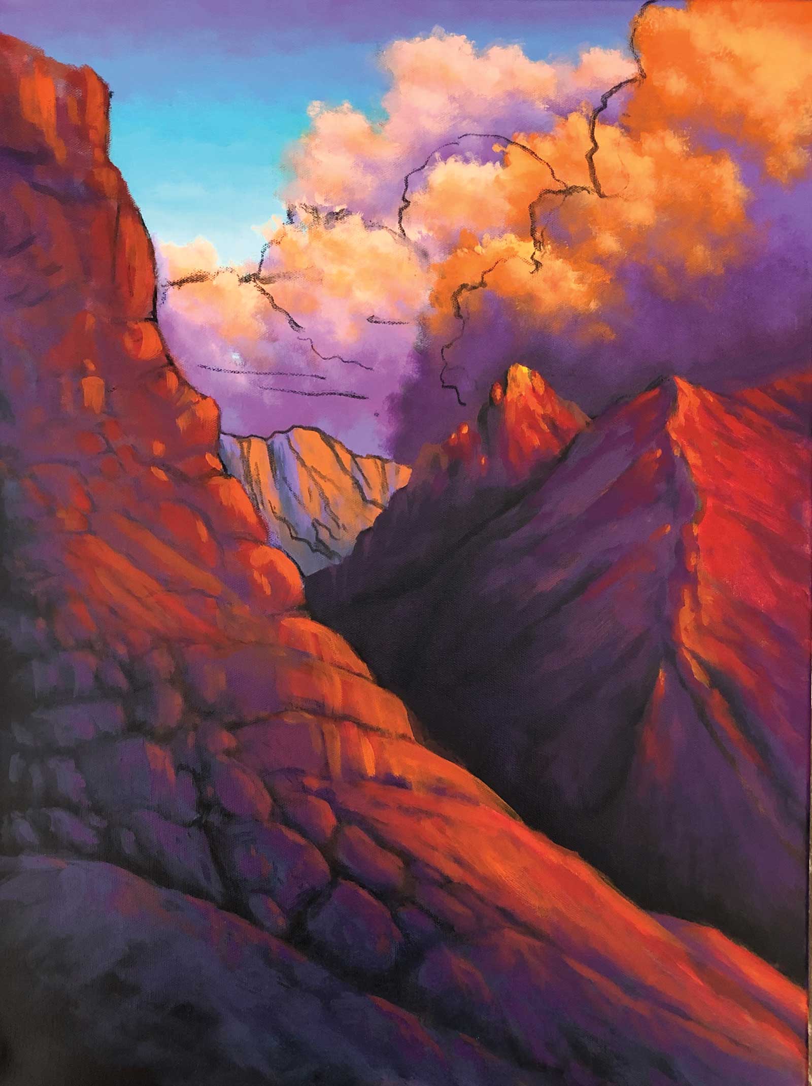
My Art in the Making Sunset Peak
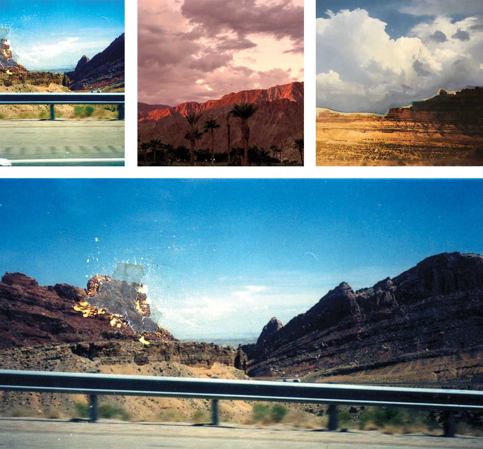
Reference Photos
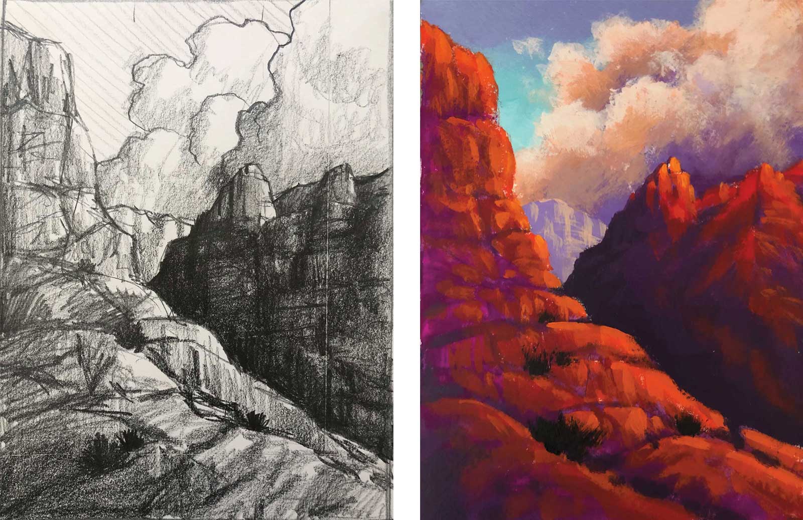
Left: Sketch; right: Color study
My Design and Composition Tactics
- Always have a focal point, a place to lead the viewer. Use the rule of thirds and never place the focal point in the center of the piece.
- Be sure that the major areas of the painting (background, middle ground and foreground) aren’t the same size and/or carry the same weight.
- In the beginning of the design process simplify all of the shapes. This is important in determining if balance, distance and movement are being achieved. It’s not about what is being painted, it’s about how the shapes are working together.
- As lines and shapes move off of the canvas, they should turn upward. Upward turns bring the viewer back into the painting, downward leads them out and away.
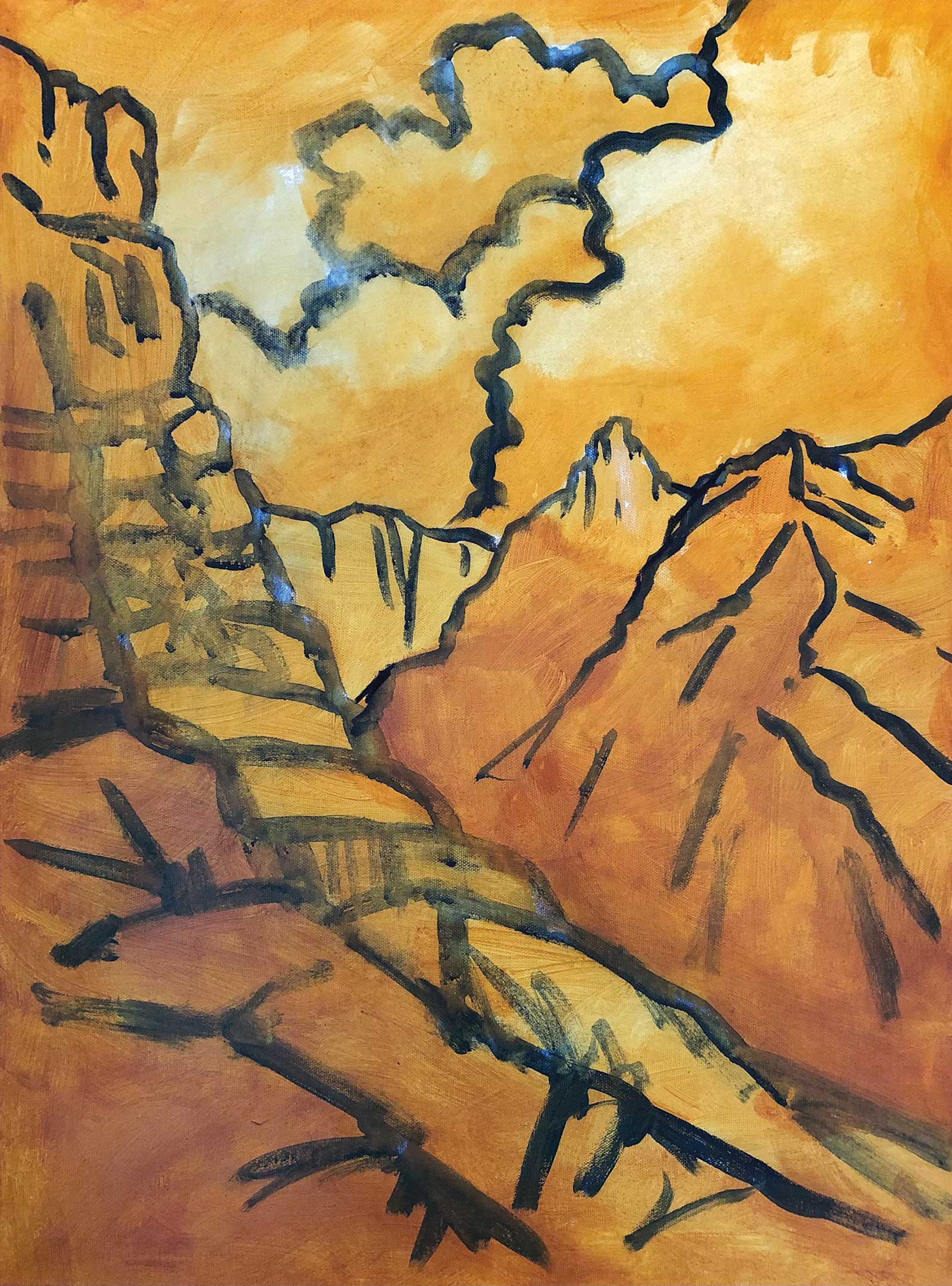 Stage 1
Stage 1 Underpainting in Earth Tone
The entire canvas is underpainted in a transparent earth tone, followed by sketching it in vine charcoal and painting over the lines when I’m sure I am happy with them.
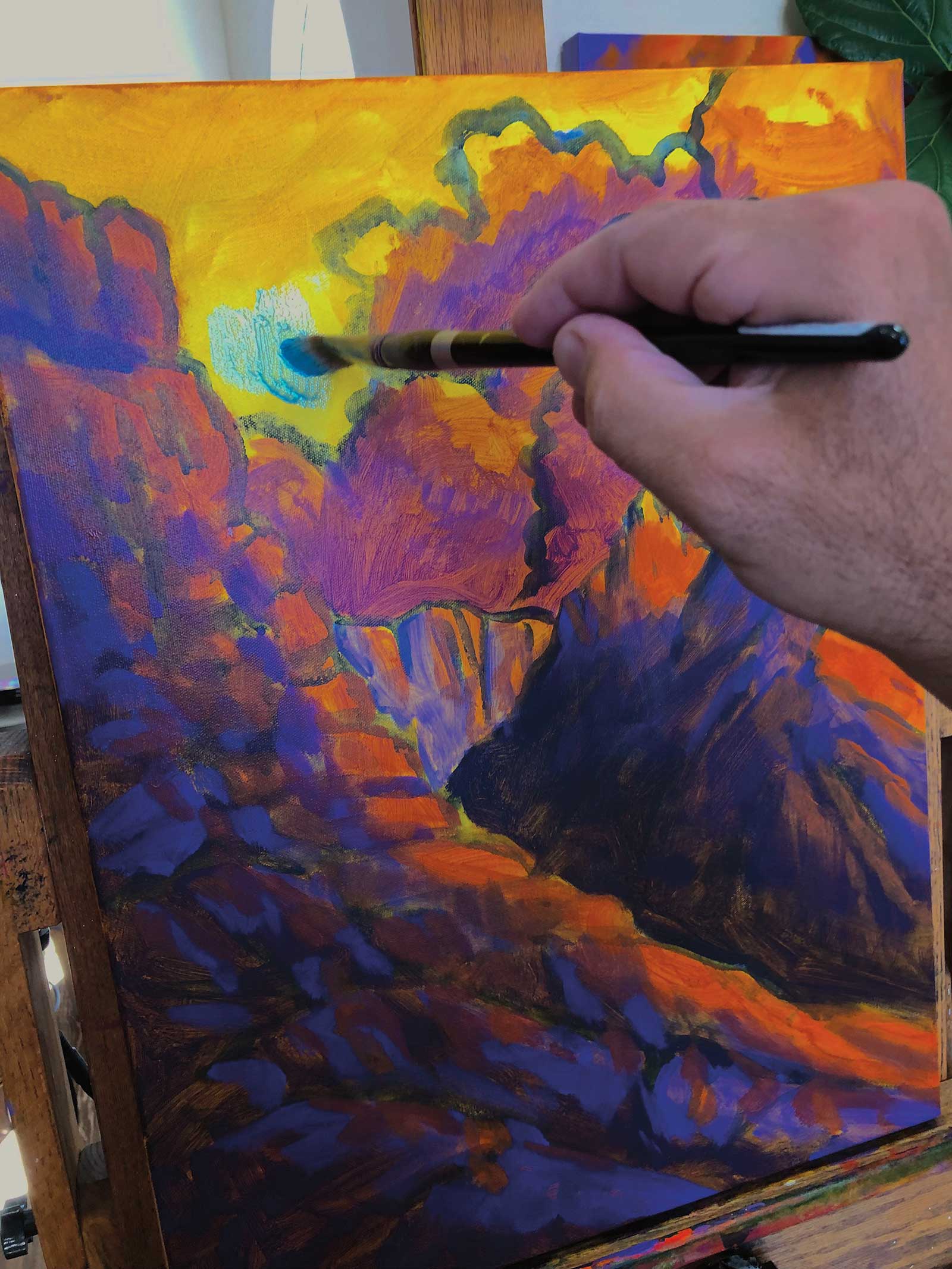 Stage 2
Stage 2 Blocking in Color
I’m using one of my larger brushes to fill in quickly. I’m not trying to be accurate or have clean mixes, I just want to see how the colors come together.
 Stage 3
Stage 3 Layering the Paint
All the areas are filled with layers of paint using the typical colors on my palette. Once dry and I’m happy with them, I move on to the next stage.
 Stage 4
Stage 4 Volume and Dimension
Next, I fll in areas with heavier layers of paint adding volume and dimension in some places and reworking the shapes in others. I’m always making sure I’m happy with the shapes and their relation to each other.
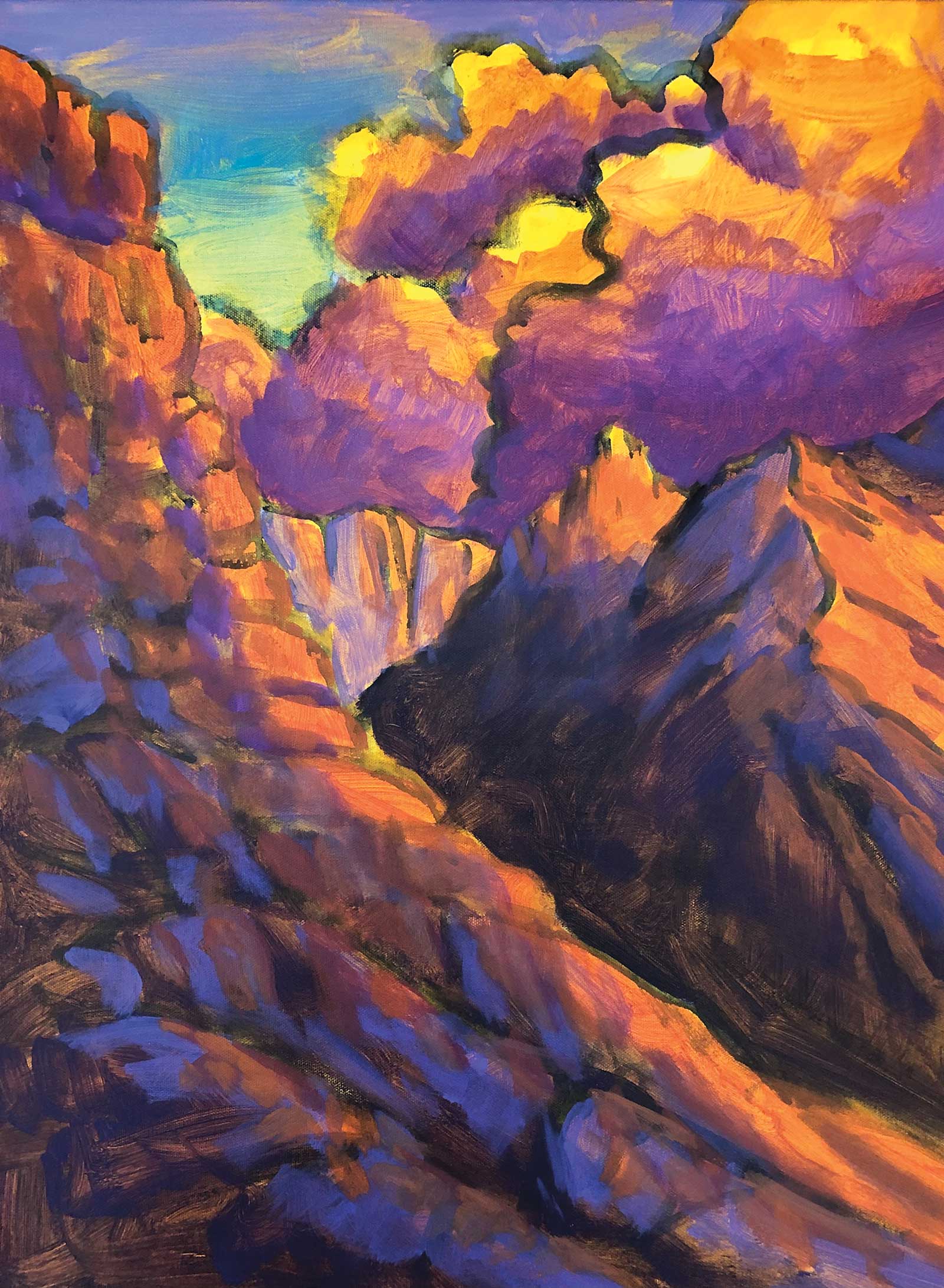
 Stage 5
Stage 5 Reworking The Composition
Once all the areas have at least a dark, mid and light tone, I’ll rework the composition a little to try and create more interest in areas and merge others that seem too busy.
 Stage 6
Stage 6 Little Adjustments
Most of the areas have been reworked, so it’s time to add some vegetation in the foreground, give some areas more definition and rework some of the shadows and/or highlights.
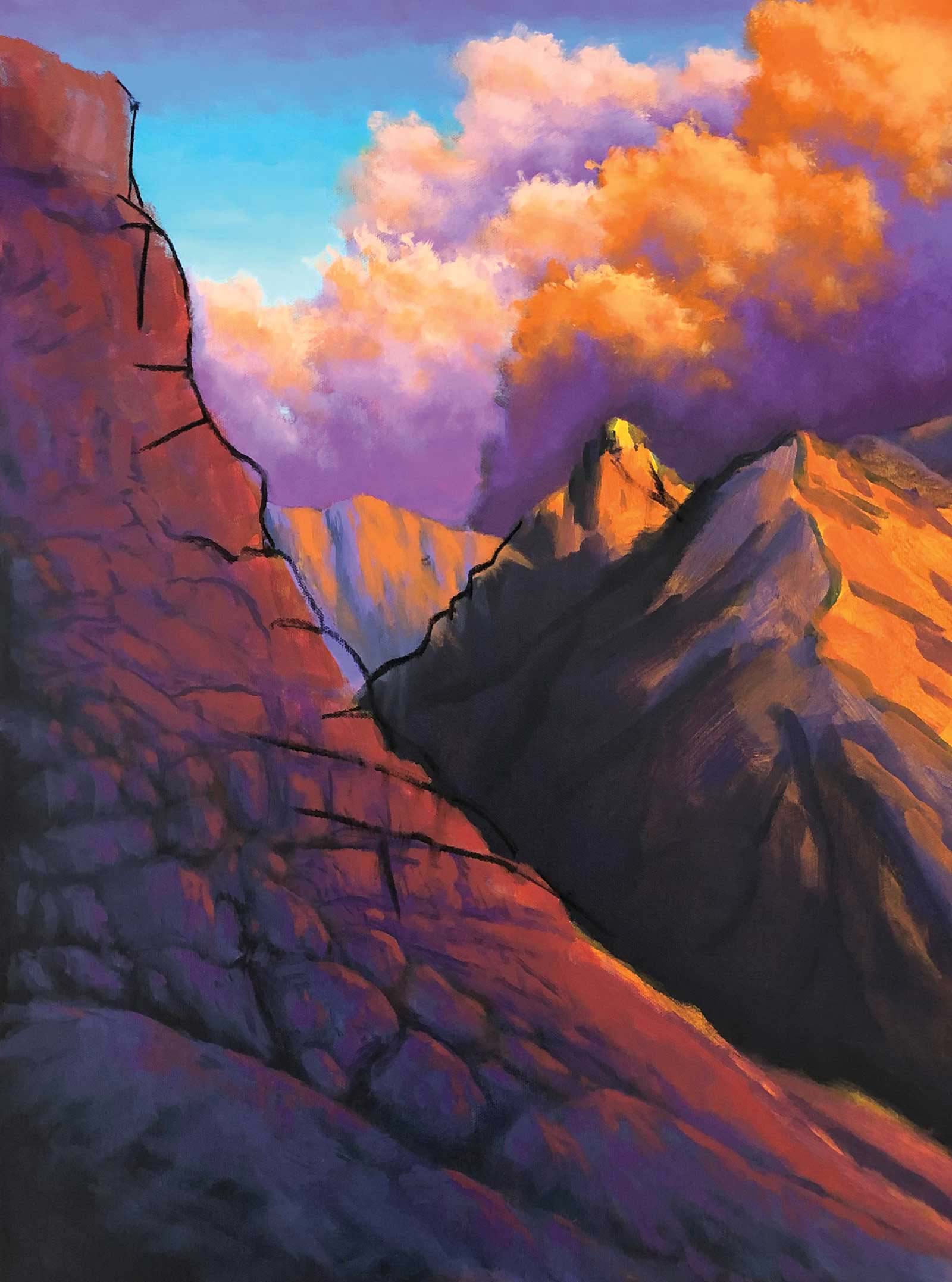
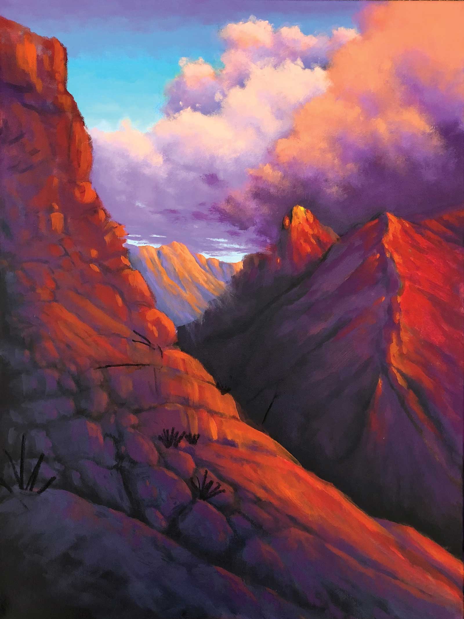
Stage 7 Finished Artwork
Sunset Peak, acrylic on canvas, 18 x 24 x 1½" (45 x 60 x 3 cm)
I’ll take a final look to make sure all the colors transition well, check the shapes again and then add maybe one last splash of highlight colors in very specific areas for maximum impact.
About the Artist
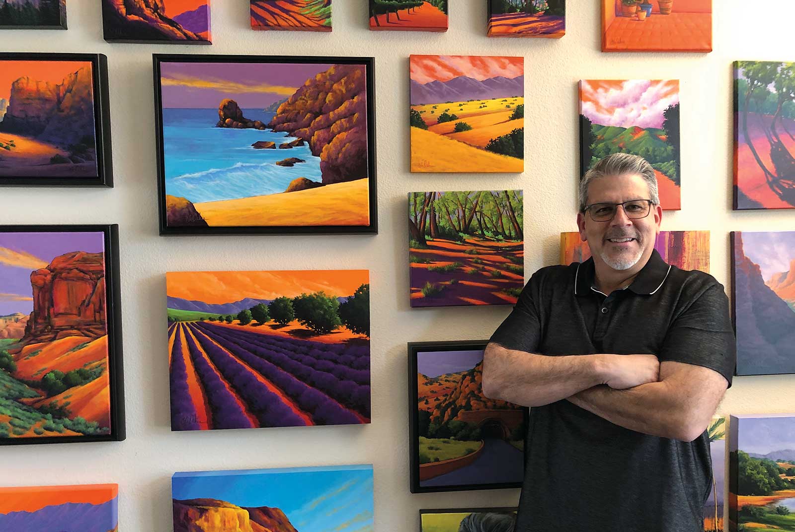 Joe A. Oakes
Joe A. Oakes has been painting full time since 2008 and teaching since 2010. He has survived cancer and the loss of a child and has used these life-changing events to propel his art career forward. His landscapes burn with the excitement of bold, bright color and draw on scenes from all over the United States but especially the Southwest and California. Oakes’ work offers a new perspective on color and place while offering a meditative sense of calm, happiness and reverence for the land. He has been included in many shows and has won numerous awards including the Distinguished Artist Award, City of La Quinta, California, and First Place Award in the Visions exhibition at Chaffey Community Museum of Art in Ontario, California. His work was also included in the 11th annual SLOPOKE Fine Art of the West juried exhibition and sale in Solvang, California, last fall.
Represented by
Romero Street Gallery, New Mexico, USA, www.romerostreetgallery.com
Van Gogh’s Ear Gallery, Arizona, USA, www.vgegallery.com
Contact at
joeaoakes1@gmail.com
www.joeaoakes.com