


For the last seven years, I’ve enjoyed the opportunity to concentrate on studying and making art. Of the several mediums I’ve explored, colored pencil has become my favorite. I work in a realistic style and colored pencils allow me to produce fine details as well as large areas of luminous color. Colored pencil can be drawn to look like other mediums such as oil paint, watercolors, pastels and photographs, prompting exclamations of “that’s colored pencil?!”
My goals for a drawing are not uncommon. My hope is to capture a mood, or tell a story, or portray beauty, or something unusual—or all of these into one great picture! I’ve drawn still lifes, animals, portraits, landscapes and interiors. If I’ve concentrated more on one category than others, it would be interiors like the one in this demonstration. A room and its furnishings can set a mood or tell a story about the people who live in them. When drawing interiors, I generally use a palette that includes white to portray light streaming from windows and deep darks for shadows to set the mood and add drama.
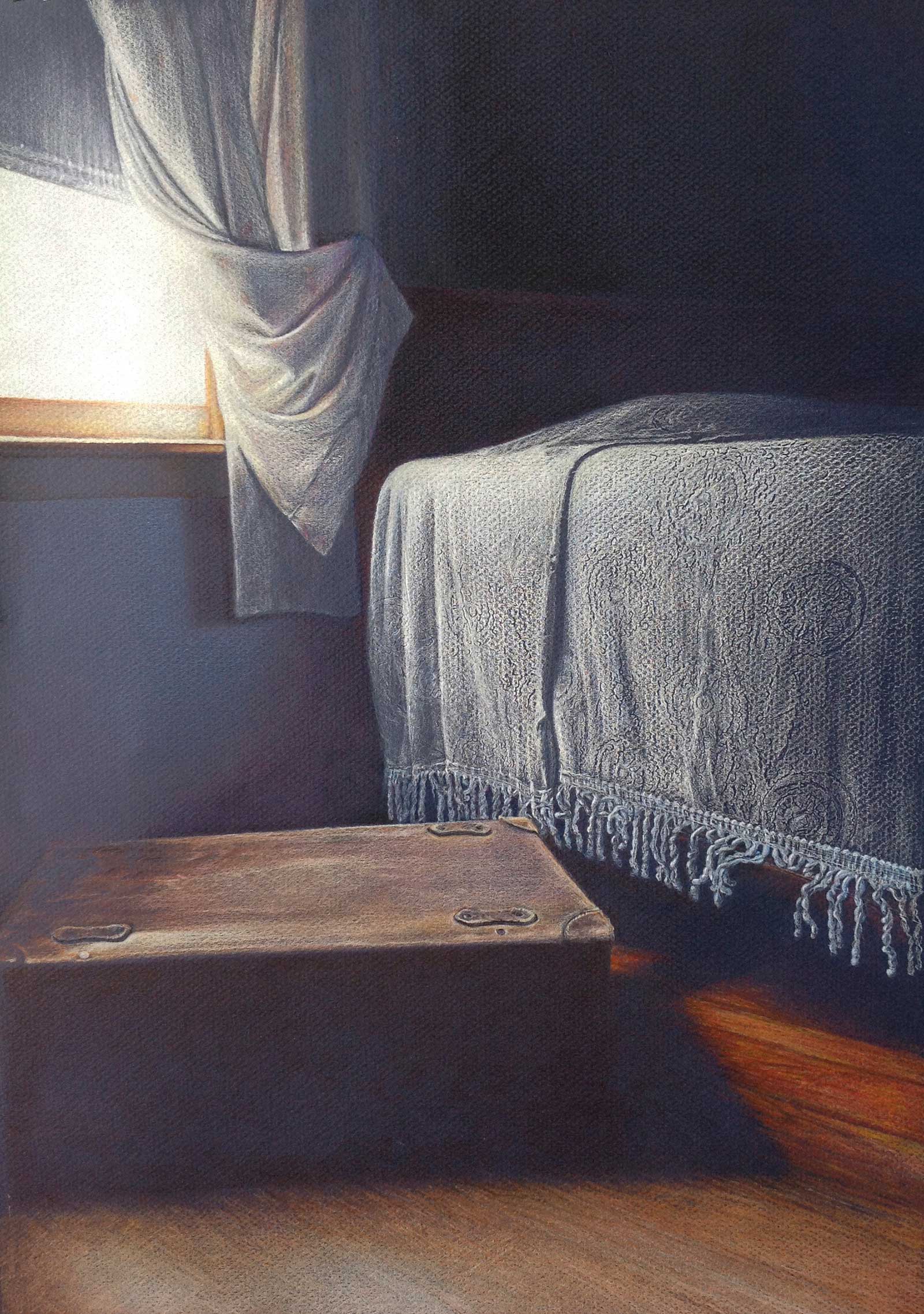
Opal’s Room, colored pencil on dark blue Mi-Teintes paper, 18 x 14" (45 x 35 cm) Light shines into my grandmother’s bedroom onto an old-fashioned bedspread telling of her thriftiness and onto the leather trunk telling of her leaving. Using the textured side of dark blue Mi-Tientes paper. the chenille bedspread’s texture was created by first indenting the circular designs into the paper. Layers of light blue pencil over the area revealed the paper’s texture and the indented circles. The treatment of the bedspread often brings praise and sentimental comments.
Drawing exclusively on paper, I often choose colored paper. A favorite is Canson Mi-Teintes, which has a vellum texture or “subtle roughness” on the top side and a flatter surface on the reverse. The side I use depends upon my subject and technique. The vellum side takes more pencil to fill the “grooves” of the paper and can be used to render interesting textures. The bedspread in my piece Opal’s Room is an example of using the paper to create the texture of an object.
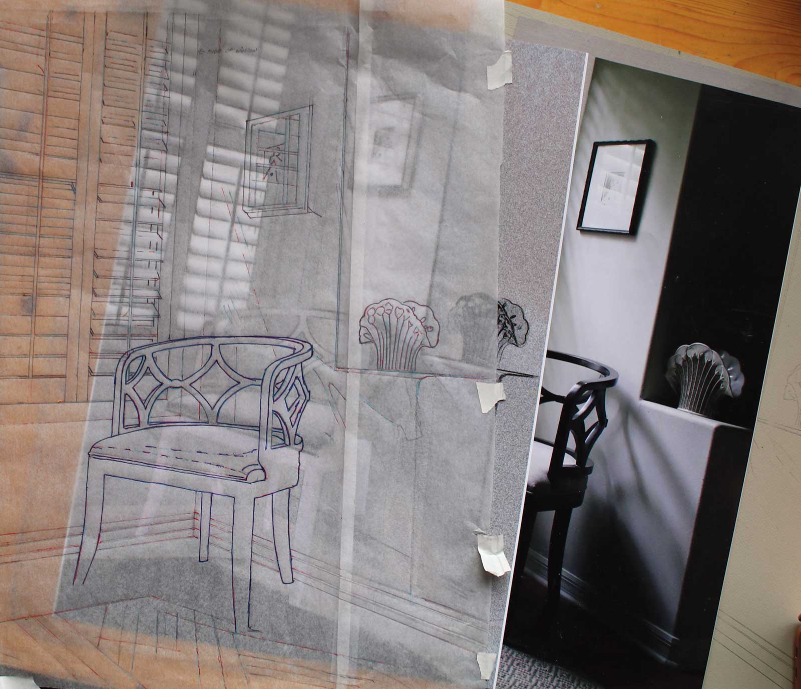
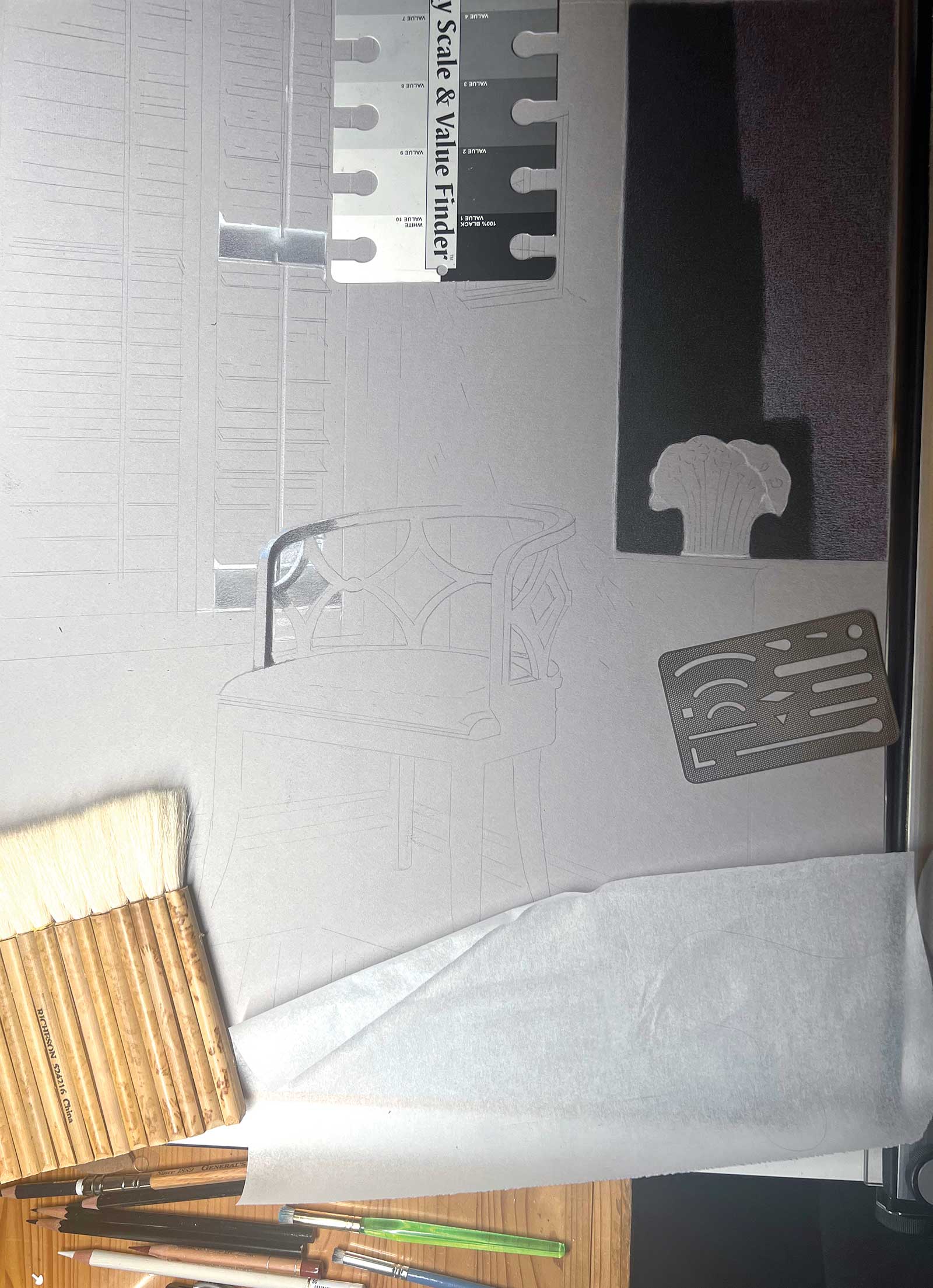
Generally working from reference photos, my process follows the steps described in the demonstration below. First, I take many photographs of the subject. Using Photoshop, I work out the composition, values and hues. The next step is to transfer an outline of the subject onto the drawing paper. This is done by a combination of tracing and freehand drawing. From there the fun begins with determining which pencils to use and testing them on the paper. Next, I begin laying in the darkest and lightest values using thin layers of pencil. At this point, I avoid getting into the detail of each element one at a time and rather work throughout the piece to ensure an overall consistency of technique and color.
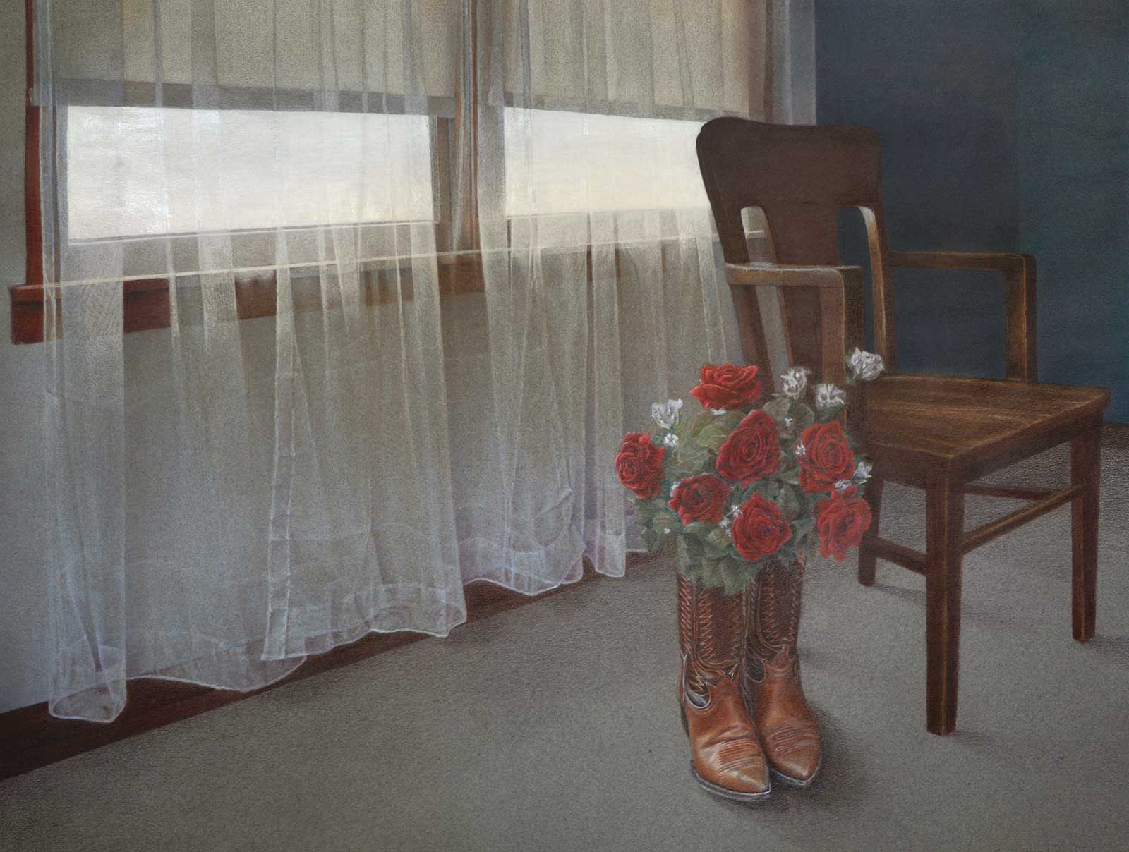
Dad’s Boots, colored pencil on medium gray Mi-Teintes paper, 19 x 25" (48 x 63 cm) Keeping my grandfather’s boots by the chair he sat in every morning to put them on, my grandmother placed roses into them as a memorial. To cover gray paper, the curtains and shadowed wall were underpainted using Caran d’Ache Aquarelle pencils. The windowsill, white flowers and isolated use of red are meant to direct the viewer to the bouquet and boots. The backlit white curtains rather steal the show and elicit the most comments.
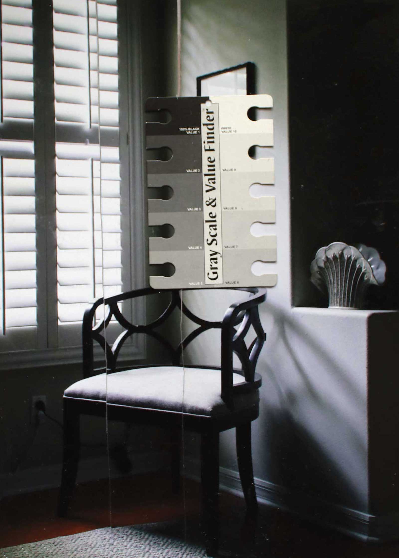
As I work through a drawing I check for correctness of perspective, lens distortion and other mistakes. As a drawing develops, I can become so involved in the images that it is easy to miss distortions. I use the advice from other artists to look at a piece in the mirror or upside down to help identify errors. For example, using the mirror test on a portrait I’d put hours into, I was chagrined to find I’d misplaced one eye much higher than the other. Drawing man-made objects realistically requires strict symmetry. In my drawing Middle Age I used the “folding method” to test the symmetry of the crystal vase in the drawing by tracing one side of the vase from the center line to the edge. Then folding the paper along the vase’s center, I compared the tracing to the other side.
As reminded by nearly every instructor, book and video, composition can make or break a drawing no matter how well its other elements are done. This is a challenging technical issue that I continue to study. The composition of many of my drawings places the center of interest in the lower left third of the picture. One of my drawings, The Whole Summer Ahead, in which a figure emerges from the left into a swimming pool, is an example of using composition to tell a story in a picture.
My Art in the Making The Corner of Her Bedroom
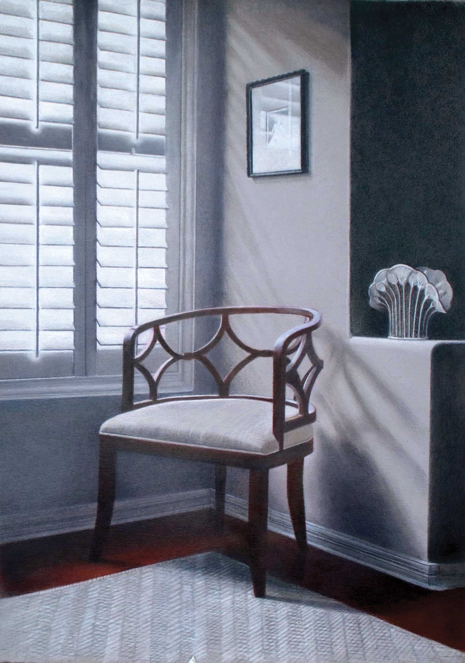
This demonstration shows the progression of a drawing using colored pencil from reference photos through the final strokes. A limited palette of white, black, grays and burnt sienna aims to create a mood of cool sophistication. Layers of semi-transparent colored pencil on gray paper define some of the objects while the paper is left bare for others. The palette is primarily of grays intended to create a gracious and sophisticated atmosphere dramatically lighted by sunlight through a window.
My drawings of interiors are intended to convey an impression or sense of those who live in them. The use of bright light from windows highlighting the subjects and dark shadows provide drama. Titles for my drawings are often important in communicating something about the story. This drawing’s title, The Corner of Her Bedroom, conveys that it is a woman’s bedroom which isn’t clear simply from the drawing alone. Light spills through shutters into a corner furnished with a carved chair. The muted color of the room’s walls, the chair, and the fluted vase are meant to convey a gracious decor. The cool overall tone is suggestive of a reserved woman and the corner’s furnishings look as if they were chosen for style rather than strictly for comfort.
The nearly monochromatic palette of black, white and grays intends to indicate a cool refinement of the space. To add color and a bit of warmth, sienna and dark brown are used for the floor and chair. The curved shape of the chair and vase contrast with the otherwise rectangular elements of the room. Except for the rug, the objects in the drawing have hard edges. The rug’s soft lines and suggested detail of pattern intend to provide texture and counterbalance to the plain surfaces of the other elements.
My Design and Composition Tactics
Important elements used to create my style of realism are color palettes to emphasize mood, light sources that enhance and dramatize the objects, and compositions that lead the viewer through the drawing.
 Stage 1
Stage 1 Assessing Photo References
Many photos are taken of a subject. The final composition may be elements from several photos Photoshopped into one. Care is taken to remove lens distortion as drawings are diminished if it is unintentionally copied.
 Stage 2
Stage 2 Sketching and Transferring the Drawing
The final photo is printed to actual size (A4) in color and black and white. Main shapes are copied onto tracing paper and transferred to the drawing paper taking care to avoid indenting the paper.
WHAT THE ARTIST USED
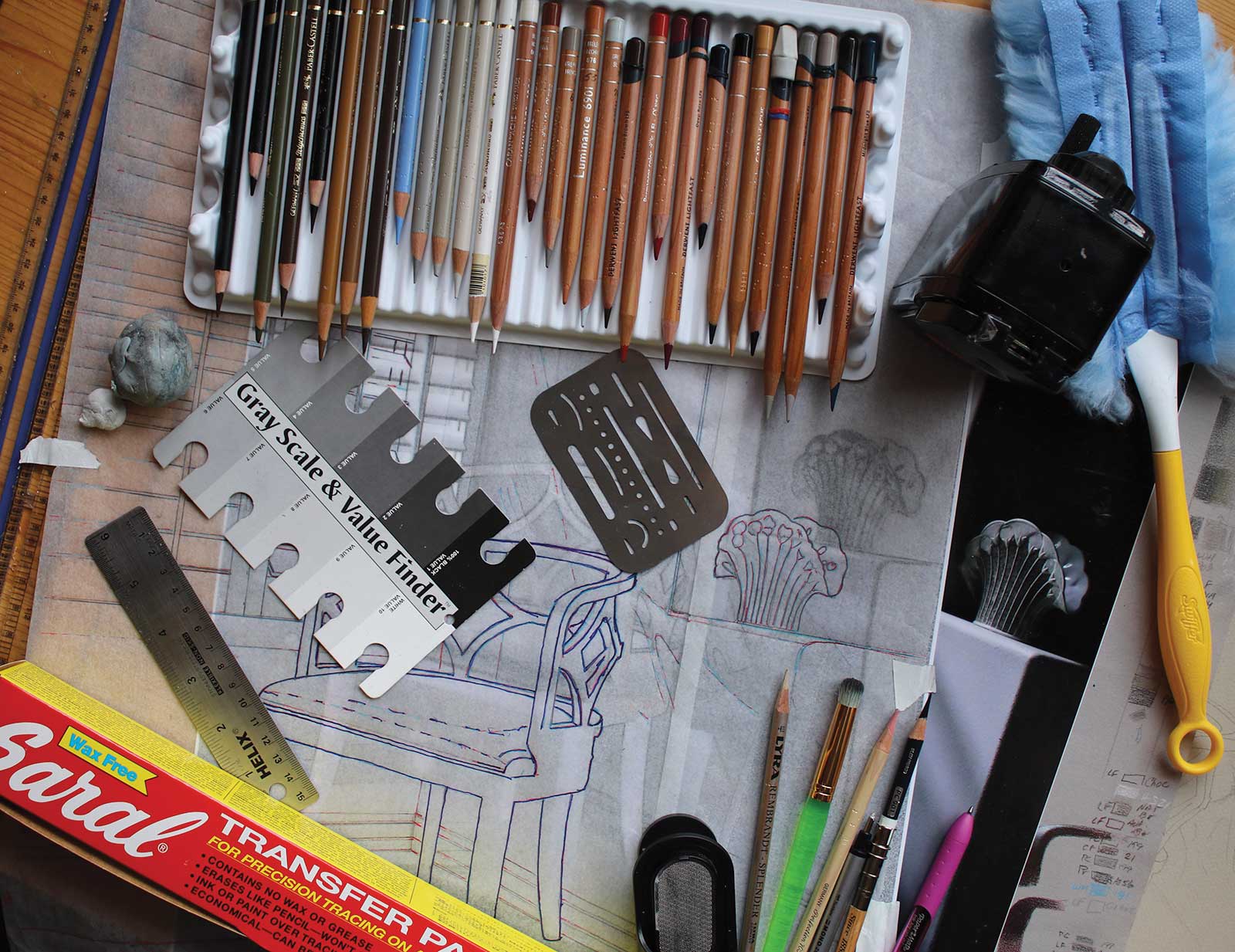
Derwent Lightfast Colored Pencils
Warm gray, Fossil gray, Autumn brown, Dark indigo, Chocolate, Midnight blue, Black
Faber-Castell Polychromos
White, Warm gray I, Warm gray II, Warm gray III, Sky blue, Walnut brown, Burnt umber, Raw umber, Brown ochre, Earth green yellowish, Black
Holbein Artists Colored Pencils
Warm gray 1, Warm gray 2, Warm gray 4
Derwent Chromaflow
Black, Natural brown
Caran D’Ache Luminance
White, Silver gray, French gray 30%, Brown ochre 50%, Russet, Burnt sienna, Cherry red, Black
Prismacolor Premier
White, French gray 30%, French gray 70%, Warm gray 30%, Warm gray 90%, Beige sienna, Terra cotta, Espresso, Prismacolor verithin, Cool gray 70%, Dark umber, Black
Additional Materials
Mi-Teintes paper in flannel gray, Pencil sharpeners: Derwent hand-crank and Tenwin pencil grinder, Erasers: TomBow mono Zero, Vanish Four in One, Faber-Castell Perfection and Scotch tape, Tracing paper, Saral transfer paper in blue, Swifter and Hake brushes, Pencil extenders, Stencil brushes, Draftsman’s aluminum template
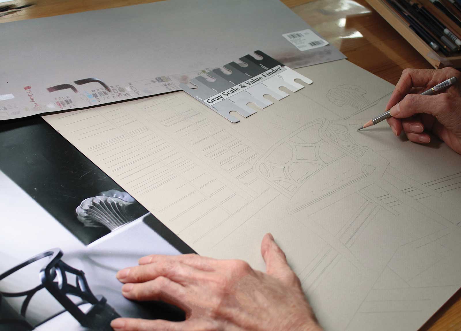 Stage 3
Stage 3 Refining the Drawing
In this stage details not transferred during the tracing are further defined. Working throughout the drawing, I lightly sketch the position of shadows, true up shapes and add more details using a light gray pencil.
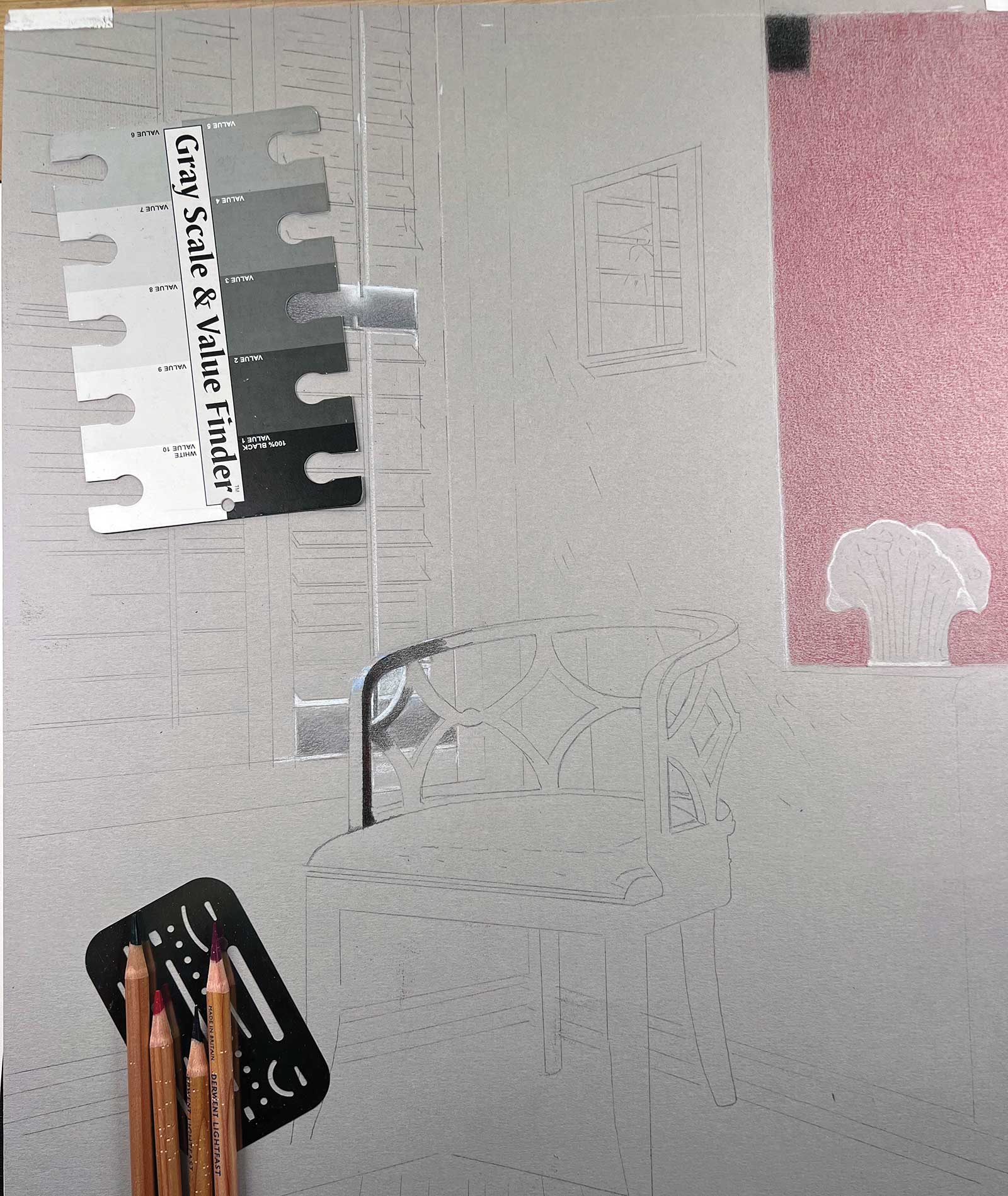
 Stage 4
Stage 4 Determining Values
The lightest and darkest grays are found on the black and white photo so that middle tones can be determined. A “colorful black” will be created with layers of red, green and indigo blue pencil.
 Stage 5
Stage 5 Shadows and Edges
Green will be layered over the red layer to create the black shadow. The chair curves are defined using a draftsman template for sharp edges. Marks are made carefully as they are difficult to erase.
 Stage 6
Stage 6 Final Layer of Shadow, plus Burnishing
The final layer of the black shadow, indigo blue, is applied. Then the area is burnished with a stencil brush (green brush in the photo). Burnishing mixes and pushes the color into the paper’s texture.
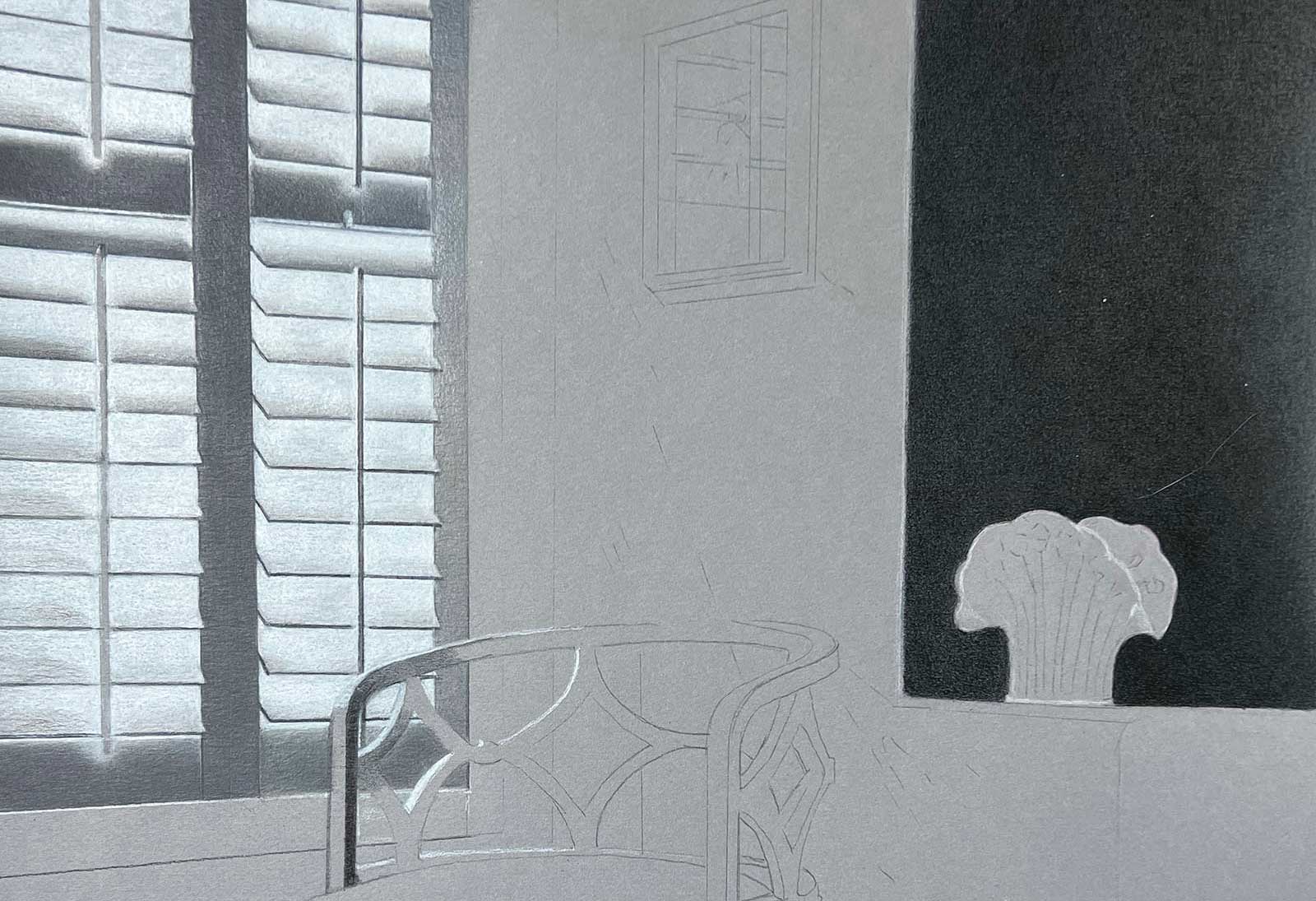 Stage 7
Stage 7 Working on Shutters
Creating bright whites with semi-transparent pencil over gray paper is challenging. Using a waxy Prismacolor pencil, the shutters are colored with multiple layers. A watercolor pencil underpainting could be used to produce an opaque white.
 Stage 8
Stage 8 Filling in the Wall
The dark shadowed wall around the shutters is colored. The dark gray pencil produced pencil crumbs, which contaminated the whites. One solution would have been to isolate the white with tracing paper as I worked.
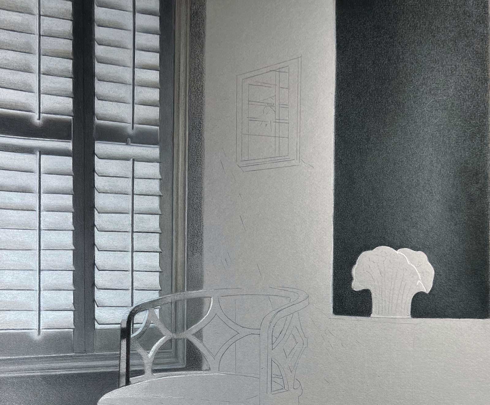
 Stage 9
Stage 9 Shadows on Shutters
Shadows from the shutters are colored with a mix of warm and cool grays. The slats in the reference photo are at different angles producing shadows that are not parallel. This may be seen as an error.
 Stage 10
Stage 10 Further Darkening
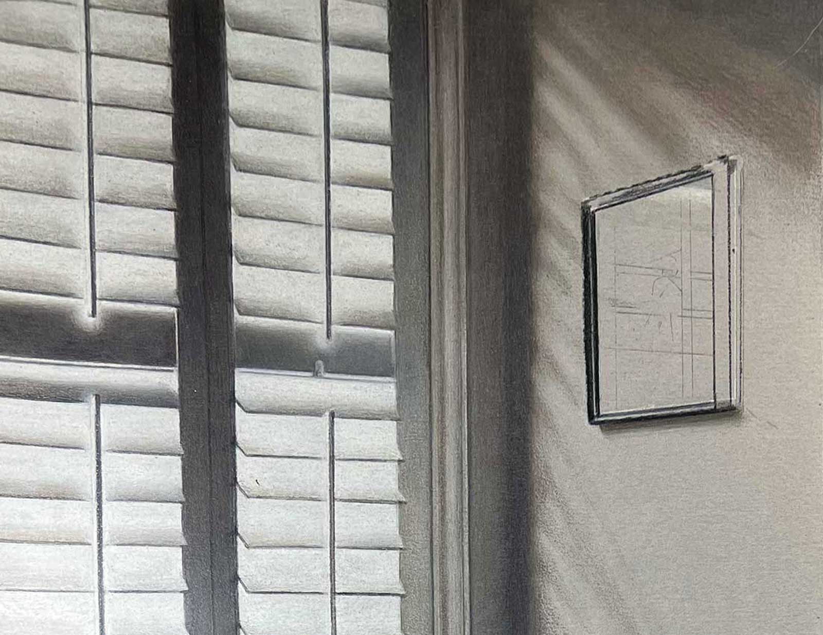
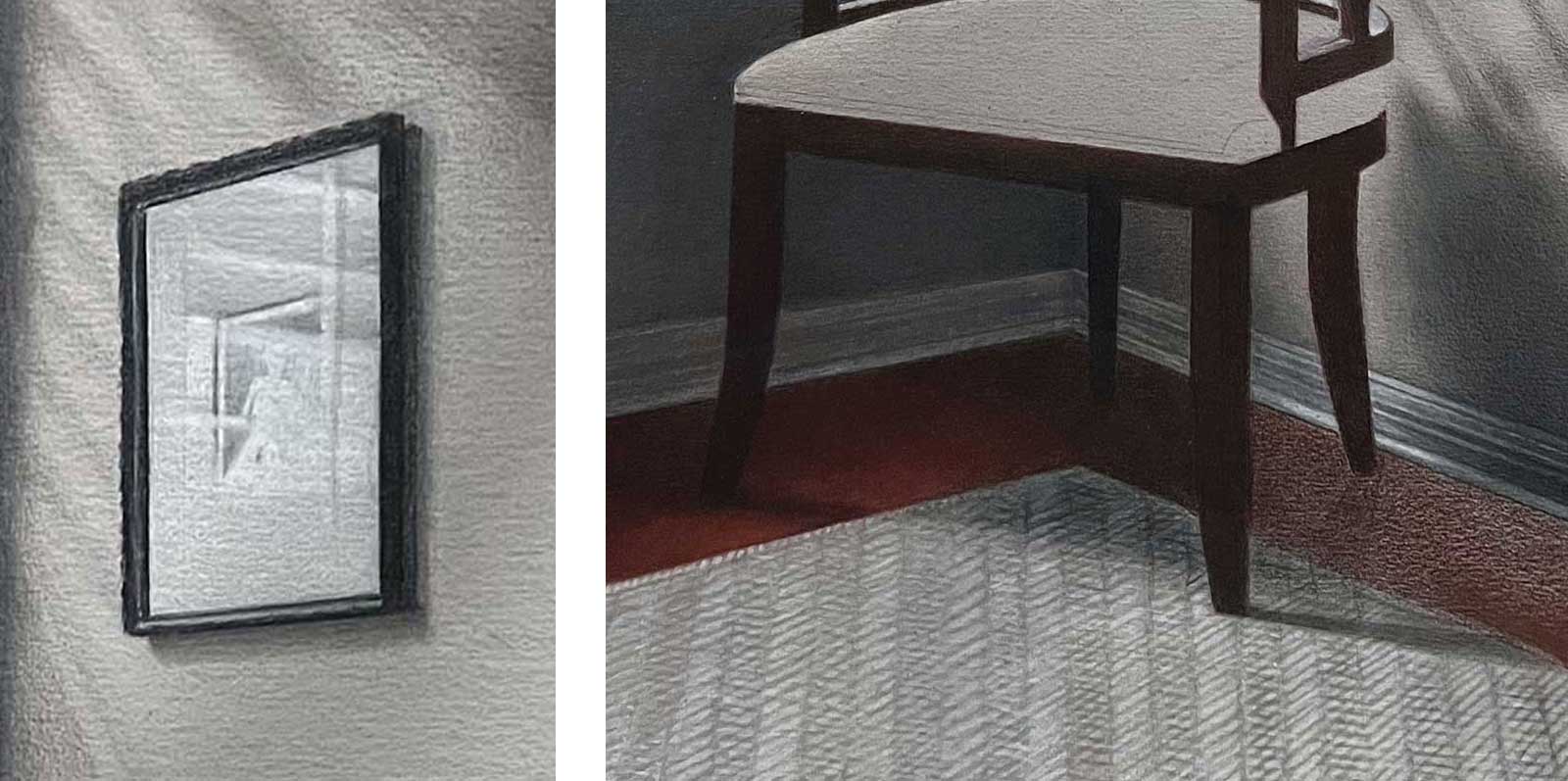
The shadows on the wall behind the chair are darkened further and drawing on the framed picture on the wall is begun. Several adjustments to the lines of the picture frame improved some perspective issues.
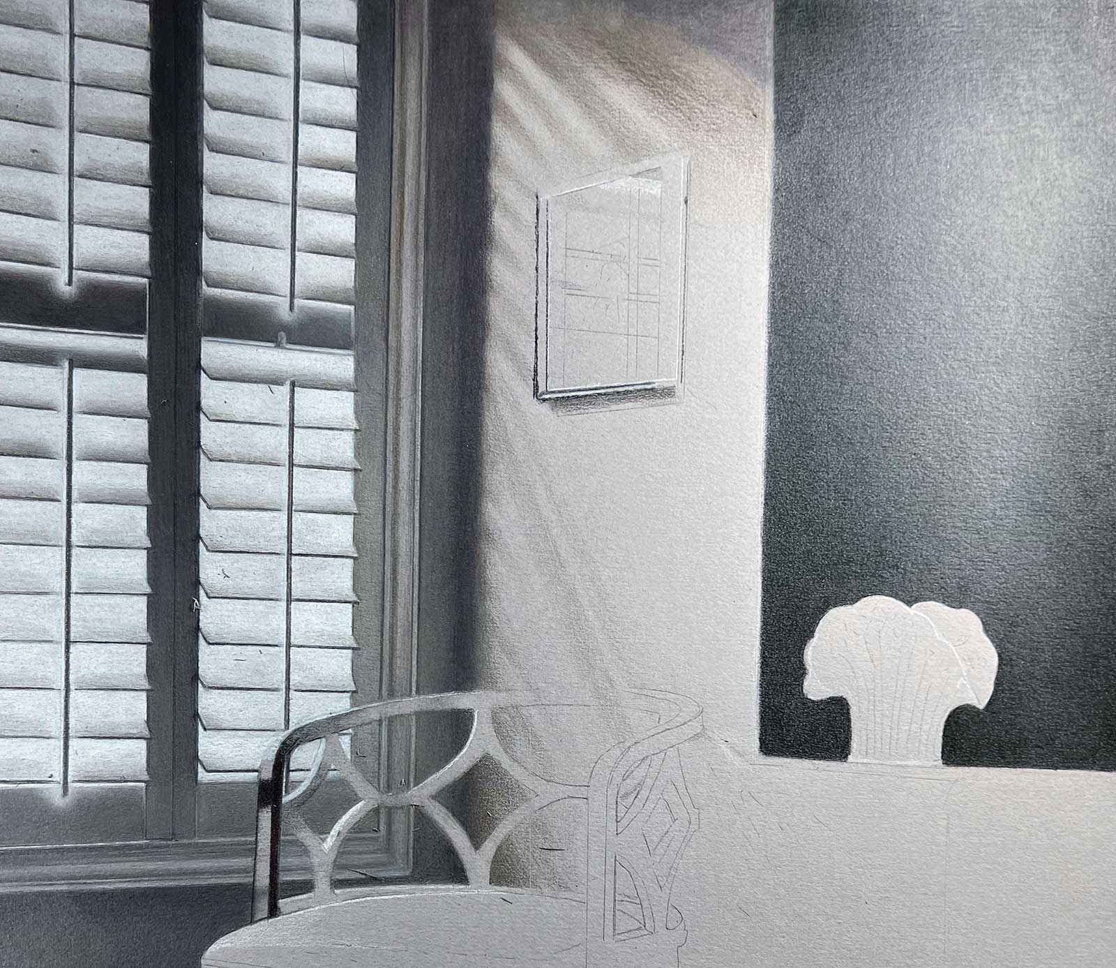
 Stage 11
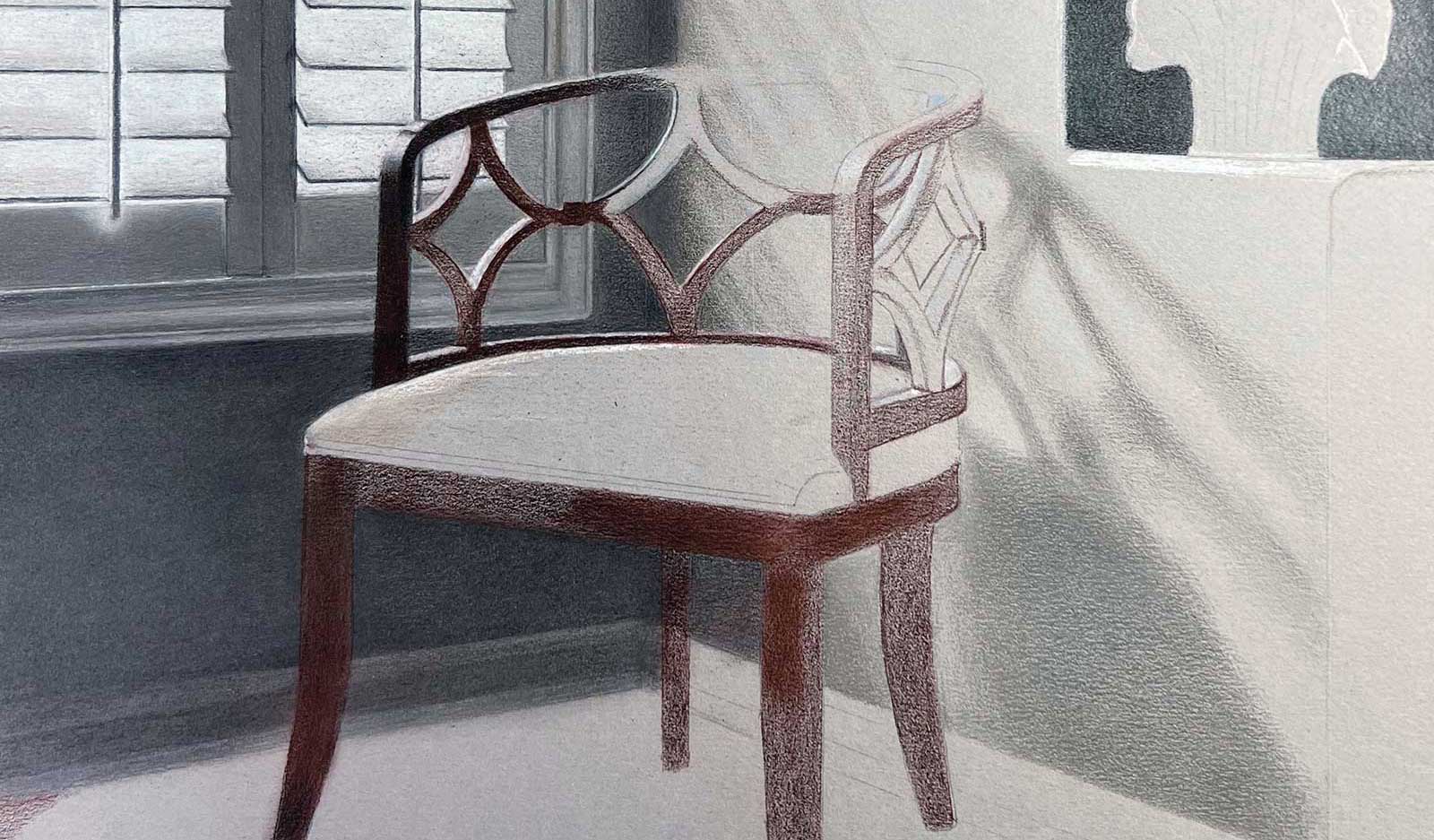
Stage 11 Reflected Color on Chair
Sienna added in the shadows on the wall behind the chair shows its reflected color. Planned as a black chair, I changed to a rich dark brown to increase the variety of the picture’s hues.
 Stage 12
Stage 12 Final Details
Details of the framed picture, floor, vase and rug are completed. The rug pattern is loosely drawn, and the lines smoothed with a Faber-Castell Perfection eraser. This treatment complements the hard edges of other elements.
 Stage 13
Stage 13 Finished Artwork
The Corner of Her Bedroom, colored pencil, 19 x 13" (48 x 33 cm)
About the Artist
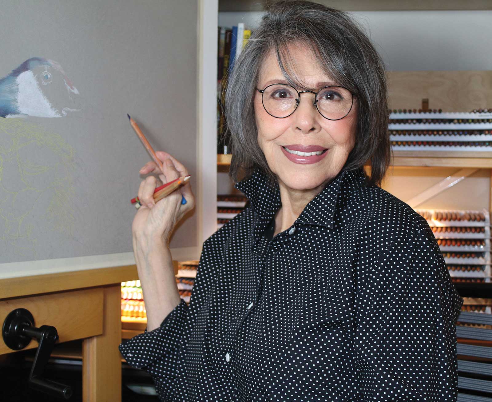 Mona Parker Weidner
Mona Parker Weidner’s first artistic success was the fuss over her realistic drawing of the circus animal border in her first grade room. Continuing drawing for fun, she eventually earned a bachelor’s degree majoring in art. Then, she took a hard “U-turn” career-wise, earning a bachelor’s in accounting, an MBA and CPA. During her business career, Weidner’s drawings were in the margins of notes from meetings. Upon retirement, Weidner enrolled in art classes for several mediums and found her affinity for colored pencils. Since then, she has been juried into six Colored Pencil of America International Exhibitions and has won Blick’s Exceptional Merit award in 2021, along with multiple other awards. She also has signature status from the Colored Pencil Society of America and serves on the board as finance director. She was recently invited to the 2022 Colored Pencil Society’s 30th Annual International Exhibition in Dunedin, Florida.