


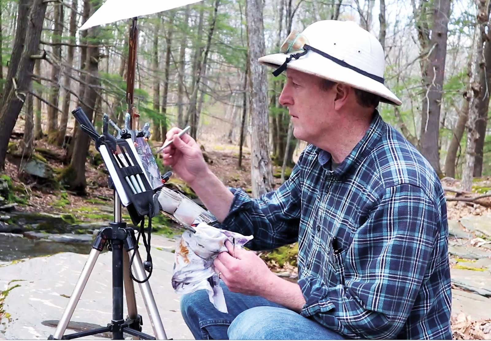
Before heading out to paint with gouache, I like to prepare the surface of a few pages or panels with different priming colors. Pre-priming a surface is a time-honored practice among oil painters, but it’s also a helpful strategy for water media painters in gouache, casein, acrylic or any other opaque medium. These base colors act like “pictorial hot sauce,” spicing up the top layers and encouraging creative handling.
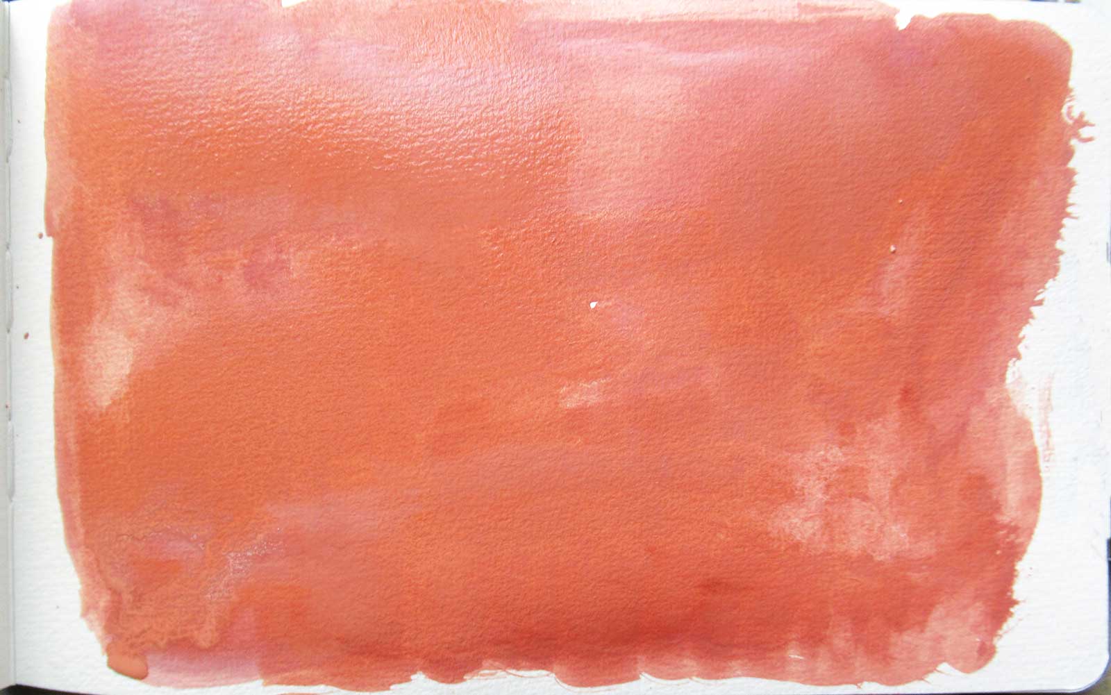 Page with red priming.
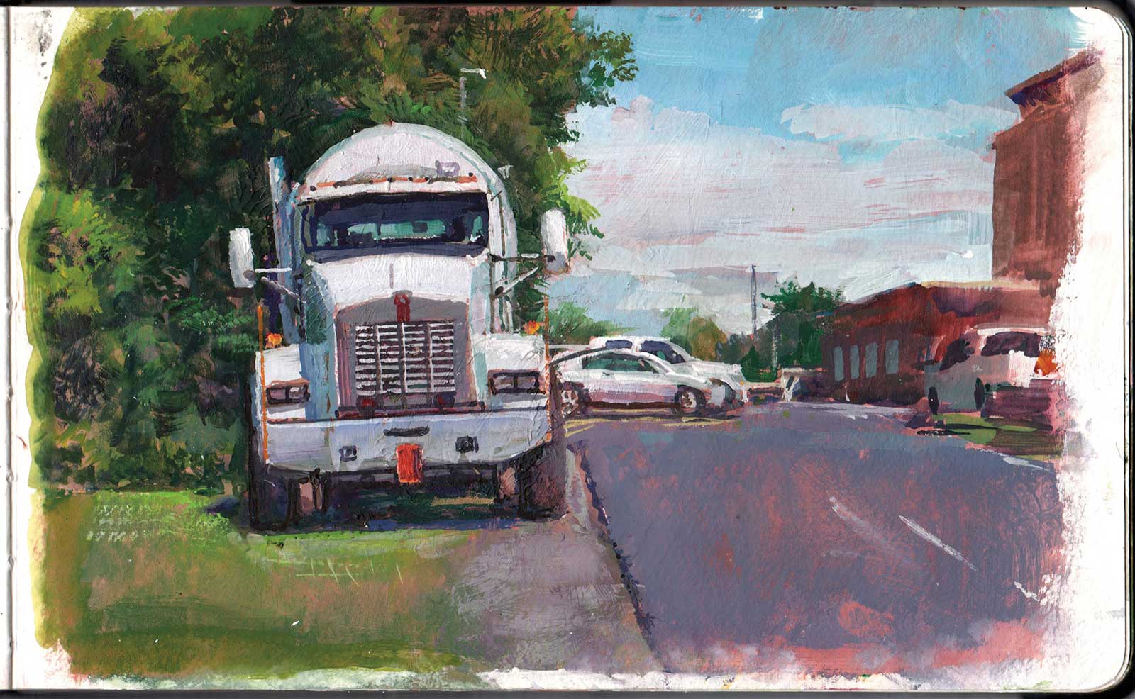
Cement Truck, gouache over pinkish-red casein, 5 x 8" (12 x 20 cm)
A Light Red Surface is Effective for Landscapes
For centuries artists have used red or pink priming for landscapes, because the reddish color provides a lively complement to the blues and greens that are prevalent in most sunny landscapes. I like to use an iron-based red-earth pigment such as light red, burnt sienna or Venetian red mixed with white to get a pale tint of brownish red. Using a red base color forces me to use opaque paints. Energy from the red priming inevitably pops through between white, blue, or green areas.
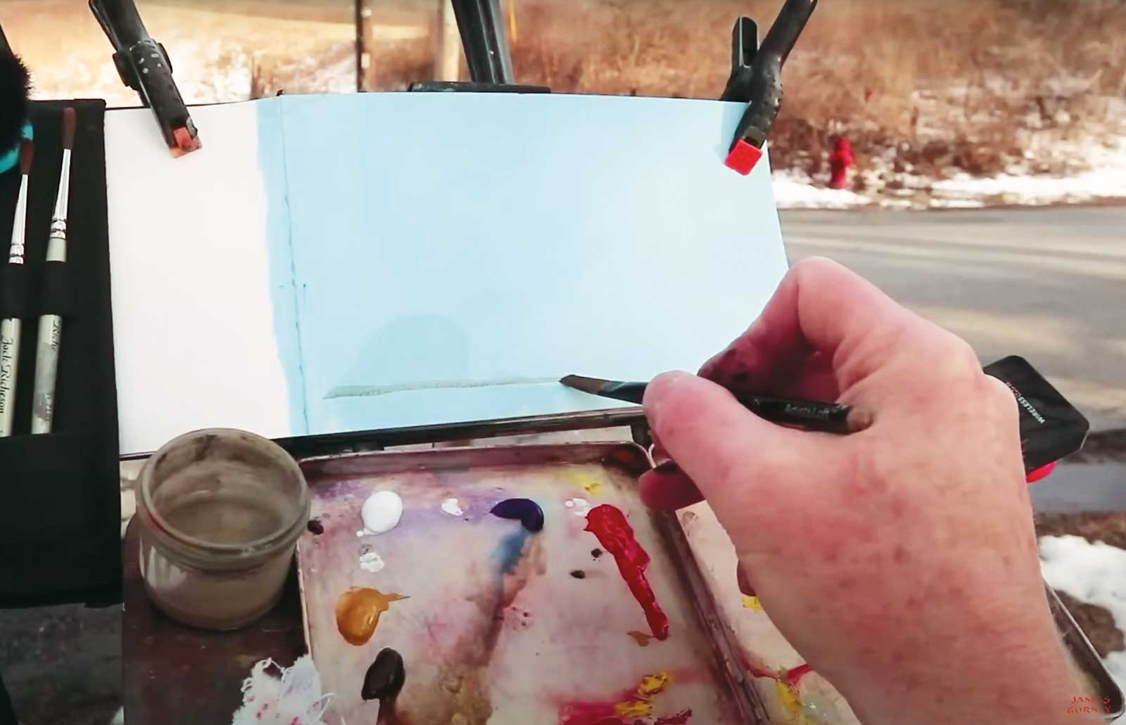
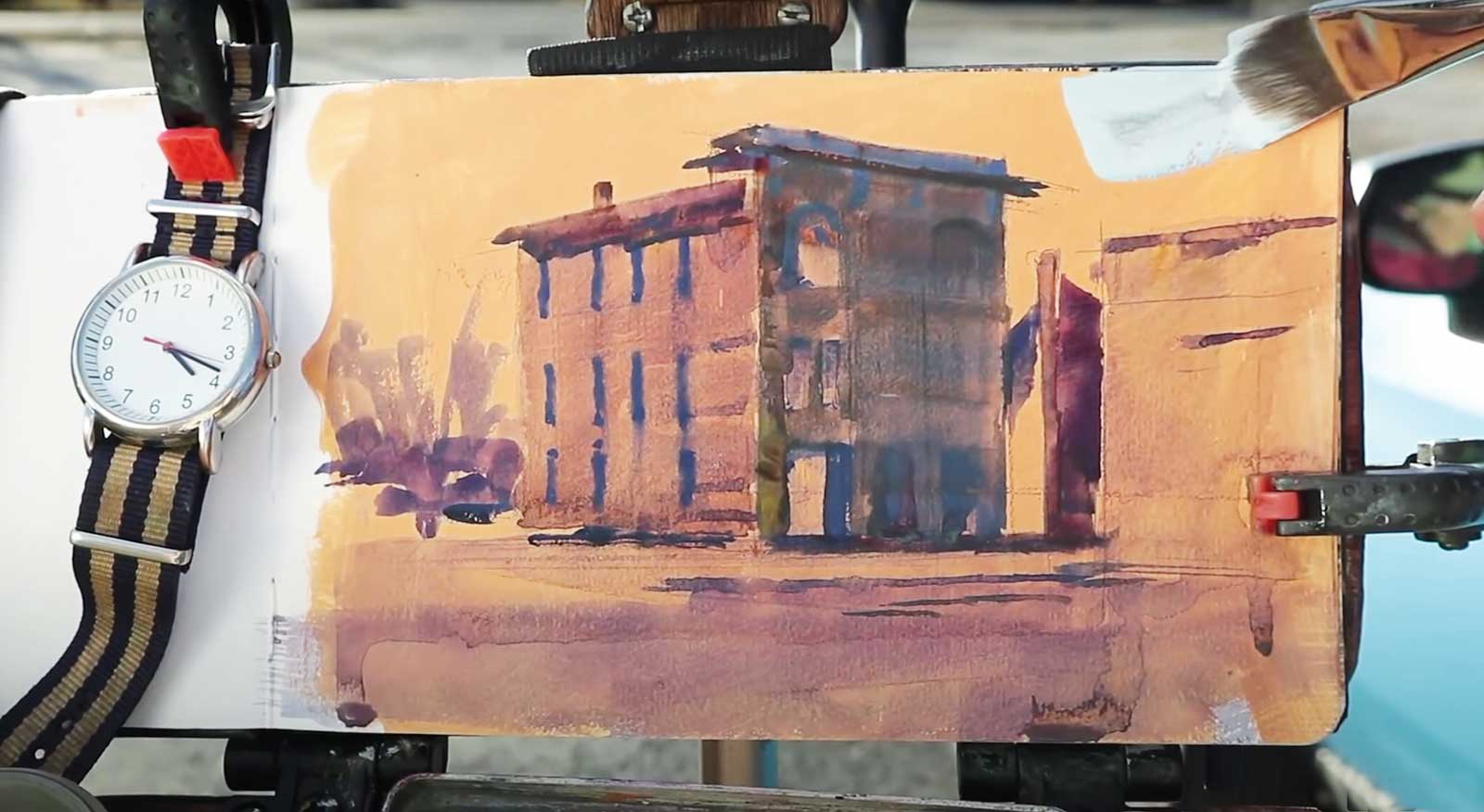
The primed sketchbook on the easel.
Staatsburgh Roadside, gouache over casein, 5 x 8" (12 x 20 cm)
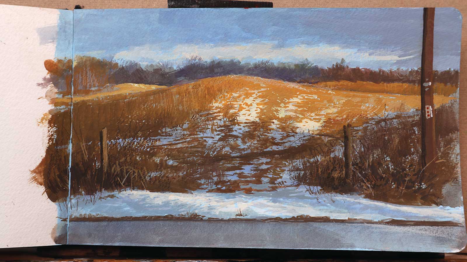
Blue Priming Sets Off Warm Colors
A hayfield lit by warm afternoon light entices me to set up the sketch easel. The golden hilltop is sprinkled with the last of the March snow, which is cast into a cool shadow at the base of the hill. Shadows surrounding the illuminated area help to define and complement the light. This is a perfect subject for a blue priming. I build up the warm colors opaquely to cover the blue and let the blue priming show through and interact with the shadow areas, which surround the light area.
Painting in progress over an ochre casein priming.
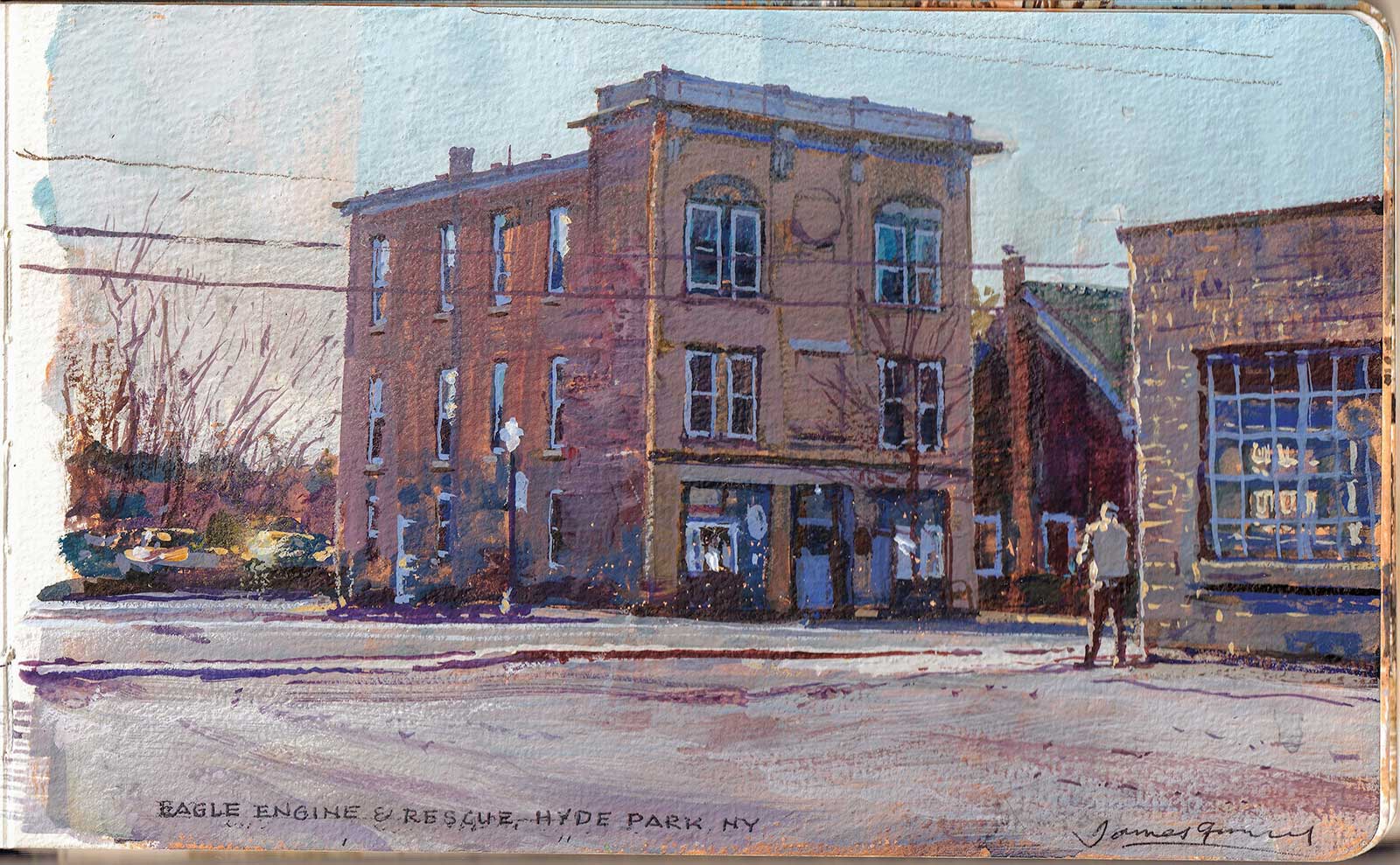
Eagle Engine, gouache over casein, 5 x 8" (12 x 20 cm)
Yellow or Orange Priming Activates Grays
A yellow or orange base color can enliven a mostly gray painting or a simple black and white grisaille. For the priming layer I use a thin, opaque layer of yellow ochre and white casein, or even a tint of cadmium yellow deep. The warm color underneath sneaks into the painting between the stones of the building at the right and along the vertical edge of the main building. Sometimes I let a hint of the warm color remain at the margins of the image, which makes it look like the yellowing on an old photograph.
General Tips on Priming for Gouache
• It’s good to have four or five pages of a sketchbook pre-primed with various colors. You don’t have to know in advance how you’ll use them.
• Priming can be used on heavyweight watercolor sketchbook pages, a piece of illustration board or an acrylic-primed canvas.
• For the priming medium you can use either casein paint, matte acrylic such as acrylic-gouache paint, or tinted gesso.
• The milk-based proteins in casein take a few days to fully cure, so it’s a good idea to apply them well in advance. Once cured, they will not dissolve when wet layers are applied over them.
• The priming can be a very thin layer with the paper grain still intact, but if you want some impasto texture, you can mix in some acrylic modeling paste with the priming color.
• If you want a really tough emulsion that will not reactivate or crack off the paper, matte acrylic polymer is very durable, making it a good kind of paint medium to use as a substrate. Don’t use any oil primers under aqueous media top layers.
• The primed surface should be flexible and have a matte finish, because a glossy finish can interfere with adhesion and make watery washes bead up.
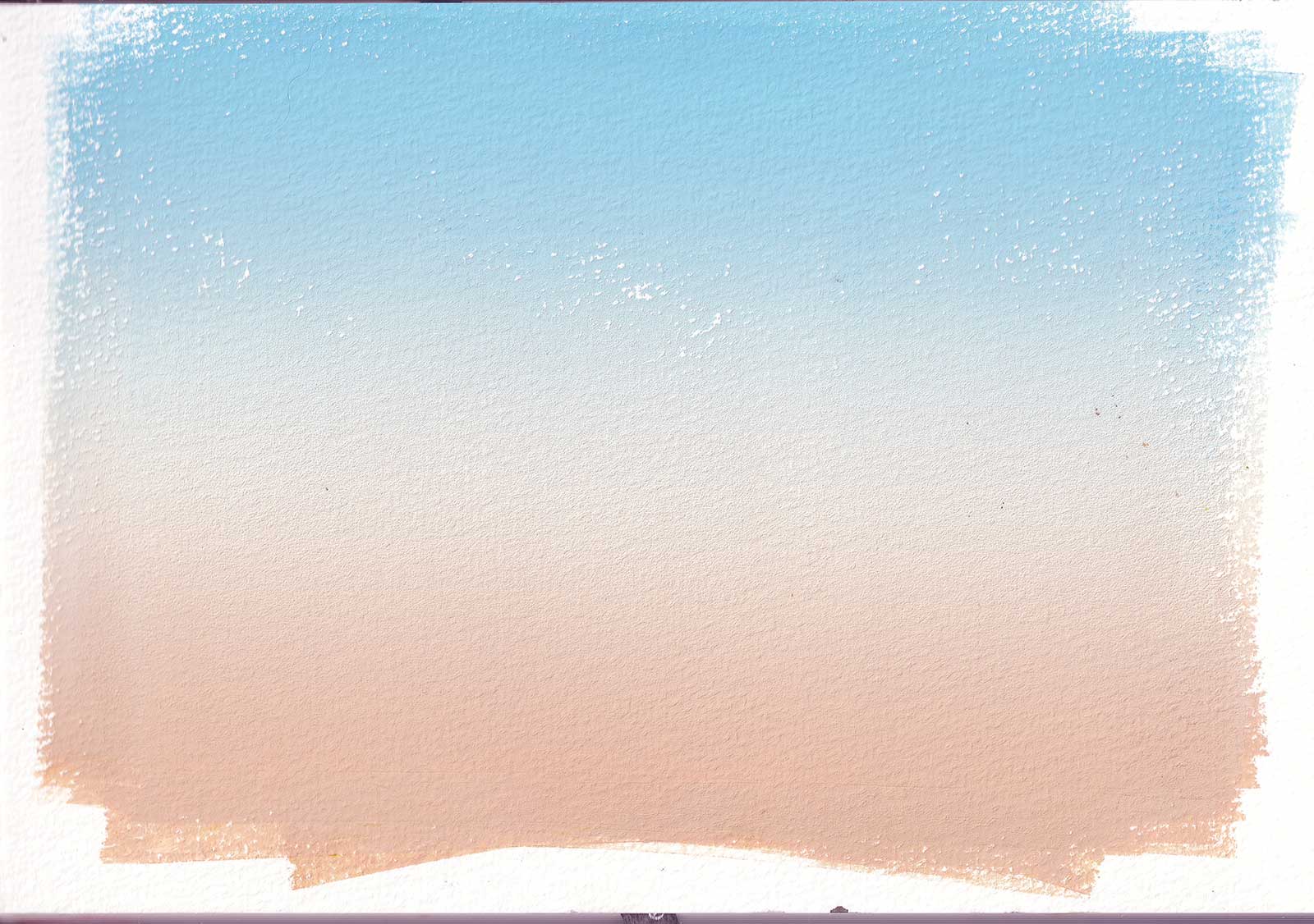
Brayer gradient, water-based block printing ink with acrylic matte medium.
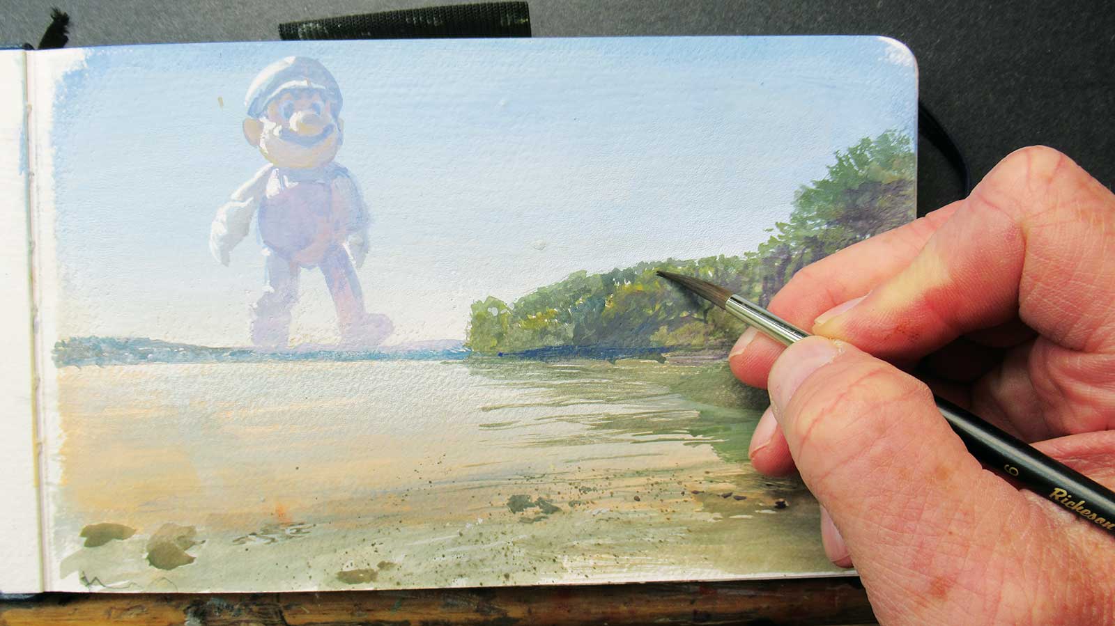
Super Mario, gouache over brayer gradient, 5 x 8" (12 x 20 cm)
A Brayer Delivers a Smooth Sky Color
Sometimes I like to apply the priming color with a brayer to create a smooth gradient. In this case I prime the page first in the studio with that blue sky tone, adding a little acrylic matte medium to keep the water-based block printing ink from reactivating later. On location I paint the trees and the water reflections on the far shore. Then, using a 3D toy for reference, I draw Mario with a pointed round brush and block in the big shapes with a long, flat brush. I keep the values light to make him look very far away and gradually refine the details.
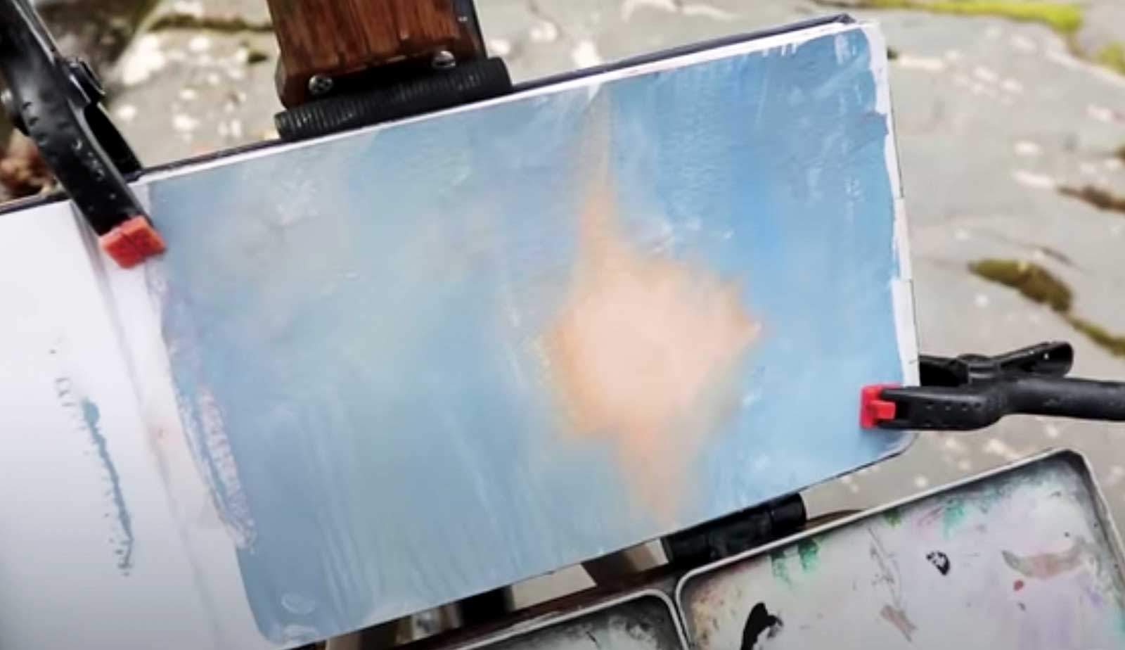
Hotspot priming, casein.
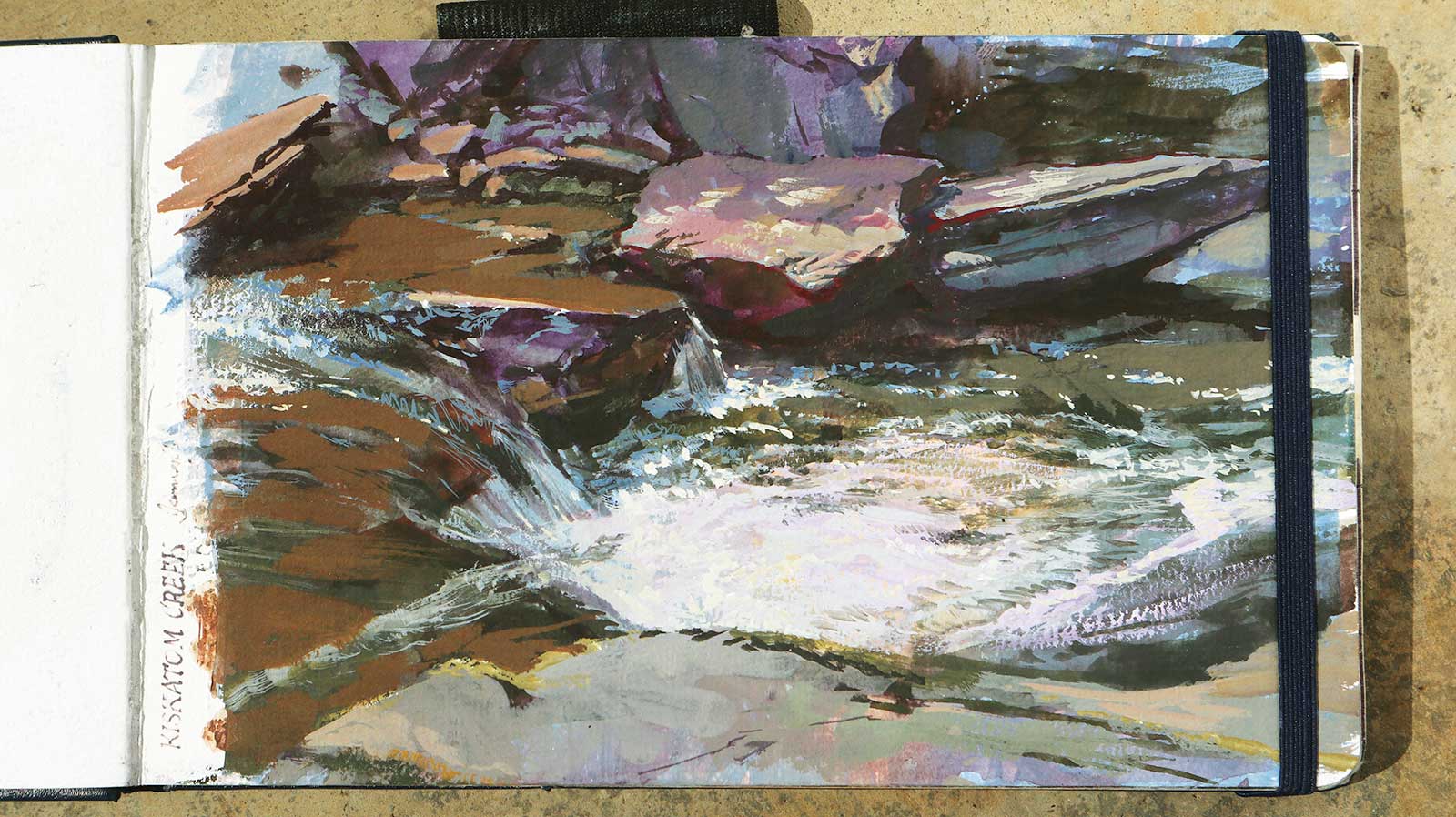
Kiskatom Creek, gouache, 5 x 8" (12 x 20 cm)
Hotspot Priming Guides Attention to Focal Points
A hotspot priming establishes a spotlight of light, warm colors surrounded by blue-gray tones. I’ve chosen that kind of priming for creating surreal spotlight effects. But here, I find it helps for a naturalistic scene like this mountain stream, which has a light effect area that I want to emphasize. Even though the priming gets almost entirely covered over by the end, it serves as a reminder throughout the painting process to downplay the surrounding areas and keep the attention on the focal point.
About the Artist
 James Gurney
James Gurney is the author of Color and Light: A Guide for the Realist Painter, Imaginative Realism: How to Paint What Doesn’t Exist and Dinotopia: A Land Apart from Time.
Contact at
www.jamesgurney.com