


There is something captivating about the way the water moves and interacts with the shore—a sense of movement and life. Painting waves and beaches in acrylics can be a challenging task, but with the right techniques and a deep appreciation for the subject, it can also be incredibly rewarding.
Richard Robinson, Waipu Cove, acrylic on canvas, 16 x 20" (40 x 50 cm)
Richard Robinson, Waipu Cove Paradise, acrylic on canvas, 10 x 30" (25 x 76 cm) I’ve taken this long format painting and reimagined it in a shorter canvas better suited to video, so you can learn all the skills and concepts required to apply to any beach you love.
Two months after I created the “Painting Waves” course (shown in the previous issue of International Artist) I decided to add this bonus chapter, including all the new learning I had done myself, learning from master artists like William Trost Richards, Ruo Li and Roy Tabora.
Student Critiques
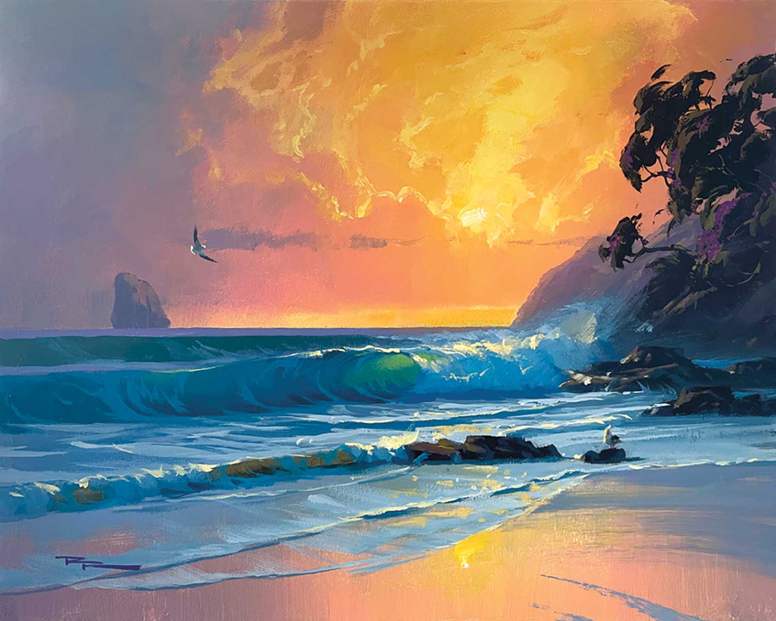
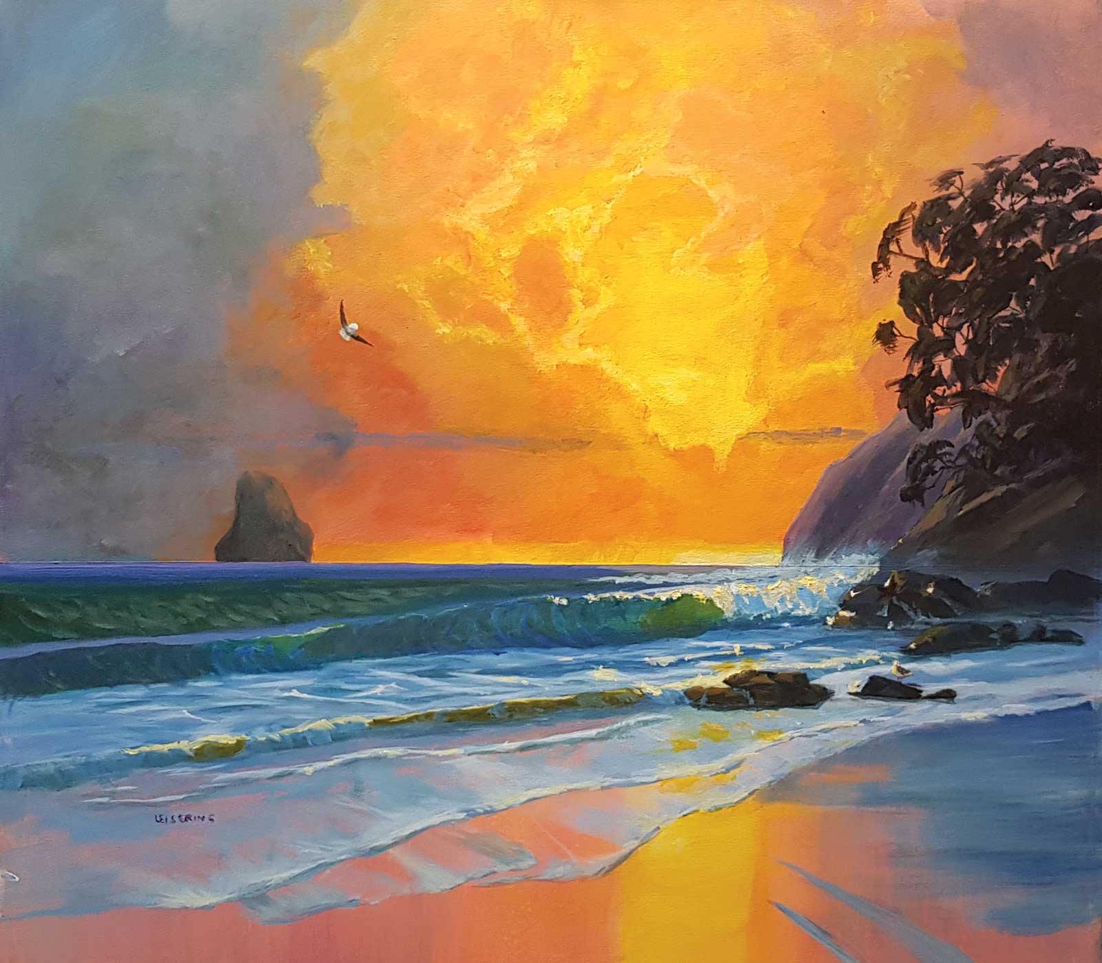
 Sunset breaks, acrylic with oil glazing on canvas, 15¾ x 19½" (40 x 50 cm)
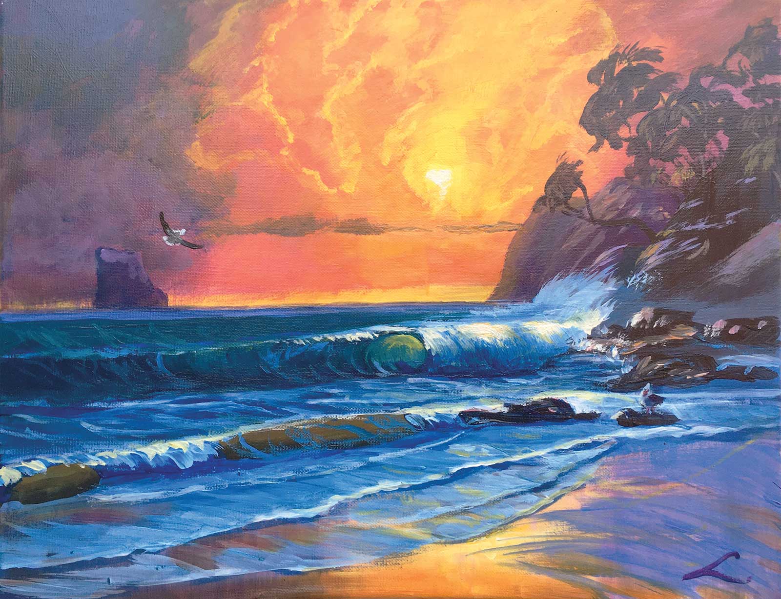
Elena Sokolova
Bold colorful work Elena, as usual. Just two things I’d like to tweak. The gradation of color from dark to light in the clouds could be smoother. You could create more of a soft blur of sea spray over and around the foam crashing against the rocks in the distance. Currently their sharp edges bring them forward too much. Good job!
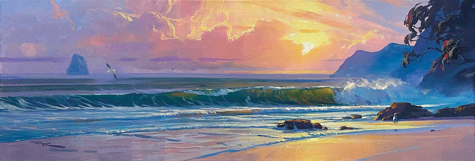
 Waipu Beach
 Jay Trotter
Great work, Jay. Strong color and confident brushwork. Good to see. I’d suggest you take a look at this in a mirror or flip it over in the computer and take a note of the things that seem a little off to your eye in the first few seconds of viewing it. Some of the foam angles are off. You’ve got a great glowing effect in the sky but the cloud shapes themselves could do with some more thought. When you’re adding the lights to a tree, try to make family groupings of shapes rather than dabbing the same pattern all over. Overall very nice.
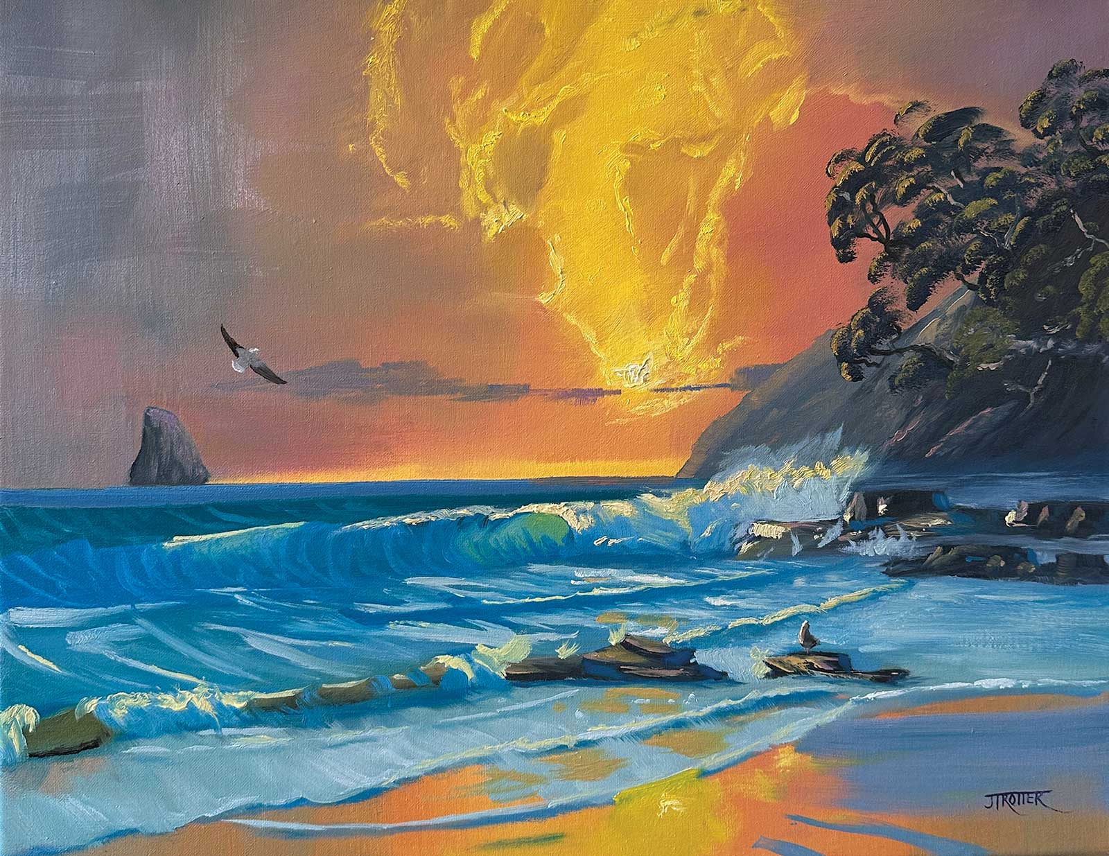
 Waipu Cove, oil
Geoffrey Geeson
Hi Geoffrey, pretty decent drawing and color work here! And great wave shape. My only tip would be to avoid over-painting as much as you can. You’ve done a fair bit of over-painting, most prevalent here in the sky. The only way to achieve a fresh painterly look without overworking the paint is to consider each brushstroke before you place it. What do I want to achieve with this stroke? How will I load the paint on the brush to achieve that? Is the paint the right thickness for my purpose? Am I using the best brush for that? How will I move and turn the brush to achieve that? All those questions go into brushwork that actually looks effortless when it’s achieved. Of course, it’s easier the second, third and fourth time you paint a thing. You build a brushstroke tool kit in your mind for achieving different things over time. That’s why I’d like to challenge you to paint this again but with all those brushstroke-y thoughts in mind as you go through the painting. Other than that, you’ve got everything working nicely in this painting.
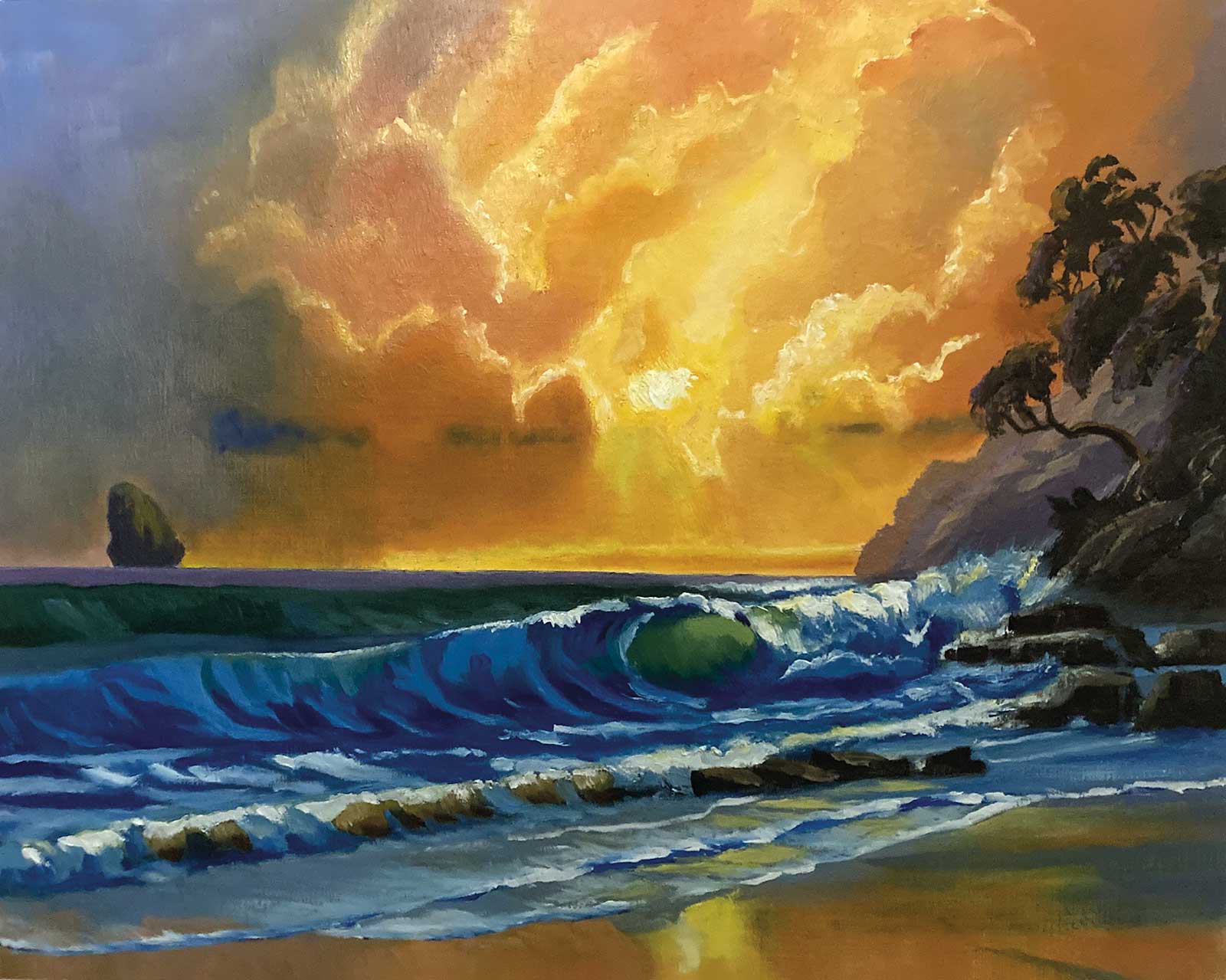
 Waves at Waipu Cove, 21 x 22" (53 x 56 cm)
 Anne-Dore Leisering
Hi Anne-Dore, good job with the drawing and color, and some of that brushwork is elegant, particularly in the tree and the foreground thin foam. I’d like to see a more gradual transition from dark cool to warm light in the clouds. Not easy, I know. Also, painting over some of the choppy foam pattern in the face of the swell behind the main wave would help simplify it and smooth it out.—
About Your Tutor
Richard Robinson is one of New Zealand’s premier outdoor painters. You can view his extensive online lessons at www.mypaintingclub.com.