


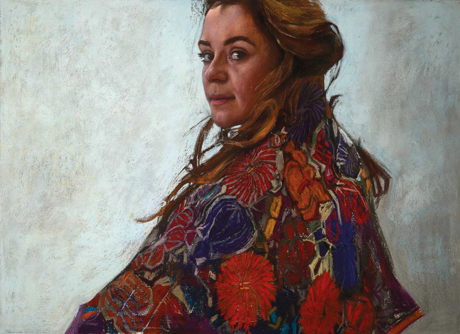
 Laura Series: Glance, soft pastel on toned paper, 22 x 30" (55 x 76 cm)
Daud Akhriev
Inspiration
The Laura Series is inspired by our colleague, artist Laura Henley. She inspired me to create many artworks because of her directness and ease, which were exactly the qualities I was seeking. I did many studies with her in pastels and in oils, which I am now using in a series called Veritas. This is one of the pastels done towards that end. The clothes wrapping her were bought in Puerto Vallarta, Mexico. They are embroideries from Oaxaca. Somehow when she put the textiles on herself, the result seemed highly ceremonial.
Process
I begin pastels by blocking in the large form with black or dark brown pastels, and I like to work on paper that is toned or naturally darker. I begin with Rembrandt pastels for several layers, spraying in between each layer and going from dark to light. With each new layer, some darks still peek through. The early darks provide contrast. Toward the end, I use Sennelier or Unison soft pastels for more buttery marks. The soft pastels allow me to feel like I’m laying down brushstrokes. The surface even becomes a little uneven. Sometimes at the finish I use pastel pencils, sharpened to points. Usually, I apply between 5 to 10 working layers before completing a piece.
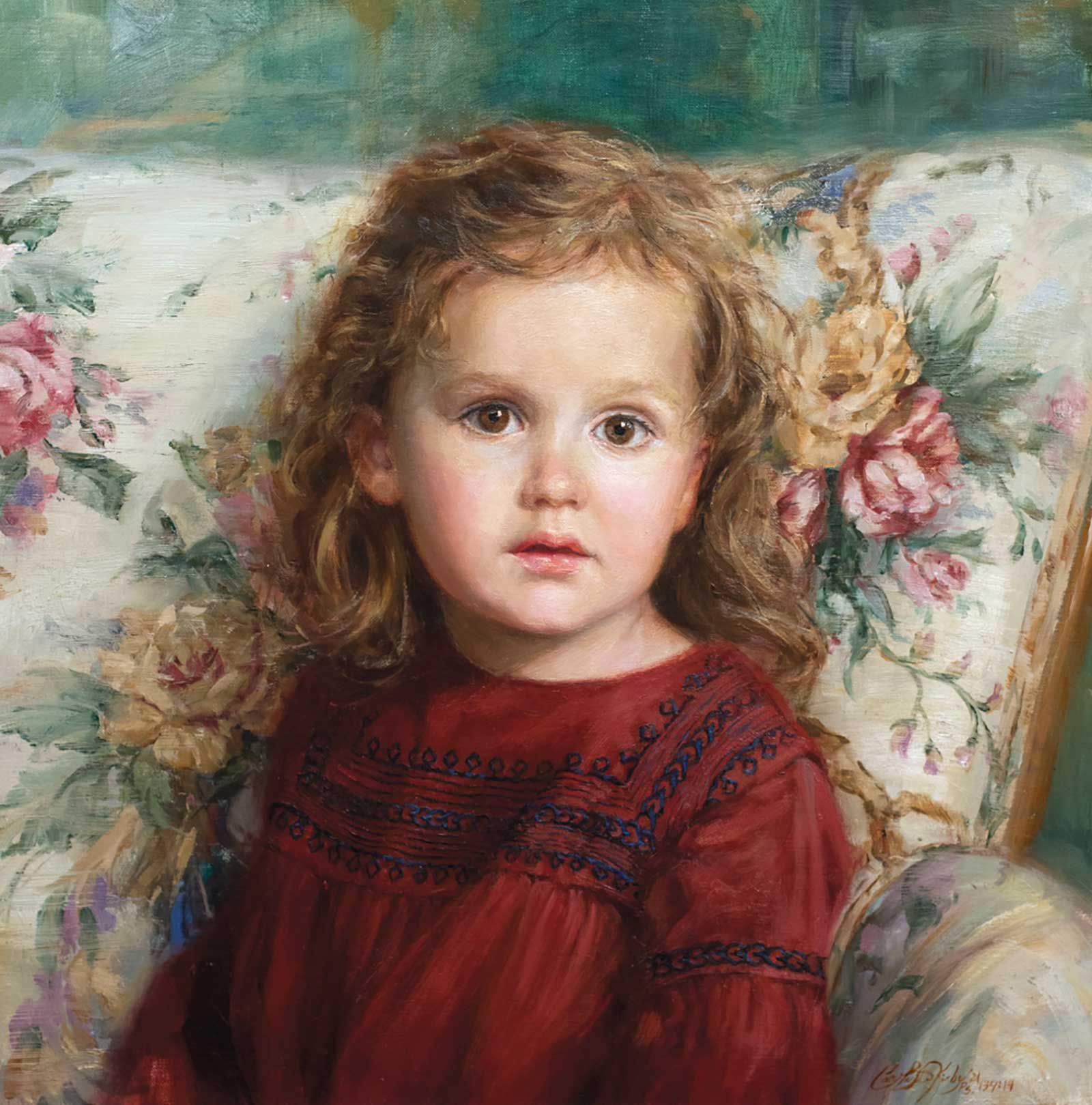 Kaylynn, oil, 16 x 16" (40 x 40 cm)
Carol Baxter Kirby
Inspiration
For years, I saved a chair that once belonged to my mother (purchased when my parents first set up housekeeping in the 1950s) in hopes of painting a granddaughter in it one day. When Kaylynn was born, I patiently waited until I thought she was just the right age for this portrait. I searched online for a dress and found this one from Spain that completed the vision I had in my head. I was drawn to the repetitive shapes and scale of the embroidered pattern on the dress in contrast to the scale of the larger, fluid, floral design in the chair fabric. I intentionally placed her where the movement and color of the branches in the background wrapped beautifully with her hair and body.
Process
With every painting, I search for a primary color chord that works with the subject and background to create harmony and unity. For Kaylynn’s portrait, it was an unusual combination of cadmium red deep, cadmium yellow pale and cerulean blue. Every painting is a journey of discovery. I try different approaches until a combination of colors starts to sing. Even though I painted with a full palette, this color chord combination is dominant in the flesh and used throughout the whole painting. Utilizing dry brush techniques near the end of the process, I was able to emulate the linen texture of the chair and play up the richness of color and texture through layering.
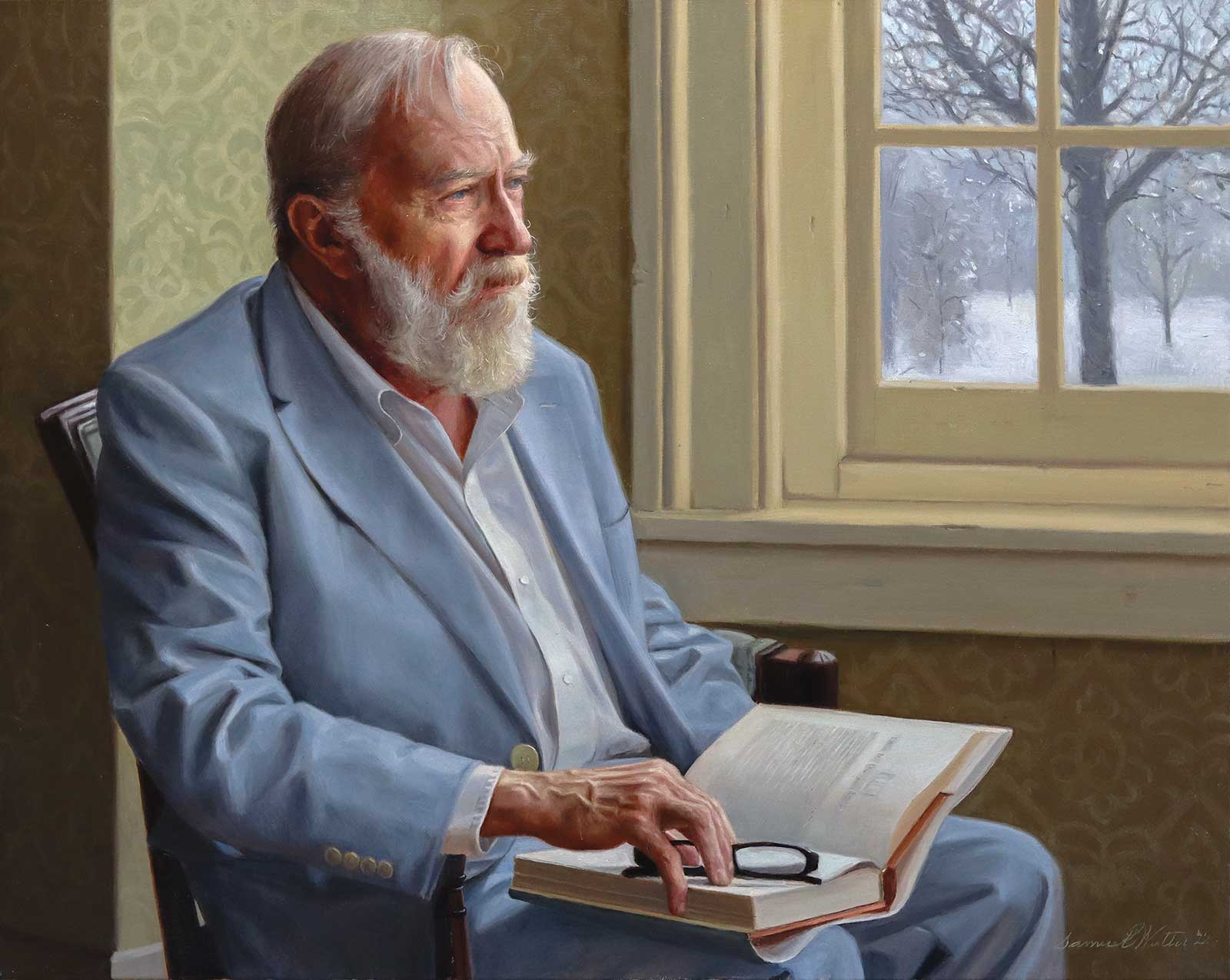 Britt’s Winter, oil, 20 x 30" (50 x 76 cm)
Samuel Walter
Inspiration
Last year, I spent months trying to come up with new ideas for a non-commissioned portrait. As soon as I met Britt, I knew I had to paint him. When we met, Britt was going through a lot of stress: his arthritis was hampering his ability to play the organ and harpsichord, he had issues with his work as a landlord, and he was finding it hard to get around and meet with people. As I began the composition, there was not, originally, a specific mood or story that I wanted to get across. However, as I attempted to paint his likeness, I realized that I was capturing a sense of world-weariness and melancholy. In the painting I tried to communicate feelings associated with both seasonal winter and the winter of someone’s life. The bleak outdoors, with its pale blues and grays, matches the pale blues in Britt’s suit and his melancholy gaze.
Process
I started the process by visiting Britt, taking photos, and making an initial oil sketch. It took a while to sort through the photos and find a composition that worked. I combined elements from a couple of different pictures, softened the lighting, and completely changed the scene outdoors (it was a sunny October day when I took the photos). Seven days before the deadline for the Portrait Society’s International Portrait Competition, I started painting. I teach both cello and art, so I would teach until 3:00 p.m., take a break, and then paint until 3:00 a.m. every day for a week.
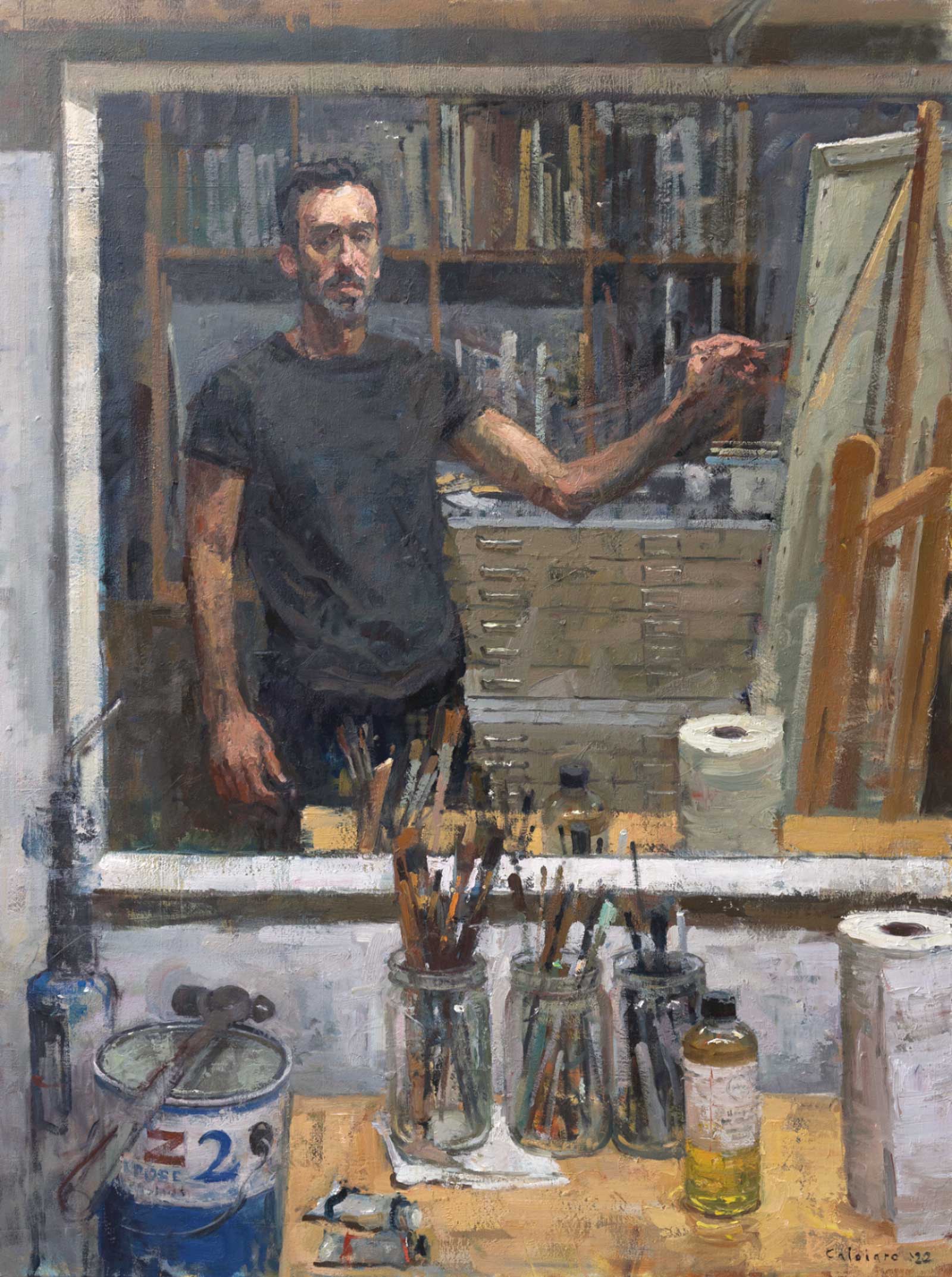 Self Portrait in the Studio, oil, 48 x 36" (121 x 91 cm)
Matteo Caloiaro
Inspiration
The events that led to this painting are sort of humorous. I had initially set out to make a still life on the bench. As I was setting up, I caught a glimpse of my reflection in the mirror and was struck by the way the light on the foreground elements and figure contrasted with the darkness in the rear of my studio. I don’t paint a lot of self-portraits–I find my contemplative expression to look like I take myself too seriously! However, painting oneself provides a model that is always available. In the end, what was intended to be non-figurative became a figurative painting. Despite my lack of fondness for painting self-portraits, I always appreciate the challenge, especially when painting from life as I did here. I learn much from the process of having to really look hard at the subject to accurately record what I see. The challenge is amplified by trying to achieve a balance of accuracy and spontaneity.
Process
Overall, the process I followed was straightforward. After discovering what I wanted to paint, I made a quick compositional sketch to determine the arrangement of the big shapes on the canvas. This was painted over an old painting, so I used dark paint to sketch things out to get my bearings, then I blocked in the big areas of value and color to set the overall mood and palette. The rest of the process was several hours of struggling to refine it to the level of finish that I wanted.—