


I long ago fell in love with the luminosity and beauty of pure watercolor. A 40-year relationship in which I still feel the underdog, and I still have days when I wish I had fallen for an easier lover, such as brain surgery or space travel. I suppose that I am being a tad unkind as the highs have far outweighed the lows, and it has been a fascinating and rewarding journey. I have ended up with what I presume to be a fairly traditional approach, in that I use the fewest washes in the least amount of layers to achieve what I hope is a fresh, atmospheric and spontaneous result.
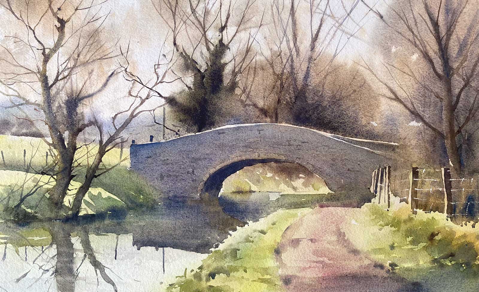
Bridge on the Brecon Canal, watercolor, 13 x 21" (33 x 53 cm) This is a half sheet watercolor painted in the studio from an on-site sketch and a photograph taken on my phone. I used the sketch for the stripped-down composition and had to improvise a color scheme, as the photograph had blacked out the darks. I knew that it would be important to put some life into the bridge colors by moving them gently from cool to warm.
I have always loved the transparency of watercolor and for even longer, the natural world. I hate the way we consistently disrespect and disregard its beauty, but painting both the natural and more built-up landscape has become a type of solace to me.
I work in three basic ways. My first preference is to work directly in front of the subject and complete the painting in one sitting of around one to two hours. I may then tweak it a bit in the studio, but often it is left as stated. If the weather is very changeable or excessively windy, I will make pencil sketches and may even place a few watercolor washes over the sketch. This will often be backed up with a photograph taken on my mobile phone (and often then subsequently forgotten).
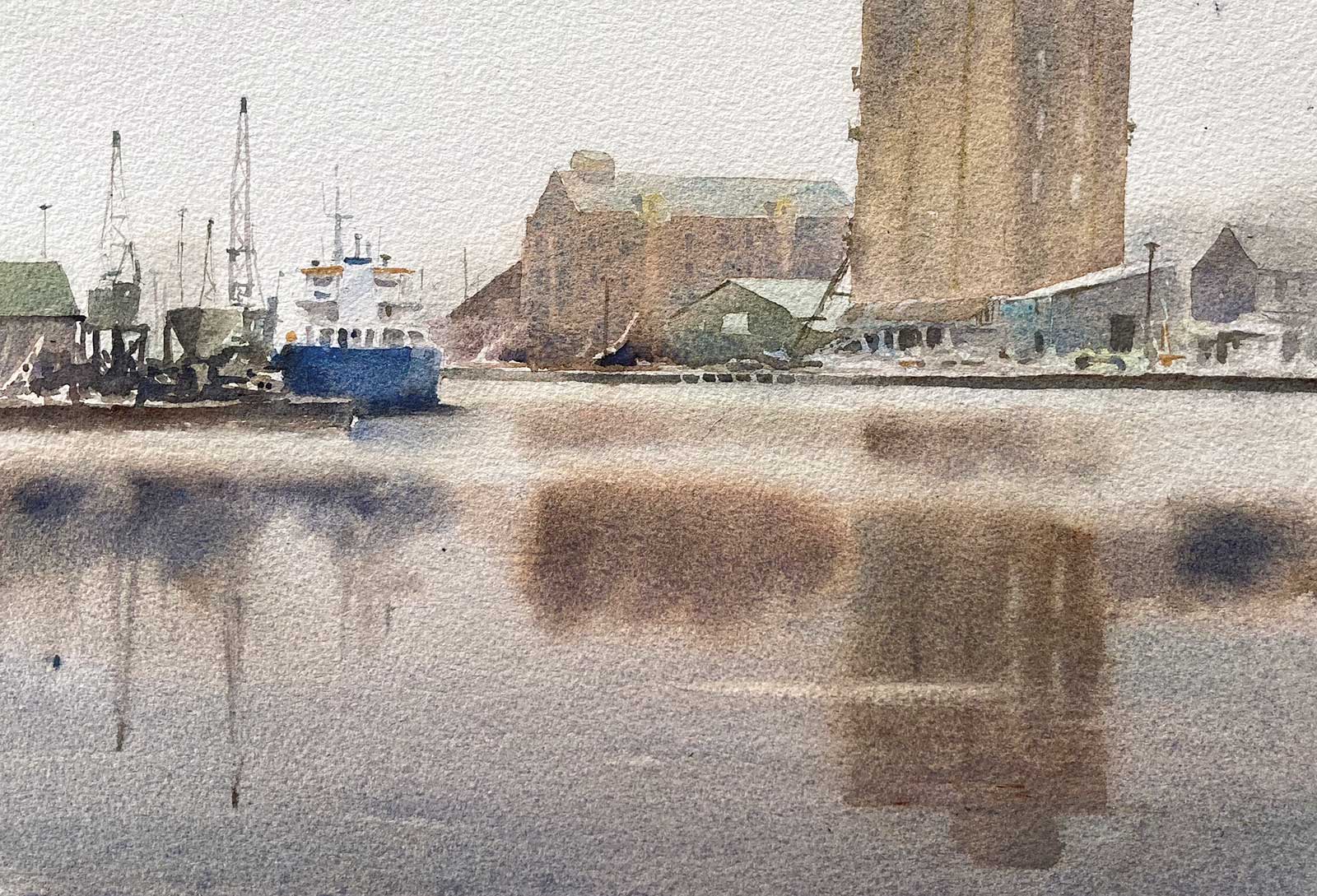
Quiet Day Sharpness, watercolor, 12 x 16" (30 x 40 cm) I made a sort of pilgrimage to a dock where my dad trained many years ago. Once thriving, it is now very quiet and run down, with the ghosts of the past made more melancholy by the flat overcast day. It’s essentially a very simple painting with a few big washes placed over the initial overall wash, that set the mood.
If time is very short, or I am with a group of friends and sketching is not an option, then I will take a photograph and sketch the subject later from my tablet or main computer, to see if it’s a “goer” or not.
I always start a watercolor with an overall wash. In damp or wet weather, I start on dry paper and bring a bead down, changing the wash as I go, but on warmer days I pre-dampen the paper and go in wet-on-wet. The aim is to create a soft-edged impression of the scene that, once dry, will only need a few superimposed washes to create darker tones, harder edges and negative shapes. With very complex subject matter, with lots of shapes, the process is a little more involved, but is still essentially the same. My primary aim is not to create a landscape painting, but to produce a pure luminous watercolor that reflects my emotional response to my chosen subject, so I will take liberties with tone, color and composition to achieve the desired result.
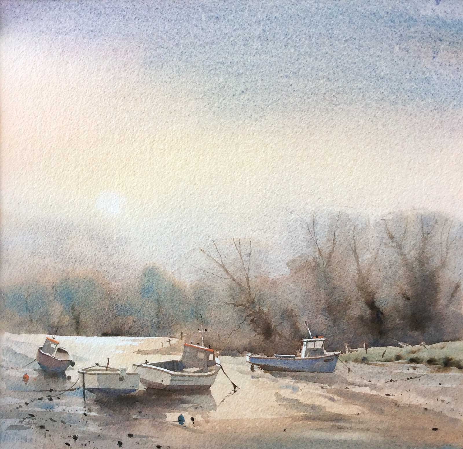
In the Morning, watercolor, 20 x 20" (50 x 50 cm) This is a striped down studio piece, where I tried to get the effect of strong morning light on the distant water. The cadmiums (red and yellow) were used a lot, to warm the picture and a minimum number of washes have been used. It won me the Canson prize at the Royal Society of Marine artists exhibition at the Mall Galleries in London.
I love the texture of rough watercolor paper and use other surfaces only occasionally. My main paper is Arches 140-lb and 300-lb rough, but I use a lot of Saunders Waterford too and have just discovered the tremendous Baohong Chinese paper. My palette is a mix of Daler-Rowney, Winsor & Newton and Maimeri Blu paints. I’m not too fussy regarding brushes, but usually use Escoda Perla or Princeton brushes.
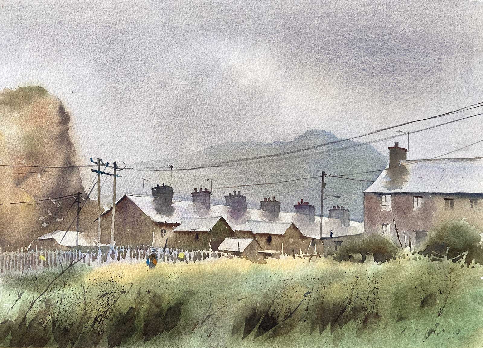
My Art in the Making Wet Day Blaina Ffestiniog
Reference Photo
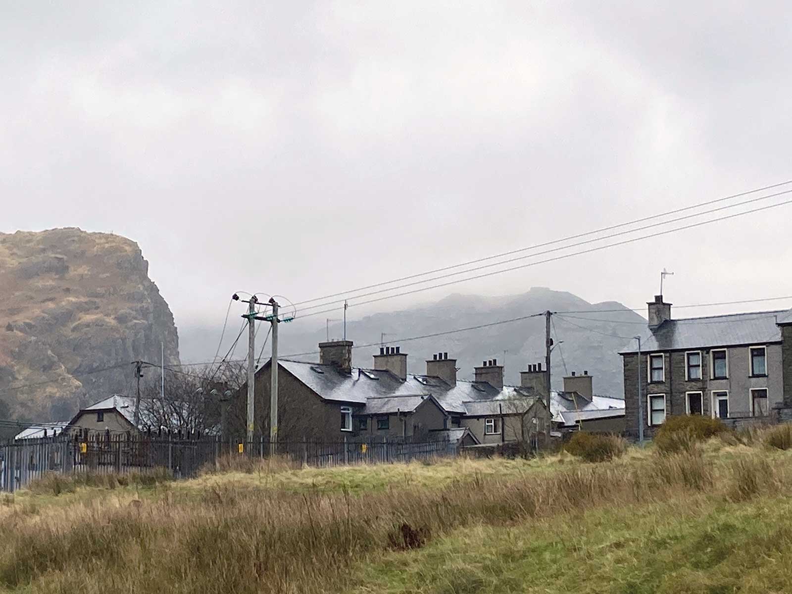
I was driving through North Wales in my camper van and this view caught my eye. It’s not a classically beautiful subject, but I was instantly attracted to its melancholy feel. It was pouring rain, and I got a real soaking whilst I snatched a few photographs on my phone. Back in the studio I AirDropped the photographs onto my desktop computer and appraised their potential. I chose this one because I was drawn to the light roofs, dark chimneys and the contrast between the color in the foreground against the limited palette of the backdrop.
Normally in the studio, I will work from a sketch that was made on site and use a photograph only as a backup in the early stages. Here though, I am starting with a photograph, so I will produce a sketch, for the reasons outlined below.
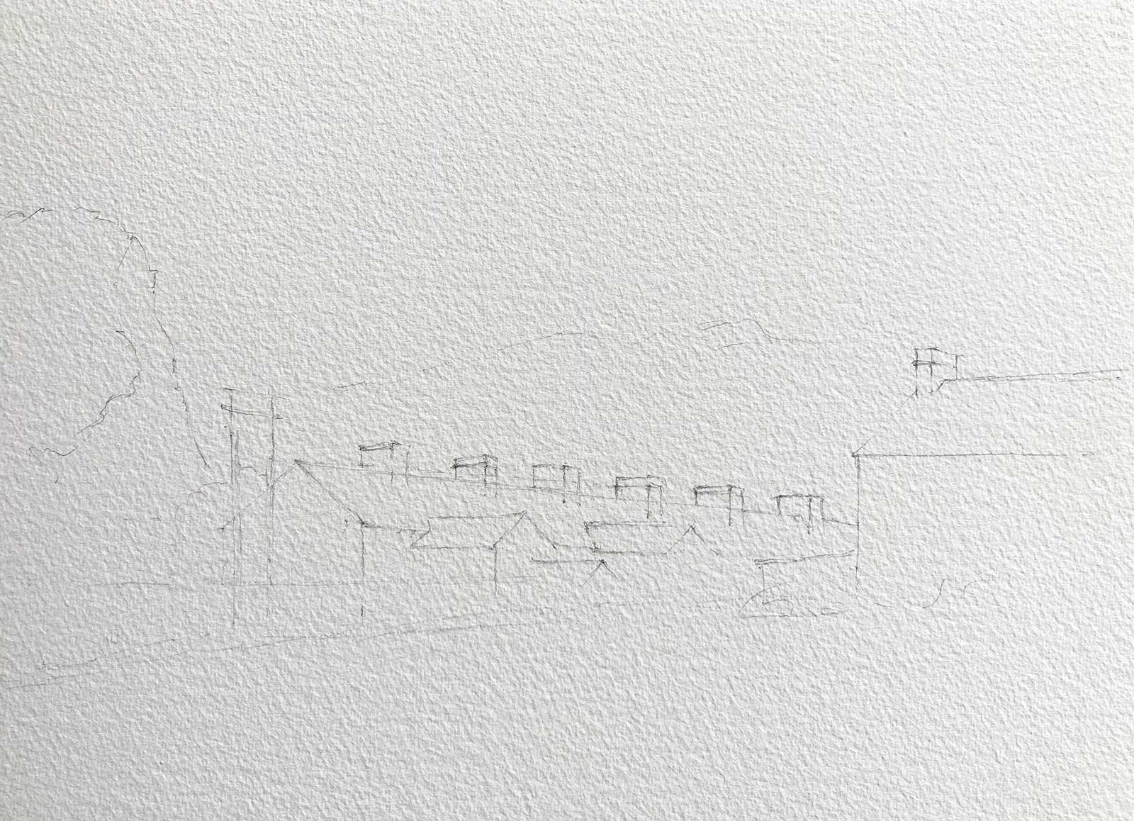
 Stage 1
Stage 1 Sketch
For me, sketching came way before painting, and the ability to work out the composition and tonal map of a scene has become a vital asset to my watercolor process. This sketch from the photograph re-familiarizes me with the scene and lets me know what made me photograph it in the first place. Also, it helps me decide if I want to change, subdue or pull out any aspects of it. Sometimes I learn a lot from the sketch and can then make further changes at the painting stage. At other times the reference, sketch and the finished painting will be quite faithful to each other, but this is rare and more often aspects will change.
 Stage 2
Stage 2 Drawing
On site I will use a minimum amount of drawing, just to place the main shapes, but on a more complex studio piece, I may spend quite a bit of time on the drawing, as I like the process of drawing immensely, and although a lot of the drawing may be eventually lost under the washes, it matters not. For this subject, I lay a few light lines for the main shapes and once I am happy with the composition, I can’t wait to get started.
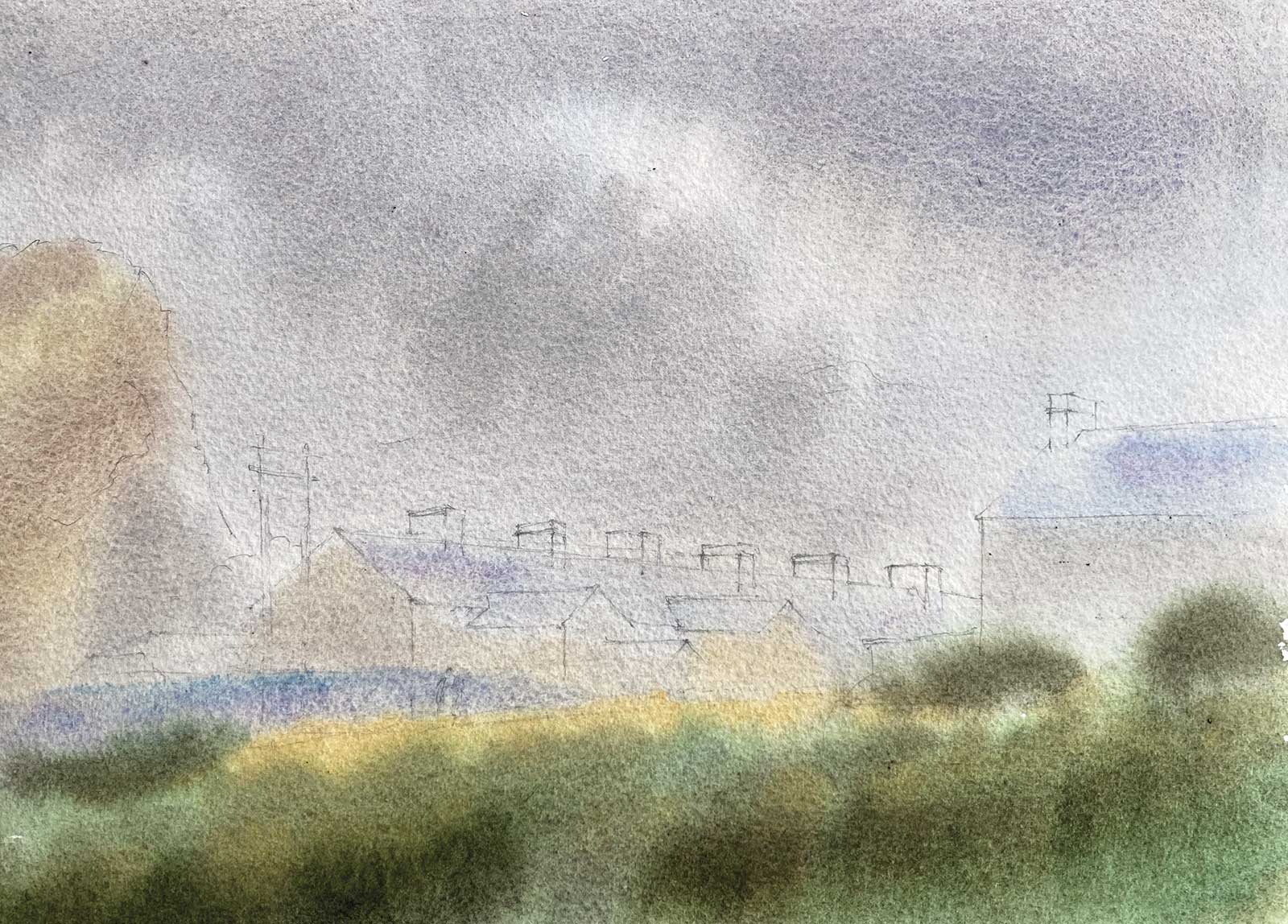 Stage 3
Stage 3 The Overall Wash
Once I begin painting, the first part always consists of some kind of overall wash. Its complexity will vary within the context of what I wish to eventually say, and with the type of atmosphere being portrayed. Obviously, I can get a lot more done with a soft misty scene consisting of a few shapes than with a strong sunlit scene with lots of contrast and loads of separate shapes. Here I have registered the sky using French ultramarine with burnt sienna and placed some soft colors through the mid ground using raw sienna, burnt sienna, cobalt violet and cerulean blue. I then hit the foreground hard with stronger applications of Naples yellow, raw sienna and hookers green, deepened with burnt sienna and French ultramarine blue, as much of this was to remain as first wash.
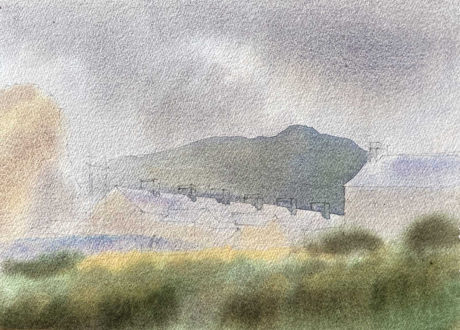 Stage 4
Stage 4 Background Hill
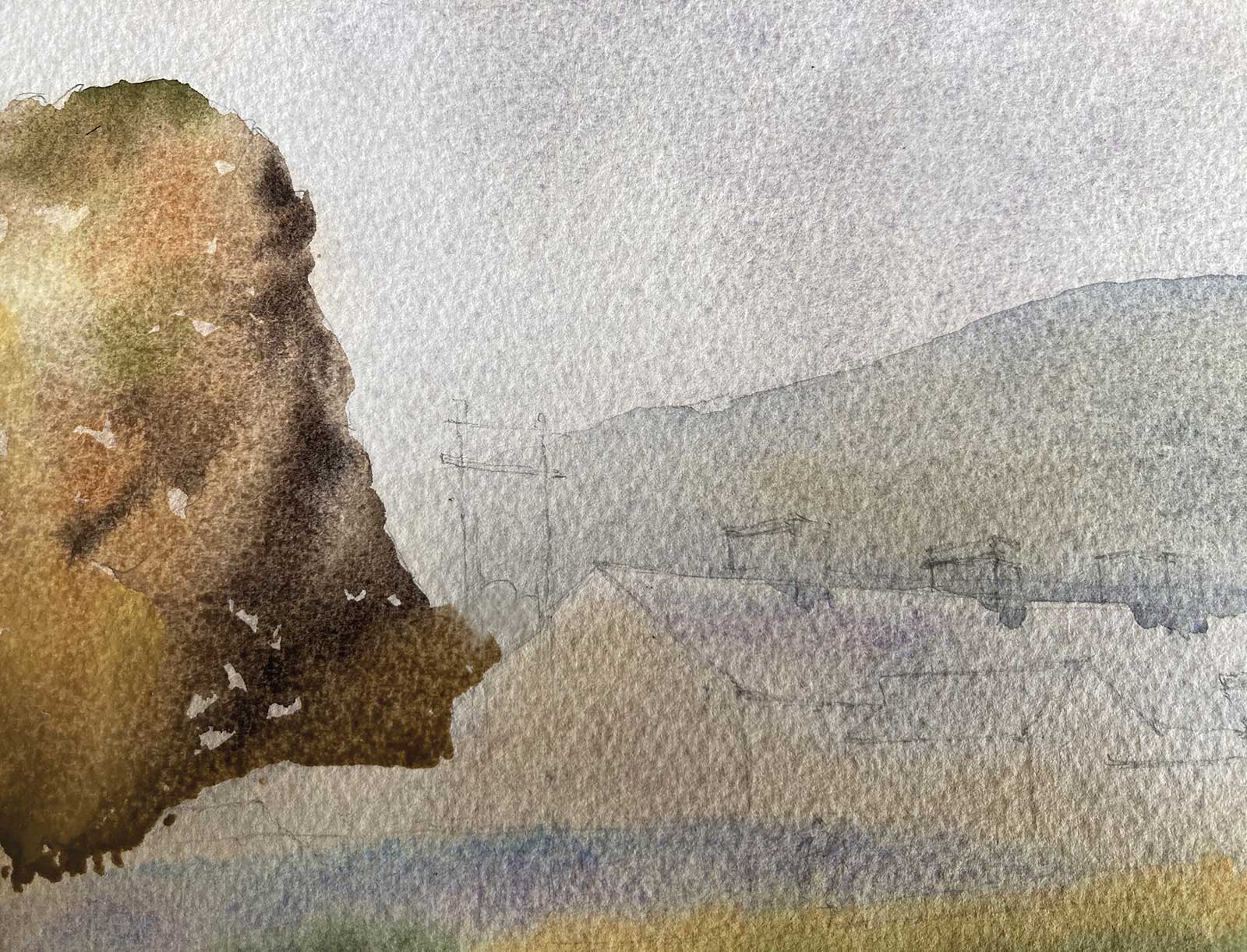
Once the first wash has dried, I add the background hill with a stronger mixture of French ultramarine and burnt sienna. I started from the right-hand side and added water to the wash as I traveled leftward to lighten the wash as it met the closer outcrop.
 Stage 5
Stage 5 Outcrop
Now, with a much stronger and more complex wash, I place the outcrop. I start with a strong but wet wash, which allows me to go back in with yet stronger wet-on-wet marks to model the darker recesses, etc. The colors used here were raw and burnt sienna, hookers green and French ultramarine blue.
 Stage 6
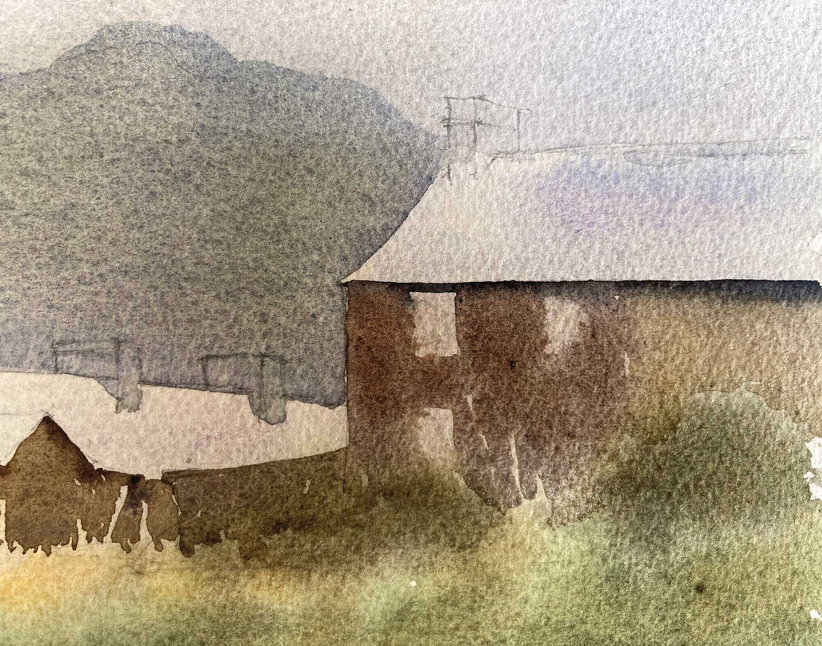
Stage 6 House Fronts
Before the base of this wash has a chance to dry, I carry it on through the houses, using the same colors as the outcrop and making sure that it is a good mid to dark tone in places.
 Stage 7
Stage 7 Windows
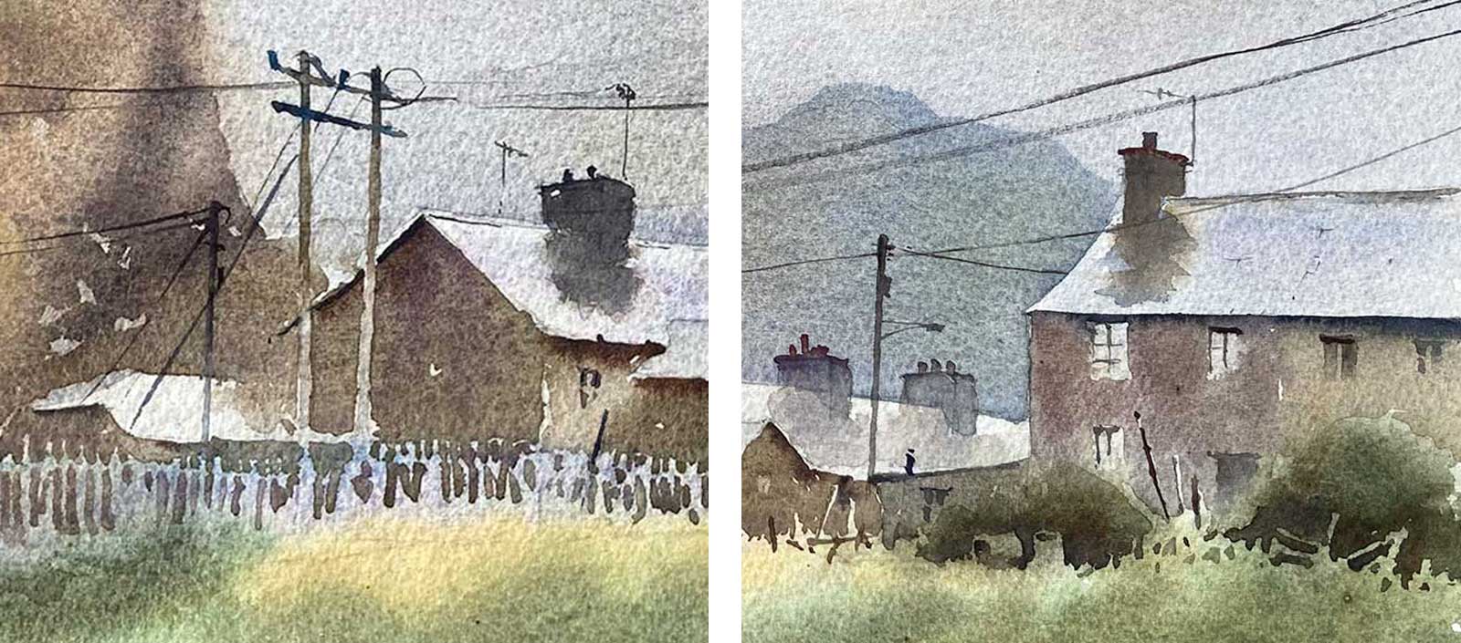
Notice how the windows are added, wet into wet, and also the amount of negative painting with regard to the fencing and telegraph posts.
 Stage 8
Stage 8 Mountain Glaze
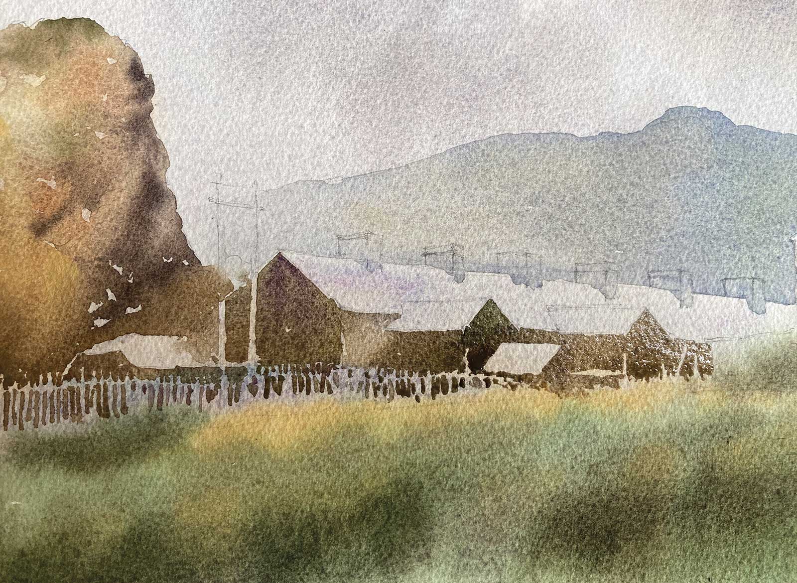
At this stage, I get a sinking feeling as I realize that I am unhappy with the sky. It is too high key, and I need it slightly darker to help emphasize the light on the roofs. After much cursing and wishing that it was an oil painting, I decide to risk putting a glaze over the sky and background hill, hopefully confident that the Arches rough paper will take the hammer. A big puddle of French ultramarine and a touch of ultramarine violet is mixed to the correct tone and placed over the sky and hill using a big soft mop brush.
 Stage 9
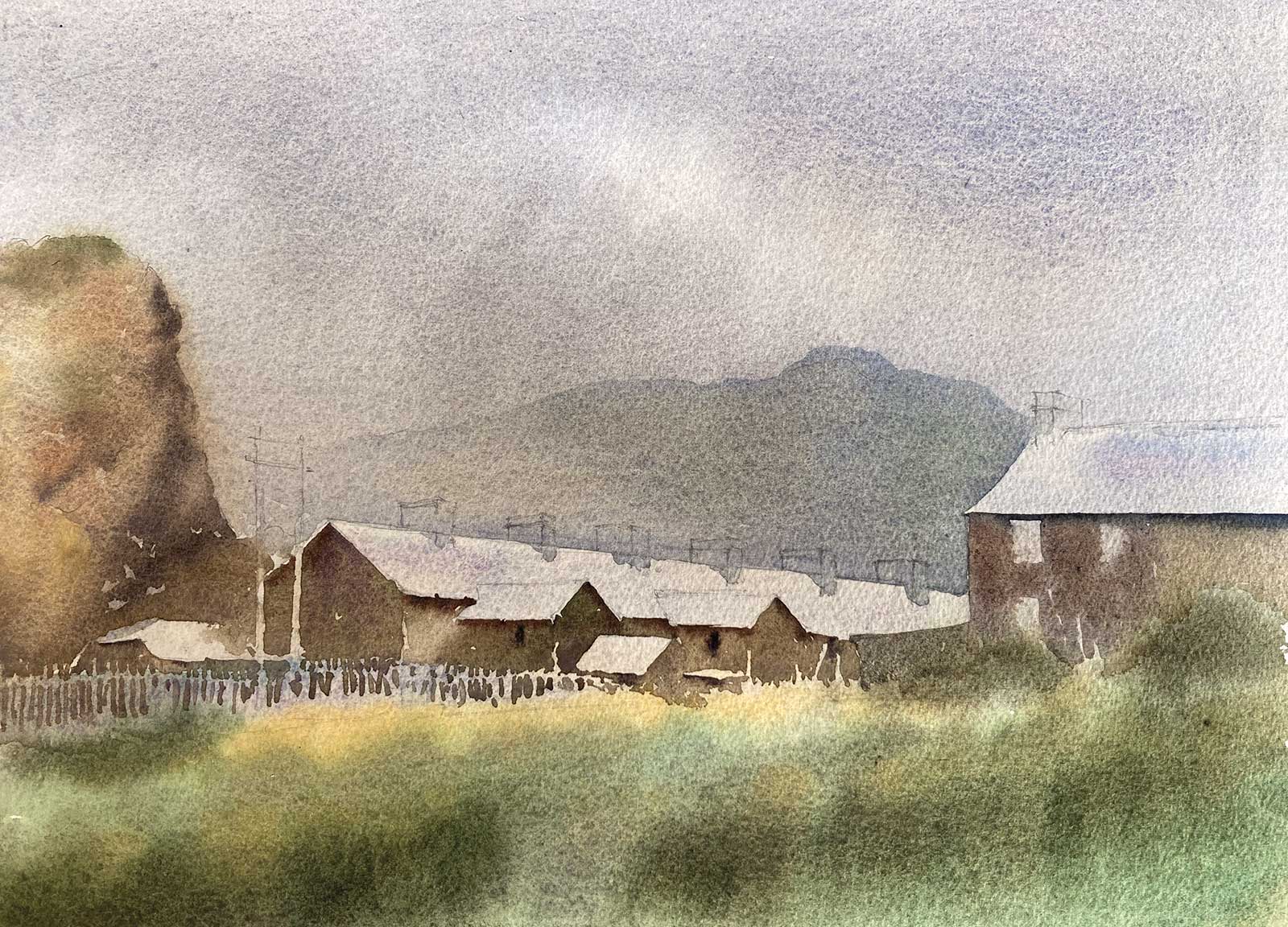
Stage 9 Strong Wash on Houses
Now that I am happy with the tonal contrast between the top of the painting and the roofs of the houses, I can place the nearby houses with a strong wash, again, using the same palette of colors.
 Stage 10
Stage 10 Light Effects
We have now reached the stage where the big shapes have been placed and by placing second washes around the roofs, I have achieved the light effect that I was chasing.
 Stage 11
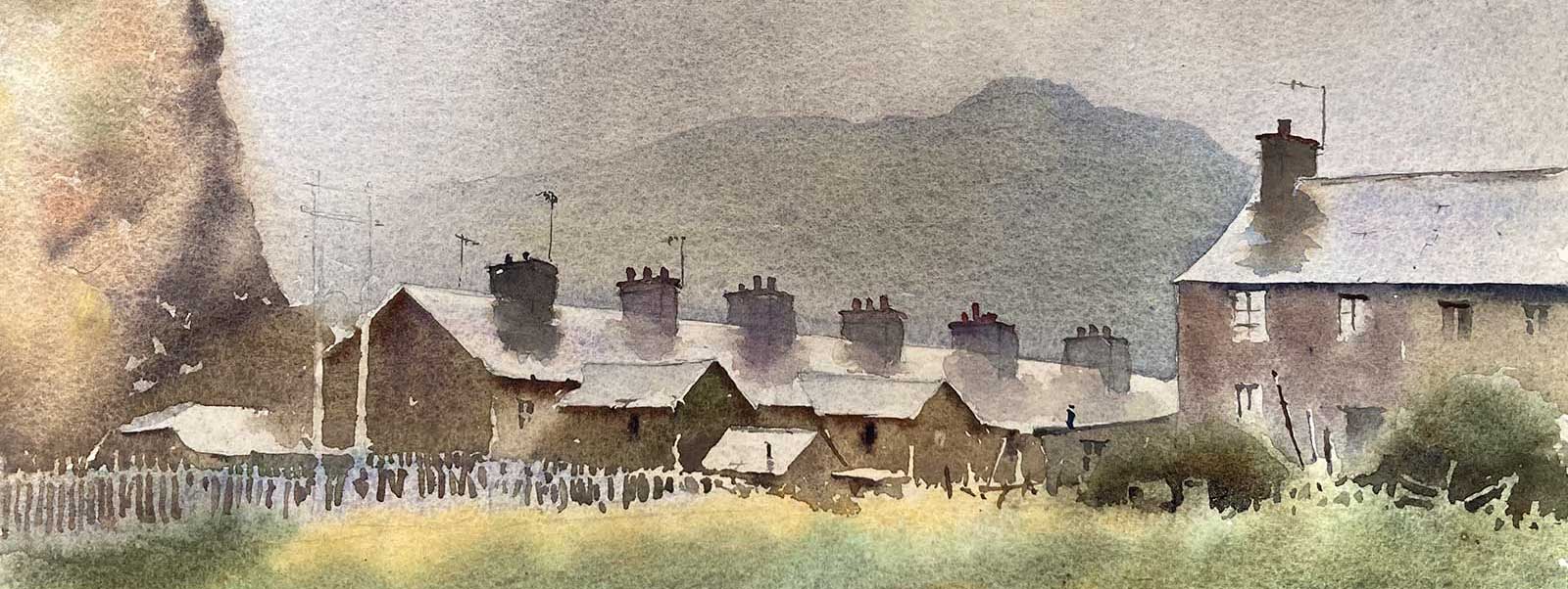
Stage 11 Chimneys and Reflections
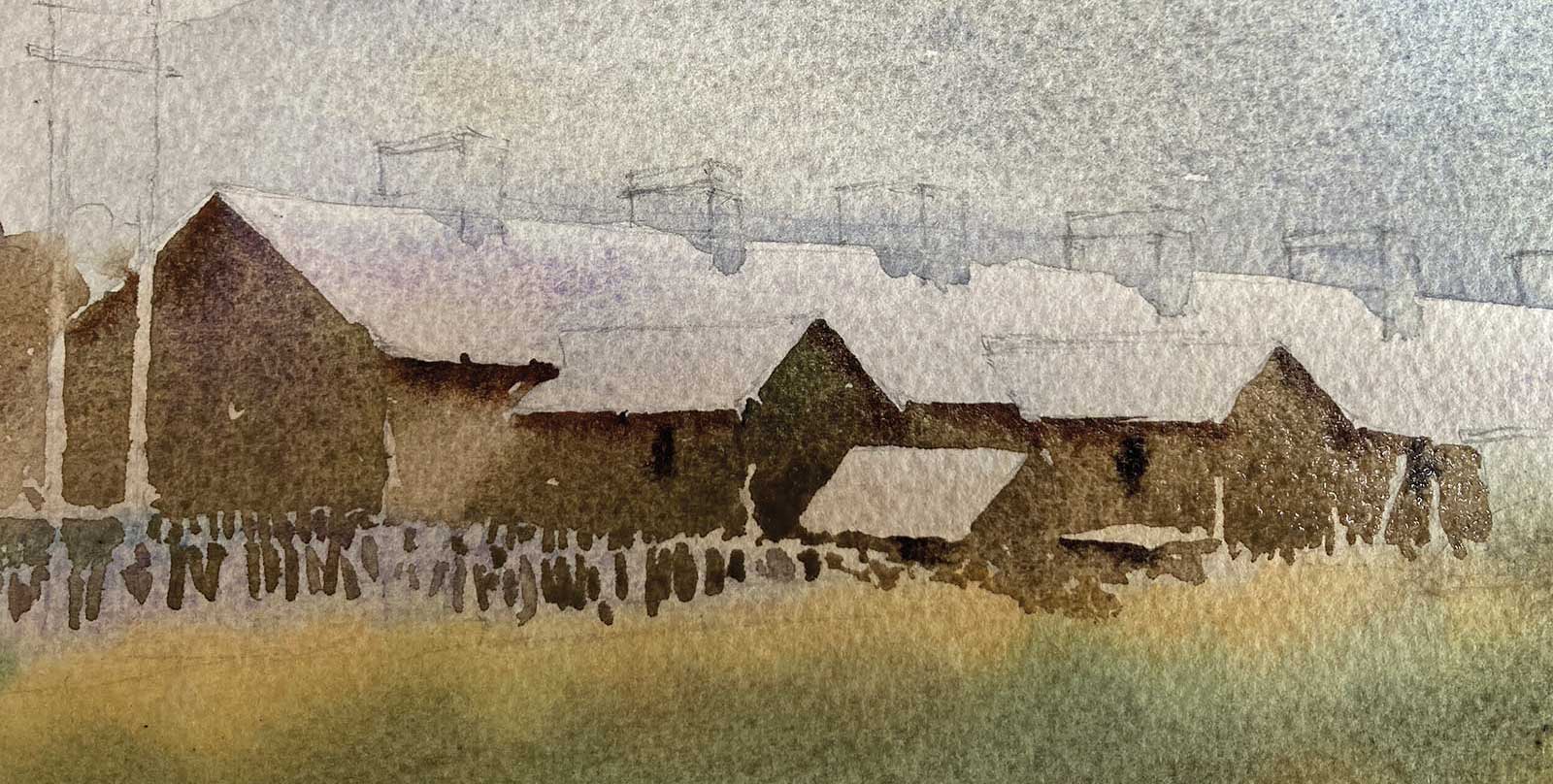
The chimneys and their reflections are added with French ultramarine, burnt sienna and ultramarine violet. I make the nearer ones darker in tone to pull them forward.
 Stage 12
Stage 12 Final Details
I detail up the windows and telegraph poles, adding just enough to make them “read.”
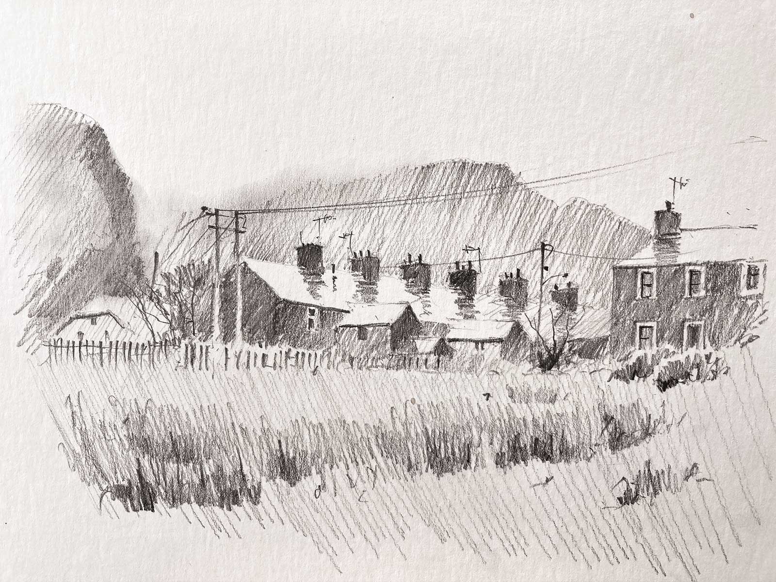
 Stage 13
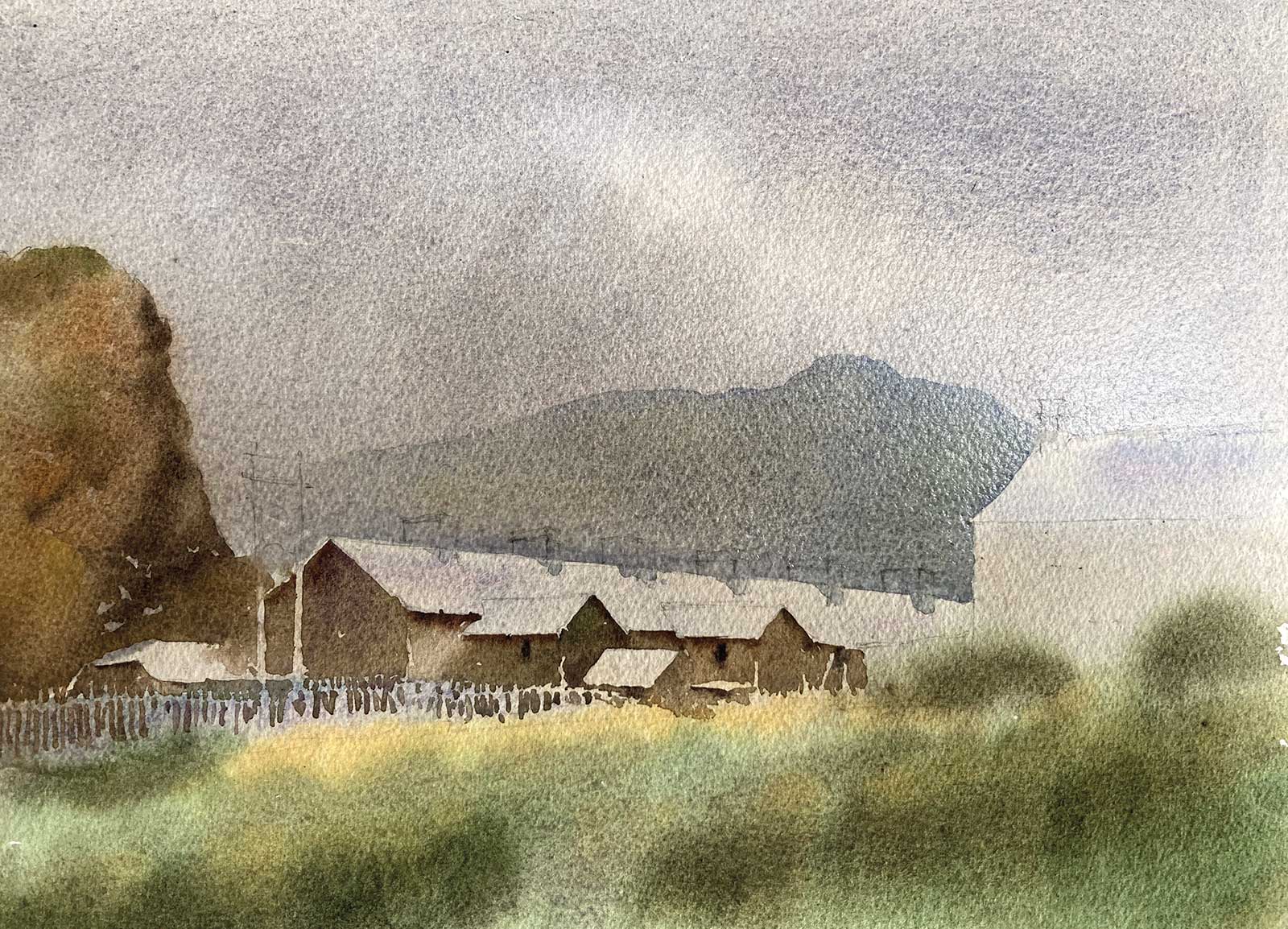
Stage 13 Finished Artwork
Wet Day Blaina Ffestiniog, watercolor, 10 x 13½" (25 x 34 cm)
Finally, a figure and some darker marks are added to the foreground to further pull it forward and to add some hard edges.
About the artist
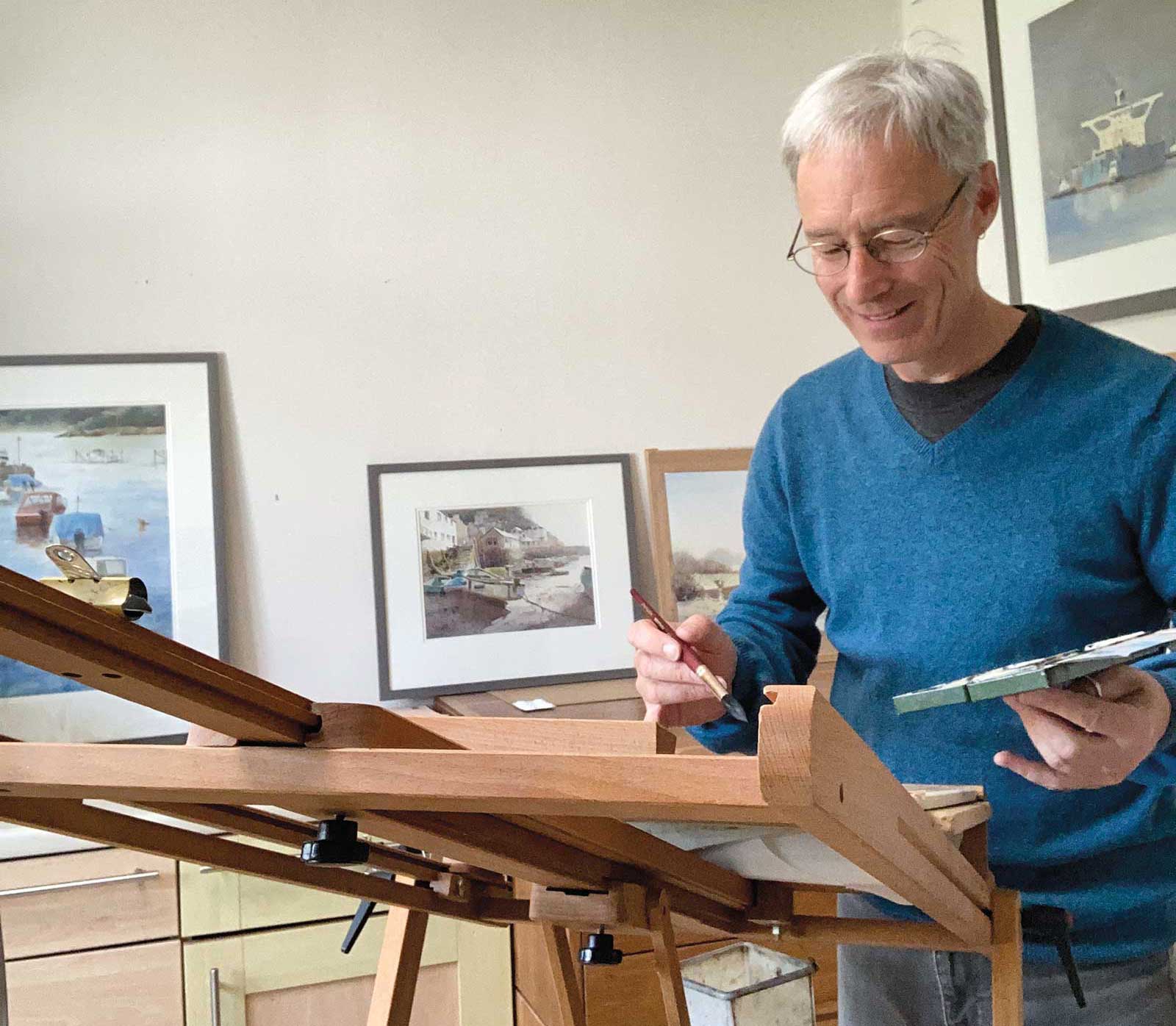 Peter Cronin
Peter Cronin is a self-taught artist living in South Wales, United Kingdom. He began painting professionally in 2003 after a 20-year career in structural engineering. Very much a traditionalist, he paints in pure watercolor, thus giving the luminosity of the medium full prominence. An ability to draw is seen as essential to enable the heart and emotions to express themselves freely, unhindered by technical deficiencies. Working in plein air directly in front of his subjects has played a large part in the evolution of his style. An awe and fascination with the natural environment felt as a child has been sustained throughout his life and is reflected in the coastal and landscape aspects of his work.
Cronin is a member of the Royal Society of Marine Artists, the Royal Watercolor Society of Wales and the Pure Watercolor Society. He has written two books published by Search Press: Pure Watercolor Painting and Sketching for the Absolute Beginner.
Contact at
www.petercronin.org