


I have often had people tell me that my paintings look like they could be photographs. While I certainly take this as a compliment, I also see it as an opportunity to explain that there is actually a lot more going on below the surface. It’s the underlying design or composition, the selective editing of information that takes the painting from merely a well-executed copy of a photograph to a true work of art. The photorealistic aspect is really just a thin veneer of three-dimensional reality on top of a two dimensional, abstract design.
Inspiration for my paintings comes as a flash of light or spark of color that I see in the world around me. It may be blooming flowers in the spring, the changing leaves in autumn or any ordinary little corner of the world that happens to be catching the light in an extraordinary way at that moment. As long as the elements all come together in just the right way, I can see the potential for a painting. I take reference photos to remind me of the overall impression as well as all the necessary details to use as my raw materials back in the studio.
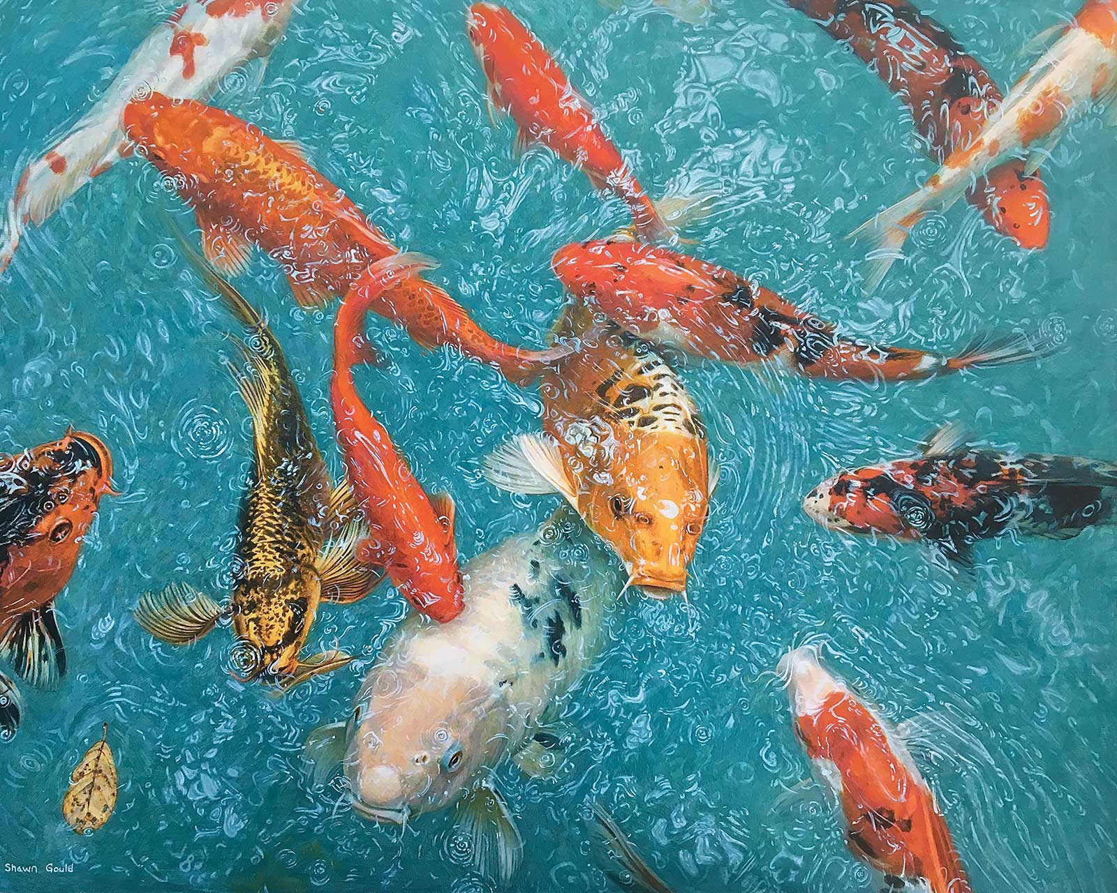
Koi, acrylic, 24 x 30" (60 x 76 cm) I imagined this painting as a completely abstract composition with the emphasis on vibrant color and movement. The fish were all arranged to create dynamic movement throughout the composition while maintaining a feeling of balance. The blue of the background was chosen to contrast with the warm orange and yellow colors in the fish.
I usually start with the scene or setting and then I add animals to act as characters, bringing life to the image and an opportunity to tell a story. Thinking about the image abstractly in the beginning allows me to take what nature has provided and transform it. Each element of the scene can be evaluated for its contribution or distraction from the whole design. Does it need to be there? Should I move it or just remove it all together? How will adding animals change the scene and create focal points within the design? I can move things around to create better balance in the composition, change lines so they intersect at the right places and remove any that lead the eye off the edge. When placing animals within my scenes, I try to avoid the center of the frame. Placing the focal points in the corners or closer to one edge makes for a more dynamic design. The goal is to create a composition that leads the eye naturally through the image without getting distracted or stuck on anything that feels out of place.
The backgrounds in photos of nature can be overly busy and have drab, unappealing color. Replacing that with a more unified color can brighten the overall palette and provide contrast with the foreground elements. It can also set the color tone for the whole painting, changing the mood and feel considerably. Applying a gradient to this color can also create a sense of depth and help move the eye across the painting.
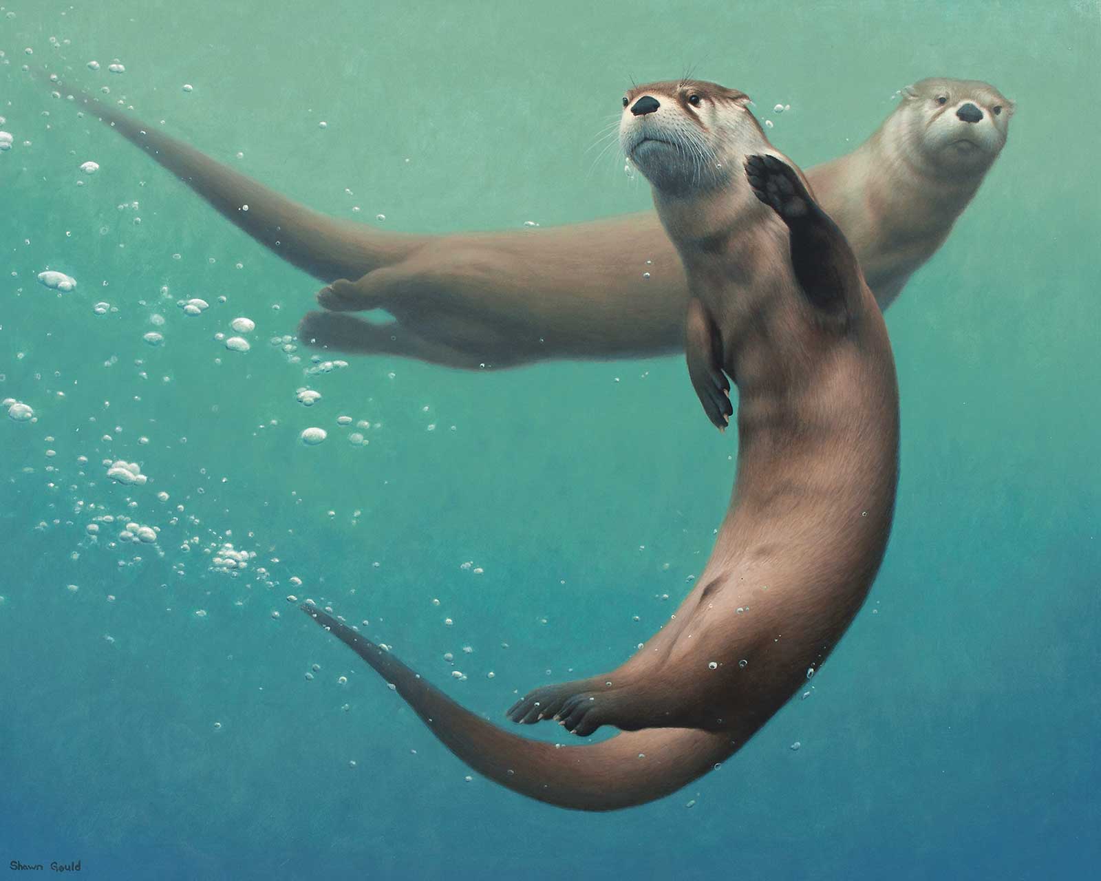
Otter Curiosity,, acrylic, 24 x 30" (60 x 76 cm) My goal for this painting was to capture the playful, fluid movement of the otters. The background was kept very simple so there was nothing to distract from the otters, just a gradient of cool blue to create a feeling of depth and three dimensional space and a few bubbles to emphasize their movement. The intersection of the otters’ curving forms becomes the focal point of this composition.
I start with some quick thumbnail sketches to work out the overall design without getting distracted by details, then I create a detailed pencil sketch on the gessoed hardboard panel. Now I can see the design and overall values at full size for the first time and have another chance to reevaluate and edit further. Using transparent glazes, I then loosely block in colors over the sketch, building it up through layering. When the color is blocked in and values have been established, the outlines of the whole image can now be seen and evaluated again. I now finish the painting beginning with the background, moving forward. I will reserve the greatest contrast and brightest colors for the main focal points in the foreground. My brushwork becomes more opaque and details get sharper as I get closer to the end.
As the painting develops, everything becomes more clear and problem areas that need to be altered become more evident. One trick I use for identifying these problem areas is to repeatedly look at the painting in a mirror and/or upside down. This helps me see it abstractly again so that I can evaluate the design without being distracted by the details. In the end, I will hopefully have a painting that looks real enough to believe but is also an objectively good work of art.
My Art in the Making Sunflower Golds
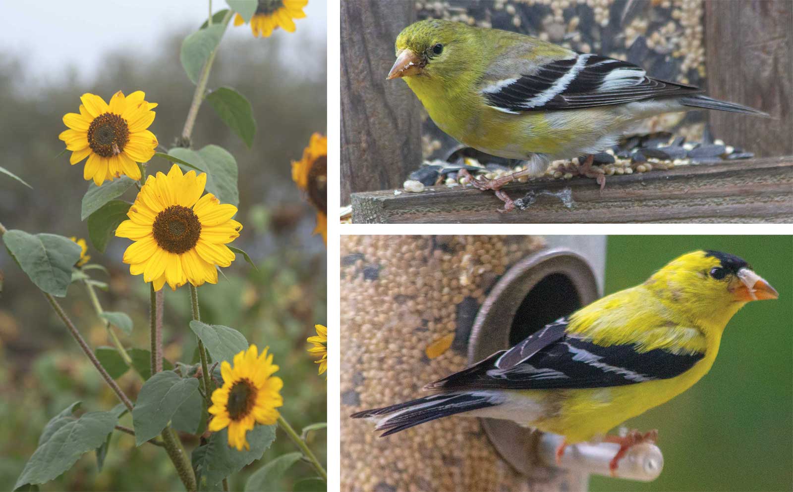
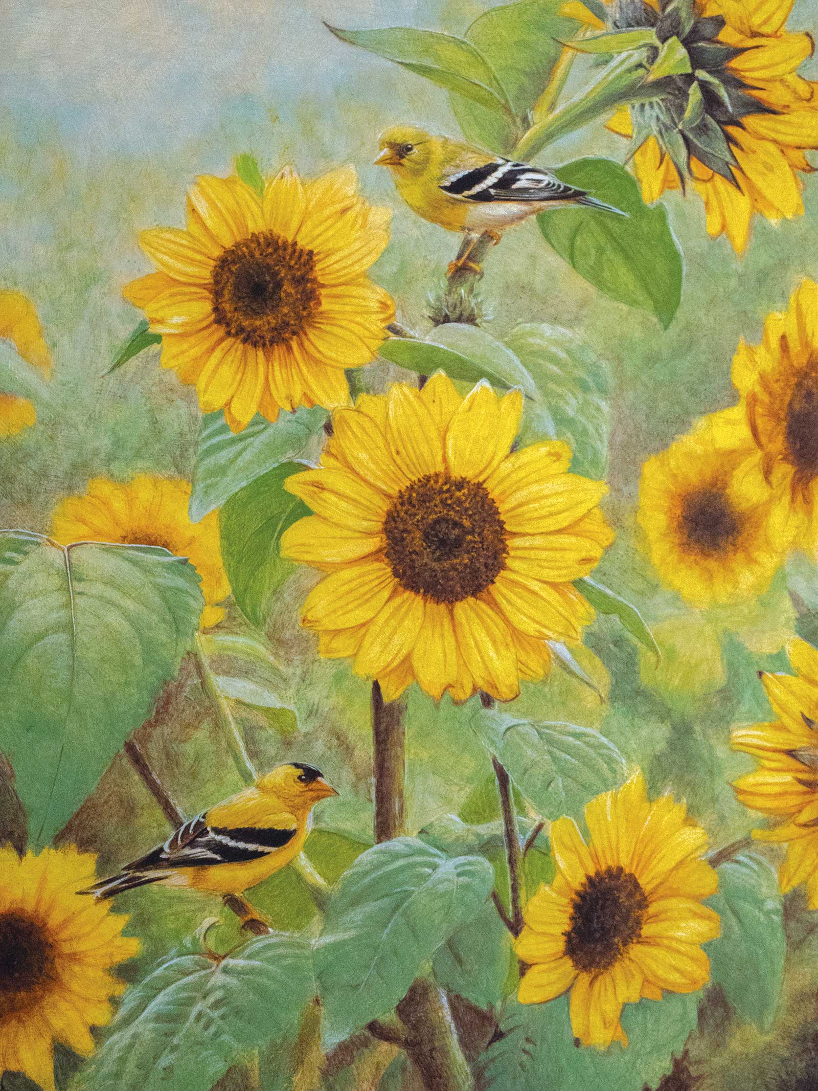
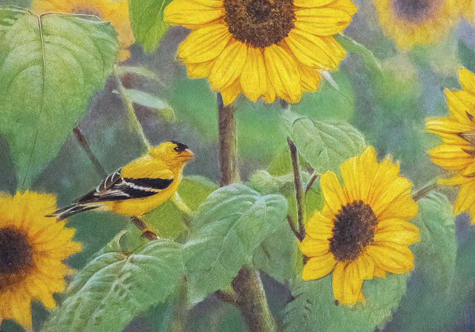
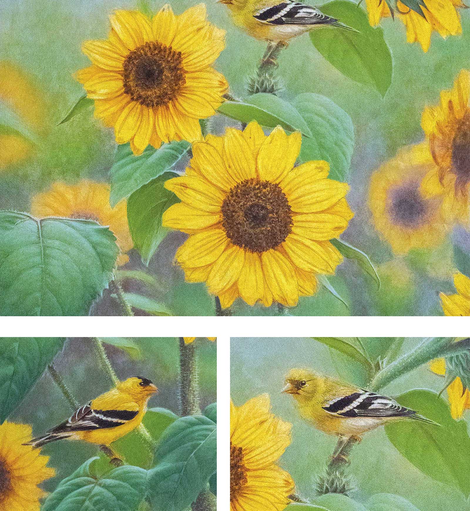
Reference Photos
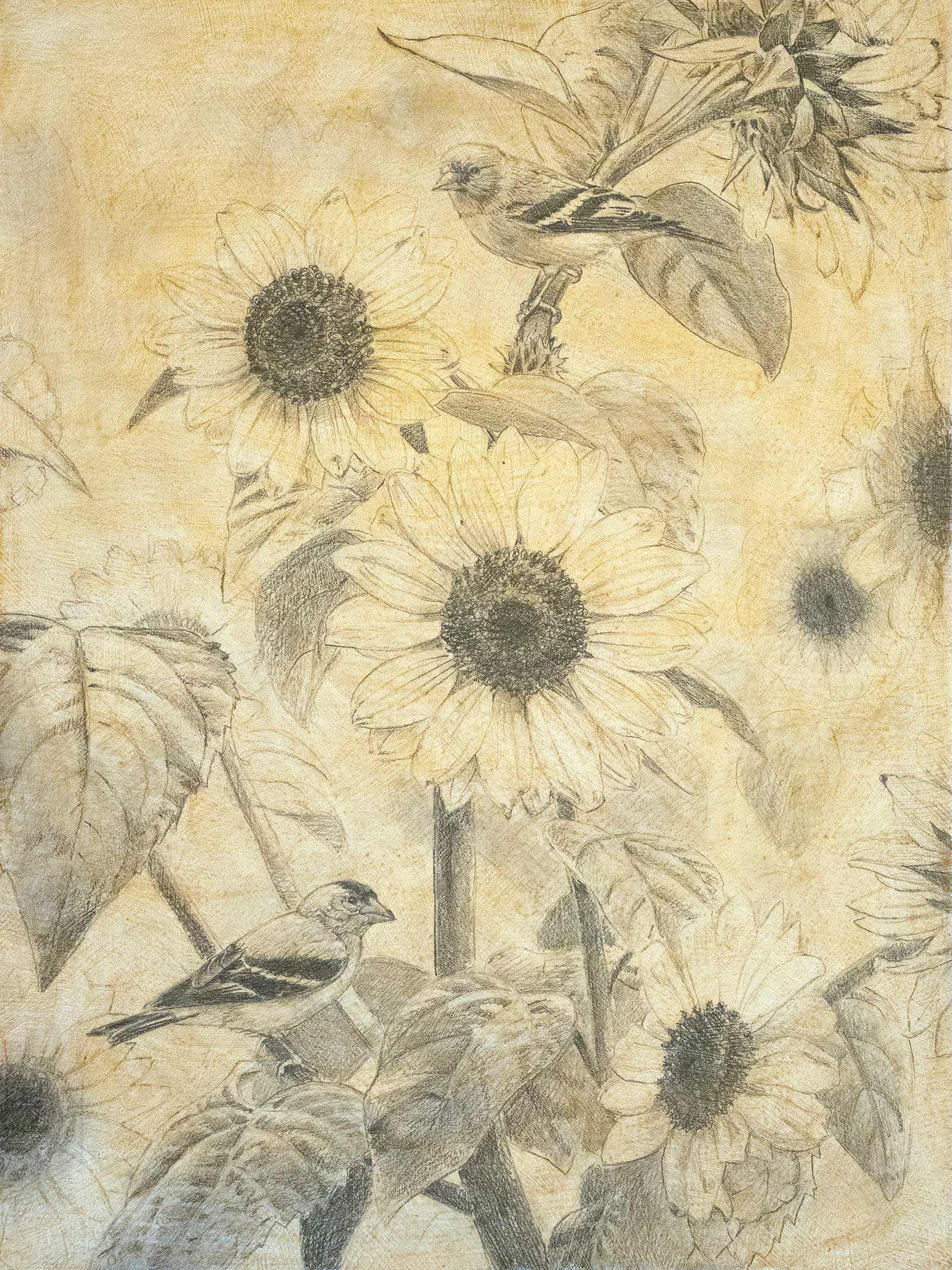
 Stage 1
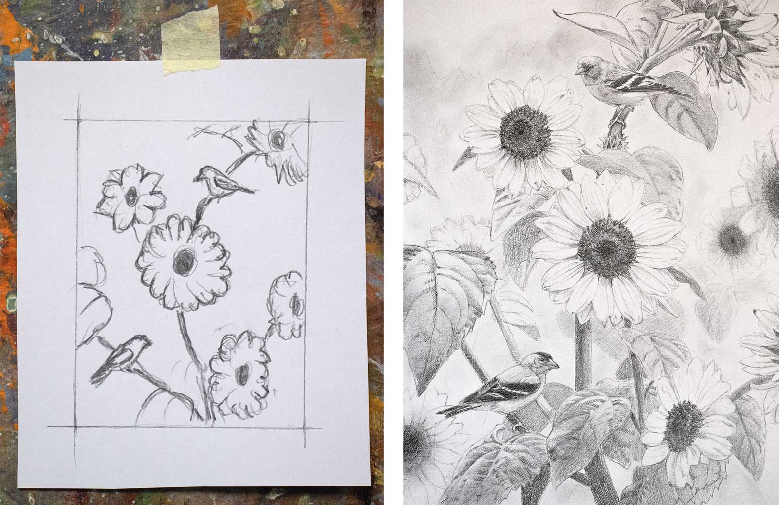
Stage 1 Thumbnail Sketch and Detailed Sketch
I start with a quick thumbnail sketch to design the placement of the main elements and lines of the painting. Just the very basic points laid out in an almost abstract composition. Then, I move on to a fairly detailed sketch on the gessoed panel using a 4H pencil. At this stage you are paying attention to values and edges of forms. A wash of yellow ochre thinned with matte medium and water is added to seal in the graphite and tone the panel.
WHAT THE ARTIST USED
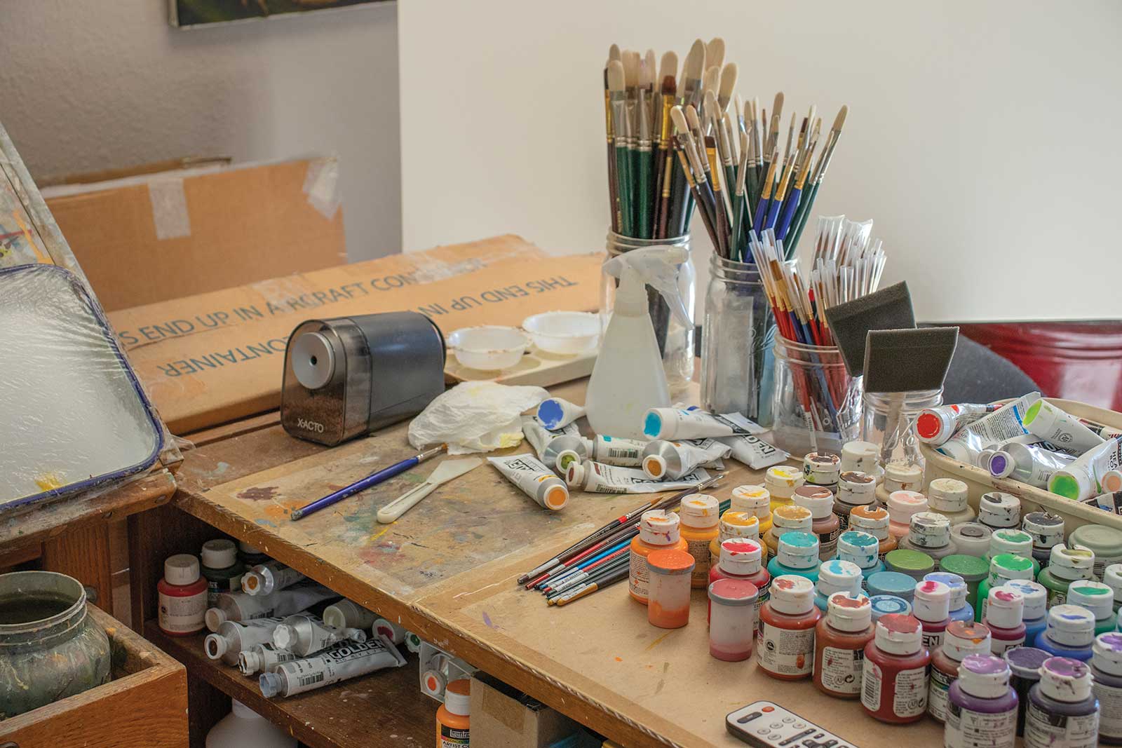
Acrylics
Yellow ochre, Titanium white, Cadmium orange, Cadmium yellow medium, Red oxide, Light portrait pink, Burnt umber, Raw umber, Burnt sienna, Raw sienna, Hookers green, Chromium green, Green gold, Vivid lime green, Light violet, Prism violet, Cerulean blue, Light blue violet, Aqua green, Cobalt turquoise, Neutral gray 5, Ivory black
Additional Materials
16 x 12" hardboard panel, Gesso, Matte medium, Satin varnish, #12 filbert, #8 filbert, #4 filbert, #6 round, #2 round liner, 2B pencil, 4H pencil, Kneaded eraser, Ceramic tray, Jar for rinse water, Paper towels, Palette knife, Spray bottle
 Stage 2
Stage 2 Blocking in Color
Begin blocking in color by layering glazes over the sketch with #4 filbert and #6 round brushes. Start with warm colors like yellow and orange working only with light to medium values at this point.
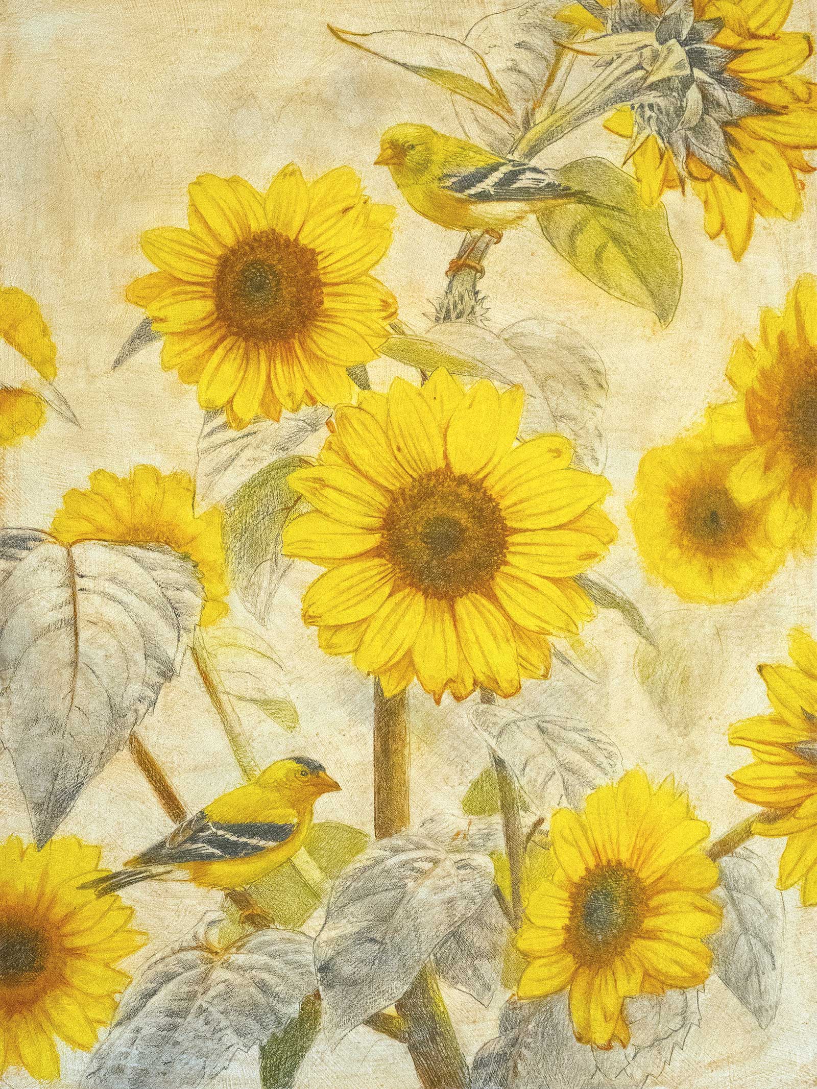 Stage 3
Stage 3 Keep it Loose
Continue loosely layering in color, moving to cooler greens, blues and grays. Stay in the light-to-medium value range until you have blocked in the full range of color for the painting.
 Stage 4
Stage 4 Strengthening Values
Now add the values in more detail using #6 round #2 round liner brushes. Push the atmospheric perspective by limiting the detail and contrast in the background. Reserve the darkest darks and lightest lights for later.
 Stage 5
Stage 5 Bringing it All Together
Beginning with the background and moving forward, start finishing the painting. Add detail, expand and fill out the color palette and blend values. The brushstrokes are getting more opaque and detailed. Use #6 round and #2 round liner brushes for this stage.
 Stage 6
Stage 6 Final Details in Foreground
Final details are added to the foreground starting with the green leaves and stems of the sunflower. Note the warmer greens on the underside of the leaves and the cooler grays on top. Use #6 round and #2 round liner brushes.
My Design and Composition Tactics
Color
I am usually drawn to bright, eye-catching color for my subjects. In my paintings I will often simplify the background by using a solid color or gradient that complements the colors found in the main foreground elements. This background color also helps to set the overall tone and mood of the final image. Intersecting Lines
I like to use intersecting lines to create focal points and help move the viewer’s eye through the image. Strong diagonal lines can help you create energy or drama in a composition, while sweeping curved lines will have more of a calming effect.
Values
I pay close attention to the values throughout a painting. The feeling of depth in a scene can be emphasized using atmospheric perspective. Objects in the background are softer and have less contrast compared to those in the foreground. Saving the greatest contrast for the main focal points of the composition helps them to stand out against the rest of the image.
Asymmetrical Balance
I like to create drama and energy in a composition by using asymmetric balance. For example, a small area of positive space can be balanced by a large area of negative space, or the focal point can be placed near one edge or far into one corner to create tension, as long as the composition as a whole is still balanced by the other elements of the scene.
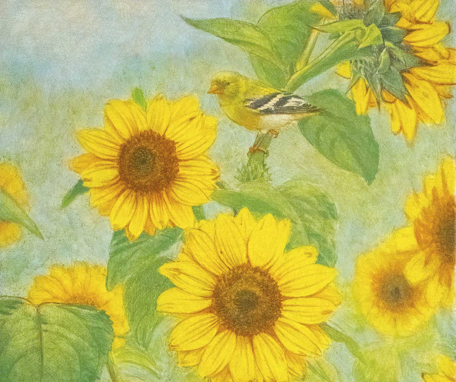
 Stage 7
Stage 7 Finishing the Flowers and Finches
The brightest colors, greatest contrast in value and sharpest details are saved for the main focal points of the painting: the two birds and the central sunflowers. Use a #2 round liner brush here.
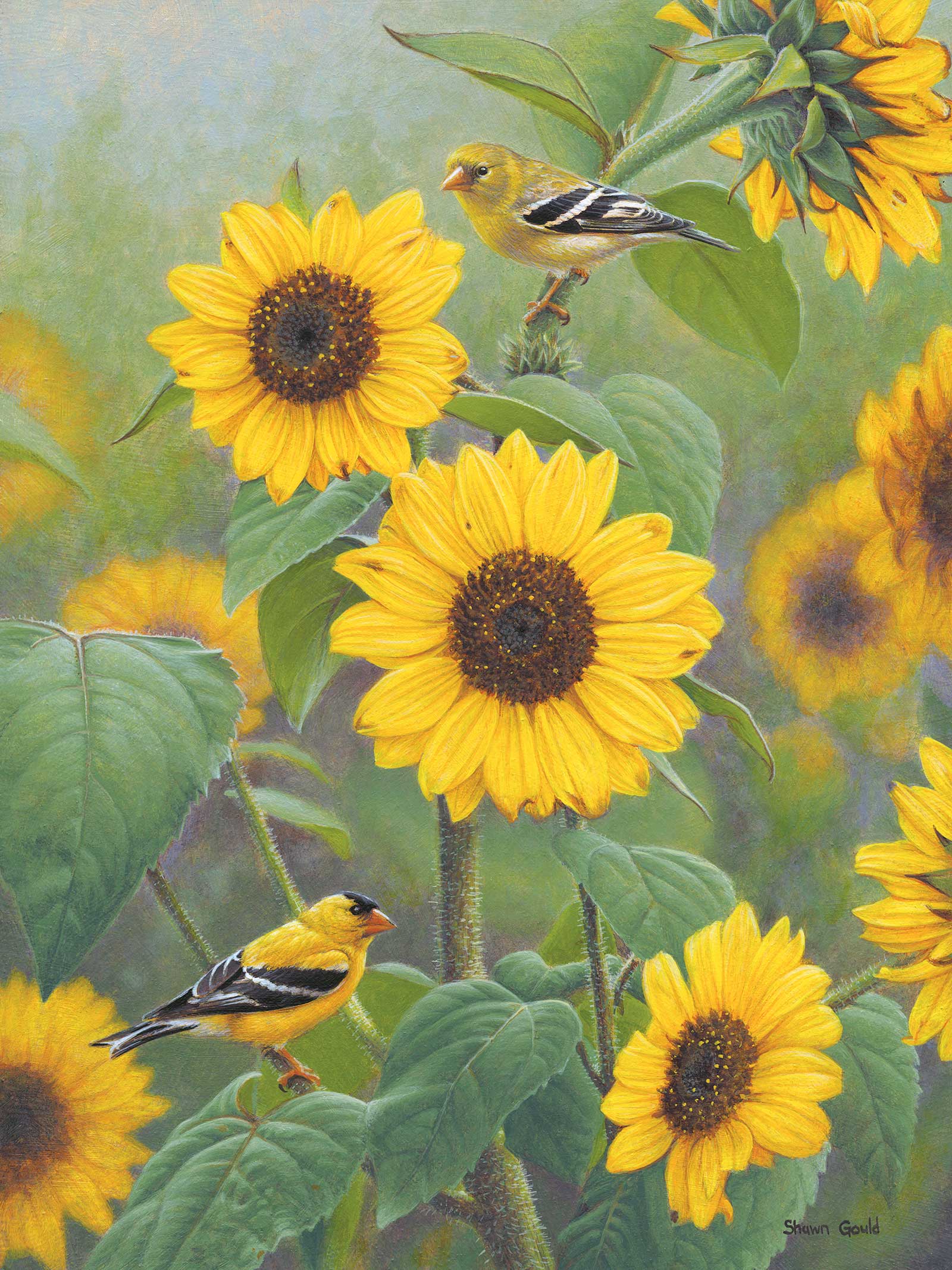 Stage 8
Stage 8 Finished Artwork
Sunflower Golds, acrylic, 16 x 12" (40 x 30 cm)
About the artist
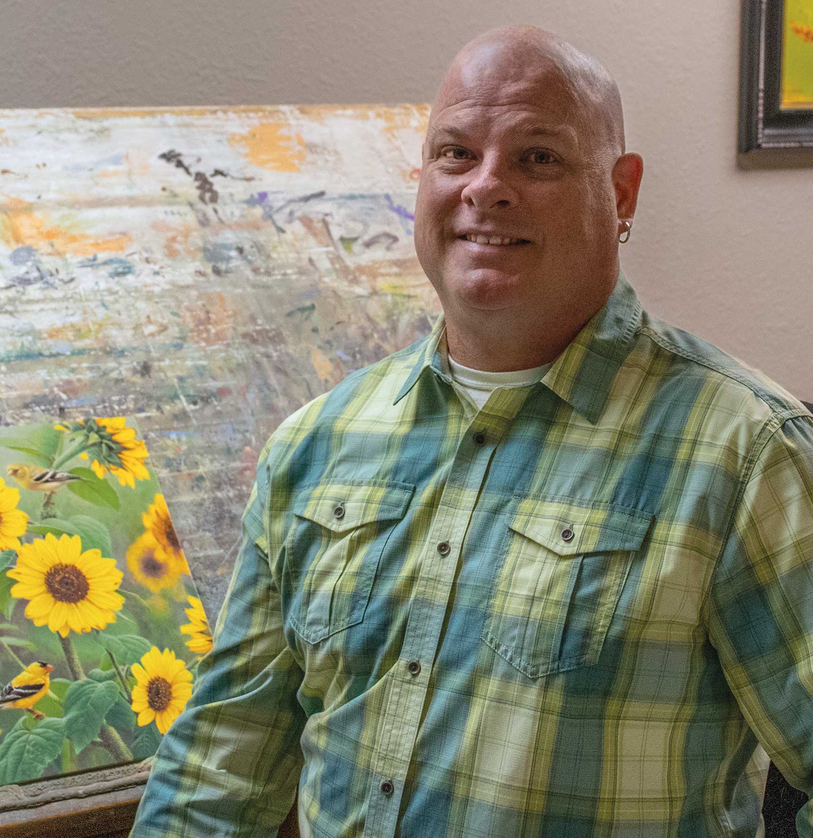 Shawn Gould
Art and nature have always been important parts of Shawn Gould’s life. Growing up, he spent many days outdoors exploring the streams and woodlands near his home. These formative experiences first established his deep love of nature and his unending curiosity to see more.
Gould began his art career as an illustrator, creating award-winning science and natural history illustrations for clients like the National Geographic Society, Smithsonian Institute and National Audubon Society. This was an important time to hone his skills until he was able to turn his attention to creating his own paintings full time.
Gould’s paintings have been exhibited in Birds in Art, the Buffalo Bill Art Show, the Society of Animal Artists’ Art of the Animal, and are held in public and private collections across the nation. He has been awarded First Place in the Richeson75 Animals, Birds, and Wildlife Competition, and an Award of Excellence at the NatureWorks Art Show. Gould is a Signature Member of the Society of Animal Artists.
Represented by
Big Horn Galleries, Wyoming, USA; Arizona, USA, www.bighorngalleries.com
Howard/Mandville Gallery, Washington, USA, www.howardmandville.com
Lovetts Gallery, Oklahoma, USA, www.lovettsgallery.com
Sorrel Sky Gallery, Colorado, USA; New Mexico, USA, www.sorrelsky.com
Trailside Galleries, Wyoming, USA, www.trailsidegalleries.com
Contact at
shawn@shawngould.com
www.shawngould.com