


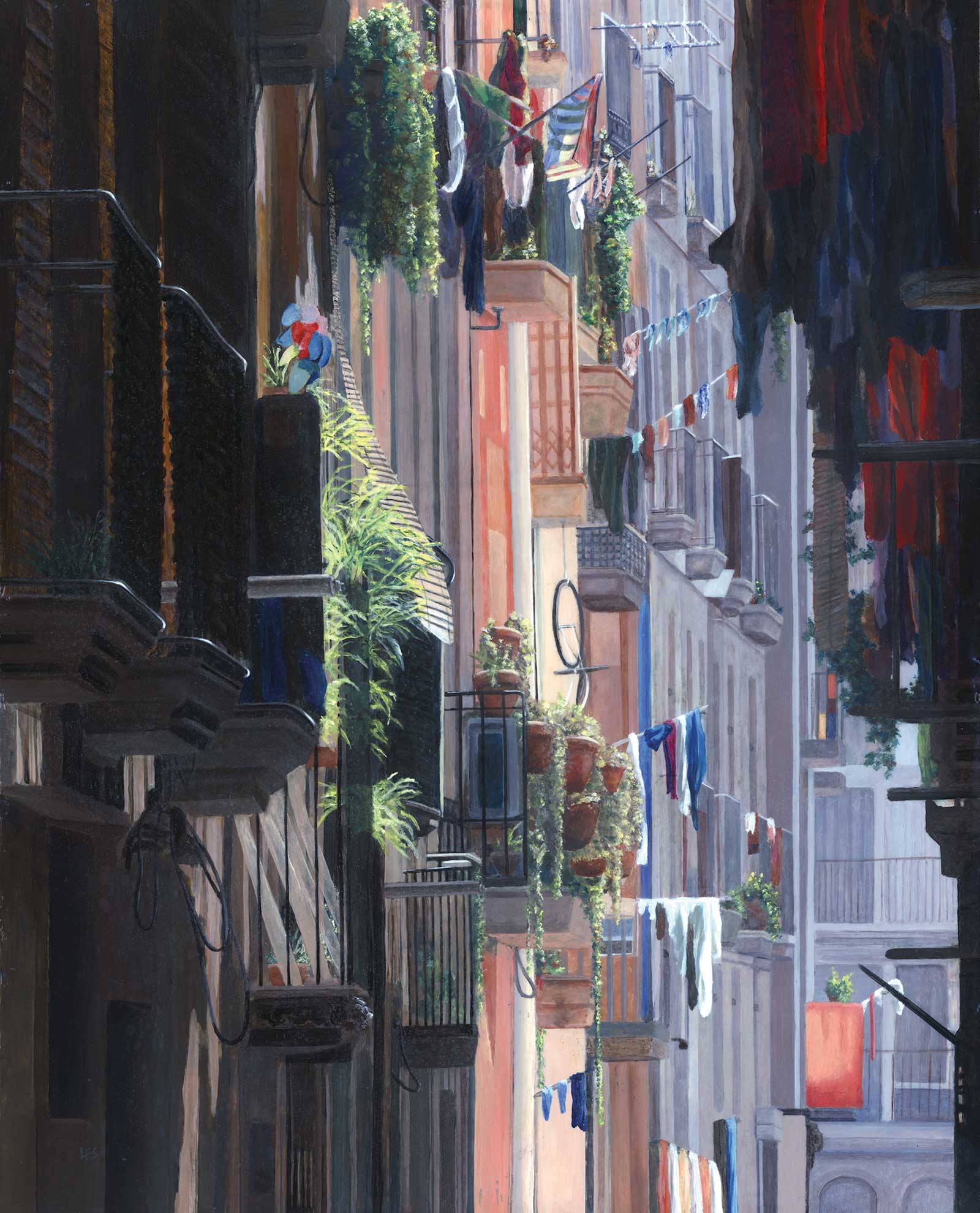
 Barcelona Balconies, acrylic on hardboard panel, 20 x 16" (50 x 40 cm)
Grand Prize is a four-page editorial feature in American Art Collector magazine
Len Swec
Connecticut, USA
Noticing the Details
Acrylic artist Len Swec works in the genre of realism, depicting a variety of scenes that capture different elements of life. In one painting, you might find a simple interior of an empty room with a lone white chair; in another, a group of patrons chat casually in a bar; others feature train depots, crashing ocean waves or a narrow alleyway.
“I haven’t focused my art on particular subjects or themes; I enjoy the creations of so many fine artists from around the world that I like to try my own hand at the subjects that come from their studios,” Swec reflects, adding that his themes include landscapes, seascapes, cityscapes, architecture, figurative, still life, and the occasional animal. Since his retirement from a non-art-related career ten years ago, Swec now paints full time. “I find it stimulating to continually change genres and experiment with new subject ideas and painting techniques.”
He continues, “My style is often described as ‘photorealism,’ a term that I don’t particularly like. I think this description diminishes what a painting can accomplish and implies that a photo is the highest standard of realism. In truth, a photo can portray only a subset of the range of colors, values and detail that the human eye can perceive; a painting can expand the range of what can be conveyed by a photo, and is therefore often superior to a photo. One of the things I try to do in my paintings is to encourage the viewer to come up close and study details.”
My Inspiration
Wandering through the Gothic Quarter of Barcelona presents endless painting possibilities. It is a fascinating area where you can see changes in lighting, shadows and architecture on every street and around every corner. This street scene struck me with its contrasts between deeply shadowed foreground, brightly lit middle distance and subdued blue-gray background. I also loved the variety and color of laundry hanging out to dry, along with the greenery and other paraphernalia on private balconies. Architectural subjects are also a favorite of mine because they present the challenge of accurately depicting perspective.
My Design Strategy
This painting closely followed the reference photo with regard to layout. For architectural subjects I sometimes use photo manipulation software to correct perspective distortions that may be present in wide-angle reference photos, as was the case here. There were also elements in the original photo that I chose not to reproduce, including a couple of satellite dishes that were mounted to balcony railings because I thought these were distracting to the composition. This required some imagination to fill in missing details of things that might be behind the dishes. I also decided that in the finished painting I would intensify the contrast and colors of the reference image, so the painting has a wider range of color and value than the reference.
My Working Process
Because my paintings usually include a high degree of detail, I like to work on a smooth surface, as it gives me greater control over fine brushwork. This painting, like most of mine, was done on an Ampersand or DaVinci gessoed hardboard panel. I use acrylic for all of my art. My process involves laying down multiple layers of thin, semi-transparent glazes until I get the depth and richness of color I am looking for. I like the way this lets light filter through the color layers to enhance their brilliance. On some passages in this painting there are eight to ten layers of color glaze. I avoid using water to thin the glazes, but instead use a few drops of high flow medium, because water can dilute the acrylic binder and reduce adhesion. I work with a fairly limited palette, generally using either quinacridone magenta or pyrrole red, anthraquinone or ultramarine blue, burnt sienna, bismuth vanadate yellow and titanium white. I almost never use greens from a tube because I like to mix my own greens. I also use bone black, which is transparent, to darken values of other colors, as well as zinc white mixed with glazing medium to tint selected dried paint surfaces.
Contact Details
Email: len@lenswec.com
Website: www.lenswec.com
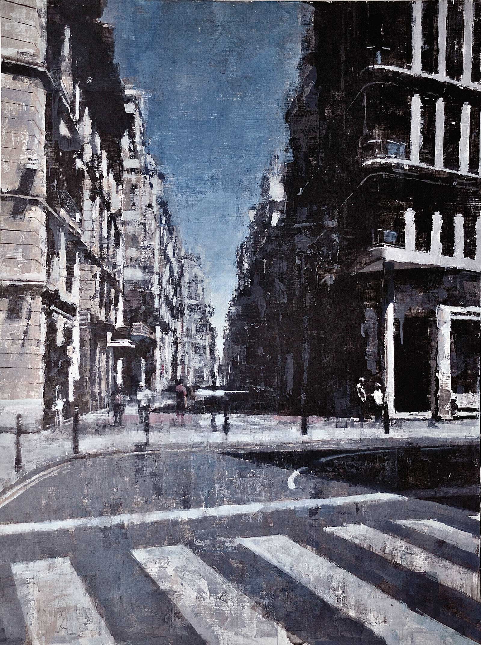 Malaga Avenida, oil, 31½ x 23½" (80 x 60 cm)
Second Prize is a two-page editorial feature in American Art Collector magazine
Leslie Gaduzo
Gibraltar
My Inspiration
Having trained and subsequently worked as an architect for many years, I have an almost ingrained sensitivity to the built environment. I feel drawn to buildings and in particular the spaces between them; streets, roads and plazas. It is how we interact with these spaces that I find interesting to observe, and which then makes me want to depict them. When I was 10 years old, in middle school art class, I would produce numerous single-point perspective drawings of imaginary streets with buildings on both sides, perhaps a sign of the work that I would eventually do as an adult.
My Design Strategy
Composition is key, but I have somewhat changed my philosophy over the last few years or rather, my position fluctuates between composition being key and a favorite saying which I heard somewhere that says “it’s not what you paint but how you paint it.” Ask yourself how many paintings have you seen of rather mundane or ordinary things and have been captivated by a unique quality it possesses. Something about the textures or color juxtapositions that keeps you glued to the image. In a perfect world, composition comes first and hopefully everything else falls into place after that, with mark-making playing a vital part in giving the painting a dual character of realism and abstraction as well as giving evidence of the energy and movement that went into producing it.
My Working Process
My working process mostly revolves around photography and video. This applies to portraiture as well as figure painting. In the case of cityscapes, if I find a space that is potentially the subject of a painting, I try hard not to decide in that moment what specifics will be included in the painting. I will rely on my eyes to absorb the view in that moment. Then in my studio while viewing the images or video recording, I try to transport myself to the future and imagine the feeling of painting it. I have to feel that I am able to transmit the illusion of depth but at the same time transmit the energy of the act of painting.
Contact Details
Email: lesliegaduzo@gibtelecom.net, lesliegaduzo@yahoo.co.uk
Website: www.lesliegaduzo.com
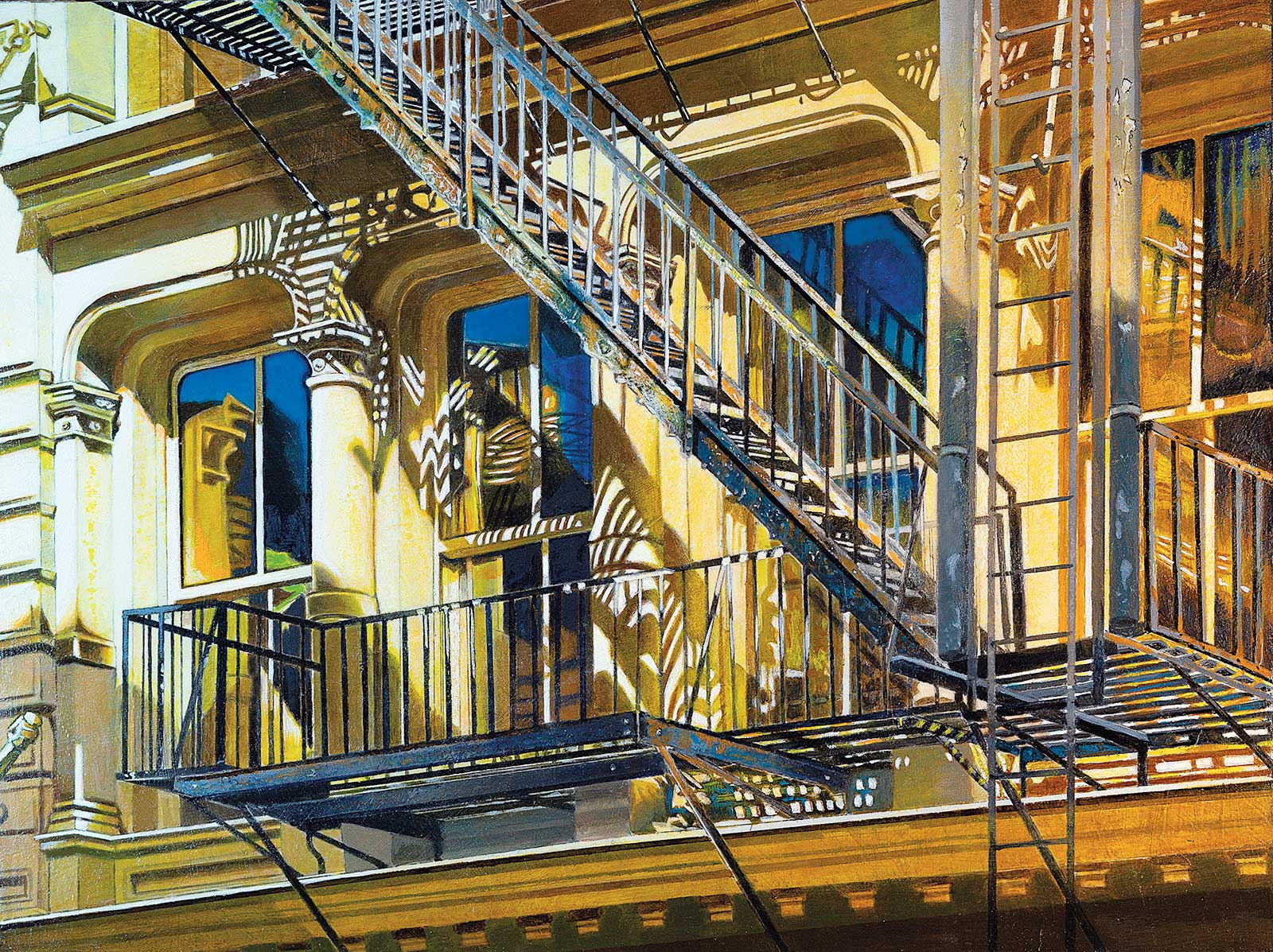
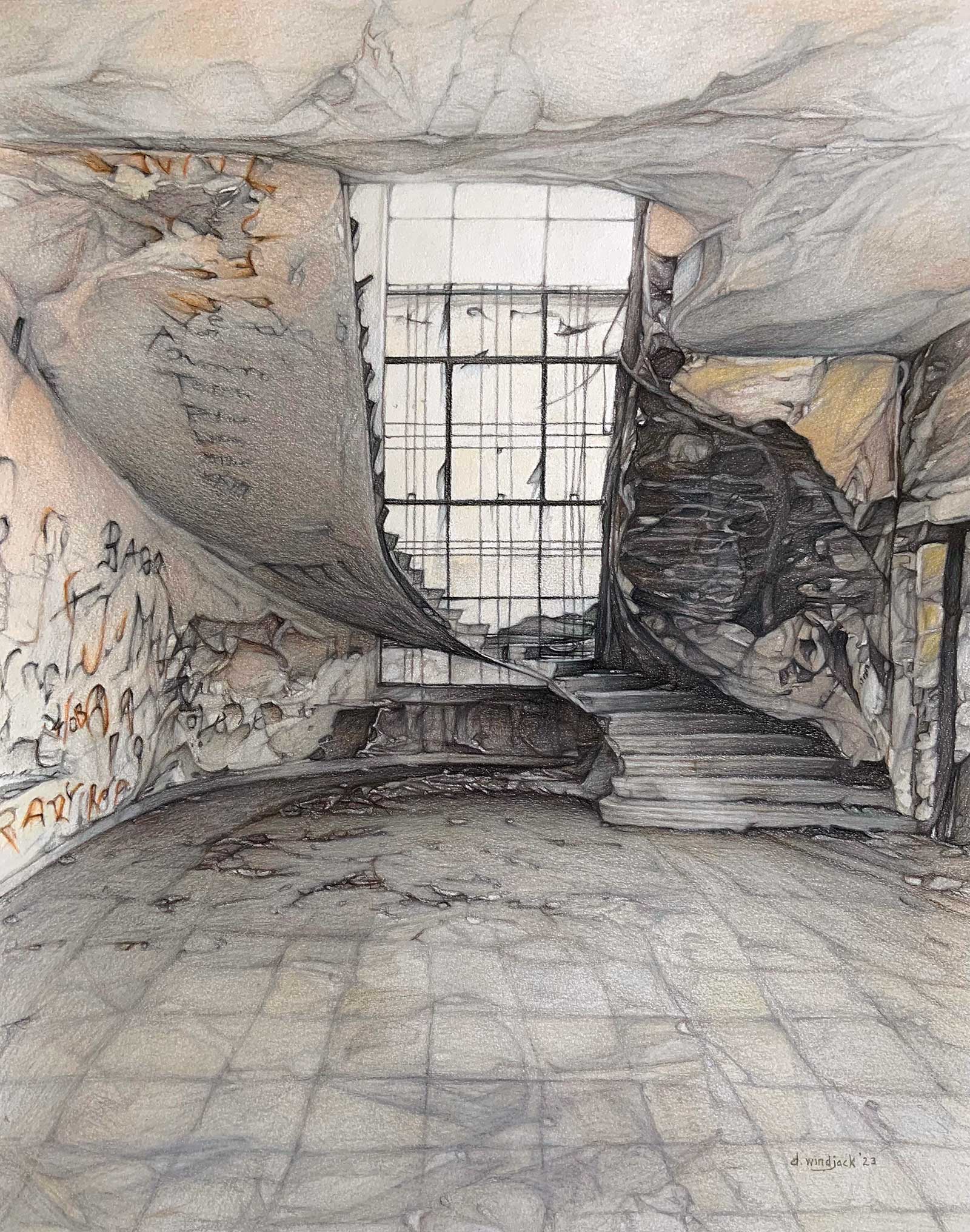 Ascension, Polychromos pencil on paper, 19½ x 15½" (39 x 49 cm)
Third Prize is a one-page editorial feature in American Art Collector magazine
Darrell Windjack
Alberta, Canada
My Inspiration
Beautiful architecture, both modern and historic, always catches my attention. My artist eye sizes up brick-and-mortar constructs of human ingenuity as potential sources for future artworks. Although it can be daunting, I enjoy tackling this subject matter. I should have been an architect! A friend photographed this pedestal staircase, and I immediately asked her if I could use it as a reference. Something about this abandoned scene drew me in. It makes you wonder how alive this dilapidated villa must have been during its heyday decades before decay and graffiti chipped away at its grandeur.
My Design Strategy
I work from the photo reference but alter things for greater impact. Much of the fine detail will be stripped away to present a more simplified composition where “less is more.” Saturated colors in the photo are minimized, leaving mainly black and white for a more haunting effect. Fringes of the painting take on an abstract feel with defined features being the central focus, that is, the staircase and window. Lastly, the photo appeared to show the wall of an adjacent building in the window. I decided instead to leave the window illuminated only by natural light. Polychromos pencils on 98-lb mixed media paper were used.
My Working Process
Step one is to freehand sketch a detailed drawing of the laptop photo. This takes up to a week as I carefully observe and transpose angles and shapes to paper. A ruler is used to regularly measure distance from borders to certain points in the drawing to ensure the relative distance matches the photo. Accurate drawing is crucial to a good painting. Patience is a virtue. Transitioning left to right colors and values are applied with a light hand, layer upon layer before blending with a burnishing pencil. White pencil is used to soften sharp edges and for highlights. A fixative is applied once the painting has been signed off to prevent smudging.
Contact Details
Email: darrellwindjack@shaw.ca
Website: www.darrellwindjack.wixsite.com/website
Finalists
Each receives an Award Certificate and a one-year subscription to International Artist magazine PLUS having their work seen worldwide by international galleries looking for new talent.
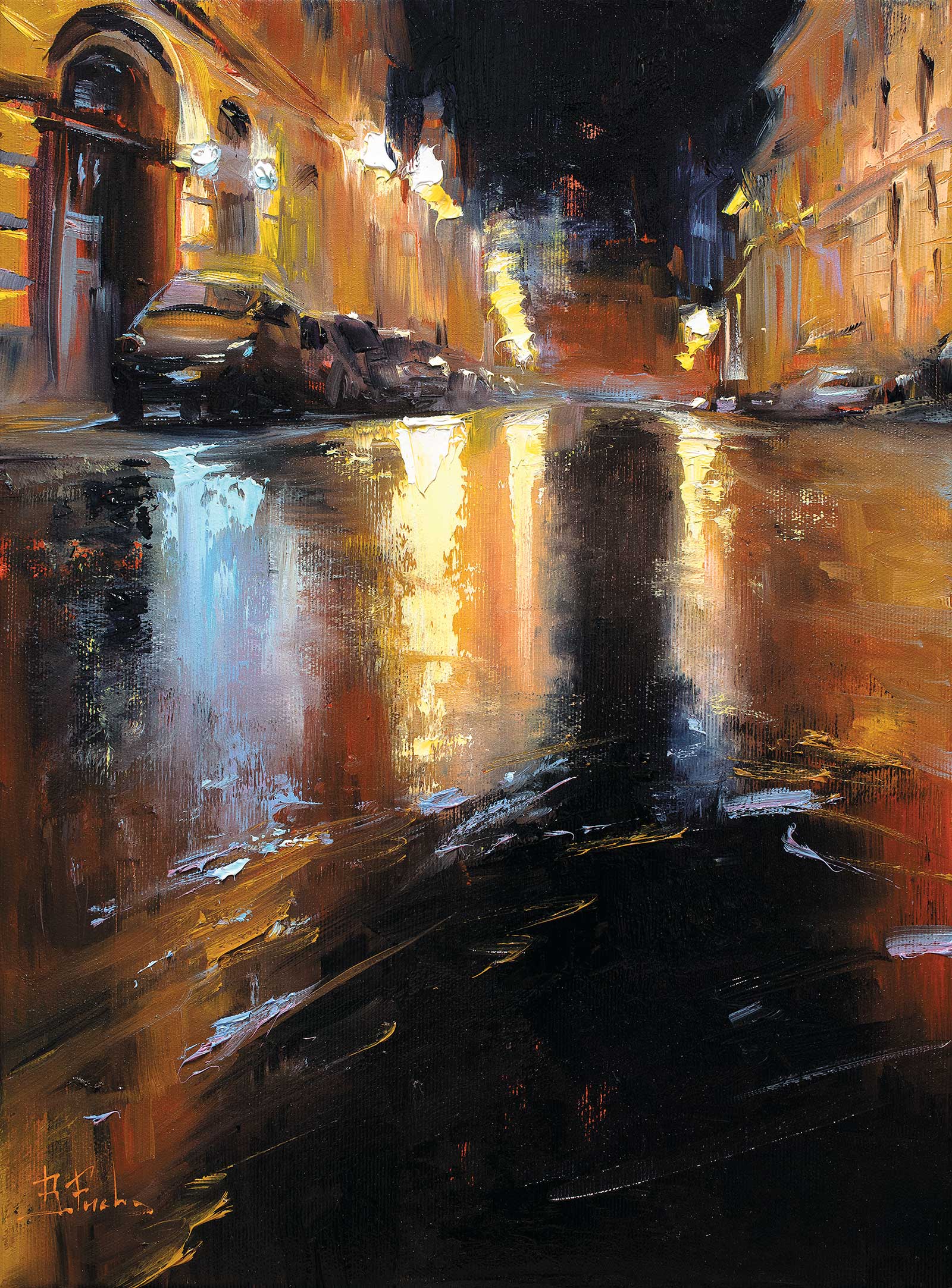 Walking through a dream, oil on canvas, 16 x 12" (40 x 30 cm)
Bozhena Fuchs
Prague, Czech Republic
My Inspiration
As the rain stopped and the night fell in Prague, a quiet street came to life with the shimmering reflections of streetlights on the wet road. The atmosphere was tranquil, as if the street was sleeping, leaving its parked cars to rest. This dreamlike scene inspired me to paint a nocturne cityscape that would capture the serenity and liveliness of this moment. I knew I had to capture this beauty, and so I took a few pictures to use as reference for my painting.
My Design Strategy
To convey the depth of night, I painted a dark sky that contrasted with the warm bright streetlights. I deliberately raised the horizon line to allow more space for playing with warm and cool colors, to focus on the contrasts and textures of light and dark, and wet and dry surfaces. I aimed to convey the specularity and moisture of the wet road surface, and thus enliven the night scene.
My Working Process
I started by toning the canvas and then worked wet-on-wet, using both brushes and palette knives to experiment with shades and transparency, layering colors and textures. I did not do a preliminary sketch, as I wanted to keep the painting light and airy without getting too caught up in details or precision. The painting was completed in one sitting in a spontaneous and intuitive way. Through my working process, I aimed to convey the dreamlike and peaceful atmosphere of the night street, using contrasts and textures to bring life to the painting. It is my tribute to the beauty of the night and to the way it transforms the city into a dreamlike experience.
Contact Details
Email: bozhenafuchs@gmail.com
Website: www.bozhenafuchs.com
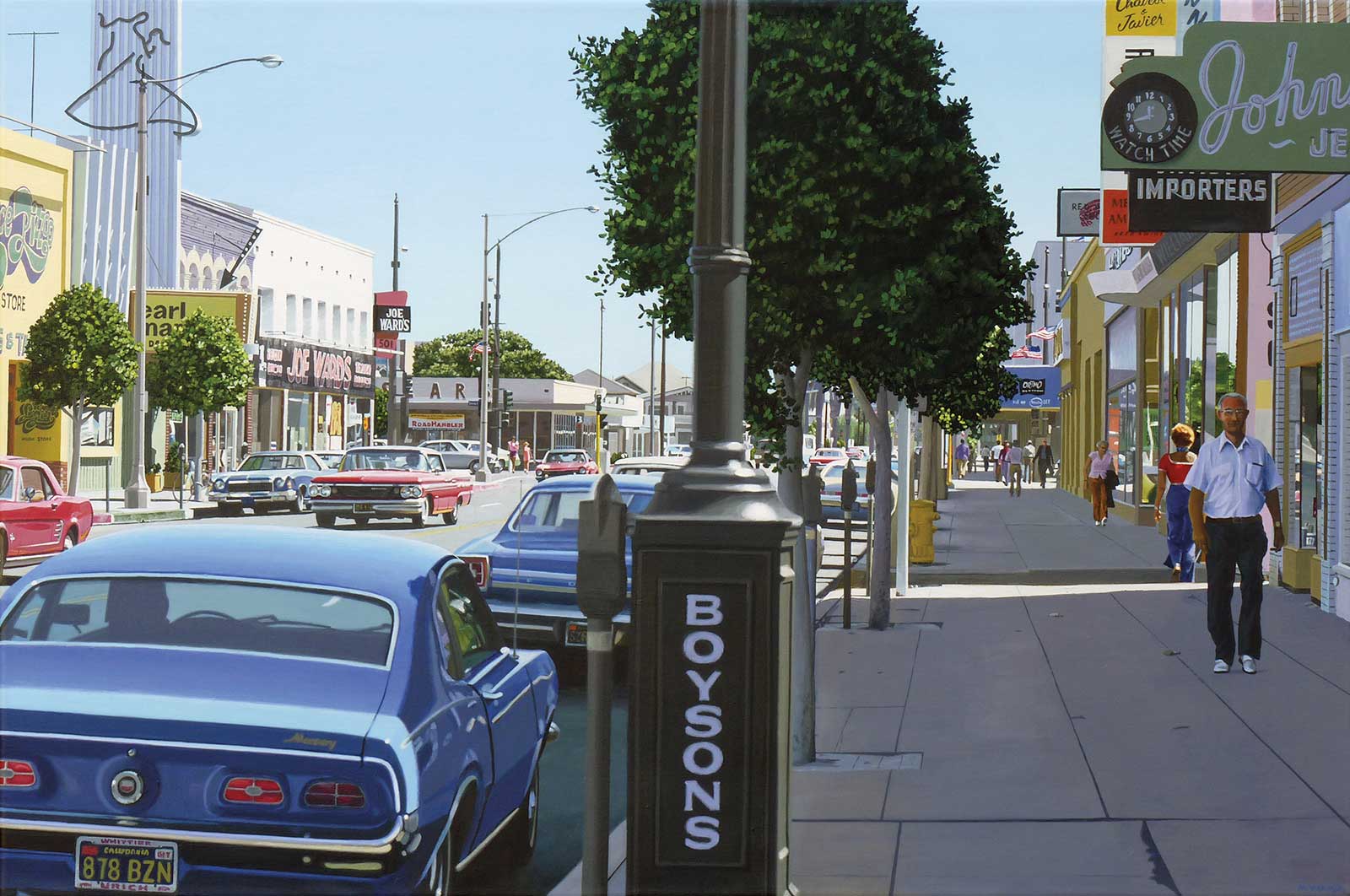 Joe Ward’s, acrylic on canvas, 28 x 42" (71 x 106 cm)
Michael Ward
California, USA
My Inspiration
While on vacation in New York City, I came across this scene, which reminded me of the paintings of Richard Estes and other urban realist painters. (I was actually in town to see an Estes retrospective.) I took some photos for reference, not knowing if I’d ever be able to render this complex scene but wanting to at least try.
My Design Strategy
Working in Photoshop, I cloned one of the second-floor windows to fill a gap and simplified the store signage, which originally had a row of photos of restaurant equipment under the lettering. I kept a couple photos but eliminated the rest. There was already enough to do. I wanted to incorporate references to some of the realist artists I admire, so I made the license plate read “Sheeler” for Charles Sheeler.
My Working Process
To save time, I made a paper printout to size, attached this to the top of the canvas and used transfer paper to outline the image on canvas. Then I began painting, working down from the top. Along the way I incorporated references to Robert Bechtle and Rackstraw Downes along with Estes and Sheeler. I thought about eliminating the bicycles, but it would have been more work to leave them out, so they stayed.
Contact Details
Email: tmichaelward@att.net
Website: tmichaelward.weebly.com
 Soho Shadows, acrylic on board, 18 x 24" (45 x 60 cm)
Al Vesselli
New Jersey, USA
My Inspiration
Sometimes inspiration stares you in the face and you just don’t see it. That is what happened to me with Soho Shadows. I have been going to the Soho neighborhood of Manhattan for a long time and never really thought of the beautiful cast iron buildings—which are plentiful in that part of the city—as a subject for a painting. Then recently, I took a number of photos of these terrific buildings, and I found the subject of my next painting.
My Design Strategy
My paintings are about the way light falls on an ordinary object and transforms it into something remarkably beautiful. In Soho Shadows, I was attracted to the shadows that fell on the building’s facade. These abstract shadows seem to be alive as they dance across the building’s outer surface, creating movement and adding depth to the composition.
My Working Process
I work from photographic references. I always take my own photos and then import them into Adobe Photoshop. That’s where my creative process begins. I can usually tell instantly if a photograph has the potential to be a painting. It needs a certain structure, light and shadow combination. I use Photoshop like many artists use a preliminary sketch. There are times I might use six or seven different photos for one painting.
Contact Details
Email: alvesselliart@gmail.com
Website: www.alvesselli.com
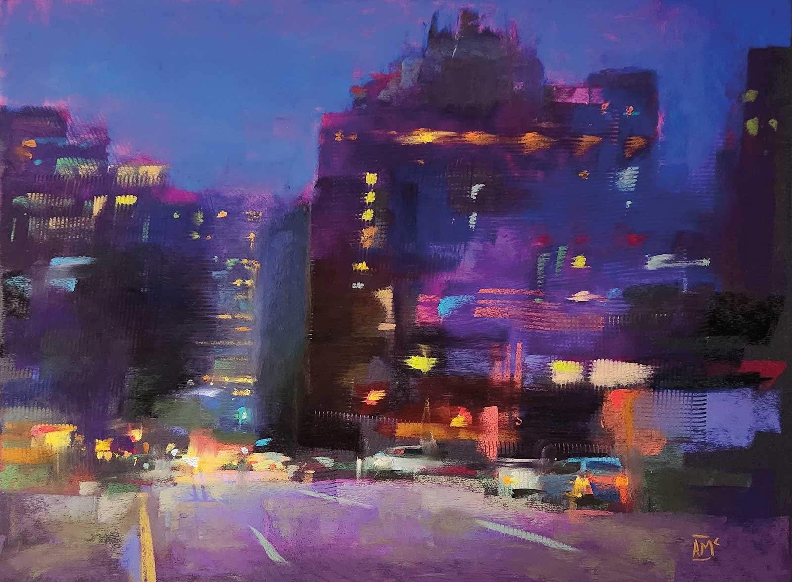 Vancouver Hotel at Night, pastel, 12 x 16" (30 x 40 cm)
Andrew McDermott
Vancouver, Canada
My Inspiration
I love painting night or rainy day scenes in the city. I love the action of the city with the reflections and the glowing lights of cars, buildings and streetlights. Both contemporary artists and the Old Masters have inspired me—too many to name. From the Old Masters, I especially loved the impressionists. One particular artist that I love was a British artist named Sir George Clausen and his painting Harvest, Tying the Sheaves, 1902.
My Design Strategy
The ability to rework, make quick changes or switch directions altogether is what I love about the versatility of pastels. I prefer to work on a toned substrate of dark gray or black pastel paper. Once I crop my reference picture to my liking, I begin by using the side of a pastel to lay in broad, general strokes. In this piece, I created a visual lead in from the foreground to the distant lights in the background. My final goal for this pastel was to create an impressionistic feel using grays, purples and local color, and to create a vibrant night feeling, hence my pastel painting Vancouver Hotel at Night.
My Working Process
Beginning with abstract shapes, as the first freely applied marks appear on my paper, the painting begins to take form. Layer by layer, I apply the vivid, buttery pastels until I have created a dramatic, energetic scene. I slowly define the forms, the layers of pastel build up, and the buildings, cars, streetlights, reflections and figures (if any) begin to take shape. I usually work from dark to light, starting with more somber colors and gradually increasing the intensity of the chroma in areas I feel are particularly interesting focal points. I believe my best pastel paintings are those that feature strong opposites in the shapes, colors, values and edges. When it comes to color, I go with my gut feeling. If it intuitively feels right, I use it.
Contact Details
Email: mcdermottart@hotmail.com
Website: www.mcdermott-art.com
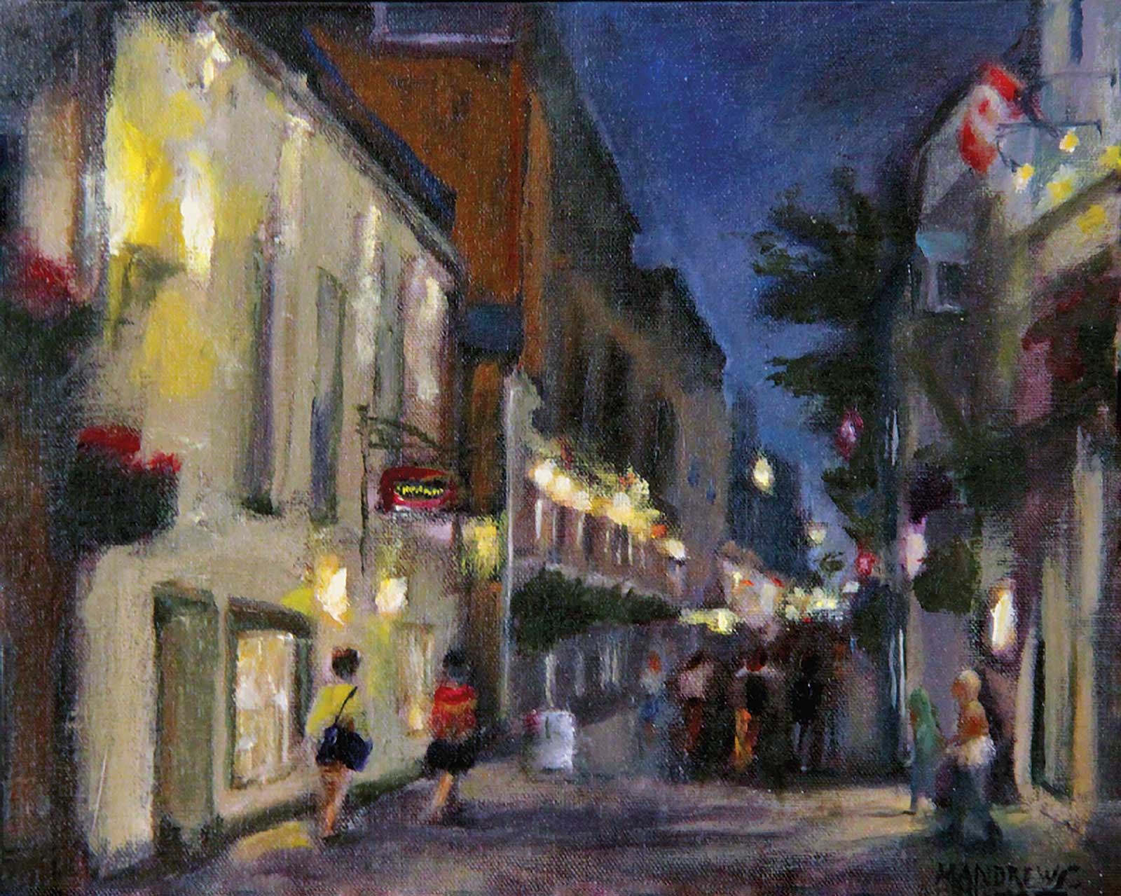 Night Stroll - Petit Champlain, oil on panel, 8 x 10" (20 x 25 cm)
Michelle Andrews
Ohio, USA
My Inspiration
Old Quebec City is a historic city whose ancient streets hold magical, paintable architecture in all directions. Yet the city is also very alive, populated by locals and tourists, horse-drawn carriages, art galleries and busy cafes and restaurants. A city whose streets hold unexpected beauty at each turn. A city whose streets are perfect for walking, both day and night.
My Design Strategy
I used one point perspective to encourage the viewer to look down Petit Champlain, which is the oldest commercial street in North America. Color and the placement of people were used to support the viewer’s experience of the street’s nightlife. The shop lights were positioned in space to invite the viewer to look into the shop windows. The Canadian flag was placed as a note of red overlooking the people enjoying a leisurely evening stroll.
My Working Process
I kept returning to my goal of capturing the energy of the evening by defining the vanishing point and maintaining a bit of a mystery. I chose to not paint exquisitely detailed information so the viewer could add their own story. The placement of the store lights and the groups of people along the street were intended to portray the interaction of the evening street life and invite the viewer to be an active participant.
Contact Details
Email: contact@michelleandrewsartist.com
Website: www.michelleandrewsartist.com