


The focus on my work is generally geared towards my theme, “the art of conversation.” I attempt to capture figures in modern day culture as they go about their daily lives. Many of my figures are in conversational scenes. To me, a scene without figures is lifeless. My job is to create the visuals that tell a story, real or imagined.
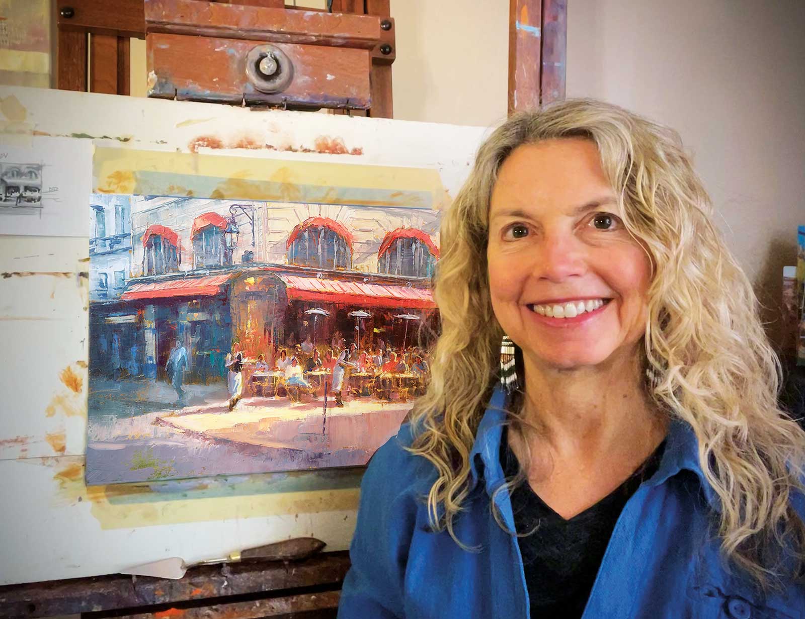
Michele Byrne
In these pages I will show you my process to create believable figures in a café scene. I was in Paris in September of 2022 with three wonderful artists/friends for a week. We painted plein air all week. This painting was done from a compilation of photos, memories and plein air pieces from that trip.
One of the core elements of my work is impressionism. I love to see thick juicy paint on a canvas—to see the artist’s hand. Therefore, I paint primarily with a palette knife, which allows me to transfer a lot of thick paint onto the canvas or panel. I prefer Cobra Artist Oils because the paint is very creamy and easy to manipulate. I also love that I do not have to use any turps and can keep my studio non-toxic and healthy. I prefer to paint on linen panels or hardboard because I can push harder with my knife and not worry about the surface. For larger studio pieces I use stretched canvas. After applying the paint, I use a brush and other tools to manipulate the paint.
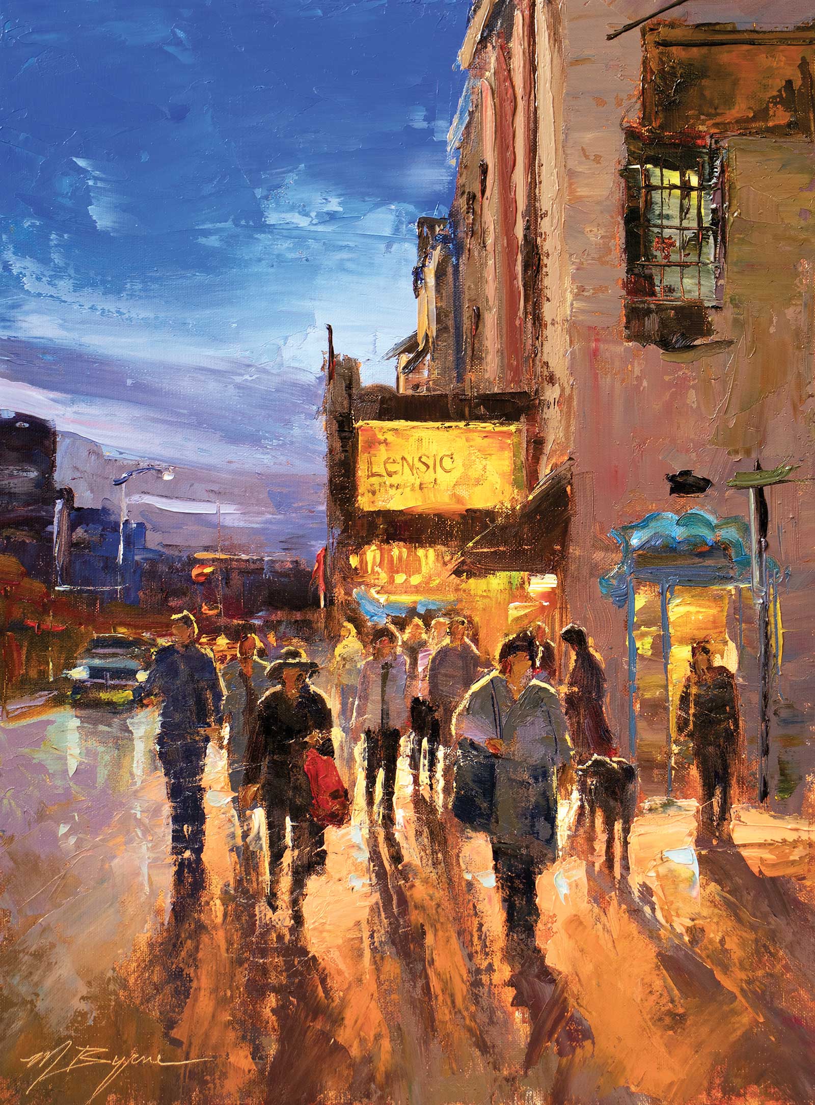
AFTER THE SHOW, Cobra Artist Oil, 16 x 12" (40 x 30 cm) This piece was inspired by a concert I attended in my new hometown of Santa Fe. This took place at the iconic Lensic Performing Arts Center. I loved the light and movement as well as the glow from the marquee above. By manipulating the paint at the very end with a tissue, I was able to create the movement.
Body language is key. If a figure does not have believable body language, they could look stiff or contrived. The light and shadow as it falls upon a subject creates the figure. I think of my figures as shapes and colors with highlights. My objective is to create a feeling, a memory or a moment in time. A sunny café full of relaxed or lively figures could evoke a happy memory or a rainy street scene showing figures leaning forward, hurrying to their destination, could jar a memory of a moment in your history. I’m a people watcher, and I have spent many years sketching and painting figures from life. I participated in plein air competitions for almost 20 years and that experience of painting figures on the move greatly enhanced my studio practice. Many times, I apply paint to the panel where I want the figures to be and then by looking at what’s there, I create the figures from these shapes. It’s similar to finding faces or figures in clouds. I love using my imagination as opposed to being married to a certain visual or photo. In plein air painting the figures move, and that is actually great practice for your visual memory. When painting in the studio, I give myself time limits so I do not overpaint and get too detailed.
Many folks tell me, “Your paintings have so much detail,” but in fact they do not. I create the perception of detail. Upon looking closer at my work, there is very little detail. I create the impression of detail. There is something artist C.W. Mundy calls “the association factor,” which means if you paint one or two of the figures to look somewhat realistic, all the other shapes in your painting will read as figures without much detail.
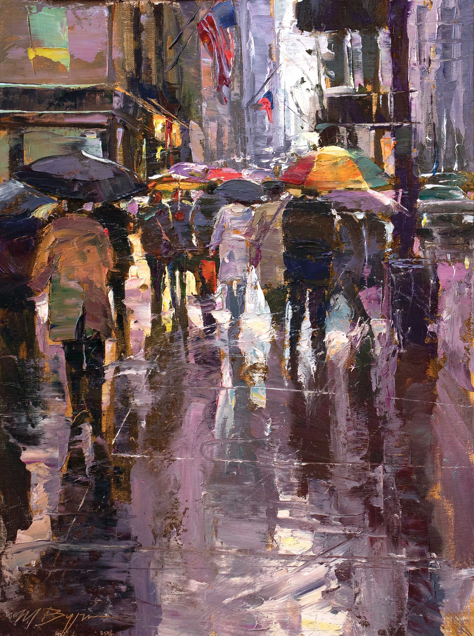
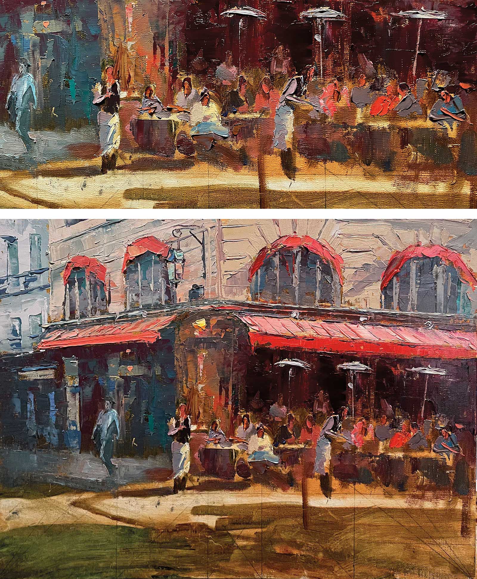
MANHATTAN HUES, Cobra Artist Oil, 16 x 12" (40 x 30 cm) This piece was inspired by many trips to Manhattan while I was living in Pennsylvania. I love capturing the hustle and bustle of the city. I also enjoy the abstract qualities I can generate in the reflections of a rainy street scene. By applying many layers of thick paint I am then able to manipulate it to create a sense of movement and action.
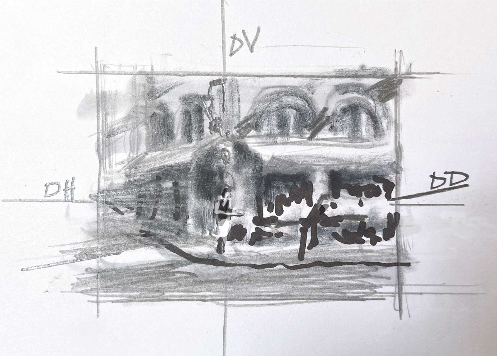
In my online and in-life workshops I teach exercises that help you to become better at painting figures—a process of sketching shapes of figures with a brush in one color and then wiping them out and trying again and again until you get better. It is great practice. I strongly believe in planning my painting before I start. No one ever wants to take the time to do a value study, but in the end, it will help your work. I create a value study and a thrust map before I do almost every painting. You can see that in the first stage of my demonstration. The thrust map shows what direction I want your eye to move throughout the piece.
My Art in the Making CAFÉ PARISIEN
This piece was inspired by a recent trip to Paris where I spent a week plein air painting with a few friends. I took a few photos of this scene and composed them to fit my idea. The waiters were from photos at a different café. I am good at Photoshop from my previous graphic design career. You can see my design ideas in my value study/thrust map in my first step.
 Stage 1
Stage 1 Value Study/Thrust Map
This was completed with pencil and marker on a 4-by-6-inch index card. In the value study, I create my vision of the painting before I start. The thrust map shows the dominant vertical (DV), dominant horizontal (DH) and dominant diagonal (DD). Where these three converge is the general area of my focal point. The lightest values against the darkest values should also be near the focal point. In this case, the focal point will be the waiters and the figures closest to them.
WHAT THE ARTIST USED
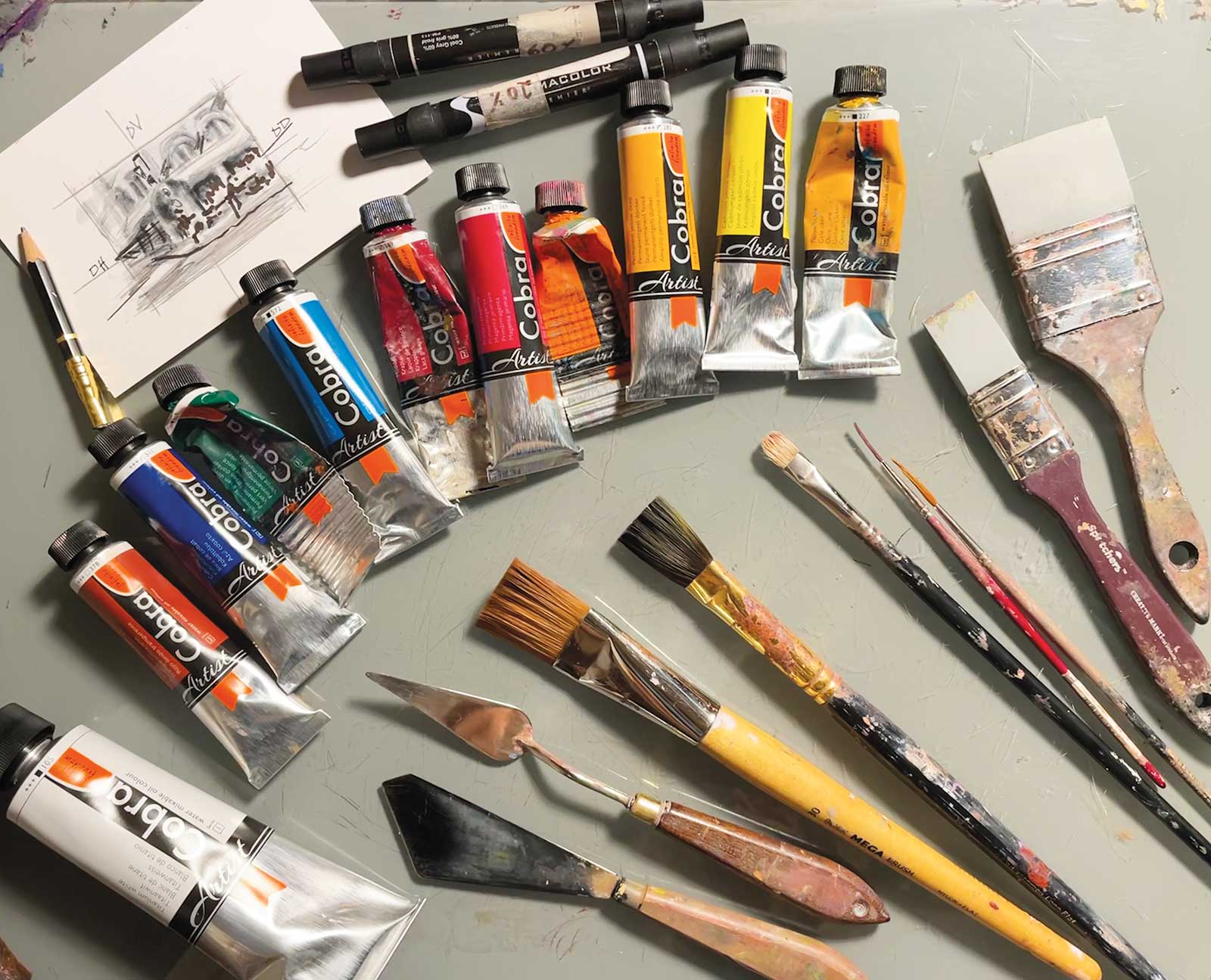
Cobra Artist Oils
Ultramarine blue, Primary cyan, Permanent green deep, Madder lake, Primary magenta, Permanent red light, Permanent orange, Permanent yellow deep, Cadmium lemon, Yellow ochre, Transparent oxide red, Titanium white
Brushes
Blick mega brush #30, Rosemary & Co. Evergreen long flat, size 10, Rosemary & Co. Ultimate short flat, size 5, Watercolor rigger or liner sizes 1 and 2
Additional Supplies
30 Italy RGM Plus palette knife, 4 x 6" index card for value study, Markers, soft pencils, Barvotti silicone shaper tool, 2”, Centurion linen panel DLX (acrylic-primed, as water-mixable oils cannot be used on oil-primed panels), Water
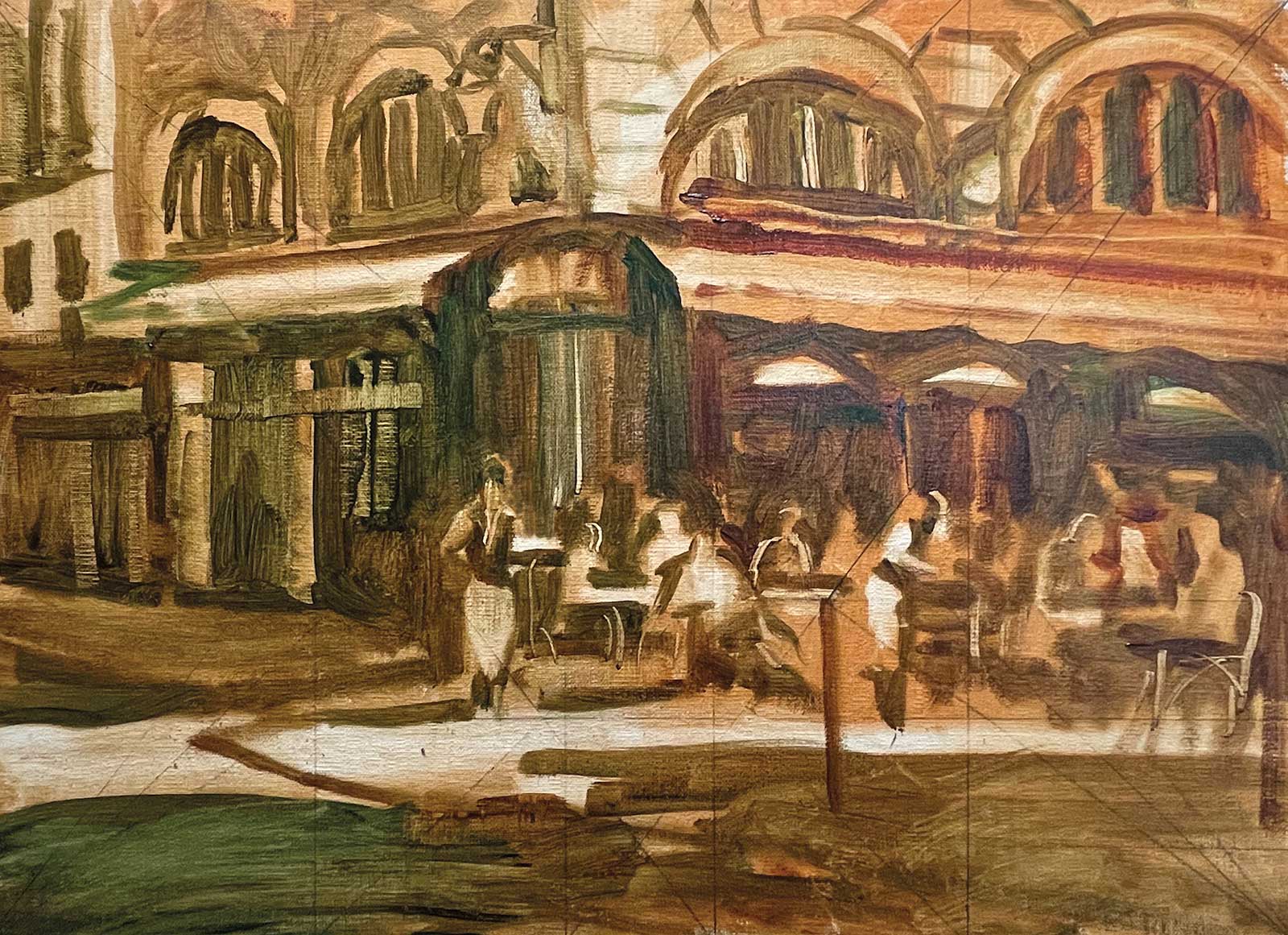 Stage 2
Stage 2 Underpainting
For the underpainting I paint the image onto the linen panel using a large brush dipped in water and a mixture of transparent oxide red and permanent green deep, predominantly transparent oxide red. What I love about using Cobra Water-Mixable oils is that this stage dries very fast. I can jump right into the final painting. It’s especially good for plein air painting because the water evaporates quickly and does not interfere with the process. You’ll notice with the left-hand side where the building goes back in distance, I use more of the green. This part of the painting is less important and will be cooler since it goes back in space. At this stage I try to create the correct values. If I squint at the painting at this stage and it looks like it tells the story I want to create, then I know I am ready to move on to the color.
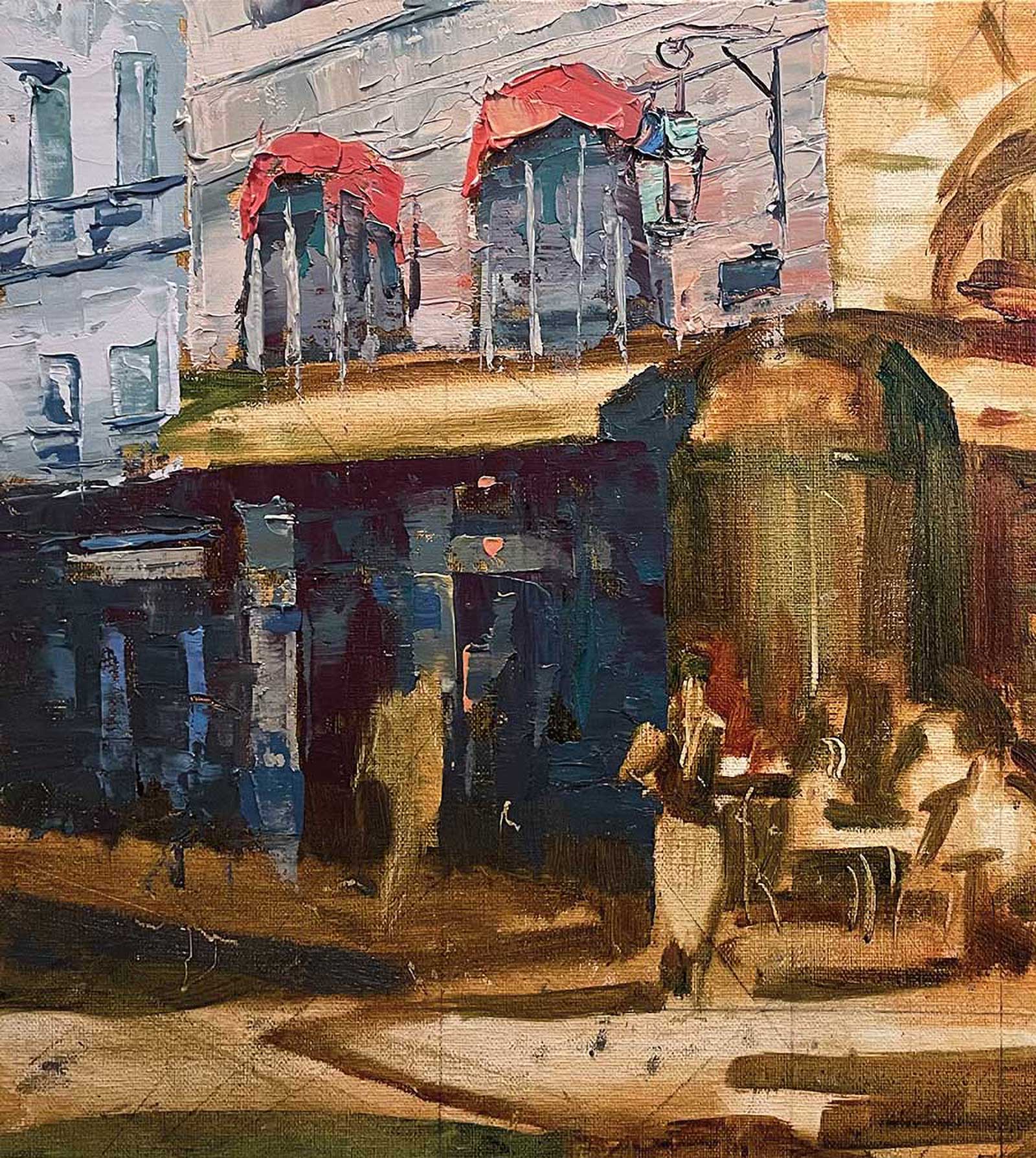 Stage 3
Stage 3 Adding Cooler Colors to Left Side
Here I used a brush and palette knife to add thick colors to the left side, which is the cooler, less important side of the piece. At this stage I am using pure paint with no water. I left the red awning for when I painted all of the awnings, and I also left the lone figure in the shade until later. Notice how the hanging lamp at the top center brings your eye down towards the focal point of the waiter.
 Stage 4
Stage 4 Sunlit Side of Building and Windows
Here, I’m adding the warmer/sunlit side of the building as well as the red awnings and windows. I continued to use mostly palette knife work adjusting with brushes where needed. I painted the dark area inside the restaurant with thinner, transparent, warmer colors to create the darks. I want the inside of the café to look warm and inviting. In general, you do not want to paint darks with thick paint. If you do, it could create a glare, which could show the illusion of a lighter value.
 Stage 5
Stage 5 Beginning the Figures
Now that I have taken the time to create the backdrop, I can start the figures. Here I use mostly brush, as well as some knifework, to add color into the spaces I have allowed for the waiters and seated figures. It doesn’t matter if you use a knife or brush, just try to keep the shapes more abstract. I usually paint the figures more from my imagination using the shapes that have organically appeared. If you try too hard to copy the photo it could look stiff. You can see in the close-up how little detail is used in the figures.
Cobra Artist Oils
Art Education Director for Royal Talens North America
By Jeff Olson
Artists are looking to paint solvent free for many reasons. Some have specific health concerns, while others are looking at reducing their impact on the environment. Cobra Artist Water-Mixable Oils offer a solution that enables painters the ability to enjoy the traditional working properties of oil painting, without the need of harmful solvents.
There are many myths surrounding water-mixable oils. The most common is that they contain water. Cobra Artist Oils do not contain any water. They are a true oil paint, with a linseed oil binder and only quality lightfast pigments. They are an archival material with excellent pigment-to-binder ratio. They do not dry faster than a traditional oil paint and exhibit all the working properties of a traditional oil. They can be mixed with any other oil paint or medium, either traditional or water-mixable, and depending upon the ratio, they can maintain their water miscibility. We do not recommend mixing with acrylics, as doing so may compromise the integrity of the paint film.
You are not required to use water with Cobra Artist Oils. You can paint using them straight from the tube or mixed with any of the Cobra mediums to enhance the working properties. Using water with Cobra is very easy. Wetting your brush in water prior to mixing the paint makes the paint more fluid and easier to cover larger areas. Water can be used in the paint, making it leaner, as well as to clean brushes between colors or after your painting session. You can pre-mix Cobra with water, up to a 1:1 ratio, in a container or on the palette, and then brush on for very fluid techniques like washes. As with a traditional solvent, the water evaporates rapidly, allowing you to create layers, establishing a durable paint film.
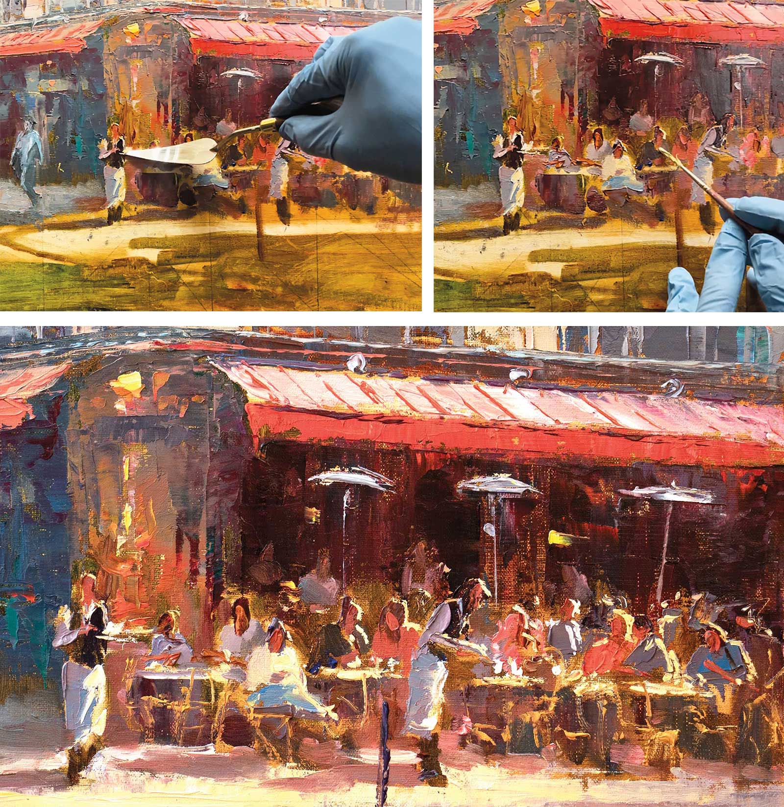 Stage 6
Stage 6 Bringing it to Life
This is my favorite part of the process. Making all these simplified shapes become figures full of life and light. I use a watercolor liner or rigger brush because it is long and flexible and holds a large load of paint. I gently lay the paint on top of the painting. I do not want to disrupt the paint that is already there. Occasionally I will dip my rigger brush into the water, but mostly I am using very thick paint for these highlights. I also use my knife and press hard at the correct angle to create the tabletops, waiter’s tray and anything with straight lines.
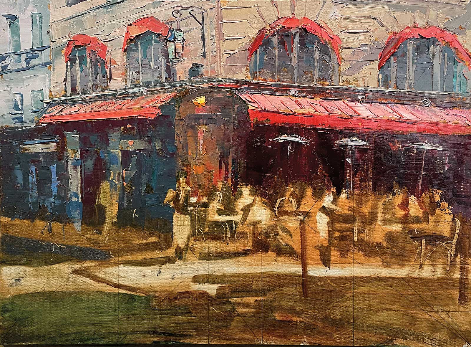
 Stage 7
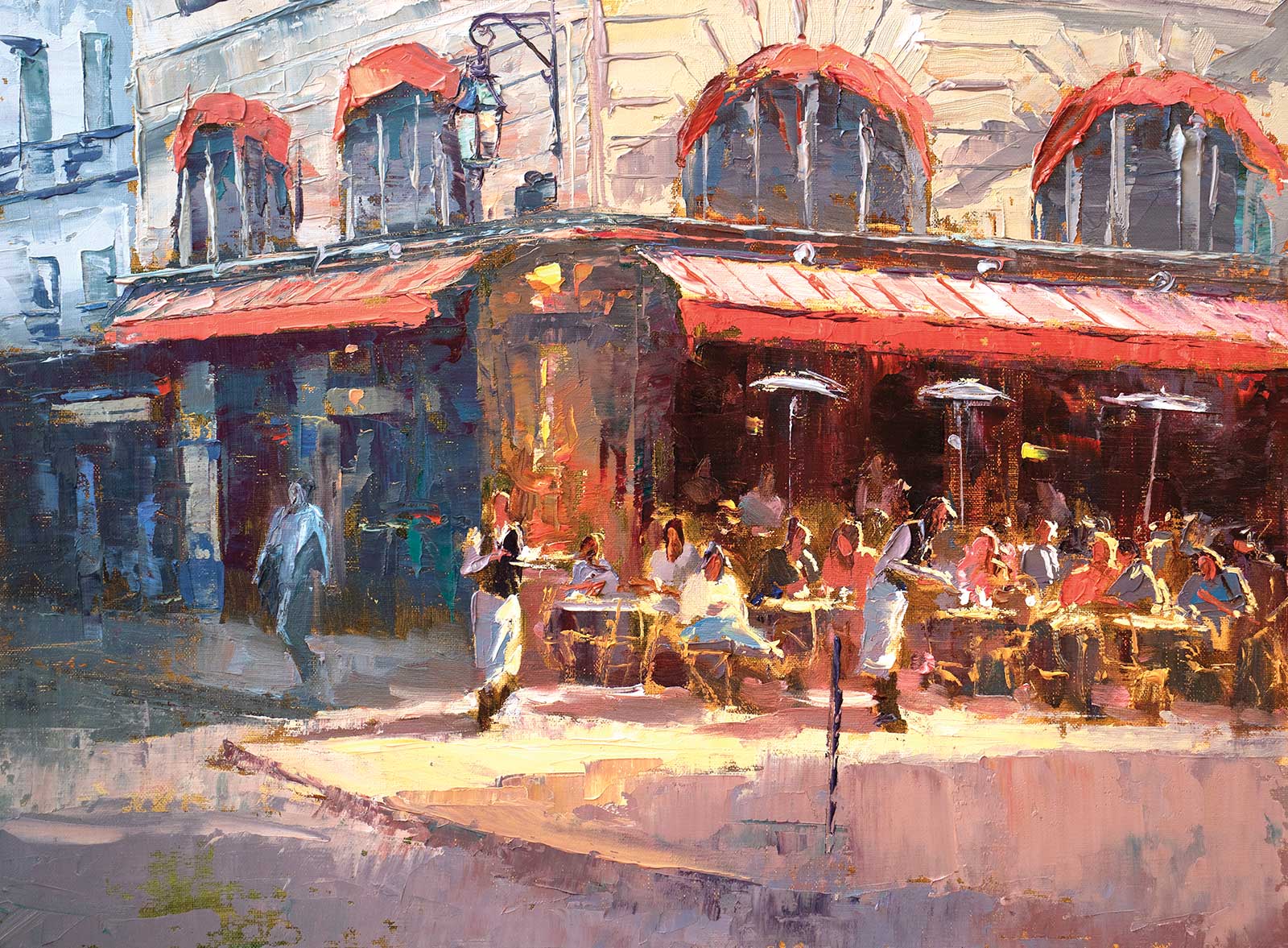
Stage 7 Finished Artwork
CAFÉ PARISIEN, Cobra Artist Oil, 12 x 16" (30 x 40 cm)
Finally, I do the foreground last. I use the knife as much as possible to keep it simple so it draws you into the scene. Also remember foregrounds are usually warmer in color. I added the post in front to help draw your eye upward. I also added some warmer lights inside the café to show some activity inside as well. And I added some reds into the cooler side of the painting to keep it all cohesive.