


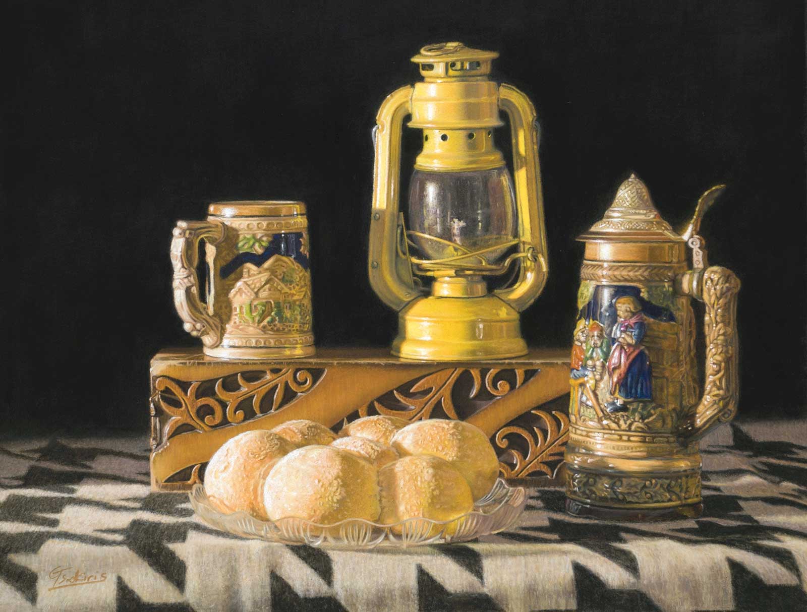
One of the most important elements of artistic progress is the development of a personal style that makes the artwork unique and distinguishable to art lovers. This is why we hear it so often as advice to emerging artists. Unfortunately, sometimes this leads many of them to rush towards this pursuit with the consequence that they skip the basics of painting and end up making gimmicky art. When it comes to painting, I embrace Paul Rand’s quote: “Don’t try to be original. Just try to be good.” With this in mind, when I start to conceive an idea for a painting I focus on a single goal, to bring out those elements that will make the work interesting and appealing to me and hopefully to the viewers.
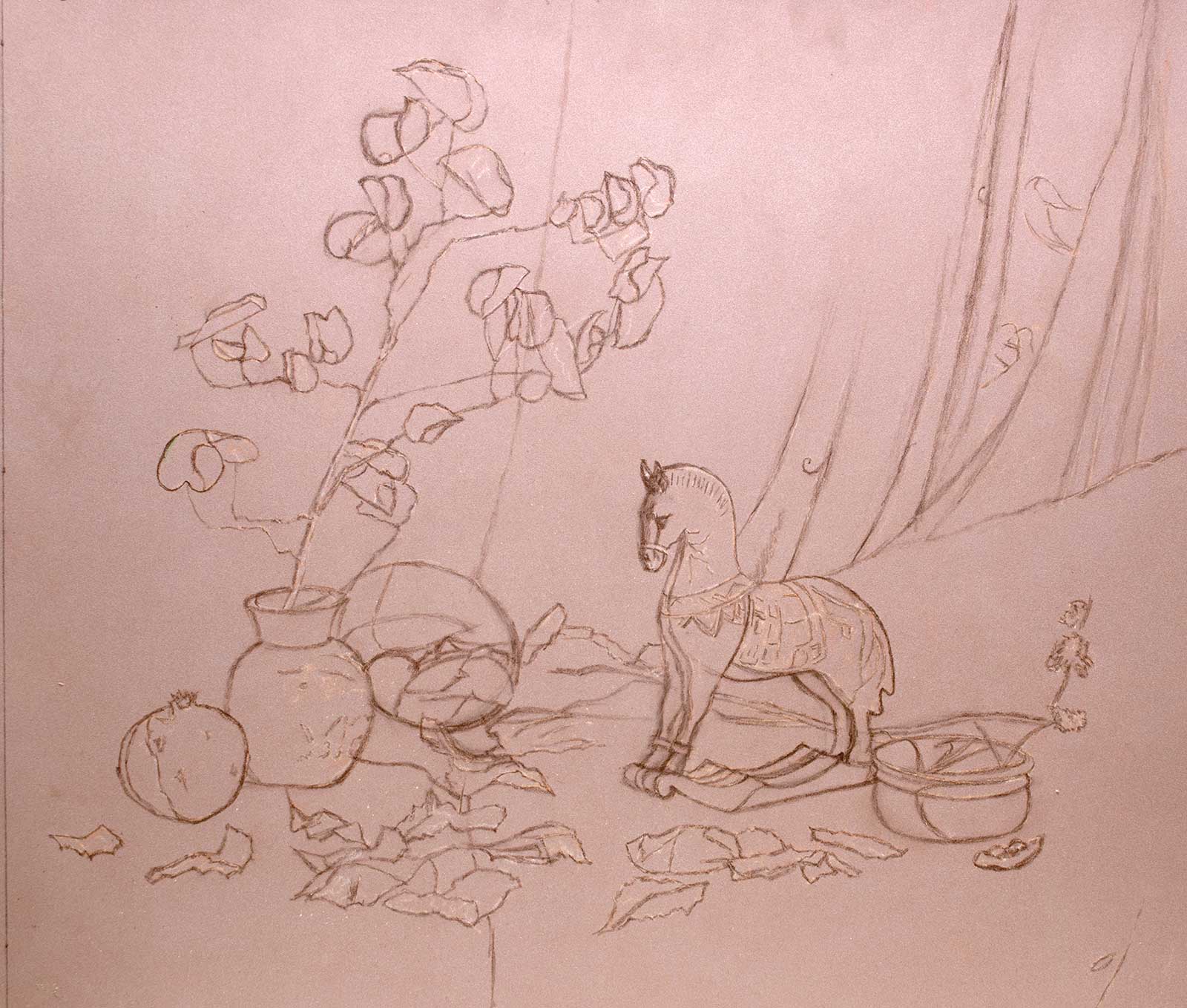
Cylinders, spheres and a rectangle, pastel on Pastelmat paper, 12 x 16" (30 x 40 cm) The challenge in this painting was emphasizing the importance of the underlying structure consisting of simple geometric forms, even in a photorealistic piece like this. Hence the descriptive title.
My main consideration is about design and composition. I also have to decide on the mood of the painting to determine the appropriate lighting. This approach applies to any subject, whether it is still life, landscape or figurative. Still life in particular gives me the ability to have total control over all the aforementioned elements, plus the fact that it is much easier to find a model in relation to the other two genres.
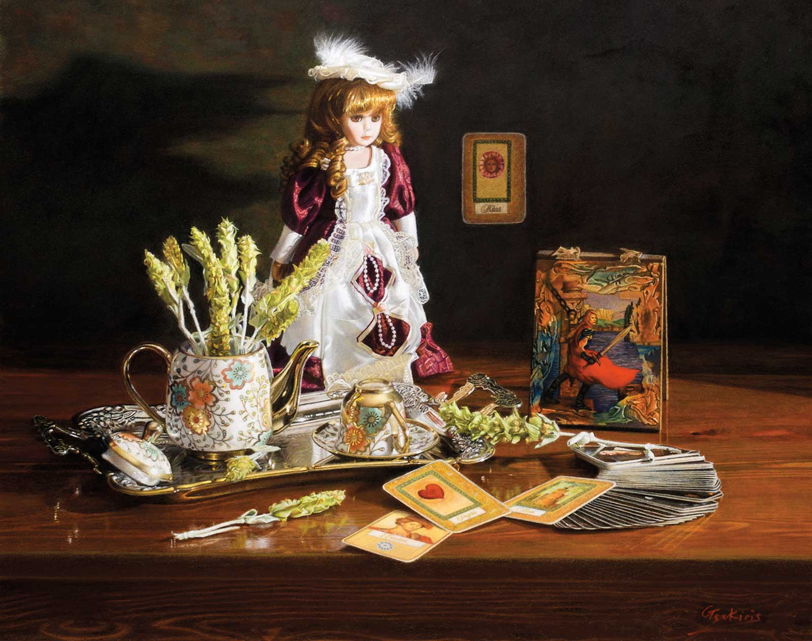
Fortune Teller, pastel on Pastelmat paper, 16 x 20" (40 x 50 cm) This is a narrative painting. My inspiration came from a popular book in Greece that included a divination card deck. Also, tea leaves are traditionally used for fortune telling. The rest of the story is left to the imagination of the viewer.
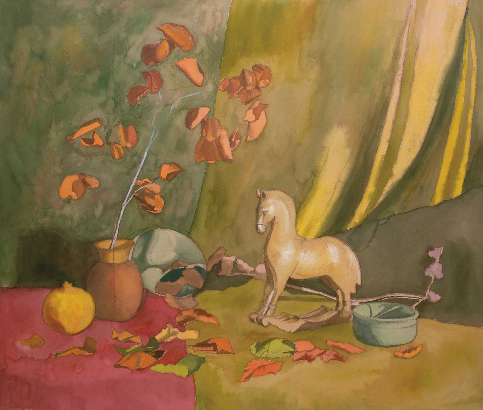
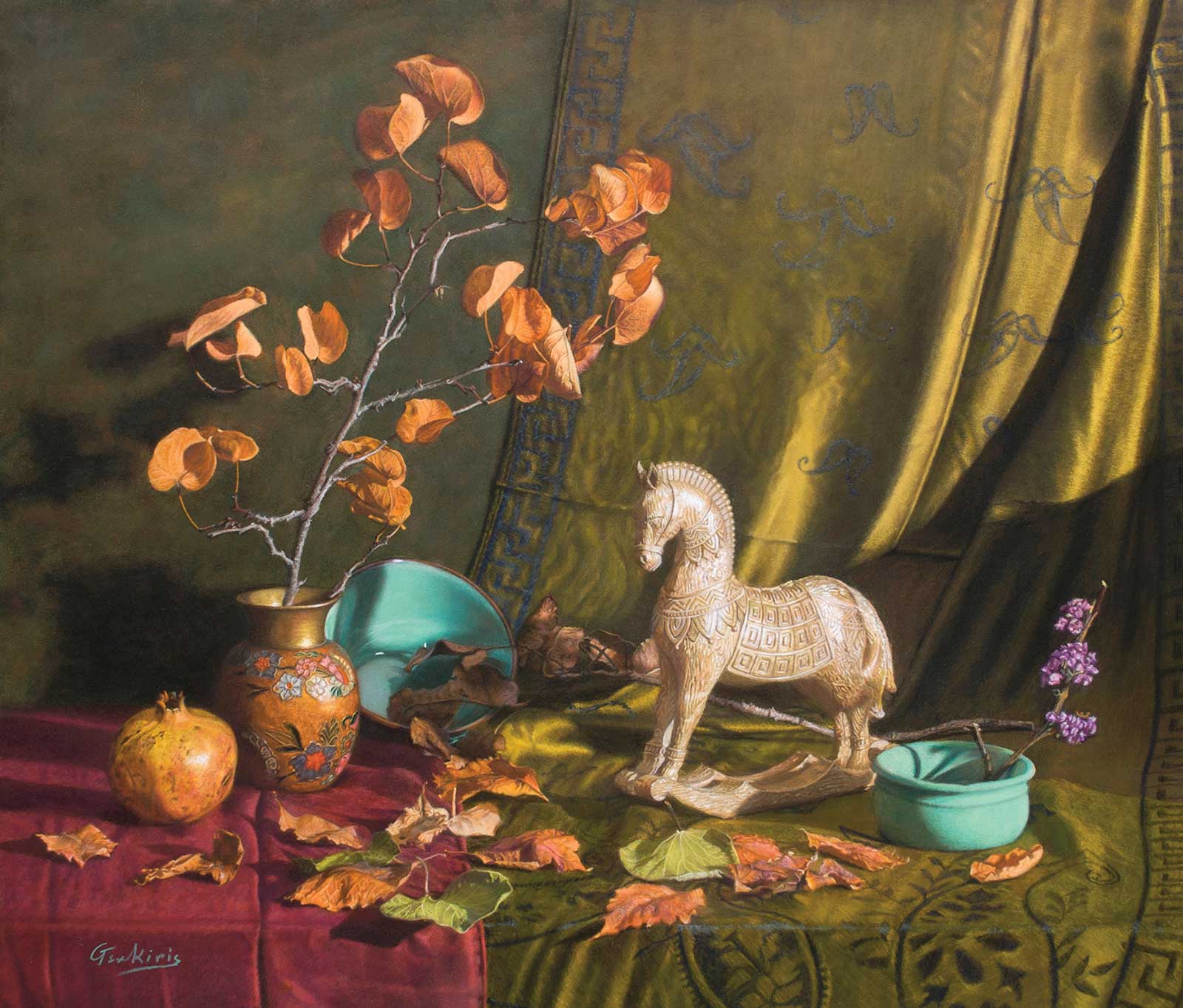
When I envisioned this particular still life for this demonstration, I wanted to create a luscious image out of humble ordinary objects with rich warm colors and a variety of textures and shapes. I aimed to have an eye-catching focal point—the figure of the horse—but at the same time several secondary points of interest where the viewer’s eye can stop and explore. First I chose the objects, and then I had to place them so as to create a pleasing interplay of the shapes in relation to each other, with light and space (negative shapes). Also, I had to create a visual path that leads from one object to another and keeps the viewer’s attention within the painting. This was achieved not only by the arrangement of the shapes in space but also by the pre-designed path of the light as it describes the different textures. For example, this is evident in the folds of the fabric that give the intended direction to the eye and the purple flower that stands out due to the value contrast with the shadow in the background. I placed the props at different distances between them to avoid monotony, with some of them overlapping to give depth and visual coherence. I paid special attention to include a variety of hard, soft and lost edges. The shadow next to the horse was intentionally created so that there would be the most intense value contrast and a hard edge to draw the eye to the focal point. On the contrary, I softened the edges in other areas such as on the left side of the vase and on the background above, to knock it back.
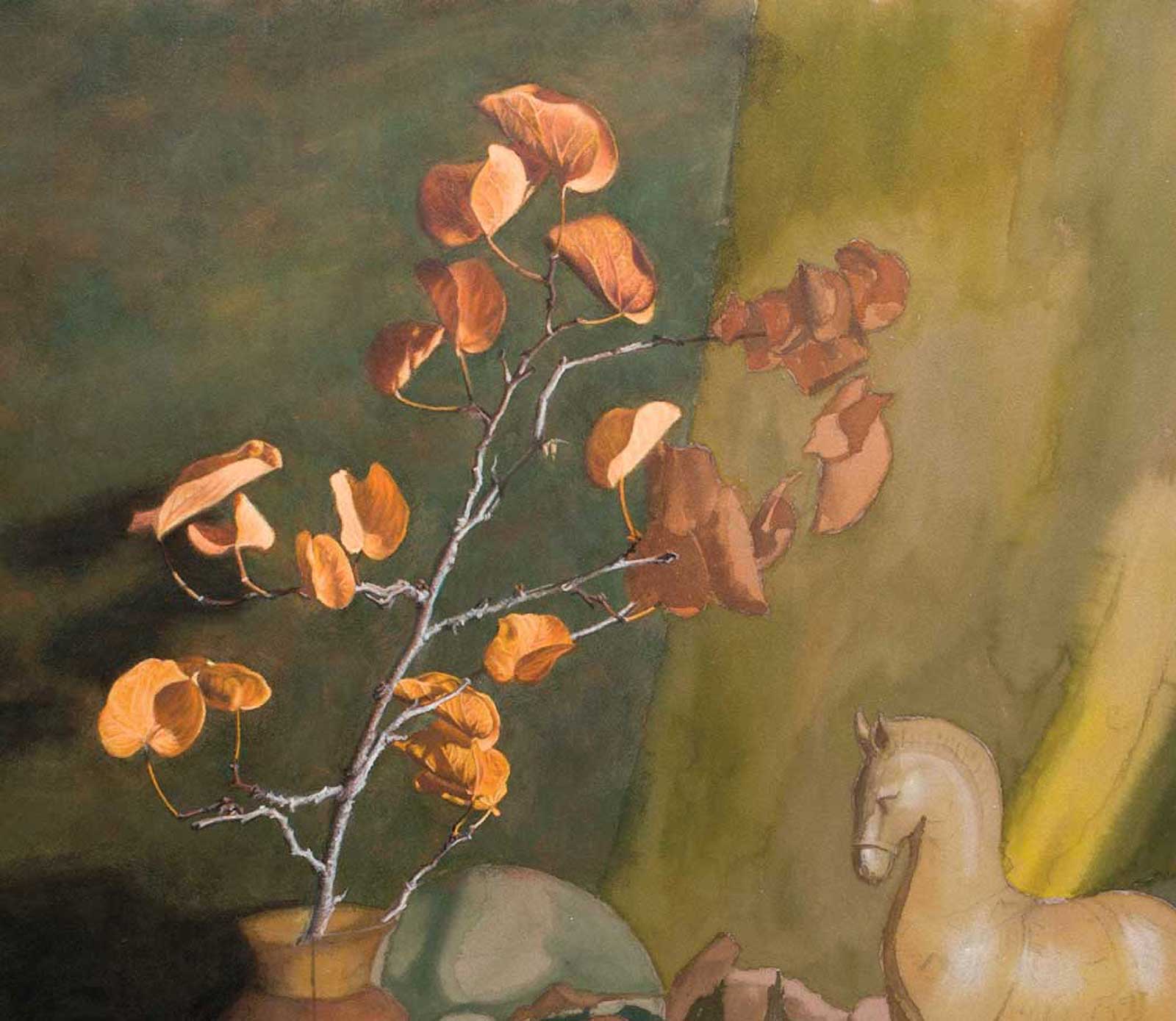
I opted to use dead leaves for their warm colors and more interesting shapes. The two turquoise objects provide the cool color contrast that I felt was necessary. I also strategically placed the curve of the horse’s neck and the edge that separates the red from the green fabric on the lines of the golden ratio. The final result left me quite pleased as it was very close to what I had originally envisioned.
My Design and Composition Tactics
- Matching a color from reference and painting exactly the same is not as important as getting the value and temperature right.
- To get a very dark tone if I don’t have such a dark pastel, I create a dark underpainting, either with watercolor, charcoal or PanPastel. In the latter two cases, I spray with a workable fixative to stabilize the pigment. Then I scumble very lightly on top of it with the darkest shades I have to achieve the color I am after.
- I try to lead the viewer’s eye to the focal point using different ways, depending on the subject. Sometimes I use an organic figure contrasting with artificial and symmetrical objects. Other times I may rely on color or value contrast.
- In paintings that contain many elements I include a variety of shapes and sizes as well as unequal spacing to avoid monotony.
My Art in the Making The little wooden horse
 Stage 1
Stage 1 Drawing
I printed a photo of the subject on plain paper and used it to transfer a few basic proportions on a Pastelmat paper using a proportional divider and a HB graphite pencil. After that I completed the drawing freehand with a brown pastel pencil.
WHAT THE ARTIST USED
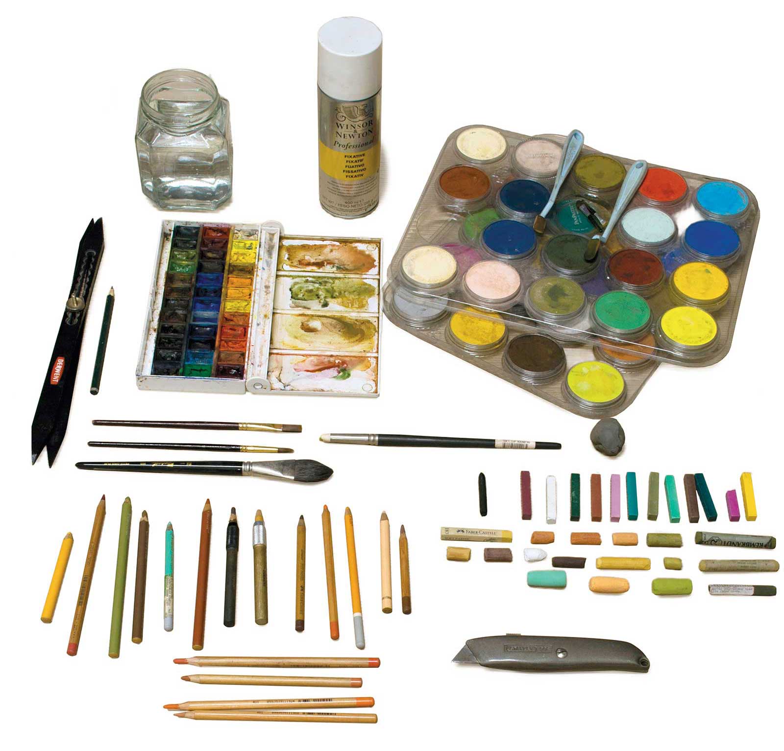
Pastel pencils
Faber-Castell, Carbothello, Conte, Koh-I-Noor.
Pastel sticks
Rembrandt, Richeson, Holbein, W&N, Koh-I-Noor.
Watercolors
NEVSKAYA PALITRA WHITE NIGHTS
Watercolor brushes
medium flat, small round, large filbert
Additional Materials
PanPastel, Wooden board as a support, Pastelmat paper in sienna, 50 x 70 cm, Graphite pencil, Proportional divider, Utility knife, Kneaded eraser, Water container, Paper towels, Color shaper, Workable fixative, Masking tape
 Stage 2
Stage 2 Watercolor Underpainting
Creating a watercolor underpainting with an approximation of average colors makes it easier to evaluate the relationships between colors, values and temperatures. It’s a strong foundation upon which I can add pastel layers and also economical as far as saving pastels.
 Stage 3
Stage 3 Background and Leaves
In a detailed pastel painting like this where I frequently use pastel pencils, I end up laying my hand on the paper for stability. I start in the upper left corner to prevent paint from smudging and complete each area separately before moving to the next. I completed the background area with PanPastel and the leaves in front of it with pencils for the details and softer brands of pastels for the brighter and lighter colors.
 Stage 4
Stage 4 Foreground, Left Side
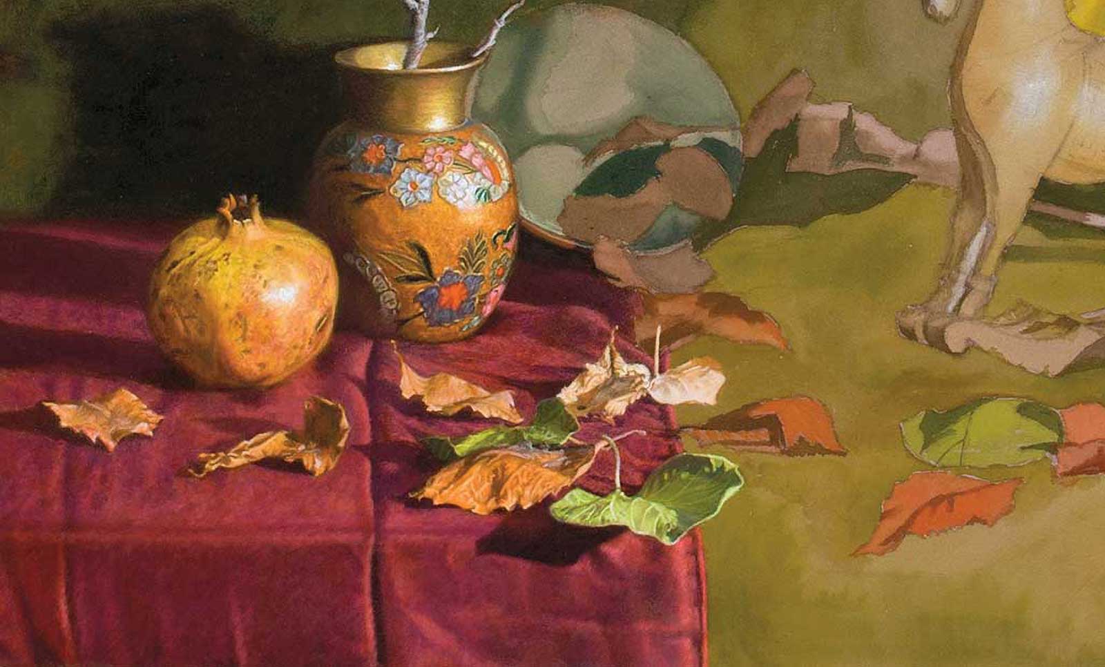
To complete the lower left area I painted the big shapes over the watercolor underpainting, aiming for more accuracy regarding color and value. Next I outlined the details and filled the shapes with the local average color that I could see in each of them by squinting. Next, I refine things by adjusting colors, values and taking care to create a variety of hard, soft and lost edges.
 Stage 5
Stage 5 Backdrop and Scumbling
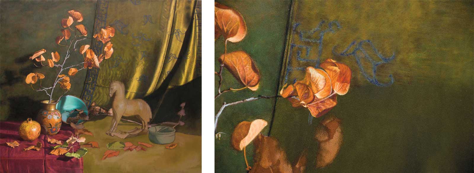
Although the hanging backdrop is just a part of the background, it is an important element of the design as it provides a directional pull through the folds, so that the viewer’s eye moves toward the horse’s back curve and then upwards to the leaves following the horse’s crest line. I also finished the turquoise bowl as a welcome cool contrast in an otherwise mostly warm color scheme.
 Stage 6
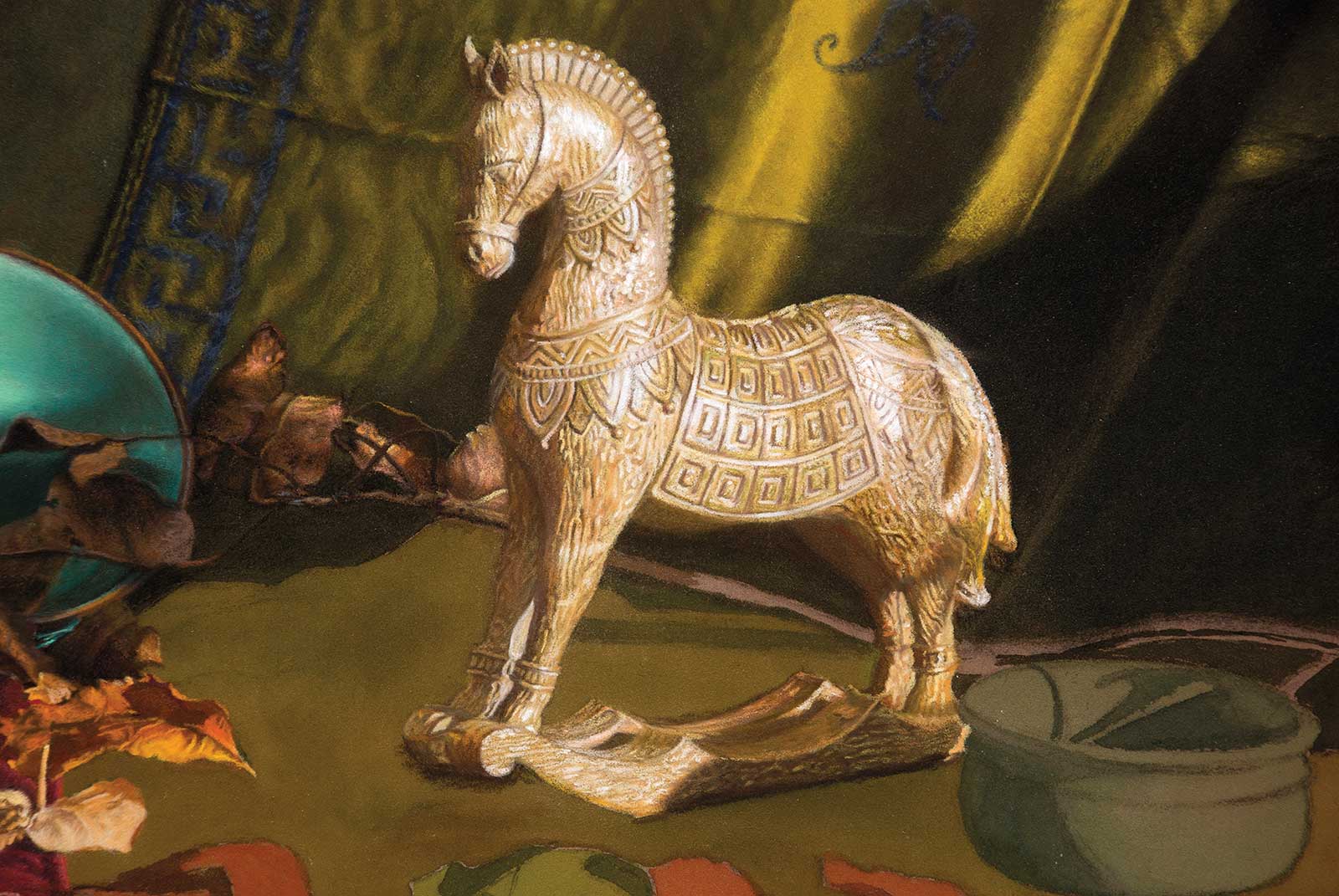
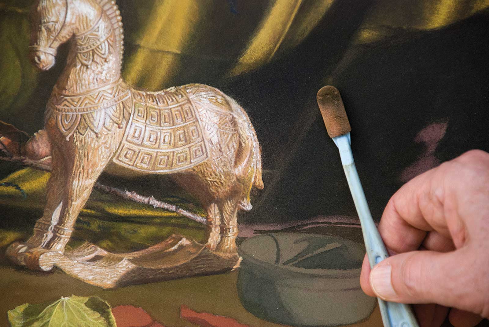
Stage 6 Refining the Horse
Since the horse is the focal point of the composition, it had to be painted with the most care and detail. First, I established the general tones and the highlights without any details. Then I literally carved the details with sharp pencils as a kind of negative painting.
 Stage 7
Stage 7 Foreground, Right Side
I completed the painting, following the same process. First establishing the general values and tones accurately with PanPastel adding the details later. I had already painted the clay pot the same color as the bowl. These two elements, along with the tiny bit of the signature’s turquoise, form a triangle, which I feel gives a balancing effect to this color accent.
 Stage 8
Stage 8 Finished Artwork
The little wooden horse, pastel on paper, 18 x 22" (45 x 55 cm)
About the artist
 George Tsakiris
George Tsakiris was born and lives in Athens, Greece. He is a self-taught artist who paints representational art, working primarily with pastels and oils but also occasionally with watercolor. He is a member of the International Guild of Realism and the Pastel Guild of Europe. Since 2015, Tsakiris has participated in many group exhibitions and has been a finalist in many juried shows such as Richeson’s and IGOR. He’s also won several awards in painting competitions including Grand Prize in International Artist Competition #113 Still Life and many more.
Contact at
georgetsakirisart@gmail.com