


 Stage 1
 Stage 1
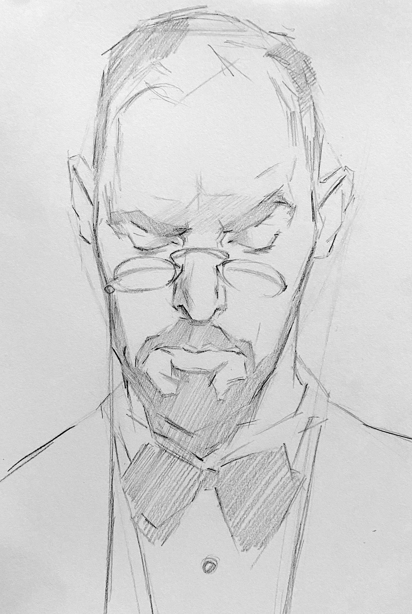
Drawing Always start with a strong drawing. Your painting will never be as good as you want it to be unless you start with confident lines that show structure, gesture and shadow. Draw with your shoulder, not your wrist. This allows for broad strokes and prevents detail too early. Drawing with straight lines creates a solid foundation. Eventually those lines become more natural curves. Build the drawing like you’re building a structure. Strong supports come before wallpaper. Along with the contour, place your shadow shapes to show the entire likeness of your subject.
 Stage 2
 Stage 2
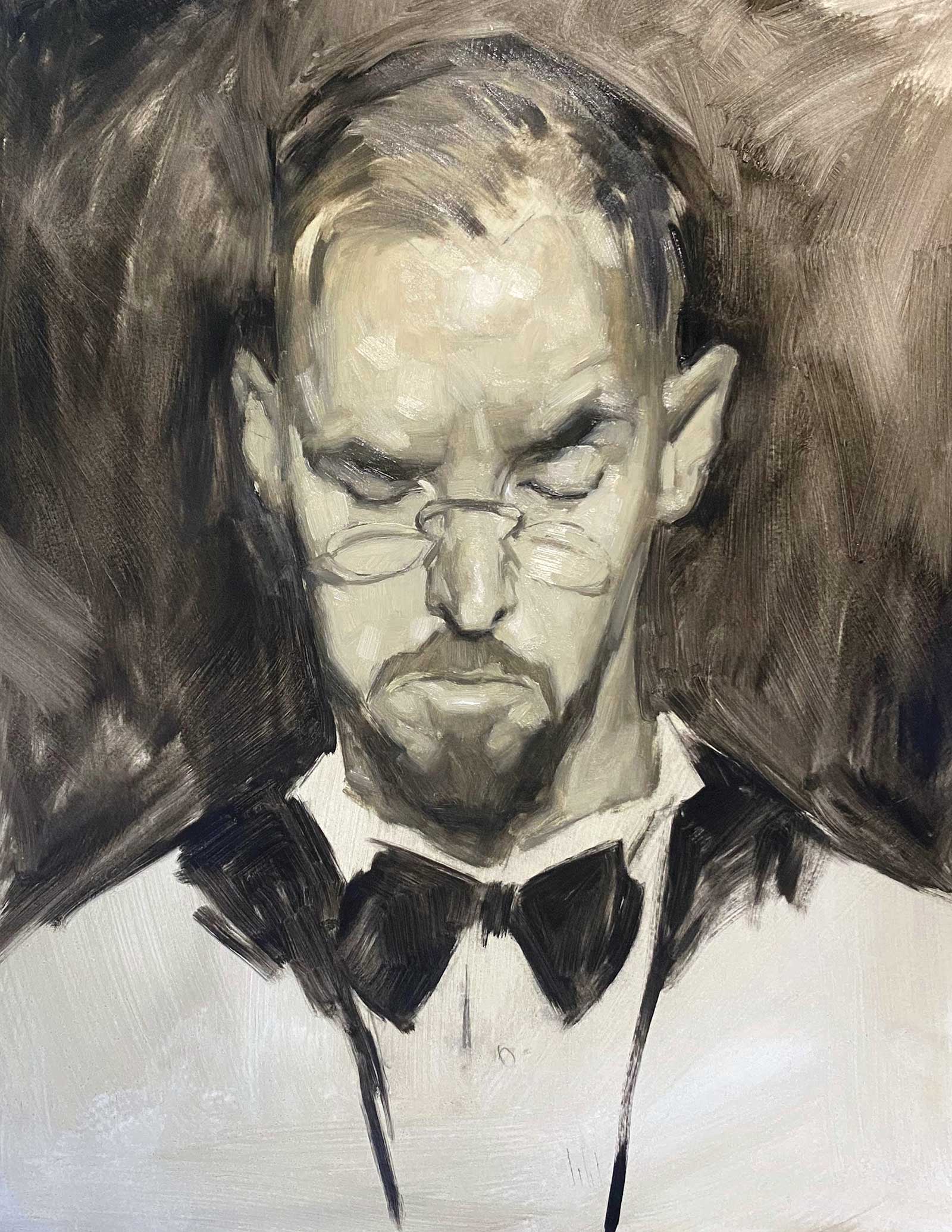
Grisaille Grisaille can be either open or closed. Open grisaille is a tonal layer of paint, applied with one color—no white. The lighter values are created by thinning the paint with medium, which allows more of the canvas to show through. This is a nice technique to capture a particular luminosity later in paint. Closed grisaille (featured here) adds white to your chosen color. This method feels the most like traditional oil painting. You can build a sense of mass very quickly. With either technique, you always want your values to be lighter than what you see because when you start glazing color over it, everything will get slightly darker. If you go lighter, it allows color to glaze over the lights and shine rather than becoming dark and dull. Focus entirely on value in this stage. It’s all about locating your shadows and showing form through the expression of lighter values. Keep things simple but accurate. No detail. Just show the impression of light and likeness.
 Stage 3
 Stage 3
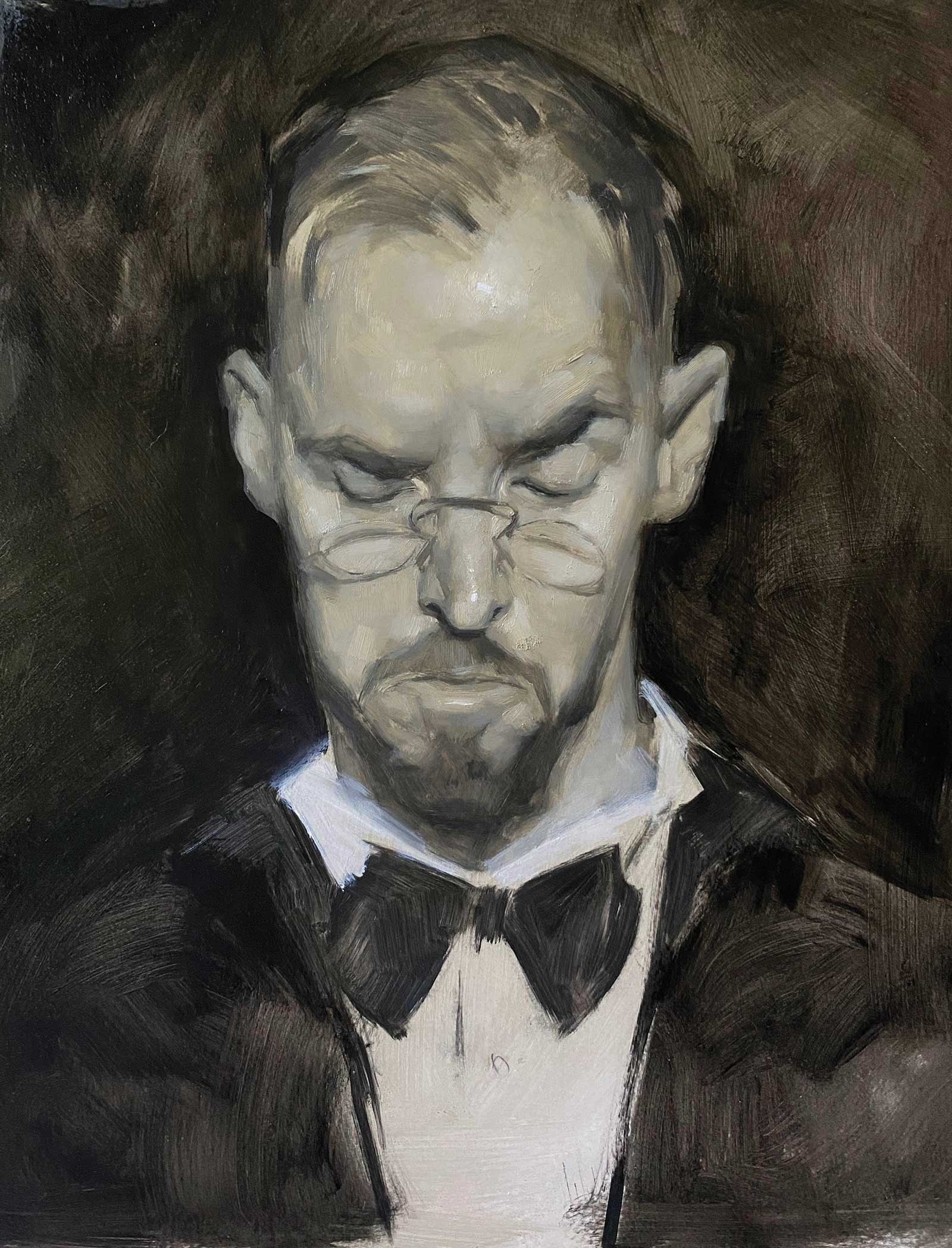
Grisaille Part II Now your painting has officially started. You have your lighting set, and there is nice structure in your shadows. Take time to fine-tune what you’ve previously painted. Take your impression of light and start showing more form through further exploration in transitional values. The more of these values you find, the smoother your transitions will appear. Quick transitions demonstrate high contrast and/or a sharp edge. Multiple transitions demonstrate a rounder and softer form. Your painting should not be particularly detailed in this stage, but it should go from feeling like a sketch to being more solid and developed. Do not blend and mush your values together. Blending gives a nice effect, but you lose the structure. Blending this early will make everything look “pretty,” but also over-simplified and ultimately weak.
 Stage 4
Stage 4
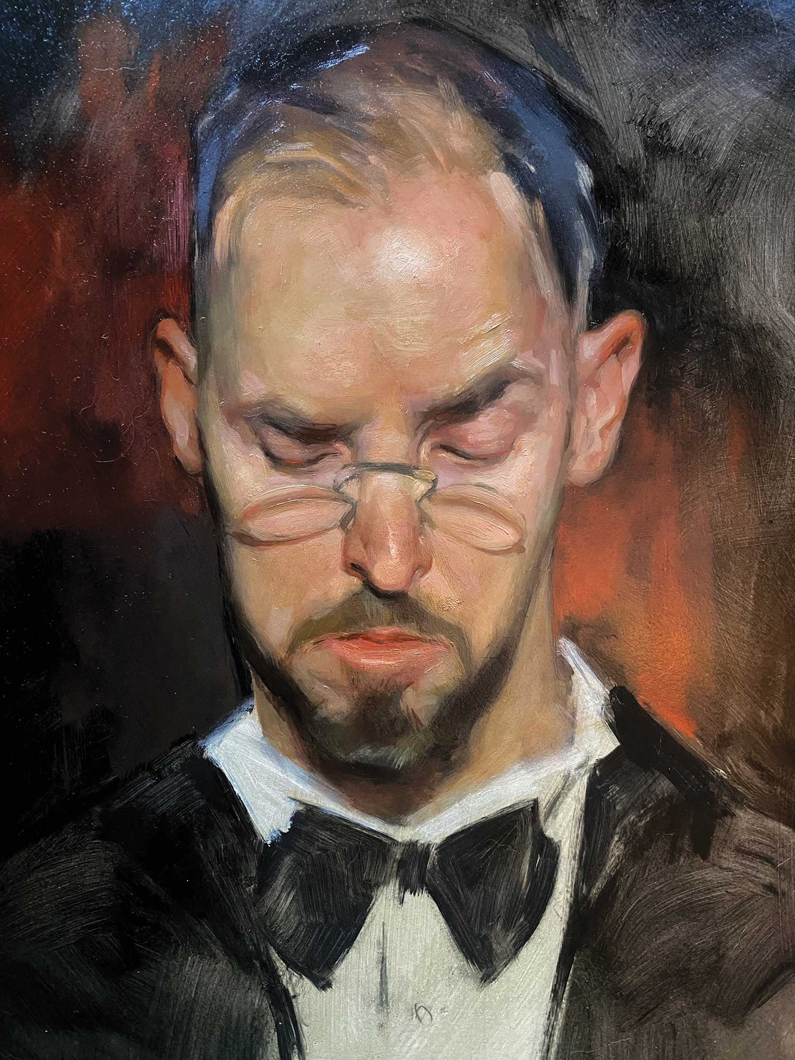
Color Glaze Glaze the color in with transparent layers of paint. This can be done with turpentine or linseed oil or a mixture of both. Start with a transparent color that demonstrates the temperature of the shadow and light. What color is the light? Knowing this will also reveal the shadow. Warm light? Cool shadow. Orange light? Blue shadow. It works this way every time. If you understand the science of light, you will have a fantastic platform to begin planning your painting strategy. In this case the lighting is cool, and the shadows are warm. Focus entirely on temperature now. Color, as fun as it is, is shockingly unimportant…and I am in love with color and the science of it! But if you capture the right value and set the temperature, you have cleared 90 percent of the hurdles.
 Stage 5
 Stage 5
Color Now that the glaze is in and you have set the scene in terms of temperatures, it’s time to use thicker paint to develop the form and find subtlety in color. Keep your shadows thin and build up thicker paint towards the light. This causes the eye to swim through the shadows and land on the lights. It is a solid effect that reflects the natural way we see and ultimately makes the painting feel more believable. Fine-tune your shapes. Can you find additional values and colors to better explain the form and light? Think about alternating temperatures. Our eye alternates between warm and cool colors, so if you see a warm color, the next color is guaranteed to be cool. This stage of painting may take longer than you imagine, so spend the time analyzing color and checking on temperature, all while prioritizing the value. Even though this stage is about color, value and drawing are always primary concerns.
Think as well about saturation. Both muddy and clean colors are important as the muddy colors push the eye back in space, and the clean colors come forward. This creates the illusion of value. It’s not all about taking something from black to white. You also need to know how to push from a muddy color into a saturated color. Saturated colors register to our eye like lighter values. We want to elevate them into a higher register even though they may not actually be the value they appear. For example, find a vibrant cadmium red. Looks light, right? Turn it black and white, and you will find it is a much darker value than expected.
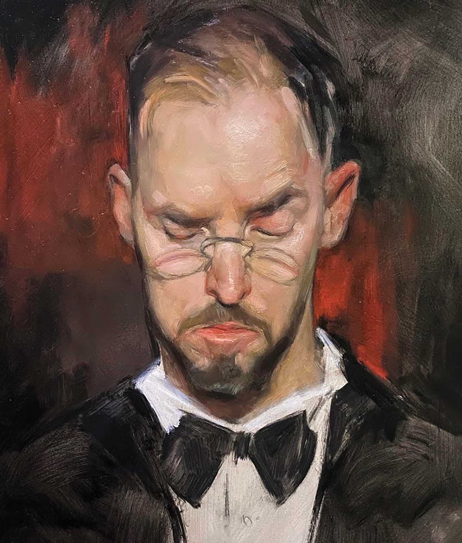
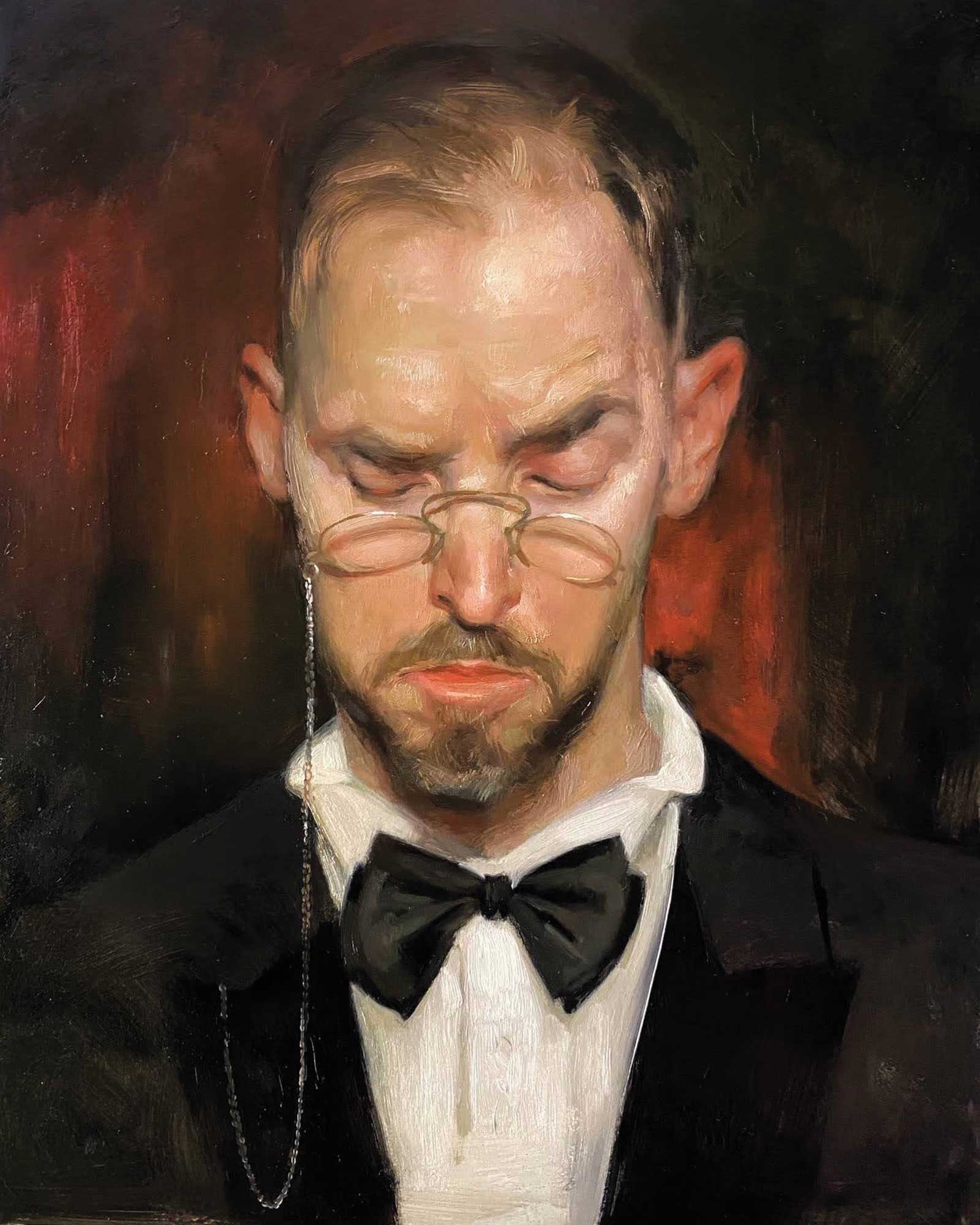 Stage 6
 Stage 6 FinishED Artwork
This stage can take days or weeks. It’s made up of little moves to further adjust everything. Ask yourself these questions: How is my drawing? How are my values? Can I improve my temperature? Are there extra colors I can use to better capture the light? How are my lines?
Line quality is extremely important. You need a mix of blurry and sharp lines to keep the image natural. Blurry lines move away in space and sharp ones come forward. This is the stage where, after all these questions are asked and answered, you can put the shine on the glasses, the sparkle in the eye and any loose strands of hair deemed important.
Jennifer Gennari is a classically trained artist. She graduated in 2005 from Ringling College of Art and Design and in 2008 left for Italy to study at the Florence Academy of Art where she spent three years abroad studying classical realism under Daniel Graves. Gennari has been painting animals since 2014 and is driven by a deeply rooted passion to elevate and legitimize the life we have with them.