


International Artist has always been reserved as a space for artists to learn from one another. Readers get to experience first-hand stories and tips from the peers whom they admire. While a discussion of tools and materials can be important, there is another entity that will require consideration from every artist—our relationship with the inevitability of art created by artificial intelligence.
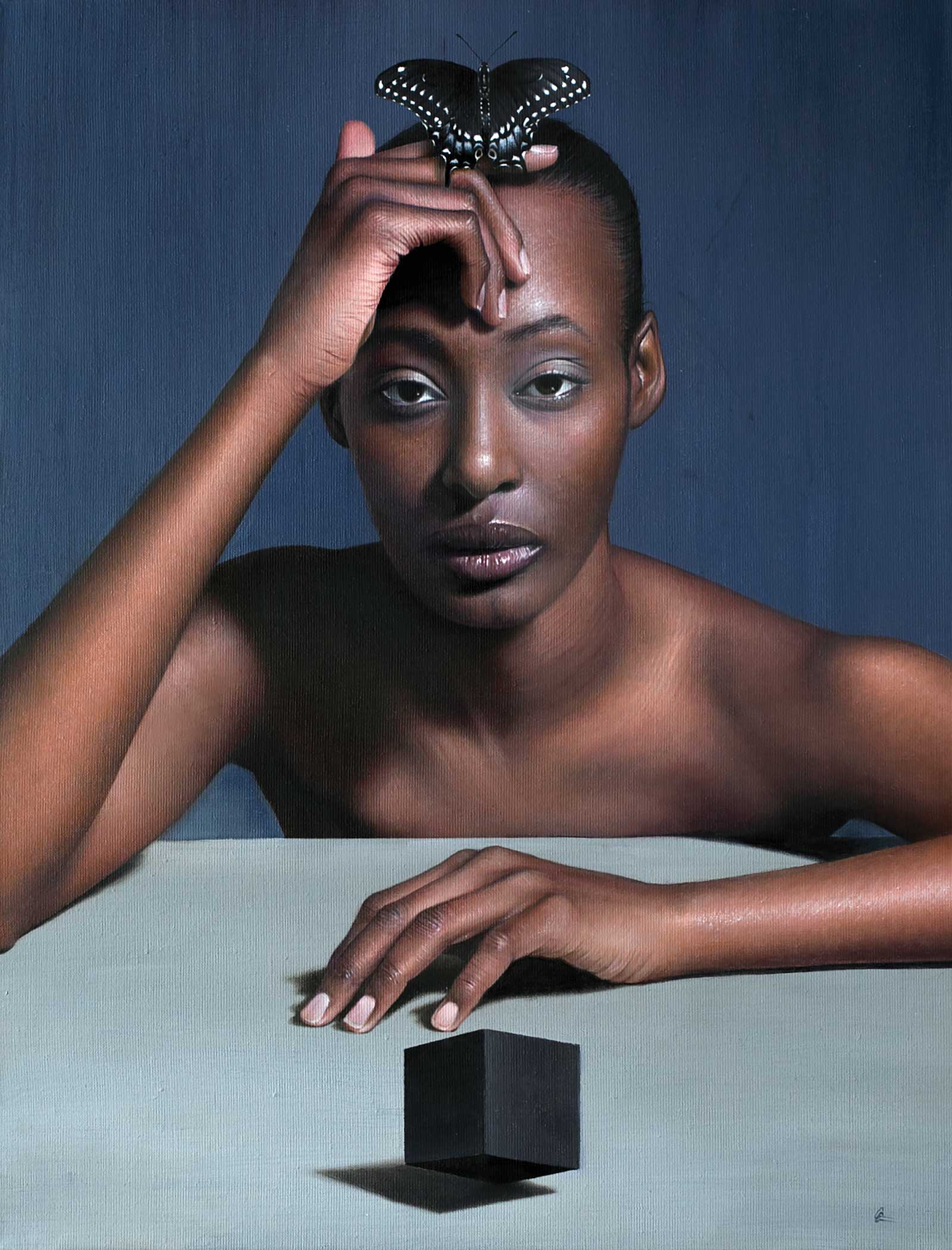
Balanced, oil on linen, 24 x 18" (60 x 45 cm) Balanced utilizes the visual effect of comparing blocky geometric shapes (the cube) vs organic shapes (the butterfly) to create a space and tension between the two chosen symbols. I don’t believe that any AI could match the performance of the model and nuance in the expression of her gaze.
What seems more akin to a work of science fiction is quickly becoming a common fabric of our reality. There are numerous computer programs written to quickly cross reference all recorded data points throughout history and generate mathematically accurate original images that rival or even supersede a human’s ability to do the same. And yes, artists are quick to point out the fact that AI-created imagery is bound to digital confinements and could never match the experience of viewing artwork created by hand. While that may be true, any dismissal of AI’s artistic potential is dangerous and naive. Instead, we must begin to understand how we, as human artists, will coexist alongside this potential behemoth.
Please allow me the opportunity to share my ponderings and explain where I see my personal artwork situated in response.
If indeed AI artwork may threaten the value of human-created art, then we have no other option than to counter it with what I call being “radically human.” Where AI comes up short is in its ability to match the human capacity for authenticity, spontaneity and ultimately, our vulnerability. Going forward, your artwork will require something of yourself. It will require that you are inserted into the DNA of your work.
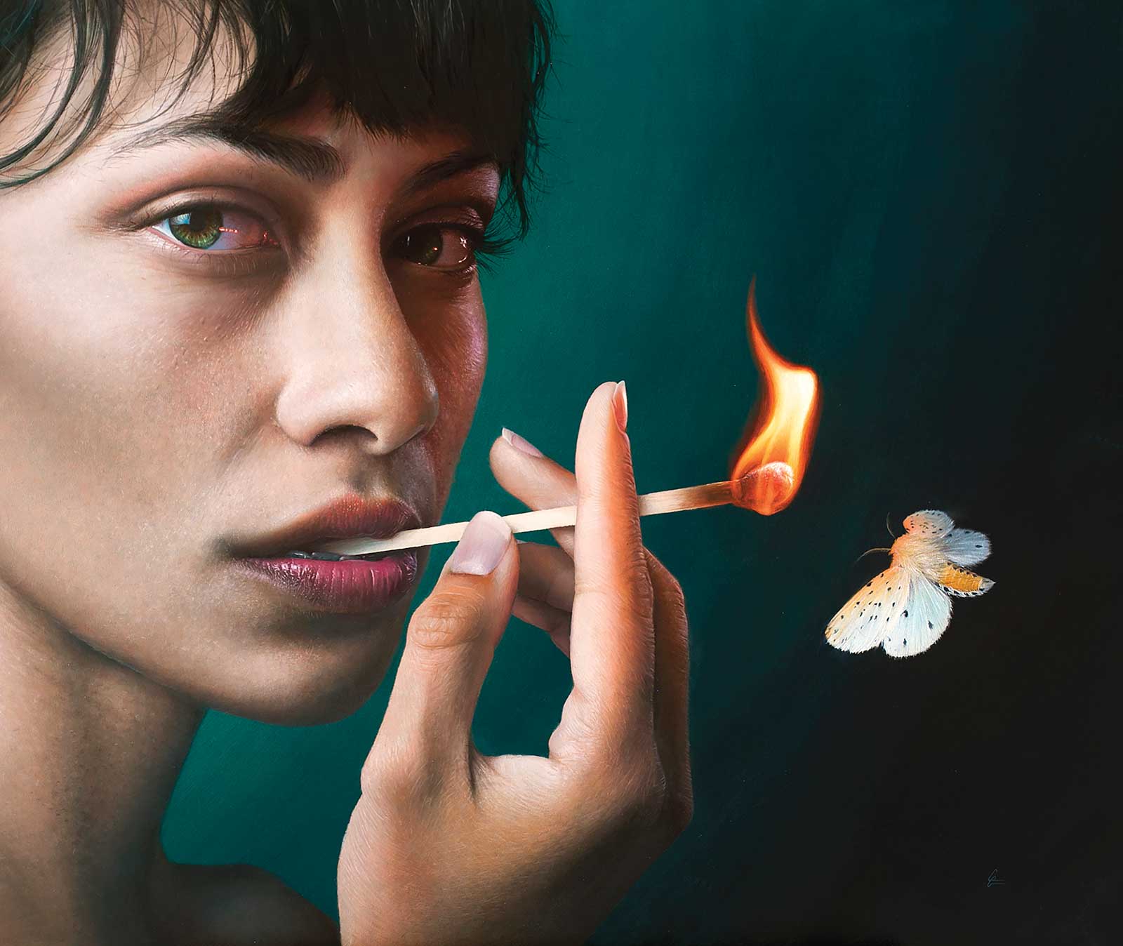
Inner Fire, oil on ACM, 24 x 30" (60 x 76 cm) This painting strives to explore the attractiveness and empowerment of self-actualization. The painting feels as though it hinges on the connection of the subject and viewer in a way that can only be achieved through the collaboration of a talented model and adept director. These are the fleeting moments that if properly captured allow human-formulated imagery to surpass the ability of AI.
Your personal preferences will matter. Your fears will matter. Your limitations will matter.
The beautiful alchemy of all these seemingly disparate parts of you are what comes together to make your artwork your own. And while AI will use its algorithms to try and match your mixture, it may never understand the final and most important ingredient: meaning. Your art must carry meaning as we move forward. Edward Hopper was a bit clairvoyant when he stated, “If you could say it in words, there would be no reason to paint.” If AI-generated art spawns from a sequence of word-based prompts, then our aim as humans must be to transcend those mere words and tap into something much deeper…the human experience.
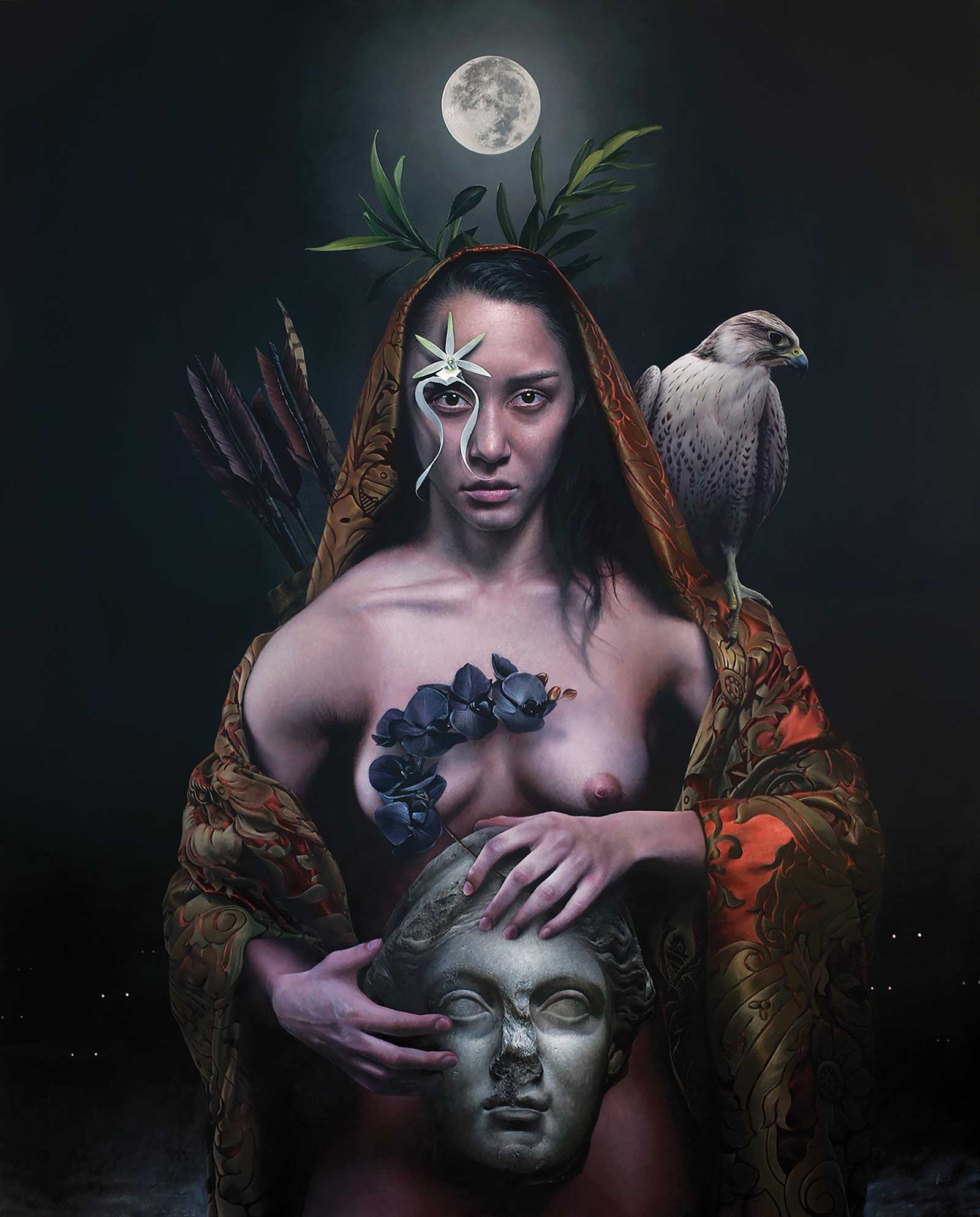
The Reckoning, oil on canvas, 60 x 48" (152 x 121 cm) The Reckoning combines symbolism and realism to explore virtues I believe humanity has lost. My choices in symbols are both personal and unconventional. How could AI ever anticipate that I envision a hawk as a symbol for patience? AI will always be calculated; we must embrace risk.
My mission to imbue my paintings with meaning has been at the forefront of my artwork over the last few years. It is my intent to use my ability to render paintings in hyper realism, to create compositions that touch on emotionally resonant truths and explore the big questions of our human experience. I strive to create artwork that challenges the viewer to venture beyond just appreciating something pretty. I want my art to move and provoke the viewer through an intersection of unease and beauty. Life, as we understand it, dances on the continuum between both of those dichotomous pillars.
I always aim to depict my chosen topics in a way that may connect with the viewer on a simple and primal level, and through an aesthetic that withstands the test of time rather than one rooted in a specific place or era. The work, the materials, the tools, they all matter. But the thing upon which I place the greatest importance is always the meaning of the piece.
My Art in the Making Le Prince Des Coeurs
 Stage 1
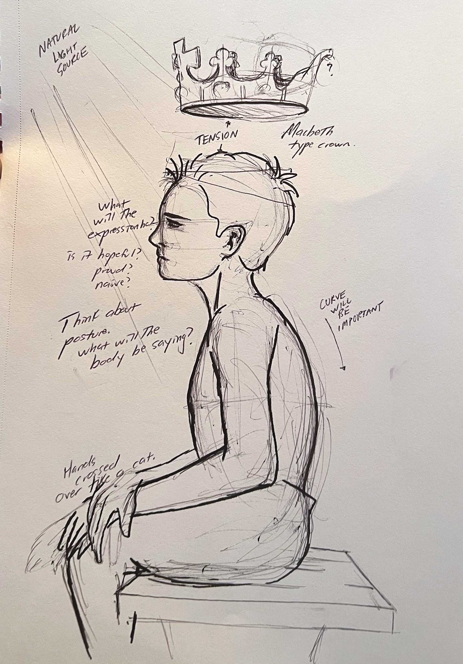
Stage 1 Concept Sketch
Most ideas originate from scribbles on a notebook, napkin or whatever is around at the time. This process began with a quick concept sketch. As I sketch, I leave little notes for myself to consider and return to. Here, I noted my curiosity for what the body language and expression could convey.
 Stage 2
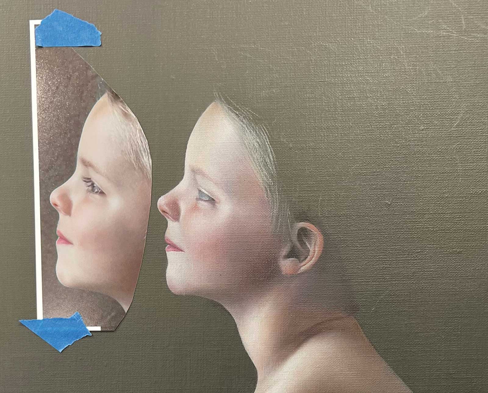
Stage 2 The Power of Reference
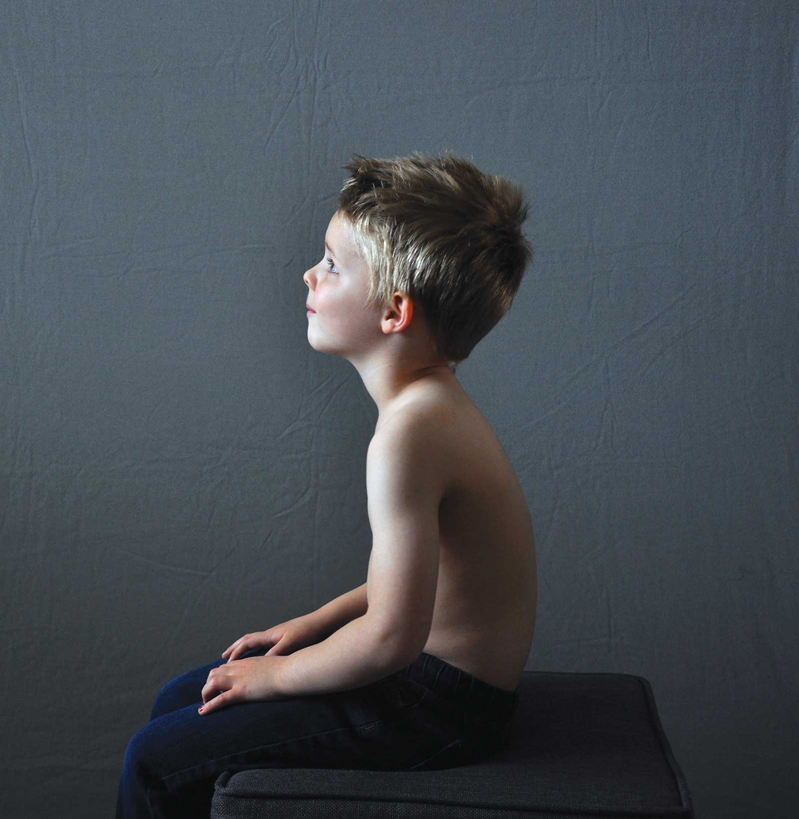
One of my biggest secrets, and one of my artistic super powers, is my reference photo. Yet for most artists, their reference is just that—a reference. But for me, it is the moment when my vision becomes reality. My artistry doesn’t begin when I put paint to canvas, it begins behind the camera. I solve a lot of compositional and lighting issues right there on camera in real time. My painting will end up being very close to the reference, so these photos truly matter. In this one, I cast my own son as the subject.
 Stage 3
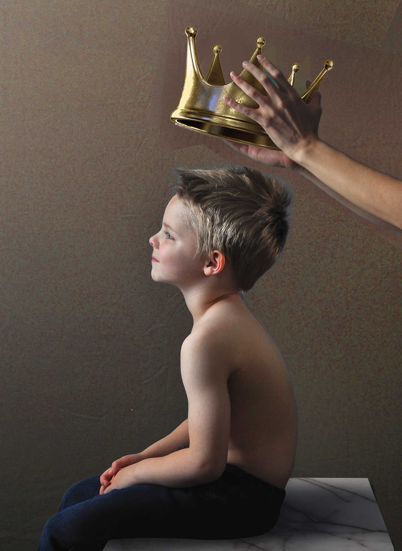
Stage 3 Designing Conceptual Elements
I use Photoshop the same way most artists use a sketchbook. In this program, I adjust colors, tweak proportions, add elements and anything else I need to do to bring the reference in complete alignment with my vision. One interesting thing that changed in this stage was that I strayed from the original idea of a levitating crown. Having someone responsible for placing the crown upon my subject’s head just felt instinctively right and added a conceptually heavier, emotional element.
 Stage 4
Stage 4 Color Mood
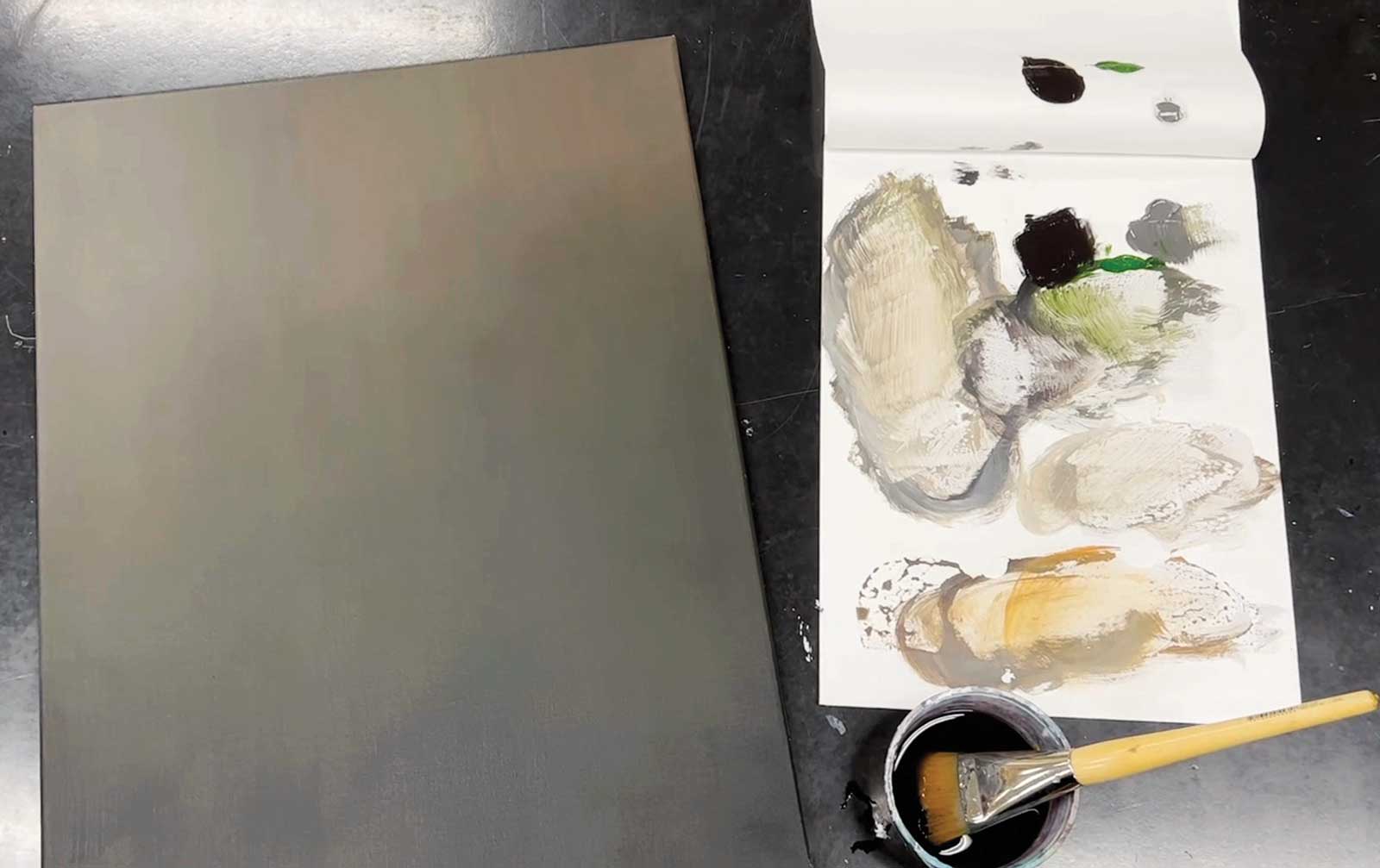
Here I tone the whole canvas and try to create a color “mood” for the painting. I lay a base and then build up thin layers to try and make a subtle, yet hazy background.
 Stage 5
Stage 5 General Tones and Colors
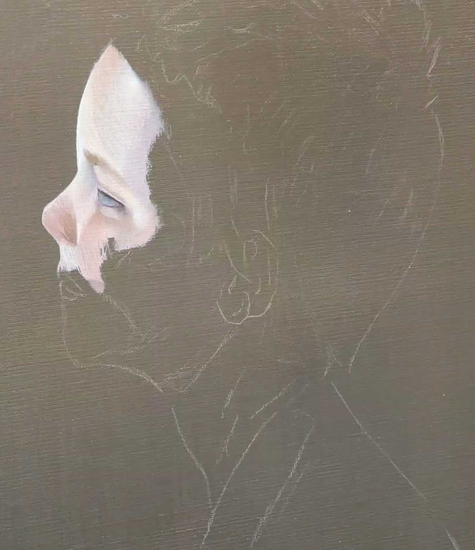
It is always at this point that I question my ability and resolve. I know what the painting will look like, but it seems so far away from completion. Additionally, this stage looks rough and feels unfulfilling. I begin laying down my “building blocks” of color by roughly laying in the general tones and colors. I typically start with whatever I think the focal point of a painting will be, as seeing that come to life can help build momentum.
My Design and Composition Tactics
Intent
Whether you work abstractly or in hyper realism, I believe each work of art requires intent. There must be something you are hoping to achieve with the work. It could be color exploration, compositional irregularity or a mood. For me, it is always a theme. There are many questions I ask myself when conceptualizing a piece: What is it that I am hoping to communicate? How would I like the audience to feel about this? How can I present this in a way that will still make sense years from now?
Reference
As a realism painter, I believe that the right reference photo can separate good and great art. There is an opportunity here to really find the spirit of the painting. I spend time talking with the model about my intended theme and direct them like an actor, often inviting them to bring their own thoughts about the theme to their character performance. If you are lucky, you will find something incredibly vulnerable, authentic and powerful in this process.
Design
Now that you have your theme and your references, it is time to put them all together into a composition. Here is where your instinct and your artistic education all come into play. How will I arrange these components into something visually satisfying? This is the intoxicating pursuit of the right alchemy of space, color, contrast—all the design. Once this has been set, make that art, yo!
 Stage 6
Stage 6 Depth and Luminosity
In this stage, I go back into my rough foundation and try to build depth and luminosity. I push more shadows in and bring more highlights out. This stage is not really about detail, so much as form.
 Stage 7
Stage 7 Assess and Compare
While I have certain colors set up on my palette, I typically continue to rough in and then render out all other areas in the painting with those tones. Additionally, I step back from my painting and compare it to the original reference. I allow myself to make some artistic choices with lighting and color, but I want to be certain I’m still working closely to the image I labored over in Photoshop.
 Stage 8
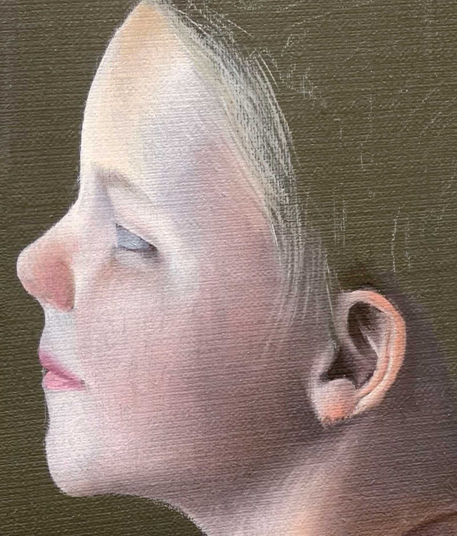
Stage 8 Subtle Details
This is where I’m most happy. I could spend forever in this stage. I love detail work. Subtle skin texture, individual eyelashes, strands of hair, cracked lips, freckles, temperature shifts…I can’t get enough of it. I feel like it takes so long to get to this point, that I consider this reward time. This is also the stage where I feel the work of art come to life, and now I’m sharing my studio with that originally conceived character.
 Stage 9
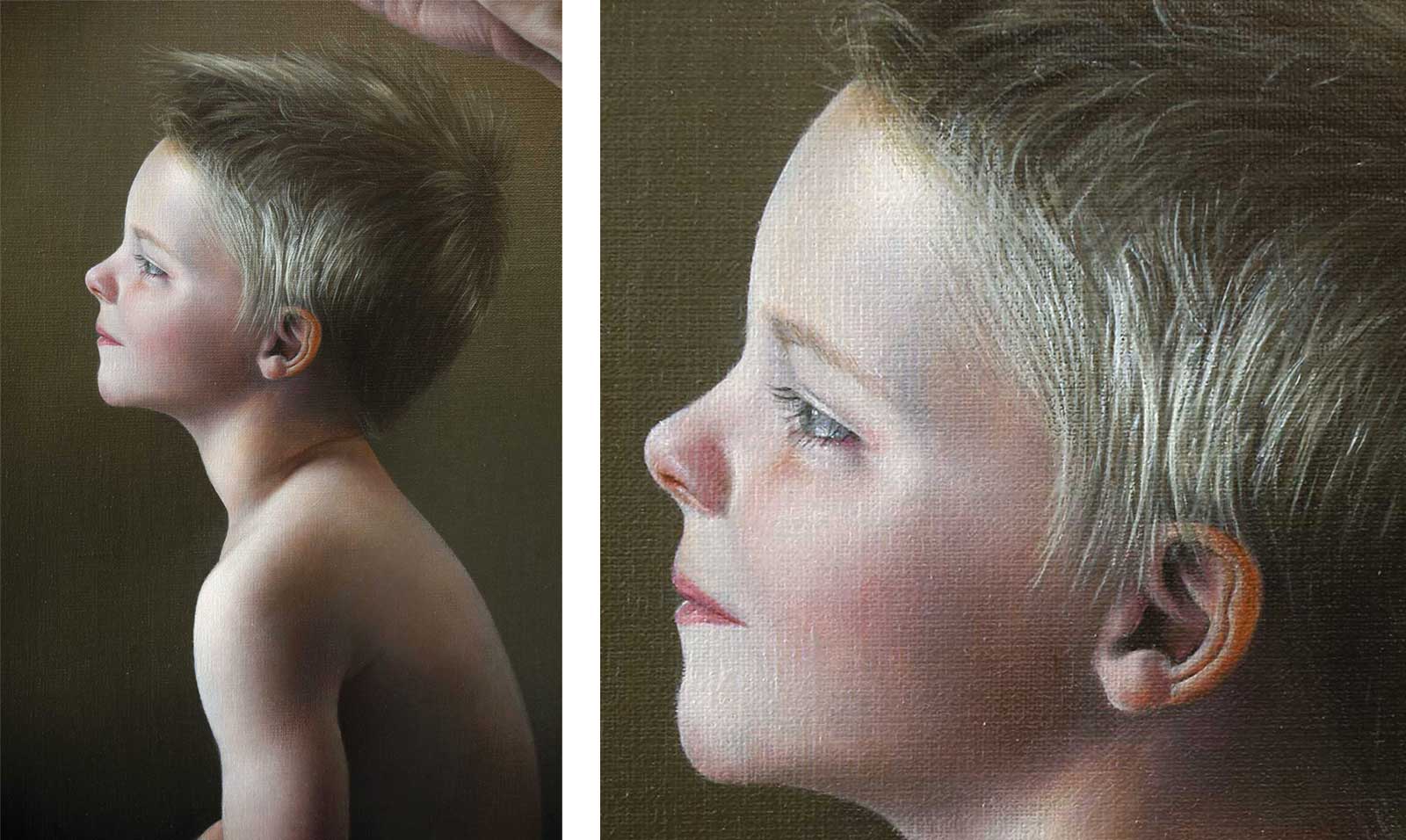
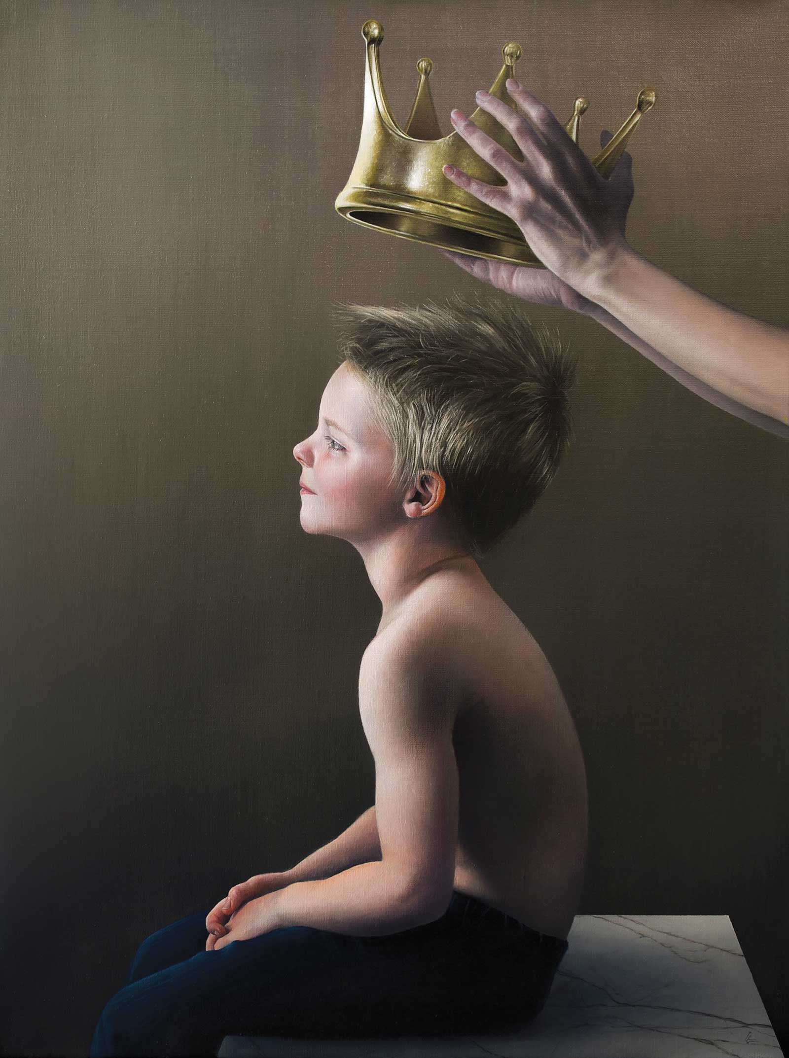
Stage 9 Finished Artwork
Le Prince Des Coeurs, oil on linen, 24 x 18" (60 x 45 cm)
I utilize the same sequence of laying foundations, building luminosity and finishing details in all parts of the painting. This is the culmination. I wanted to create a painting about the two forces with which every child must reconcile—possibility and expectations. Each child’s story exists in the navigation of those two governing dynamisms.
About the artist
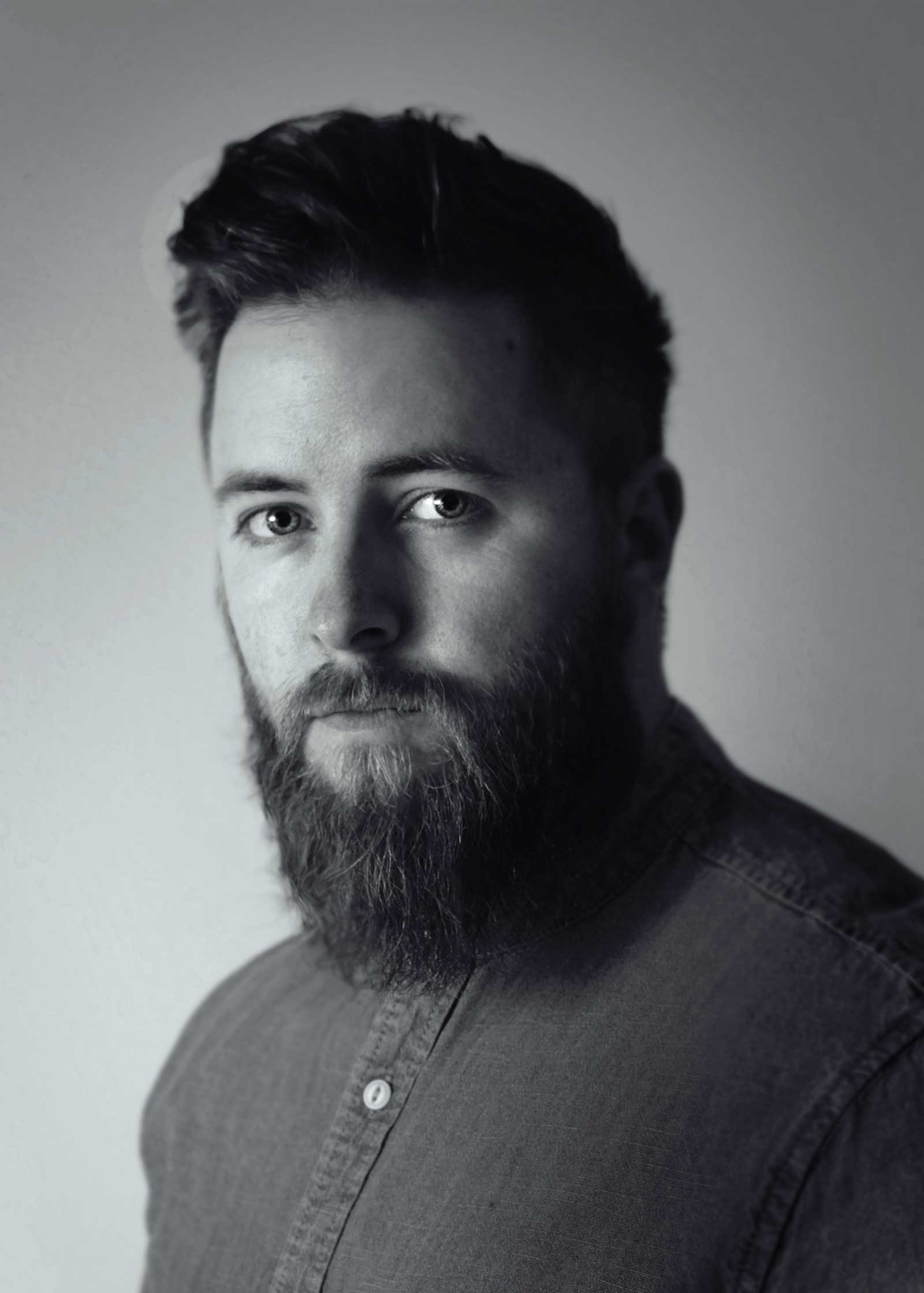 Grant Gilsdorf
Grant Gilsdorf is an emerging figurative painter living and working in Columbus, Ohio. While it is difficult to place his work in the lane of a singular genre, his paintings combine elements of realism, symbolism and portraiture in a uniquely spellbinding fashion. Gilsdorf’s work is often recognized for its intersection of unease and beauty. The paintings typically feature figures, often in direct communication with the viewer. Their meticulously rendered faces gaze out in arresting intensity. When combined with the symbolism, or “clues” (as the artist calls them) found within each piece, viewers discover greater narratives hidden within the paintings.
His work is held in numerous private collections and has been covered in various blogs, magazines and books including American Art Collector, International Artist, Beautiful Bizarre Magazine and more. He currently teaches painting and exhibits his work nationally.
Represented by
RJD Gallery, Michigan, USA, www.rjdgallery.com