


My work is simply about capturing a moment, the way I saw it or experienced it, and trying to bring a feeling to the viewer—whether it’s a golden wheat field where the wind blows and the tall reeds sway in the sunlight, an Italian Riviera port when the light brightens the side of multi-colored boats, or the light on a subject’s face sitting under the shade of trees as the sun flickers between long purple shadows at the end of the day. It’s about what I remember, saw or felt as part of that moment. My works are also focused on fashion and interiors, influenced by my father who was a clothing designer for Hollywood musicians and actors. Textures, fabric, interior design and color harmony have always been some of my favorite subjects. I have had the privilege to travel the world and see and experience many incredibly beautiful places and things. If I can capture some of those times, those moments where I stood, and make a lasting impression on canvas with the richness of oils, then I’ve succeeded in sharing an amazing thing.
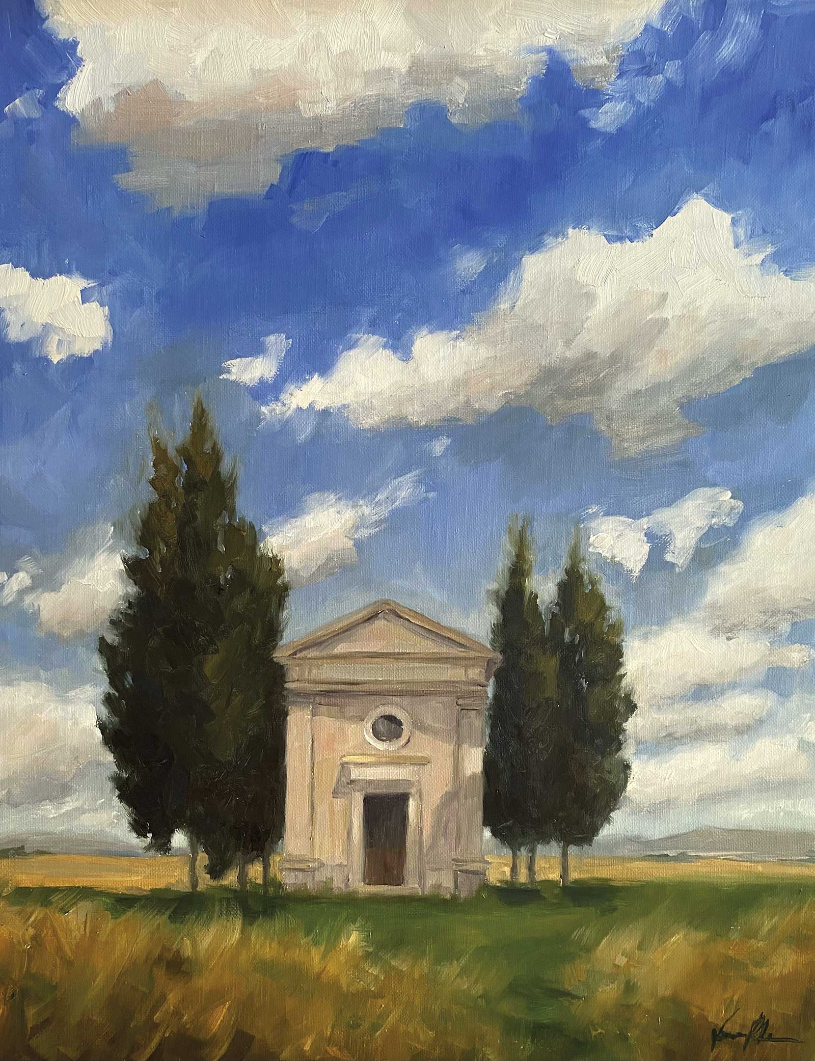
Tuscan Skies, oil, 20 x 16" (50 x 40 cm) Started on location in Tuscany, finished in the studio. I keep coming back to this subject, trying to capture the beauty of this historical little church in Italy.
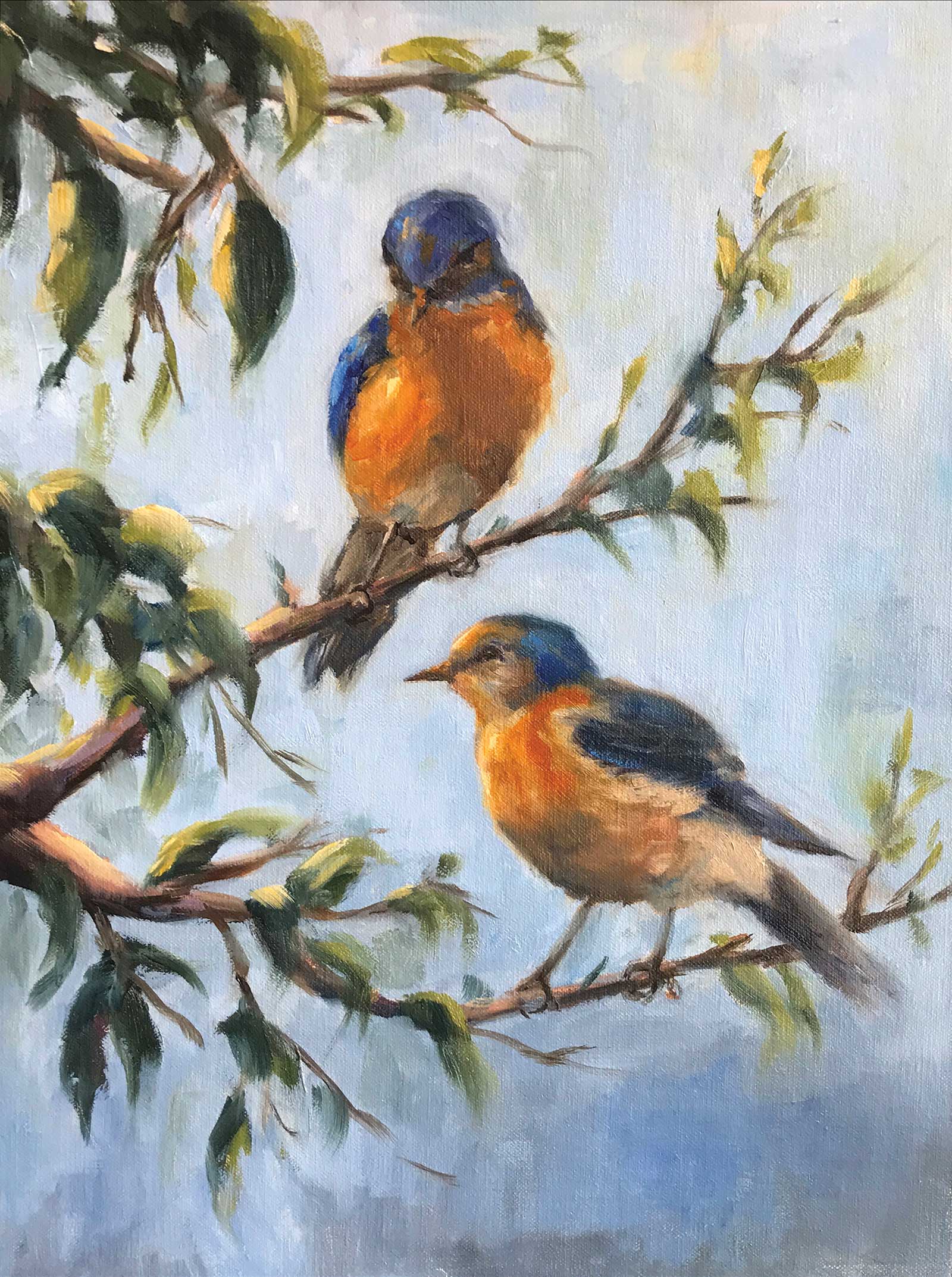
Bluebirds, oil, 16 x 12" (40 x 30 cm) Many artists like to paint birds as they are so colorful and simple, like a still life. This was done from various photographs of birds and branches with light coming from the top left.
I paint both on location, from life and from photographs. I do some watercolors, but I mostly enjoy painting with oils. Assessing the subtle changes in value and color within each subject, I love to create volume, depth and realism, then slightly blur it. Oil paints are rich and easy to put down, make changes and add or subtract color. With oils, I can give importance to an aspect of the scene that I most want to focus on by highlighting one part with a thicker or more colorful stroke, or graying, blending and softening things to make them fade or retreat. I enjoy the problem solving of realism along with the creativeness of impressionism, and both can be achieved with oils.
My Art in the Making Iconic Provence
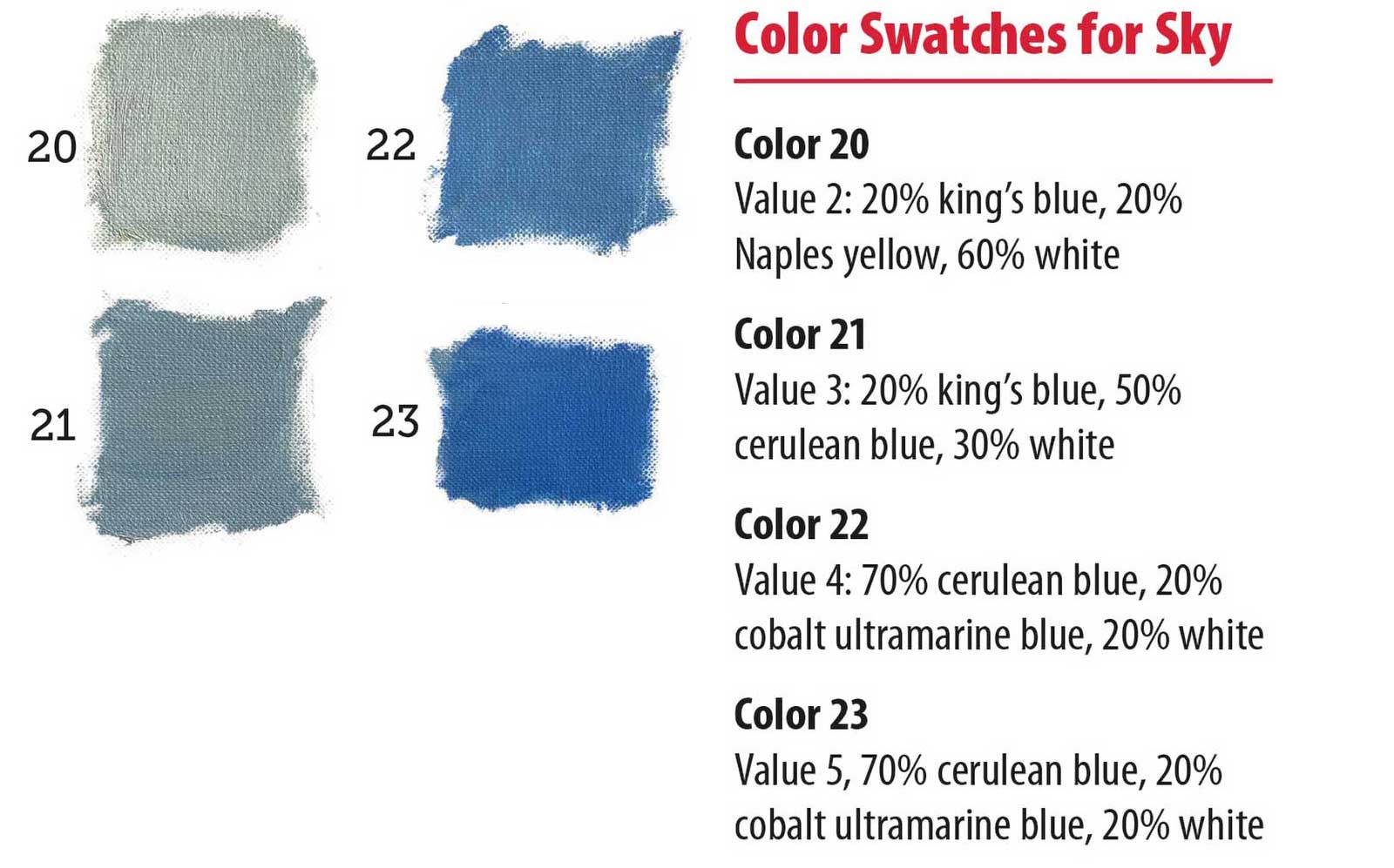
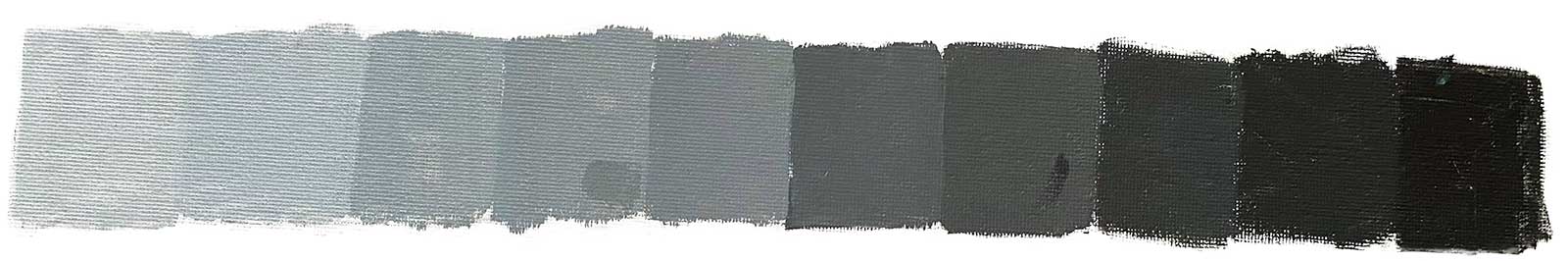 Value Scale
Value Scale
In this demonstration I used buttery rich Rembrandt oil paints, made by Royal Talens, to create a combination of color/value swatches, including warms and cools with various brushstrokes to create realism and a sense of atmospheric perspective in a colorful French farmhouse scene.
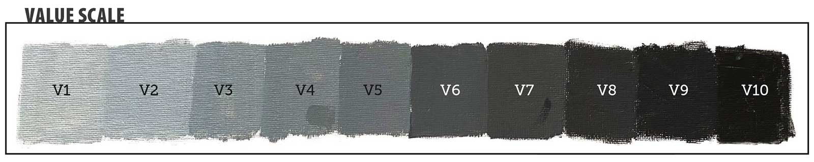
Using hue, chroma and value, I will mix three to four main base color swatches to use for each object in the scene. I often like to pre-mix my colors and values into three paint piles on the palette: a light, medium and dark of the same color (or a slightly different hue) to demonstrate how to build volume in the work, from dark to light. This pre-mixing will help us stay organized and create the illusion of reality and a sense of depth in the landscape. I will also focus on brushwork, which when purposely used as vertical or horizontal strokes, can help this illusion of depth as well. Make sure to refer to the gray value scale as you go to be sure your color mixes are in the correct value as well as the correct color. Remember “values do all the work, color gets all the credit!”

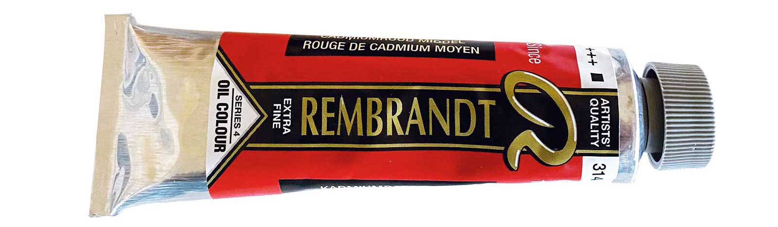
For more than 120 years, Royal Talens has been stimulating creative expression worldwide by developing trusted brands and high-quality products that inspire people to paint and draw. As an artist and art instructor, my aim is to teach students how to master values and color, so it’s important to have great professional tools, in this case oil paints, which have enough pigment and stable consistency to create subtle changes in value and color. I am very proud to be an artist ambassador for Royal Talens, makers of Rembrandt oil paints and other professional products I use daily and can wholeheartedly recommend. See more from Royal Talens at www.royaltalens.com.
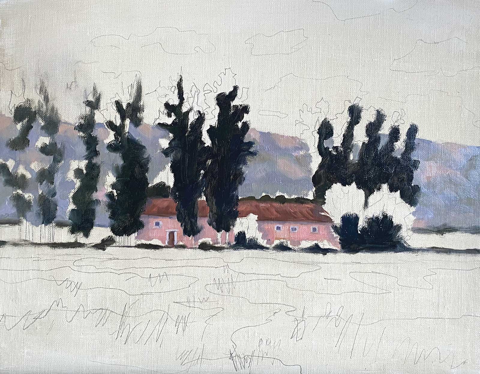
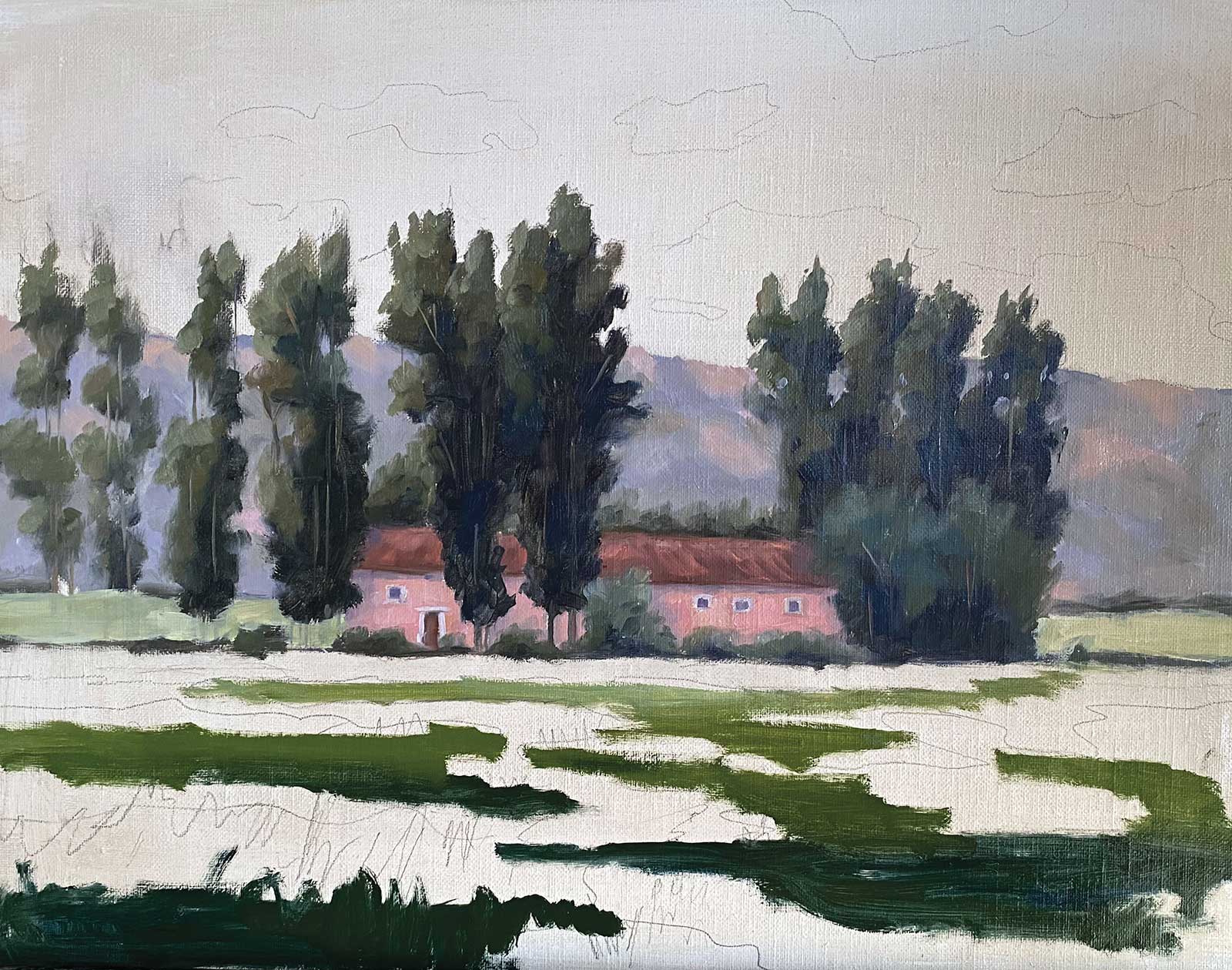
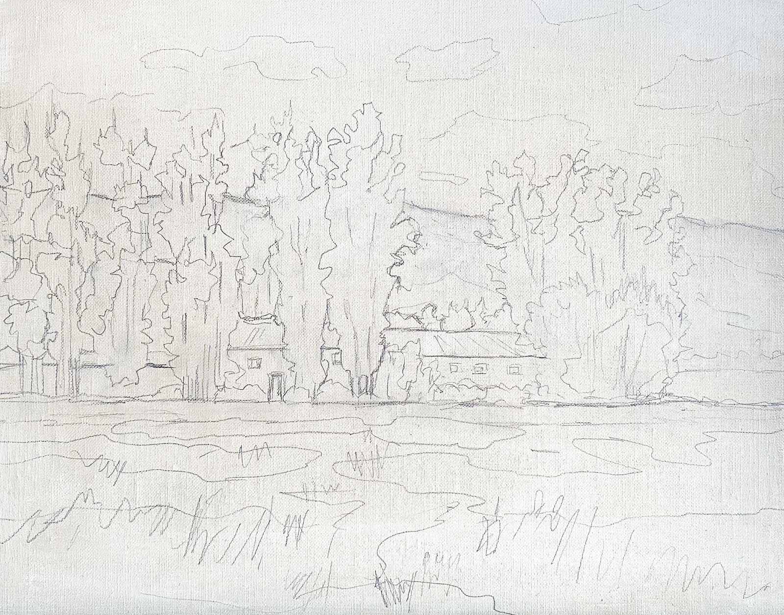 Stage 1
Stage 1 Sketch
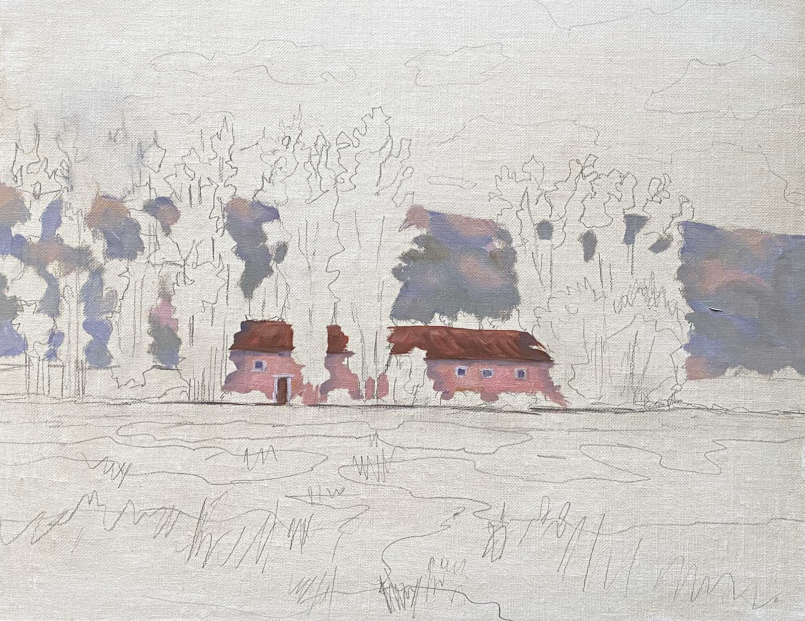
I begin by drawing my scene on the canvas. Once my drawing is figured out, I can focus on color and value and not struggle with the drawing as I go. I lay in the house first and build the trees around it, thinking of the negative shapes between the trees. I make patterns of grass in the foreground where my darks will go to lead the eye in, and a few vertical lines to suggest the reeds.
WHAT THE ARTIST USED
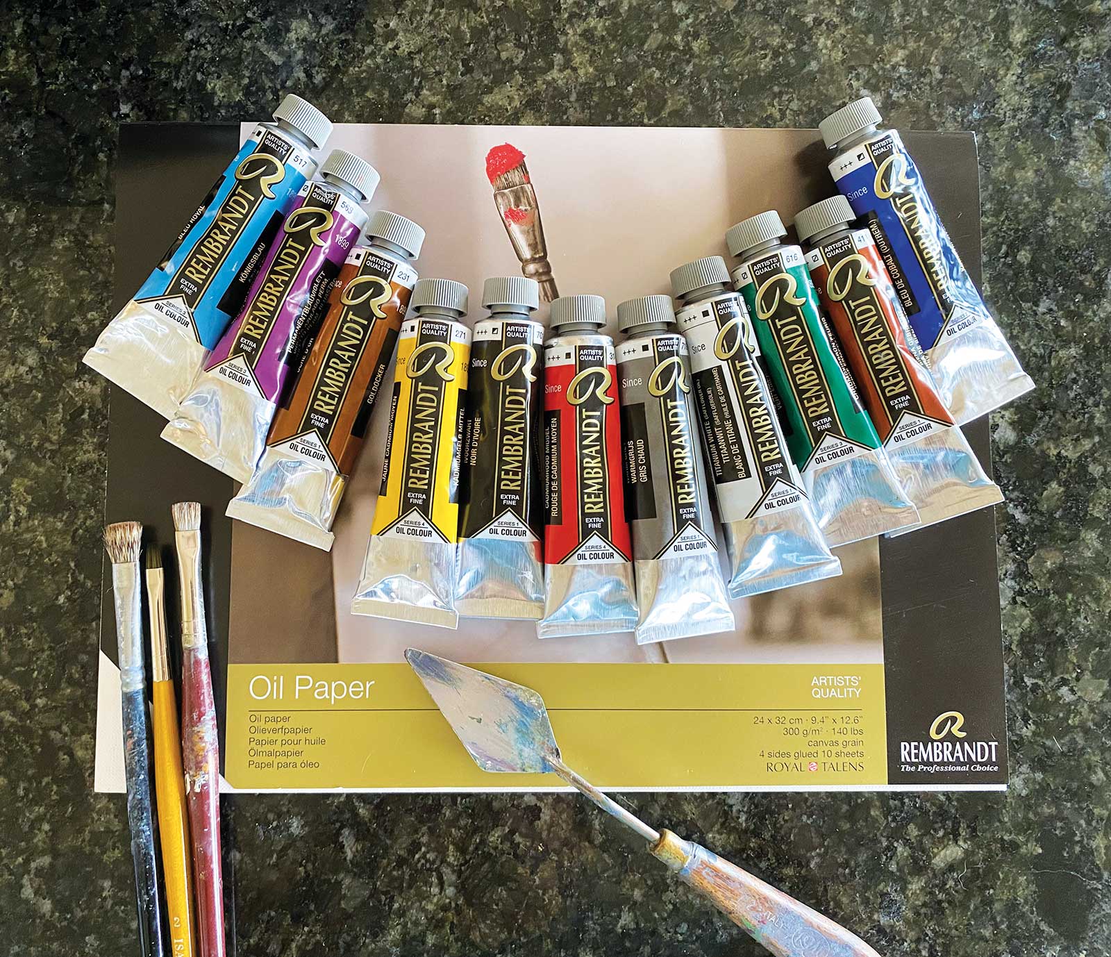
Rembrandt Oils
Titanium white, Ivory black, Cadmium red, Cadmium yellow, Naples yellow light, Gold ochre, Burnt sienna, Ultramarine blue, Cerulean blue, King’s blue, Permanent violet, Greenish umber
Brushes
Mongoose bright, size 10, Sable bright, sizes 4-6, Straight edge flat synthetic, sizes 2-4, Small hog hair fan
Additional Materials
Rembrandt oil paper, HB pencil, Paper towels or hand towels, Gamsol
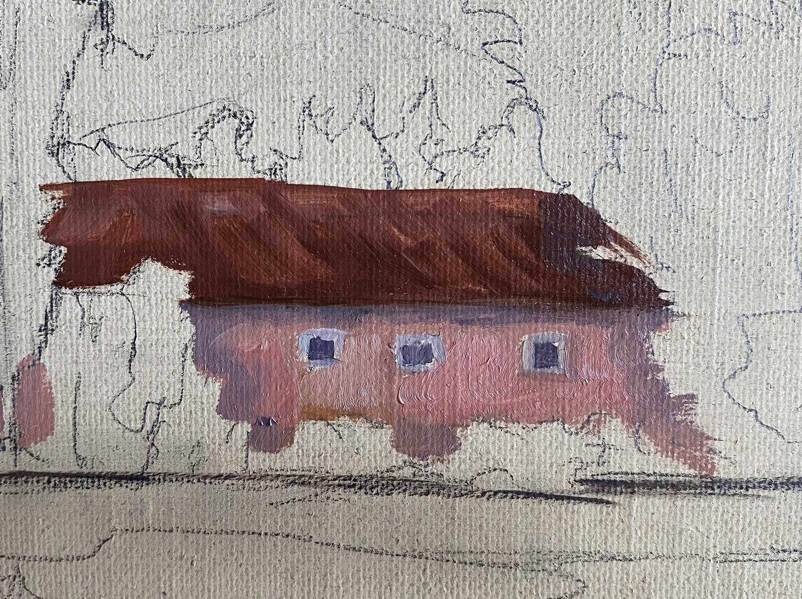
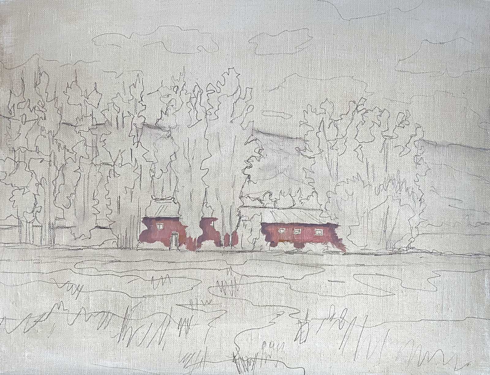 Stage 2
Stage 2 Farmhouse
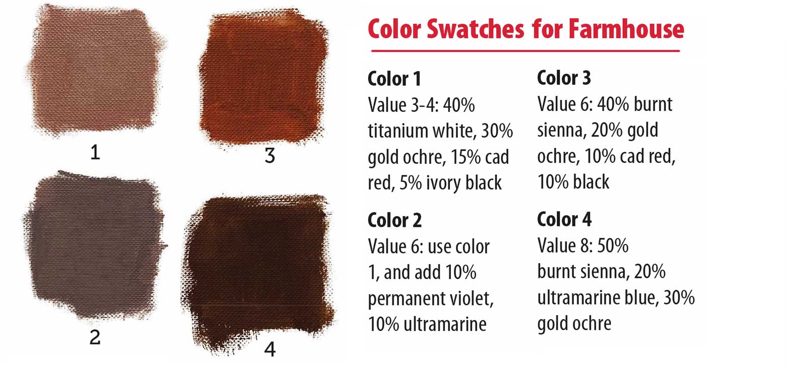
In this stage, I mix my first batch of color swatches. Next, I paint in the main pink color (Color 1) on the house, then add the darker shadow color (Color 2) where the trees would cast a shadow on the house and for the shadow under the roof.
With Color 3, I start on the bottom half of the roof and work dark to light. On the top part of the roof, I add Color 4, putting it down with brushwork that follows the roof down at an angle. You can add just a little white or yellow to tint it at the very top of the roof where the sun would hit.
 Stage 3
Stage 3 Architecture
The dark purple of the door and windows can be mixed by using the shadow Color 2 with a little ultramarine. I put a little burnt sienna in the wood front door. Make sure you use a small straight edge brush for the white trim around windows to keep the architecture straight, using mostly white with a touch of gray mixed in.
 Stage 4
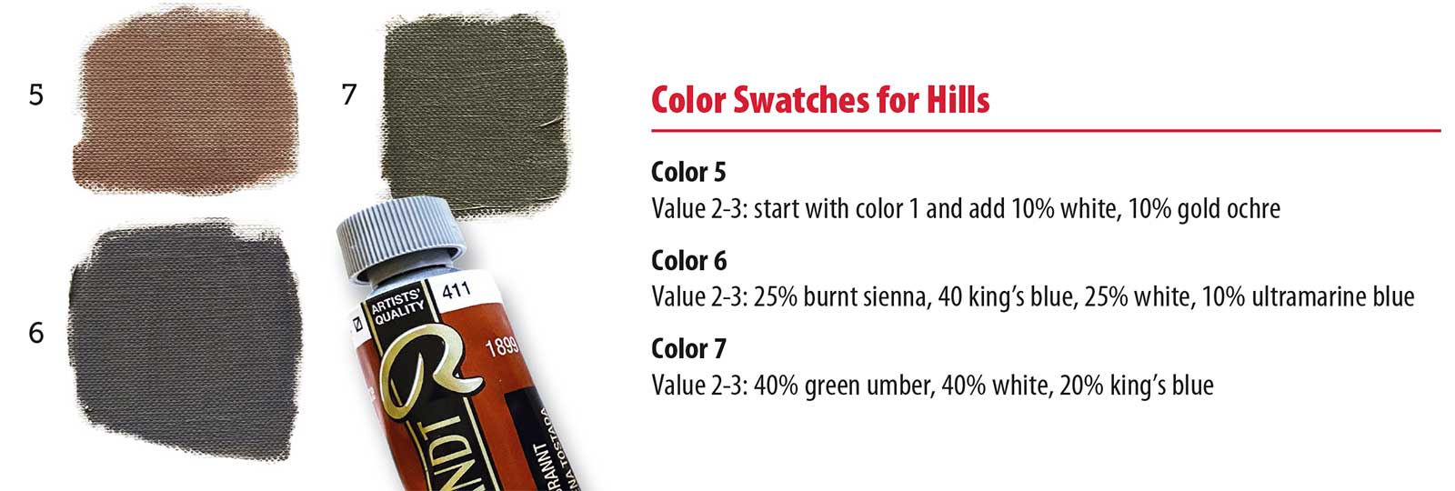
Stage 4 Far Hills
The distant hills are made up of three main pale muted colors, with high key values of 2 to 3. To create rocky hills in the distance, I first lay in Color 5 near the top of the ridge line. I then add Color 6 as the shadow color near the pink rock areas, and finally added the green-gray Color 7 to the rest of the hills, making a quilted pattern. Since this hill is far away, be sure to lightly blend the three colors using a clean, dry mongoose hair or sable brush so there are no sharp edges or details.
 Stage 5
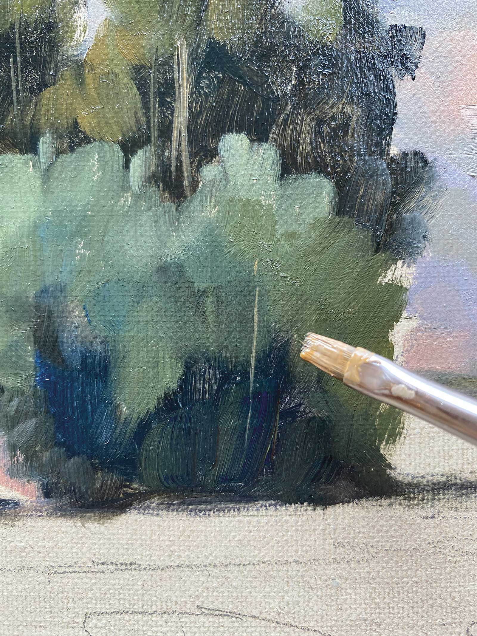
Stage 5 Dark Trees
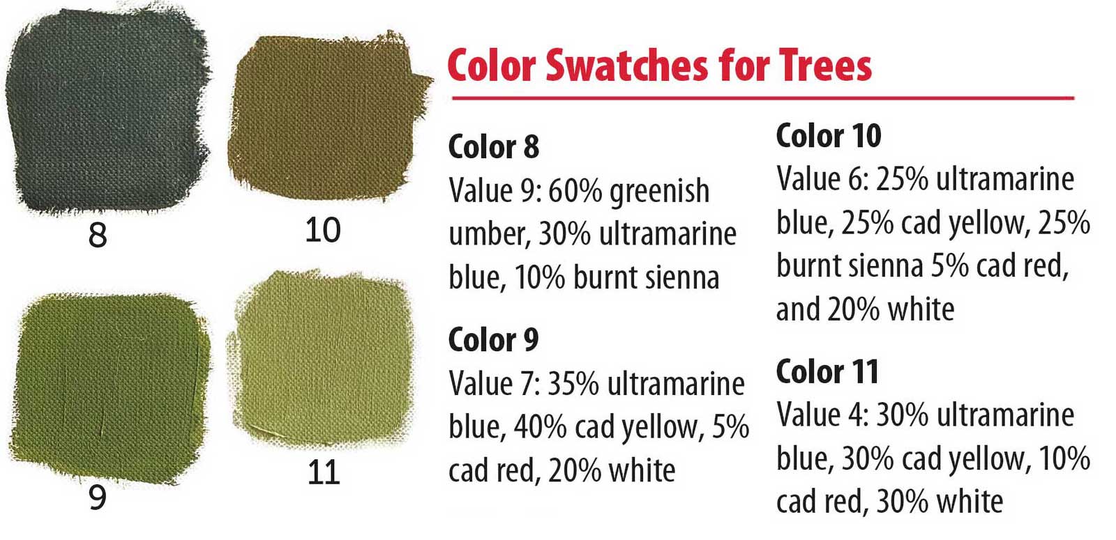
For the dark tall trees, I first use the dark Color 8 to block in all the dark areas of the trees, copying the darkest shapes I see. The light is coming from the high left, and the lighter values will hit the trees on that side mainly. To build volume I add Color 9, a warm olive green, next to the dark, and next to that, the main green Color 10. Note that even the lightest light on the tree is not as light a value as the hills behind. You will want to use a soft sable or used brush with wispy edges (not sharp) where the colors hit one another to create soft transitional effects.
 Stage 6
Stage 6 Bushes and Shrubs
For the bushes and shrubs around the house, I added a little ultramarine blue to each of the three tree color swatches to make slightly different, cooler greens.
 Stage 7
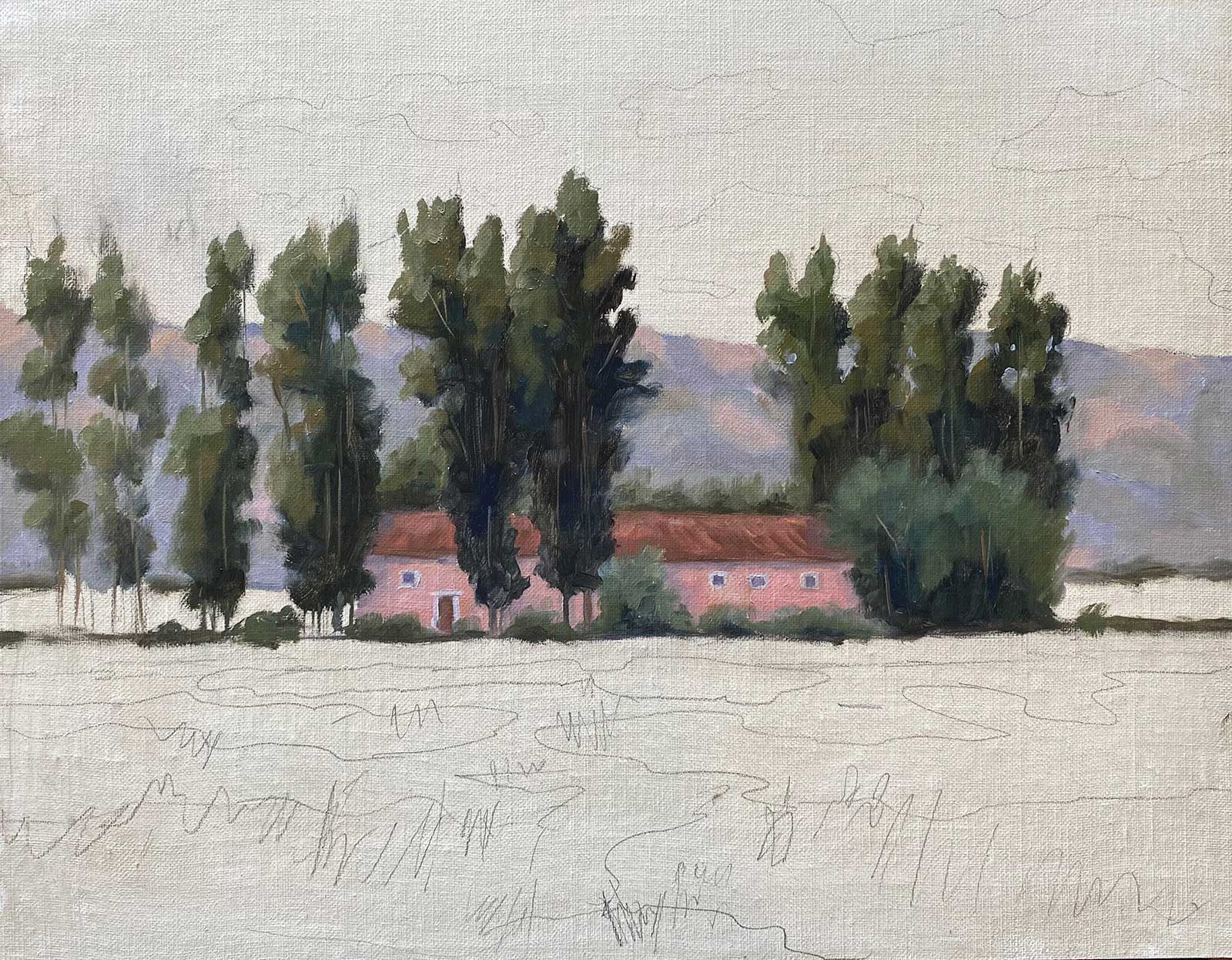
Stage 7 Negative Spaces
In this step I use the pale purple values of Color 6 between the trees to show the hill colors coming through the trees in all the negative spaces. I will put the sky color behind the tops of the trees later. This makes the trees appear more realistic, as we can often see things through the trees. They are not a uniform solid mass but have leaves and branches that grow randomly.
 Stage 8
Stage 8 Foreground Grasses
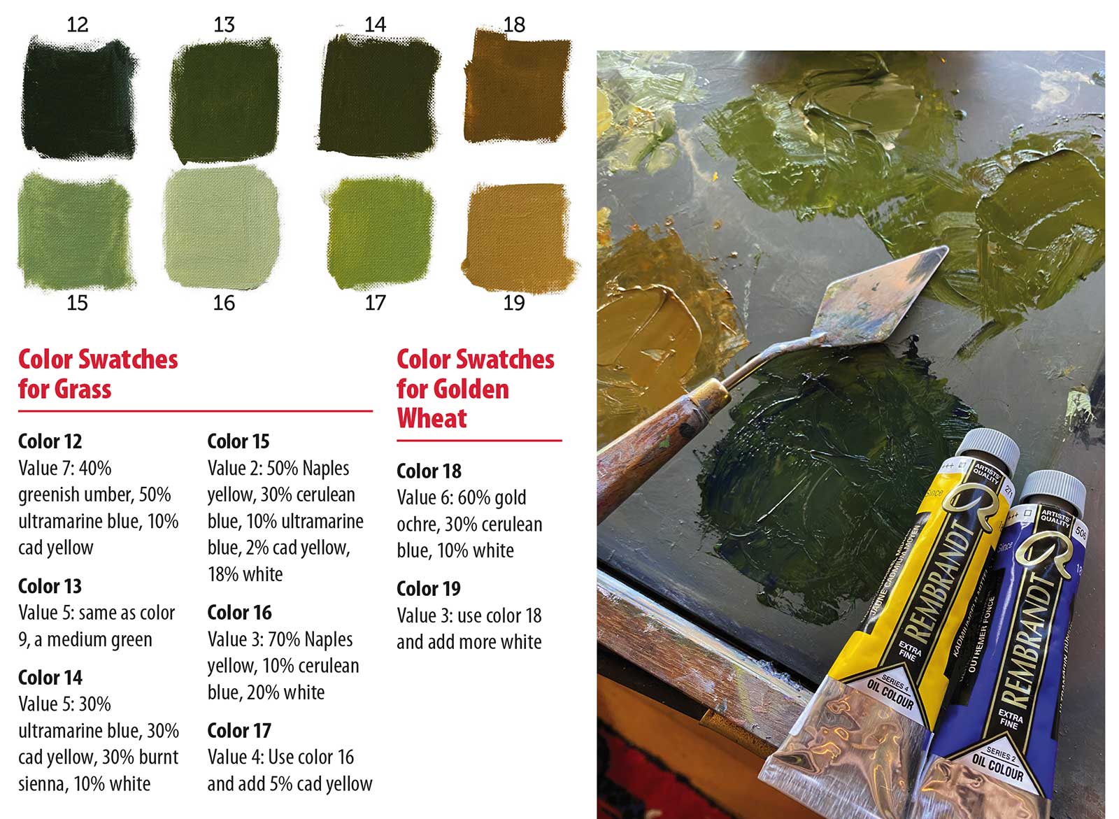
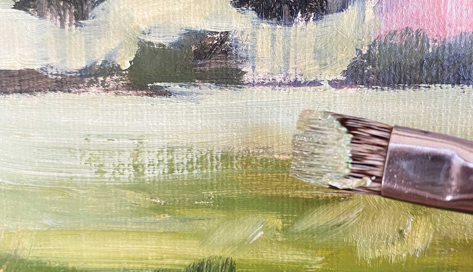
Here it’s important to lay in your darks in a pattern that leads your eye back to the farmhouse. I use value changes from dark to light as I go back in space, working from front to back. I use Color 12 and create an “S” shaped pattern that overlaps a bit, winding back. The darkest colors will be in front where there will be the highest contrast, and lightest in back where it will have less color and less contrast. Color 13 is used in the middle and Color 15 in the back. Even though these are all dark parts of the grass, they still need to lighten in value and decrease in saturation as they go back in space to create atmospheric perspective.
 Stage 9
Stage 9 Golden Wheat
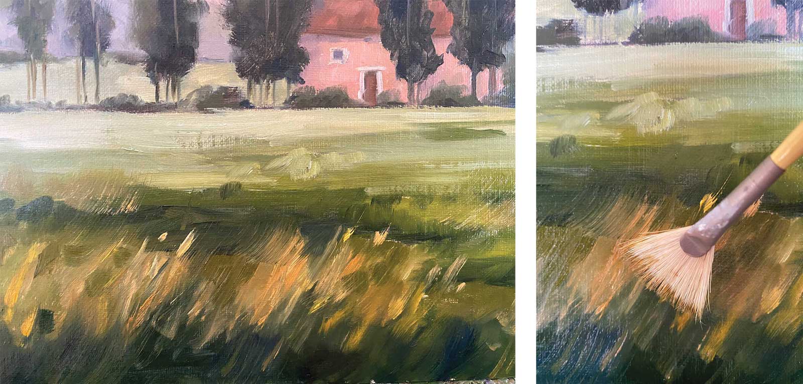
I lay in the foreground mid tones and lights using Colors 12 to 17. I use an olive warm green in the middle and front, and then cool pale greens in the back. The main wheat up front starts with a dark at the bottom, then a lighter value at the top of the reeds. To make the soft edges of the wheat, I dip my fan brush into the light Color 17 and make vertical strokes from bottom to top in the front row of wheat, painting right on top of the dark green. I lift the brush off as I get to the top.
 Stage 10
Stage 10 Brushwork and Drybrush
Here it’s important to pay attention to the direction of your brushstrokes. The wheat field will have vertical brushwork near the front as the viewer will see details. The brushwork as you go back in space should then turn to horizontal strokes, which gives the illusion of less detail and flatter shapes. Don’t paint any detail in the back of the field. In addition to the important values and color, brushwork can help trick the eye and add perspective. To get the beautiful look of the dry strokes of sage green, I use a dry mongoose brush with fresh paint and lightly touched the canvas, dragging the brush horizontally. This adds to the textures and the illusion of a field of wheat.
 Stage 11
Stage 11 The Sky’s the Limit
Now for the sky. I mix a set of four blues to have a nice gradient of cerulean sky, with clouds in between. To test if my four colors work, I create another inviting pattern, changing the color to brighter and bluer as it moves to the top of the canvas. Start with the lightest blue Color 20 by the hill ridge and trees, and then add Color 21 and 22, blending the two as you move up in the sky. My pattern leaves the places open for the clouds. With white, king’s blue and a tiny bit of black, the clouds can be created in two blended values with darkest on the bottom and pure white near the cloud top.
 Stage 12
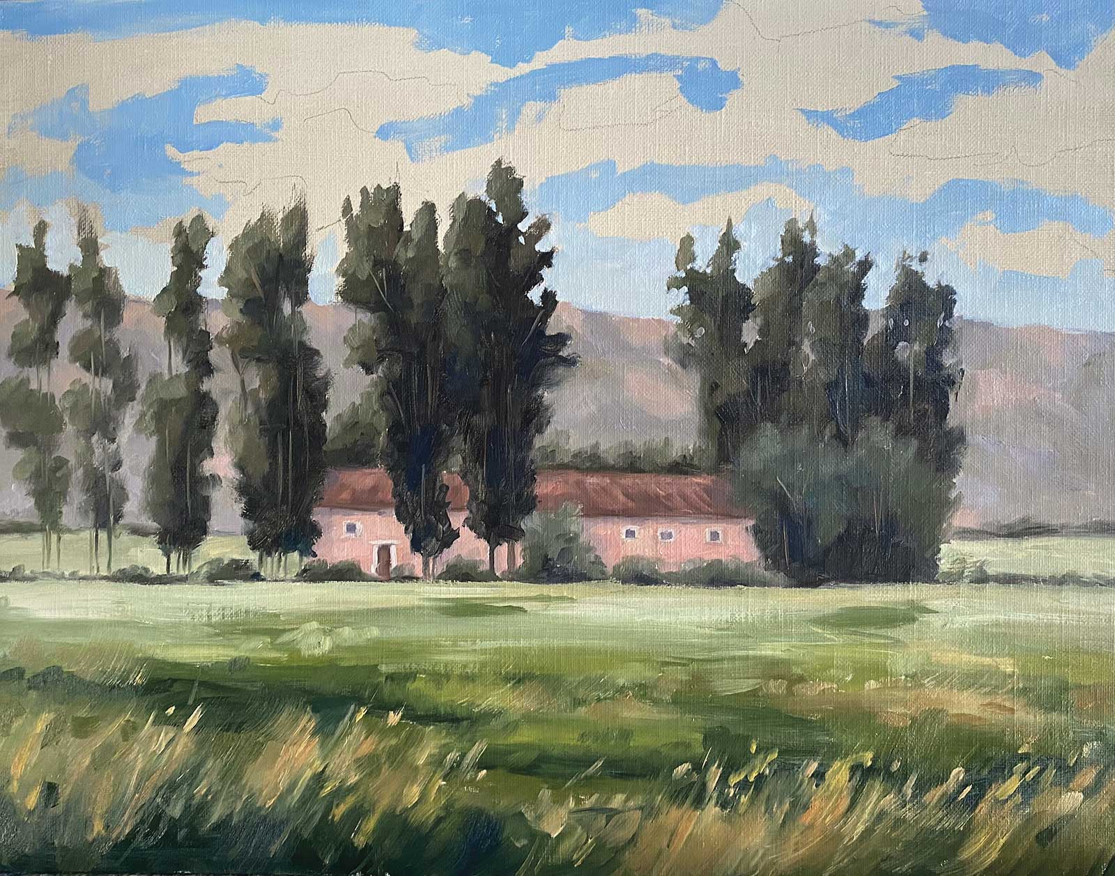
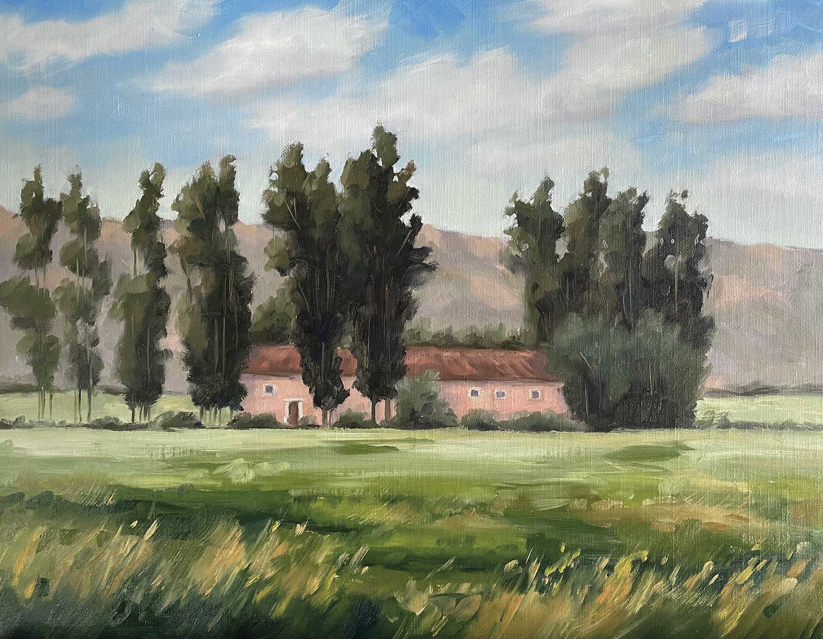
Stage 12 Softening Edges
Iconic Provence, oil, 14 x 18" (35 x 45 cm)
To finish the sky, I make sure to keep the clouds soft and without too much contrast in color and value between the clouds and blue sky, as I don’t want the viewer to pay too much attention to that area. The focus is the trees, fields and farmhouse. Use your clean large sable or mongoose to blend and soften the clouds and the sky. I use a left to right general stroke through all the clouds to indicate movement. Recall that clouds are bigger right above you and can be more detailed, whereas in the distance by the hills they are not defined and are lighter in value, with very soft edges.