


Floral gardens have been a significant source of joy throughout my life. They filled my childhood with memories of misty morning walks in my mother’s and grandmother’s gardens, still in my nightgown, feeling the cool earth under my feet and the fragrant dew in the air as bees buzzed from flower to flower. Gardens are a connection to important places, and women in my life who’ve since passed on, but whose memories and love are kept alive in my work.
For what I refer to as my garden paintings, my goal as an artist is to capture the feeling of atmosphere. I find I am able to do this two ways. One way is primarily through the use of glazes. The other is through my choice of paint colors—notably the temperature, intensity and placement of colors.
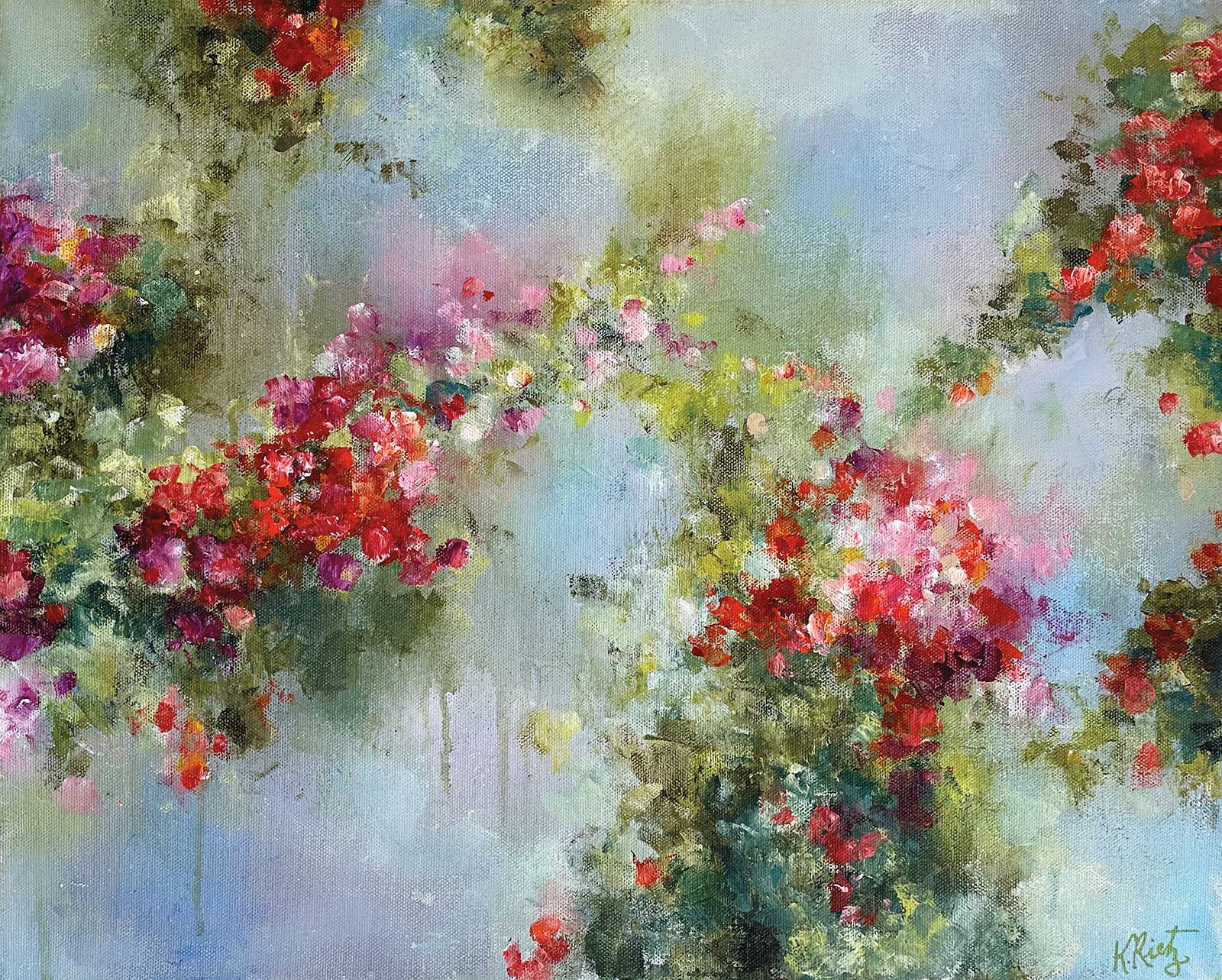
Blessed with Birdsong, acrylic on canvas, 16 x 20" (40 x 50 cm) This is a painting of harmony and contrasts. The background has a muted, subdued color palette. We can almost feel the wet mist hanging heavily in the air, holding in it the melody of birdsong. I made the foliage dark and lush to support the feeling of a garden that is thriving. I then added blossoms of deep red violet hues, pyrrole crimson and quinacridone red orange to completely wake up the painting and bring life to it. The addition of light yellow-green and touches of pink buds bring softness to the garden. Strong diagonals and flowers that creep in from all sides lead the viewer’s eye around the painting.
Glazes are a main feature of my work. Through glazing, I can achieve a buttery, diffused softness in my work, a quality which is attributed more often to oil paintings than to acrylic paintings. I can achieve the desired consistency of paint for glazing by using either acrylic glazing liquid or retarder. Both work well.
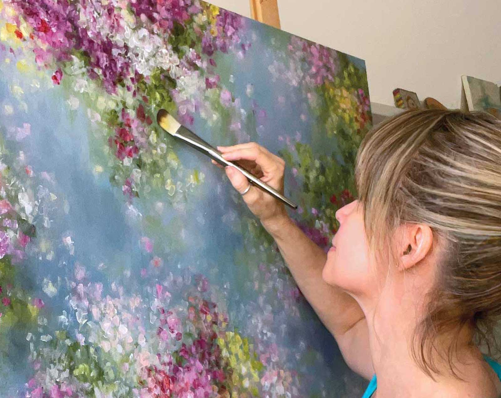
To begin a painting, I tend to tone my canvas with a medium value blue color as a base color for the sky, then I add some very transparent glazes of both a deeper blue and titanium white to create a cloudy, misty effect. This becomes the backdrop and mood-setter for the floral portion of the painting, which comes next. I tend to use my hands and a silicone wedge to block in large sections of greenery, which sets a visual map for the painting’s composition. Then, once I have established the floral composition of my painting on canvas, glazing comes into play again as I continue to work back and forth between sky and florals, taking care to integrate the floral layer with the background layer so that all parts of the painting feel cohesive. I achieve this by keeping some of the edges of my flower petals crisp, while decisively blending others into the sky. The soft, diffused effect is a hallmark of my garden paintings. Through the use of glazes, my flower petals appear to be glistening in sunlight. I find it important to constantly keep moving back and forth between sky and flowers, so that the entire subject of the painting feels connected. Lost edges help convey a sense of cohesiveness.
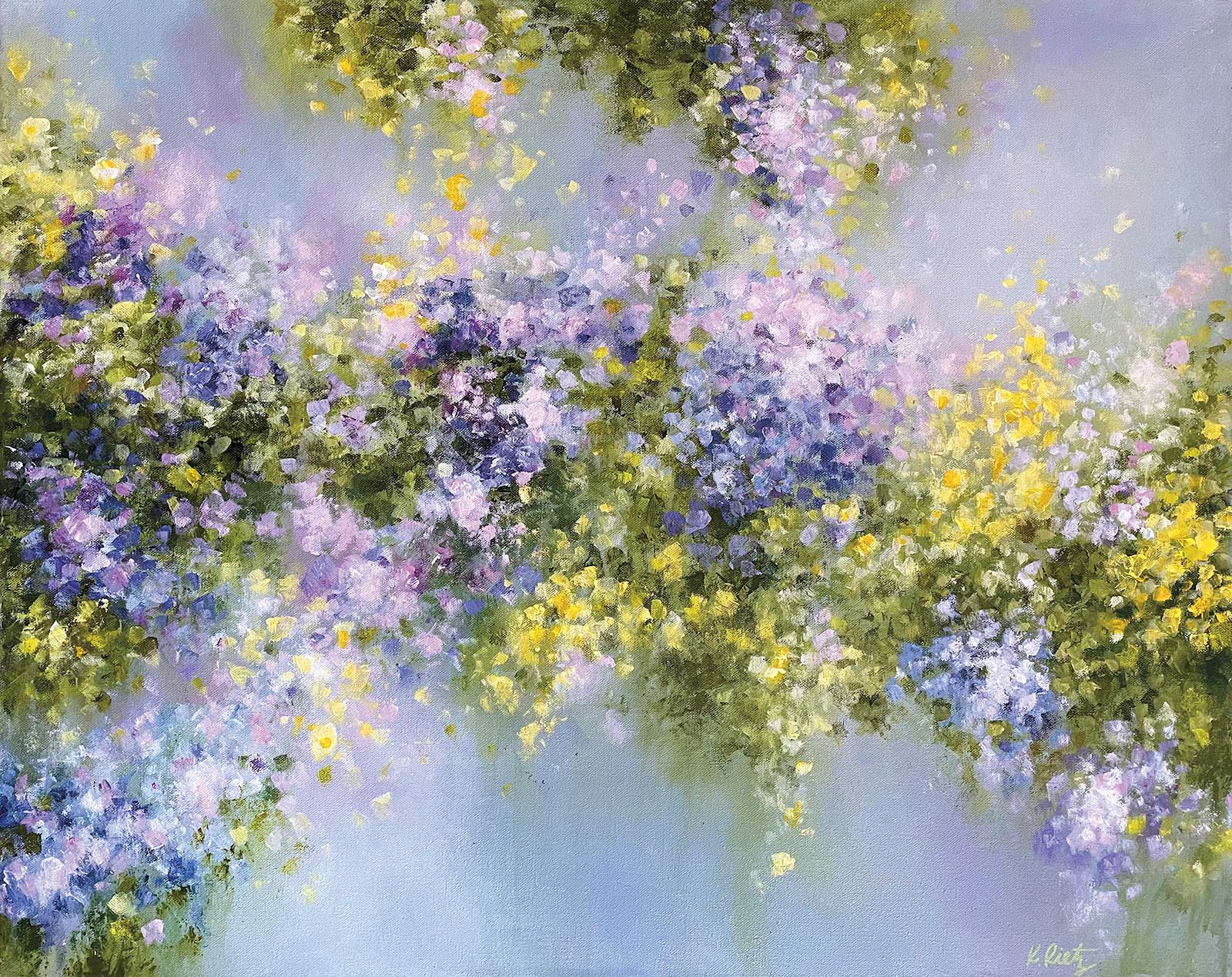
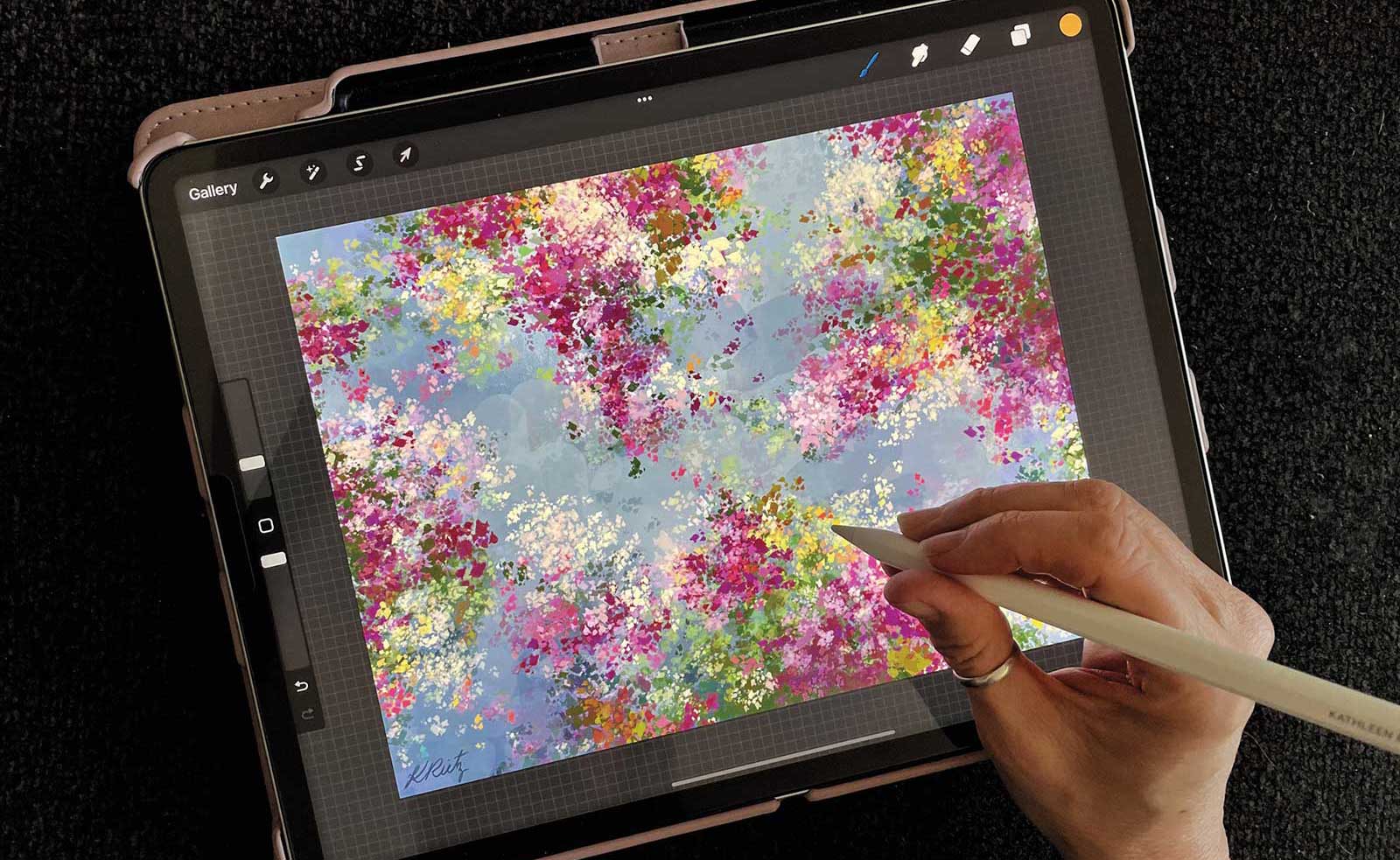
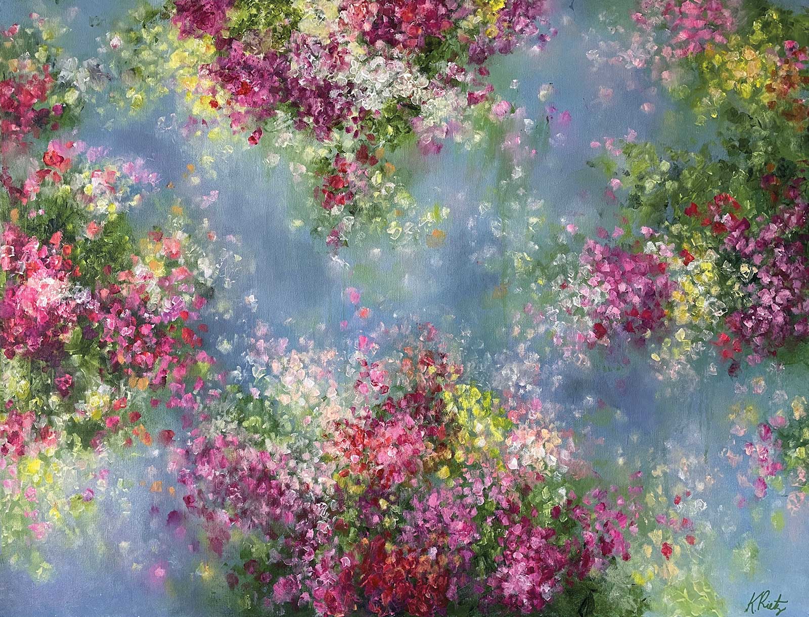
The Garden Gate, acrylic on canvas, 24 x 36" (60 x 91 cm) In this painting, I wanted the viewer to feel as though they were staring out at billows of blooming flowers clustered over a cool pond. Initially, the painting portrayed only blue and purple flowers. The painting felt serene, yet the decision to take a chance and add in yellow took this painting to another level. Before committing to this idea on canvas, I took a photo of the painting, imported it into Procreate on my iPad, and worked on a color sketch where I judiciously added the yellow in an amount that would not overpower the painting. I love taking fun chances with color, and while the colors are complimentary, the painting still feels unified and harmonious.
People often comment that my colors feel lively and joyful. The key is knowing how and when to use grayed, muted colors in conjunction with pure, saturation colors. Doing this gives my paintings a feeling of depth and liveliness. I choose gray-blue colors for my skies and greens toned with Payne’s gray for the first layers of greenery to set a backdrop for my floral colors to come alive. It is prudent to build darker and muted layers before rushing ahead to lighter and more saturated layers. The push and pull of color value and saturation is what gives the finished work depth and life. Pure, saturated colors seem even more lively when placed next to grayed and muted tones. If your paintings consistently look dull even though you are using paint colors straight from the tube, graying down some of your other colors will help.
I discovered the Princeton Catalyst silicone wedge a few years ago. Finding it stiff and clumsy to use at first, I eventually found that if I used just the flexible corner of it to apply and move the paint around on my canvas, I could achieve graceful, organic shapes. This technique now finds its way into all of my work. Using my gloved hands and brushes, I soften and blend edges of petals and greenery into the background and create glazes that give my paintings a feeling of atmosphere. My entire act of painting has become a beautifully tactile experience, allowing me to feel fully conscious and awake to my process of painting each work.
My Art in the Making Joyous Blossoms
 Stage 1
Stage 1 Creating a Digital Color Sketch
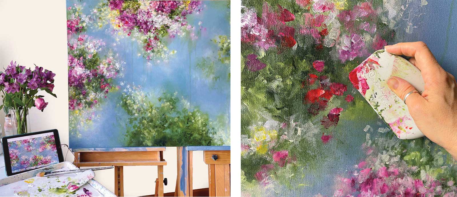
For paintings that are 30 by 40 inches or larger, I like to create a color sketch in the app Procreate on my iPad. This helps me to plan the scale of the painting, map out the composition and play with colors I might like to use. I work in layers that can be turned on and off, which allows me to explore and experiment before committing with paint on canvas. Once I am happy with my sketch, it’s time to move on to the canvas.
 Stage 2
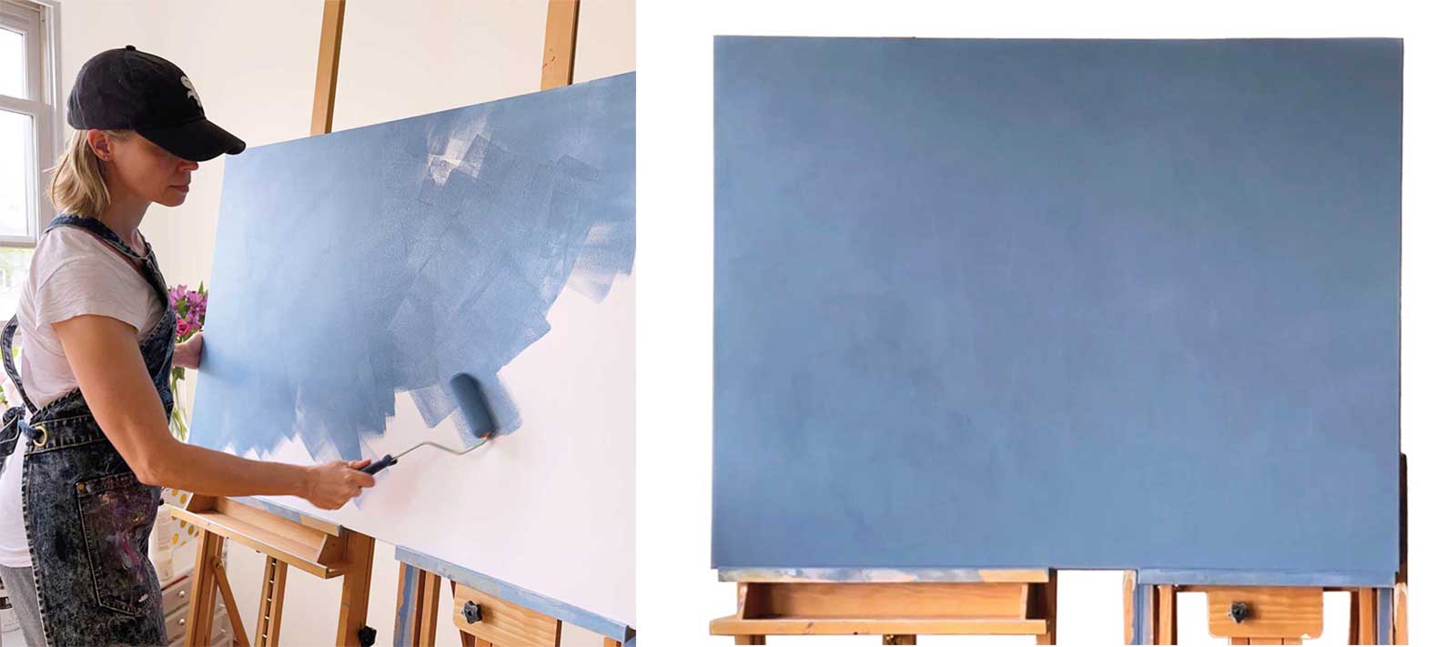
Stage 2 Coating the Canvas
I like to apply a coat of paint to the canvas with a sponge roller. I mix a ratio of approximately 70 percent paint to 30 percent matte gel medium to help extend my paint and make it easy to roll on. I use two coats, letting it dry between coats. This is especially helpful for larger paintings, such as this 30-by-40-by-1½-inch stretched canvas. At this point I paint the sides of my canvas as well, which is very easy to do with the roller. They will need to be touched up later, but adding the first layer to the sides now feels like less work and is easily done with whatever paint is left on my roller.
 Stage 3
Stage 3 Adding Interest to the Sky
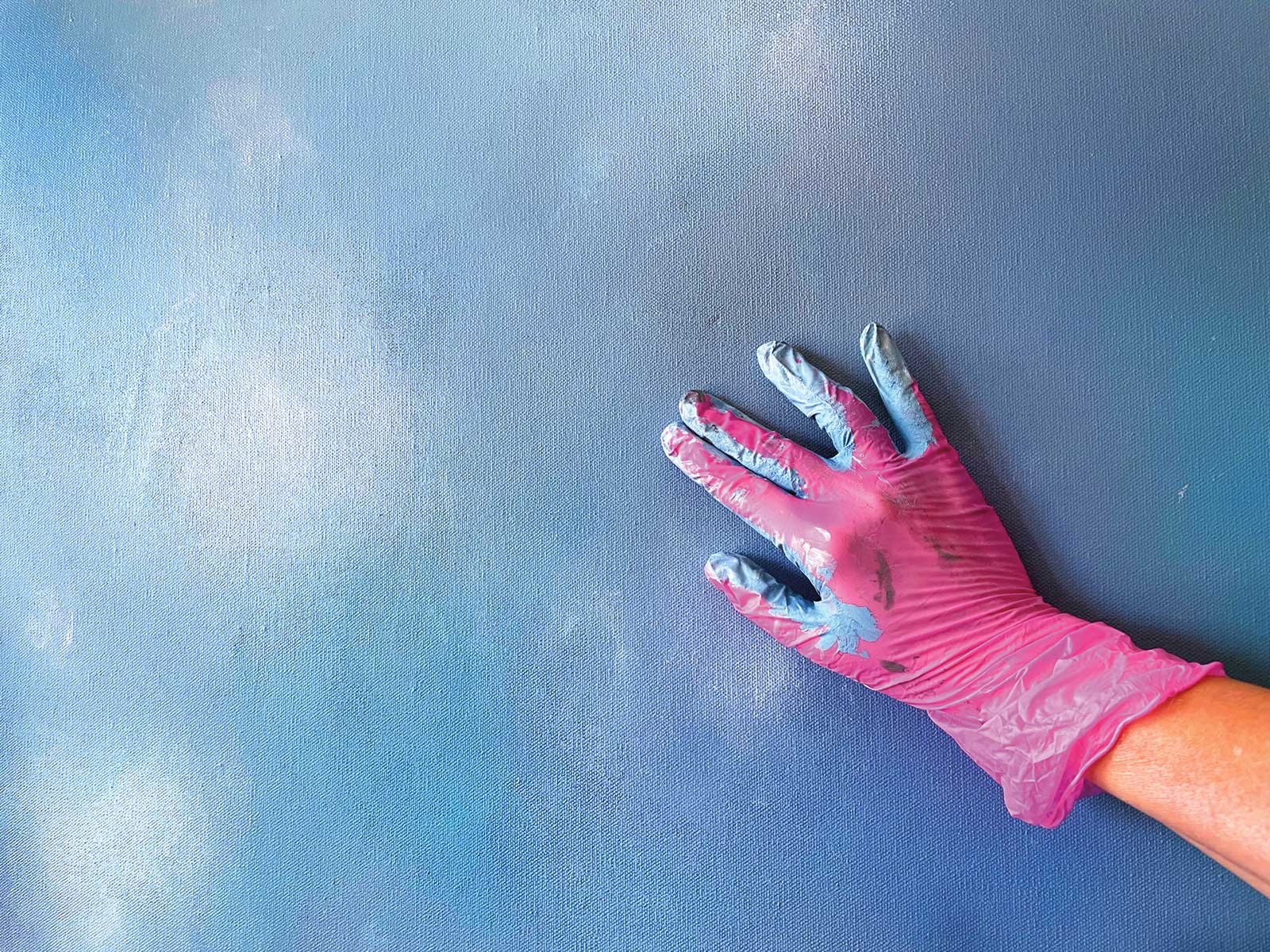
I use glazing liquid for this step, carefully mixing in some deeper shades of blue on my palette and applying the glazes to my canvas with gloved hands. I don’t need much paint mixed into the glazing liquid because my idea is to keep the layers transparent, with edges that blend seamlessly into the background color. Then, I use the same approach with titanium white mixed into glazing liquid on my palette. The sky begins to emerge from the background. I protect my hands with vinyl hairdresser’s gloves, which helps to smooth out the paint while protecting my skin.
 Stage 4
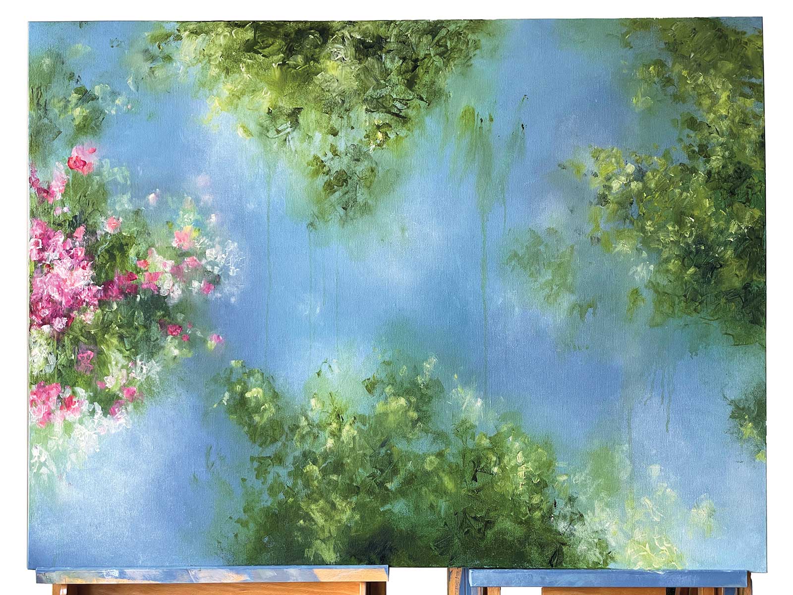
Stage 4 Blocking in the Greenery
I use a variety of techniques to create my greenery: gloved hands, the Princeton Catalyst silicone wedge and brushes. I start by spraying my canvas lightly with water to dampen it. This helps the paint go on more smoothy, and also keeps it somewhat transparent and keeps the edges soft. Only a light misting of water is needed.
 Stage 5
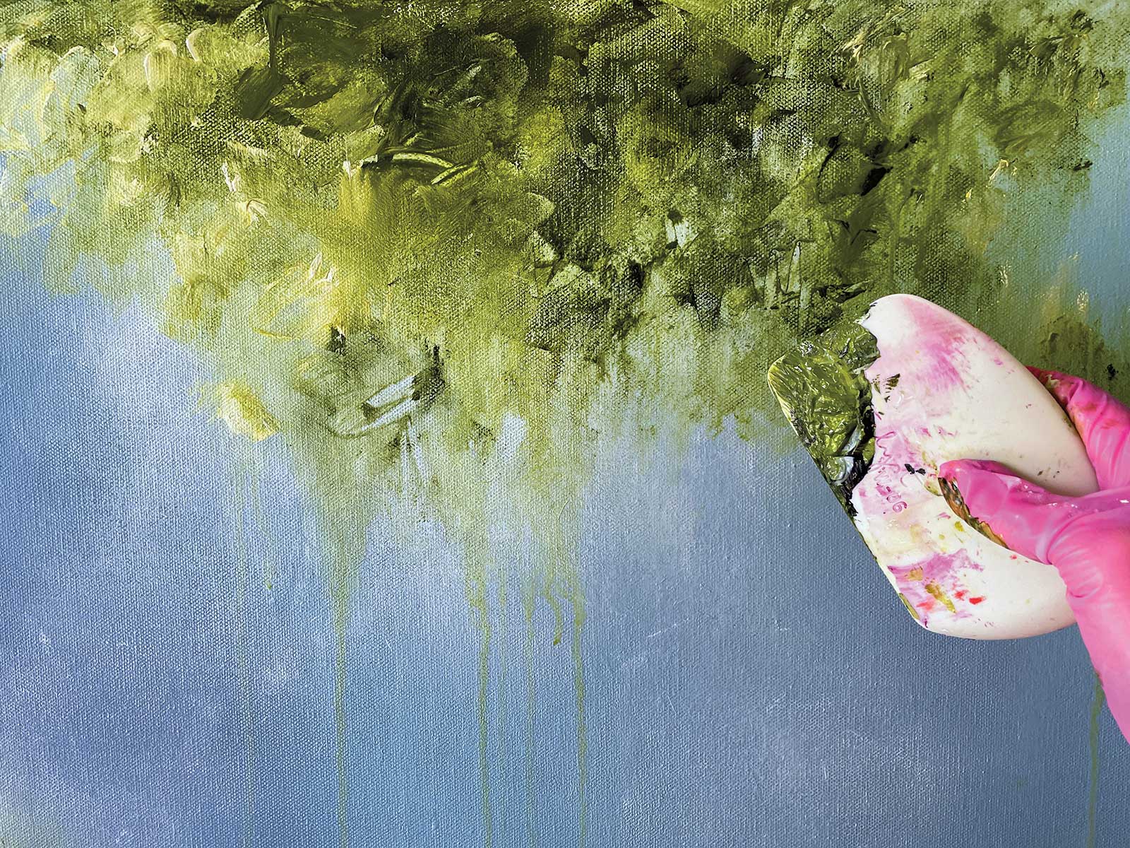
Stage 5 Layering the Greenery
This photo is a closeup of my Catalyst silicone wedge. It’s important to mix a liberal amount of paint and keep it wet as you work.
 Stage 6
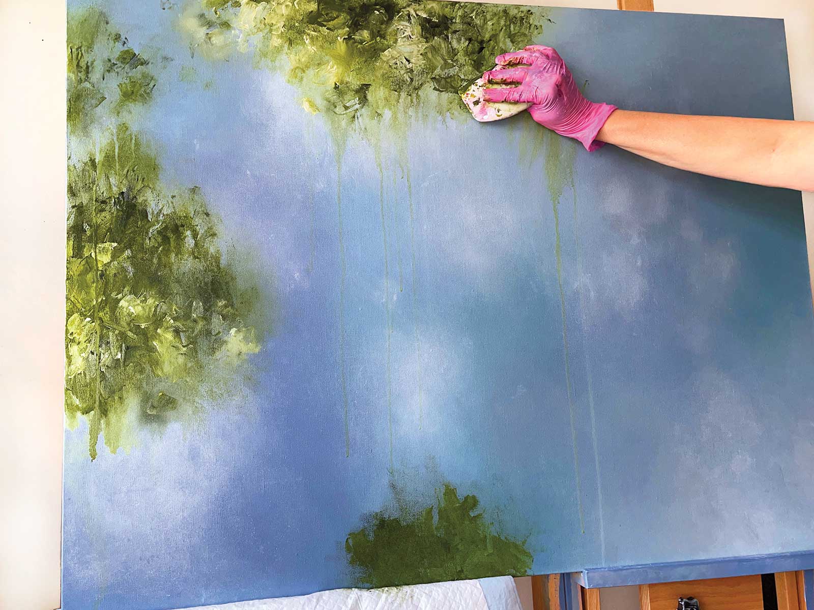
Stage 6 Glazing the Greenery
Once I’ve laid down my beautiful greenery, it’s time to switch back to glazing. I mix a little of my green into some glazing liquid on my palette, then apply it to areas of my greenery where I want to diffuse the edges of it into the sky. In this photo, you can see how soft the edges of the bottom and right side greenery have become with the glazing technique. You can also see a difference in the left side patch, which had not been glazed yet. While the effect is subtle, this step keeps the greenery and background integrated. My favorite brushes to use for this process are nylon filbert brushes, ranging from ¾ inch to 13⁄8 inches wide.
Pro tip: I have discovered that puppy training pads are wonderful at catching water drips and paint splatters. I use them both on my floor under my easel, and I also fold them up and tuck them under my paintings while I work, as you can see here. They are so much more absorbent than towels and tarps, and can be used multiple times before they need to be discarded.
 Stage 7
Stage 7 Adding Colorful Blooms
Once my greenery layer is completely dry, it’s time to add in some flowers. I use the Catalyst silicone wedge to apply my paint in the same manner I did the greenery.
 Stage 8
Stage 8 Creating Depth
I constantly refer to my digital color sketch while working. This shows me where I need to add depth and also helps me to be sure that I have the right balance of colors that I had planned out ahead of time. Darker, duller colors will recede; lighter and more saturated colors will pop forward. While I find it helpful to use my digital color sketch as a guide while I work, I do allow for some edits in the final painting to keep the painting feeling fresh, light and spontaneous. Here’s a closeup of my painting and the silicone wedge. You might notice the variety of shapes and marks I am able to achieve with the wedge. You’ll also notice how transparently I apply some of my paint. This also adds depth to my painting. I prefer not to glob the paint on heavily. To apply the paint transparently, I add a little glazing liquid to the paint on my palette.
 Stage 9
Stage 9 Watching it Come Together
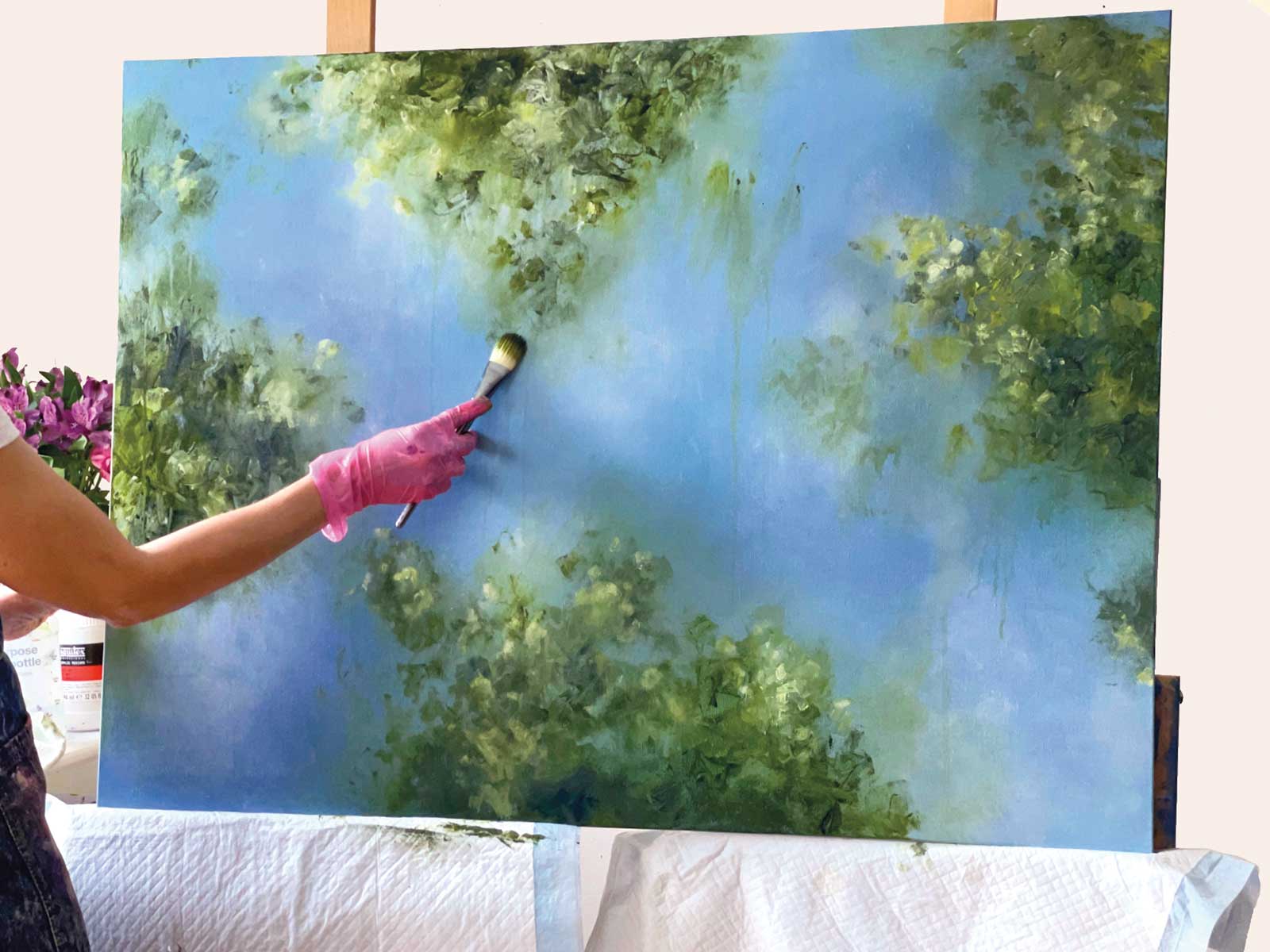
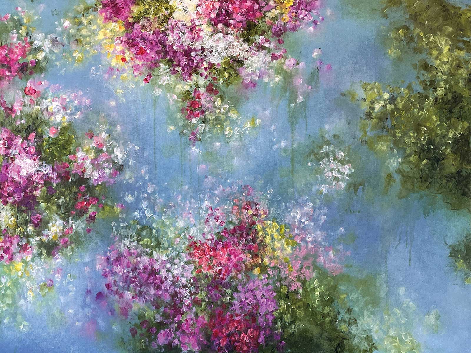
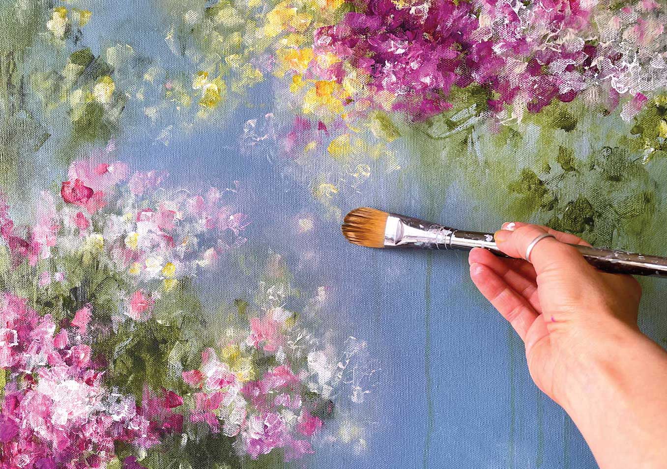
I tend to work left to right, section by section, all the while keeping my eye on the composition and checking for balance.
 Stage 10
Stage 10 Softening Petals with Glazes
As I render the outermost petals of each section, I keep my brush handy to diffuse the edges of some of them. In this photo, you can see that there is barely any paint on my brush. The mixture is mostly glazing liquid. For this, I use the ¾-inch nylon filbert brush for the small petals.
 Stage 11
Stage 11 Dappling Light
When my painting is nearly finished, I often let it sit for a day or two so I can study it to see if anything is lacking. At this time I might add some lighter, more opaque petals to some of the blooms to add depth if they appear flat. Or I may soften some edges of the greenery. It is also in this step that I add final glazing in the sky, creating light and atmosphere. This step is fun and intuitive, and gives my paintings a diffused, dappled light effect.
 Stage 12
Stage 12 Finished Artwork
Joyous Blossoms, acrylic, 30 x 40" (76 x 101 cm)
What a journey. So much went into this painting! The final step is to sign it, and then seal it with UV protectant varnish to protect it from light, moisture and dust. Although all of the layers are permanently set, I prefer to use a spray varnish to minimize bubbles and “ghosting.” I have found that the best way to achieve an even finish is to set up my garage as a spray booth. I lay the painting over two work horses, leave the garage door half open for proper ventilation, hold the spray can as far up from the painting as possible and spray using even strokes. I apply two to three coats, allowing the varnish to dry for at least an hour between layers.
About the artist
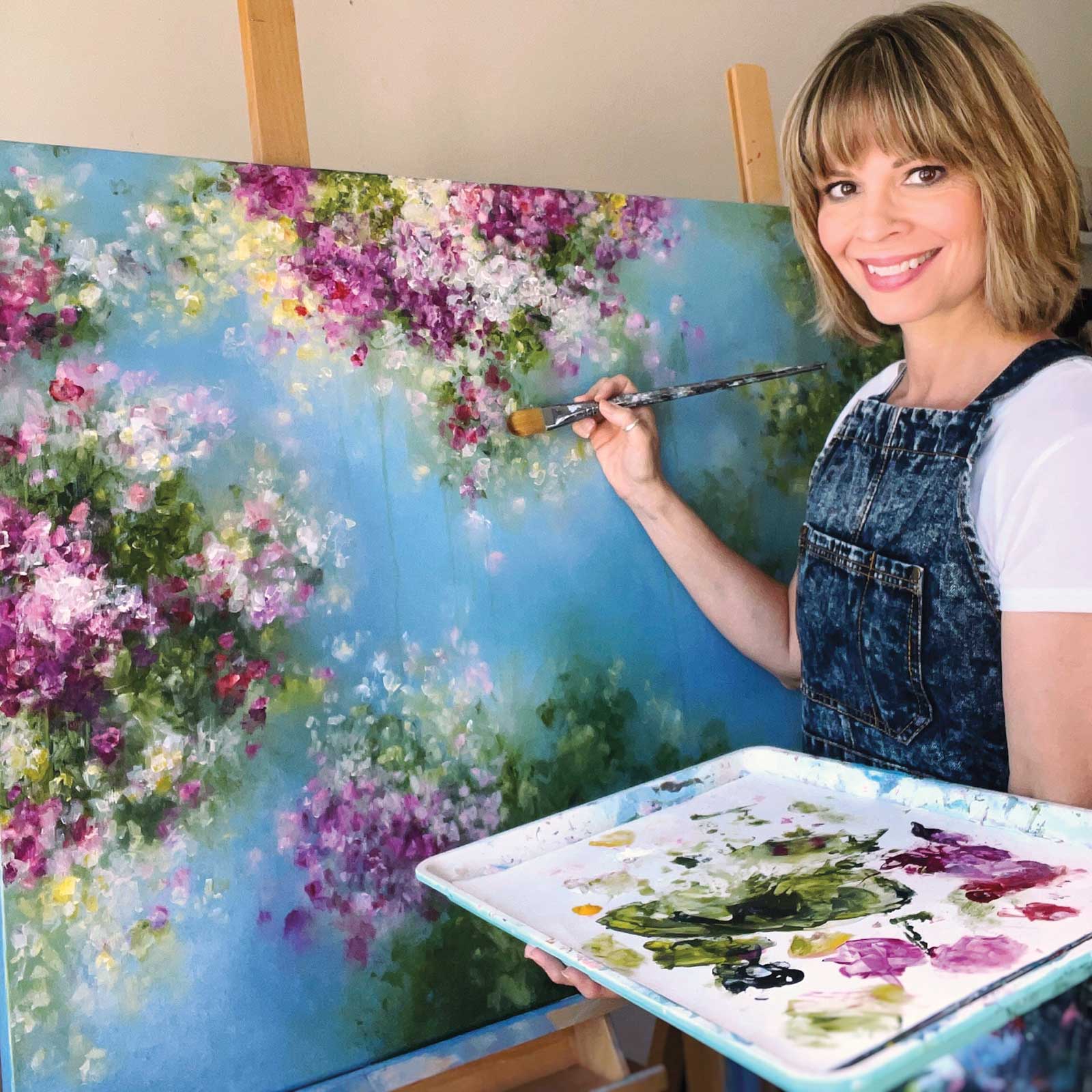 Kathleen Rietz
Illinois native Kathleen Rietz attended the American Academy of Art in Chicago in the late ’80s, deciding on a career path in commercial art. She spent 30 years freelancing as a designer and illustrator. In the early 2000s, Rietz was offered a job teaching art through an adjunct program at Wheaton College in Wheaton, Illinois. This ignited her desire for teaching and the belief that fine art fundamentals are the foundation of great art. In 2018, she left the world of commercial art in pursuit of painting. Now, her paintings are sold internationally. During the height of the pandemic in 2020, Rietz heeded the call of many of her social media followers to teach online. She now teaches online art courses and workshops. In 2022, Rietz won a Silver Award in Camelback Gallery’s international Bold Abstracts competition, and a Bronze Award in their International Flower Power competition for her painting Joyous Blossoms, featured in this demo. She credits teaching others with making her a stronger artist. “For every course I create, I dive deep into practical application,” she says, “which means I am constantly learning and growing in my knowledge of art.”