


As a plein air painter, my work is primarily concerned with capturing a sense of time and place. Each individual location has its own characteristic light and color palette, and the best way to evoke a sense of the place is to match that light and how it affects the environment at different times of day. Accurately depicting light is crucial in telling the story of a particular place, and color is a powerful visual tool for any artist who wants to achieve this.
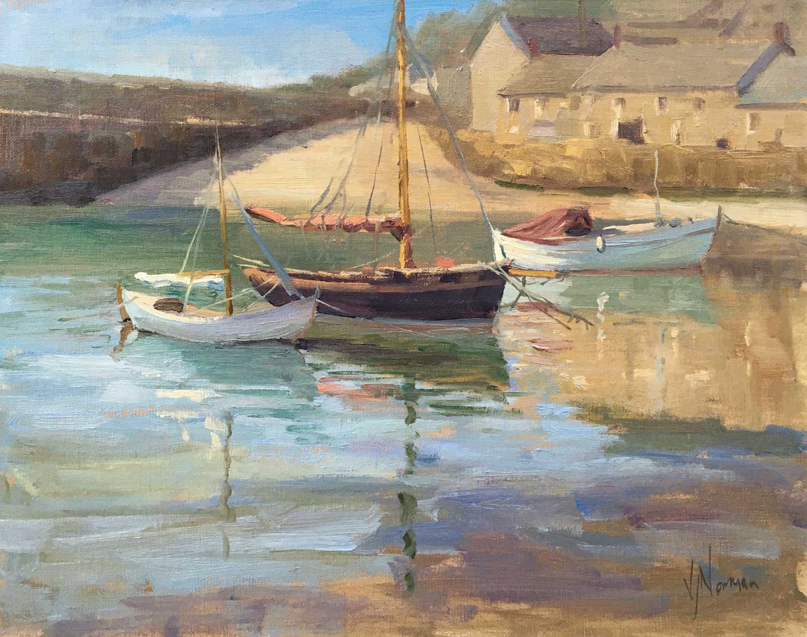
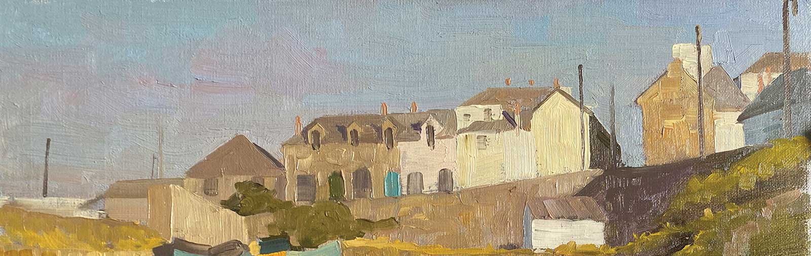
Mousehole morning, oil on linen, 11 x 14" (27 x 35 cm) The delightful harbor in Mousehole is filled with characterful little sailing and fishing boats. I selected these three beauties from a busy harbor full of vessels and decided to simplify their background, leaving out cars, canoes and tourists in order to give myself space to capture the interplay of colors and the timeless nature of the scene.
In learning to paint I find it helpful to understand how the human eye and mind perceive color and light. For example, we can tell the difference between a blue mug in white light and a white mug placed in blue light. We achieve this by using the color in the shadows to figure out the color of the light. This ability is called “color constancy,” and it enables us to discern the true “local” color of objects in varying light conditions. When we study a scene that contains multiple objects of different colors, we observe the shift in value and temperature from the lit planes to the shaded planes on each object and use this information to interpret the intensity and color of the light.
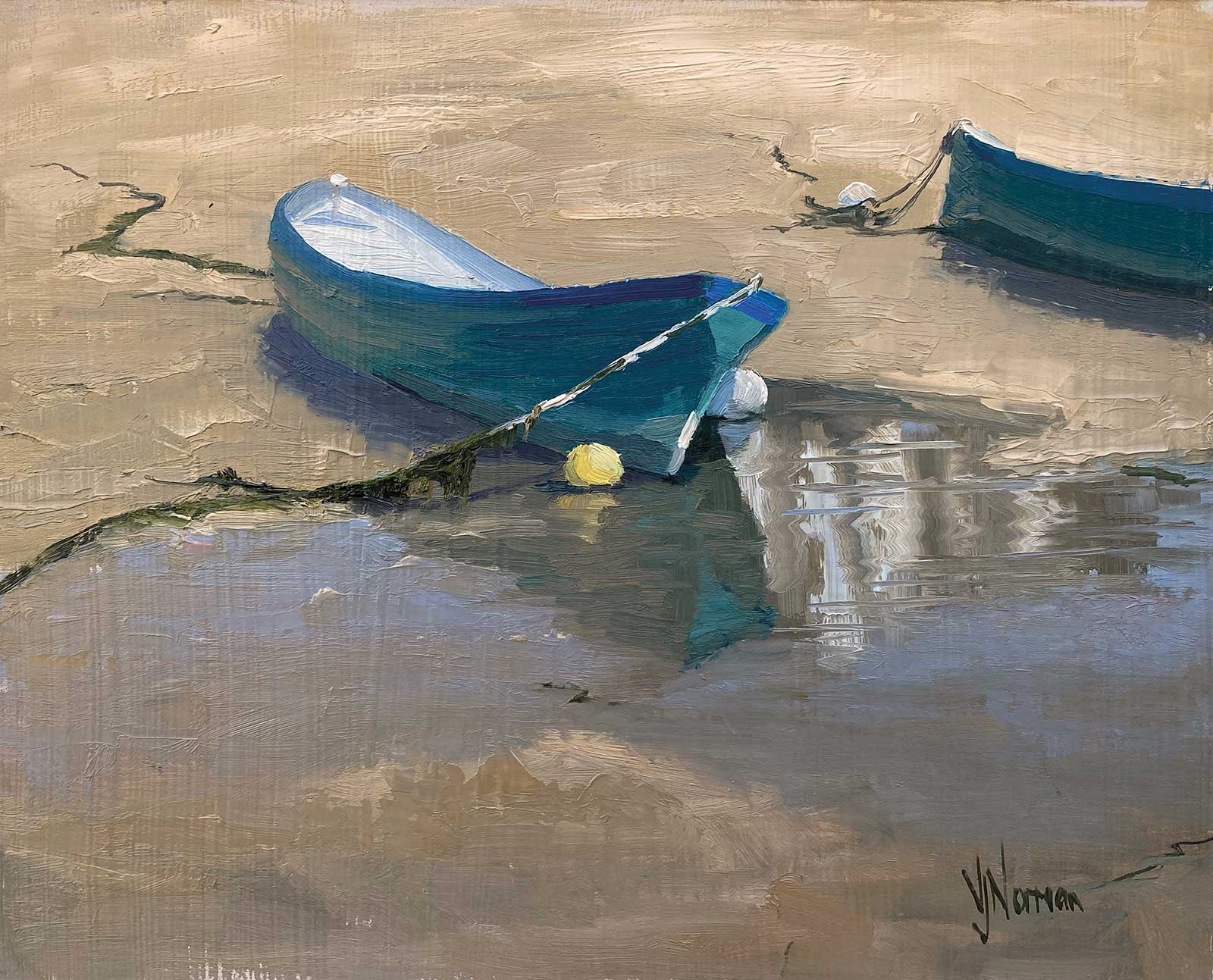
Sisters, oil on linen, 11 x 14" (27 x 35 cm) Two identical boats resting on the shore in St. Ives harbor at low tide created such beautiful fluid rhythmic shapes that I couldn’t resist painting them together. The boat on the right is cropped hard to place emphasis on the boat nearer to the center of the composition, as this allows the eye to rest comfortably and enjoy the curves of the boat and its ropes and puddles.
Sunny days inspire different types of artworks from overcast days. A strong light source like sunlight will create a dramatic light and shadow pattern, which will usually dominate the painting. On these days I’ll look for an interesting pattern of light and dark shapes to make sure I have a strong design. Overcast conditions are more likely to allow me to observe the intrinsic local colors of the objects in a scene. In flat, gray light I would expect much less value contrast between lit and shaded planes. The lit planes will exhibit the influence of the cool light source and therefore the shadows may appear a little warmer by contrast. In these conditions it seems as though the value scale has been compressed towards the center, the lit areas are not very light and consequently the shadows are not very dark. The whole scene is more subtle, and the paintings I make on overcast days will often explore how the local colors and values relate to each other in a subtle harmony.
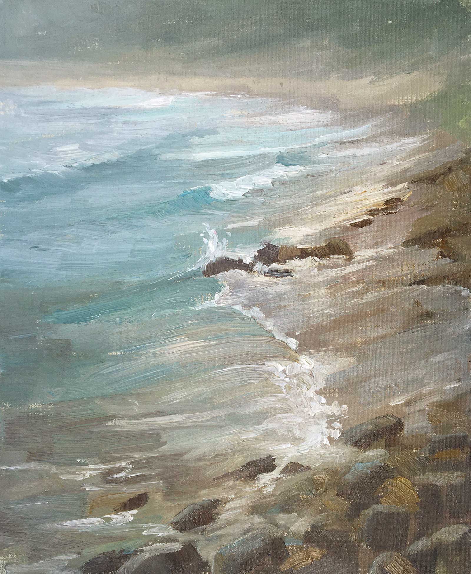
High Tide with Fog, Sennen, oil on linen, 12 x 10" (30 x 25 cm) A difficult day teaching in plein air in the fog culminated in a very happy painting experience for me as I wrestled the wind and salt spray onto the canvas in this energetic study of crashing waves and atmospheric perspective. The fog created a subdued palette of milky turquoise greens and pinkish grays with hints of yellow. I caught the movement of the water with bold, heavily loaded brushstrokes and lots of gestural marks.
Whatever the light condition I’m working with, the most important element to capture is the harmonious relationship between lighter and darker values and between warmer and cooler colors. No color can exist in a painting by itself; it is impossible to say I have matched any color perfectly on its own. A color can only be deemed “correct” when it sits comfortably amongst its neighboring colors as part of the whole family of colors that make up that particular scene, on that day, at that time.
In order to make an image convincing we must ensure that every element in the subject appears to be bathed in light of the same intensity, color and direction, and the sum total of the colors used should tell the story of the light. I find this challenge one of the most enjoyable things about painting, and my fascination with it is endless.
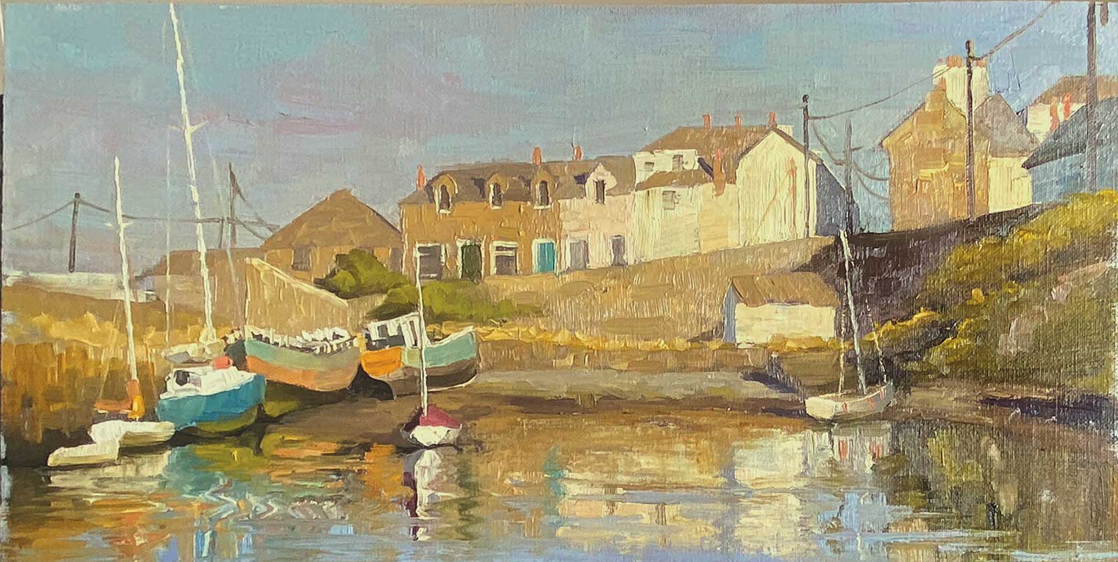
My Art in the Making The Old Harbour, Newlyn
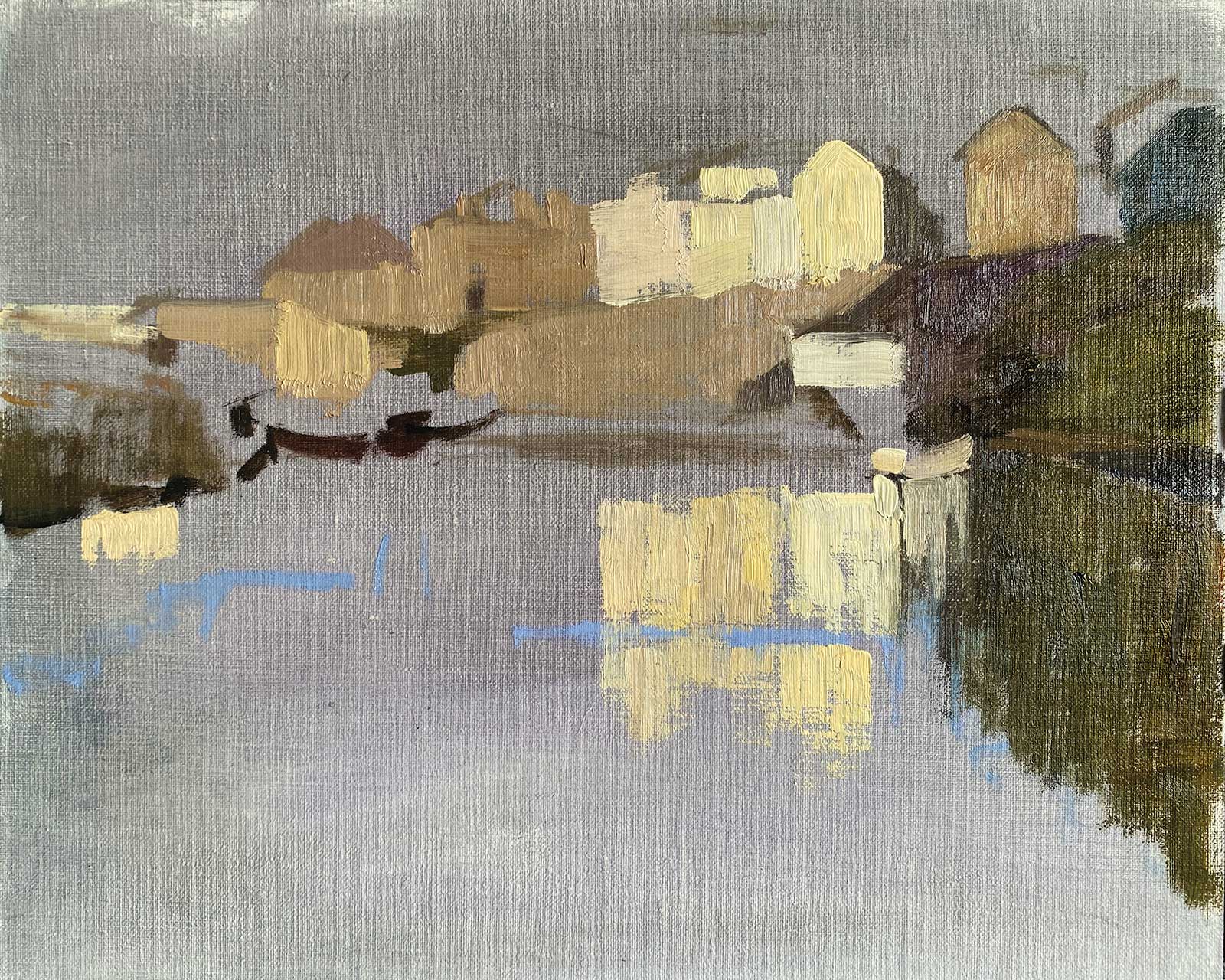
The goal of this painting is to capture the colorful boats basking in the warm late afternoon sunlight of Newlyn’s historic Old Harbour. Color temperature offers the key to capturing the mood here, and I will prioritize the sense of light over everything else in the scene. As a plein air painter I use the alla prima oil painting method, which means I make the whole painting in one session while all of the paint is wet. The paints cannot be layered in glazes because they do not dry during a single painting session, but whole sections can be scraped back and reworked and more paint can be added into areas that have already been worked. It is a very fluid, forgiving process that allows for a “conversation” with the painting as it progresses.
 Stage 1
Stage 1 Three-Value Thumbnail
Beginning with a three-value thumbnail ensures a good design with a dominance of a single value and interesting shapes.
 Stage 2
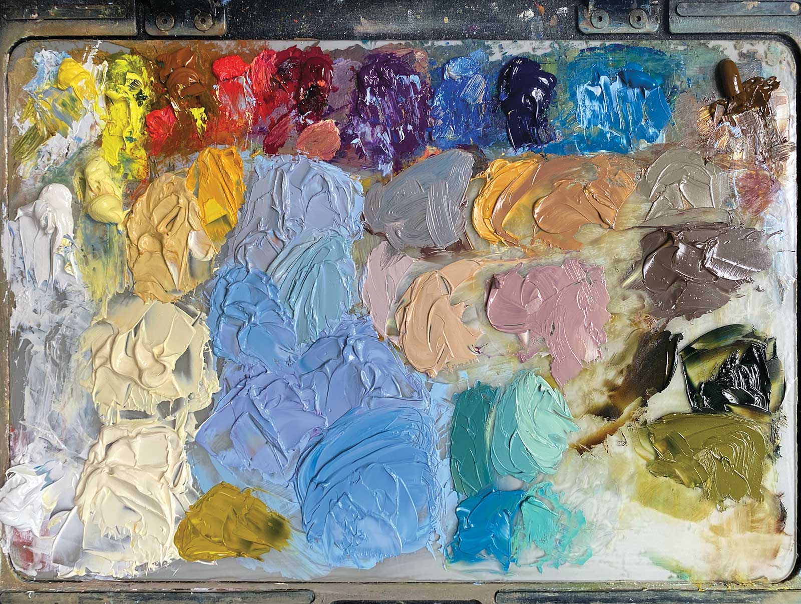
Stage 2 Key Colors
I often premix the key colors on the palette before I begin painting. Adjustments are always required as I go along, but I usually get more accurate end results if I start in this way.
 Stage 3
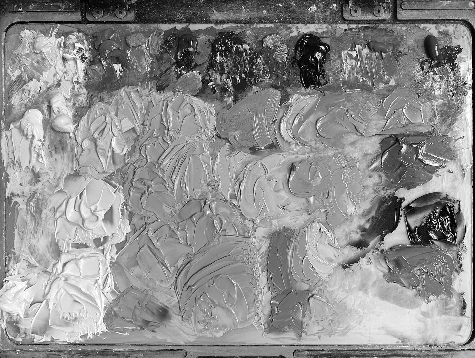
Stage 3 Value Relationships
It can be helpful to take a grayscale photo of my palette at this stage to check the value relationships between the colors are correct.
 Stage 4
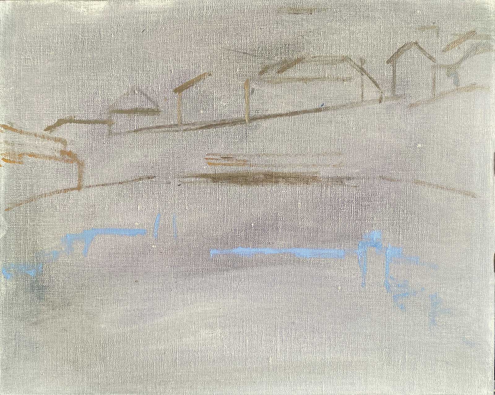
Stage 4 Gray Imprimatura
A cool gray imprimatura is sympathetic; it will accentuate the warm colors while allowing the blues to look fresh. The composition is sketched onto the dry imprimatura using a small amount of undiluted oil paint.
 Stage 5
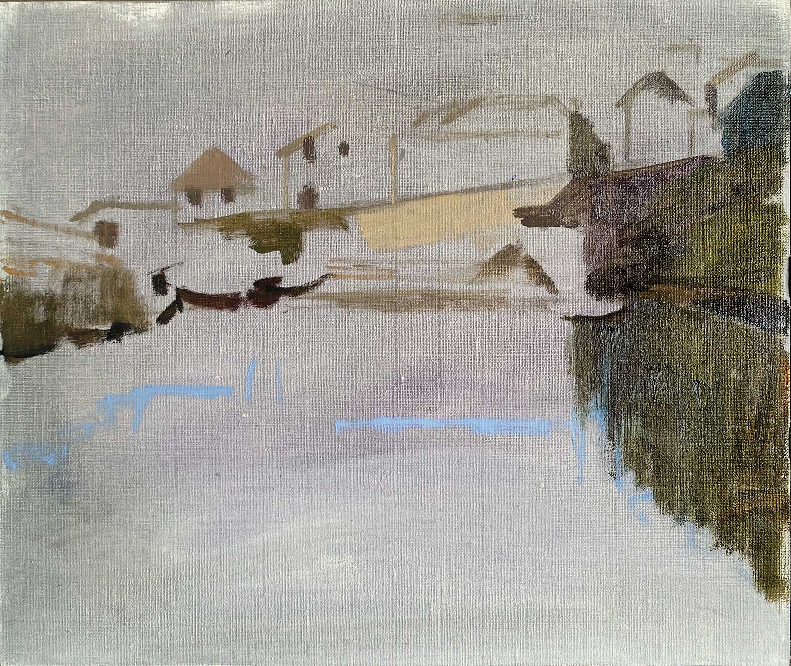
Stage 5 Applying Transparent Darks
Applying transparent dark colors onto a dry canvas at the beginning of the process lets the darks look deep and rich and helps me to see the light and dark design of my image from the outset.
 Stage 6
Stage 6 Blocking in Light
Blocking in light areas immediately after the darks allows me to see the full scope of values to be used in the painting, and this helps me to accurately pitch the key of the more subtle mid values.
 Stage 7
Stage 7 Boats
After adding the large areas of blue sky and water, I introduce the colorful boats. Painting their surroundings first allows me to pitch their bright colors carefully to suit their environment.
 Stage 8
Stage 8 Adjusting Color
After I paint each boat, I adjust the color slightly to make it a little deeper and draw the brush down the canvas below each boat to make a vertical streak for the reflection.
 Stage 9
Stage 9 Additional Subjects
Adding the warmer colors to the houses, a few lamp posts and their reflections in the water completes the block in.
My Design and Composition Tactics
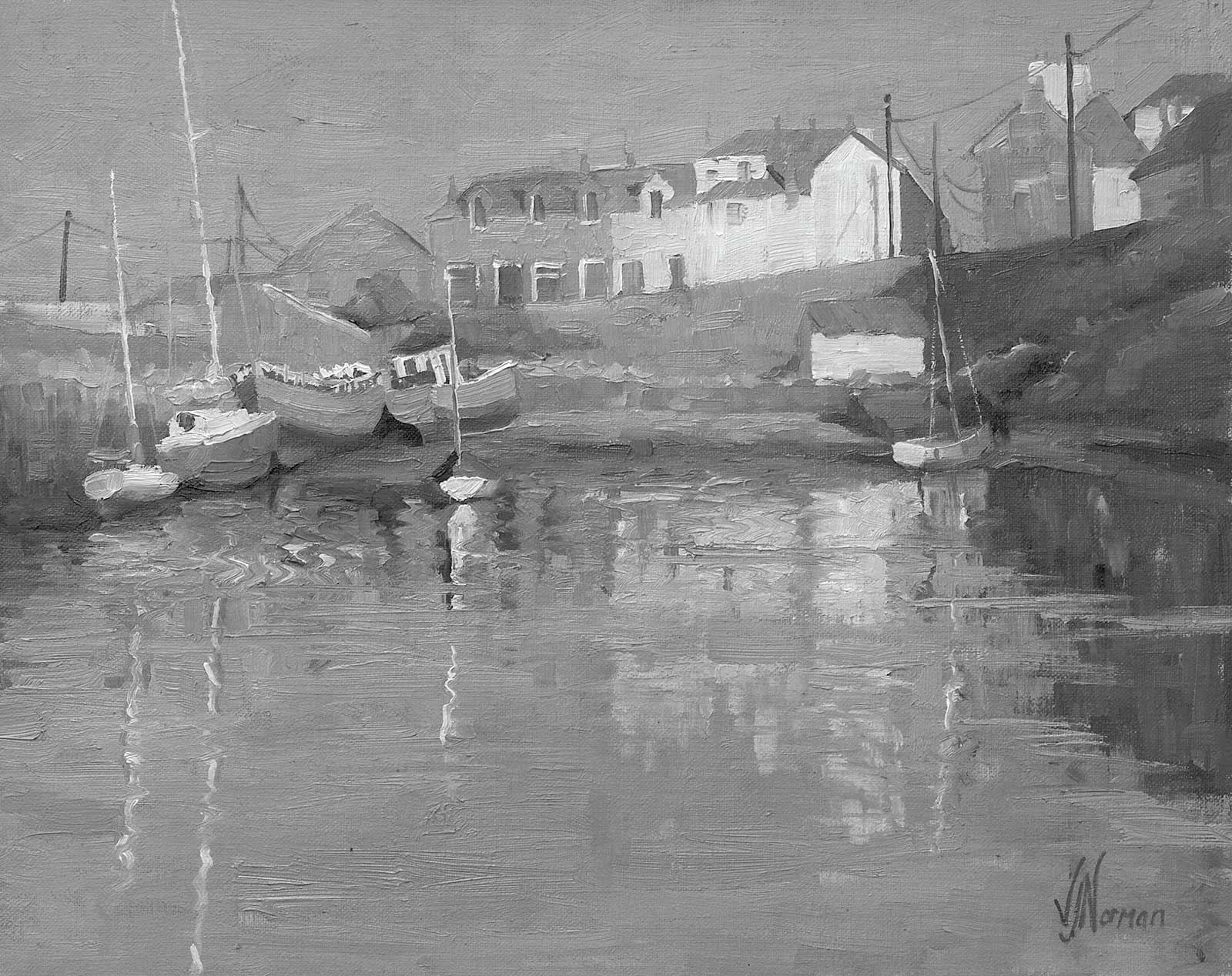 Demo painting in grayscale.
The balance of light and dark is everything
A strong but simple value design will underpin the whole painting, providing freedom to play with technique and color. Aiming for an imbalance of values with a dominant value covering more than half of the painting, I then subdivide the remainder of the picture plane unequally between the other values. This makes the painting more elegant and interesting to the viewer.
Make sure the design suits the intention for the painting
My Newlyn painting design is dominated by mid gray values which allow me to play with color and luminosity while providing contrast with the lightest buildings. The brightest colors and highest value contrast are reserved for the old boats on the shoreline, the windows and roofs of the houses are lightened and their edges are softened to reduce distraction from the boats. The majority of the painting surface is covered with softened cobalt blues and violets, which provide an accentuating complementary contrast to the warm sunlit colors on the shore.
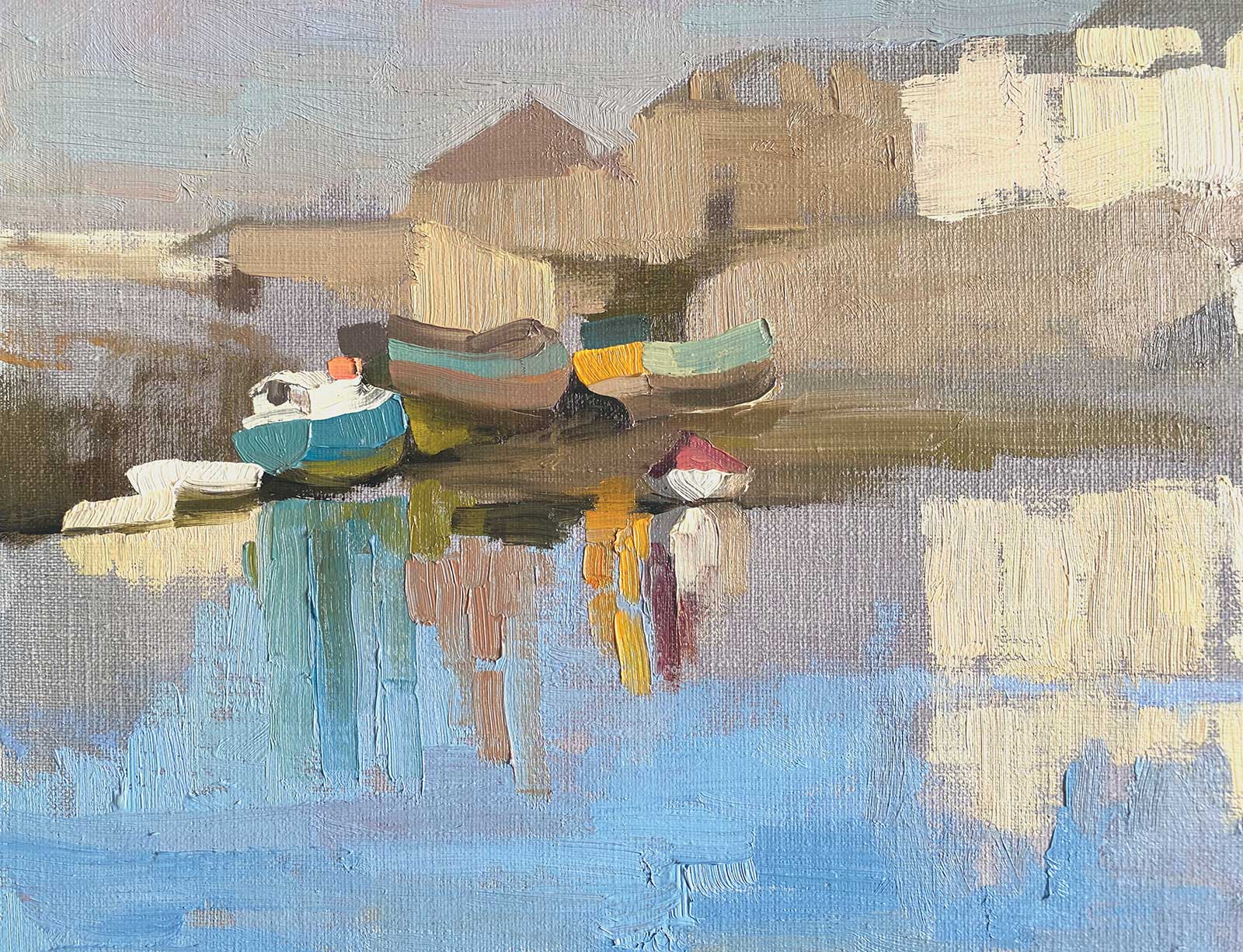
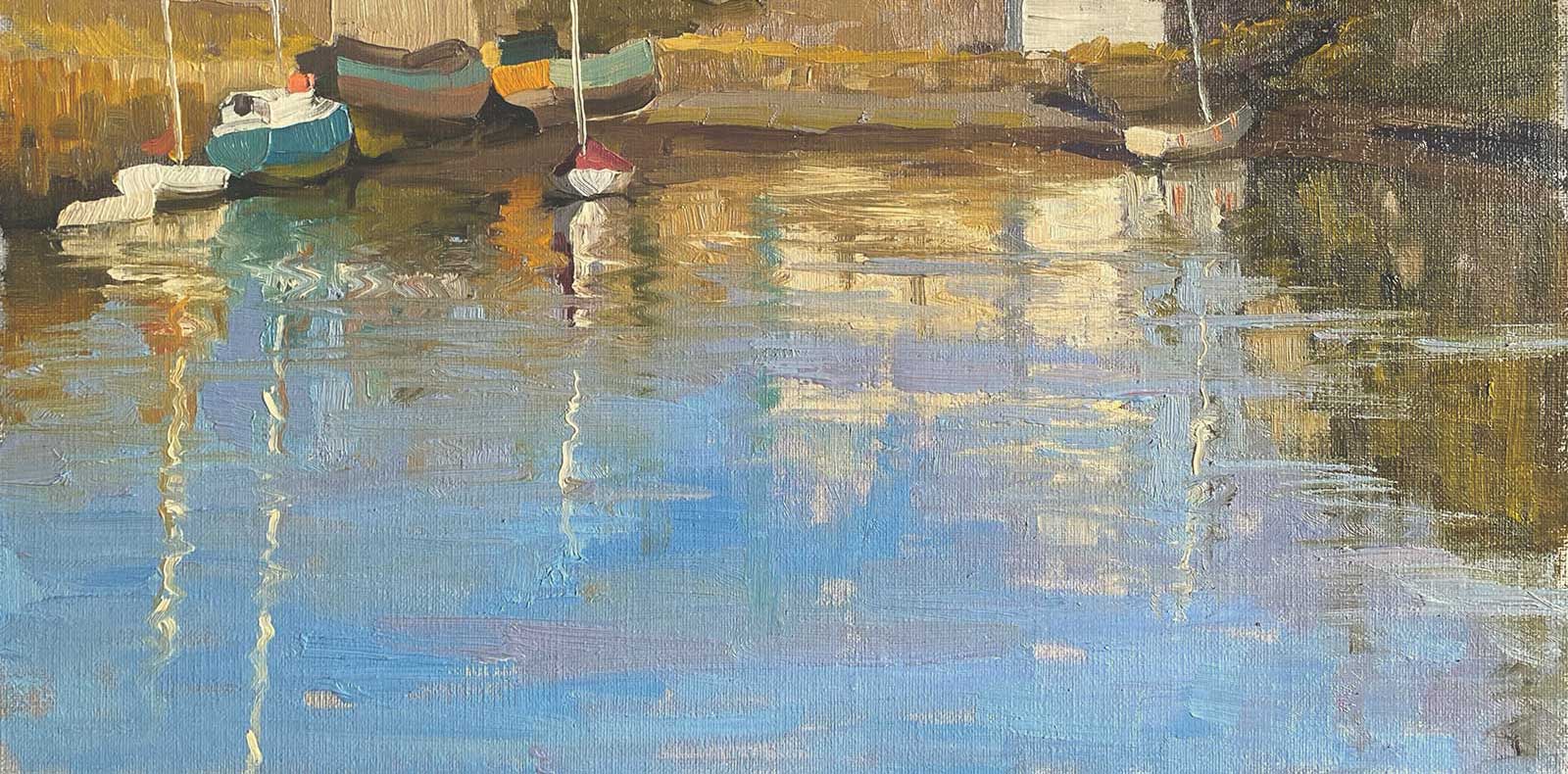 Stage 10
Stage 10 Ripples in the Water
Adding the masts, I begin to create some ripples in the reflections by wiggling my brush left and right a tiny bit as I drag it down the canvas. Now I reassess the color relationships.
 Stage 11
Stage 11 Bringing Lit Areas Together
Adding warmer lighter mixes to the stone on the harbor wall and houses, roofs, chimneys and the middle boat helps to unify all the lit areas and makes the sun shine in the painting.
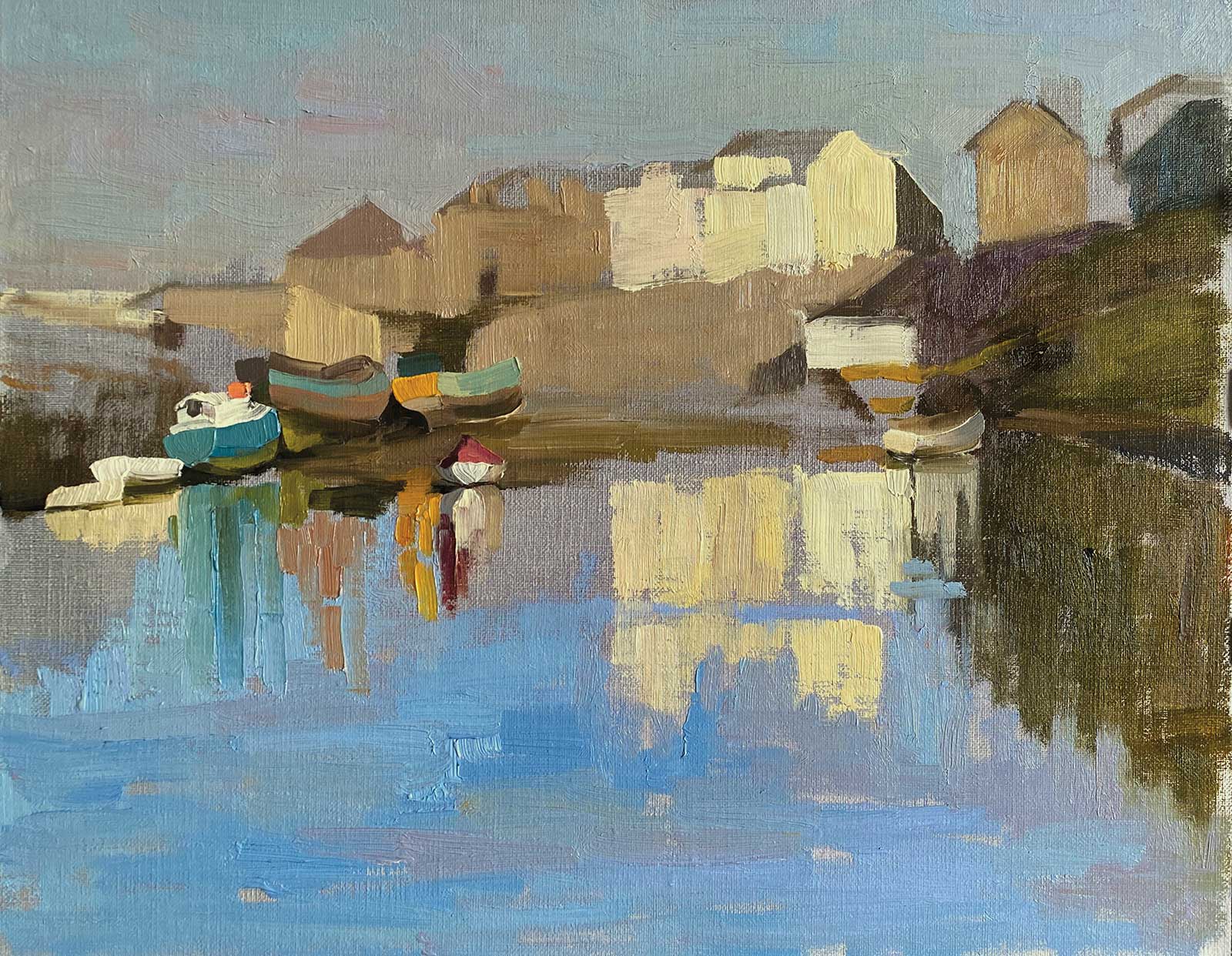
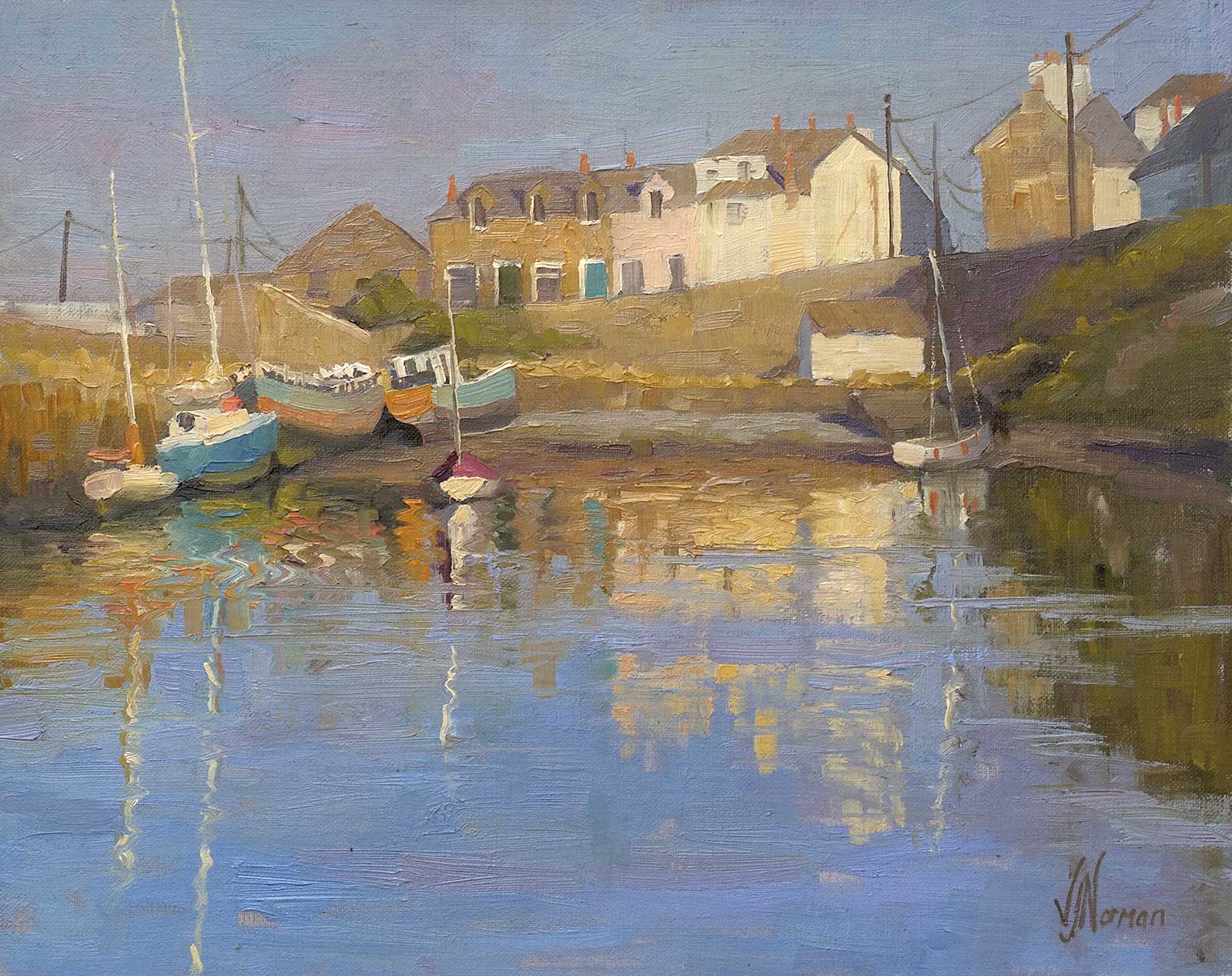 Stage 12
Stage 12 Finished Artwork
The Old Harbour, Newlyn, oil on, 11 x 14" (27 x 35 cm)
The finished painting now has a strong sense of warm sunlight created by using warmer, lighter colors in all the lit areas and contrasting them with cooler, darker shadows and blues in the water.
About the Artist
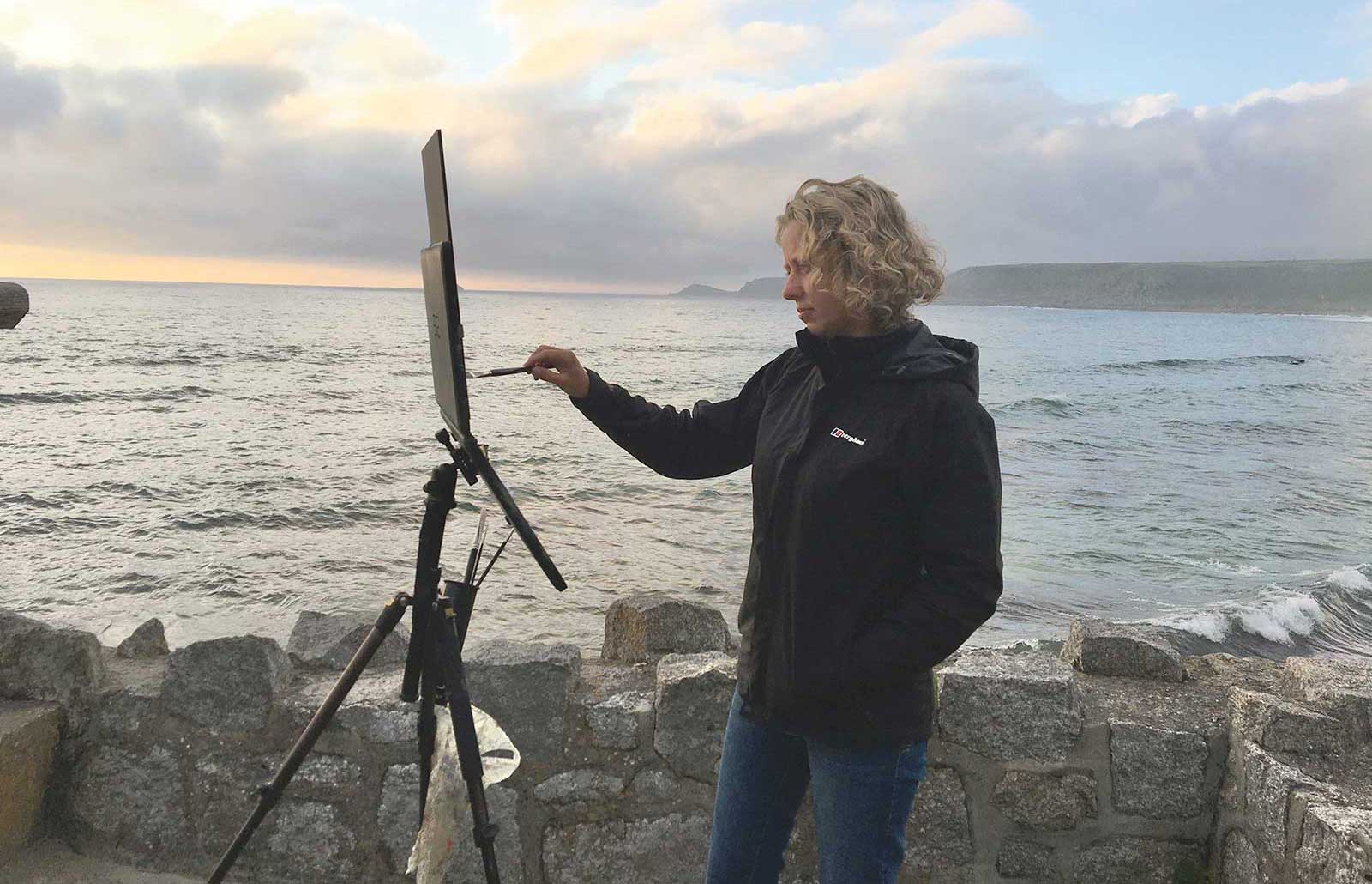 Vicki Norman
Vicki Norman has exhibited with the Royal Institute of Oil Painters in London and has received an award from the Oil Painters of America. Gaining a Bachelor of Arts Degree in Fine Art in 2000 and a post-graduate certificate in post-16 education in 2009, Norman values teaching as an integral part of her creative practice. Articulating complex concepts and techniques through simple and concise instruction, Norman is a superb and highly sought-after teacher. Applying years of in-person teaching experience to her new Online Art School is proving to be a big success. Her 10 pre-recorded “Mastering Colour” lessons and other courses offer self-directed study, enabling anyone in the world to build their painting skills at their own pace. You can also study with her in live interactive online workshops and in-person holidays. Her Online Art School can be found at school.vickinorman.com.
Contact at
vicki@vickinormanstudio.com
www.vickinormanstudio.com