


It was love at first touch when I was given a box of Faber-Castell Polychromos pastels as a child, and since then pastels have been a part of my life for almost 40 years. I started off with hard pastels, but today I use a mixture of hard and soft pastels as well as pastel pencils in my work.
With all my paintings I try to capture an animal or person at a specific moment and express it in a new but truthful way that will hopefully intrigue the viewer regardless of the subject matter. Building my paintings up in layers, I see them as journeys with several stops along the way. Good reference material is essential, especially for wildlife paintings. To that end I developed my photographic skills and have learned that a good photo is not necessarily the best reference material. I look for photos with strong shadows and light areas. I believe Tolstoy when he said that “all the beauty of life is made up of light and shadow.”
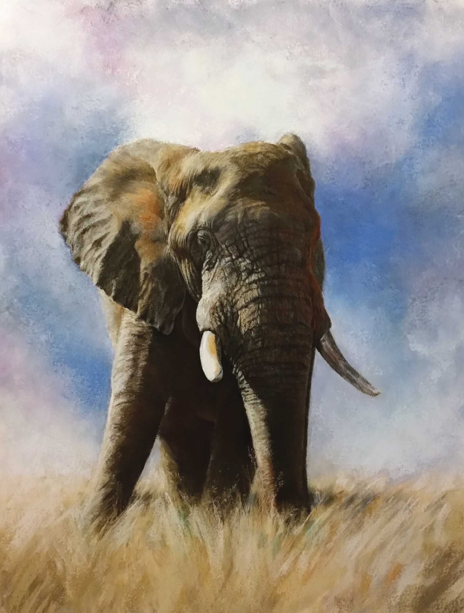
Kruger Elephant Bull, pastel, 25 x 18½" (63 x 47 cm) In this painting I wanted to portray the immense size of an African elephant bull towering above the savannah. This one obliged me by posing for quite some time before he crossed the road in front of us. Working on Art Spectrum Supertooth paper allowed me to put down more layers as it has more tooth than other sanded papers. Working on white however can be challenging as the white is difficult to cover in the shadow areas.
Every successful painting I have ever done had three things in common: good design, accurate drawing and a strong value structure. Doing those thumbnail sketches are worth it! That is where I work out different compositional options and the value structure. I also do small color studies on the same paper on which I intend to do the final work.
I mainly use Art Spectrum Colourfix (original) papers. They have a variety of different colors and if chosen carefully the color can do a lot of the work for you as well as contribute to the overall harmony of your painting, as the same color is technically present in every area of your painting.
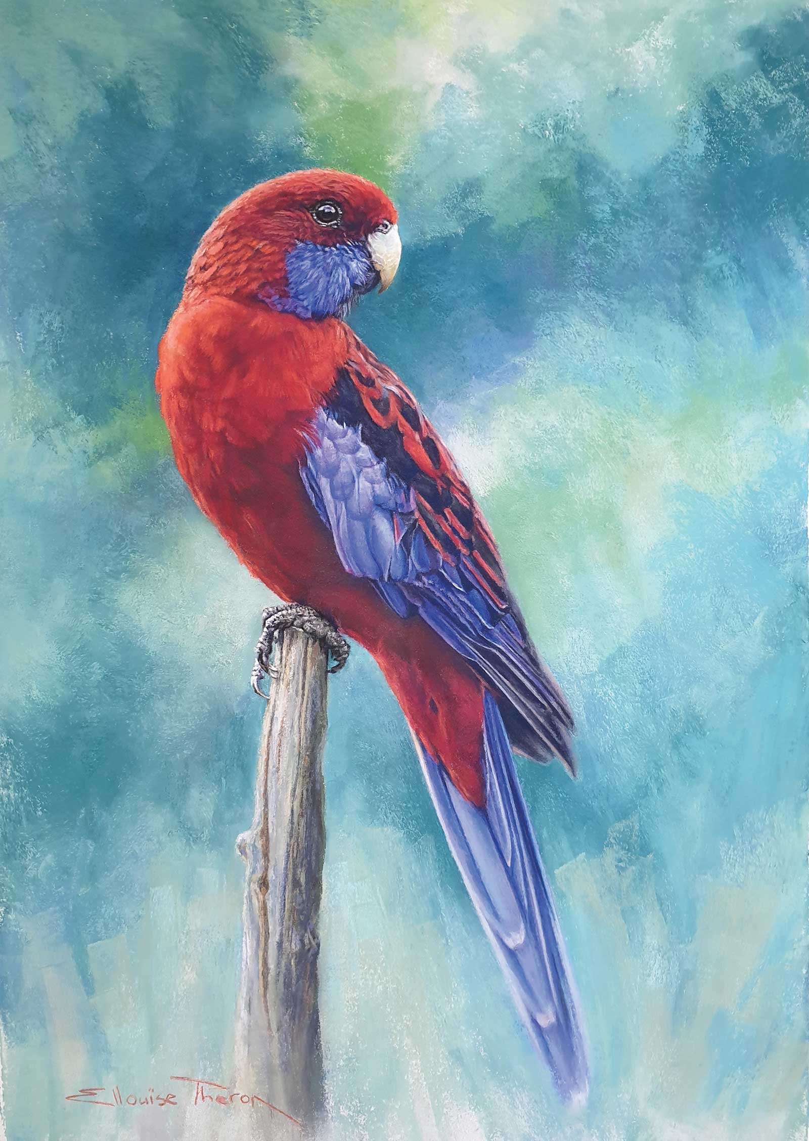
Crimson Joy, pastel, 27 x 19" (69 x 48 cm) Crimson Rosellas are frequent visitors to my garden. They add a vivid splash of color throughout the year. In determining my colors for the background, the Munsell color Wheel led me to pick the blue green as a compliment to the bright red. It is also the predominant color of the Bluegum trees the Rosellas love to frequent.
Once the drawing is finalized, I check all the proportions by viewing it in reverse in a mirror. I block in the dark values with a very dark Art Spectrum Flinders blue or red violet soft pastel, blending it into the paper with my finger, a piece of T-shirt fabric or a kneadable eraser. At this stage the pastel load is kept very light to preserve the tooth of the paper. The aim is to create an underpainting or value structure with a strong three-dimensional feel. Success at this stage almost guarantees a winner. I only spray my work with a workable fixative twice during the entire painting process, once after the initial drawing and again after the underpainting is established. This ensures I can find the drawing again if I lose my way and need to back up and prevents the underpainting from staining subsequent layers.
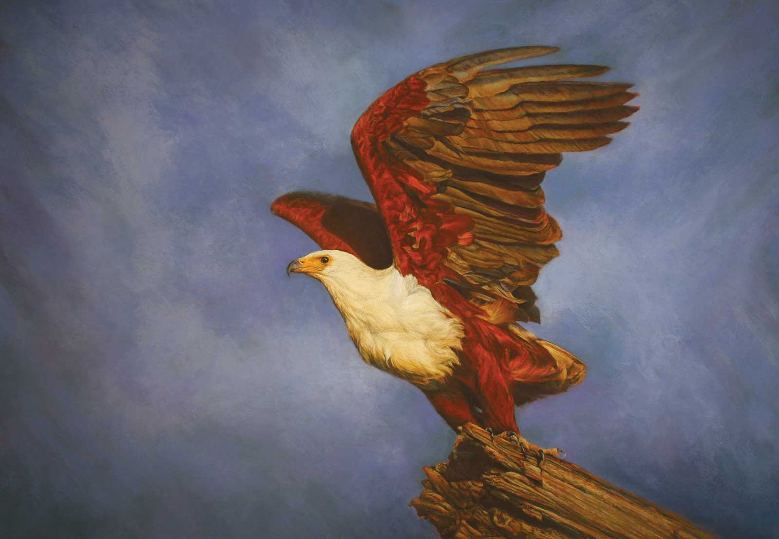
Call of Africa, pastel, 26 x 37¾" (67 x 96 cm) Few sounds define the African Bush like the haunting call of the African Fish Eagle. The contrasting colors of white and chestnut makes this striking bird one of the most recognisable sights in sub-Saharan Africa. I did this painting on Art Spectrum (original) Terracotta. It is a very vivid color but made painting the red brown feathers a breeze.
Working back to front and top to bottom, I block the background in with soft pastel using broad strokes in different directions, carefully blending with my fingers. The idea is to create interest in the background but not distraction. I then start with hard pastel pencils working from the top on the medium and light values in the middle and foreground. Building up the textures and shapes I pay close attention to the direction of fur, hair, feathers and curves as well as cool and warm colors. Keeping the pencils sharpened to a fine chiseled edge is vital during this stage. In the final layers I switch to hard pastels like NuPastel and finish with soft pastels like Schmincke for their increased covering ability.
Throughout the painting process I will often step back or look at my work in the mirror to check that I am not losing accuracy in the drawing.
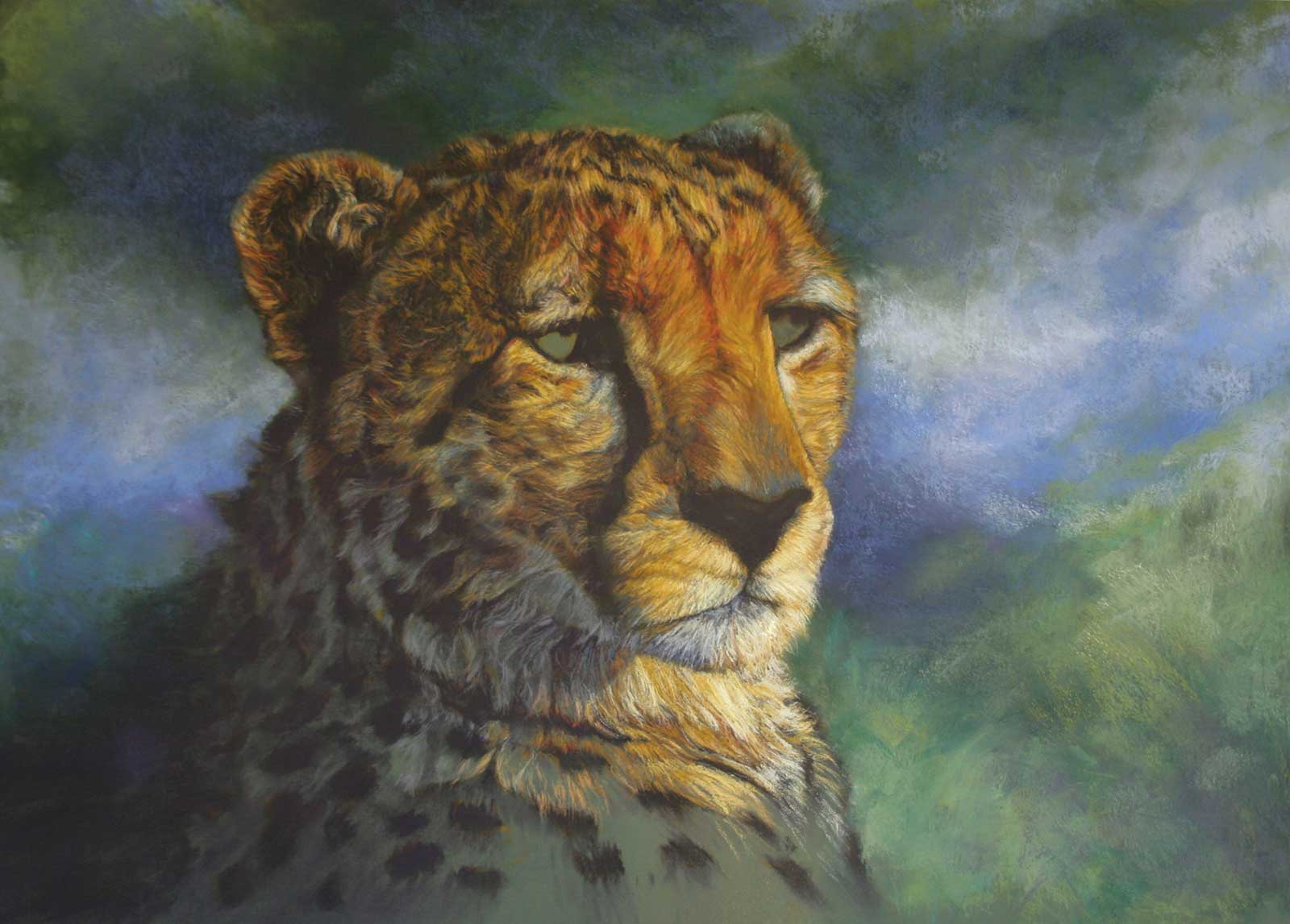
My Art in the Making Queen of the savannah
 Stage 1
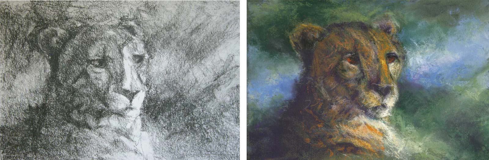
Stage 1 Value and Color Studies
Working out my design and value structure with a quick graphite sketch, I proceed to do a thumbnail color study in pastel that will serve as a guide for my final painting.
WHAT THE ARTIST USED
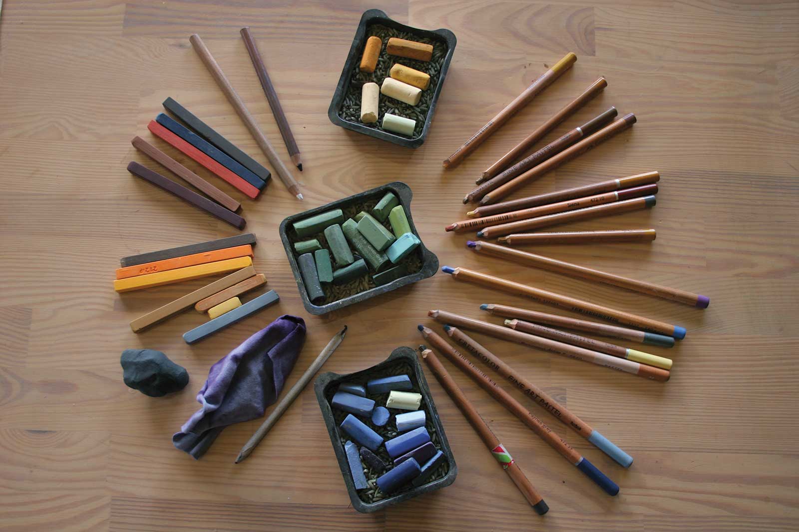
Paper
Art Spectrum Colourfix Paper (original) in leaf green dark
Pastels
Prismacolor Nupastel, Rembrandt, Art Spectrum and Schmincke
Pastel Pencils
Faber-Castell, Bruynzeel and Cretacolor
Additional Supplies
Kneadable eraser, Thin cotton T-shirt fabric, Paper stump, Wolffs Carbon 6B pencil, General’s white charcoal pencil
 Stage 2
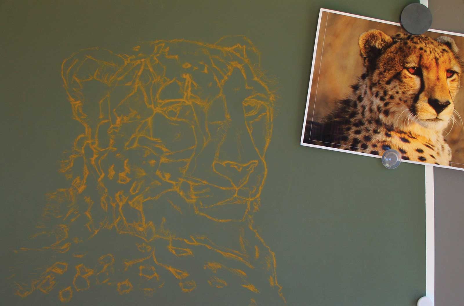
Stage 2 Drawing
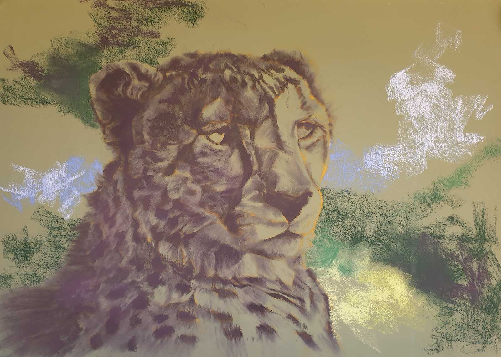
Focusing on shapes and lines, I draw the cheetah directly onto Art Spectrum Colourfix (original) paper in leaf green dark with a yellow ochre pastel pencil. I anchor my paper with strong magnets onto a smooth metal sheet on my easel.
 Stage 3
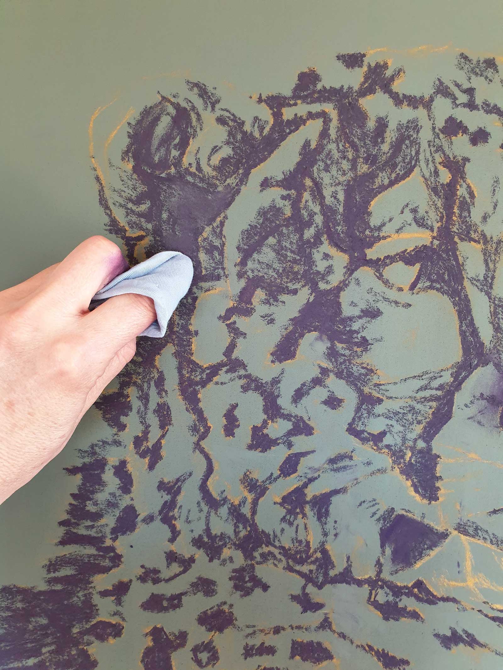
Stage 3 Dark Values
After spraying the drawing with fixative, I use a dark Art Spectrum Flinders blue violet soft pastel to block in the darkest values. I keep my eye on the big shapes and not any real detail.
 Stage 4
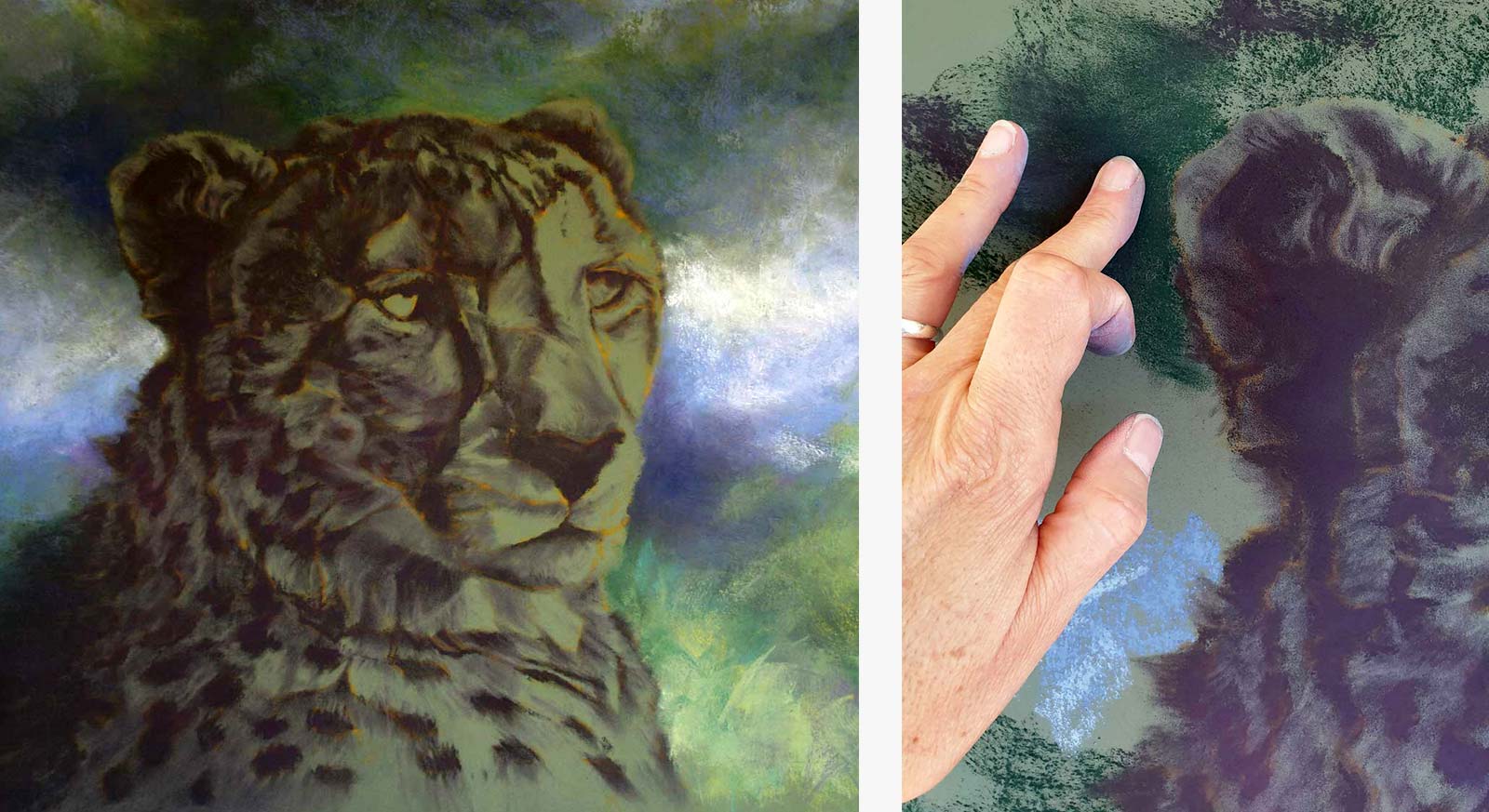
Stage 4 Underpainting
Using a piece of soft T-shirt fabric wrapped around my finger and a kneadable eraser, I soften and blend the dark pastel pushing it into the paper creating darker and lighter values.
 Stage 5
Stage 5 Background Block-in
Satisfied with my underpainting, I spray it with fixative and start to block my background in with soft pastels turned sideways following my initial color study.
 Stage 6
Stage 6 Blending
Alternating between blocking the background in with broad strokes and blending parts into the paper with my fingers, I bring it right up to and under the edge of the cheetah underpainting.
 stage 7
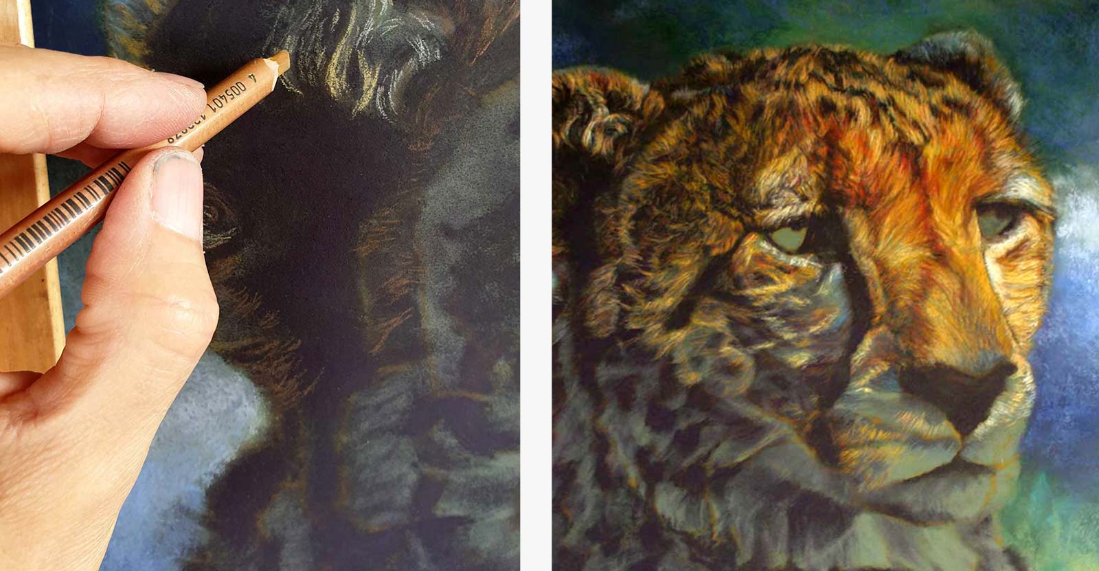
Stage 7 Medium and Light Values
With pastel pencils sharpened to a chiseled edge I put in medium and light values building the shapes and following the direction of the fur.
 Stage 8
Stage 8 Additional Layers
Alternating between cool and warm colors and working top to bottom, I add more layers with the pastel pencils, careful to stay true to the value structure and the drawing.
 Stage 9
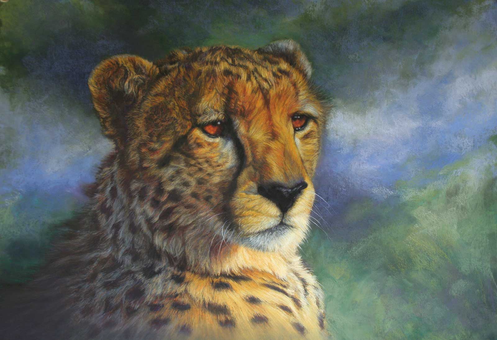
Stage 9 Hard and Soft Pastel
Following the pastel pencils, I layer hard and then soft pastel over some areas to strengthen the values and deepen the colors.
 Stage10
Stage 10 Eyes
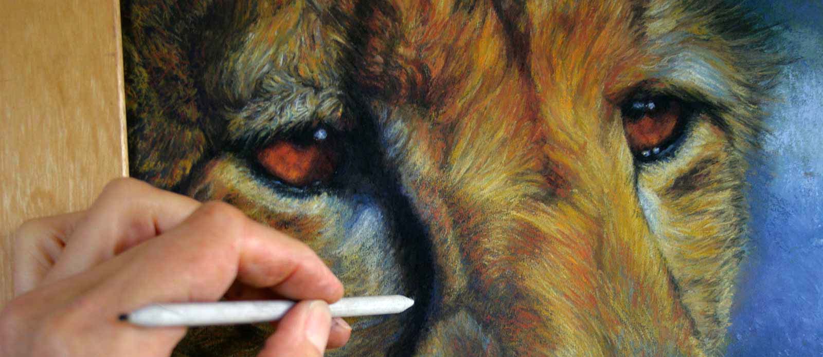
I do the eyes with hard pastels and pastel pencils and strengthen black areas with carbon pencil. I blend the carbon with a paper stump to prevent it from overpowering the painting.
 Stage 11
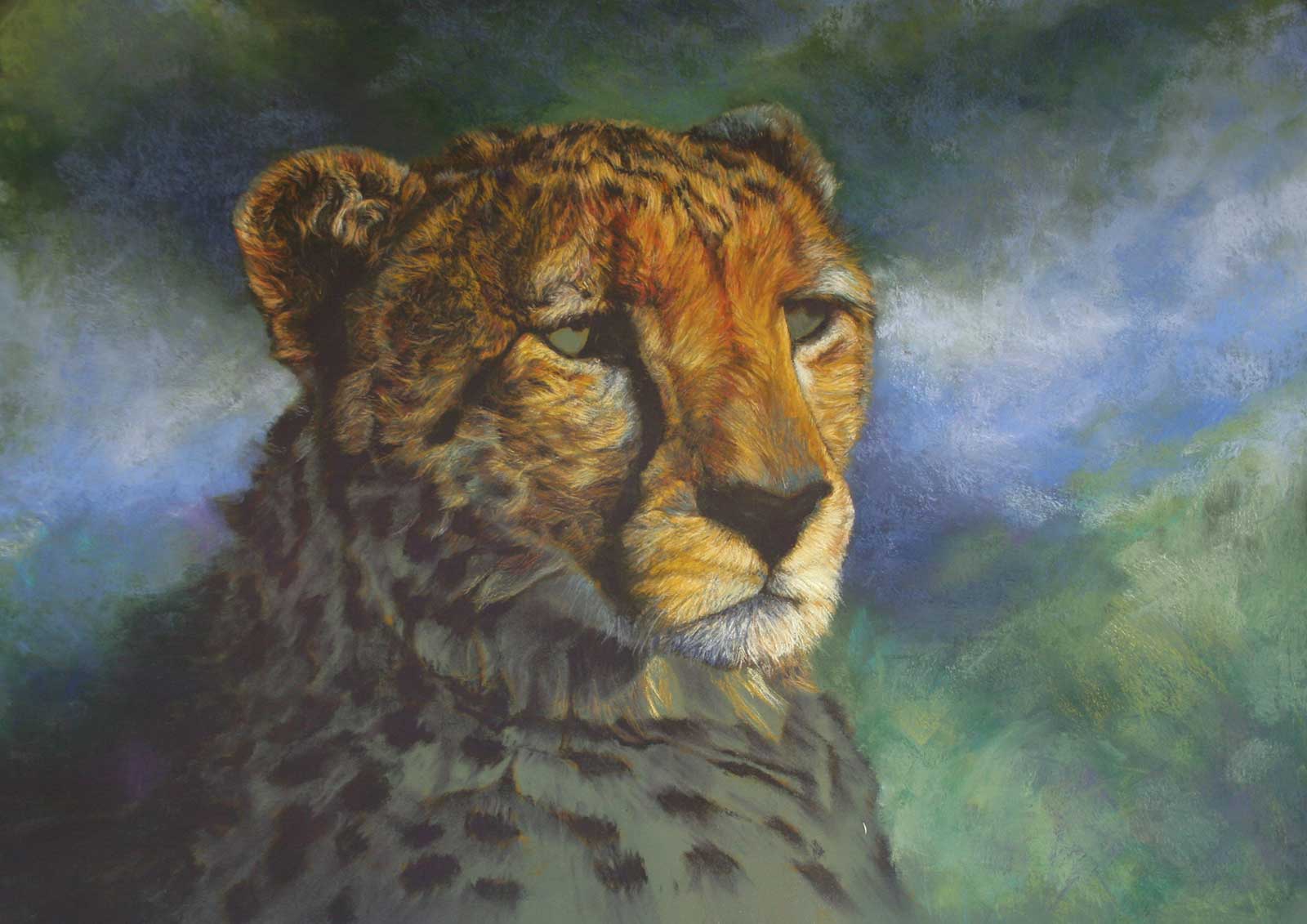
Stage 11 Finished Artwork
Queen of the savannah, pastel, 18½ x 26" (47 x 67 cm)
Final details in the eyes, nose and mouth areas are picked out with black carbon and white charcoal pencils sharpened to a very fine point. I do the whiskers in white charcoal using a flicking motion with the wrist.
About the Artist
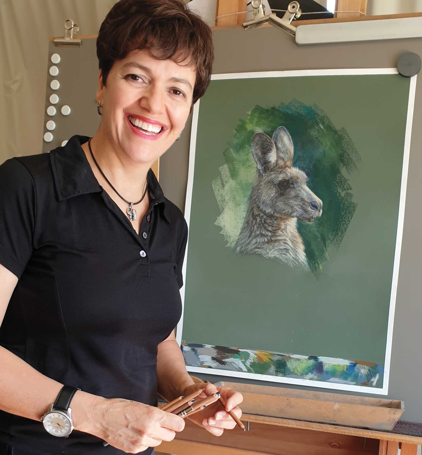 Ellouise Theron
Ellouise Theron grew up in South Africa and her art developed from a young age as an expression of her passion for the African bush and its animals. She spent a few years in the Middle East, and the colors of this harsh region also influenced her art direction. Living and painting in Australia for the past 11 years, she recently turned her focus to Australian wildlife. Theron graduated in graphic design from the University of Pretoria and is also a qualified teacher. She has taught art across the spectrum from junior school to adult classes. This equips her well to teach her approach that design, drawing and a strong value structure is the key to success in realism. Her preferred medium is soft pastels combined with pastel pencils.
Represented by
Aarwun Gallery, Australia, www.aarwungallery.com
Contact at
ellouise.theron@gmail.com
www.ellouisetheronart.com