


Oh that glowing light! It’s a favorite of every painter and non-painting civilian alike, the majestic sunset. We each only get handed so many of them, and they don’t hang around so it sure is nice to capture one in a painting and make it last a little longer.
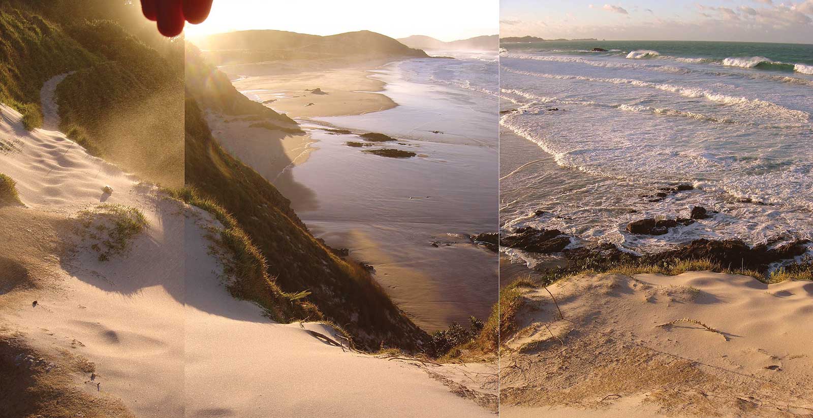
Reference Photo: Ocean Beach, New Zealand.
Painting the effect of a glowing light source is in essence the same as painting the recession caused by the atmosphere, called atmospheric perspective. In atmospheric perspective, everything gets more like the color of the atmosphere as it recedes from us. If it’s a clear blue sky everything gets bluer as it recedes. If it’s a gray sky everything gets grayer as it recedes.
The difference between that and a glowing light or sunset effect is that everything gets warmer as it gets closer to the sun, and that happens in a radial fashion around the sun. What’s the same is that everything loses contrast as it recedes, which means in effect that the highlights stay the same value but the darks get lighter and lighter in the distance.
The tricky thing about painting a sunset landscape is that you have both effects happening at once—atmospheric perspective and a glowing light source, so you’ve usually got a radial warmth and a linear cooling effect. How well you observe and paint that big transition from cool to warm is the great test of the sunset painting.
I’ve found it’s made much easier if you start out by painting a big soft gradation of cool to warm as the first layer of your painting, then work into that, either wet or dry.
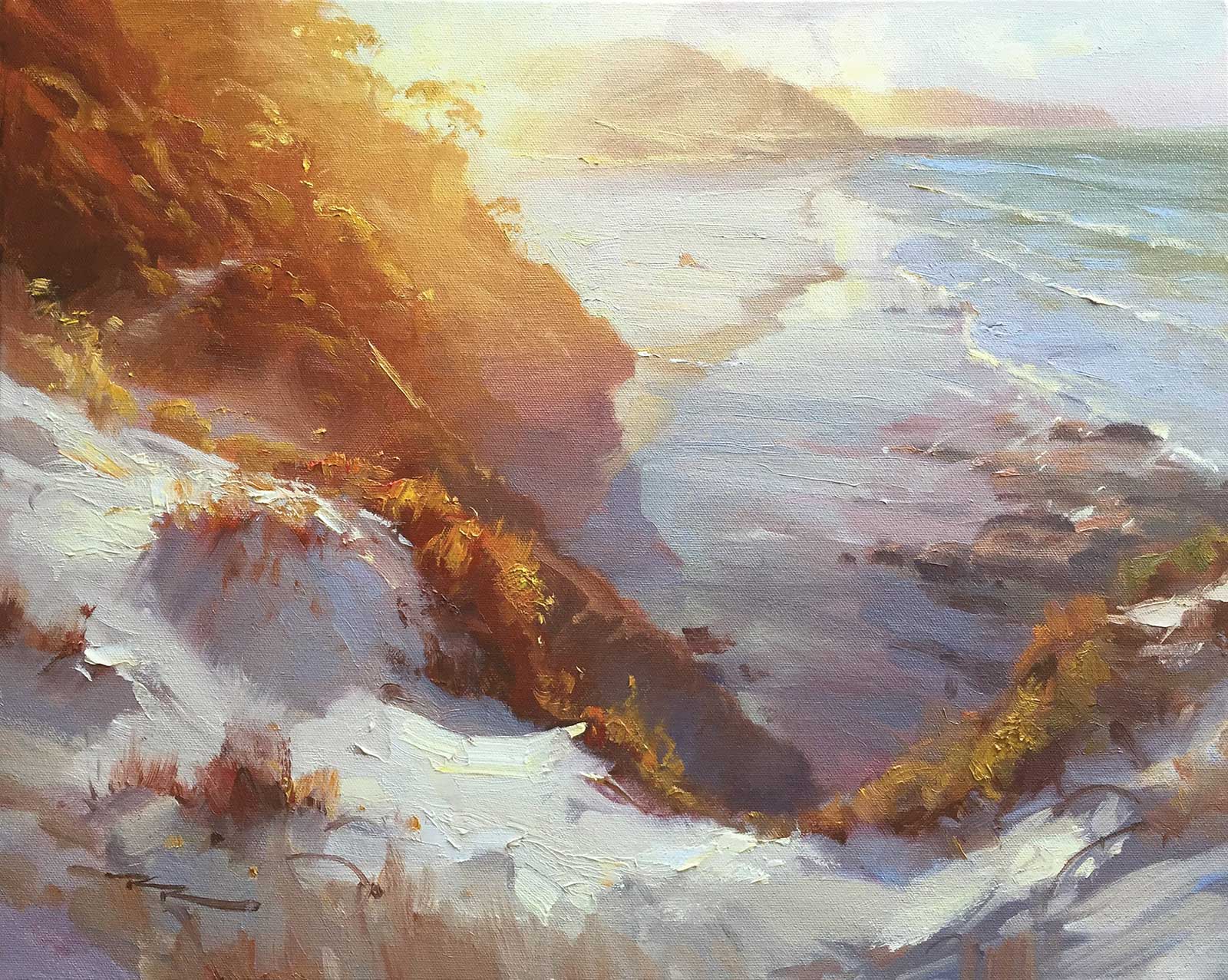 Sunset Beach, oil on canvas, 15½ x 20" (39 x 50 cm)
Richard Robinson
Student Critiques
Karen Woodhouse
Great job, Karen! This is a tricky one for acrylics because of all the soft gradations of color but you’ve managed that well. Your brushwork is gestural and well considered. I’d like to see a little gradation of warmth on the beach close to the sun, as the cool gray there is spoiling the glowing light effect currently.
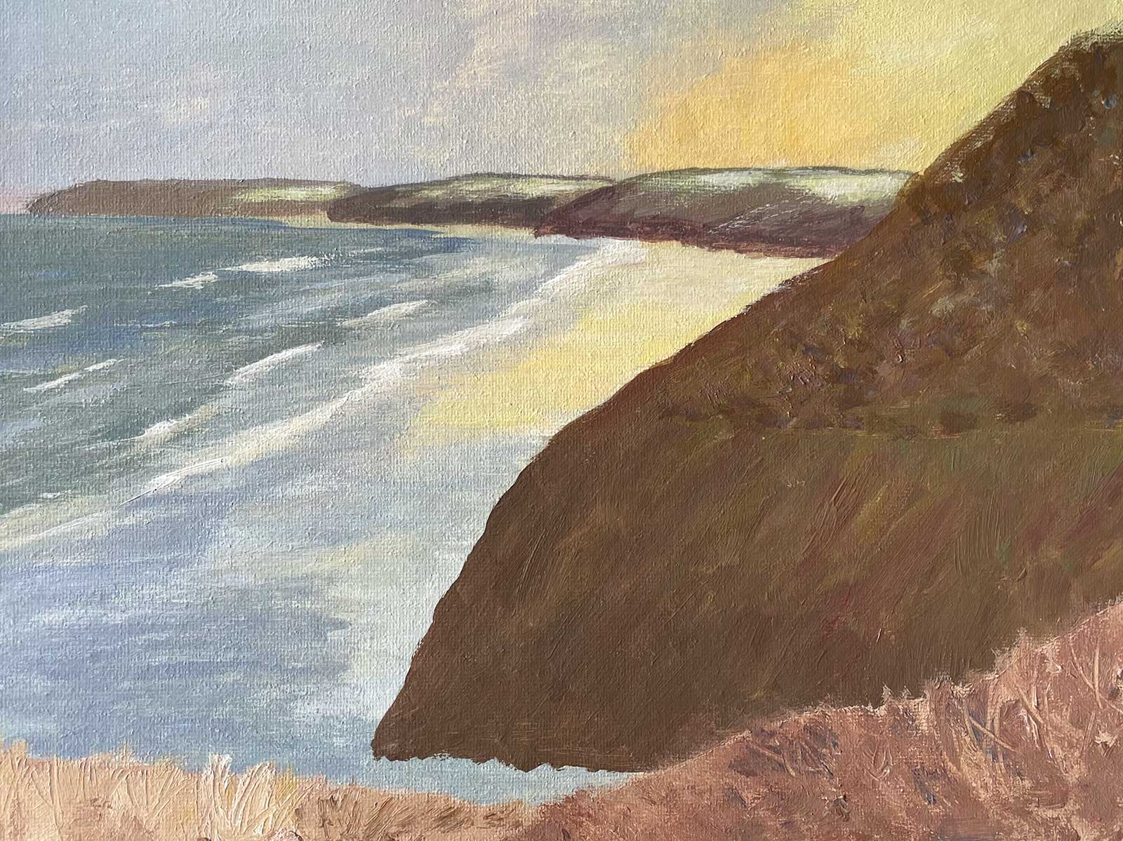
Also, as the yellow light reaches the base of the mid-ground hill it is darkening abruptly at the moment into a red-brown, disturbing the light effect. A soft transition there would be more convincing. The gulls are a nice addition.
Evelyn Tuhi-Herewini
Really nice work here, Evelyn. Beautiful, lyrical brushwork and good drawing. The only thing I’d bring your attention to is the dark brown outline you’ve created around the grasses in the left foreground. Outlines tend to flatten depth in a painting, and this painting is all about depth, so it’ll pay to fix this. You can remedy it simply by painting the top outline shape a touch lighter. (about 10 percent lighter.)
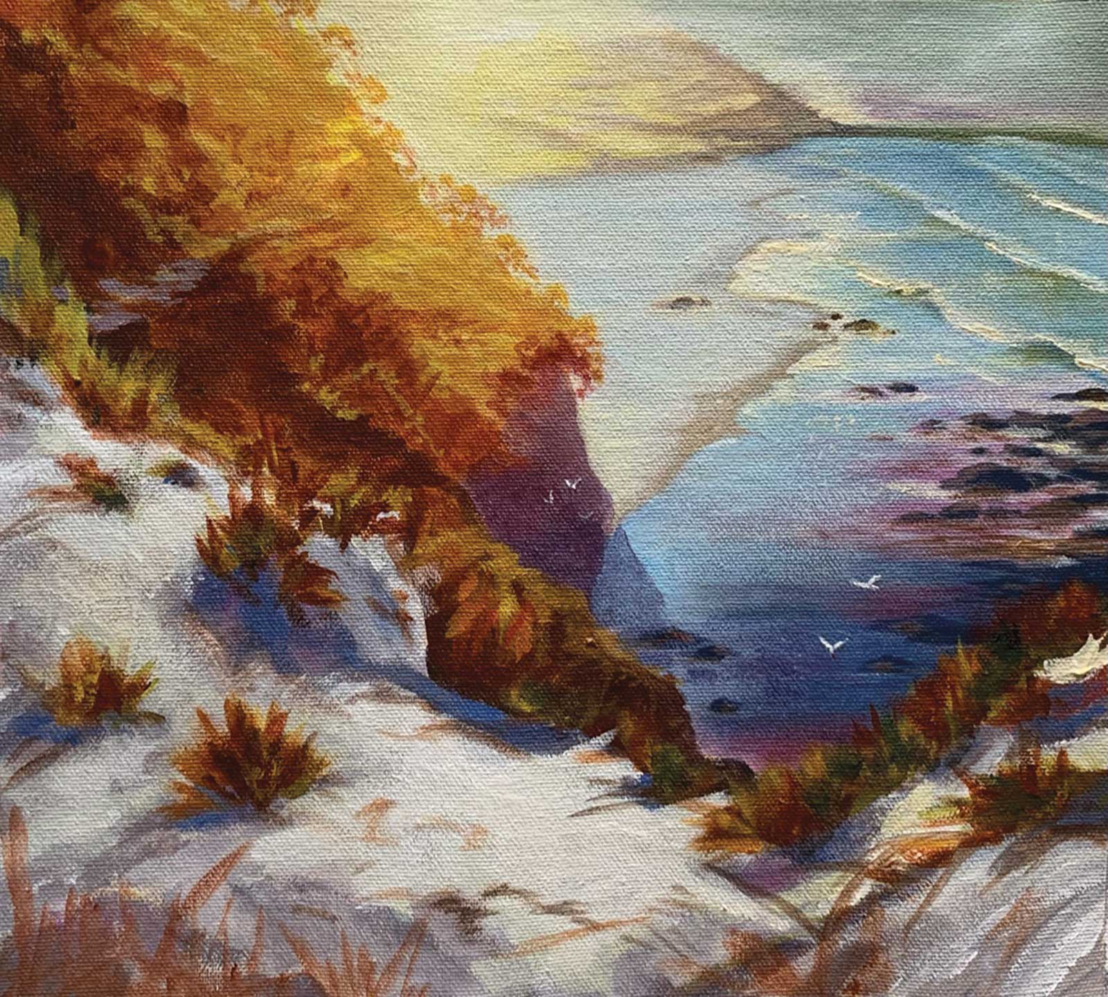
If you look at my painting and the photograph you’ll see that that section is actually the hill behind the foreground grasses, and goes down to the beach, so it should be a little lighter than the darks in the foreground. When you do that you’ll see that the rocks on the beach would look a little lighter as well to separate them from the foreground. In the daytime you’ll observe that the lights stay relatively the same value as they recede in the distance, but the darks get progressively lighter. That’s atmospheric perspective in action.
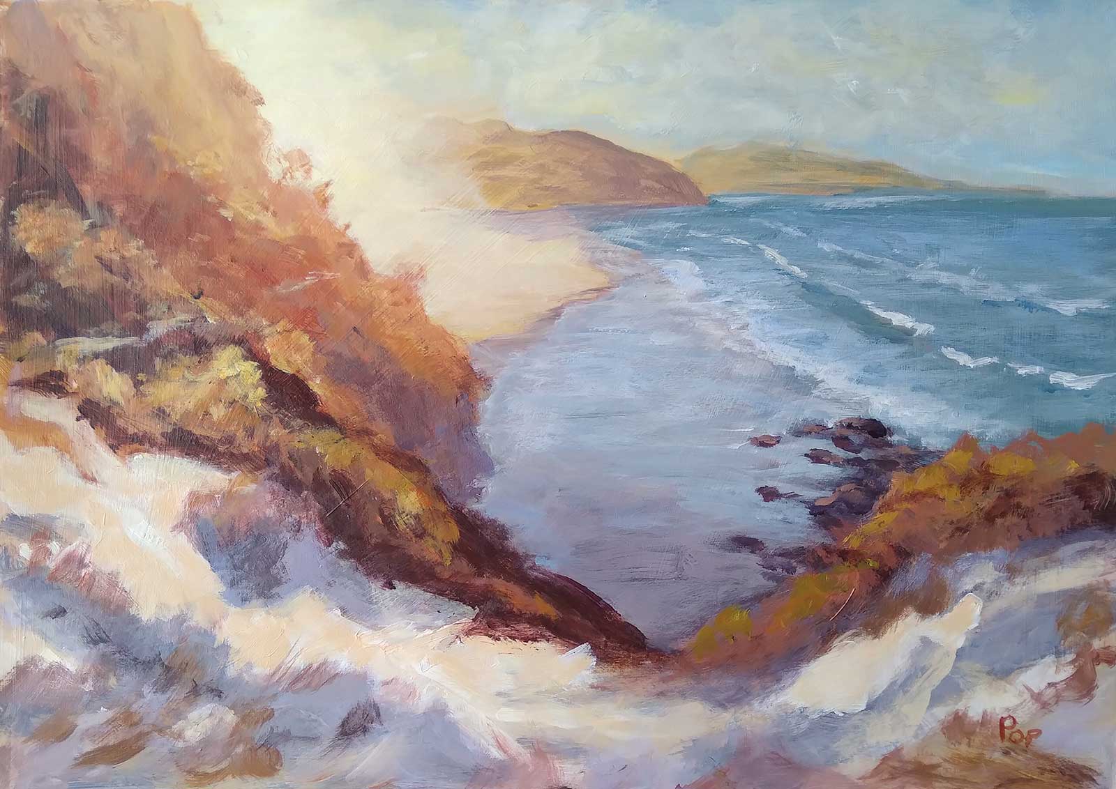
 Sunlit beach at Perranporth
Barbara Magor
Hi Barbara, thanks for your painting. Looks to me like a great start, and with some more study of the demo painting this could be improved. Don’t you hate it when the teacher says “great start”?
The first thing, and the biggest, is the big hill on the right. You weren’t quite sure what to do with that, possibly because that’s how the hill looked in your photograph, like a big area of flat color with barely any detail. Well you’ve achieved that, but now you could add some interest by introducing a big, soft radial transition gradually getting lighter and more orange towards the sun. Then you could reshape the base of that hill, turning it up to the left a little, and darkening the beach with a darker gray where the hill would cast a shadow upon the sand. You could also add a few little bumps and bushes to the edge of the hill to give it more interest.
Next, you could add a similar soft orange glow in the distant hills on the right, close to the sun. To finish, add a few soft darker shadow clumps in the foreground grasses. Then sign it, put your feet up, and enjoy with a good coffee.
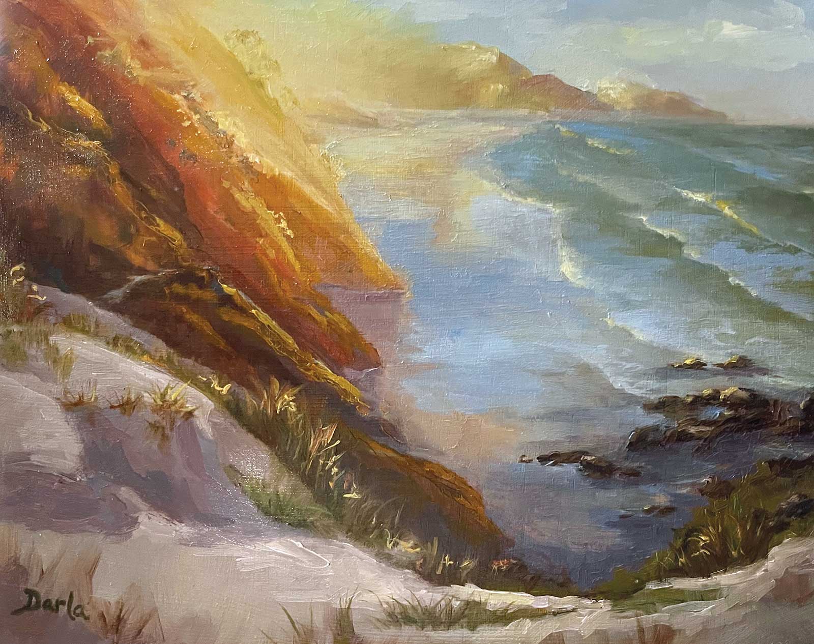
Darla Calhoon
Hi Darla, wow, this has got a real blaze of warmth blasting out from the sun. Nice recession back there, if a little bereft of detail. You’ve added yellow to all your highlights too which has added beautifully to the lighting effect. Just one point: see the big S-curve of the edge of the foreground sand dunes? You’ve over simplified it, making it very smooth and manicured, which, yes, is more peaceful, but removes variety and interest from the painting. Think about variety when making the shapes in your paintings, both big and small.
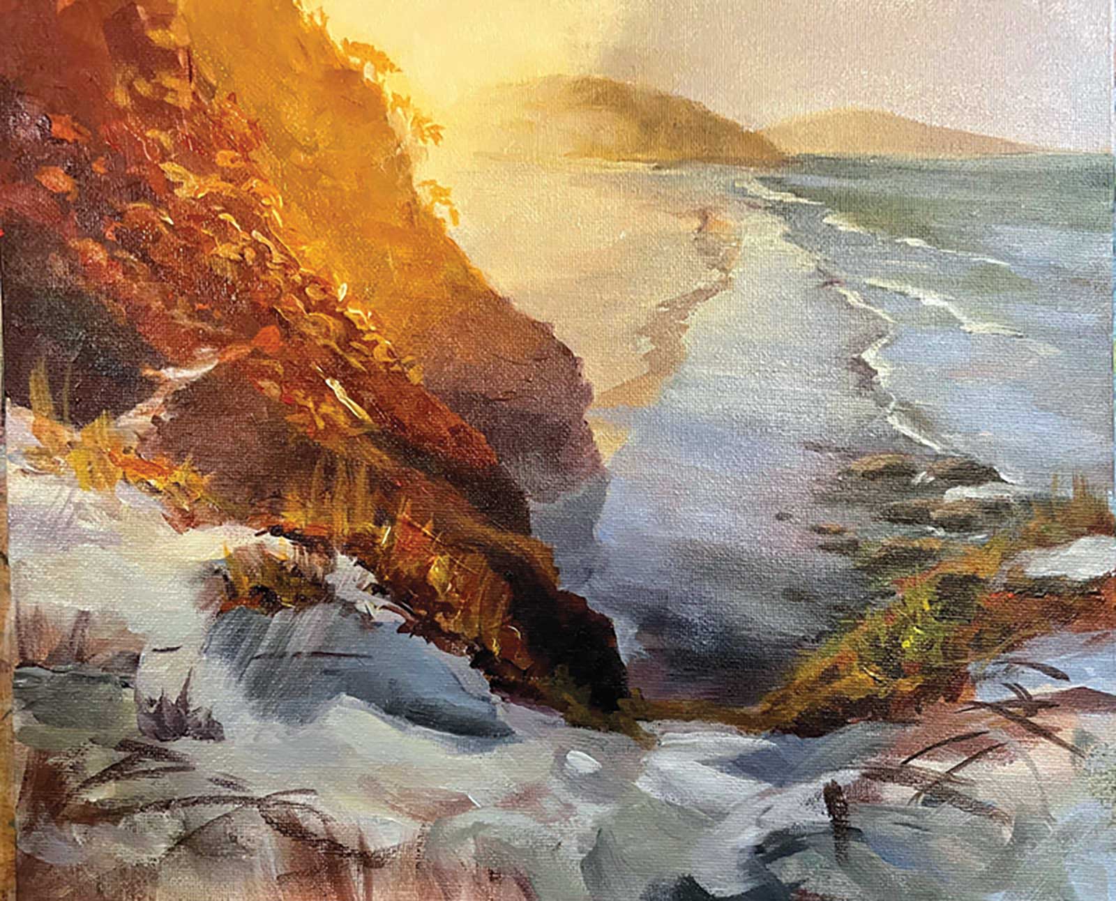
Mérie Botes
Hi Mérie, that’s a lovely painting you’ve made with a convincing glowing light effect from warms to cools. Exciting brushwork and some beautiful shapes in there too.
I’m just thinking that the details in the foreground seem a little unfinished. Being so close to the bottom of the canvas I’d like to see all the edges in that bottom inch softened and made more suggestive rather than descriptive. Its harshness is interrupting the otherwise soft feel of the painting for me. Beautiful work!
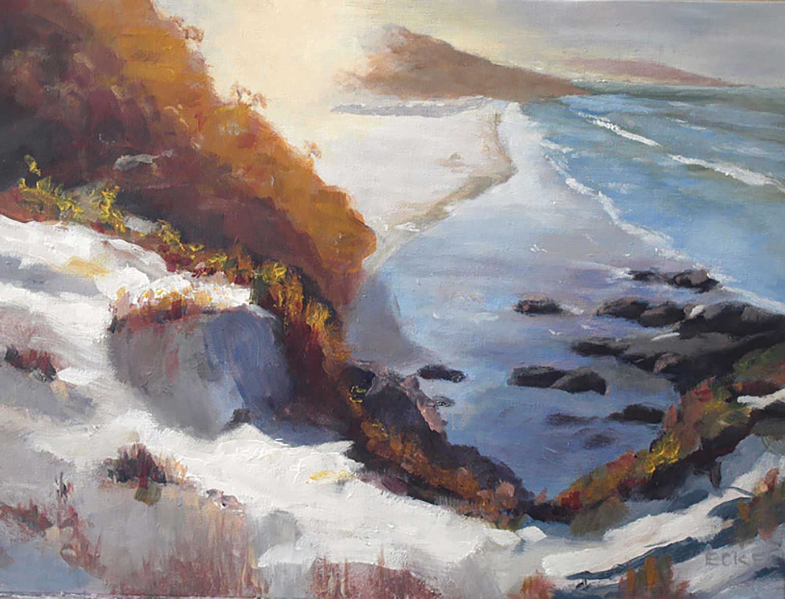
Peter Eckel
Great work, Peter. Nice color, brushwork and attention to detail. Really nice work in the foreground sand and grasses. I’d just caution you about repeating shapes in the rocks on the beach—see how they’re clumped randomly, which is great, but the individual rocks are mostly the same size and shape, and there’s a diagonal string of four of them leading up and off to the right like good little soldiers with all the same spacing.
It’s so easy to make this mistake because our brains adore a good pattern, so you need to consciously work against it with every shape and brushstroke in your painting. —