


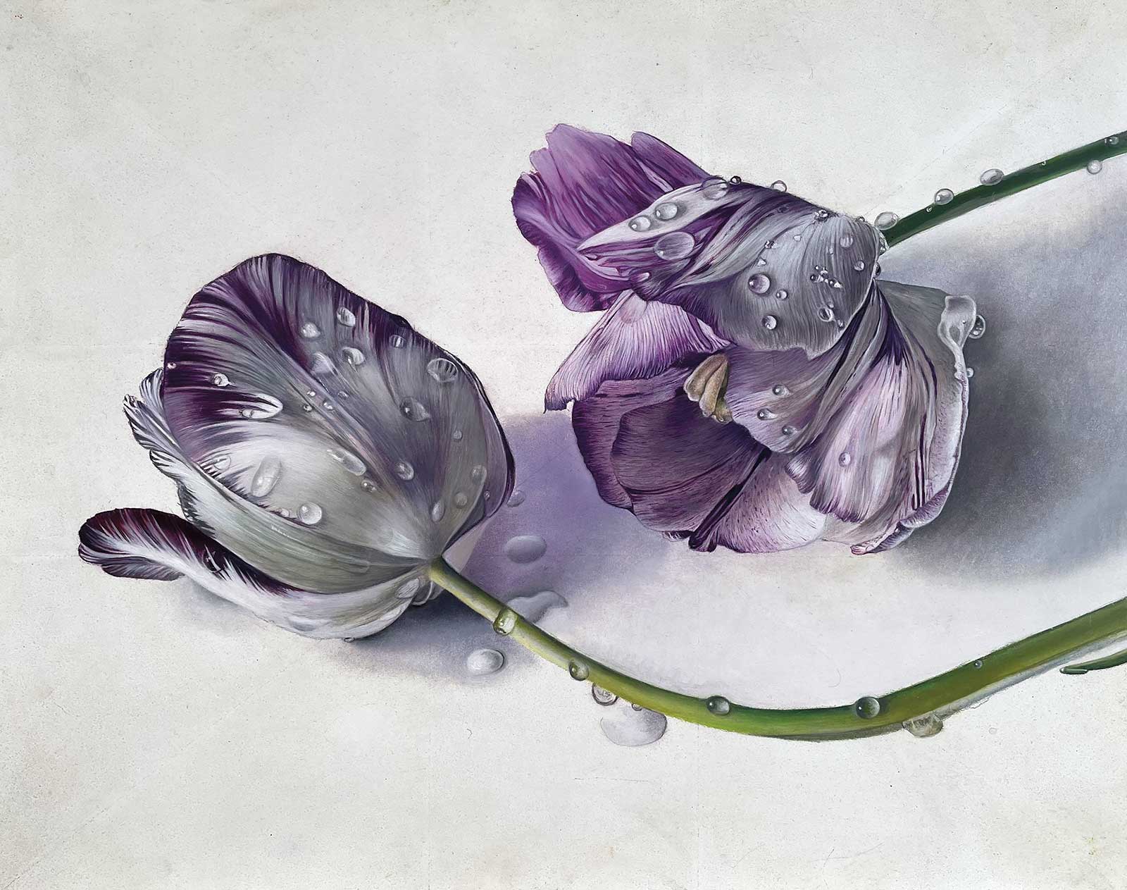
 Broken Tulips, oil, 11 x 14" (28 x 36 cm)
Grand Prize
Grand Prize is a four-page editorial feature in American Art Collector magazine
Ginny Page
Copenhagen, Denmark
Fleeting Moments
“I have an ongoing obsession to record precious moments in paint while they still exist in the now. Soon it will be gone. Life is short and fragile,” says artist Ginny Page. “Be kind and pay attention. Slow down, look around and be grateful for [the] small things that matter.”
Like most artists, Page finds inspiration everywhere, from the moment she wakes up. “The play of the first morning light shining through my water glass, the way our unfinished plastered wall resembles a silhouette of Queen Victoria, my upside down reflection in a spoon, frost patterns on the greenhouse windows, autumn leaves, spider webs with morning dew, wizened flower heads and seed pods,” she says. The list goes on and on.
Recently, Page has begun a series of works with the theme of tiny fruits and other organic materials in vintage bowls with insects. “I love the history and craftsmanship of antique porcelain and the nostalgia connected with the places in which it was produced. My idea started during the pandemic, as I found it soothing just to mess about with small bits and bobs that I love to paint.” So far, she’s at 16 paintings and counting.
In terms of style, Page is continuously inspired by the Old Masters—particularly the Dutch and Flemish painters—and their ability to create textures in the paint. She also emphasizes in her work the elements of lighting, composition, and above all, a well thought-out plan.
“I consider myself to be as honest as possible concerning my art. I like to stick to what I love to do only,” says Page. “Art has always been my coping mechanism and my way to relax and feel happy. I refuse to follow trends or worry about what will sell or what people may advise me [on]...I have never been ‘in’ with anything, and I prefer it that way.”
My Inspiration
I was spending a week in Aarhus taking care of my dear friend who had just been diagnosed with a serious form of cancer. On the way to the hospital for my friend’s first treatment I suddenly noticed some beautiful striped Rembrandt tulips (broken tulips) growing in the car park, which sparked my inspiration for a painting idea. I persuaded my friend to turn the car around so I could “steal” a couple. The tulips had almost finished flowering and the petals were very fragile, so I needed to act fast if I was to capture their beauty in paint in time. Painting these tulips while my friend was sleeping gave me a feeling of peace and calm during a very turbulent and traumatic time.
My Design Strategy
I bought an Ampersand panel and planned my composition. Being away from my studio I had little equipment. Five tubes of paint, thinners and two brushes. I set up my composition up on a small windowsill in my friend’s kitchen, but the natural light from the window worked well. I spent hours arranging the flowers from different angles before starting. By now, the tulips were fading fast and the petals on the left tulip were about to fall (my friend). The tulip to the right was more robust (me). I imagined a narrative that the two tulips were my friend and me. The painting suddenly became about being present. Two friends alone showing compassion and attentiveness but still allowing for quiet contemplation and some tears.
My Working Process
After measuring the “Golden Section” onto my panel, I drew out my motif accordingly and sprayed with fixative to avoid smudging. Using an oil palette of ivory black, titanium white, alizarin and cadmium yellow, which I find works for every painting no matter what. Using the thinned paint like a watercolor technique, I built up the forms of the flowers using lots of tiny delicate lines following the forms of the petals, working from light to dark. I added the tiny water drops last. I purposely left the bare white panel as it was, which I would normally never do, but I felt it gave a feeling of freshness to the finished result and made it resemble more a watercolor study than an oil painting.
Contact Details
Email: art@ginnypage.com
Website: www.ginnypage.com
Second Prize
Second Prize is a two-page editorial feature in American Art Collector magazine
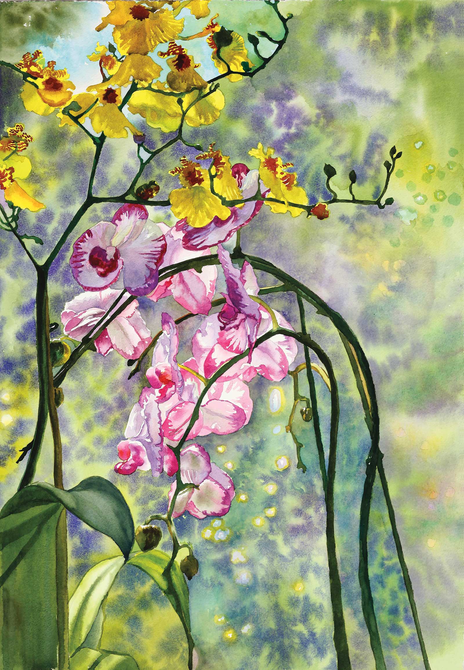 Springtime Orchids, watercolor, 29 x 21" (73 x 53 cm)
Teri Starkweather
California, USA
My Inspiration
One of my favorite things to do on any vacation is to visit a botanical garden. I often take many photographs for use in future paintings. One garden, which was a great inspiration for me, was Longwood Botanical garden in Pennsylvania. There were quite a few beautiful orchids growing there, which greatly impressed me. For this painting, I purchased some orchids growing in pots from my local market and set the two pots next to each other. I really liked the yellow blooms next to the bright purple-pink orchids.
My Design Strategy
I set these orchids in front of a window, for natural light. Then I played around with the best arrangement for a pleasing composition. I really liked the curvature of the pink orchids next to the upright yellow blossoms. The sun shone brightest on the lower left pink petals, and I decided that this would be my center of interest, below center point and to the left of middle of the composition. This is in keeping with the rules of the golden ratio. I decided that I would invent the background because I didn’t want the background to compete with the main subject.
My Working Process
I took several photos of my composition to save for reference. Then I did a careful pencil drawing full size on tissue paper and transferred the drawing to a piece of Arches 300-lb watercolor paper. I carefully erased any smudges or dark places in the drawing before I painted so that pencil lines were not prominent. I used Winsor & Newton and Daniel Smith watercolors. My brushes are Loew-Cornell ultra round, sizes 10 and 12. I also use an Escoda Barroco size 16 for the background. I painted from my photo reference and viewed my orchids from life. I painted the flowers first, then the background. The background was done using a wet into wet technique where I drop wet paint onto the wet paper. When completed, I framed the painting in a simple black wood frame for watercolor exhibitions.
Contact Details
Email: teri@teristarkweather.com
Website: www.teristarkweather.com
Third Prize
Third Prize is a one-page editorial feature in American Art Collector magazine
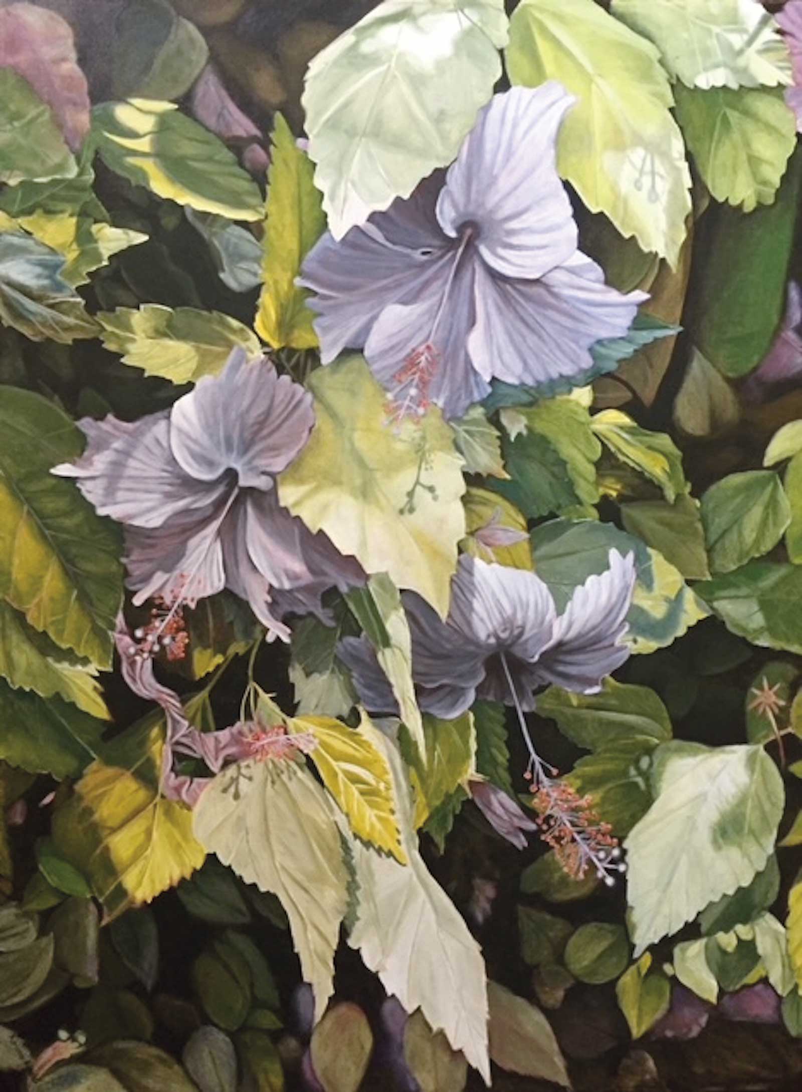
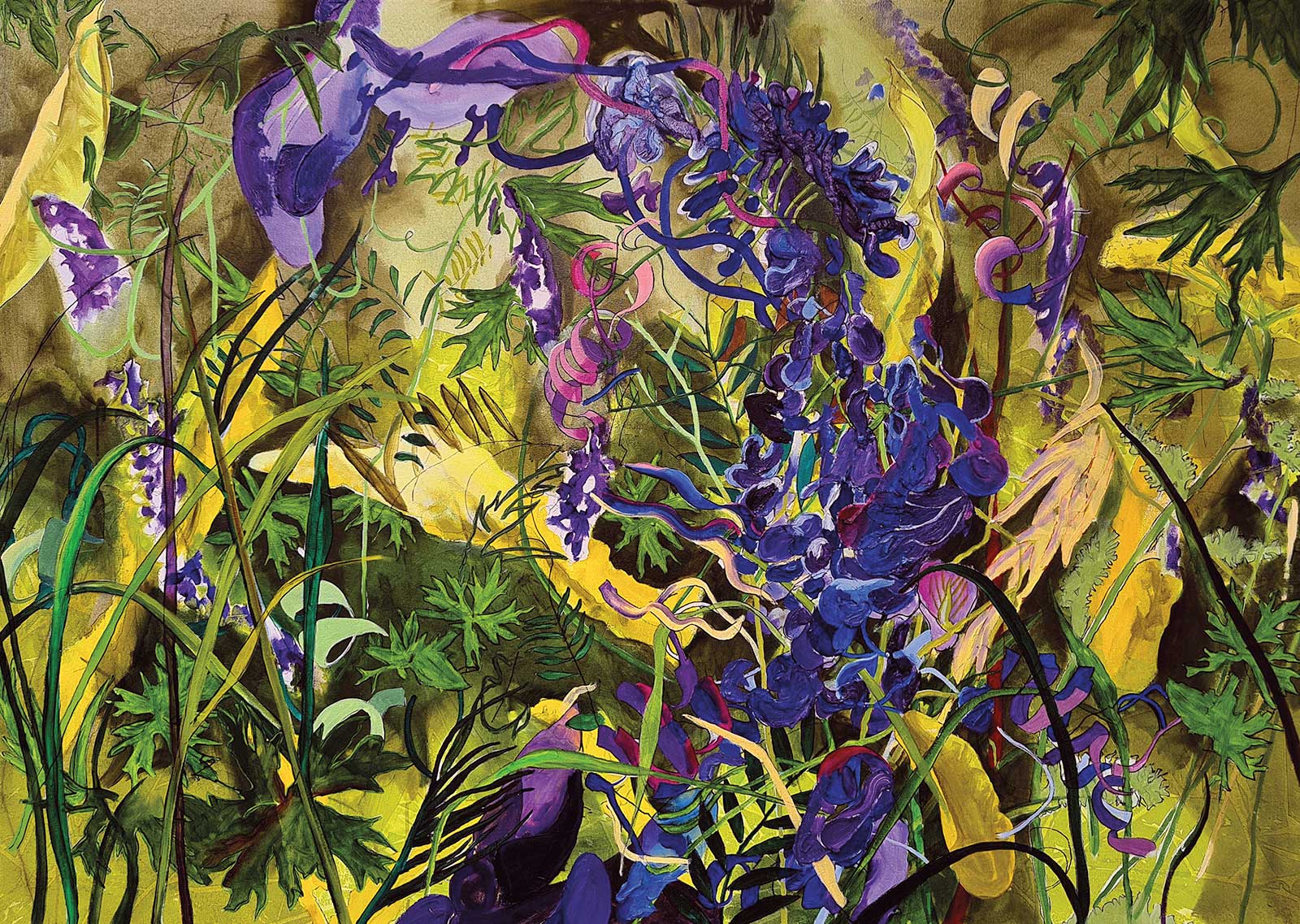 At the roadside, oil on canvas, 39 x 55" (100 x 140 cm)
Georg Douglas
Kjós, Iceland
My Inspiration
The flowers that I like to paint most are wildflowers in the fields or along the roads and paths of Iceland. I spent my working life as an earth scientist, and my training has imprinted itself on how I view the world of flowers and how I paint them. Apart from color and light, I am inspired by two other things which I include in my work. One is the beauty of life at the microscopic and molecular level. We normally don’t see this directly, but it is there and my scientific background enables me to include it and thus greatly extend our view. The other is the great complexity of nature at all levels. In the environment of At the roadside, we see the entanglement of tall clinging vetch flowers and other weeds and grasses. Here and there we also see protein spirals and collagen chains. Thus widely differing scales are given equal value, which I feel adds to the feeling of complexity.
My Design Strategy
In some ways the basic design may seem to be easy: I want to convey a feeling of disorder, entanglement and complexity and to some extent a realistic portrayal of the grasses, and tall vetch does just that. Nevertheless, I find that including microscopic and molecular features greatly enhance the feeling of confusion. Also contributing to this are the placement of light and shade areas, and I do this intuitively, or for instance, by the memory of an illuminated leaf.
My Working Process
I like to produce a reasonably exact underpainting, which is a combination of drawing in fine charcoal and tonal values painted in a light gray-blue acrylic. I often continue in acrylic to start the main features and colors, as the fast drying time enables me quickly to see how the work is developing and to make early changes of direction. I frequently return to drawing, and a process of alternately painting and drawing can continue for some time before I start to lay in the colors in oils. I always work over the entire painting. I use photographs first and foremost to help me obtain plausible morphology of features like blooms, petals and leaves, which I have always found important even in a work which tends towards the abstract.
Contact Details
Email: georg2103@gmail.com
Website: www.artgeorg.com
Finalists
Each receives an Award Certificate and a one-year subscription to International Artist magazine PLUS having their work seen worldwide by international galleries looking for new talent.
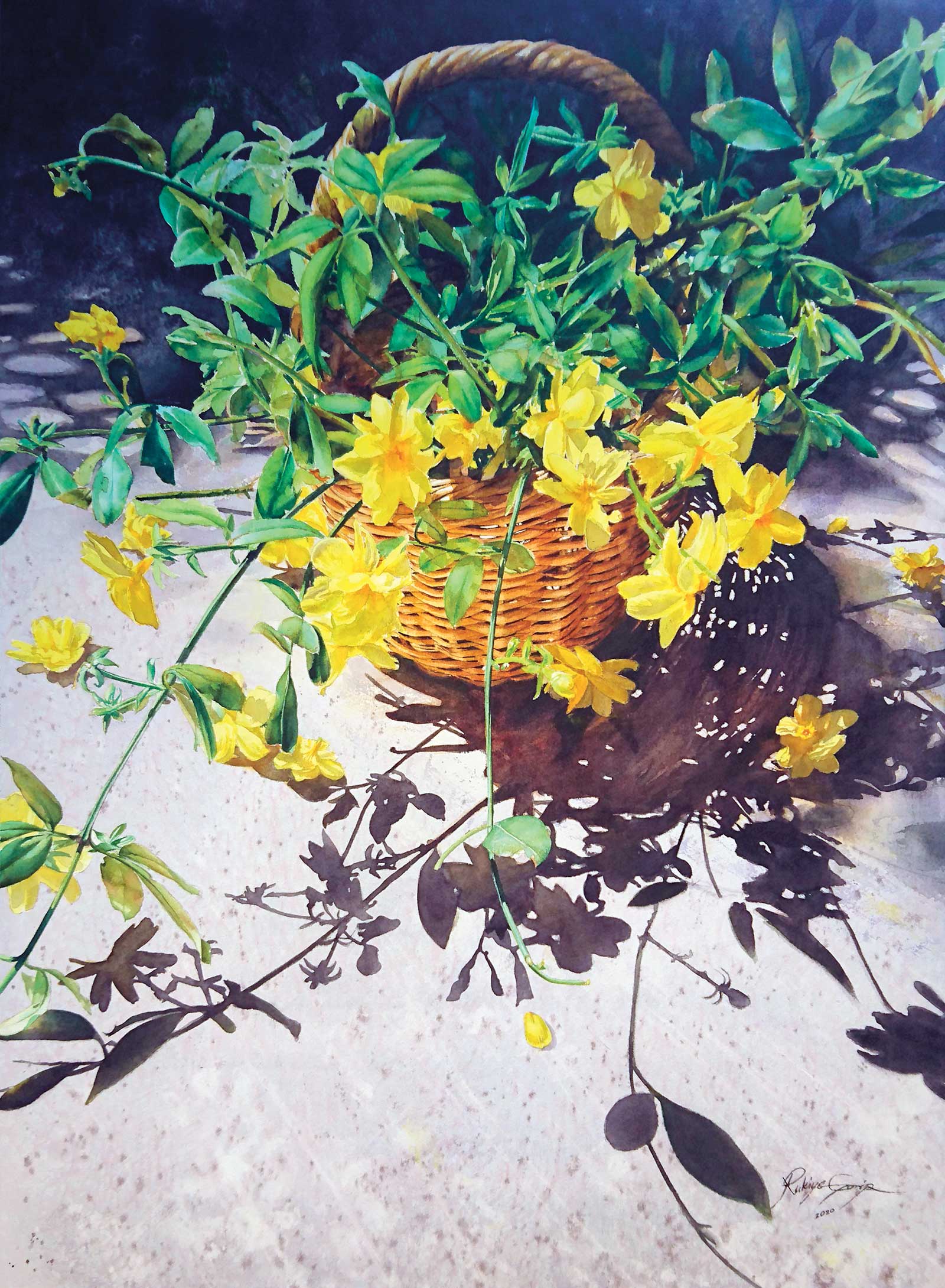 Yellow flowers, watercolor, 30 x 22" (76 x 55 cm)
Rukiye Garip
Balıkesir, Turkey
My Inspiration
Yellow flowers (jasmine), became the flower that gave me hope during the heaviest days of the Covid-19 pandemic. They were in the garden near of my workshop, which I had been locked in by myself because of the curfew. They had formed a cheerful heap, with flowers lined up like yellow popcorn on the tall branches. During the four days I worked on the yellow flowers painting, I felt that my intense stress under pandemic conditions was lost in the power and beauty of nature.
My Design Strategy
I created a composition in a basket from the parts I cut from among the scattered branches. I took pictures of it, waiting for the right time to take advantage of its falling shadow under the summer sun. I made the drawing using reference photos. Since the delicate flowers that fall easily were not as dense as I wanted, I increased the number and size of the flowers a little. I created the light-dark balance by increasing the degrees of darkness in the background and shadows. I then added purple to the blue and brown tones I had already applied to the dark areas to ensure the visibility of the yellow flowers.
My Working Process
I wetted a 56-by-76-cm piece of watercolor paper and stretched it. I applied masking liquid to the flowers to protect the yellow areas, which are a difficult color and easily soiled. I created the floor by splashing paint and salting on the grays that I applied by wetting the paper. I painted the basket, the leaves and finally, the flowers, in that order. The colors I used are burnt sienna, Van Dyke brown, brown ochre, bismuth yellow, Winsor green, magenta, French ultramarine, indigo, orange, quinacridone gold, cobalt turquoise and Winsor yellow deep.
Contact Details
Email: rukiyegarip@hotmail.com
Website: www.instagram.com/rukiyegarip
 An Artists’ Prerogative, oil, 40 x 30" (101 x 76 cm)
Adriana Rinaldi
Ontario, Canada
My Inspiration
I went to Ecuador on a work exchange program. Our host had the most gorgeous florals: hydrangeas and passion flowers that would attract light bugs. The air glowed with them at night. The hydrangeas were red in real life, but I decided to make them white because of the purity. As artists we can bend reality and create illusions if we so choose, hence the name An Artist’s Prerogative.
My Design Strategy
My challenge was to make sure I conveyed the sun drenched atmosphere by using my computer to bring out the lights and darks in the photo reference. The sun creates all those wonderful contrasting shadows that play out on the leaves. Also, the leaves are all different colors, otherwise you’ll end up with a boring background. The three flowers are the focal point and needed to be enhanced by really white whites and shadows.
My Working Process
I use a modernized version of Renaissance traditional oil glaze painting. I transferred my photo to a white 30-by-40-inch canvas using the grid method. I normally start with a brown and white Grisaille, but this time I decided to use a green and white Grisaille on white canvas. I am basically drawing in my painting to start. I build up the detail, color and luminosity using white and a limited palette of four to six colors.
Contact Details
Email: arty.adri@live.com
Website: www.adrianarinaldi.com
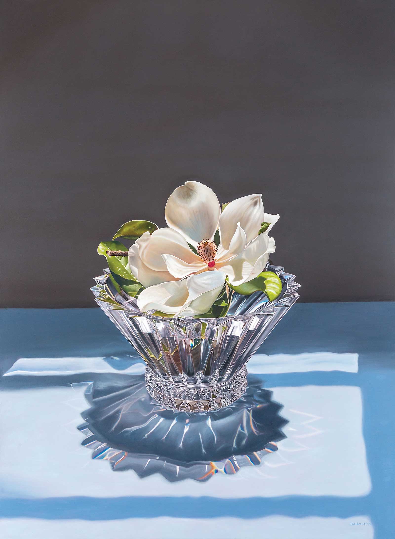 Queen Magnolia, oil on canvas, 102 x 45" (216 x 160 cm)
Jeannine Zambrano
Monterrey, Mexico
My Inspiration
I have a deep love of nature, and how every creation exhibits its own uniqueness. A single magnolia flower is all at once beautiful, flawless, strong and resilient, able to endure the challenges of life. This was the perfect subject to represent living in tough times during the pandemic. I needed inspiration to stay positive, continue moving forward and challenge myself to get the best out of an uncertain period in life.
My Design Strategy
I had this crystal vase shaped like a crown stored in a box for years, and when I wanted to paint the beauty of the magnolia, this vase was the perfect fit. I filled the base with water and set the magnolia on top. I covered a table with a white cloth and placed it in front of a window with the morning light going through the crystal base, showing the reflections and small pieces of rainbows, light and shadows. This made for a challenging design.
My Working Process
My process starts with a custom primed cotton canvas. I used tempera with rose pigment for the underpainting to counter the blue tones. After that, I draw a detailed sketch, showing every detail possible, before moving on to my oils. First I painted the magnolia, then the crystal vase, the background and finally the cloth with shadows. Time and patience were the key to my success.
Contact Details
Email: jeanninezambranoart@gmail.com
Website: www.instagram.com/jeanninezambranoart
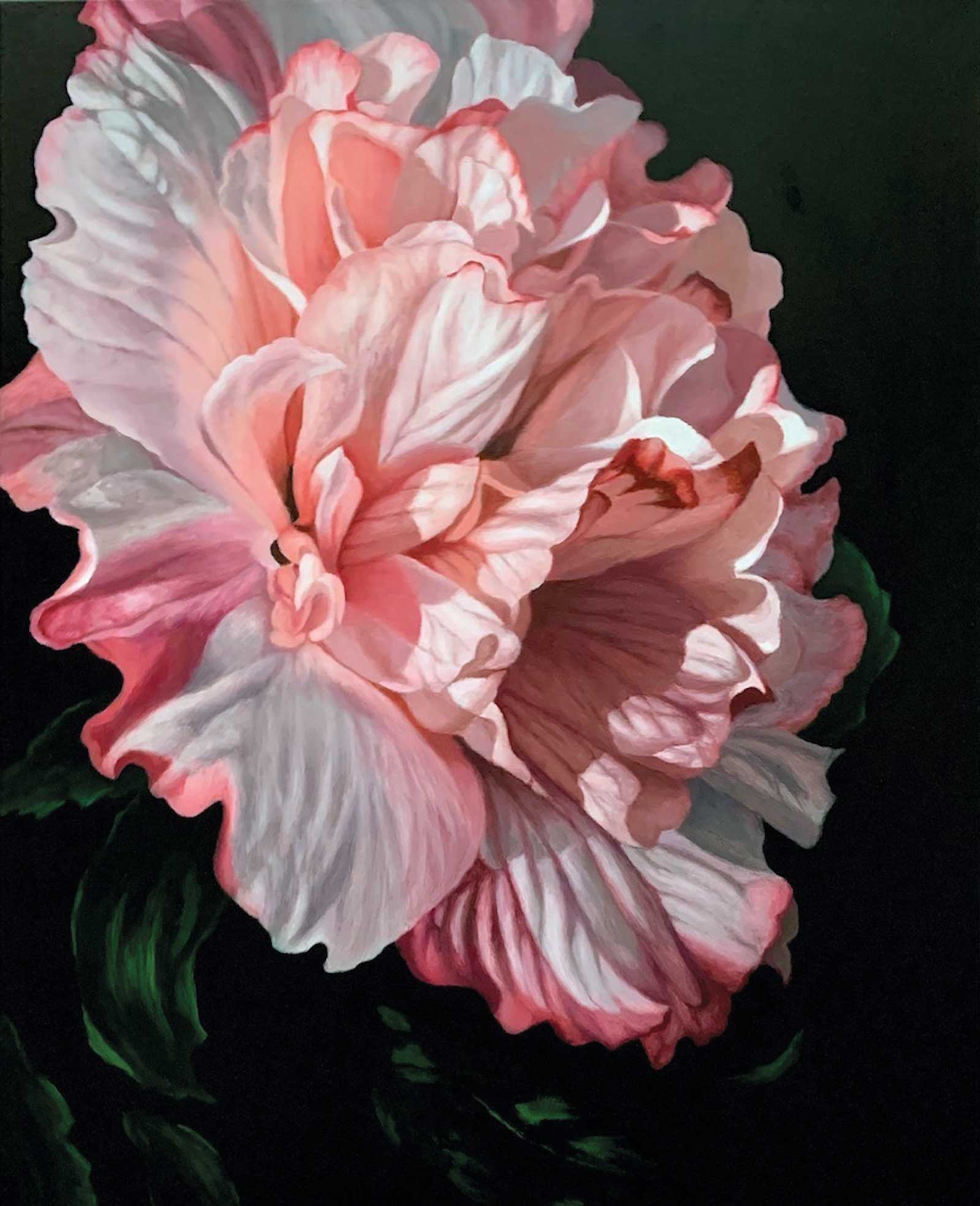 Danica, oil, 30 x 24" (76 x 60 cm)
Rosemarie Meis
California, USA
My Inspiration
Danica was inspired by a potted plant I had bought for my garden. I’m always looking for something new to add to my flower beds, and I’m captivated by striking and unusual blooms. When the first blossom appeared, I was thrilled and felt that I had to paint it. I loved the wonderful color values and the delicate shadows on the petals that were created when the sun was shining on it.
My Design Strategy
Next, I photographed the flower from different angles, looking for the most striking interplay of lights and shadows. After loading it on my computer, I cropped it and changed a few of the petals for a more pleasing composition. My designs are by intuition, and I rarely do value studies. The painting style I have developed is realism, and I pay close attention to the shadow shapes and the lightest parts of the petals.
My Working Process
I first sketched my subject on paper and then transferred it to a gallery wrapped canvas covered with three coats of gesso. Next, I painted the flower thinly, establishing the basic colors and design. The background was then blocked in, using transparent colors. Each petal shape was painted several times, paying attention to subtle value and color changes and aiming for smooth transitions. I worked in oil with a limited palette and a small amount of medium.
Contact Details
Email: diroseme@yahoo.com
Website: rosemariemeisart.weebly.com
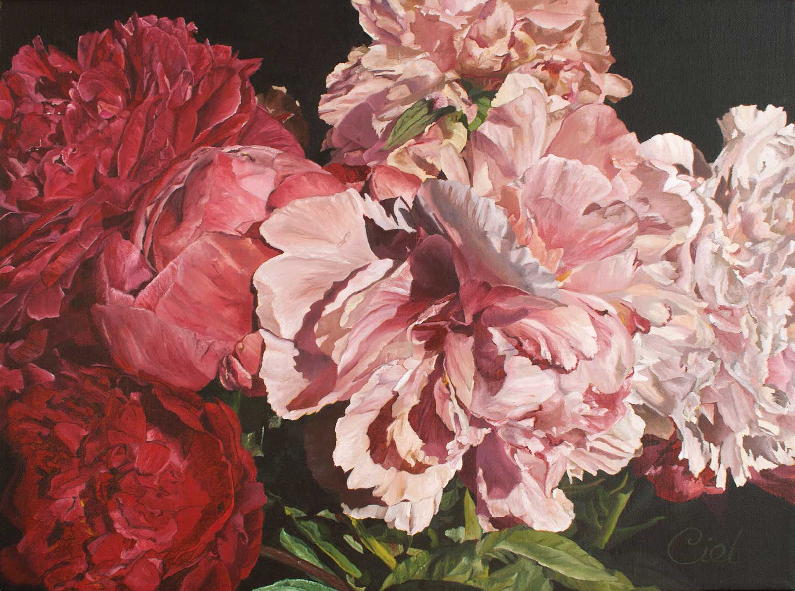 THE DELIGHTFUL SIX, oil, 18 x 24" (45 x 60 cm)
Ciel Ellis British
Columbia, Canada
My Inspiration
Intuition is my guide. Whether I’m walking the neighborhood looking for flowers to photograph, stalking my own garden of designer roses and peonies or purchasing arrangements, I’m paying attention to how I feel. If I hear myself gasp, or say, “Wow, that’s beautiful!” then I move in to capture what caused that reaction. It’s my goal to recreate what I saw and elicit something similar from viewers and collectors of my work.
My Design Strategy
When it comes to design, I take multiple digital images from different angles and lighting conditions. Once the images are on my computer, I consider which images would make a good painting and start doing some preliminary compositional studies. I look for leading lines, interesting lighting patterns and focal points. From there I select the best image(s) for the painting. These six blooms looked amazing. I hope I’ve done them justice.
My Working Process
From my selected photos, which are cropped and composed for interest, I decide on the canvas size, making my own if the dimensions stray from commercially available sizes. I prep my canvas, transfer a rough line drawing, then start meticulously defining the structures within the image. Often after the first pass of color I need to return to earlier areas, adjusting the shapes to be sure they truly reflect the beauty I’m attempting to capture.
Contact Details
Email: studio@cielellis.com
Website: www.cielellis.com