


My painting practice stemmed from being uprooted after I emigrated to Canada in 1994 at age 28. Upon arriving in Vancouver I grappled with issues of belonging, wondering how to find an emotional connection with my new country. Art made this happen for me. The beautiful paintings by the historical Canadian artists from the Group of Seven triggered a desire to see this magnificent scenery with my own eyes and document the experience. The act of painting became a conversation with the landscape, which gave me a sense of belonging. I traveled in Canada for 20 years and created an extensive, well-received body of landscape paintings.
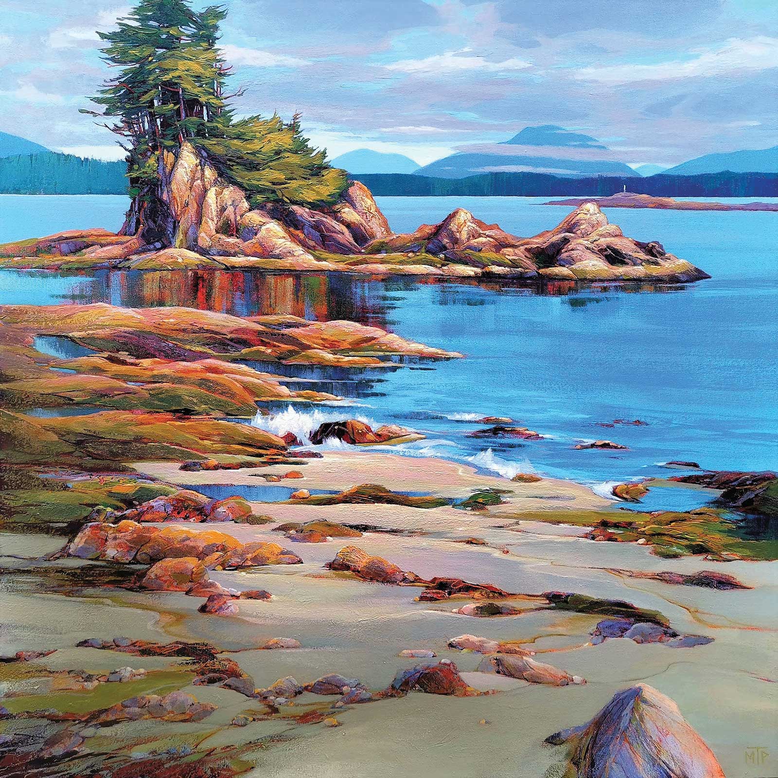
Ocean’s Gifts, acrylic on canvas, 36 x 36" (91 x 91 cm) This is a scene from the amazing Barkley Sound, British Columbia. The golden glow of the richly textured sea stack reflecting in the water was what inspired me to paint it. There is a stunning contrast between the sunlit, rocky areas and the serene blueness of the background.
My visual language utilizes expressive marks, rich textures and bright colors with acrylic paint on a small and large scale. This reflects my awe of the landscape and satisfies my need to decode the physicality of spectacular geological formations.
I work in series, focusing on a certain area for a period of time. Coastal Sentinels is my recent body of work depicting the quintessential coastline of British Columbia. I am grateful for the opportunity to travel to these amazing destinations, make plein air studies on location and generate an enormous collection of reference photographs that I use for my studio work.
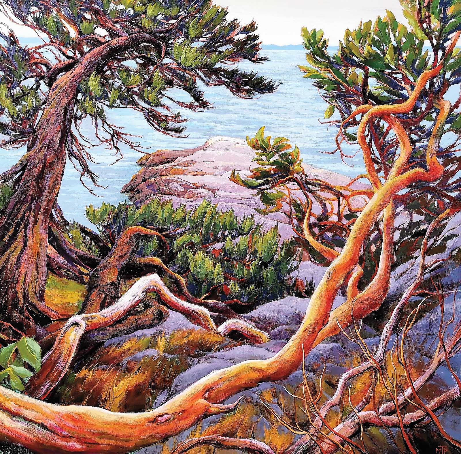
Coastal Arbutus and Jack Pine, acrylic on canvas, 48 x 48" (121 x 121 cm) The coastal trees of the Pacific Northwest bask in the richness of the rainforest ecosystem while enduring the punishing conditions of winter storms. Different species coexist and support each other like a family. This grouping made me think of how humans have a lot to learn from trees.
My process has developed over time and keeps evolving. I use acrylic paint because it allows me to work quickly, expressively, and change my mind if need be. The foremost principle for me is to approach every painting as a unique visual puzzle. This means that, although the process is determined, my excitement with the subject matter translates into a specific combination of design elements. The excitement itself is by far the most important ingredient that I keep alive through all of the steps in my creative process.
I haven’t invented these steps myself. They are quite standard, but I tweaked them in a way that keeps them fresh and engaging. For example, instead of using grids or other means of mechanical transfer, I draw the composition on the canvas free-hand. To maximize the fun, I sometimes use a three-foot-long stick with a pencil affixed on one end. In the next step, the application of the underpainting is done with bright, lively, transparent colors applied quickly with a rag dipped into the juicy paint. The blocking-in is done with a large brush and loose, gestural strokes. During this exuberantly chaotic stage, I work so loosely that the actual image is unrecognizable because my goal is to create an expressive and texturally rich base for the painting. Making the order from chaos comes next. I carve out the shapes and establish forms while preserving the marks that evoke the feeling of being present in the natural environment I want to capture.
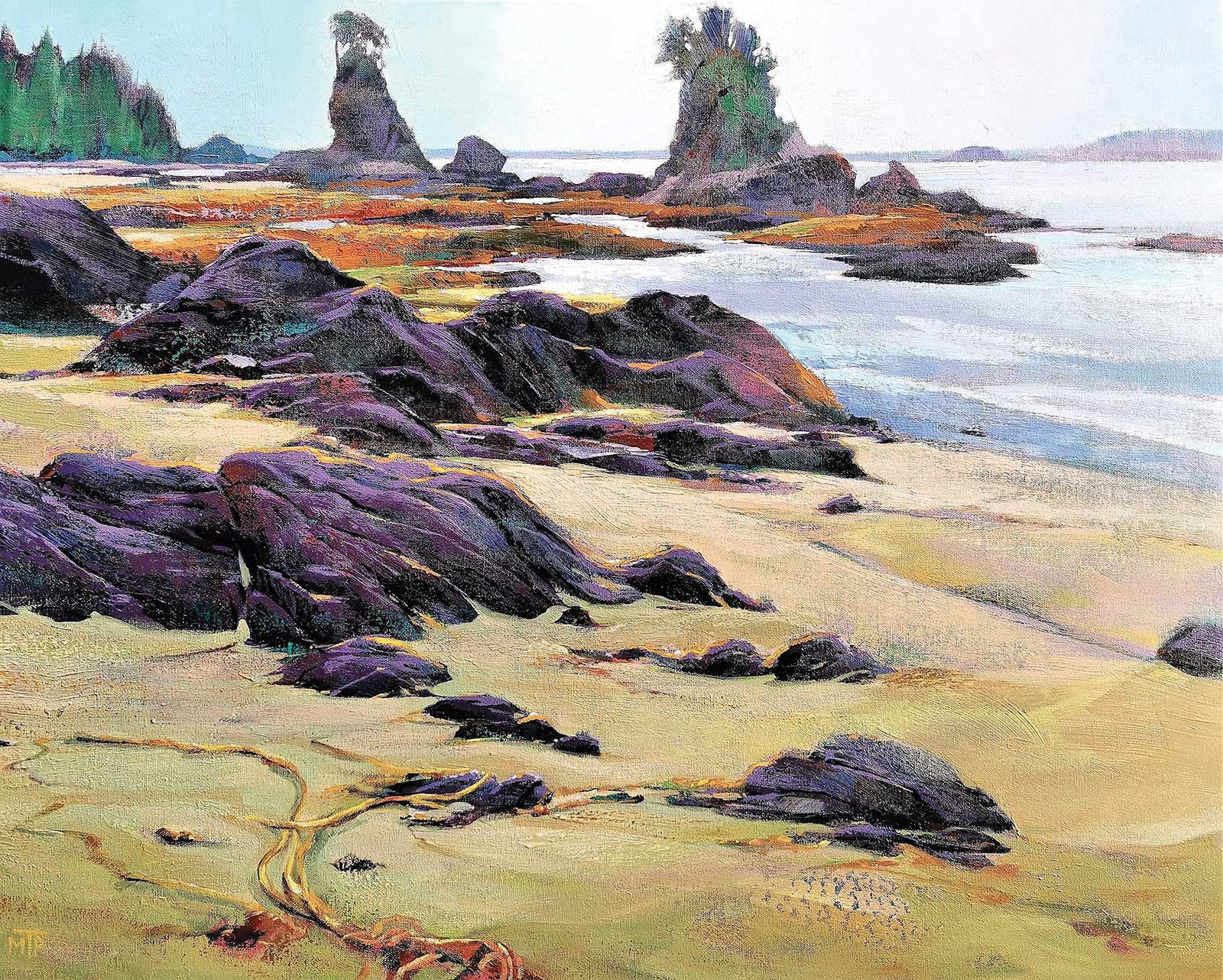
Pacific Patterns, acrylic on canvas, 24 x 30" (60 x 76 cm) This was the first studio painting I made inspired by the Bamfield trip that spurred the entire Coastal Sentinels series. This amazing beach is studded with sea-stacks that seem to be on the lookout for what the future might bring. The sand is strewn by the goodies washed out by the tides. It was a perfect subject matter for my expressive approach.
This process allows for changes until the very end. Most importantly, I find this way of painting conducive to generating ideas that can be tested and abandoned on the fly. I often reach for an unconventional tool to scratch in some interesting marks or add a patch of unexpected, bright color to change the mood of a passage. The overall principle is to employ the expressive approach in order to create a realistic painting. The main reason for this is to keep me on the edge because I can never predict how the painting will unfold. I am always excited to see the outcome of each step, and I have learned not to dwell on it when things take a strange turn. It’s all a part of the fascinating and ever-changing creative process.
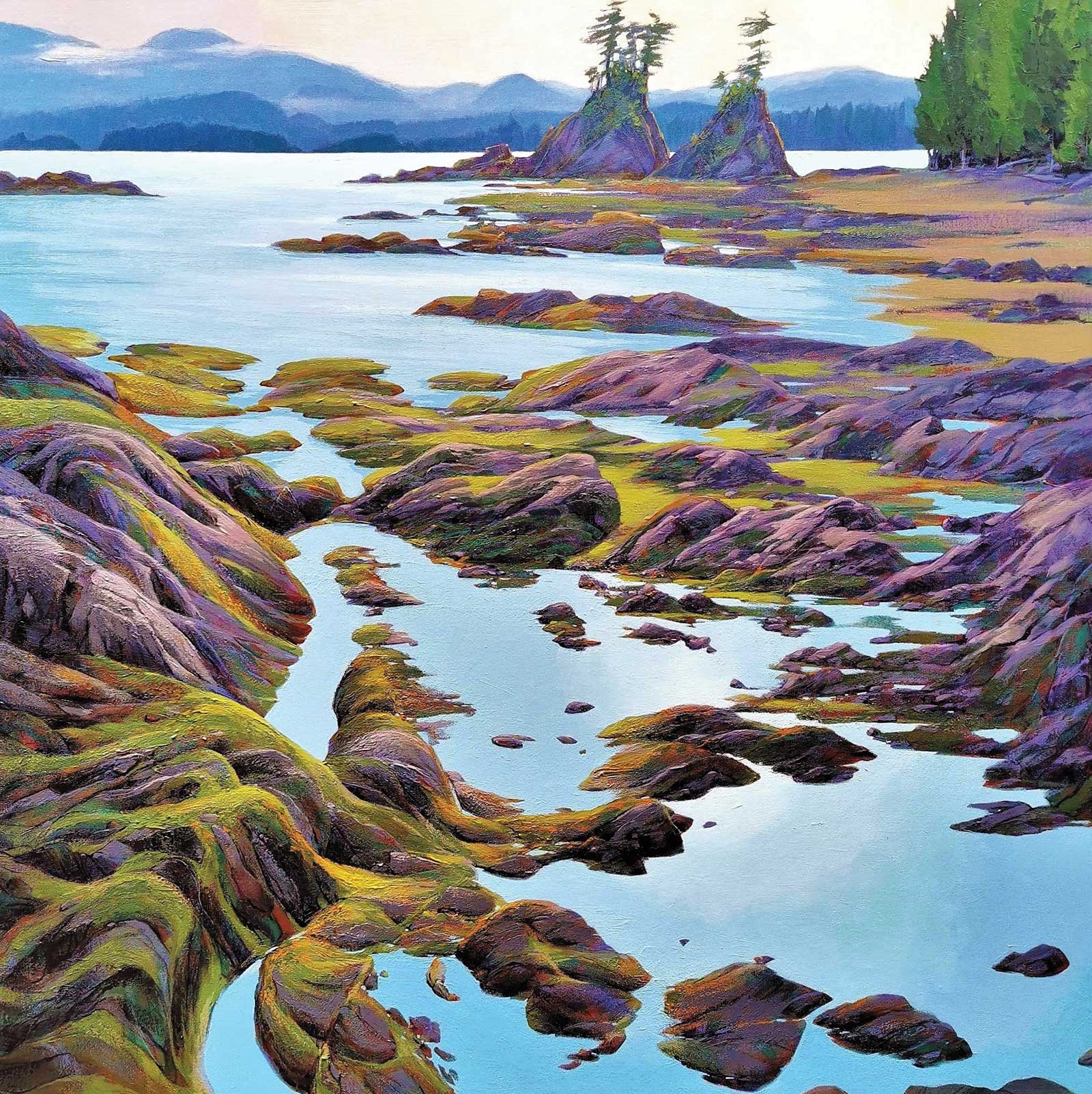
My Art in the Making Coastal Patterns
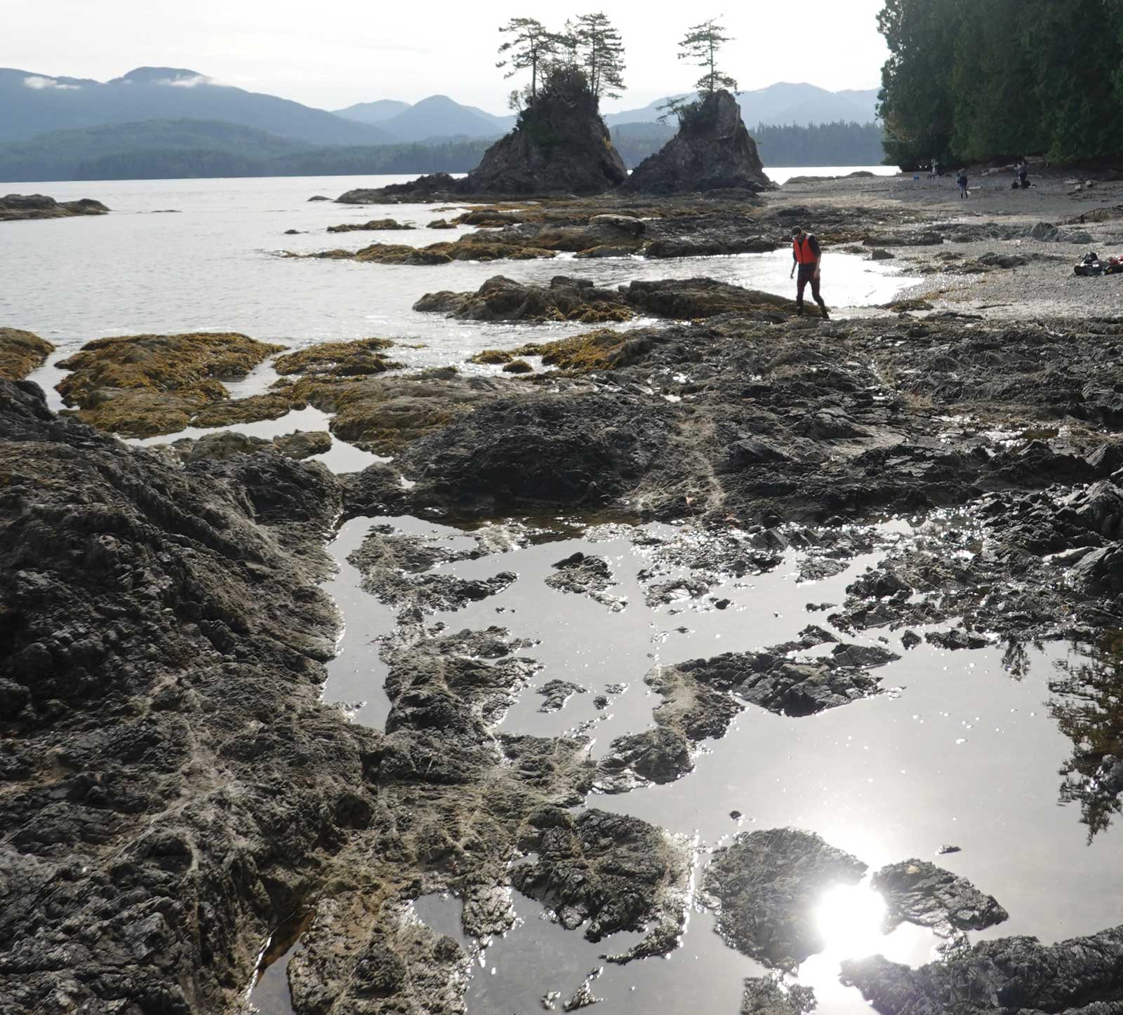
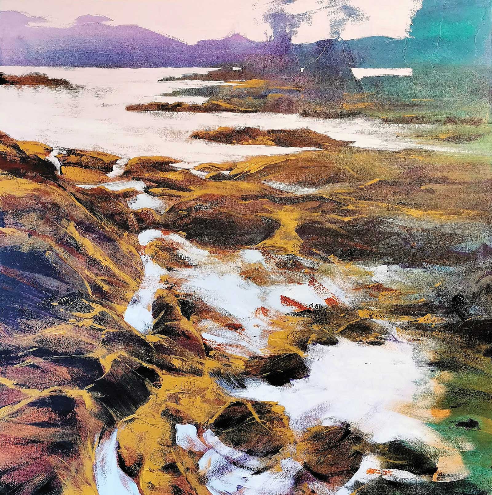
Reference Photo
This painting was inspired by a visit to the Marine Science Centre in Bamfield, British Columbia. I was mesmerized by the patterns of water and land in the glistening light of the rising sun.
 Stage 1
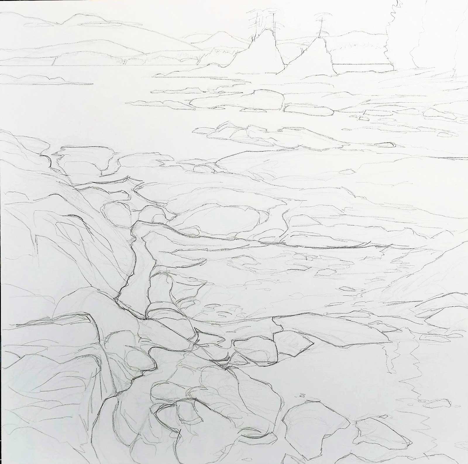
Stage 1 Gestural Drawing
I sketched the composition by looking at my reference photograph and thinking about the beautiful, abstract shapes of interlocking water and rocks. I used a black china marker which is a waxy, water-resistant crayon.
 Stage 2
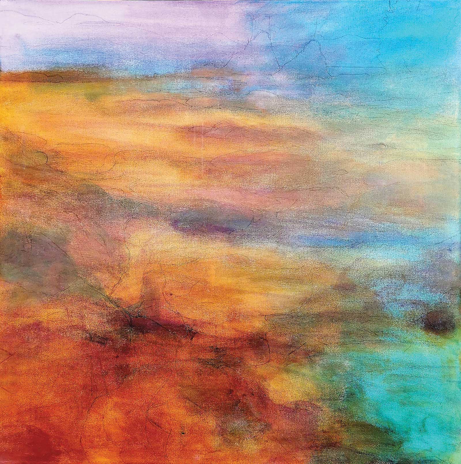
Stage 2 Soft, Multi-color Underpainting
I diluted the acrylic paint with medium and quickly rubbed it onto the canvas with a rag. I used transparent red oxide, dioxazine purple and phthalo green (blue shade).
 Stage 3
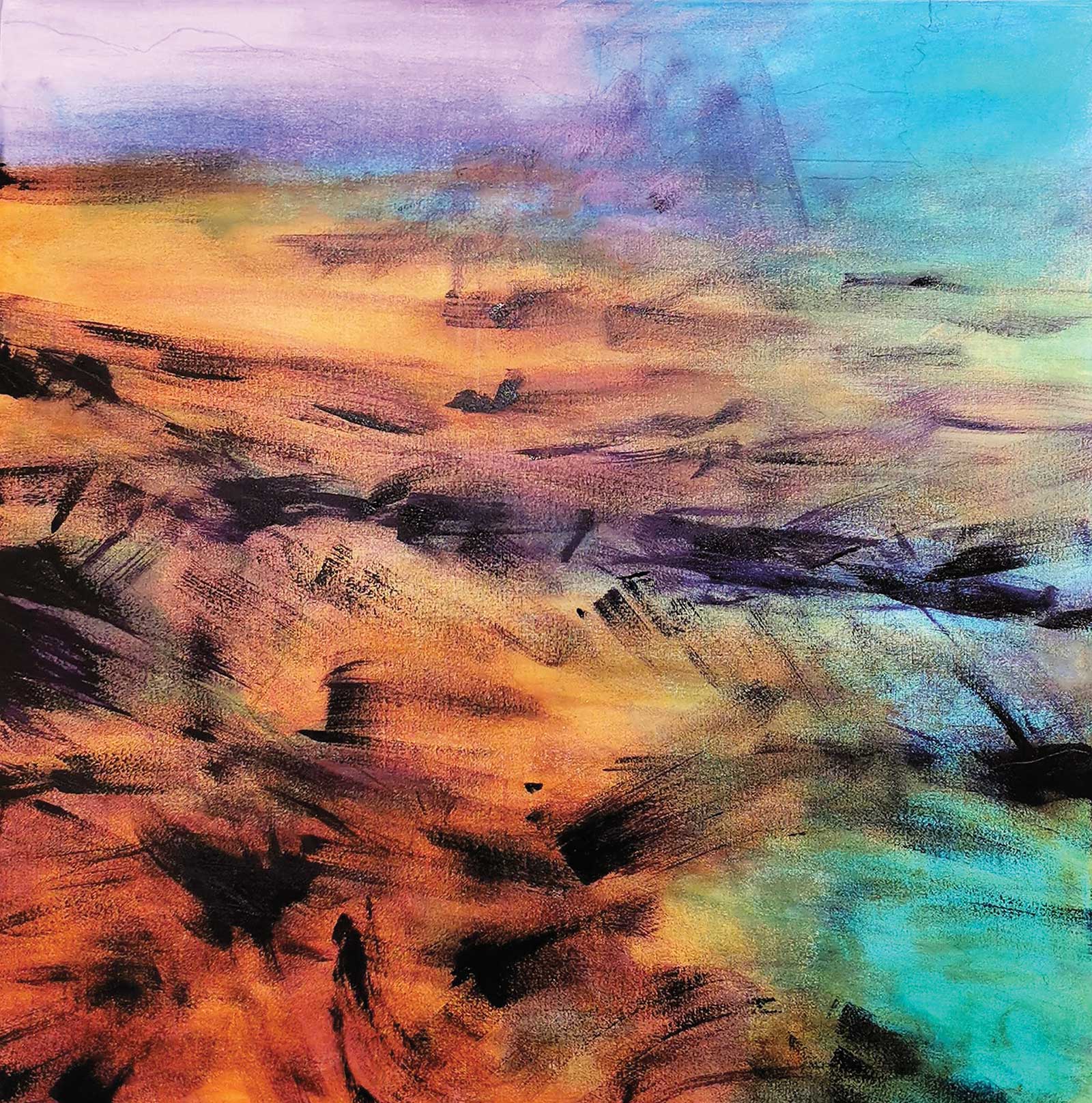
Stage 3 Dark Values and Expressive Patterns
I suggested the pattern of rocks by adding expressive dark marks with dioxazine purple as my darkest dark value. I used a #16 flat brush and a directional dry-brush technique.
 Stage 4
Stage 4 Light Values and Negative Shapes
I used a pale mix of titanium white and dioxazine purple to block in the light areas of the composition, mainly the water and the sky. I wanted to allow for changes down the road so I worked thinly and loosely.
 Stage 5
Stage 5 Middle Values and Texture
I expressively blocked in a pattern of ochre yellow in the rocks to establish middle values while continuing to develop patterns and textures. I used the same #16 flat brush throughout most of the steps.
 Stage 6
Stage 6 Color Temperature
I used a mix of dioxazine purple and titanium white to add cool colors into the rocks. I will keep adjusting the color temperature by adding cool and warm grays in subsequent steps.
 Stage 7
Stage 7 Finalizing the Composition
I used china markers to adjust the final shapes. Some of them were broken up, others slightly reshaped, and some were marked for removal, in which I paint over them with opaque acrylic paint.
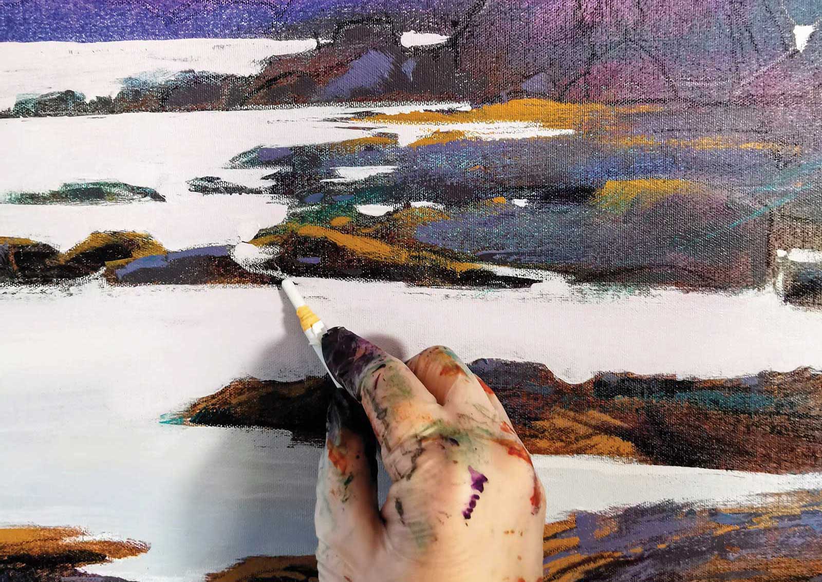
 Stage 8
Stage 8 Value Transition and Blending
The water was painted over with several layers of cerulean blue mixed with titanium white while blending and transitioning from the darker foreground toward the sunlit horizon line.
 Stage 9
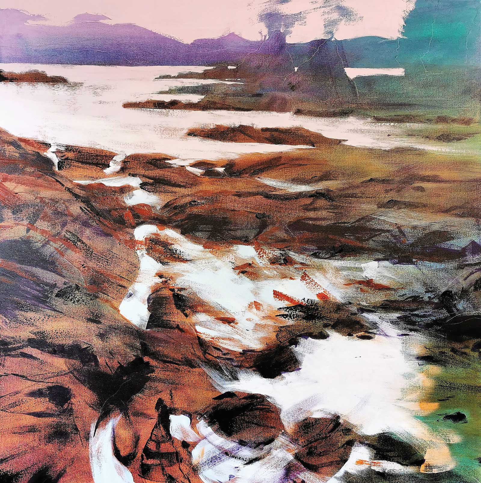
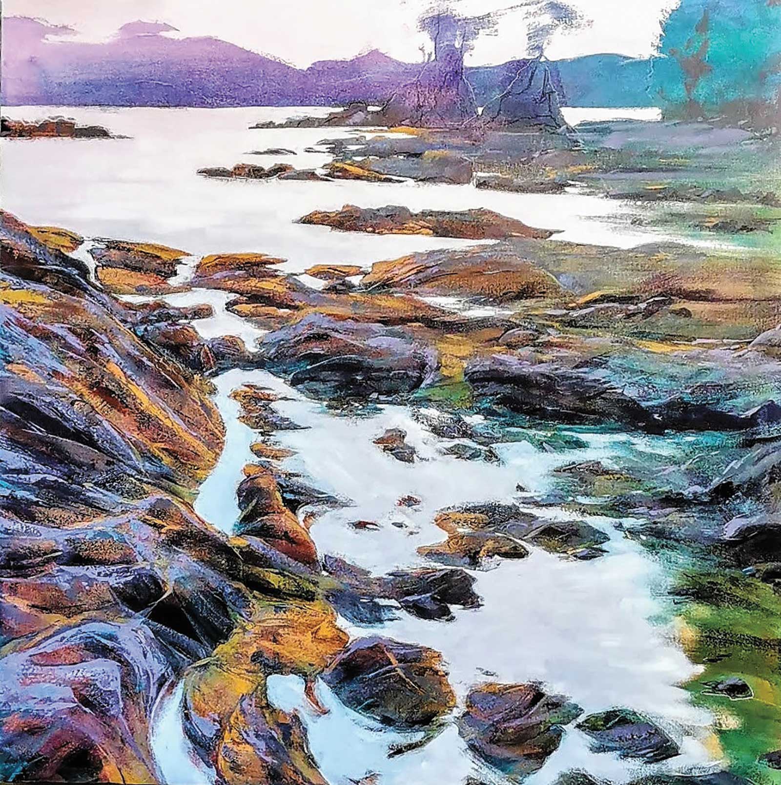
Stage 9 Background and Finishing Touches
Coastal Patterns, acrylic on canvas, 48 x 48" (121 x 121 cm)
I added greens into the trees and rocks, blues into the distant hills, grays into the sand and some sparkly bits throughout the scene. The rocks needed to be adjusted with various tones of gray.
About the Artist
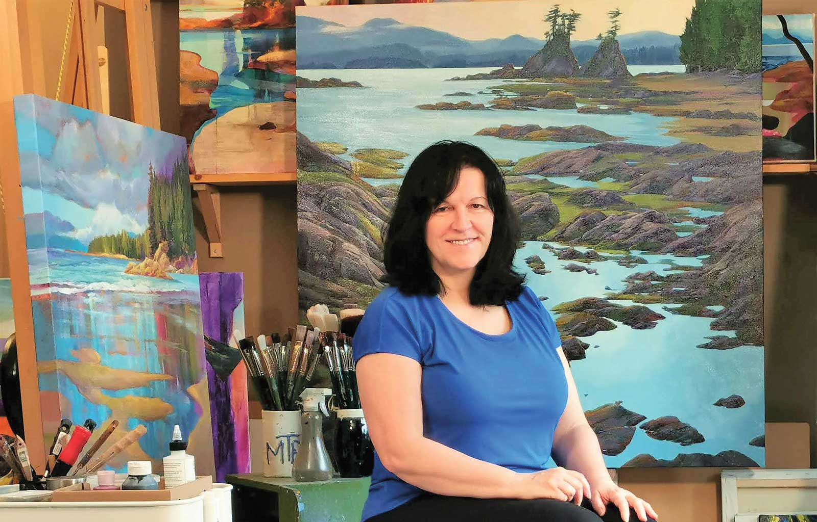 Tatjana Mirkov-Popovicki
Tatjana Mirkov-Popovicki is an award-winning Canadian landscape painter based in Port Moody, near Vancouver, British Columbia. She emigrated from Serbia in 1994 after graduating with a Bachelor of Science in electrical engineering, and subsequently pursued a high-tech career while studying and making art part time. Her accomplishments include awards from national and international competitions, numerous solo exhibitions and participation in curated art shows and plein air events in Canada and the United States.
Mirkov-Popovicki is presently a full-time painter with a passion for the west coast and mountains. She is an appraised artist with the Canada Council for the Arts, as well as a past president, Senior Signature Artist and Honorable Lifetime Member of the Federation of Canadian Artists. Her paintings have been exhibited, collected and represented by fine art galleries since 2005.
Represented by
Mirkov-Popovicki Fine Art, Canada, www.mirkov-popovicki.com
Lando Gallery, Canada, www.landogallery.com