


Through my paintings I aim to highlight the beauty I see in the world around me. I am particularly drawn to the interplay of light and shadow. Light for me transforms a scene from something that is ordinary, to something truly extraordinary. The pursuit of capturing the perfect light keeps me endlessly engaged in my work and practice.
While I don’t favor a particular color palette, color is extremely important to me, as is the design and composition of a piece. When these elements work in perfect harmony, a piece really sings.
Painting for me is a largely intuitive process. Not having any formal art education, my process has come about through a trial-and-error approach. I’ve been working as a full-time, practicing artist for a little over two years now. The learning curve has been steep. Only in the last few months would I say that my painting process has solidified into a consistent approach that I more or less follow for each painting.
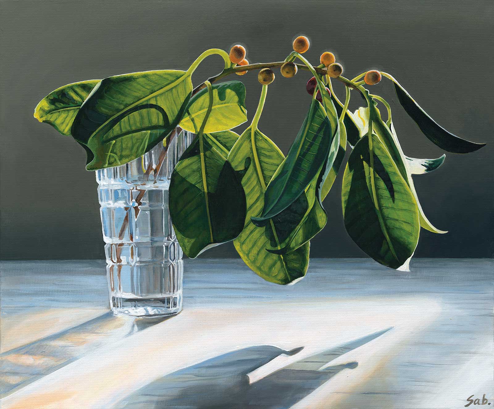
The Golden Hour, acrylic on canvas, 20 x 24" (51 x 61 cm) This painting marked a real turning point in my abilities. It’s a scene I had painted a year and a half earlier, and measuring the progress between this work and my original attempt was incredibly eye opening. This is one of the first works where I established an effective way of achieving a smooth blended background in acrylic paint.
As I’m a busy mum with a young family, my painting usually happens between 8 p.m. and midnight most nights. For this reason, working from photographs is an essential part of my practice.
Compositionally, when I stage my still life work, I will play around with lots of different possibilities. I love using shadows as visual tools, and the location of a shadow can play a vital role in painting, and in creating harmony, balance and drama. When staging a particular scene I may take hundreds of photos of the same subject, testing different ideas and combinations. I scrutinize these images until I land on one (or a combination of two) for my final reference. The reference largely dictates the composition, but I may still play around with the colors and tone to create a final work I am happy with.
I paint in acrylics for the practicality and ease of clean up. I find that the fast-drying property of acrylic is both the best and worst aspect of the medium. When layering up the paint it is hugely beneficial, however, when trying to achieve a smooth blended background, the drying time becomes a major obstacle. I’ve discovered with time and focus there are workarounds for everything.
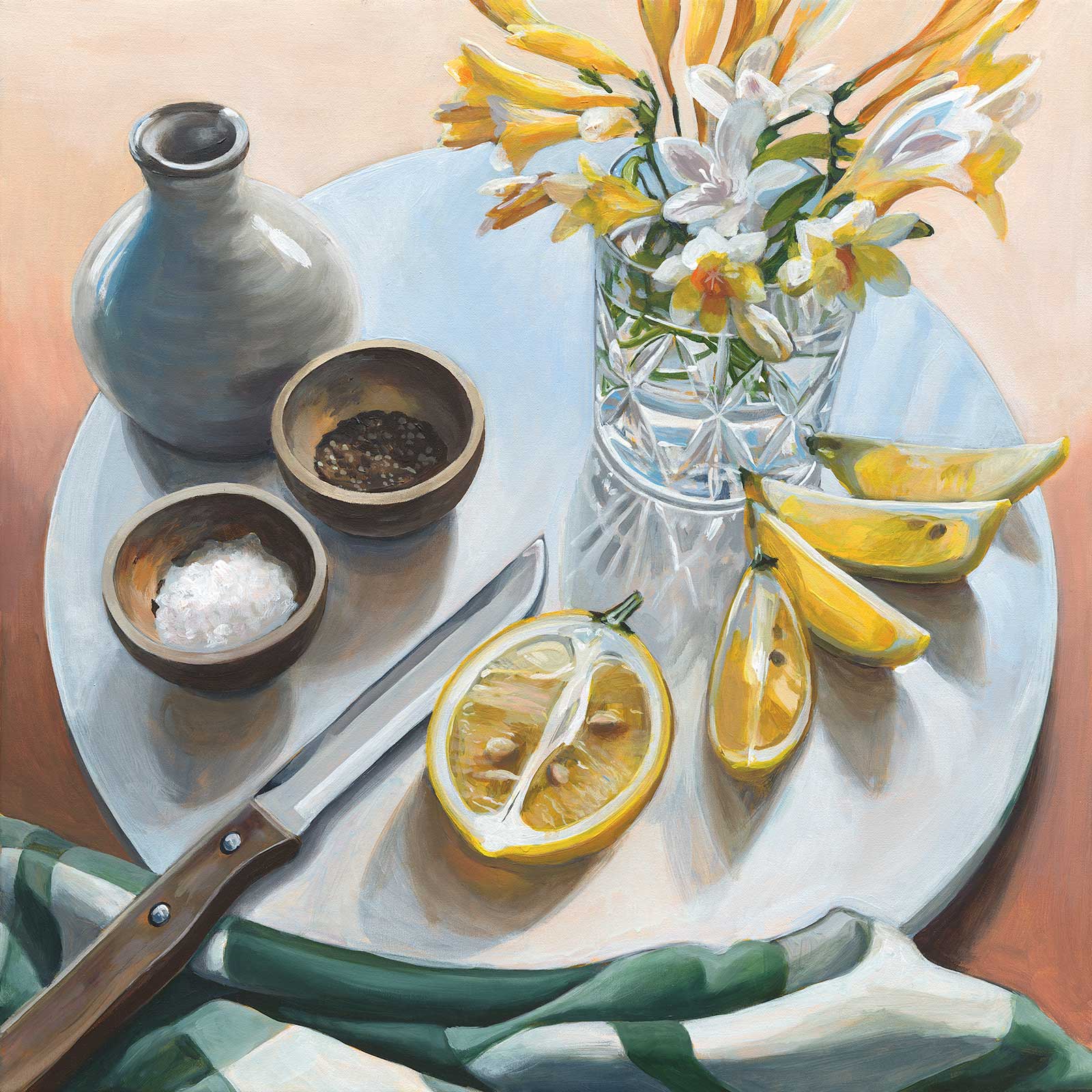
Freesias and Lemons, acrylic on canvas, 19½ x 19½" (50 x 50 cm) One of my most popular paintings with collectors, Freesias and Lemons came about particularly quickly. It’s a work where I leaned more toward a pleasing design than a realistic interpretation of the subject. I intended to lay down the pink background tone, and then layer up some timber detail on top, ending up with a warm timber grain in the final piece. However, the block color just worked, so I stopped myself from adding anything more.
The majority of my effort in painting is spent perfecting color and tone. As acrylics are quite thin, even when using professional quality paints, I find it necessary to layer the paint in multiple layers to get the depth of color and intensity that I like. I work quickly, building up a clear image of the final work with as much speed as possible. This allows me to make judgment calls on what elements are working, and which aren’t without spending too much time on the little details. My approach is not as methodical as one might think when looking at the finished product. I do jump around when working to whichever area calls my attention. As time goes on, I’m learning to trust my instincts more when approaching the painting process.
Every painting teaches me something new, and my process and thinking constantly evolves with these new experiences. I believe there is no substitute for experience, and nothing beats the lessons you can learn from consistent and concerted effort. Painting is a discipline, and when approached as such, the capacity for learning and improvement are endless.
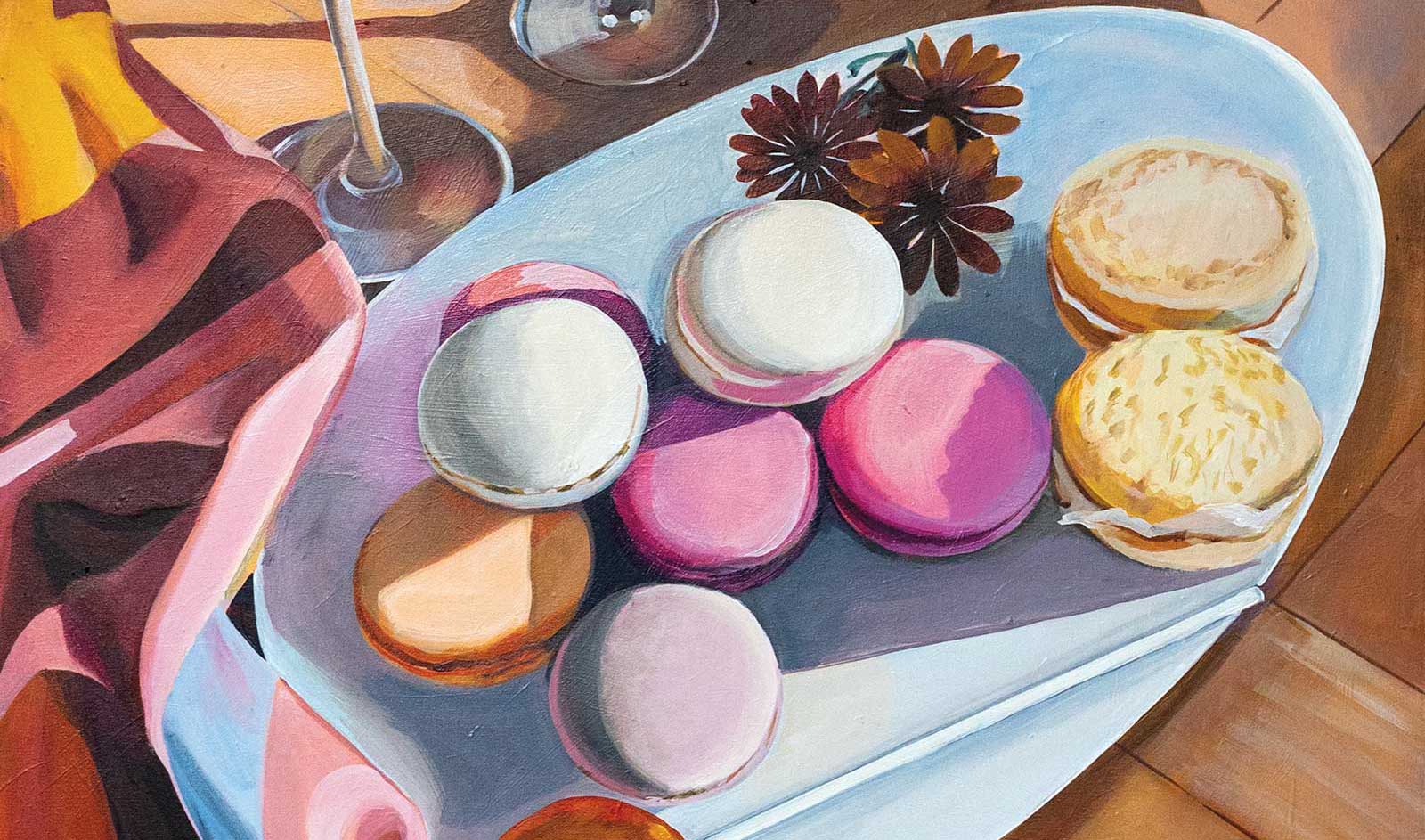
My Art in the Making Sweet Treats
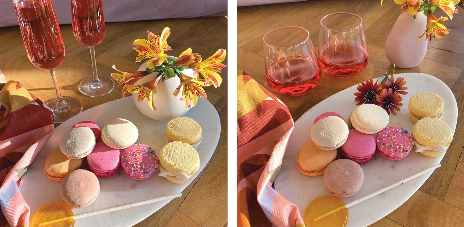 Photo references
For this painting I am working from two main reference images. I loved the light in one of these images, but preferred the color in the fabric and the angle of the main platter in the second image. There were additional images from this sequence I consulted when working through some of the details for the flowers and the vase.
 Stage 1
Stage 1 Tone the Canvas
The ground color changes for each work. For this painting I chose Australian sienna to bring out the warm tones. I mix one part paint to one part fast-drying medium, giving the canvas a uniform coat.
 Stage 2
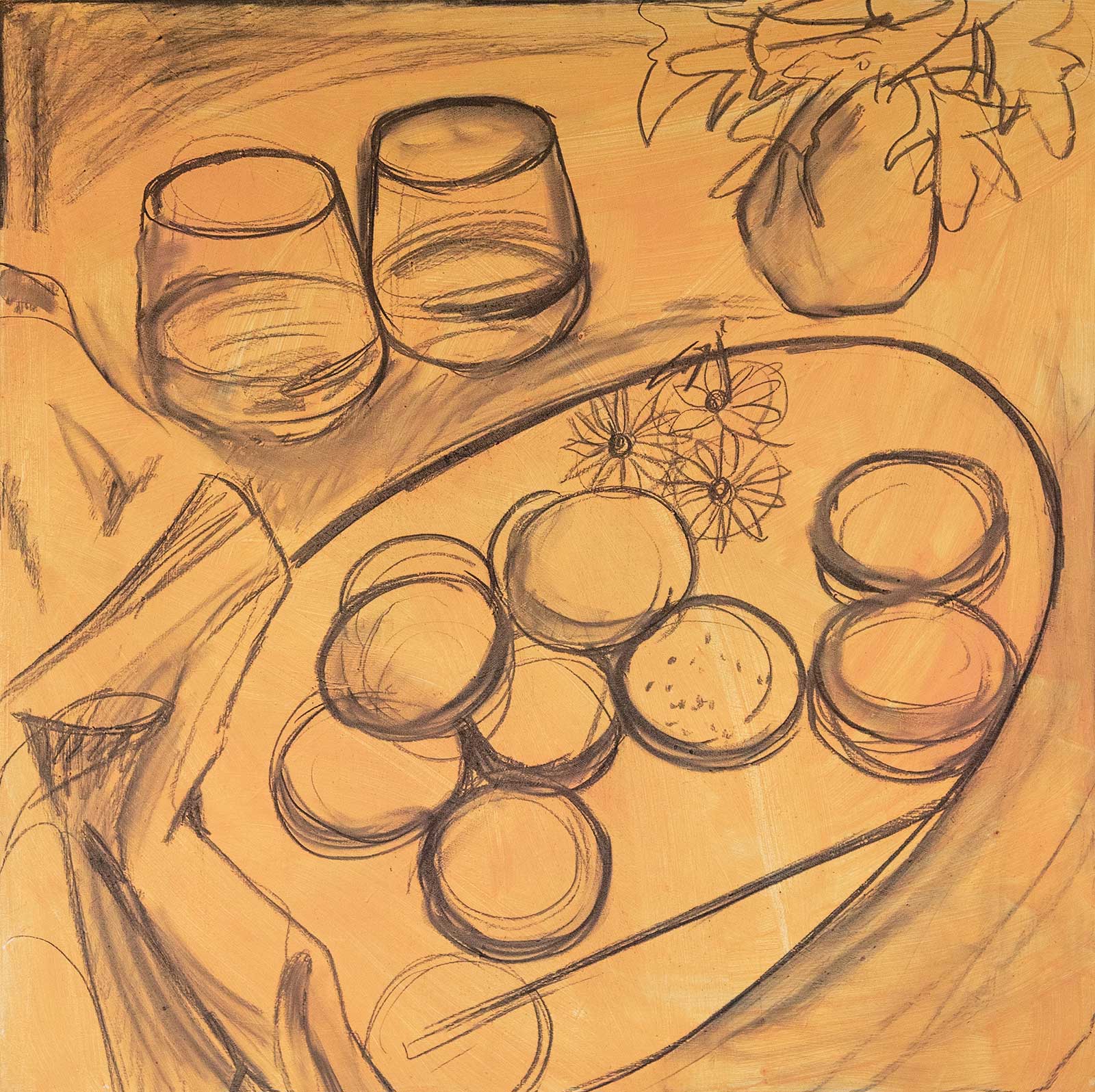
Stage 2 Charcoal Drawing
Mapping out the large shapes first, I complete a rough underdrawing using willow charcoal. The ground color and the messy charcoal sketch help take away any anxiety about starting on a clean white canvas.
My Design and Composition Tactics
Establish your big picture items quickly before getting bogged down in detail. Detail work can commence once you’re satisfied the overall composition and layout are working and shouldn’t require any major edits.
Don’t be afraid to change things that aren’t working. Compositional issues will remain and overshadow the work, no matter how much they are dressed up.
Work your colors up in layers. Even the best quality acrylic paints are thin and will require multiple applications to get a good consistency and depth of color. Accuracy isn’t essential at the beginning, as each area will likely need multiple coats for realistic work. Our perception of color is very much affected by what is around it, so getting a quick base layer down on everything will help you make more informed decisions with your subsequent color mixing. Colored pencils that use wax as a binder adhere to the paper much better than pencils that use oil as a binder.
Use mediums to your advantage towards the end of your painting to make minor adjustments in temperature without repainting large sections. A series of thin glazes at the end can create cohesion in the painting and add to color harmony.
 Stage 3
Stage 3 Fixing Layer
I rough in the colors and tones, avoiding unnecessary detail at this stage. This first layer beds down the charcoal. I work quickly and remain as unfussy as possible at this stage.
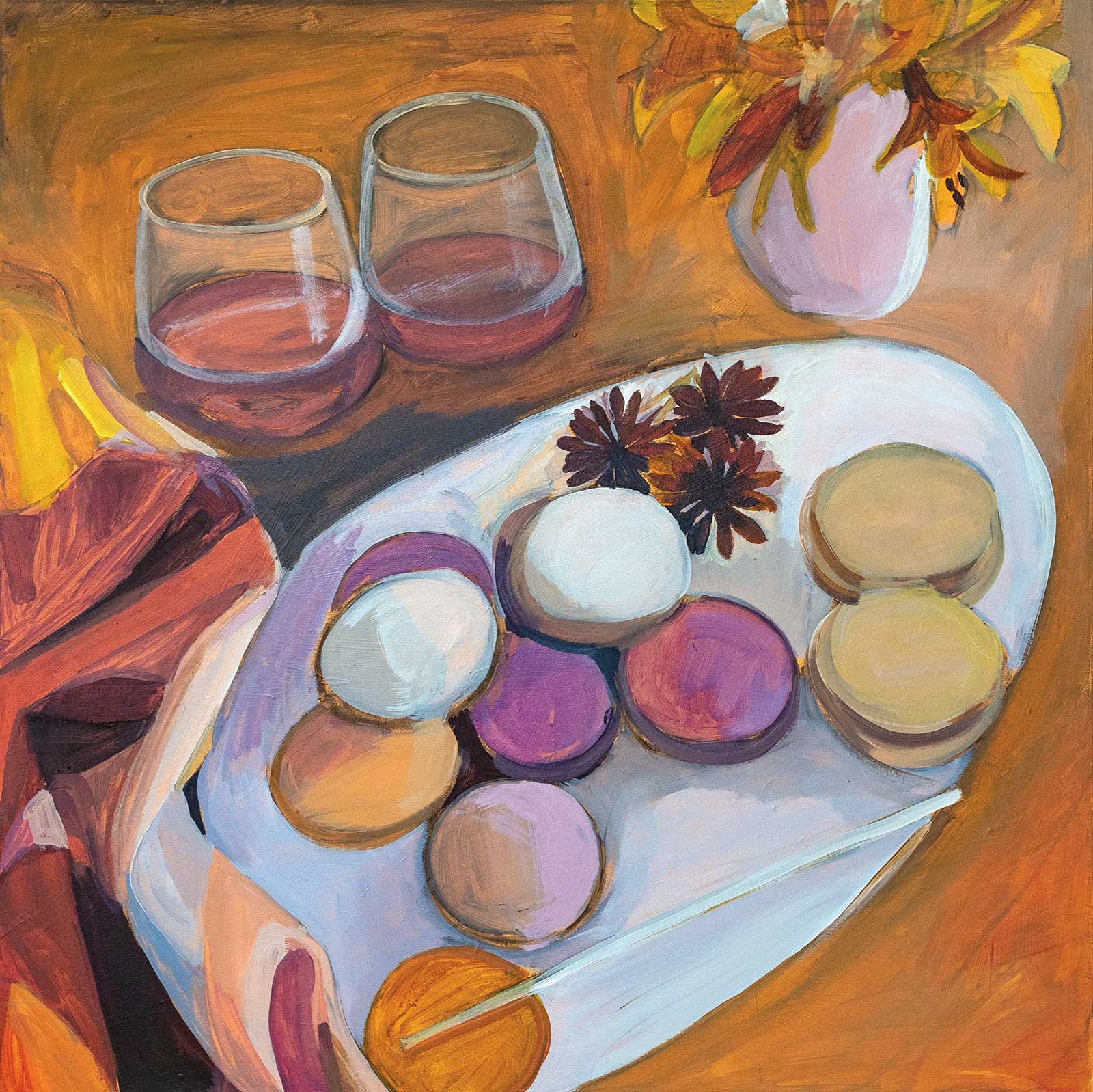
 Stage 4
Stage 4 Solidifying Color
This is where I slow down and perfect my block in. I start to push and pull the colors to reflect a more accurate portrayal of the subject. I often rely on complementary color schemes in my work.
 Stage 5
Stage 5 Compositional Corrections
The image was lacking balance. Most of the activity was in the bottom left corner. I altered the top left corner to activate this space. I swap the low set glasses for champagne flutes to add drama.
 Stage 6
Stage 6 Adding Detail
The composition feels more balanced and interesting. I build up color and detail with each pass. I spend time perfecting individual areas, adding the smaller bits of information that build up the painting’s realism.
 Stage 7
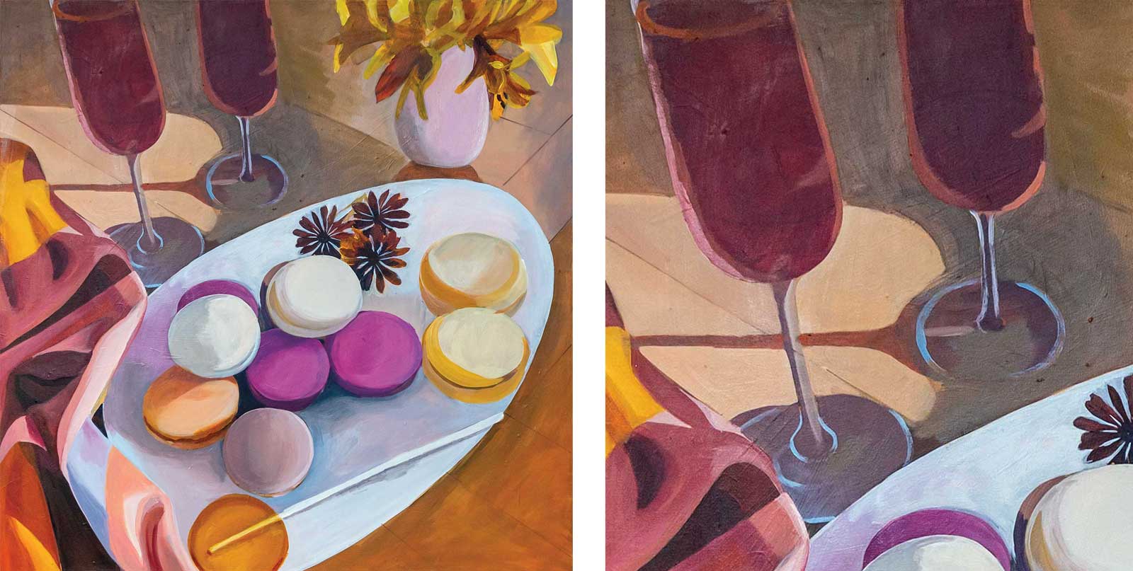
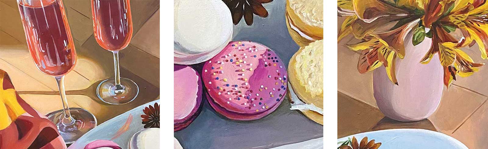
Stage 7 More Detail and Highlights
Focusing primarily on the glasses and the flowers, I add in more of the finer details. I also add sprinkles to the right pink macaroon. I lighten some of the areas that feel too dark.
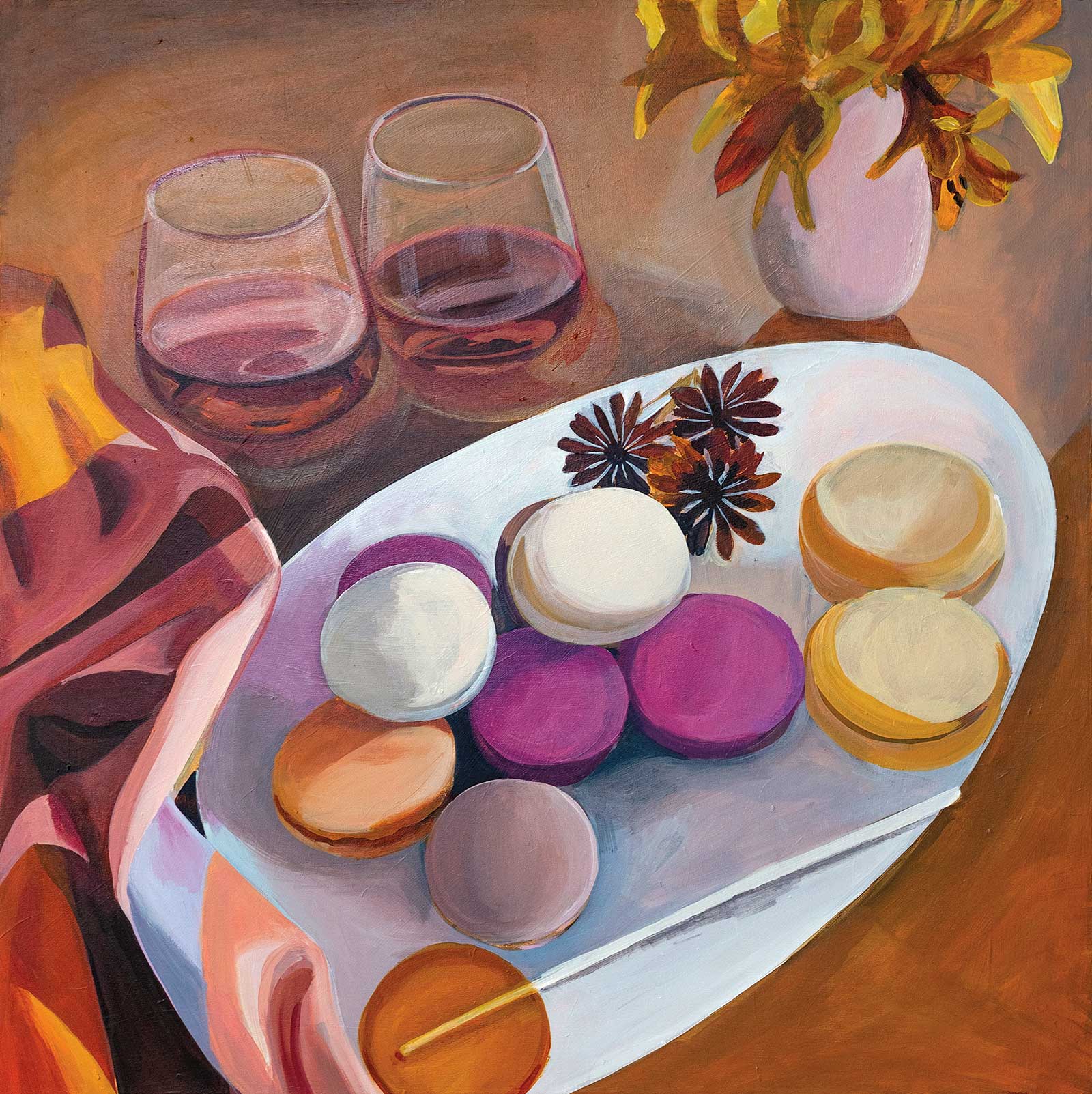
 Stage 8
Stage 8 Final Color Adjustments
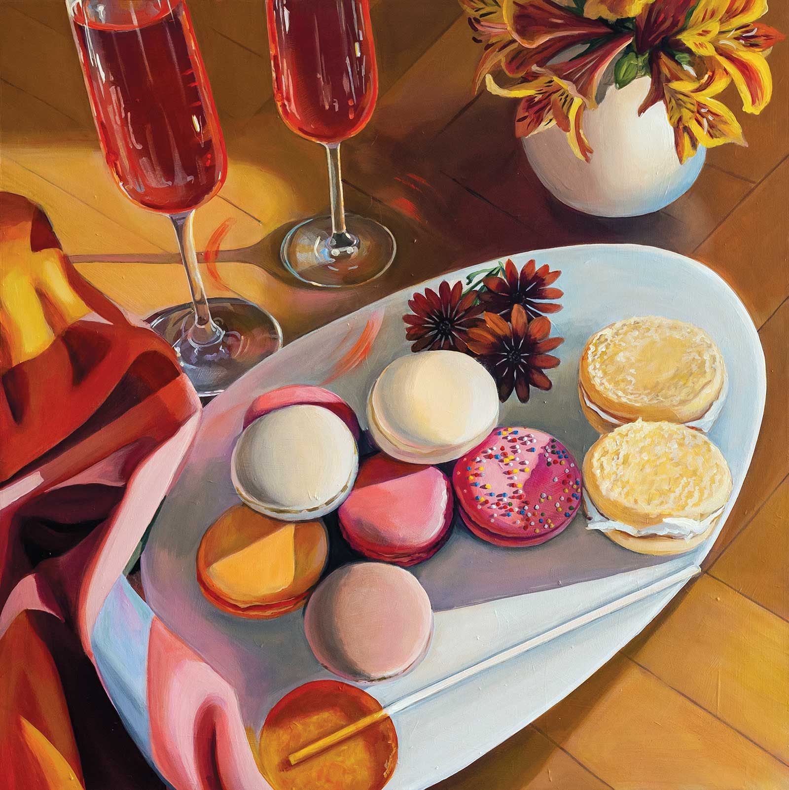
Sweet Treats, acrylic on stretched ultra-fine canvas, 31½ x 31½" (80 x 80 cm)
I turn my attention back to the painting as a whole. I realize the work is too cold and needs to be warmed up. Using thin glazes of color I move both my lights and darks closer to the middle tonal ranges, and I make the final decision to alter the vase on the top right.
About the Artist
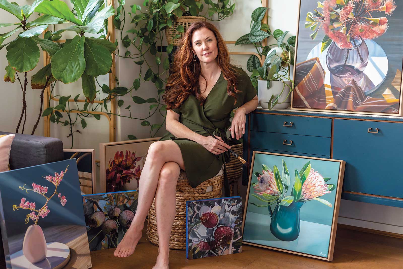 Sarah Abbott
Sarah Abbott is a West Australian artist that works out of her home studio in Fremantle. Hailing from a background in interior design, it was only in the last few years that Abbott began painting again after a 15-year hiatus. Dubbed “one to watch” by Bluethumb, Australia’s largest online gallery in 2020 after listing her first work for sale earlier in that year, Abbott has quickly established a loyal following of collectors both in Australia and abroad.
Her work has been featured in the popular Australian interior design magazine Inside Out, and she was a finalist in the Bluethumb art prize in 2021. Her work is available online through her website, or with gallery partners including The Toowoomba Gallery in Queensland, and Satch & Co., in New South Wales.
Represented by
The Toowoomba Gallery, Australia, www.thetoowoombagallery.com
Satch & Co., Australia, 139 Albury St, Holbrook, NSW www.satchandco.com.au
Contact at
www.sarahabbott.art