


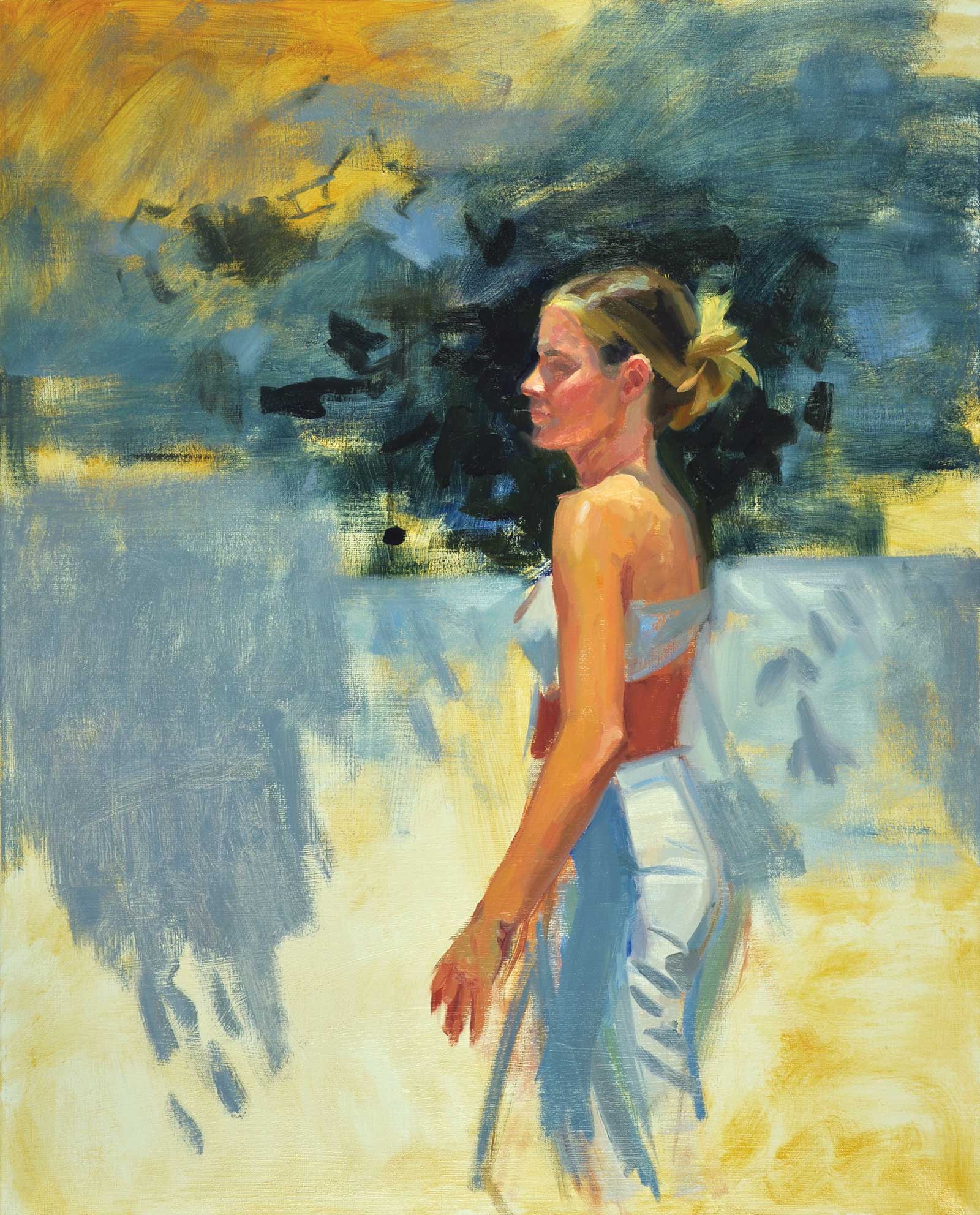
Although I must have painted hundreds of portraits and figures, I realize that it is the light that falls on the subjects, and not the subjects themselves, that inspires me. I have come to embrace landscape painting, and I equally love the experience of plein air painting, but the process is more enjoyable than the result. I am always humbled by it, as one should be.
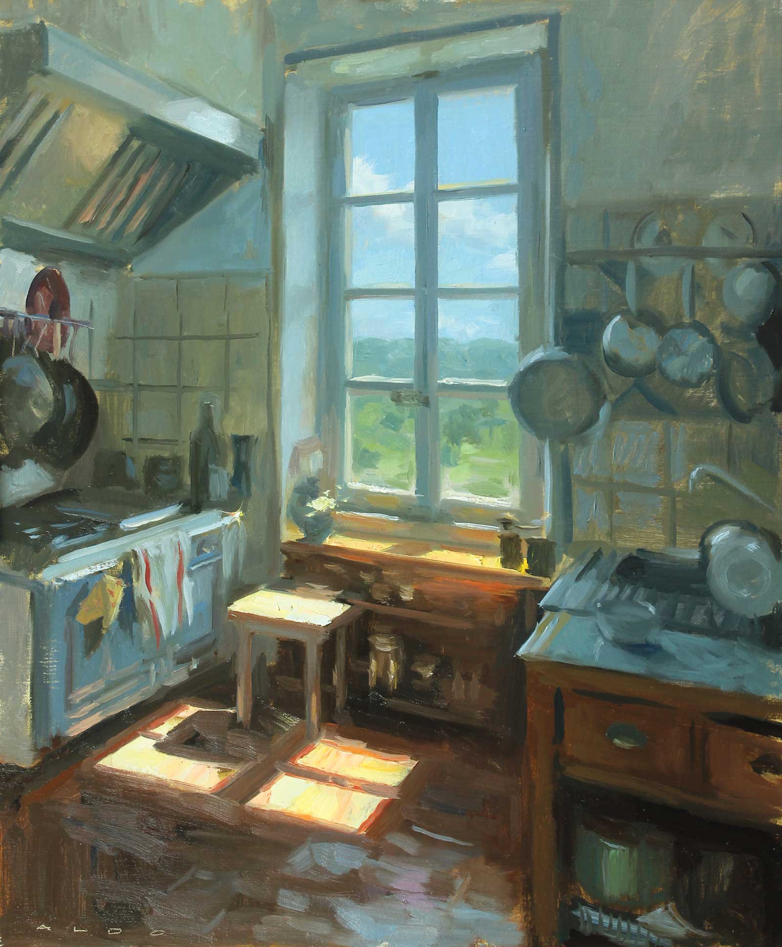
Domaine d’Audabiac, oil, 23½ x 19½" (60 x 50 cm) This was the kitchen in the main house at Domaine d’Audabiac during a painting workshop I took in May 2022, near Uzès in Southern France. It was painted in two sessions of not more than two hours each. It had to be painted between and 12:30 and 2:30 p.m. as the light shifts so quickly. What I saw with a quick glance is what I painted; I didn’t linger one moment too long on the subject itself. It was all done from my first impression, and there is something to be learned from that.
So, with this in mind, my subject is light. I realize through taking workshops and demonstrating I have cultivated, sometimes unconsciously, an understanding of how light works. This is fundamental to painting well. There is no light without shadow, the two combine to create our visual world.
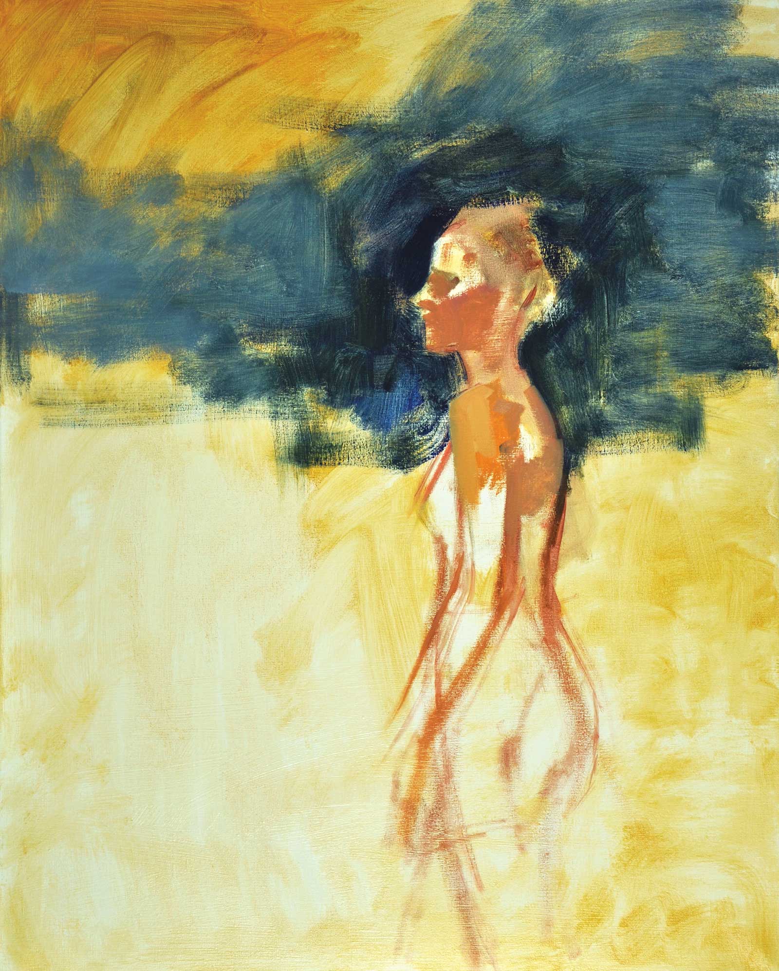
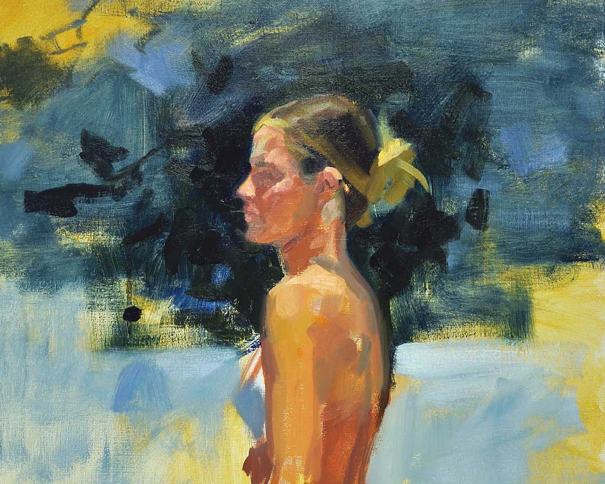
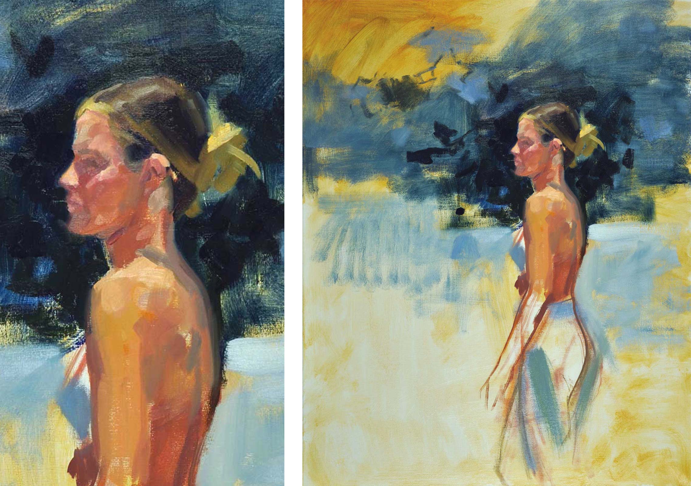
To start to paint the appearance of light, one must start with values, and they must be observed correctly with the appropriate edges. Color merely augments this effect. When I speak about value, from light to dark, we have only nine different values. If you separate them into 10—an easier number—the differences are too small. In nature, we have perhaps a hundred values. So, we can’t paint anywhere near them all. What I have learnt from the masters such as Sargent, Munnings and Stanhope Forbes, is that one also needs to limit the values one uses. Sargent used five or less.
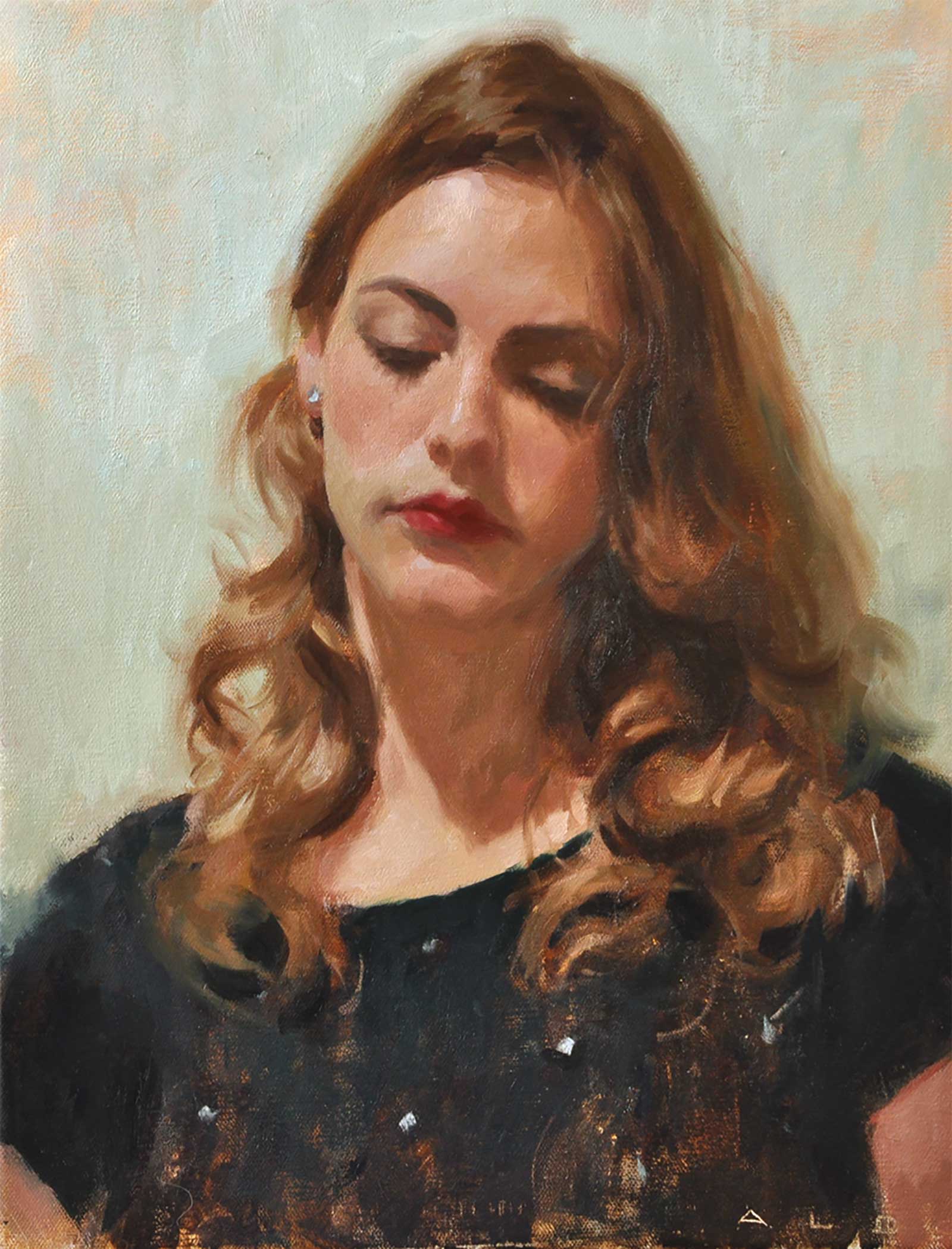
Gilda, oil on canvas, 19½ x 15¾" (50 x 40 cm) This is my daughter from many years ago, when I was painting in a retro theme. I had bought some retro clothes and set up Rebecca as a 1940s character with the makeup and hairstyle to match. This is from a photoshoot under natural light, and not painted from life. The title comes from a Rita Hayworth film.
This achieves a simplicity of design and value composition. One needs also to understand that each value marks a different plane in a form like a portrait. The values in a well-observed landscape would show that darks become lighter when they recede. This is because we see the distant horizon through a semi-transparent atmosphere. We call this atmospheric perspective.
One sees the world in all its details, it’s the way the eye focuses. We need as artists to see less, but at the same time, the essential. I get around this problem by squinting and looking at my subject in a slightly blurred way. This gives me the simple structure that I need to build on.
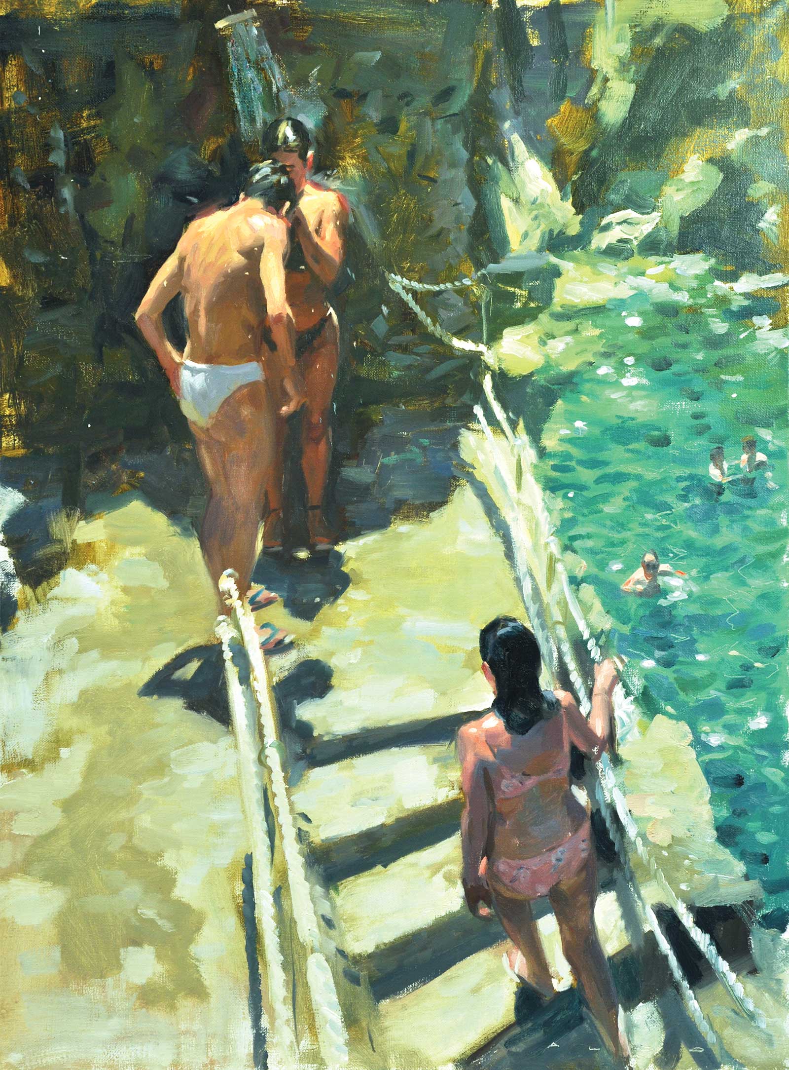
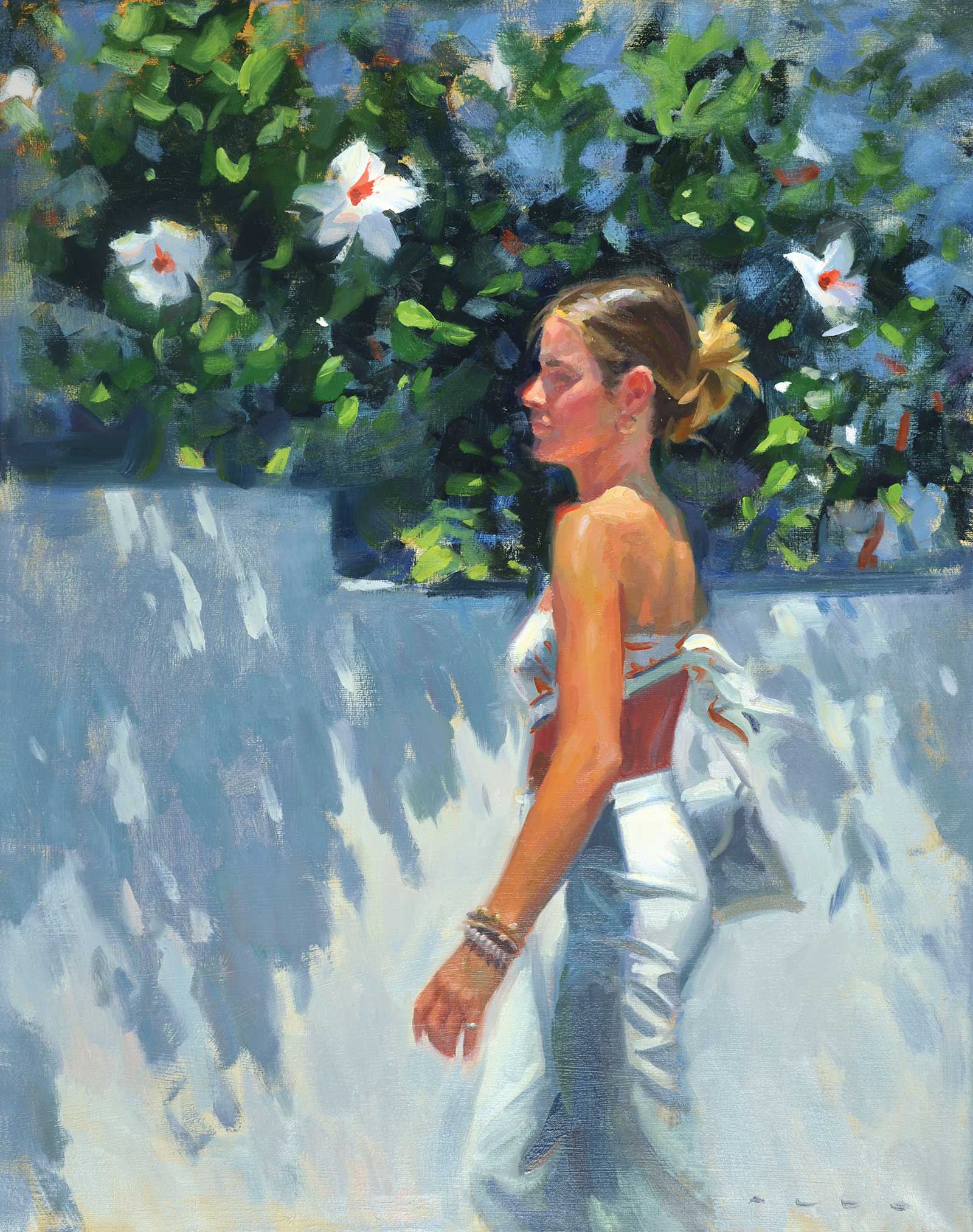
Amalfi Creek, oil on canvas, 32 x 23½" (81 x 60 cm) Amalfi Creek, as the title suggests, was from a holiday or rather, honeymoon on the Amalfi Coast in Italy. I only brought watercolors with me and painted 15 to 20 studies. The high perspective and the plunging point of view is what I loved, and that turquoise water! Inspiration comes from being open to all possibilities, whether it is seen and photographed, painted or invented.
My palette for outdoor work is mainly primary colors, my indoor interiors are more restricted. Like my values, I look for a limited color theme, using warms and cools in juxtaposition, and I push the chroma in certain areas to achieve this effect of light.
I am, as an artist, the sum of my experiences, personality and the artists that have inspired me. I have borrowed this pushing of light from Sorolla, the economy of brushwork from Sargent and Zorn.
My recent work explores color more deeply. I look for natural complementaries that exist in nature and endeavor to bring them out in my paintings. Knowing that when we look at a red square for a short amount of time, then look at a white space, we will see a green square. This is a valuable insight into how the eye works.
My process of painting itself is to start off with some light tone of color on the canvas that relates to my color theme, and so I can leave parts showing through at the end. I never draw it out beforehand, but work as I go and with the brush, preferring to paint the shapes of color that I see and comparing them to each other, rather than line drawing. I paint values, shapes, color and then the drawing—in that order—most of the time. I aim for a value key that dominates, either light, medium or dark. A value theme adds mood and ambiance.
My Art in the Making Lily-Orange
 Study
Study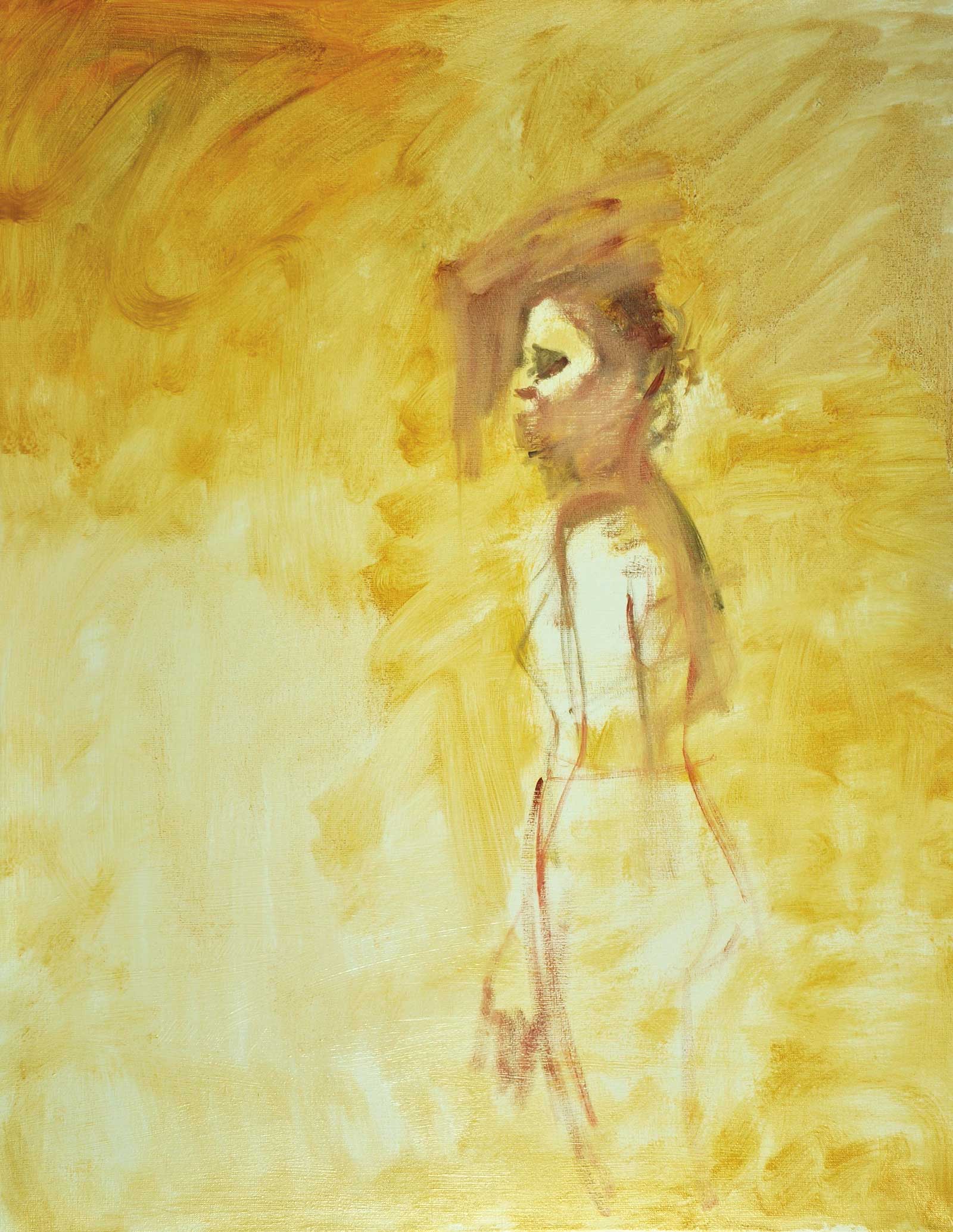 Stage1
Stage 1 Toning the Canvas
I start with toning the canvas with a yellow ochre and cadmium orange diluted with a little Gamsol. I begin the placement of my subject, a few lines to guide me, then I start to feel my way in, starting with the head. And a little alizarin and a touch of ultramarine blue to scrub in the shadow of the face.
 Stage 2
Stage 2 Using Study Painting as Guide
Using my reference painting as a guide, I play around with some arm positions, blocking in more color thinly with ochre and orange. I want to see how this works with this dark ultramarine, cadmium yellow and alizarin crimson mixture. I am looking at value and color harmony.
 Stage 3
Stage 3 Blocking in Blues
With a large size 12 hog brush, I am blocking in some blues, both dark and light, that contrast the orange figure. The planes of the face are blocked in with color with a touch of medium, starting with the light and shadow. I start normally, with light and shadow, looking for early color temperatures in the face. I’m trying a different leg position that feels natural.
 Stage 4
Stage 4 Refining Face and Body
I am looking to place some orange lilies in this composition to lead the eye around the painting; here you can see the dark marks in the top left. There is no repetition in nature, so I want them to be different sizes and shapes. I’m refining the face and body, with appropriate color values and edges. For the hair I use ultramarine, cadmium red light and ochre.
 Stage 5
Stage 5 Mid Values
The figure is looking more natural now. The values of the arm, body and face are carefully observed so that I have the feel of a round arm, and the colors become cooler and less chromatic on the edges. The reflected light on the chin is mainly a change in color temperature and little difference in value. The warmer light area on the trapezius contrasts with the cooler shadow temperature. Most of the fundamentals are there. The mid value key is the direction I am taking here. This means the major part of the surface area is occupied by a mid value.
 Stage 6
Stage 6 Finished Artwork
Lily-Orange, oil on canvas, 36 x 28" (92 x 71 cm)
There is only an hour’s work between stage 5 and stage 6, and it’s mainly blocking in the vegetation with greens that are slightly blue/violet in temperature with a large brush. The light of the lilies are painted in titanium white and yellow; ultramarine, alizarin and orange were used for the stamen. The edges of these flowers are painted with a large brush of dark ultramarine/blue and cadmium yellow and alizarin. The white wall is also blocked in in a cool white, leaving traces of the warm yellow tint showing through. Refining of the hands face are made with economy. The orange/blue color theme dominates.
About the Artist
 Aldo Balding
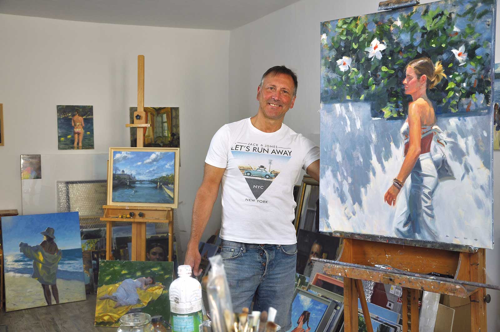
Aldo Balding was born and raised in the United Kingdom and currently lives in the South of France. He started off his career as an illustrator in London before moving to France to become a full-time artist. He is represented by a number of galleries around the world, including the United Kingdom, Ireland, the United States, France and South Africa. Galleries include Thompson’s Galleries, Anagama Galerie, Galerie en Ré, The Whitethorn Gallery, Christopher Moller Gallery and Waterhouse Gallery.
Balding considers himself a tonalist painter who paints in an alla prima style, though color is the tool he employs to influence harmony and mood. Painting a variety of subject matter, he takes workshops in France every year, and demonstrates regularly to other students. His inspiration is light, and his ideas and subject matter can originate from something he has seen—a village road, a man in a café, a woman crossing a street, or it can be an idea he has set up, with a model. He paints regularly from life.