


I fell in love with painting glass after completing my first still life that included a glass bowl full of apples. I got lost in all of the colors and shapes that fit together like an abstract puzzle up close, but from a distance a highly detailed painting emerged. Initially I drew from childhood memories, and a series of bottle and jar paintings were the result. My works were inspired from summers with my grandmother canning in Ball jars. My lightbulb series began after learning that incandescent bulbs were in jeopardy of being banned due to government phase out programs. My teapot series started shortly after our move from the United States to Japan. I began collecting glass teapots and incorporating items from Asia in my compositions. A constant theme running through all of my series were glass objects.
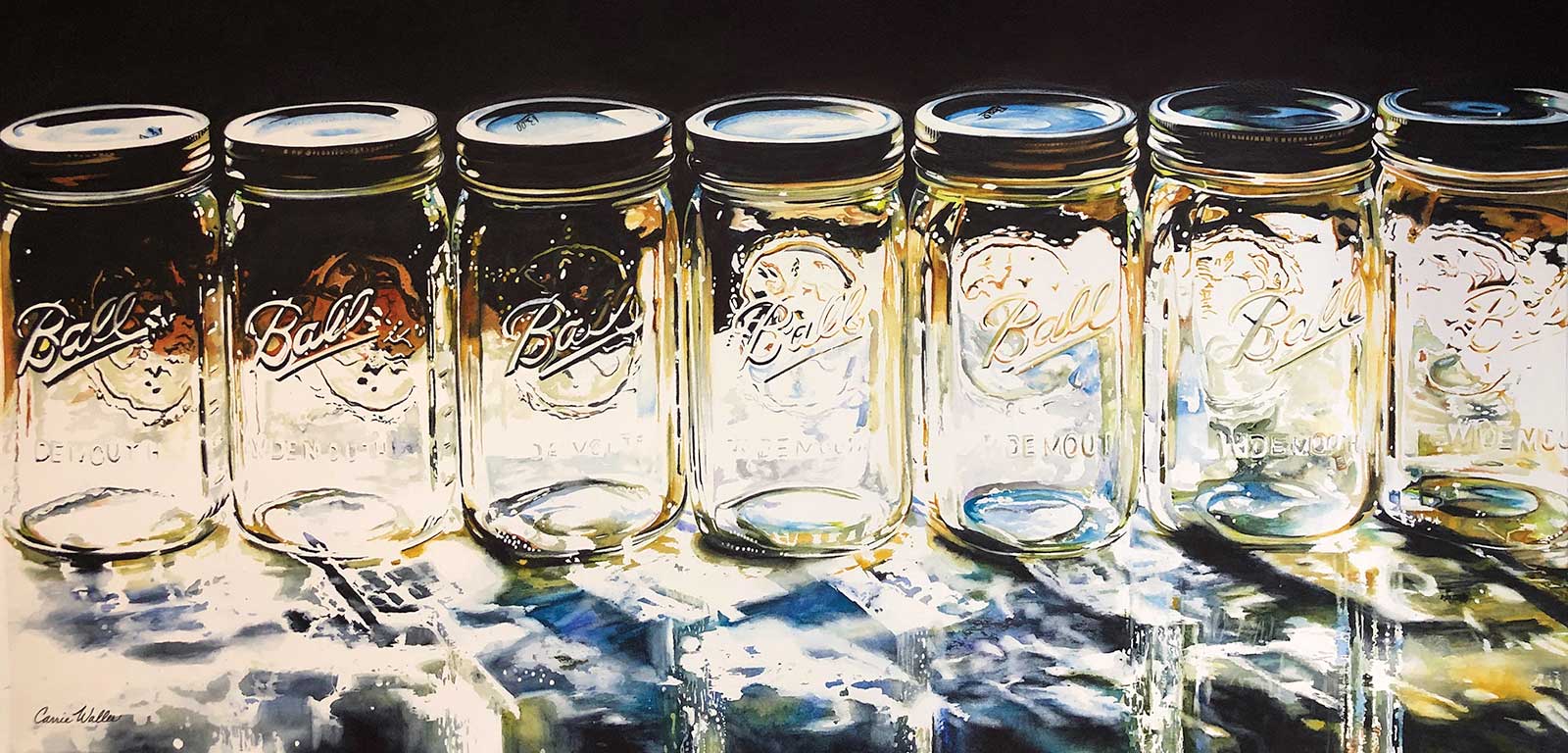
Conservation, watercolor on cold-pressed paper, 16 x 32" (40 x 81 cm) Conservation is part of my Bottles and Jars series inspired from childhood memories of canning vegetables with my grandmother when I spent summers with her in Southern Illinois. I lined up my Ball jars in the sun, having them back lit for dramatic effect. I really love making mundane objects come to life, emphasizing their beauty in my paintings.
I began to teach workshops on how I achieved translucency in my works. Teaching really made me aware of my processes and techniques. During Covid I started teaching online monthly classes, where I really honed my process, able to articulate it in step by step instruction.
The first step in every painting is taking great photographs. I set up a majority of my compositions outside in full sun and photograph at varying times of the day for optimal shadows. I photograph my compositions from various angles, taking lots of photos in hopes of capturing a handful of great images for a series. I pull my photos into a photo editing program where I saturate them and adjust the brightness, contrast, etc. I really try to have my composition very planned out and resolved in this step.
The next stage is to have a great drawing, which is the foundation of my painting. Once I have my drawing completed I transfer it to my watercolor paper using homemade graphite paper to avoid unnecessary pencil marks.
The third step is masking. I have a love/hate relationship with masking fluid, but I find it to be necessary. I have learned that masking is just as essential as a good drawing. I apply my masking very thoughtfully with extreme attention to detail. I want nice thin lines and shapes using thin amounts of masking.
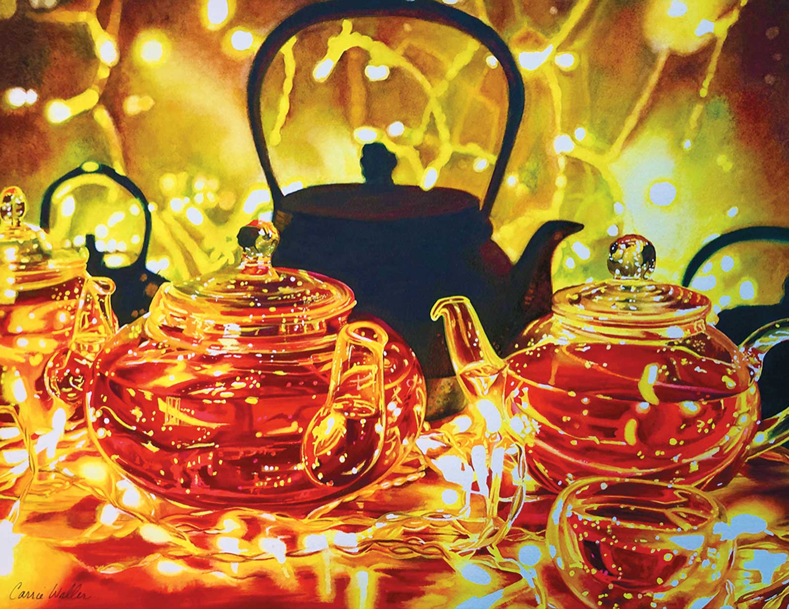
Hikari, watercolor on cold-pressed paper, 16 x 21" (40 x 53 cm) Hikari, meaning “light” in Japanese, is another painting in my teapot series. In this composition I wanted to play with the glass teapots and lights but contrast it with the harsh iron teapots that are almost shadow-like in the background. I was playing with the yin and yang philosophy of contrary forces actually being complementary.
Now the fun begins, and it is time to start painting. I noticed in my painting journey and from watching my students, that establishing values can be a difficult concept to master. I adapted a process to ensure that I establish my values immediately and avoid the adolescent stage of a painting when everything is muted, washed out and not resolved. I started painting a section at a time, inch by inch, painting my work to completion from one side of the paper to the other. Painting this way allows me to see if the painting is working from the beginning. I try to get a section fully resolved before moving to another area.
A big turning point in my work was when I simplified my process and ditched my palettes. I was overwhelmed with stacks of metal palettes that I couldn’t bear to clean off because I didn’t want to waste paint or get rid of a color mix. I started mixing my paint directly on my paper. Once I began doing this I realized I was achieving more vibrant colors and cleaner washes. My paint colors were mingling together on the paper, creating gorgeous mixes that weren’t dulled down or muddied by having them thoroughly mixed on a palette. As I work across my paper, completing a step at a time, I break each small area down into manageable steps. I always start by blocking in my shapes with the lightest color, that way if I get my shape wrong it is easy to correct. I continue to build up the saturation of color with subsequent washes until I reach the desired value. I like to get my darkest dark established right away, as this helps gauge how many washes will be needed. My photo reference also plays a crucial part in my painting success. I spend a lot of time in the beginning stages of photographing and editing. My photo reference is the map that I follow throughout the entire painting.
Each painting takes multiple weeks to complete depending on the size. I love getting lost in the painting and just following the colors and shapes. Painting is a meditative process for me, and I love spending a lot of time with each painting. My intention is to share my view of the world through my painting.
My Art in the Making Bella Luce
Stage 1
Stage 1 Establishing Values
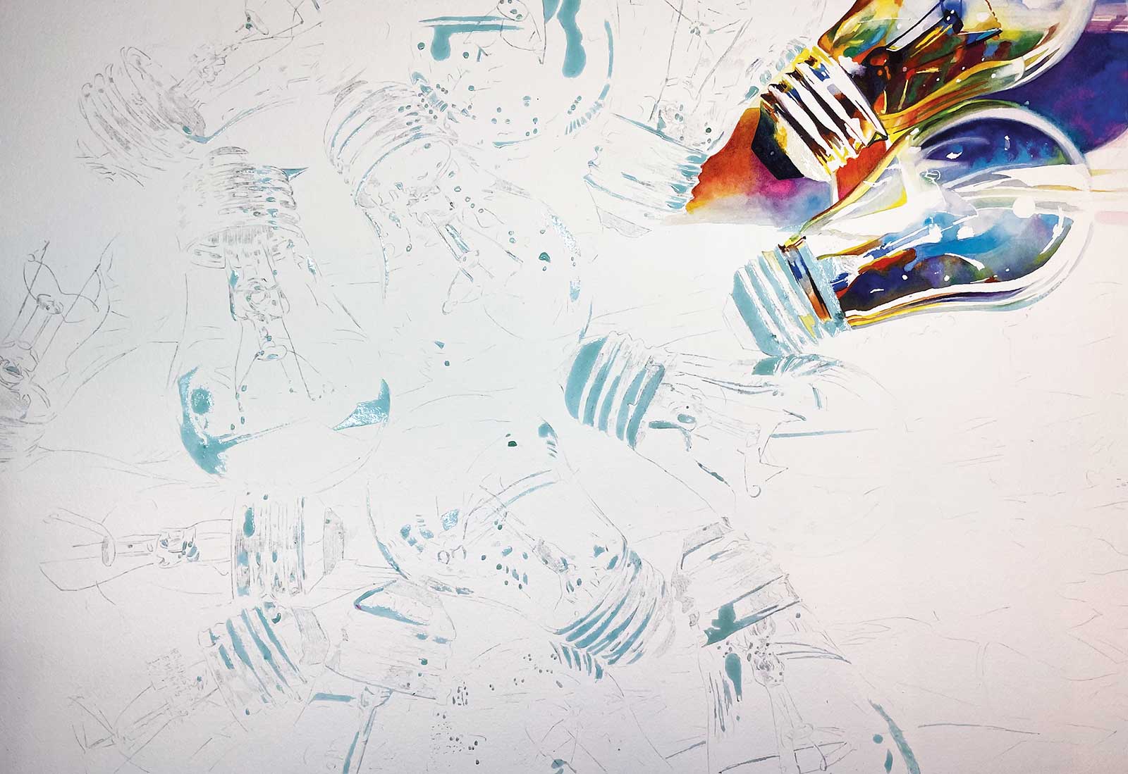
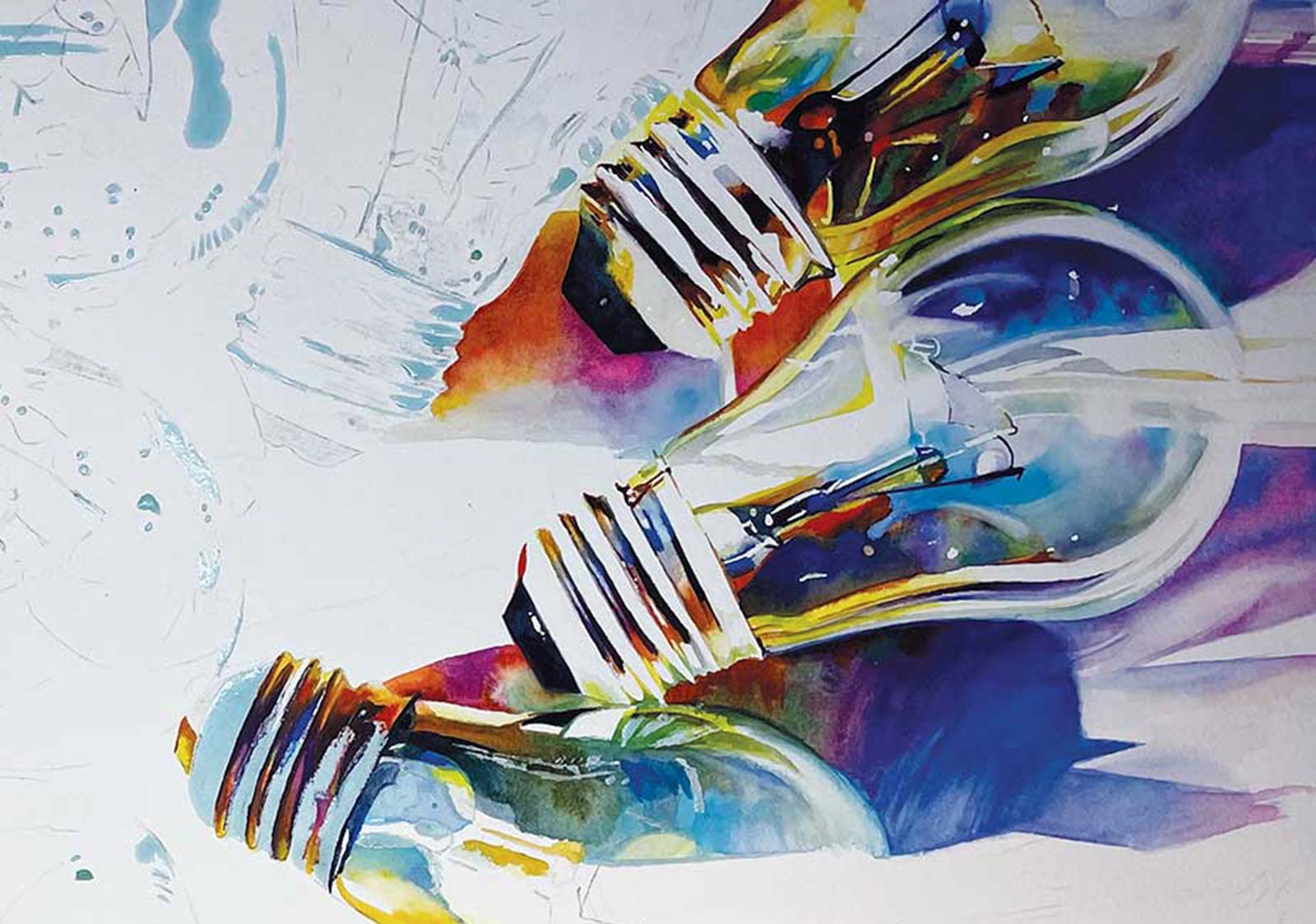
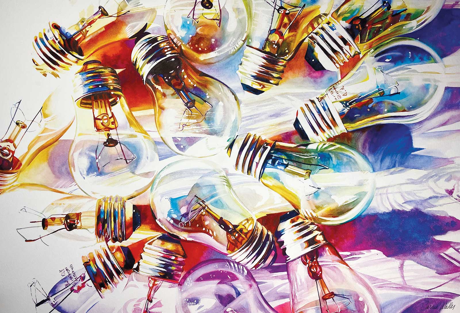
Bella Luce is part of my lightbulb series. I painted this to be part of the Fabriano exhibition, held annually in Italy. This work is 15 by 22 inches painted on Arches 156 lb cold-pressed paper. I have my drawing lightly transferred to my paper and have applied masking. The light blue areas are the masking. I have the top right corner worked to an almost complete stage, establishing my values and saturations. Doing this allows me to see if the painting is working from the beginning.
WHAT THE ARTIST USED
Daniel Smith Watercolors
Ultramarine blue, Cobalt teal blue, Bismuth vanadate yellow, Sap green, Quinacridone gold, Quinacridone burnt orange, Opera pink, Carbazole violet, Pyrrol red, Pyrrol orange, Payne’s gray, Wisteria, Indigo, Sepia
Holbein Watercolors
Horizon blue, Bright violet
Additional Supplies
Holbein masking fluid, Rubber cement pick-up, Round brush, #4, Drafting brush, Homemade graphite paper, Arches 156 lb cold-pressed paper, Corrugated plastic board (tape your paper to the board), Acid-free white artist’s tape
Stage 2
Stage 2 Building Up Color
I am continuing to work across my paper. I am taking the masking off as I go. I focus on finishing one lightbulb at a time using my photo reference as my guide. I am building up rich, vibrant colors that are being mixed on the paper, allowing washes to mingle on the surface.
Stage 3
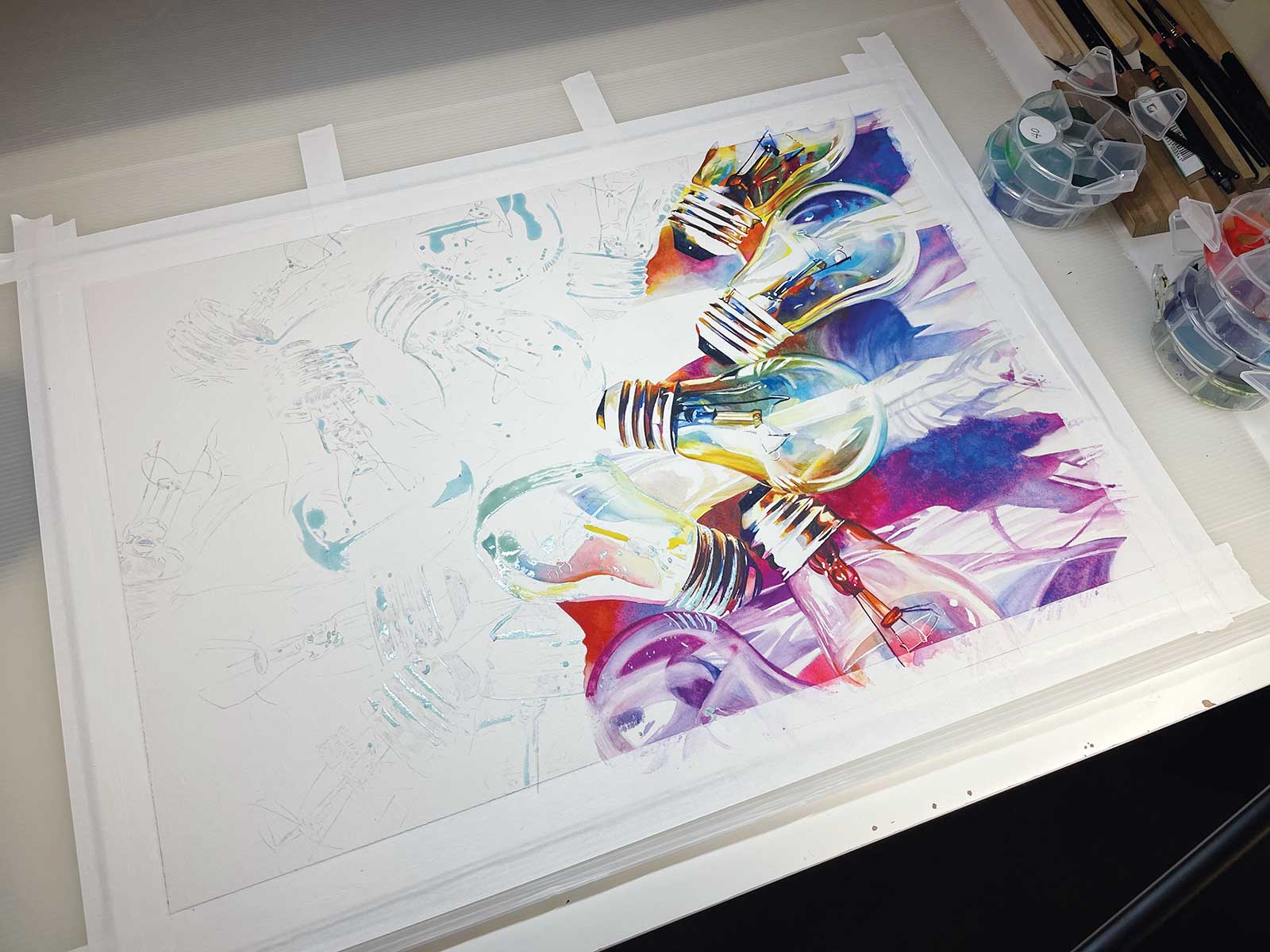
Stage 3 A Bulb at a Time
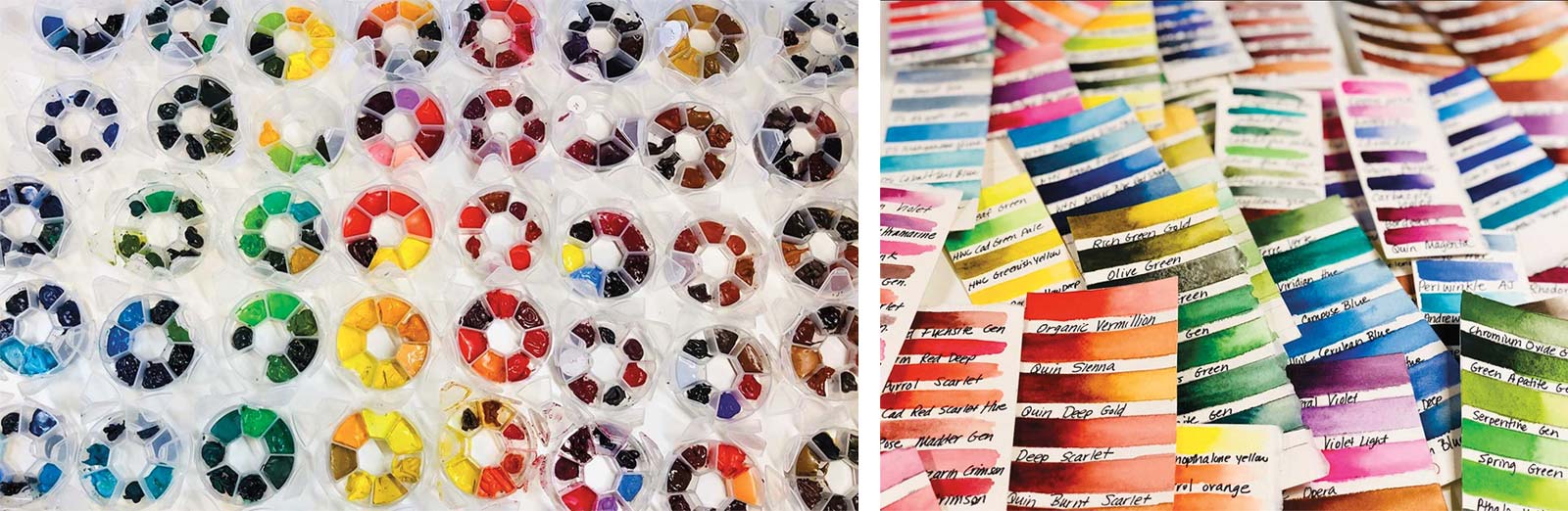
Here you can see a view of my desk set up. I have my paper taped down to a plastic corrugated board using acid-free, white, artist’s tape. I encourage all my students to not use colored tape because it can distract from the colors in your piece. I paint with pan paints that I have made and are housed in the circular containers on my desk. I have a group of seven colors in each container that are analogous colors. My synthetic round brushes are up off my desk using a wooden stand. My painting is progressing across the page a light bulb at a time.
Stage 4
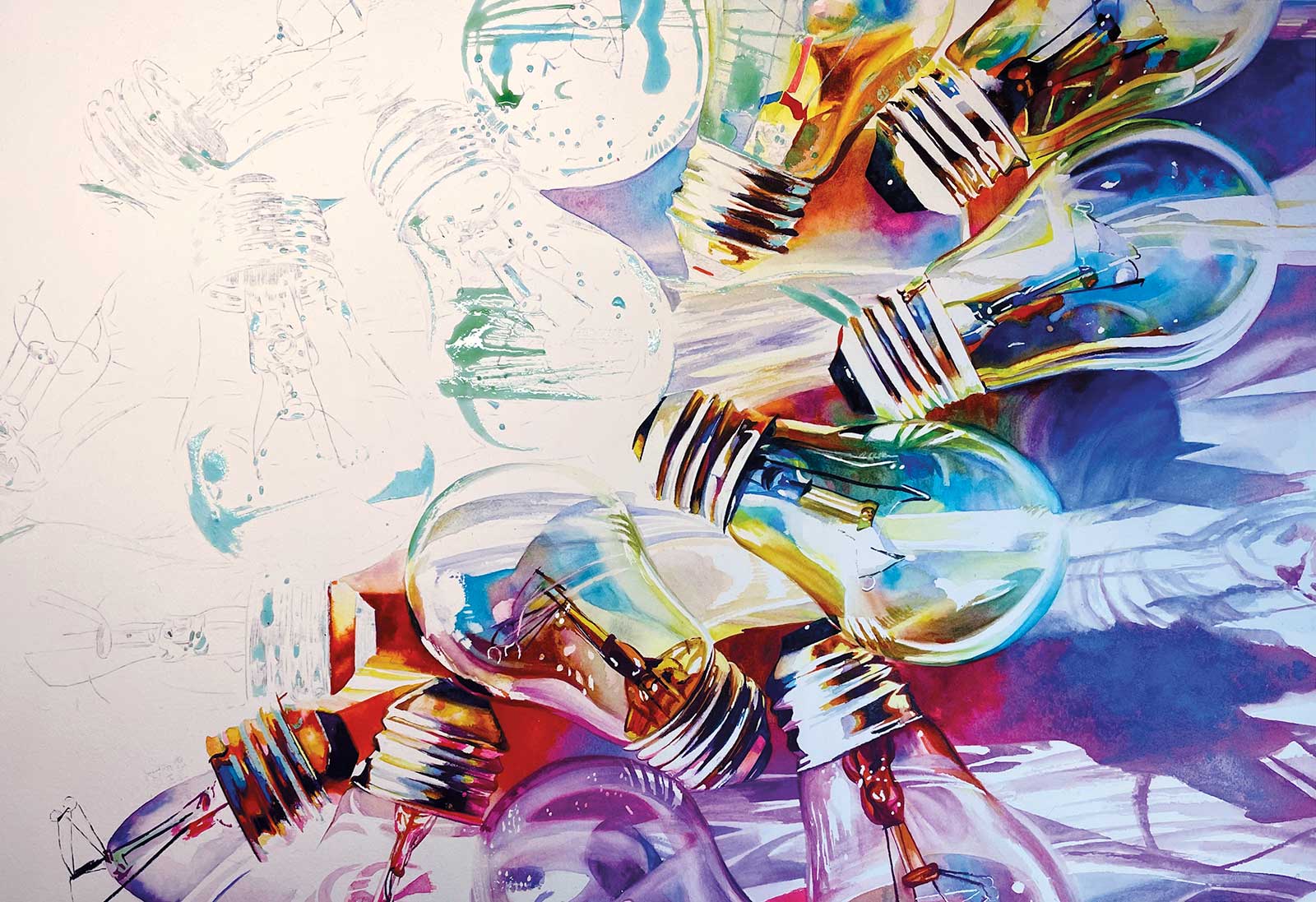
Stage 4 Intensified Shadows and Saturation
I am three-quarters of the way finished in this image. I have spent about two and a half weeks working on this painting at this point. You can really start to see the dramatic shadows and gorgeous saturated colors. The reserved whites that were masked out are really sparkling, and the meticulous masking application is paying off.
Stage 5
Stage 5 Softening Edges
The painting is almost complete. Since I have painted each section to completion, there is minimal work to be done to the entire painting during the last stages. I also find it beneficial to take progress pictures of my painting. It allows me to look at my progress with fresh eyes and see any tweaks that need to be made. I do use a scrubber brush, an old synthetic brush, to soften edges where the masking was too harsh after it was removed. I am very happy with the way the warm colors move into the cool colors in this composition.
Stage 6
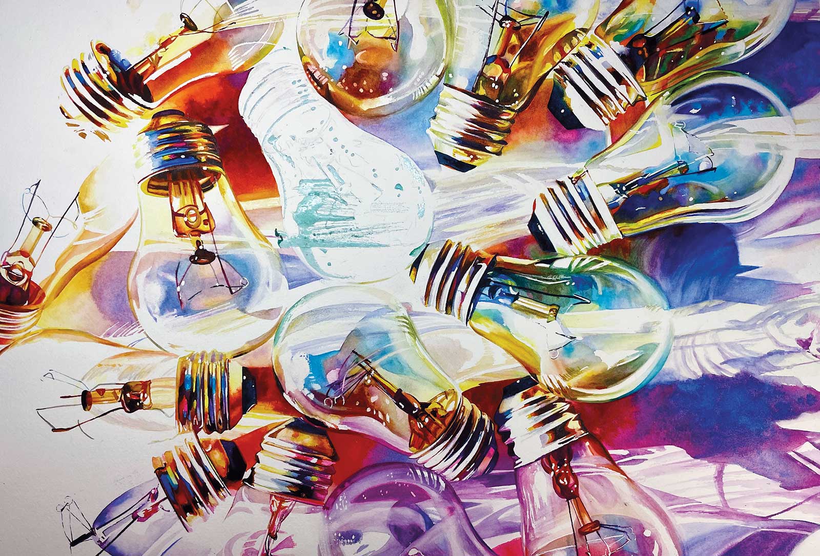
Stage 6 Finished Artwork
Bella Luce, watercolor, 15 x 22" (38 x 55 cm)
Bella Luce is the title of this piece, meaning “beautiful light” in Italian. I really love how the composition goes from bright white, with lost edges on the left side, to the dramatic shadows that are flowing through the piece as your eye progresses to the right. The saturated colors emphasize the drama of this piece. The reserved whites create the translucency and fragility in the composition.
About the artist
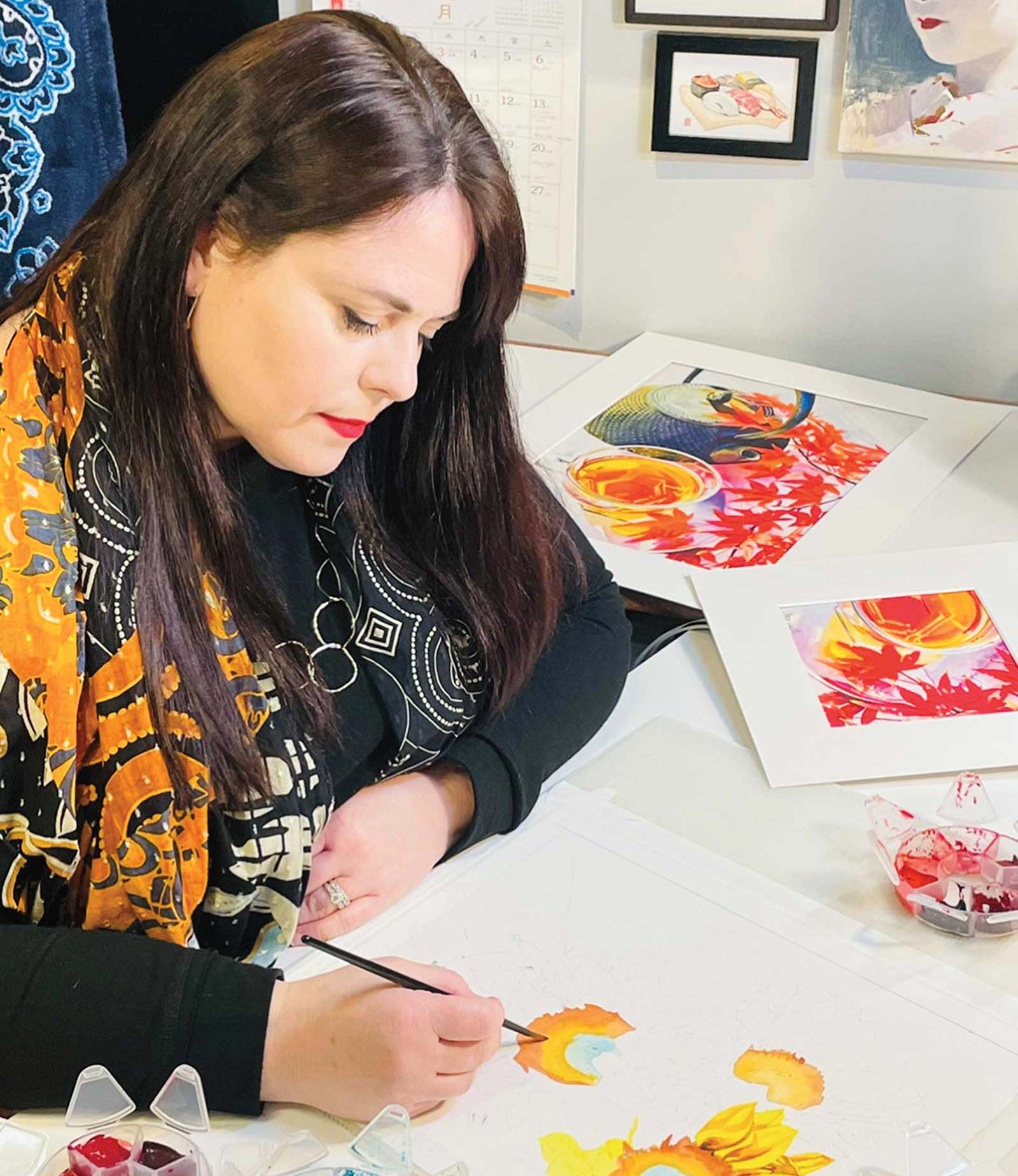 Carrie Waller
Carrie Waller is an internationally recognized watercolor artist working in a realistic, detailed style. Her studies in interior design and graphic design, as well as her time spent living in Europe and Asia, have influenced her as an artist. Her unique works are bold, vibrant and dramatic. She has won numerous awards including the $10,000 grand prize for the American Women Artists 2020 Booth Museum Exhibition. Waller’s watercolors have been in exhibitions around the world, most recently in the Tokyo Metropolitan Museum of Art, the Kyoto City Kyocera Museum and the Hiroshima Prefectural Museum. In addition, her works have been published in many art publications. Waller has signature status in the American Watercolor Society, National Watercolor Society, Watercolor Honor Society, Louisiana Watercolor Society and the Mid-Southern Watercolorists.
Contact at
carriewallerart@gmail.com
www.carriewallerfineart.com