


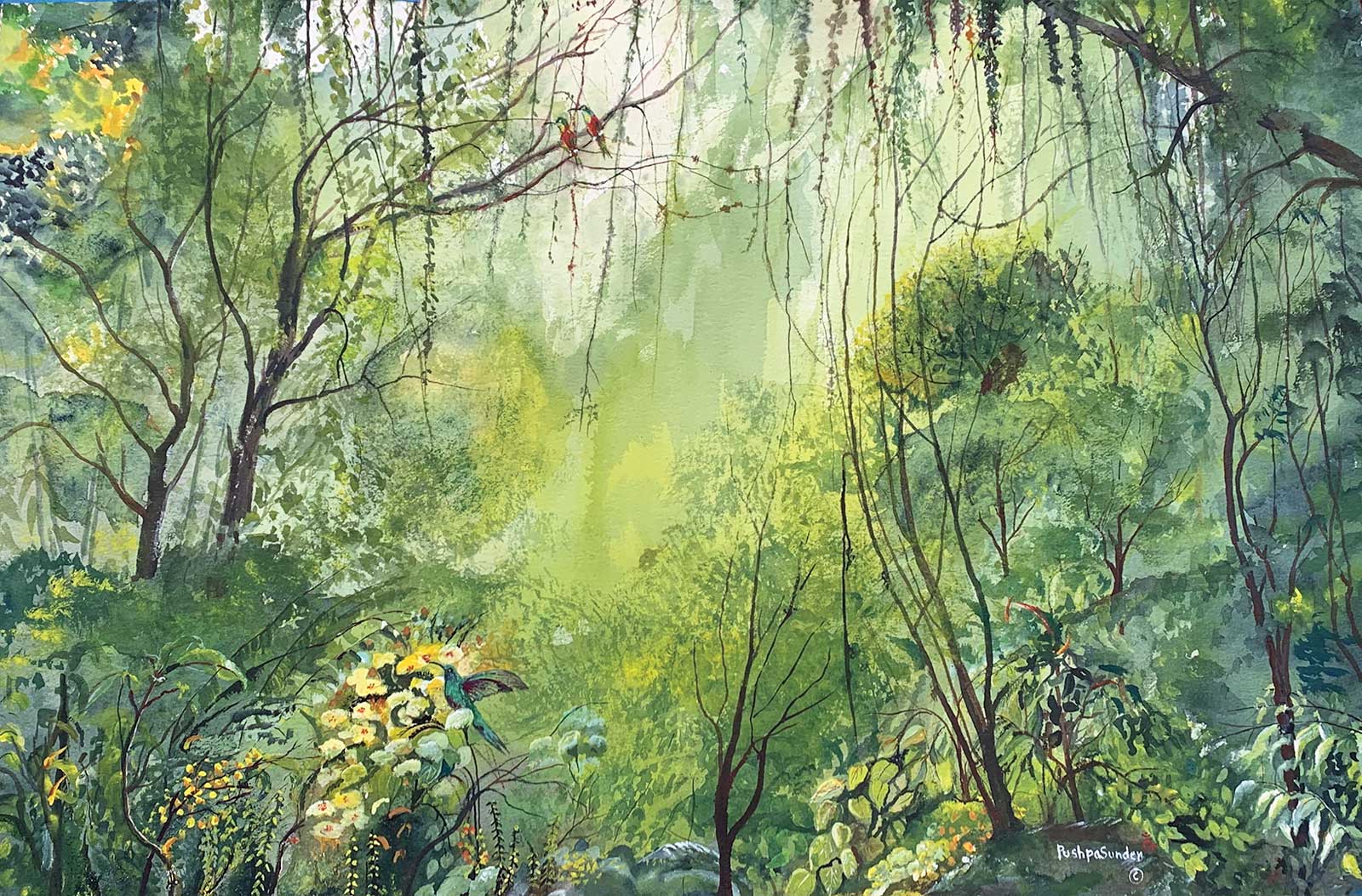
 Rainforest, watercolor, 20 x 30" (50 x 76 cm)Grand Prize
Grand Prize is a four-page editorial feature in American Art Collector magazine
Pushpa S. Mehta
Colorado, USA
A Love of Nature
Pushpa S. Mehta’s artistic style often shifts depending on the subject she’s painting, though she commonly works in the realm of realism. Formerly an obstetrician and gynecologist, Mehta has loved art since she was a child and has taken formal art classes throughout her professional medical career. Since her retirement in 2003, she has consistently attended art classes, workshops, conferences and demonstrations conducted by master artists.
“With encouragement from my loving family I continue to learn and do art,” she says. “I am always keen to learn not only technical and stylistic parameters from master artists, but also how they use light sources, composition, brushstrokes and carefully chosen colors to make an artwork that touches your heart. Thus, I am a perpetual student of art.”
Within the last few years, Mehta has been working on pieces that depict the disastrous effects of climate change. And when the Covid-19 pandemic struck, she began a series of paintings depicting the aggressive nature of the virus and “the benefits of following science and wearing the mask.”
Just last year, Mehta says, she decided to paint for her three grandchildren, who all requested paintings that spoke to their love of nature. “And so I have been happily busy doing a series of nature paintings,” says the artist.
My Inspiration
Inspiration for all my art comes from the loving heavenly voice saying, “Keep up with your art.” The driving force to act upon this inspiration is the joyful acceptance and admiration for my art by my loving family. In the last few years, I have been doing artistically conscious paintings, specifically in regards to climate change, which is having a deleterious effect on all life.
So, when my grandson requested I paint a “rainforest” landscape for him, I was truly thrilled. His request surely and truly inspired me to research on the topic of rainforests and gain knowledge on how this beautiful gift of Mother Nature is an important source that sustains life on our planet.
My Design Strategy
I wanted my design for Rainforest to be a true representation of the valuable gift of Mother Earth. Many, many years ago, we visited El Yunque National Forest in Puerto Rico. We took a guided walking tour on a sunlit trail. Remembrance of beautiful tall lush trees, rhythmic sounds of birds and insects, and beautiful flora and foliage helped me to plan the first steps for the design, and books on ecology of rainforests helped me with next steps. During my research, I found out that there are 361 species of hummingbirds, and 140 of them were seen in rainforests. Thus I decided to paint one in the foreground enjoying the nectar from the “beautiful giving flower.” As I proceeded with my painting, the design started to evolve and that itself guided me to complete this artwork.
My Working Process
I chose 300lb cold-pressed white watercolor paper for my painting Rainforest. I decided to paint mainly with transparent watercolors and some white luminous flowers with egg tempera.
Initially I used masking fluid to cover the central sunlit area and used a gradation of colors from light yellow to intense dark green in overlapping wet on wet technique, going from the edges of the masked area to the periphery of the paper. The details of the trees, flowers and the hummingbird were done in a more realistic technique.
I was close to completing my painting when I decided to add two colorful birds (scarlet macaws seen in tropical forests and are known for long life, and couples are “paired for life”), high up on a branch, vertically above the hummingbird, hoping to add to the beauty and harmony to the Rainforest.
Contact Details
Email: artisticconscience@msn.com
Second Prize
Second Prize is a two-page editorial feature in American Art Collector magazine
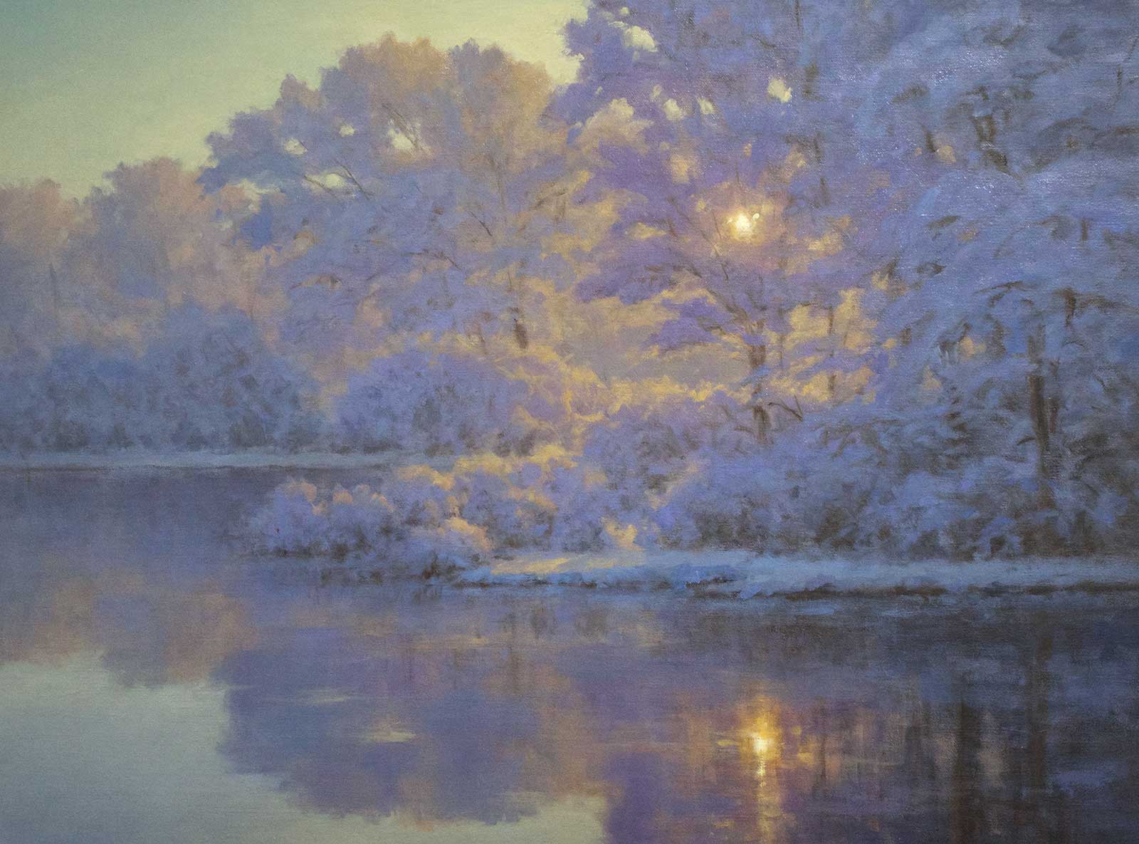 A Dusting of Magic, oil, 18 x 24" (45 x 50 cm)
Hillary Scott
Massachusetts, USA
My Inspiration
In eastern Massachusetts last March there was a late season snowfall. The following morning the landscape looked like a fairyland. The sunlight plus a fresh blanket of snow was an artist’s dream. I ventured out to a couple of favorite painting spots. The wetlands were completely thawed, creating a mirror reflection. The sun was backlit through the snowy branches, and everything around it glowed. I got quite a few photos that morning but the scene resonated. Lighting effects are a common theme in my work, and light on snow fascinates me. This scene had a dreamlike quality I was eager to recreate in paint.
My Design Strategy
The first obstacle usually requires working through design issues: format, horizon line, placement of focal point, etc. I always make small color studies to work out the value structure and color scheme. This particular concept required several drafts before I was happy with the direction. The main struggle involved the placement of the horizon line because my photographic references were not that great compositionally. Therefore, I used my imagination to create the depth in the painting, settling with the horizon just below center and placing the closest bank of trees below that. A final 6-by-8-inch color study became the blueprint for the larger painting.
My Working Process
I did not create my usual brunaille with this painting but instead chose to go with a direct approach. I blocked in the basic composition with the dominant colors: I used ultramarine blue, dioxazine purple, cobalt blue, kings blue, cadmium yellow, cadmium orange, titanium white and burnt umber. Once the painting was blocked in I built it up in thin layers, ensuring the highest chroma and warmest hues were the light-filled focal point. Everything got progressively cooler away from that. Controlling the chroma and the subtle hue and value shifts made this quite the challenge to paint.
Contact Details
Email: hillary@hillaryscottstudios.com
Website: www.hillaryscottfineart.com
Third Prize
Third Prize is a one-page editorial feature in American Art Collector magazine
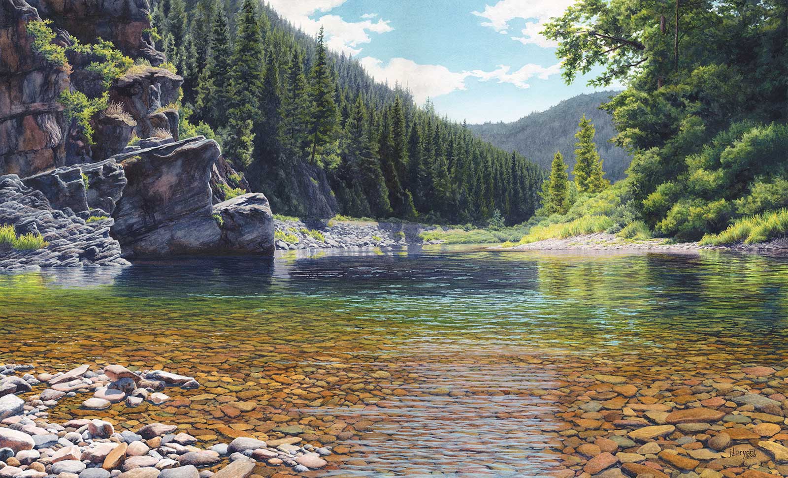 North Fork Coeur d’Alene River, watercolor, 18 x 30" (45 x 76 cm)
Jessica Bryant
Idaho, USA
My Inspiration
Located in the Coeur d’Alene National Forest, the North Fork Coeur d’Alene River is near my home in North Idaho. I first visited this location en route to a backpacking trip with my children and some friends. The kids jumped from the rocks and played in the river. Meanwhile I was captivated by the visual drama and knew I had to return. It became a favorite place to visit when I’m exploring the forest. This region has a long and rich human history that offers a heightened sense of connection to the landscape and the people who have known it.
My Design Strategy
I choose subjects to paint that I have an emotional investment in and that have good compositional potential. I am most excited by the challenge of designing a strong composition that serves the intent of my painting. I have to know why I want to paint my subject, what I want to say, and then determine how to translate that visually to offer the viewer an experience that resonates. My arrangement of value masses are critical to this process, and of course my use of color must support the value masses and emotional content of the painting.
My Working Process
Once I’ve designed my composition, a process that can be quite ruthless, I invest time considering what working environment will best support my process. I’ve learned that my best work comes from a painting experience that allows me to feel the emotions that motivated the choice in subject, and I’ve developed strategies for adjusting my state of mind so my work is infused with the feeling I want it to have. Music is a constant, but I’ll also make choices about what I read or watch in my down time, to help stay close to the emotional state I need.
Contact Details
Email: jessicabryantart@gmail.com
Website: www.jessicabryant.com
Finalists
Each receives an Award Certificate and a one-year subscription to International Artist magazine PLUS having their work seen worldwide by international galleries looking for new talent.
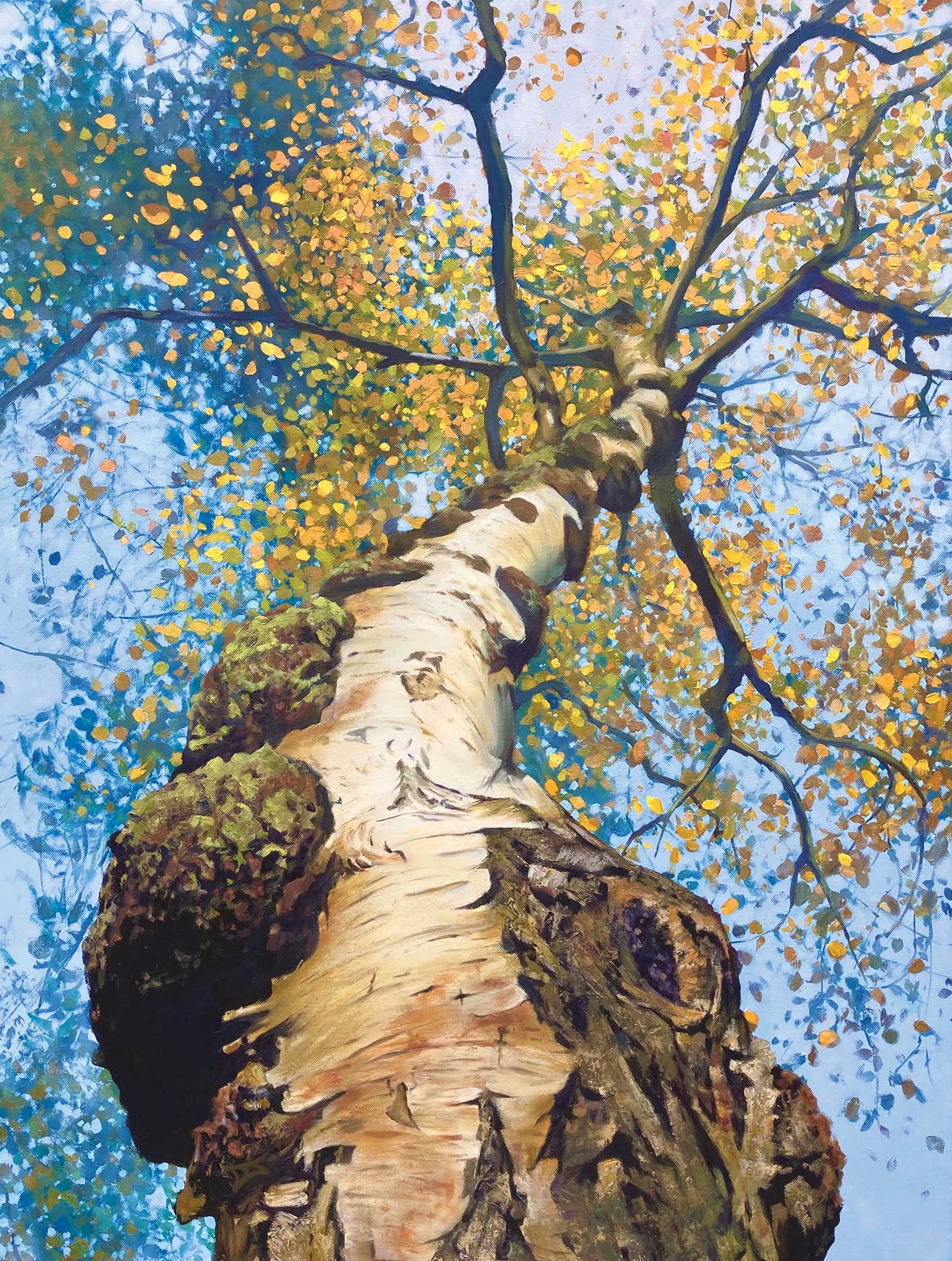
 Branching Out, oil on canvas, 40 x 30" (102 x 76 cm)
DJ
West Midlands, UK
My Inspiration
Painting trees from unusual perspectives has been a passion of mine for over 15 years now. Looking up into the tree canopy above is a fascinating and unique perspective of a tree that we only catch fleeting glimpses of, unless you are prepared to lie down and soak up the view above—which I highly recommend! Silver birch trees are some of the toughest survivors, happily growing in harsh arctic environments, and I wanted to portray the unique visual character of this silver birch tree with its rugged twisting trunk winding its way up into the leafy golden crown above.
My Design Strategy
The trunk of the tree launches itself into the painting, helping to give a dynamic composition and leads the viewer high up into the branches and canopy of leaves above. Painting the trunk with perspective helps to create the illusion of depth and distance in the painting, and detail in the foreground bark can help to emphasize this. I wanted to paint the rugged, gnarly bark at the base of the tree with a lot of texture, giving the illusion that you could almost grab the bark and begin to climb the tree.
My Working Process
After laying down a bright blue sky, I begin to paint the leaves up in the tree canopy. I start with the leaves in shadow high above, and then layer over the top with brightly lit leaves of yellows, oranges and pale greens using a variety of brushes and palette knives to provide me with an interesting range of shapes and marks. I then begin to sculpt the trunk and branches using a palette knife to help create the texture, playing with the abstract shapes produced by the array of branches fanning out from the trunk. Taking time out to put the brushes down and enjoy the painting, as well as viewing it critically, is an essential part of my process.
Contact Details
Email: artbydj@hotmail.co.uk
Website: www.artbydj.co.uk
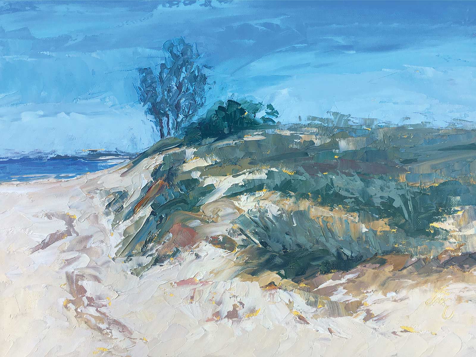 Dunescape, oil on canvas panel, 9 x 12" (22 x 30 cm)
Diane Van Noord
Michigan, USA
My Inspiration
The sandy beaches along Lake Michigan are a wonderful place to spend time. Wide open spaces, fresh breezes and the sound of waves speak of a timelessness that draws me to quiet reflection and creative inspiration. I live a short walk from this treasure of natural resources, and I go to look at it every day. This scene along the West Michigan shoreline caught my attention because of its simplicity, and the contrast of the dune grasses, soft sand and a lone tree that grows despite the challenges facing it from wind, storms and rugged winter weather.
My Design Strategy
I worked from a photo I took when exploring the beach. Placement of the horizon, varied textures, spaces, color harmony and a sense of movement around the dune caught my attention at first glance, and I wanted to capture the feeling I had when I first noticed it. Good compositional structure, a limited palette of colors and palette knives are the tools I use when painting. The rhythm of movement in the grasses, the sand, the bright blue sky and slice of water in the far distance all played their parts to help the finished painting to tell its story.
My Working Process
Dunescape is painted in oil on canvas panel toned with a wash of cadmium yellow paint using a cloth. All of my canvases are first toned with a bright color. Using a brush, I lightly drew in the placement of the horizon, water, dune shape and tree on the dune’s bluff as a guide. Then I mixed some large amounts of the darkest main colors I will use. From these few piles I adjust for tones and tints needed for the painting. Painting in an alla prima manner, I touch each stroke of paint as little as possible.
Contact Details
Email: dvn@dianevannoord.com
Website: www.dianevannoord.com
 Our Last Night Here, oil on linen, 24 x 30" (60 x 76 cm)
Jill McGannon
Georgia, USA
My Inspiration
In the last 10 years, I’ve done a lot of paintings of the sunset over the marsh in Hilton Head Island, South Carolina, and the surrounding area. So for inspiration, I just position myself on the banks of the marsh at sunrise and sunset, and paint plein air and take photos! Painting plein air helps me to interpret the photos by recording the values and colors I see, as photos often differ from what we see. I use both the photos and plein air studies to paint larger works in the studio.
My Design Strategy
I use the rule of thirds and often put the center of interest on one of the points, but not always. It’s easy to take reference photos with the center of interest on one of the points with the newer iPhones, as the grid shows up on the screen. When painting plein air, I use the 6-by-8-inch plexiglass Easy L viewer from Artwork Essentials, as it has the rule of thirds grid on it and comes with a dry erase marker. I try to line up some clouds or trees or tidal creeks to point to the center of interest, but not too precisely. I try not to repeat any shapes.
My Working Process
I sometimes grid off my canvas into thirds or even sixths for a 48-by-60-inch piece to help me to get the block in right. I use a Sharpie to grid the photo, and a chalk snap line from the hardware store to grid off the canvas. I start with the center of interest and do a one-color block-in with big brushes, often two inches wide. I use a palette of a warm and cool of each primary color, plus white and black, and mix a dark, medium, and light for each area, such as trees, marsh grass and clouds. From there, I can tweak the colors as I see variations. I work from dark to light, large shapes to small, and thin paint to thick, using the biggest brushes I can.
Contact Details
Email: jillmcgannon@gmail.com
Website: www.jillmcgannon.com
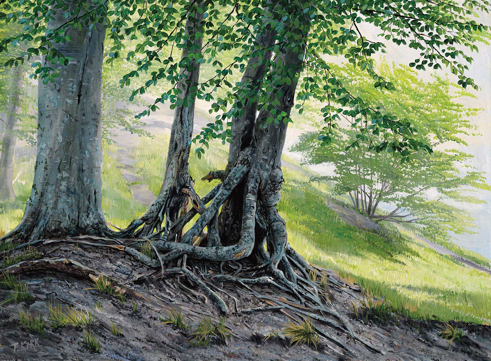 Roots, acrylic on canvas, 21¼ x 28¾" (54 x 73 cm)
Troels Kirk
Skane, Sweden
My Inspiration
The return of spring after long Nordic winters always reboost my inspiration. I leave the studio and tour the countryside extensively in search of new subjects, new angles. On a path down to the coast I stumbled across these beech trees with their roots bared from sand erosion and immediately decided to paint them.
My Design Strategy
In the field, I quickly sketched a few compositions and crops and finally decided to crop as close as possible, but still include some of the bright green foliage, and a suggestion of the steep hill slope in the highly lit background.
My Working Process
In the studio I used the sketch, combined with a few photographs, to draw the final composition in pencil on a stretched, linen canvas. Working from background to foreground, I first painted a bluish haze suggesting the sea below the hill and the cool breeze from the sea. The background trees were painted light and with little detail, the foliage with a loaded fan brush. A couple of light glazes to enhance the distant haze were followed by the foreground details in saturated color. The final touches were the beech leaves reflecting the blue sky.
Contact Details
Email: info@troelskirk.com
Website: www.troelskirk.com
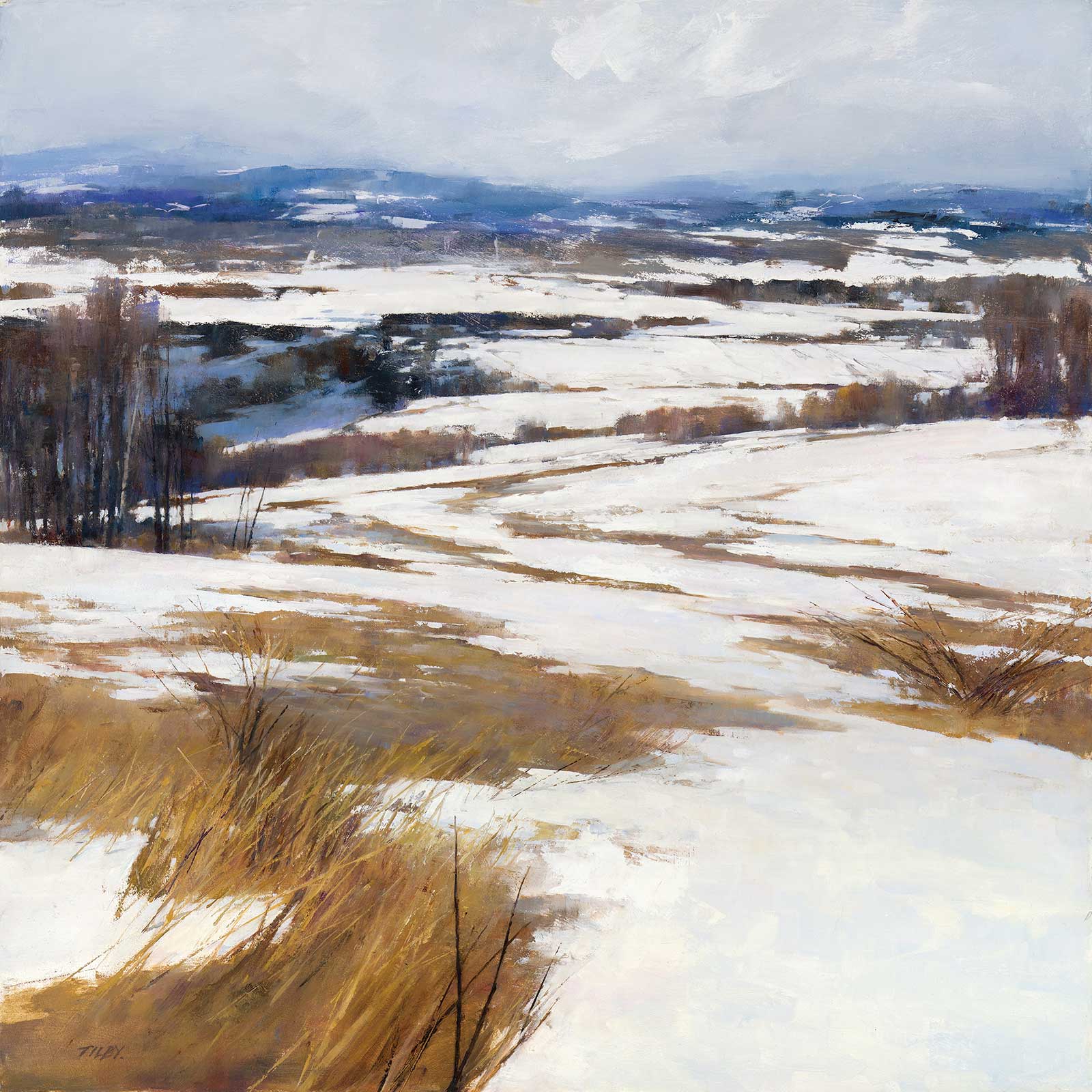 Prairie Snow, oil on panel, 24 x 24" (60 x 60 cm)
Deborah Tilby
British Columbia, Canada
My Inspiration
I am attracted to the soft and beautiful neutrals I see in the landscape, particularly the blue/grays, violets, siennas and ochres of winter. And I love shadows! Prairie Snow has it all.
My Design Strategy
Many of my paintings have a fairly high horizon with relative simplicity in the foreground, and this seemed to work well in Prairie Snow. I wanted the eye to start low but be drawn upwards and on through to the soft foothills disappearing into the clouds. To help achieve this, I used a zig-zag pattern in the mid ground snow and in the grasses and bushes, but I tried to do it in a way that didn’t appear obvious or contrived.
My Working Process
After drawing the design with a few simple lines in diluted violet, I roughly blocked in the shadow shapes and main dark areas. Usually I work all over the panel equally, but this time I started with the sky and worked down over the foothills pretty much completing these areas as I went. I did this because I wanted to lay in color, lift some away with a squeegee, paint some snow with the painting knife and then come back in with a bristle brush—a lot of back and forth creating pleasing edges as I worked. I continued in this manner with the trees and then the foreground snow and grass. I like to do quite a bit of mixing on the panel so I put down the main color shapes and then worked my violets and siennas into the wet paint. Lastly, I painted the taller grass with the knife and brush, sometimes making bigger marks and cutting back into that paint with the surrounding color.
Contact Details
Email: deborahtilby@gmail.com
Website: www.deborahtilby.com