


I have to be inspired in order to paint. I find that I need those personal moments, whether it’s from a trip or simply driving in the dark rain and noticing the dramatic reflections on the road, to inspire me. Or the memories of a family trip, a hike up the mountains with close friends or a road trip in autumn. I admire artists that set a specific time to go into their studio and paint with dedication every day. Although I wish I could do that, when I force the creative process I tend to get into my head too much and second guess everything I do. So, if I am in that mindset, I have to break the cycle and use that time for inspiration by taking many photos. That is my biggest challenge in order to be prolific, and I have the camera roll of photos that support this thought. Being primarily a studio painter, I find I need something personal that speaks to me, whether it is the composition of my subject or the color palette—which in itself is interesting, since in 99 percent of my interpretations I change the colors and composition to what works for me.
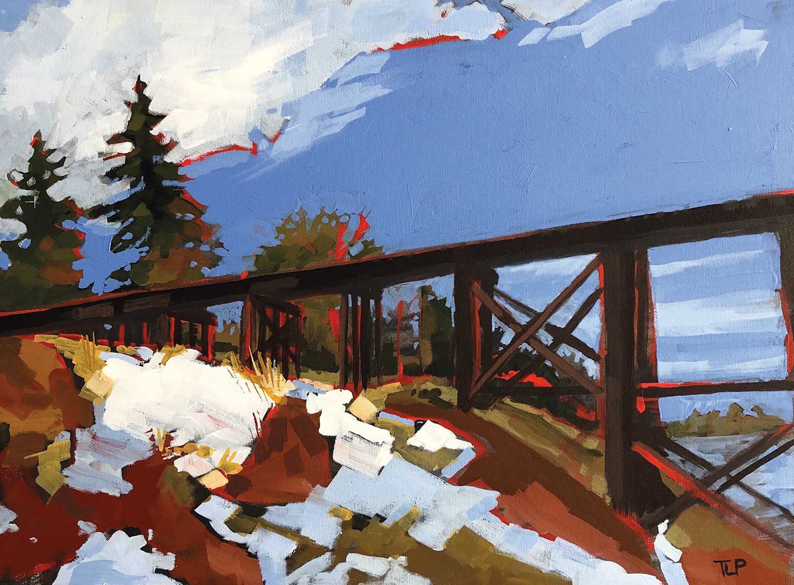
Heritage, acrylic on canvas, 24 x 30" (60 x 76 cm) We have an iconic trestle bridge in my small city, and I wanted to approach it from a different angle than the regular full view.
My work has been described as abstract impressionism, and in the beginning I thought it was because my work was somewhat blocked and angular in nature with a graphical undertone. This makes sense given that I started my career as an illustrator/graphic designer but transitioned to operations management. Which in turn led to a hiatus from art for many years because, for some reason, doing analytics, scheduling and operational planning really knocked the creativity right out of me.
And then two important events happened. A fellow employee and great friend who also was an artist convinced me to attend an out of town week-long watercolor workshop. Although the watercolors didn’t stick with me I was hooked once again and having used oils, pen and ink, gouache and watercolor in the past, I found my true love: acrylics. I loved everything about acrylics, especially with the immediacy of the medium and the ability to make and correct mistakes.
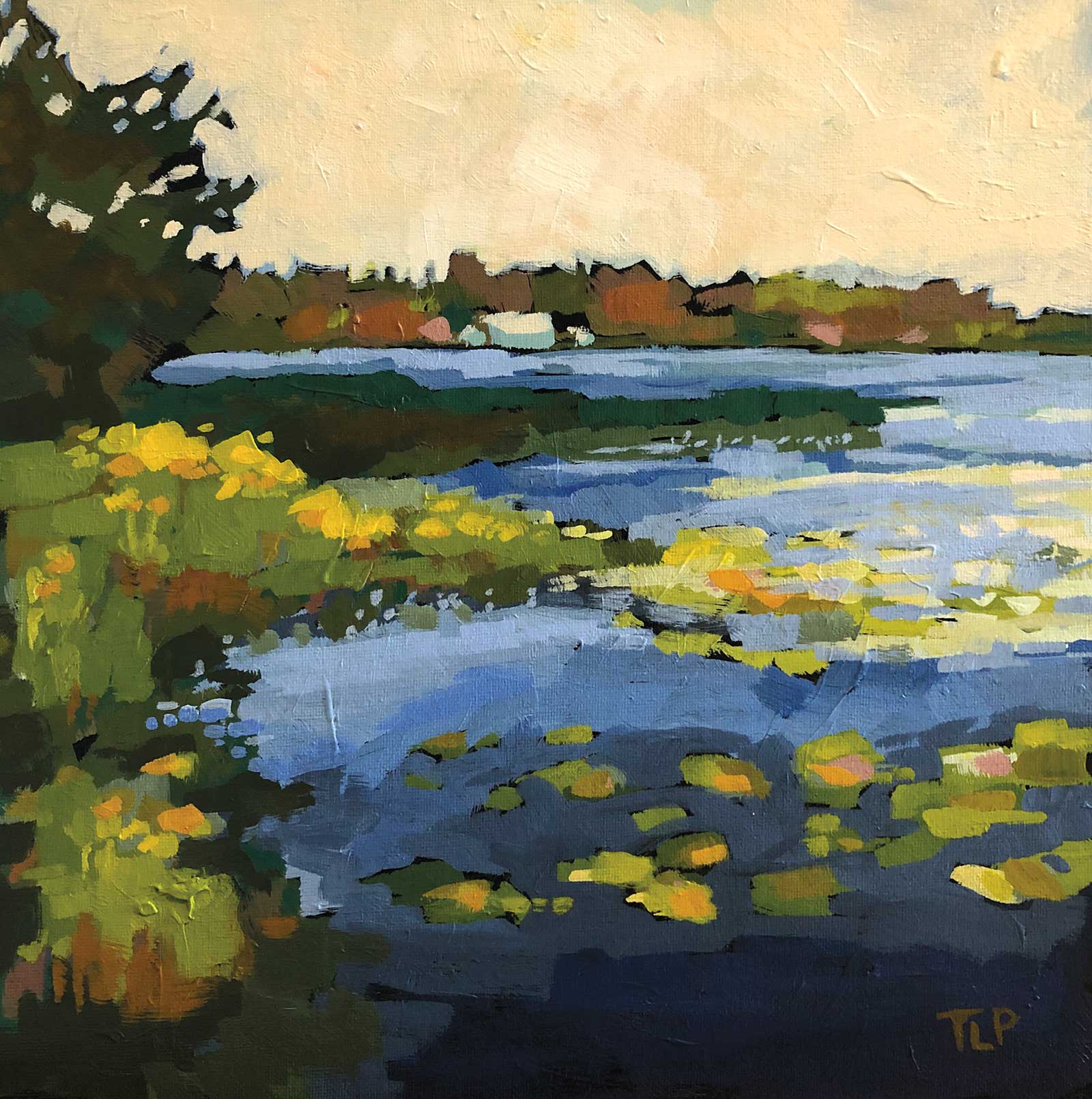
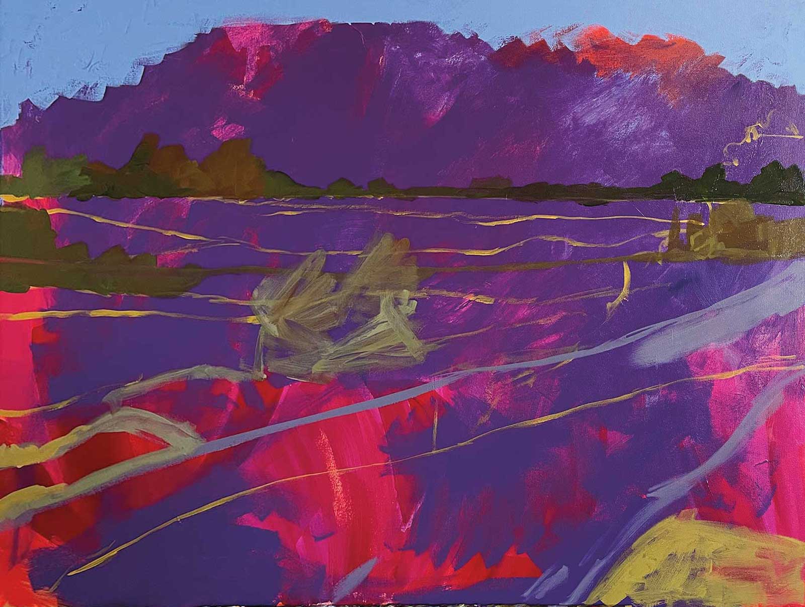
Island Lake, acrylic on canvas board, 12 x 12" (30 x 30 cm) We would spend weekends at this lake, and I loved it in early spring and fall when the loons would sing as the sun set.
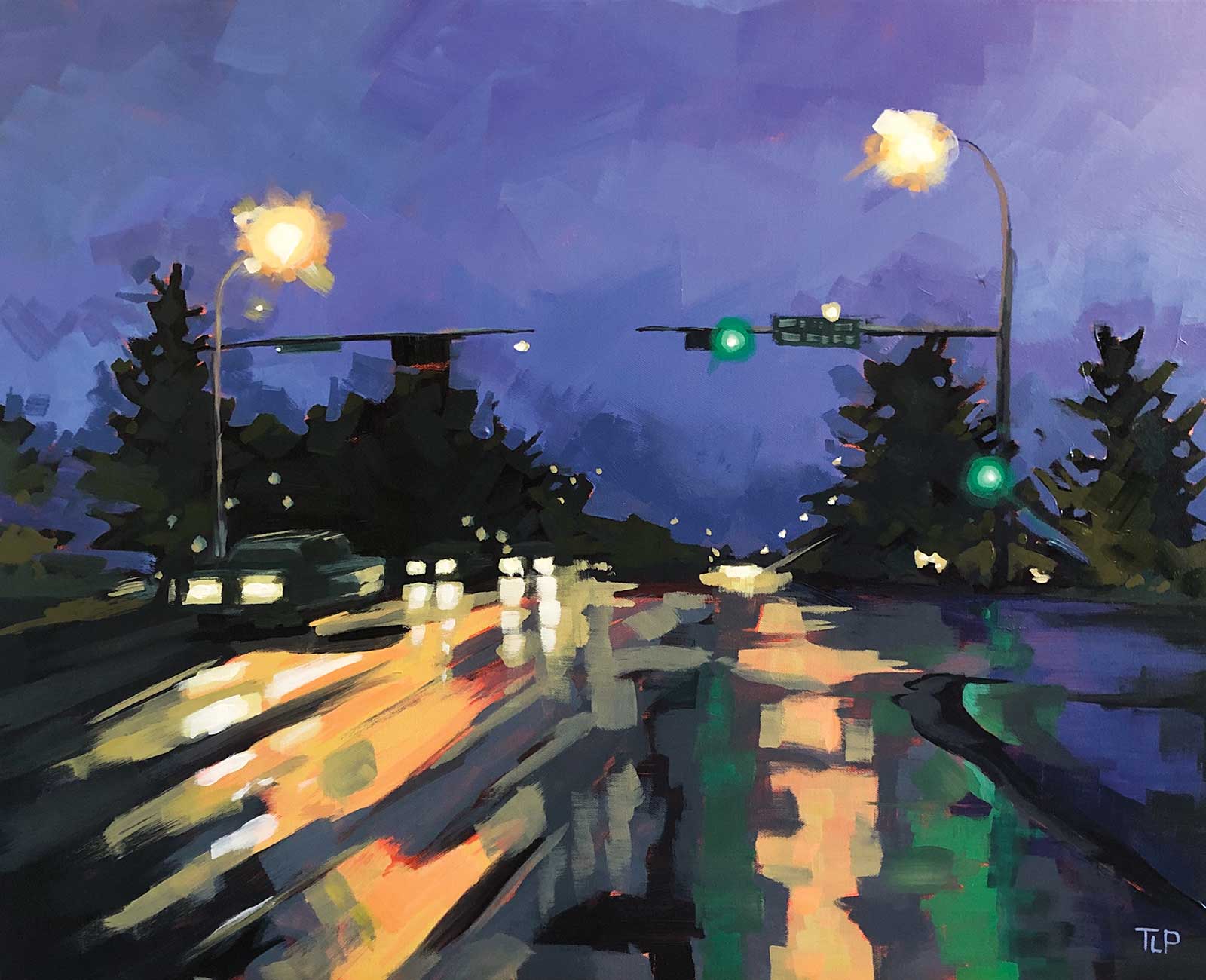
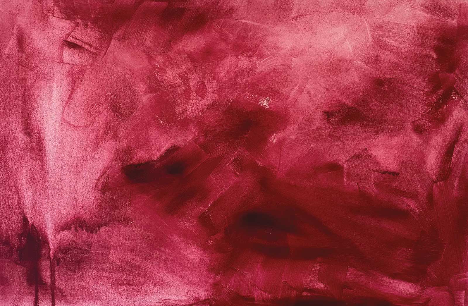
Night Moves, acrylic on canvas, 24 x 30" (60 x 76 cm) Driving home one night in early October I was struck by the reflections on the rain covered streets. I just had to paint it.
And the second event was that I was given the opportunity to take an early buyout from the corporate world. I was no longer required to plan, schedule and analyze anything other than the possibilities of art. I was free.
Being free, I was able to attend many workshops, lessons and just painting with colleagues, which helped me come back to art and do my own thing. That process always has me start with a reference photo, and I will crop and resize to what I feel is a good composition, but I am not at all afraid to deviate from the literal. I never use my photo in technology to enhance colors or try special effects. In that regard I am a bit of a purist, as I experiment on the canvas. I love that if someone were to x-ray my paintings they may find many variations done in layers. Working primarily on canvas, they are always prepared with a grounding color. Currently I am using alizarin crimson hue, although I have used yellow ochre and cadmium red light. You will always see bits of those colors peeking through my paintings, which not only can surprise but also create a balance to the painting. I tend to work my favorite colors as my base, and those colors are mixed on the palette. Halfway through the painting I typically have to start a new one as I end up with a big blended mix of all my colors. I feel this creates continuity in my works and a color palette that is pleasing as I layer on the colors to create definition and purpose.
But mostly I want to convey my personal moments and hope that people can join in and be a part of it.
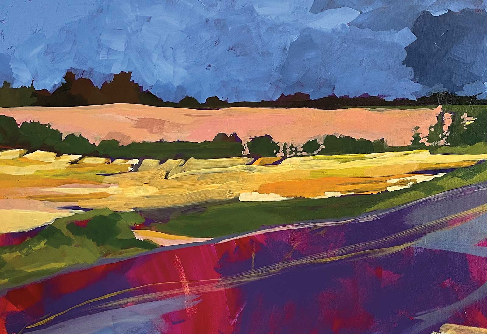
My Art in the Making Range Road
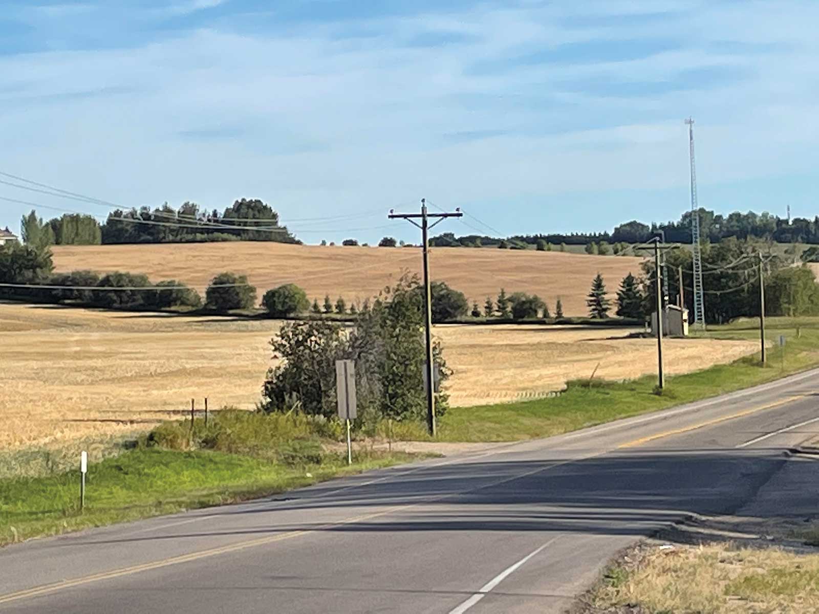 Reference Photo
Reference Photo
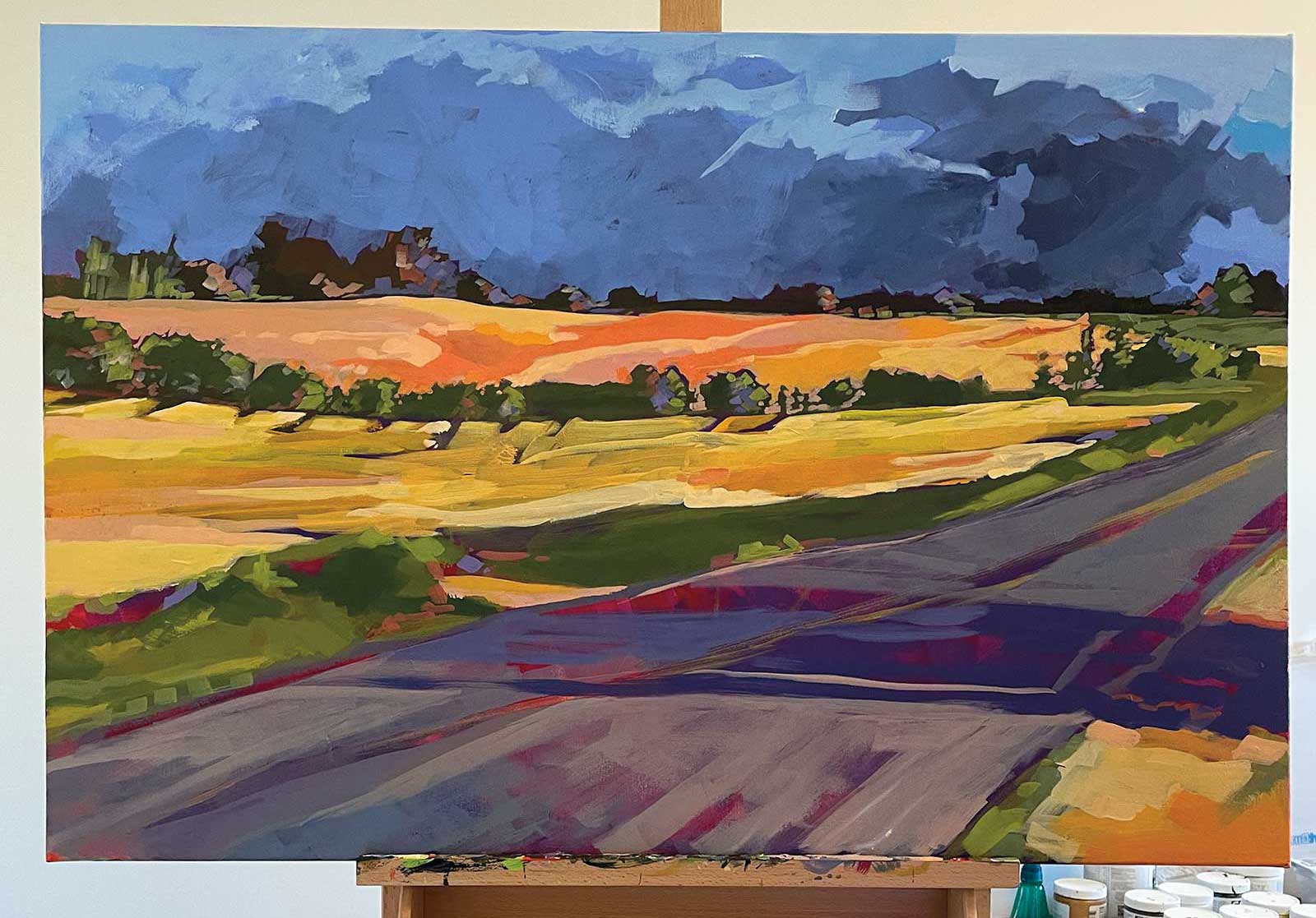
This is a range road that is a short drive from my house, and I would travel it at least once a week. The morning sun would just brighten the fields, but the photos would never do it justice. So I knew I wanted to recreate my personal response in my own way.
 Stage 1
Stage 1 Prepping the Canvas
As indicated earlier, I never work on a white canvas and will always prepare it with a grounding color, and in this case it was alizarin crimson hue. I apply this as a wash, however, I will determine the depth of color as I go in order to influence shadows and tones.
WHAT THE ARTIST USED
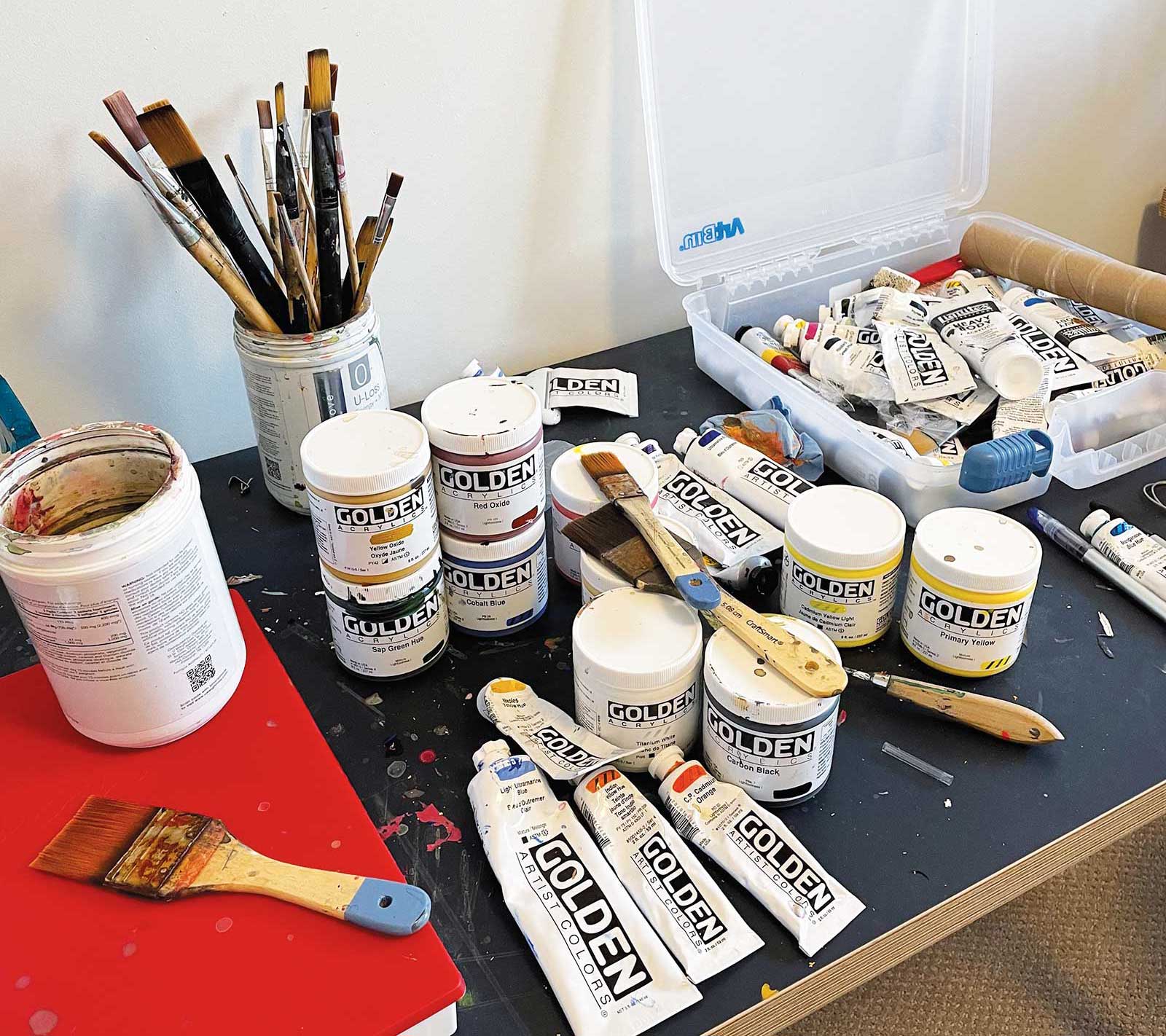
Golden Acrylics
Titanium white, Sap green hue, Carbon black, Alizarin crimson hue, Naples yellow, Cadmium orange medium, Ultramarine violet, Cadmium yellow light, Red oxide, Yellow oxide, Ultramarine blue light, Payne’s gray, Cobalt blue
Brushes
Michaels Craft flat, 1", 2" and 3", Princeton flats, #12, 8 and 6
 Stage 2
Stage 2 Applying the Marks
Here is where I apply my guidance marks—and I call them “guidance” because they are not set in stone. I do not use a grid pattern but just use my eye and instinct to guide me. This way, if required, I can move them. I will also block in some basic colors to make shapes, and in this particular painting I laid in the sky color as I knew that I wanted to have a bright balance, and using a darker ground can influence the painting.
 Stage 3
Stage 3 Composition Checks
My basic shapes are now laid in and are starting to gain a sense of distance that I will need for later. However, some composition challenges are also beginning to come forth, which will need to be addressed.
 Stage 4
Stage 4 Clarifying Shapes and Shadows
This is when I pivoted from being literal and began to change the composition as I realized that the bush was becoming a distraction. This also confirmed the fact that I did not need the power lines or the building. Plus at this time I felt that the sky needed to be more a typical Alberta stormy sky to accentuate the bright colors and create dynamic movement.
 Stage 5
Stage 5 Stepping Back
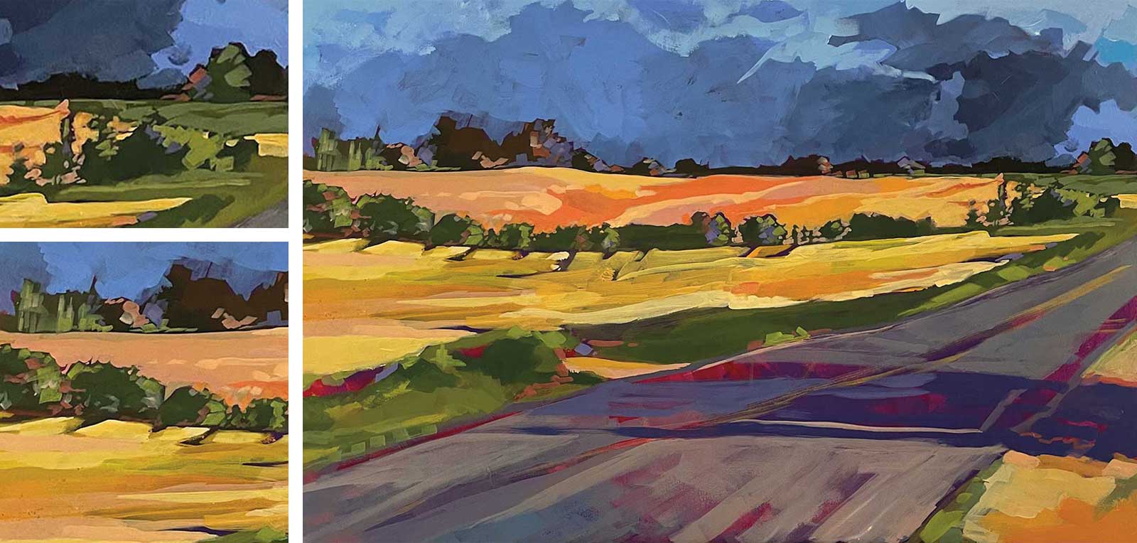
I will spend more time standing back and looking at the painting, and in this case I decided to keep the pops of the underpainting as the shadows. This is also the time when I will either take many photos to view later or even put the canvas in a central part of my home so that I continuously have to walk by it. I find that it helps to have a visual distance to see where I need to go next. Also your mind can trick you, but the camera never lies. Many times I will look at the photo and go, “How did I miss that?”
 Stage 6
Stage 6 Contrast
At this point I feel the painting is a little flat and more contrast needs to be developed, although I feel that the overall direction is fine. I create some form with the tree lines set upon defining the clouds to push them back.
 Stage 7
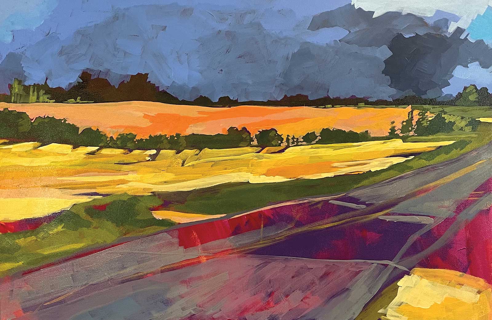
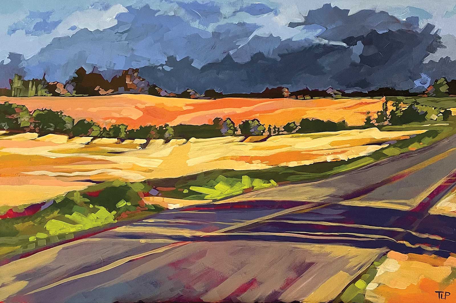
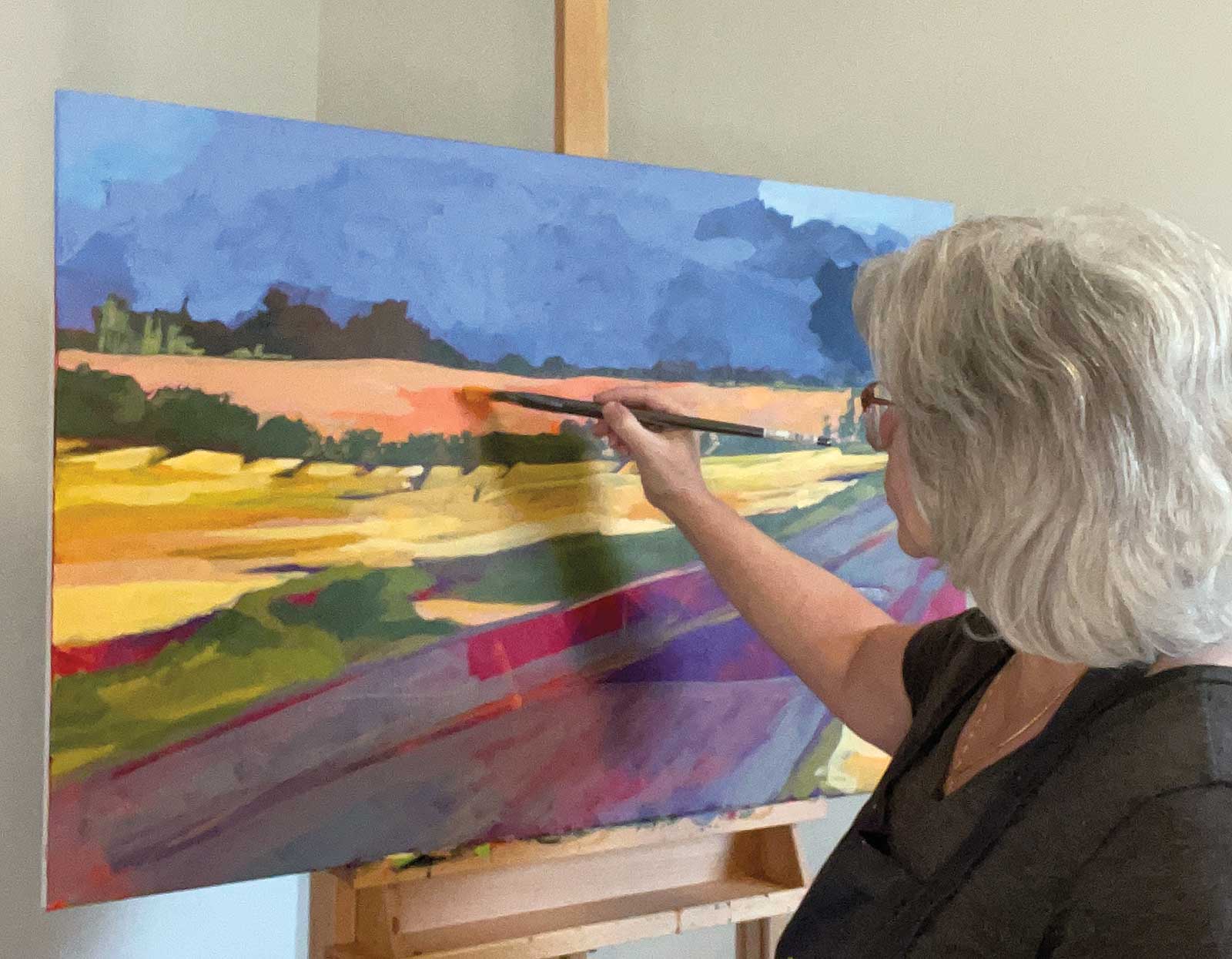
Stage 7 Finished Artwork
Range Road, acrylic, 24 x 36" (60 x 91 cm)
By adding some more bright green lights in the foreground, it helps define the shadows. Changes in the brushstrokes in the fields define the flows and create movement. Furthermore, finally darkening the clouds helps to keep the cohesive nature throughout the painting.
About the artist
 Tracy Lyn Propp
A prairie girl at heart, Tracy Lyn Propp loved drawing and painting as soon as she was able to use any tools at her disposal. Although her formal, foundational training is in graphic design, throughout the past decade Propp has explored the potential of working in fine arts. So in some ways the journey has been through observation and introspection, along with some courses and painting with colleagues. She has traveled Canada from coast to coast by all methods—planes, trains, buses, boats and automobiles—and endeavors to show that love of country and travel through her art. Sometimes she paints places that she has visited or vacationed, but ultimately she always comes home. Propp has exhibited in many art shows throughout Canada and was recognized as one of the 2021 The Best of Acrylic: AcrylicWorks 7 Competition Winners. Additionally, her works reside in private collections in Canada, United States, Great Britain and the Netherlands.
Contact at
www.tracylynpropp.com